
It’s time again for our monthly Divi Showcase where we take a look at 10 amazing Divi websites made by our community members. Each month we showcase the best Divi websites that were submitted from our community and today we want to share with you the top ten websites for the month of November. Throughout the post, I’ll point out some of my favorite design features that draw me to each of the websites.
I hope you like them!
Divi Design Showcase: New Submissions from November 2018
1. Pivot Medical Coding

This site was submitted by Leslie Tagorda. The site uses a nice color-scheme of green and orange for text, background elements, icons, and within an interesting call to action in the menu which includes the date of an upcoming event and a button to register. The background elements are made of hexagons and hard angles. The icons also use hexagons. The header and menus also use a dark blue with a pattern to stand apart. The site makes great use of text and color.
2. INSNAPSYS
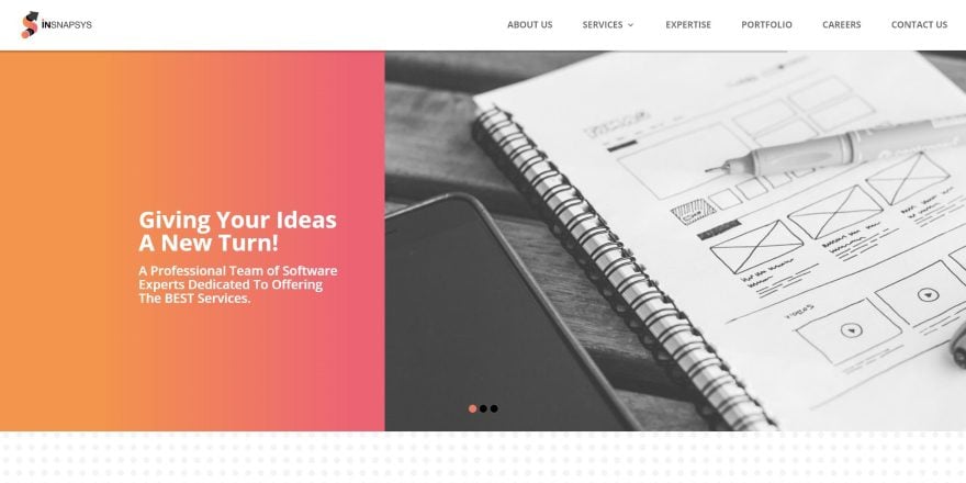
This site was submitted by Dinesh Milani. It uses warm colors to create a gradient that stands out against the gray background. The warm colors are also used for the text and graphic elements, buttons, overlays, and blurbs. I like the layout for the services, which displays a circled image next to an icon and text, with each service alternating down the page. The portfolio uses an interesting layout with elements of each website shown in a split screen with angled overlays, a text description to one side, a desktop screen in the other, and mobile devices in the center. The portfolio shows a lot of information and still finds a way to keep it all readable.
3. BlueMax
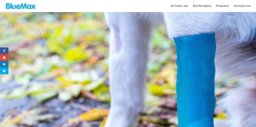
This site was submitted by Victor Duse. This is a one-page product site that uses the product’s branded blue color as highlights throughout the site. The blue is used for text, icons, as section backgrounds, and in the logo. The layout is clean with a full-screen slider, an image gallery that demonstrates the product, an embedded video, clickable store logos, a product gallery, images with text for information, and a contact form. The site makes excellent use of branded color and I like the way it uses images to show how to use the product and its benefits.
4. The Blog Creative
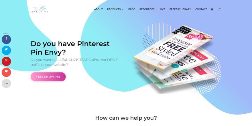
This site was submitted by Cecille Solmerano. This site has a clean design with lots of white space and elegant colors, but what stands out is the background shapes. Shapes made of soft colors, and a few having gradients, create backgrounds that move behind the foreground elements to create an interesting effect that draws attention without distracting from the foreground elements. Icons for blurbs use the same soft colors while buttons and a CTA go a little bolder. The blog continues the elegant design with clouds for section dividers in a blue gradient for the header and a pink gradient for the footer. The rest of the blog’s color is supplied by the border in the featured images. This site is an excellent example of elegant color, graphics, and photography.
5. Checkerboard
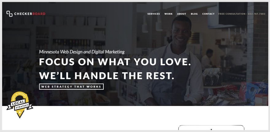
This site was submitted by Brady Balhorn. This site has one of the most interesting graphic elements that I’ve seen. A tablet sits just under the full-width header and displays a graphic (the graphic is also used as the site’s favicon). The tablet is on the right with text on the left. As you scroll, the tablet shifts a touch to the left and the graphics around it changes. The tablet then remains in place as the text scrolls. The graphics on and around the tablet changes to match the next section of text, creating a presentation which continues for five sections. A section of client logos and rewards followed by a blog are placed over a marbled checkerboard background in parallax. The blog uses elegant cards with lazy loading to create a clean four-column design.
6. Integra
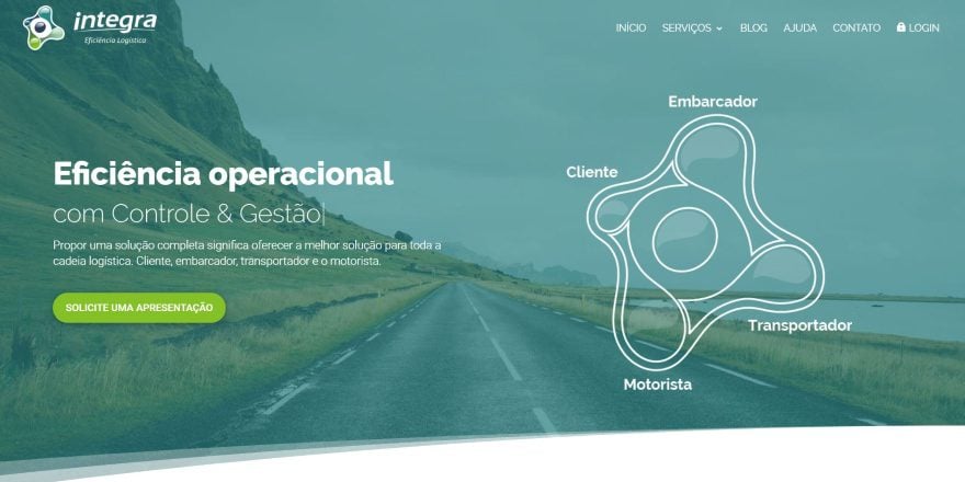
This site was submitted by Marcio Sartor. It has a full-screen background with gradient behind the call to action that includes a typing effect next to an interesting graphic that steps through the logistical process. A graphic presentation is displayed in a slider with shadow effects. Another interesting section shows a laptop to one side and text to the other. When you click on the text, the laptop (or mobile devices) shows supporting information for that service or benefit. The green branding fits the genre of the site perfectly. Even the login page is branded with a full-screen background image, a green overlay, and logo.
7. 5 Linx
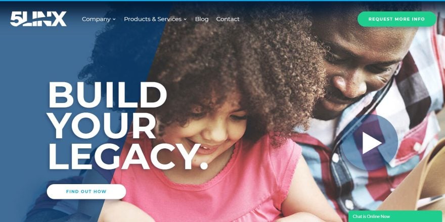
This site was submitted by Justin Arcara. It uses lots of large text and elements throughout the site as either headers or behind other text as part of the headers to describe the sections. The full-screen header has an overlay that covers a portion of the image on one side and a large play button on the other. Clicking the play button opens an embedded video. Products are displayed in a multi-column section with hover animation. Many of the elements, such as text, icons, buttons, and blog cards use deep shadow effects that make the elements stand out. The blog follows the same layout design and includes a styled sidebar with a darker background to make the blog posts stand out. The posts themselves follow the same layout.
8. Sphonic
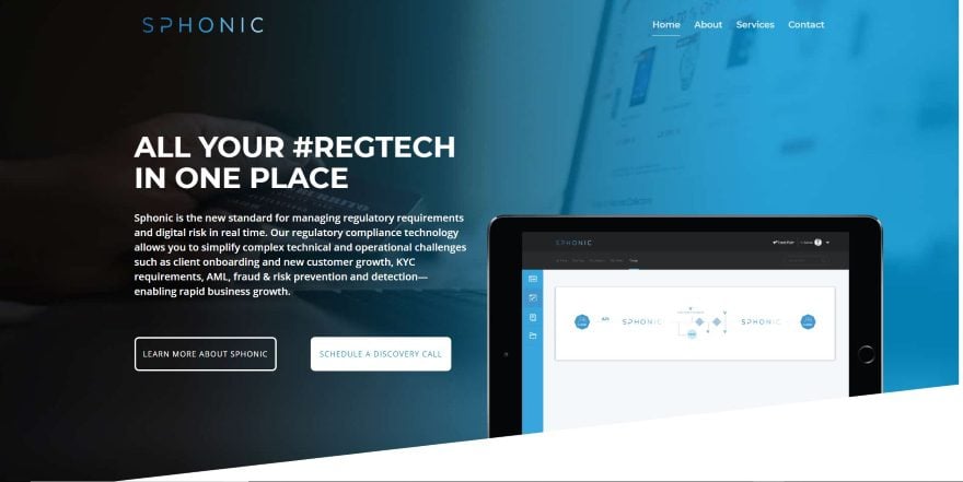
This site was submitted by Marcy Henriques. It’s a one-page design that alternates between lots of slightly off-white and gray backgrounds, with several of them using angled separators. The hero section displays a background image with a blue overlay with a gradient to help set the branding for the site. The header text uses the gradient in the reverse direction. I like the benefits section, which use octagons in blue or gray backgrounds and icons with heavy shadows to stand apart from the background. I also like the testimonial slider. It includes a shadow effect and is placed over an octagon background pattern with an image to one side.
9. Better Health by Heather
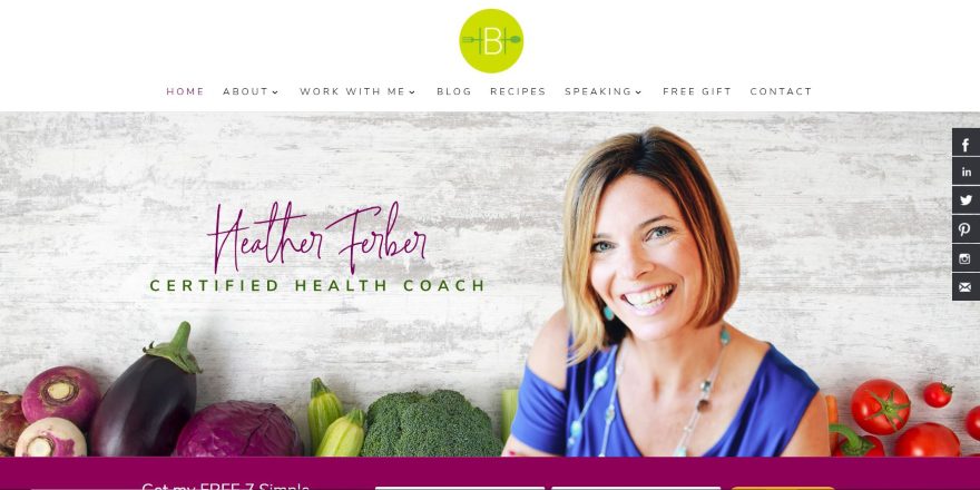
This site was submitted by Christie Halmick. This one uses lots of bold color in the highlights including the hand-scripted logo, menus, titles, buttons, a single-sided border for images, behind the testimonials, behind the CTAs, and in the footer. Several of the sections are divided by a styled line with the logo in the center. The bold colors look great against the high-quality photography. I like the recipes which work like blog posts but include recipe cards. The e-book CTA page removes the navigation and displays a form with branded colors over a full-screen background image. This site makes excellent use of color.
10. CMG Agency

This site was submitted by Carlos Montalvo. This site uses bold yellow with black or light gray-to-white gradient backgrounds, and even though there are a lot of things on the home page, each of the elements has plenty of breathing room. Visuals are supplied by flat graphics, embedded videos, icons, recent work, client logos within a slider, blog posts, and Google reviews. The portfolio page includes a sharp filter that’s styled to match the site’s yellow branding. I love the team page. It uses comic book-style artwork for each of the team members. I also like the blog page which includes a yellow gradient and other yellow highlights.
Conclusion
That’s our 10 best community Divi website submissions for the month of November. These sites look amazing and as always we want to thank everyone for your submissions!
If you’d like your own design considered please feel free to email our editor at nathan at elegant themes dot com. Be sure to make the subject of the email “DIVI SITE SUBMISSION”.
We’d also like to hear from you in the comments! Tell us what you like about these websites and if there is anything they’ve done you want us to teach on the blog.
Featured Image via Kostenko Maxim / shutterstock.com


4. The Blog Creative
Does anyone have a clue on how those animated backgrounds can be made?
I love most of these submissions! Great ones, Randy!
Who can send a link to a site made on DIVi?
Please read the last section of the post for submission instructions.
Thank you guys for showcasing BlueMax (#3)! Some really nice inspiration in the websites as well. Keep up the good work!
I like the website – Better Health by Heather. I personally feel it was well put together. Professional looking. The job was well done by the creator.
Thank you John! It was a fun project for a great client and it really reflects her personality.
The header and navigation of 5linx is brilliant. How would I incorporate the menu on my website using divi?
For menu what I do see is the final menu item getting a CSS class added to it. Then you have a whole bunch of CSS for the menu item to get the look that it does.
I would be really interested in finding out how to add that call to action in the menu which includes the date of an upcoming event and a button to register. On the pivot medical website
Well one thing I do see is a child theme used.
Along with some CSS I say they modified the header.php file to do that.
Hi! The main thing I’d like to know is how to get my website to load properly! Rite now most of my sites come up in pieces, similar to the how the 1st on the list loads. I see a lot of the sites DON’T do this, and I’d like to know the proper settings for that!
I also really like how the team page on the last one was done- how do you have the popout slider from the right side? It’s great!
Hi Rivka
The hero image of the Pivot-site is 2.36 MB large – that’s a huge image file size. I’am pretty sure that this is the reason why this part loads in pieces, which it also does for me located in Denmark. The other submissions loads better for me.
@ET – Thank you so much for an other great post with loads of creative inspiration 🙂
BR Rikke
The first site in this list loads instantly for me, I don’t see any of the bits and pieces you mention. As a suggestion, could it be your individual resources, for instance the speed in which your internet service provider is giving you? I would imagine a lot depends on your own download speed.
My location is Australia and I have a very basic business ISP package (nothing fancy), It’s the smallest account. Hope this helps 🙂
Well in a quick look at the code on that page I do see they have a whole MESS load of CSS for that site including one just for the team page.