
It’s that time again for our monthly Divi Showcase, where we take a look at ten amazing Divi websites made by our community members. Each month we showcase the best Divi websites that were submitted from our community and today we want to share with you the top ten websites for the month of March. Throughout the post, I’ll point out some of my favorite design features that draw me to each of the websites.
I hope you like them!
Divi Design Showcase: New Submissions from March 2021
1. Huntington YMCA
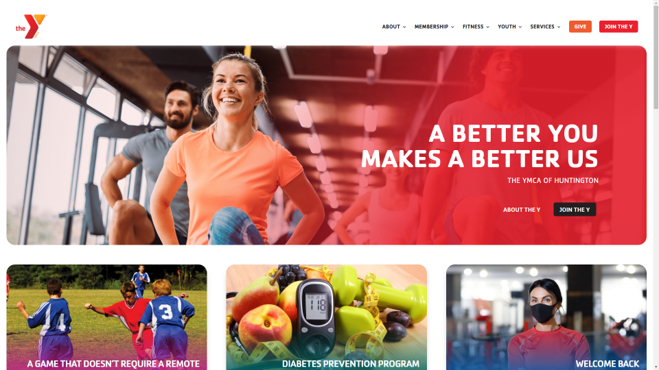
This site was submitted by Jimmy Lemon. All of the images on this site use rounded borders that make them look like tiles. Blurbs with rounded corners highlight the categories. Even the submenus in the header match the tiled design. The hero image places a gradient overlay on one side with the CTA in the overlay. Each of the images with text follows a similar design by placing the overlay at the bottom with text in the overlay. Fonts and backgrounds use lots of colors across the color spectrum. This site makes great use of color, images, and typography.
2. Batcom
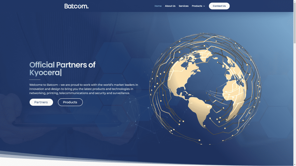
This site was submitted by Dijimoe. This one has lots of small details that work perfectly with a tech site. A typing effect reveals information in the hero section. Particles in the hero section follow your mouse. A blurred image of the Earth comes into focus as you hover over it. Blurbs for the categories look like cards with rounded edges. They spin around on hover to show details of each category. Blue backgrounds for the sections include styled borders that stand out. Featured products also include rounded borders and stand apart from the site with box shadows. This site makes great use of color and micro-animations.
3. Thoroughbred Construction
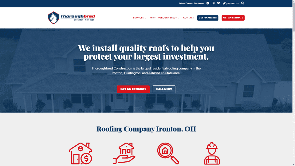
This site was submitted by Jimmy Lemon. It uses a blue and red color scheme that stands out while looking elegant. The background image in the hero section helps describe the site at a glance. Extra-large icons draw attention to information about the company and its services. The red or blue text highlights the information. Testimonials and CTAs display blurbs and sliders to create cards with rounded borders. All of the elements are tied together nicely with the red or blue branded colors. This site makes excellent use of graphics and color.
Visit Thoroughbred Construction
4. LV Wedding Luxury & Special Events
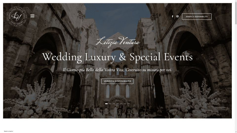
This site was submitted by Domenico Cannetti. It has lots of elegant images and text throughout the site. The hero section displays a large slider that cased in a white border to create a frame. The header displays the logo and hamburger menu on one side, and social icons and a CTA on the other. As you scroll, the hamburger menu is moved to the left and sticks to the side of the screen for the slide-in menu. Gold text is used for the large headers, titles, links, button text, and information. Large images provide links to galleries. They display titles in a scripted font on hover. This site makes great use of images and text.
Visit LV Wedding Luxury & Special Events
5. Naxian Wave
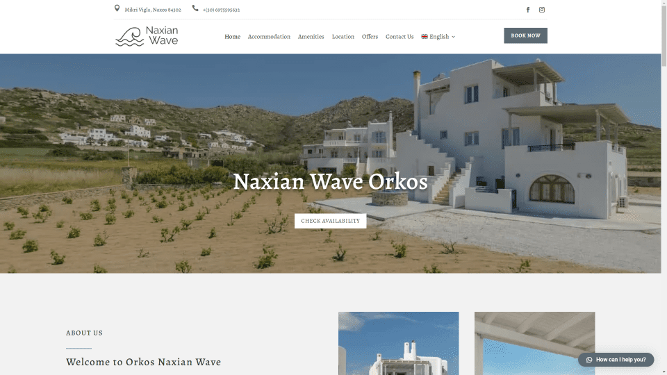
This site was submitted by Alba Solution. It displays rental properties with large images, meta information, and a button to see each property. Some of the images include a small banner across the corner that works well with the site’s design. Grayish-blue highlights are used throughout the site and work well with the images. The large images are placed in a double-column layout to showcase the properties. The Accommodation page displays the images in a single column with a gray box shadow. A mosaic gallery shows even more images. The simple layout and muted colors work great for creating an elegant design that looks clean and professional.
6. Goupili
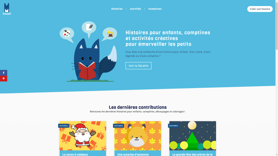
This site was submitted by Laurent Albertini. This one uses lots of bright non-primary colors and graphics that stand out and are well-suited to the target audience. The hero section shows a graphic over a blue background with an angled separator. The menu displays links to categories in the center to create a unique header. Blog posts display a featured image and an excerpt with a blue background. Category tags are placed on the image. Each category is a different color. Links to information are shown with blurbs that include hover animations. The posts display the image to one side and the text on the other. The image is sticky until you scroll past the end of the text. The site looks fun and inviting.
7. Georgina Bexon
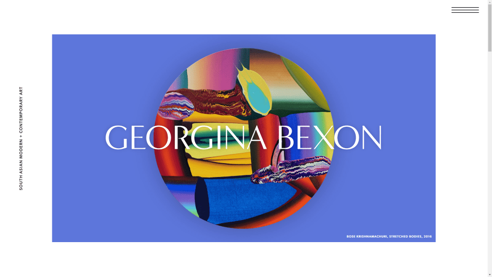
This site was submitted by Joe Walkling. This site makes intriguing use of text. The hero section displays a large block of color with a graphic in the center and the site’s title over that in extra-large text. Text links are placed vertically on the left and an extra-wide hamburger menu is placed on the right. The hamburger icon opens a full-screen menu. As you scroll, the site’s title fades away and becomes the vertical text on the left. A large title for the next section scrolls and then sticks to the top of the screen. Once it sticks, it lightens in color and becomes the background that other sections scroll over. The next few sections display CTAs with large images on one side and text on the other in an alternating layout. The text and images scroll and different speeds.
8. Timber Ridge
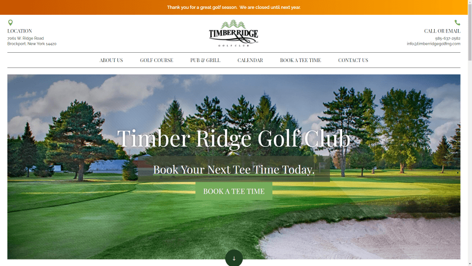
This site was submitted by Justin Arcara. This one uses color and photography to create an elegant design. The header displays two sections. The top section places contact information in the outer edges and the logo in the center. The bottom section uses separation lines and large text for links. A full-screen background image with a white border and a CTA in the foreground creates the hero section. Several sections display overlapping images on one side and text on the other. Information about the facilities displays images and text as cards. The text includes dividers on both sides. A button to read more overlaps the card. It also has an interesting footer design with contact information over a green image and links that match the header.
9. LOCAMAT
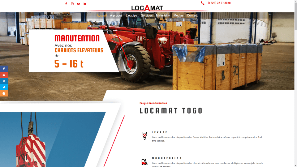
This site was submitted by Samuel. This one uses lots of large images and angles throughout the site. The hero section displays a video background slider with an animated CTA that slides in and out. The CTA includes the angles found in the rest of the site. An angled shape divides it from the next section. The next section displays an image on one side with an angled border. Several sections include a similar design. This site also includes lots of red highlights and custom icons. I especially like the angles and the large image of a truck. It overlaps the next section with a dark blue background yellow number counters. This site makes great use of color and angles.
10. Salvation Army – Charleston, WV
This site was submitted by Connor Smith. This one stands out with its dark colors and red highlights. The header is simple but it includes a mega-menu that displays information in two columns and an overlapping logo. The hero section displays a large background image with a video icon that opens a video lightbox on click. A list of events is shown within a sidebar next to a section of information. A full-width section places large icons in the overlay of a background image. The icons zoom on hover. Information about programs and services is shown within sliders. Both contain slides that look like styled cards. This site also has an interesting footer with an overlapping logo. Simplified contact information is placed over a background image with a dark overlay. This site makes great use of color and images.
Visit Salvation Army – Charleston, WV
Wrapping Up
That’s our 10 best community Divi website submissions for the month of March. These sites look amazing and as always we want to thank everyone for your submissions!
If you’d like your own design considered please feel free to email our editor at nathan at elegant themes dot com. Be sure to make the subject of the email “DIVI SITE SUBMISSION”.
We’d also like to hear from you in the comments! Tell us what you like about these websites and if there is anything they’ve done you want us to teach on the blog.
Featured Image via Dmitry Kovalchuk / shutterstock.com


Hi !
Thank you for this selection Randy. The number 9 is my creation and I noticed an small error in the name.
It is “LOCAMAT” not “LOCOMAT” please 😅😅😅.
Best regard, Samuel Messigah
Would love to learn how to use the vertical text and different scroll times of the Georgina Bexon site.