

It’s that time again for our monthly Divi Showcase, where we take a look at ten amazing Divi websites made by our community members. Each month we showcase the best Divi websites that were submitted from our community and today we want to share with you the top ten websites for the month of June. Throughout the post, I’ll point out some of my favorite design features that draw me to each of the websites.
I hope you like them!
Divi Design Showcase: New Submissions from June 2021
1. Casa Los Silvestres
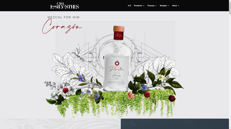
This site was submitted by Idea Design. This site makes great use of photography and animation. The hero section displays a graphic of the product floating over and around several graphical elements. Scroll effects blur the images until they’re in place. Several sections have an interesting water ripple effect that follows your mouse. I found this fun to watch. Full-screen background images display large styled text in the foreground. Information is provided with two-column sections that place an image on one side and text on the other. Patterned backgrounds are placed behind the text. This site is multilingual.
2. Vivienne Law
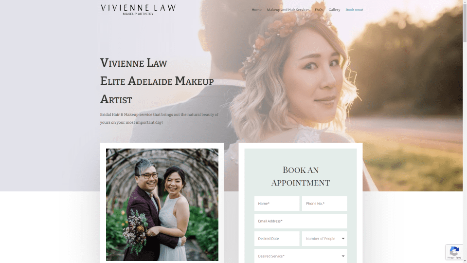
This site was submitted by Nick Li. This one makes great use of photography and soft colors. The photos include large borders to stand out from the background and to help inform the reader of the services provided. The hero section includes a full-width image that is overlapped by a photo and a contact form. The images for services have opaque overlays that just allow a little of the image to show through. Several sections show an image on one side that overlaps the information on the other. The gallery and services pages show lots of examples of the work.
3. Waymaker
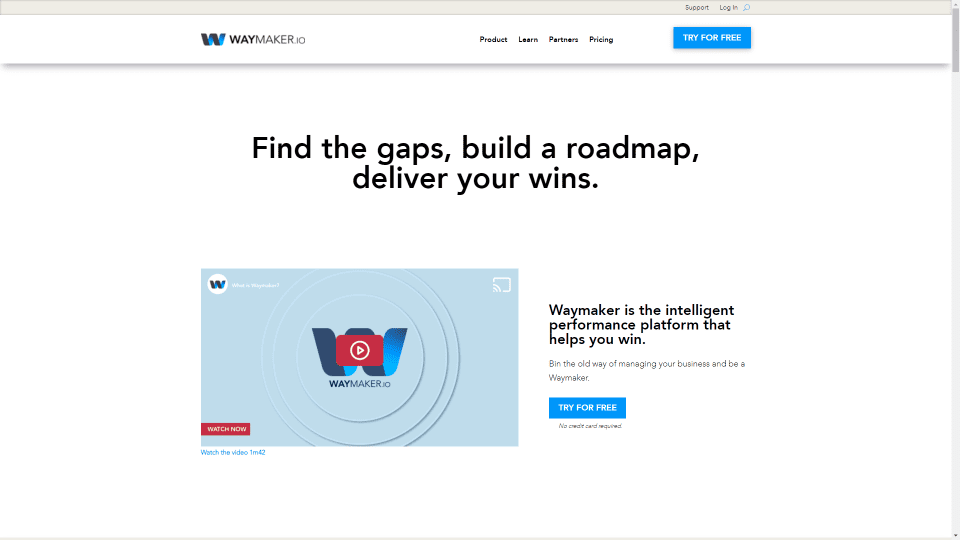
This site was submitted by Stuart Leo. It has a clean design that uses shadows to separate the sections. Several of the sections and CTAs include color backgrounds in pastels to stand apart. The CTAs have a watermark in the corner that overlaps the image, giving it an interesting design without standing out. I especially like the mega menu. It shows a list of links with an icon next to each one. The bottom of the dropdown menu includes a CTA banner. Many of the pages include style blubs and menus. The embedded podcasts are also interesting. They work like blog posts but include embedded video and audio.
4. Bisi Alimi Foundation
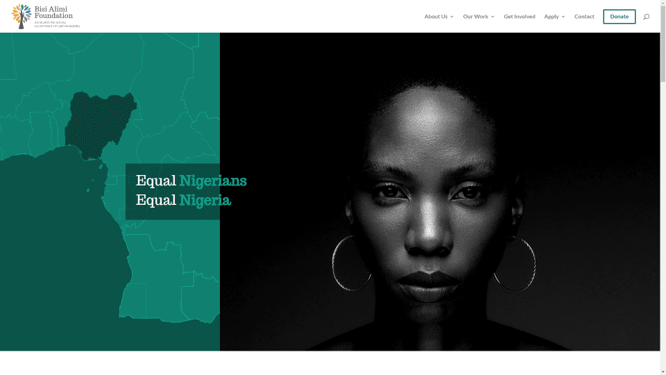
This site was submitted by Flavio Mester. It uses dark green as the highlight color throughout the site. The hero section shows a map on one side and a large image slider on the other. The title overlaps them. Many of the elements have hover effects that change the colors, zoom images, reveal information, and more. The layout is clean and easy to follow. The colors from the photos work well with the branded green. Other pages include styled toggles, forms, images, and an embedded Instagram feed.
5. iMedica
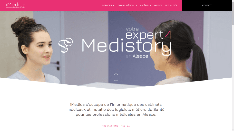
This site was submitted by Yoann PIERRE. It uses a shade of hot pink for the highlights throughout the site. The header places a contact call to action on one side in a different color that changes and includes an icon on hover. The hero section displays a video with a title and an icon in the foreground. The video also includes a styled divider that creates a down arrow. The icons, toggles, buttons, and hover animations are hot pink, change to hot pink, or change from hot pink. Many of the backgrounds show a styled pattern. Several of the pink elements are lighter until they scroll to the center of the screen. A two-sided CTA slides to show the side you’re hovering over.
6. Genesis Creative Co.
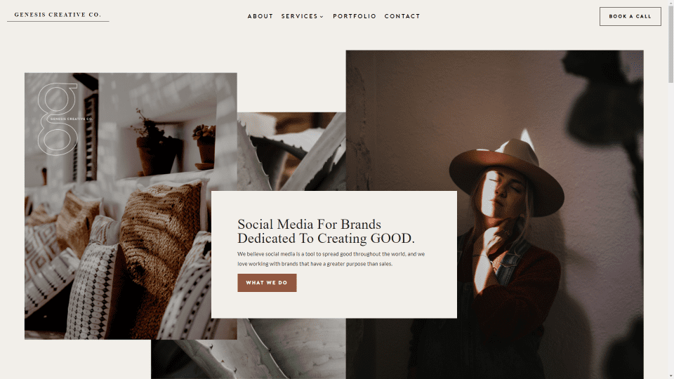
This site was submitted by Chaucee. This one uses lots of tan and brown for the highlights, text, and buttons. The brown matches the content of the images throughout the site. The header blends with the site and includes a CTA. This one has an interesting layout. The hero section shows three images that overlap with a CTA in the center that overlaps all three. Another section has a similar design with smaller images and larger text. The title for that section uses a different font that stands out from the rest. The footer is also interesting. It shows a large logo, links, and a booking CTA.
7. BevCheck
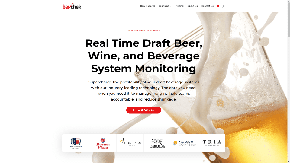
This site was submitted by Michael White. Bright red is used as the highlight color throughout the site for text, backgrounds, and icons. It uses a tall background photo that spans an extra-large hero section. The hero section displays information with a CTA and an embedded set of logos. The next part of this section includes blurbs with styled icons and extra-large buttons with rounded corners and box shadows. A section about the company shows an image on one side and text on the other with a box shadow to make it stand out from the background. I like the contact CTA in the footer. It shows a large block of text over a background image with a red overlay that overlaps the next section with a styled contact form.
8. Breeze Hypnotherapy
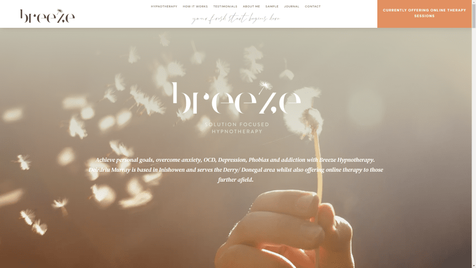
This site was submitted by Sibora Halili. I love the graphics and colors in this one. It uses a light orange and gray color scheme to create an elegant look. The header places a CTA on one side in the orange. This is a one-page design. The hero section shows a full-screen background image with styled text in the foreground along with information. Hand-drawn graphics in the branded colors are used from blurbs and background images. Some are drawings of objects while others are abstract. Many elements such as photos, podcasts, toggles, and a slider overlap backgrounds in blocks of color. Small details such as one image in parallax and a line that changes size as you scroll stand out. It only uses a few colors but it uses them perfectly.
9. Centrolab
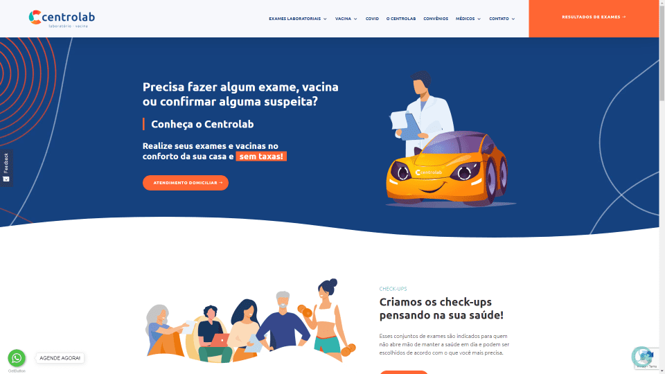
This site was submitted by Lethicia Diniz. This one makes excellent use of color and graphics. It uses lots of bold colors with a heavy focus on orange and blue in the backgrounds, buttons, icons, and drawn graphics. They work perfectly for the target audience. The graphics show people with objects to set the scene. All backgrounds have wavy dividers. The background of the hero section includes circled patterns that stand out. All sections show information on one side and graphics on the other. I also like the footer. It’s created with multiple blocks of color that overlap to create an area for contact information, links, and the copyright notice. The blue header has orange highlights for the menu items and a green CTA.
10. Clément Fromont
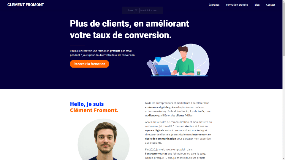
This site was submitted by Clément Fromont. This one uses a blue and orange color scheme with extra-bold colors. The home page layout is simple and creates a well-designed CTA. It includes a short CTA in the hero section, a full-width about section, a section of text with information, a section with testimonials, and a CTA in the footer. They work together to provide the information you need while catching your eye at the same time. I like the animated graphic in the hero section that draws attention. The blog also has an elegant design with a CTA and the latest posts. The posts have a unique design. They’re extra-large cards that resemble case studies with a title, text, bullets, and a button on one side and graphics that match the site on the other.
Until Next Month!
That’s our 10 best community Divi website submissions for the month of June. These sites look amazing and as always we want to thank everyone for your submissions!
If you’d like your own design considered please feel free to email our editor at nathan at elegant themes dot com. Be sure to make the subject of the email “DIVI SITE SUBMISSION”.
We’d also like to hear from you in the comments! Tell us what you like about these websites and if there is anything they’ve done you want us to teach on the blog.
Featured Image via Happy Job / shutterstock.com


Leave A Reply