
It’s time again for our monthly Divi Showcase where we take a look at 10 Awesome Divi websites made by our community members. Each month we showcase the best Divi websites that were submitted from our community and today we want to share with you the top ten websites for the month of June. Throughout the post, I’ll point out some of my favorite design features that draw me to each of the websites.
I hope you like them!
Divi Design Showcase: New Submissions from June 2019
1. Marie Bouzkova
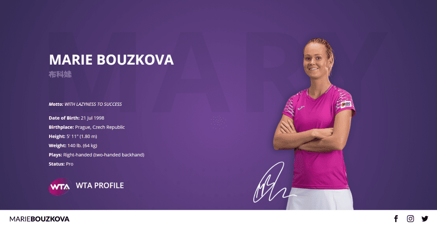
This site was submitted by Michal Teska. This is a one-page design that uses a navigation menu only for the title and social media links and places the menu at the bottom of the page. The menu remains in place as you scroll. The hero section shows a large image of the site owner to one side over the full-screen background. The name and stats are placed on the other side. The titles for each of the sections display large text behind the title. Career Highlights shows overlapping images to one side with the highlights in blurbs on the other followed by an embedded video. Images are shown in the masonry gallery and open in a full-screen slider. The Team section shows head-shots of the team with a background pattern. The Follow section includes embedded Facebook and Twitter feeds. The site makes interesting use of color and text.
2. MWS Digital
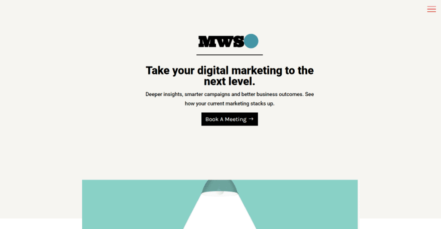
This site was submitted by Kaelynn Midgley. It has a clean landing page with a focus on calls to action. The header displays the main information in the center of the page with the logo, tagline, and CTA. A graphic with CTA for their approach overlaps the next section. A 2-column section shows an image on mobile in one column with text in the other column. The next few sections follow this design and alternate down the page. The blog section displays squared images with dark overlays and text, creating a clean and elegant design. I like the section of links to services. It shows the service in large type that’s linked to each service. This site makes elegant use of color and layouts.
3. Una Papaya
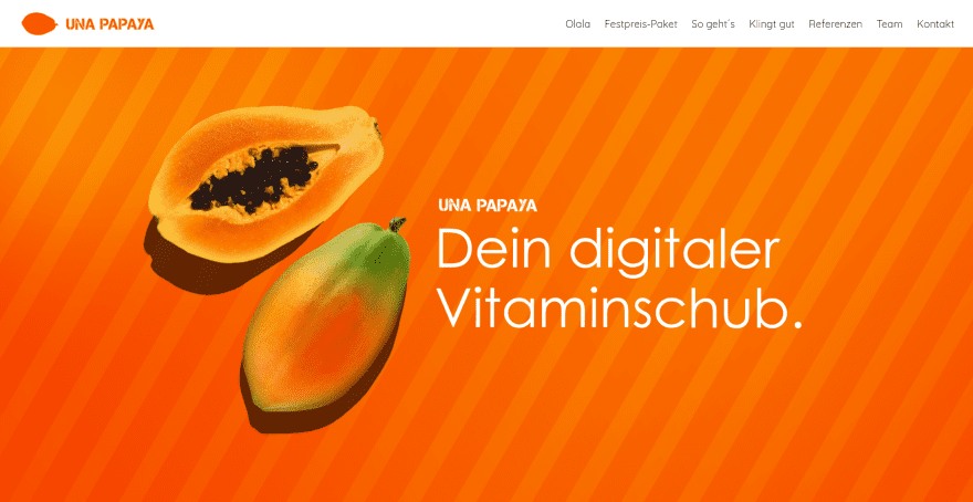
This site was submitted by Andrea El-Bardawil. The site is a one-page design that uses lots of parallax backgrounds with images of over a background pattern. The foreground displays images that interact with the backgrounds as you scroll. The foreground includes large text that describes the next section. Information is provided in blurbs with appropriate graphics. A numbered section displays information with a CTA. Examples of the latest work are shown within a slider with a description and a link over a bold red background. This site makes great use of the fruit theme, parallax images, and bold red and orange color.
4. Fresh Lime
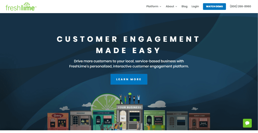
This site was submitted by Josh Allan. The site uses lime green as the branded color in the graphics such as icons, the logo, and menu CTA (after scrolling), as well as buttons and text, and blue for backgrounds and buttons. The hero section shows an interesting background pattern of various shades of dark blue with a graphic of buildings with people. The foreground displays the title, tagline, and CTA. Services are described in blurbs with green icons. Another section shows information on one side with a graphic of a building and people on the other side that matches the hero section. Each of the pages makes excellent use of graphics and patterned backgrounds.
5. Ranch on the River
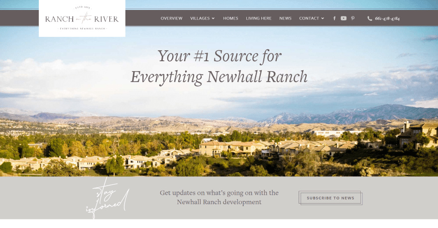
This site was submitted by Kelsey Specter. It uses an extra-large logo that overlaps the menu and the next section. The menu appears low enough on the screen that part of the main image appears above it. The full-width image shows the location and uses the sky in the image to place the title text. A newsletter CTA appears under this using a scripted font as the title that looks like hand-writing. Images are used as links to pages of information. Several sections display maps or images to one side with text on the other to describe locations or provide information. The various pages show full-width images of the locations and use hand-drawn graphics or satellite images for maps. The colors for the backgrounds and text fit the ranch theme perfectly.
6. Eden River Equestrian
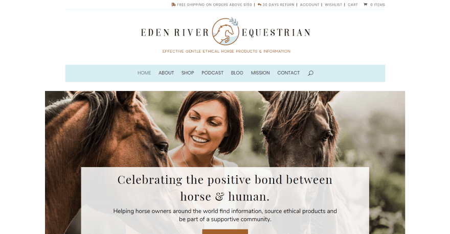
This site was submitted by Salma Sheriff. It includes a top menu bar with account links, a large logo area, and then the main navigation with a blue background that’s made narrower than the rest of the site. The main background image displays a tagline and a shop CTA in an overlay. Headings are either green or brown to fit within the site’s design. A Facebook CTA describes the group within a colored box that stands out. It uses a circled image and a button that links to the group. A section about the podcast uses images with titles to link to the latest episodes. Another section that stands out is a set of blurbs with circled images that link to the various pages, which follow a similar styling as the homepage. The colors for text and highlights work well with the site’s design.
7. Lions Avenue
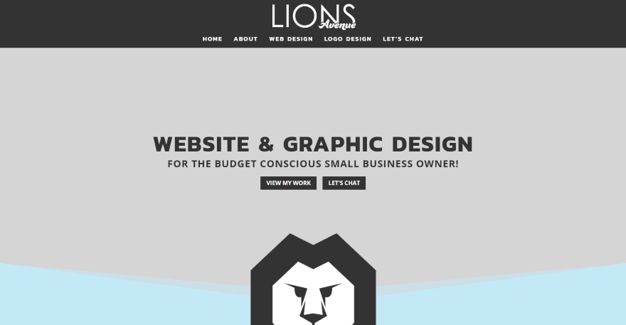
This site was submitted by Ricky. The site is a one-page design that uses both dark and muted colors together to give a styled look. Light blue highlights are used for titles, backgrounds, and borders. The hero section displays the tagline with a set of CTA’s followed by a large logo. An information section shows an image of the site owner on one side in a styled image with the information presented on the other side in a larger area with the title, a scripted font, and the information itself presented in a box with a styled border that overlaps the image. This same title and scripted font design are used to introduce several sections throughout the site including the portfolio sections which show images of projects as cards. The colors, fonts, and angled dividers help give this site a clean and interesting design.
8. Milkin’ More
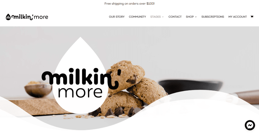
This site was submitted by DJ WHEELER. The site uses a black, white, and tan color scheme to help create a clean design. The menu’s text is larger than normal with lots of space between the links. The hero section shows a related image in full-width and extra-large wavy dividers with transparency to blend into the next section, which shows large black text over a white background. Another full-width image blends with the previous and next section, which includes large buttons for the shop categories followed by a set of products. Several sections provide information with either images and buttons or blurbs and icons. Each section keeps the information short and simple. The testimonials and newsletter sections follow the same simple design. This site makes excellent use of white space and typography.
9. Pro Foto Online
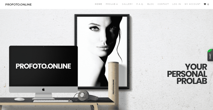
This site was submitted by Eugene Dimov. The site uses a timeline design to separate the sections. A full-screen image shows the title and CTA. Large sections include large headings that sit behind the titles. The headings slowly slide into place as you scroll. Each section is numbered with a block of color and a number with a vertical line. The numbers bounce into place as you scroll. The smaller sections have vertical titles that appear on the sides of the screen. The sections themselves include alternating CTA’s with text and images. I love the layout of the Gallery page. It shows the image on one side with a thick border and the photographer’s information on the other side and buttons to buy or print the image. The Contact page shows the contact form on a board that’s hanging from the ceiling. The form sits next to an image slider. The board they’re placed on is over a brick wall. The site makes great use of typography and photography.
10. Haiko Labs
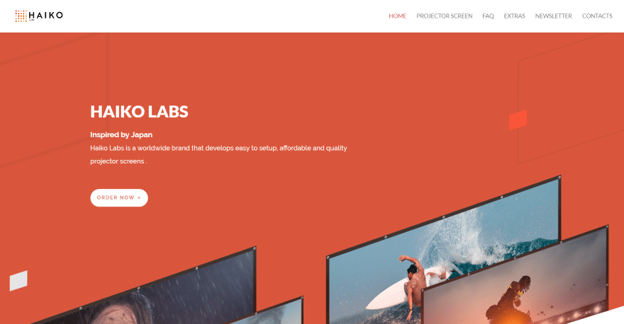
This site was submitted by Rui Silva. The hero section displays a large orange background pattern with a CTA and angled images in the overlay in parallax. The section has an angled divider that blends into the next section. As you scroll, products are shown on one side with descriptions on the other and they alternate down the page. Some of the images overlap background elements. Another interesting information section uses a block with a black background that takes most of the screen and sits to one side. As you scroll, the background that’s showing blends into the image below it. The CTA’s stand out with bold colors over the black backgrounds. This site makes excellent use of color and photography.
Conclusion
That’s our 10 best community Divi website submissions for the month of June. These sites look amazing and as always we want to thank everyone for your submissions!
If you’d like your own design considered please feel free to email our editor at nathan at elegant themes dot com. Be sure to make the subject of the email “DIVI SITE SUBMISSION”.
We’d also like to hear from you in the comments! Tell us what you like about these websites and if there is anything they’ve done you want us to teach on the blog.
Featured image via rudall30 / shutterstock.com


How did they create that animation with the curved divider on the homepage for the milkin’ more site?
Thanks for the mention Randy! I love these Divi showcases! Great way to get inspiration and ideas for upcoming projects 🙂
@Kelsey
Just checked out wildsidedesign! Looks fkn amazing! You should submit your agency site. I love the branding. I’m going through a re-design now and I feel like what I’m working compare to wildside sucks! lmao.
Keep up the great work!
Thanks so much! I’m sure your site is great – just stick with it! This is the 4th iteration of our website in 4 years so it takes time 🙂
I actually submitted it several times but it was never selected not sure why! Funny because I think the design is much better than the sites I’ve submitted in the past and gotten featured but I guess beauty is in the eye of the beholder *shrug*
These are super designs, are they created using bought templates, or are they straight Divi?
Hey Jane, Lions Avenue was created using only Divi as well as some custom CSS!! Hope you like it! 😀
No. I did not use any templates for profoto.online.
All graphics and web design was from my head. 🙂
The Ranch on the River site was built with straight Divi, no templates – we created a custom Divi Child Theme 🙂
Hi, Marie Bouzkova was created straight with Divi and CSS customizations.
Gee wanted to view all sites but FF gave me this warning about half of them
Warning: Potential Security Risk Ahead
Any site that does not have ssl will give you this warning. Doesn’t mean they are not safe, just that they don’t have ssl installed, which, could be a potential problem as all communication with said site would not be encrypted … Having said that, you can control this behaviour
in your settings …
Thanks. We have new Network admin and they are very cautious.
Milkin’ More is fire! That’s my favorite out of the list. It’s definitely my cup of tea. Great job!
The real estate development site was very strong.
The horse site had some appeal.
The others could have been templates. No strong immediate connect. Required puzzling out what they were.
Divi is the best site builder available, but these are not the best sites.
Thanks Michael! Glad you liked our Ranch on the River site 🙂
Profoto.online was not created by use of any templates.
Why did you decide so?
I made all from scratch by myself using pure Divi and custom CSS.