
It’s that time again for our monthly Divi Showcase, where we take a look at ten amazing Divi websites made by our community members. Each month we showcase the best Divi websites that were submitted from our community and today we want to share with you the top ten websites for the month of July. Throughout the post, I’ll point out some of my favorite design features that draw me to each of the websites.
I hope you like them!
Divi Design Showcase: New Submissions from July 2021
1. Stratton Craig
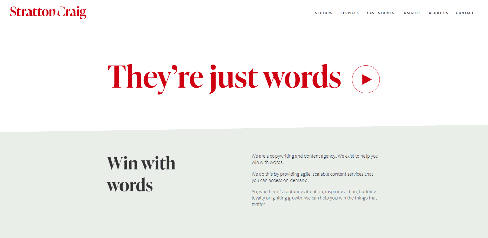
This site was submitted by Piers Elliott. It has lots of red highlights for text, links, and buttons, along with some dark blue throughout the site. Sections include white or very light green backgrounds that work great with both the red and the blue. The mega menu includes a light green background with a contact CTA and links in multiple columns. The hero section displays an embedded video. Sections for case studies and services display small rows with an image on one side with the information on the other. I like the blog section. The posts show the titles, which are separated by whitespace and a single horizontal line. Another thing I found interesting is it doesn’t have a scroll bar.
2. Mike the Freelancer
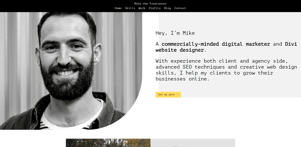
This site was submitted by Mike McManus. This one makes interesting use of typography and gray backgrounds. The hero section shows an image on one side with a rounded bottom corner. This is disconnected from the text on the other side, which overlaps a gray background. Small yellow buttons are used throughout the site and match the yellow in the menu. Projects are displayed as posts with an image on one side and the excerpt on the other. I like the section of blurbs that are separated by borders that only touch another blurb. The design of the site has a code look and feel that stands out and works perfectly to help describe the website. The site also has an interesting blog design.
3. dajo creative
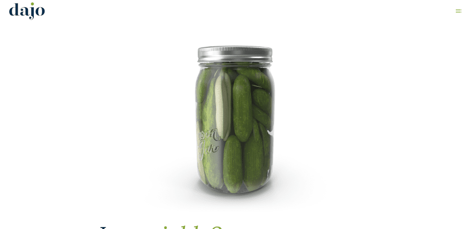
This site was submitted by David King. This one makes excellent use of green throughout the site for the branding. The hero section includes an image of a jar of pickles that zooms into the screen as you scroll. The website is introduced with extra-large text. Many of the elements include hover or scroll animations. A few of the backgrounds are in parallax and show images of the studio. One of my favorite sections shows blurbs with icons that are related to typography design. Another of my favorites shows extra-large text that zooms out as you scroll. I also like the examples of work that’s displayed in a multi-column layout. They include green overlays for the image’s hover effect.
4. Secure IT Source
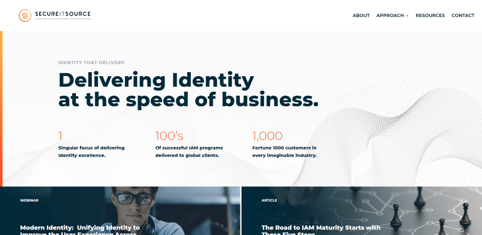
This site was submitted by Michael White. This one uses lots of orange and red as highlights for the logo, a vertical bar in the hero section, numbers, links, icons, overlays, and a horizontal border. Many of the sections include patterns in the backgrounds that are just noticeable. Some include text that describes the section. I like the section that details their approach. It includes numbered blurbs with animations and overlays. I also like the resources page. It shows blog posts with featured images with hover animations, the title, and the category. They’re short and wide, and they’re placed within two columns that give the blog a clean design.
5. Studio Vitas
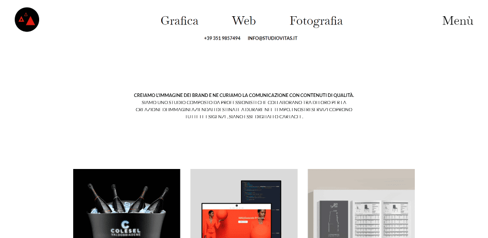
This site was submitted by Simone Vitas. This one has lots of interesting hover animations throughout the site. The mouse cursor changes to a styled triangle that lets the background show through. As you hover over something that’s clickable, the triangle is filled in, the background shows through, and the colors are inverted. The clickable elements change to a dark red that stands out. The header and hamburger menu fonts are particularly elegant. I love the block animations that reveal the page’s elements as it loads. I also like the use of interesting images for the examples of work. A call to action displays a large version of the triangle on hover and takes you to a large contact form that’s styled to match the site.
6. Surf Indonesia
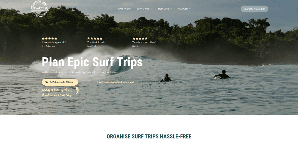
This site was submitted by Lokesh Mangyan. This one makes interesting use of notations. Many of the elements include tilted text with an arrow pointing to the element. The text provides tips on how to use the website. Several calls to action are placed throughout the home page and they work well with the site’s design. CTAs include buttons, small banners, and a full-width section that displays large text over a tan background with an image and button in the foreground. It also includes a CTA to the app version of the website’s tools. Several shades of tan are used as branded colors that work well with the beach theme. A section of blurbs reveals their borders on hover and includes tan icons. Reviews are shown as short snippets with star ratings in the hero section and within a testimonial slider. I love the use of maps on this website.
7. Kal Digital
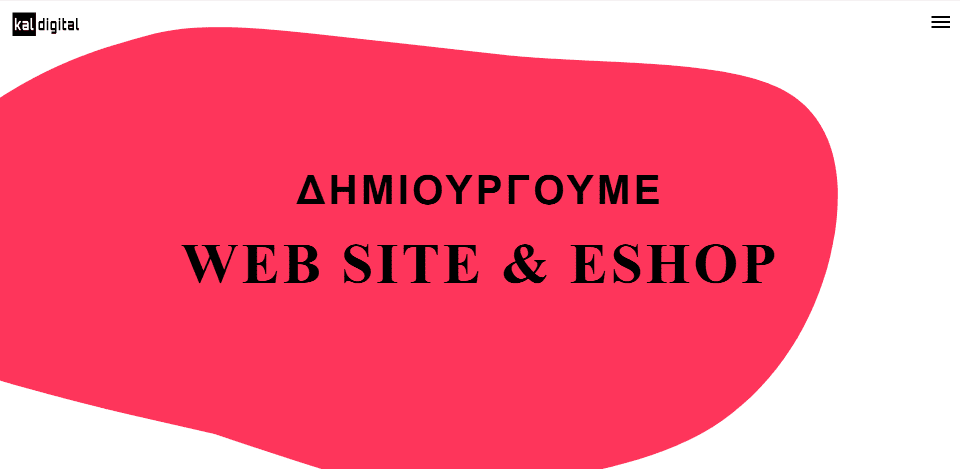
This site was submitted by Petros from Kal. This one makes interesting use of backgrounds and typography. It displays a bright red animated bubble behind the title in the hero section. The bubble remains in place as you scroll to the next sections, and changes to a different shape until it becomes the full background. It then changes to gray and turns back into a bubble and then to a black background. Along the way, the foreground shows information, services with cartoon-style graphics on one side and information on the other. The gray section displays a graphic of a computer screen with blurbs on both sides. Other pages use a similar design with different colors. I also like the animated pen on the contact page.
8. Robinson MD
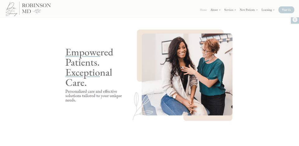
This site was submitted by Jonathan Morey. It uses light colors as highlights and background elements throughout the site. Accessibility tools are placed within an icon that’s always within reach. Several of the sections display two columns with an image on one side and text on the other. Some of the images include blocks of color behind two of their corners. Blurbs include specialized icons that work great for the genre of the website. One section of blurbs includes cards that scroll faster than the background and a blurb to the side. A detailed form near the footer matches the site’s styling. The blog page follows the same design and includes a search with suggestions and styled blog cards.
9. International Budget Partnership
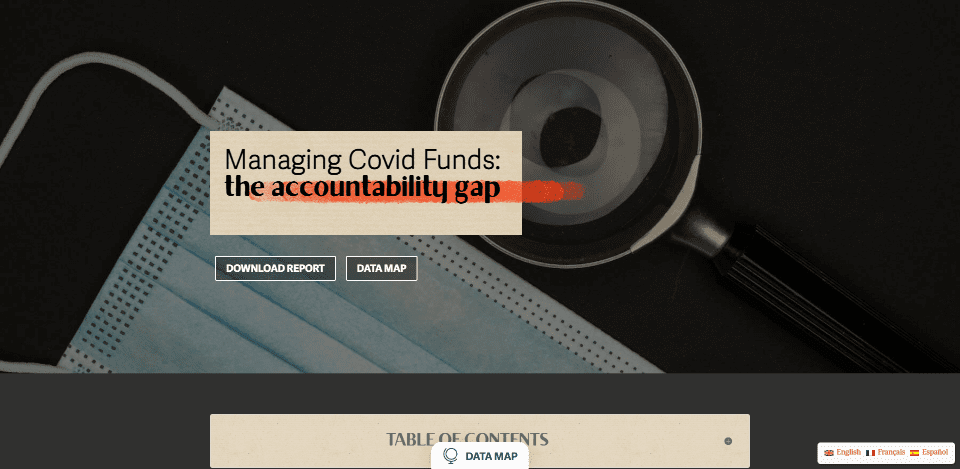
This site was submitted by Rajan Zaveri. It uses lots of earth tones within all the elements. Lots of the headings include drawn highlights that look like a marker. Some of the backgrounds include hand-drawn maps. Hand-drawn graphics of people float next to the text. The menu has styled buttons. A table of contents is created within a toggle. Along the left is a styled dot navigation system that appears once you scroll past the hero section. The header shows the name of each section. I especially like the section with numbers in a grid. The numbers are separated with large borders. In the center of the grid are small blocks of text with titles. Hovering over one scales it to full size, revealing information and an overlay that displays over the number. A button for a data map sticks to the bottom and opens a popup.
10. Nyansa
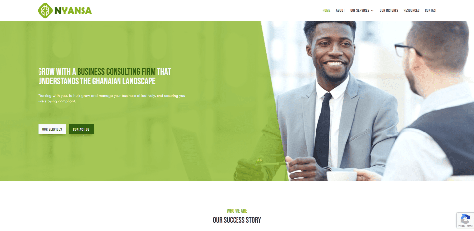
This site was submitted by Christina. This one uses several shades of green as branded colors throughout the site including the logo. The hero section places a green overlay over a portion of the full-width image and includes a CTA. Another section overlaps a block of text over an image and includes a title with a green background. I especially like the section of 5 blurbs that include green circled icons within squares turned on their corners. A section of information uses cards with different shades of green that go from dark to light. The social icons in the footer follow the same sequence. The blog section uses a dark green bottom border for the cards. The testimonial slider includes a green background for the text and includes a thick white border that stands out from the large background image.
Until Next Month!
That’s our 10 best community Divi website submissions for the month of July. These sites look amazing and as always we want to thank everyone for your submissions!
If you’d like your own design considered please feel free to email our editor at nathan at elegant themes dot com. Be sure to make the subject of the email “DIVI SITE SUBMISSION”.
We’d also like to hear from you in the comments! Tell us what you like about these websites and if there is anything they’ve done you want us to teach on the blog.
Featured Image via pikolorante / shutterstock.com


Interesting to see above the fold content shy away from large images and reinvent the wheel due to page experience update
Great collection! The Secure IT Source website is my favorite. Great use of colors, imagery and composition. Thanks for the inspiration!
I really like Kal Digital – how do they do that? I need to get away from the image above the fold and do something new – yes a tutorial on this would be good.