
It’s that time again for our monthly Divi Showcase, where we take a look at ten amazing Divi websites made by our community members. Each month we showcase the best Divi websites that were submitted from our community and today we want to share with you the top ten websites for the month of December. Throughout the post, I’ll point out some of my favorite design features that draw me to each of the websites.
I hope you like them!
Divi Design Showcase: New Submissions from December 2019
1. Artisan Glass Structures
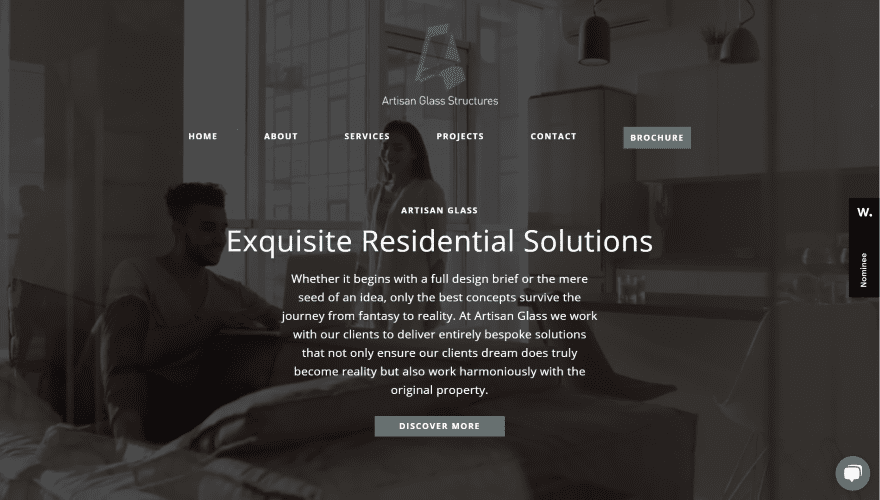
This site was submitted by Stuart Hingston. A full-screen video plays in the background with a dark overlay that highlights the text. The overlay includes the logo and menu with CTA, title, tagline, description, and button. Scrolling reveals a fixed header and a similar design with a background image in true parallax. Services and information are shown within a slim strip with graphics. A CTA displays a circular image in true parallax on one side. A testimonial slider places text over background images that serve as examples of work. Services show tall images with text and buttons. I love the projects section. It shows projects in a multi-column layout with styled side dividers and zoom effects for the images. I also like the contact form that uses fields of the same size.
2. Claire Creative
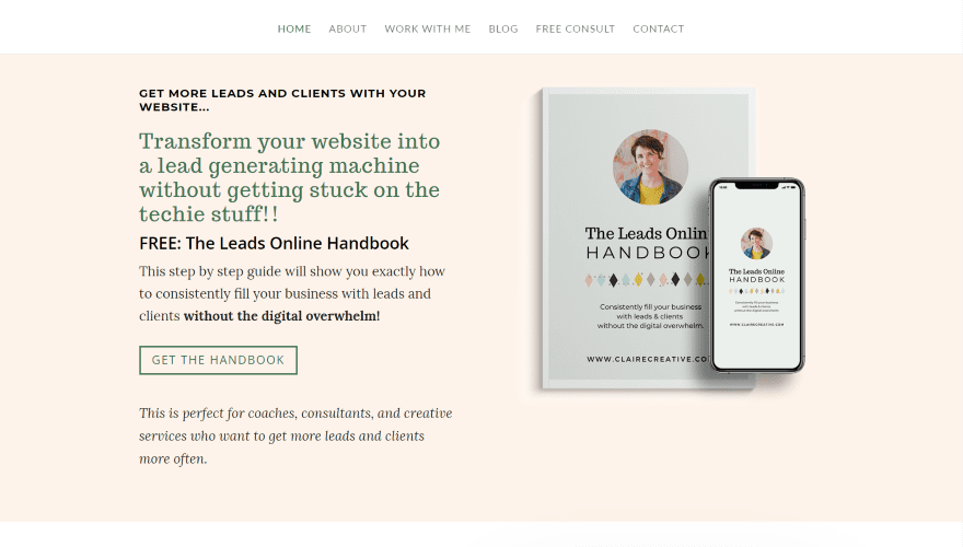
This site was submitted by Claire Gallagher. The hero section displays a handbook CTA with a warm background and helps describe what the site is about. The next section shows another CTA with a photo of the site owner followed by a testimonial with a graphic. Blog posts are shown in a section with images and the titles under them in italics. This creates a clean design with a lot of white space. I like how they stand out. A section of testimonials follows a similar design but includes more text. The page ends with a full-width CTA. The blog page follows the same clean design as the blog section from the home page. The Work WIth Me page is created for lead-generation and includes a unique design for the booking form and pricing tables. Projects follow the same design as the blog posts.
3. Freshlit Media
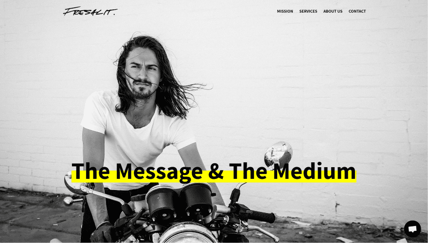
This site was submitted by Nicole Marie Zinnanti. This is a one-page design with anchors in the menu to the various sections. This site uses lots of large black and white images, large text, and yellow behind the titles over the images, starting with the full-screen header. Several sections include images that follow this design. The next section shows information in full-width. Services are shown within numbered blocks of text with large titles, descriptions, and dividers. Testimonials also include large titles and follow a minimal design. An About section continues the minimal design with a large title, text, and divider followed by a similar section that ends with a minimal contact form.
4. Hilltop Credit Partners
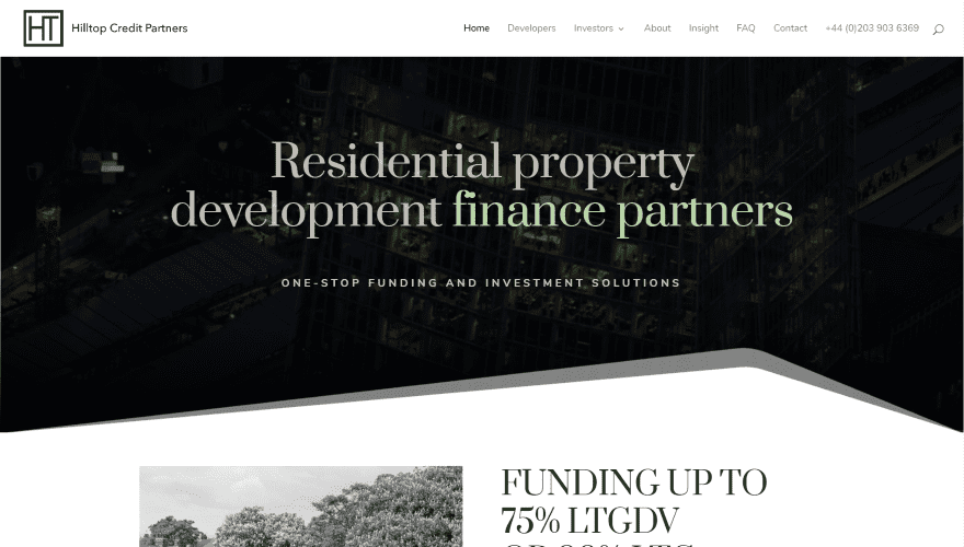
This site was submitted by Rolando S. Bouza. The hero section plays a video behind the title and tagline and leads into the next section with a styled section divider. The next section shows several CTA’s in an alternating layout. The first CTA displays an image with a large title, short description, and button, while the second CTA includes two buttons. A full-width blog slider shows featured images in almost full-screen. Following this is a section about the owner with an image and quote. I like the About section that displays information with a styled border over a dark background image. The contact form uses a similar shape in mirror, and it includes a solid background. The other pages follow a similar design but add lots of supporting information within graphics. The blog page adds a styled sidebar to showcase announcements. I also like the blog post design with its clean layout and large text.
5. Insight Hosting
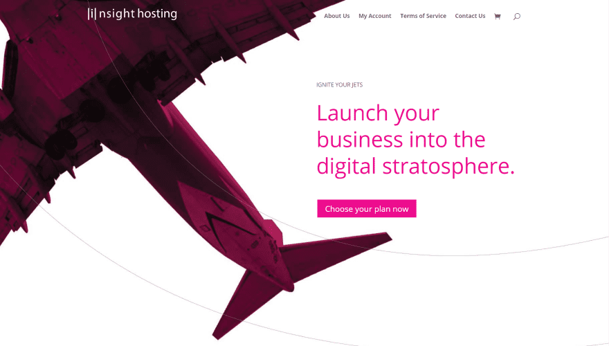
This site was submitted by Steve Doig. It uses lots of bold hot pink as the primary highlight color for the text and overlays and stands out beautifully. The hero section displays an airplane flying off the screen with a CTA on the other side of the screen. The airplane itself and the CTA are shaded hot pink. A section with plans shows the plans and prices within blocks. They include hot pink hover animations. A full-width CTA shows a pink cheetah in the center with the text to one side, while another shows a chess set and text with pink elements. Several sections show benefits within blurbs. One of my favorites is the section that discusses the types of business they serve. Images are shown in a 5-column grid with alternating overlays. The images zoom out on hover and remove the overlay. The menu in the footer is also interesting. It displays the titles with a styled first letter for each one.
6. Keren Herrera
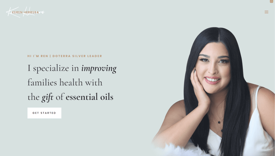
This site was submitted by Edgar Herrera. The site uses lots of soft colors to attract the audience. The hero section shows a full-screen image with a CTA on one side and the owner in the other. Following this is an elegant email signup form that shows an image on one side and description over the form. Images with styled borders provide links to the various information pages. An About section shows an image that overlaps the next section which provides a centered testimonial. The next several sections include images that overlap multiple sections within an alternating layout. These sections provide information and CTA’s. The contact form is placed over a background image of a marbled table and stands out from the solid backgrounds. A book CTA displays in 2 columns with a photo that overlaps them. The footer shows an Instagram follow CTA with multiple photos in the background.
7. Finbingo
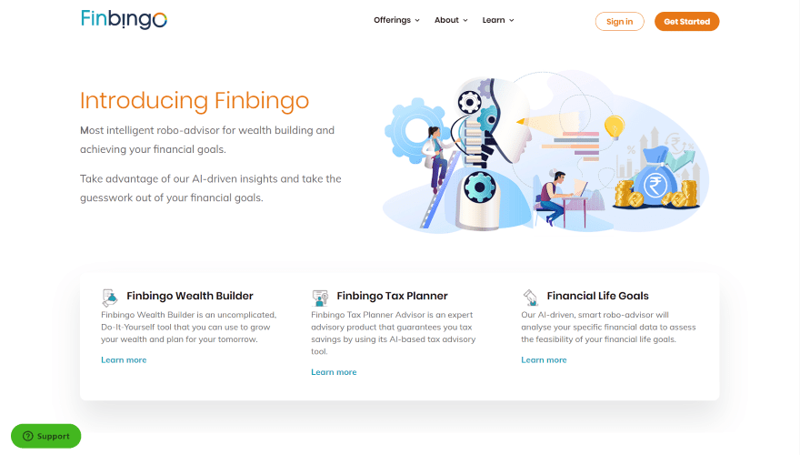
This site was submitted by Prashant Karandikar. It has a clean layout with lots of colors for the highlights. The hero section shows an introduction on one side with a graphic on the other that blends into a row of blurbs. Information is shown within a 2-column layout with blurbs to create bullet points. A couple of information CTA’s display a graphic on one side in an alternating layout. Services are shown within cards with graphics and text. More information is provided within colored blurbs that create a set of blocks. Number counters show each number with a different color to stand out. A 2-column testimonial matches the color design of the site. Many of the pages follow a similar design and then add content with a box shadow to stand out.
8. Ukhuni
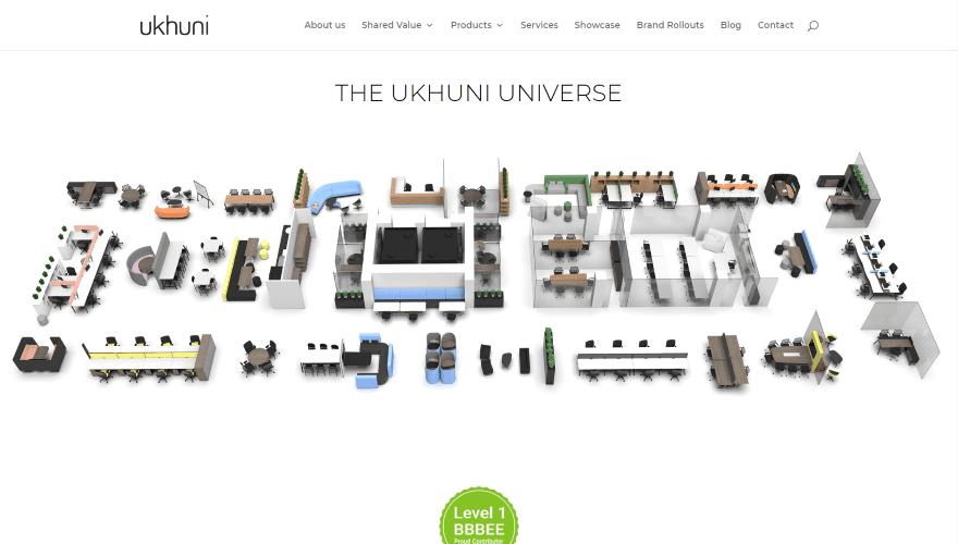
This site was submitted by Vernon Joyce. It has a clean layout with a focus on the products. The mega menu shows 3 columns with multiple links to one side that reveals information and images. The hero section shows a set of graphics for office furniture. Hovering over any one of them covers the others with an overlay and shows a small popup with a title to describe the furniture. The popups vary in color. The featured product shows a large graphic to one side and a description on the other. Following this is a full-width consultation CTA and then a section of information that matches the featured product design. The product pages show products with titles similar to the popups and include a bullet list for features. The services page is interesting. It shows lots of graphics of the products and displays benefits within blurbs.
9. Architecten Lab
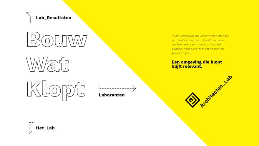
This site was submitted by Mischa Groenen. It displays a single full-screen page with links as text with arrows as navigation. The screen is divided diagonally with the title and links on one side with a white background and description in the other with a yellow background. The title is drawn onto the screen when you move your mouse cursor. Hovering over the links shows a zoom effect. Clicking one of the links opens a page with a header that follows the main screen’s design. The portfolio page adds a filter that matches the site’s design and shows images within a grid that includes hover animations and titles. The team page shows a 3-column design with images of the team on one side, a person slider in the center, and a form on the other side. The information page shows a styled graphic about the work they do. It’s a simple, interesting, and unique design.
10. Aging Next
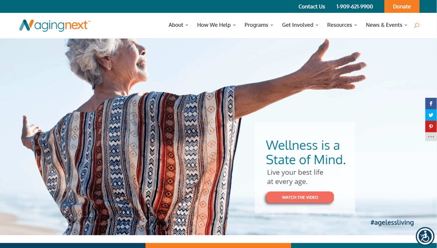
This site was submitted by Nicolle Principe. This site makes excellent use of orange and green with a few others added to additional highlighting. It has a CTA in the secondary menu. The hero section shows a full-screen background image in true parallax with a simple CTA in the overlay. Links to pages are created with blocks of color and text in a full-width slim section. Several full-width CTAs show an image to one side and the text on the other in alternating layouts. Blurbs also create CTAs with circled icons and styled buttons. A donation section shows a bar counter with a goal and the current amount. Many of the sections include an overlapping icon. I like the section about stories with text on one side and two images on the other. Each of the images includes hover effects that display information and a link to read more. It also includes an event calendar, styled blog, and lots more. The site has lots of personalization adjustments including an easy font size control and language selection.
Conclusion
That’s our 10 best community Divi website submissions for the month of December. These sites look amazing and as always we want to thank everyone for your submissions!
If you’d like your own design considered please feel free to email our editor at nathan at elegant themes dot com. Be sure to make the subject of the email “DIVI SITE SUBMISSION”.
We’d also like to hear from you in the comments! Tell us what you like about these websites and if there is anything they’ve done you want us to teach on the blog.
Featured Image via SUNATTAKIT / shutterstock.com


Solid list. My favorites are #3 and #7. With number 3 the title pops over the black and white.
I like #9, it’s different and doesn’t look like a Divi site 😉
I’m not allowed to visit site #10 from my country… (nl) 🙄😱.
Sorry… we had to block countries outside of the US to stop bogus donations on the site 🙁
I love #9
#8 and #9!
Architecten Lab
#9
It is the best of all that list.
I’m very curious about #3, Freshlit Media. It appears that their mobile site has completely different photos (and layout?) Is that accomplished by doing a whole different Divi module setup on the same page for mobile vs. desktop? Does that mean that both sets of photos, etc. are loaded even though you only need one set depending on which device it is viewed on and that’s why it loaded so slowly?
Thanks!
Deb