

Creating unique Divi button designs using a text module may have already crossed your mind. If so, you are more creative than you know! With the release of hover options in Divi, all modules can be made clickable. This opens the door for using any module (with all of its built-in design settings) as a clickable CTA or button. A text module, for example, allows you to add as much text as you want to the module in different formats. Plus, the text module also has some robust design options for customizing the rounded corners for creating unique shapes.
In this tutorial, I’m going to explore some unique Divi button designs that are possible using a text module.
Let’s get started!
Sneak Peek
Here are a few example button designs we will be creating easily with the text module.
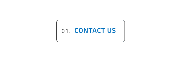
This is a button with text on two lines…

This is a button using a list item…
This is a button using creative corners…

Subscribe To Our Youtube Channel
As mentioned earlier, the text module allows for a limitless amount of text, so it would be easy to create a button with a mere two lines of text using the text module in multiple formats. Using the wysiwyg or text editor, you can add paragraph text, headers, links, lists, and blockquotes. And the best part about the text module is that you can target and style each of these text formats individually using the tab UI built in to the visual builder design settings.
This makes it really easy to add multiple lines of text and then style each line of text separately for a unique button layout.
Here is a quick example of how to set up the text module as a button with multiple lines of text.
If you haven’t already, create a new page and deploy the visual builder. Choose the option “Build from Scratch”. Then create a new section a one-column row. Then add a text module to the row.
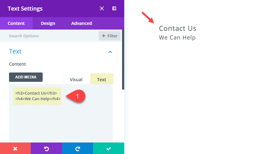
For the text content, use the html tab and enter the following:
<h3>Contact Us</h3>
<h4>WE CAN HELP</h4>
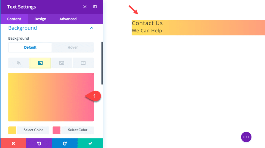
There are a lot of different background styles we can add to our module, but for this example, tet’s add a simple gradient background:
Background Gradient Left Color: #FEE140
Background Gradient Right Color: #FA709A
Then go over to the design tab and use the heading tab UI to style the h3 and h4 heading tags as follows:
Heading 3 Font Weight: Ultra Bold
Heading 3 Font Style: TT
Heading 3 Text Color: #ffffff
Heading 4 Font Style: TT
Heading 4 Text Color: #ffffff
Heading 4 Text Size: 16px
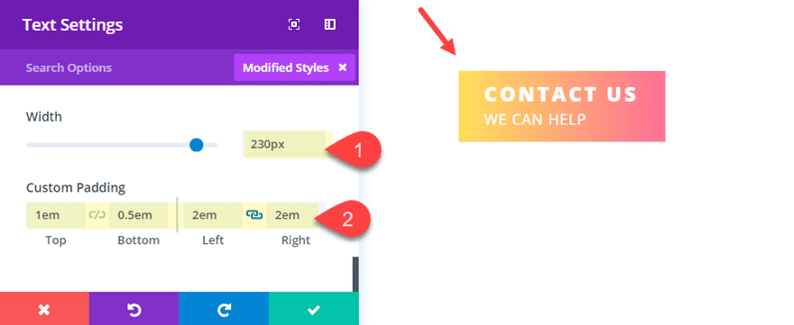
Now all we need to do is size the text module to look more like a button. To do that update the following:
Width: 230px
Custom Padding: 1em top, 0.5em bottom, 2em left, 2em right
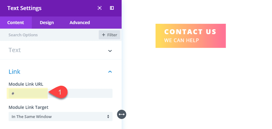
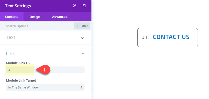
Since the release of Divi’s new hover options, all modules can become clickable just like a button. To do this, go back to the content tab and enter a module link url.
Here is the final result.

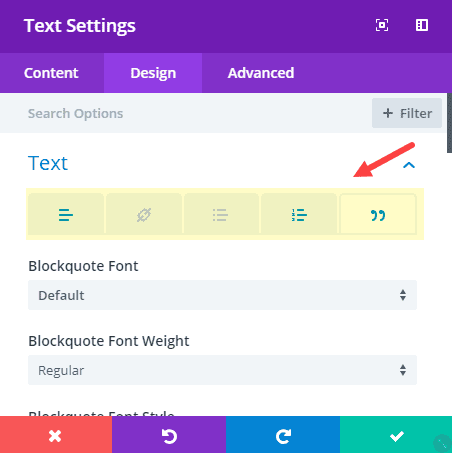
As a hover effect, you can add a box shadow that sweeps across the button, ultimately applying a new background color to replace the gradient.
To do this, open the text module settings and update the following:
Box Shadow: see screenshot
Box Shadow Horizontal Position: 0px (default), 230px (hover)
Box Shadow Vertical Position: 0px
Shadow Color: rgba(0,0,0,0) (default), #fee140 (hover)
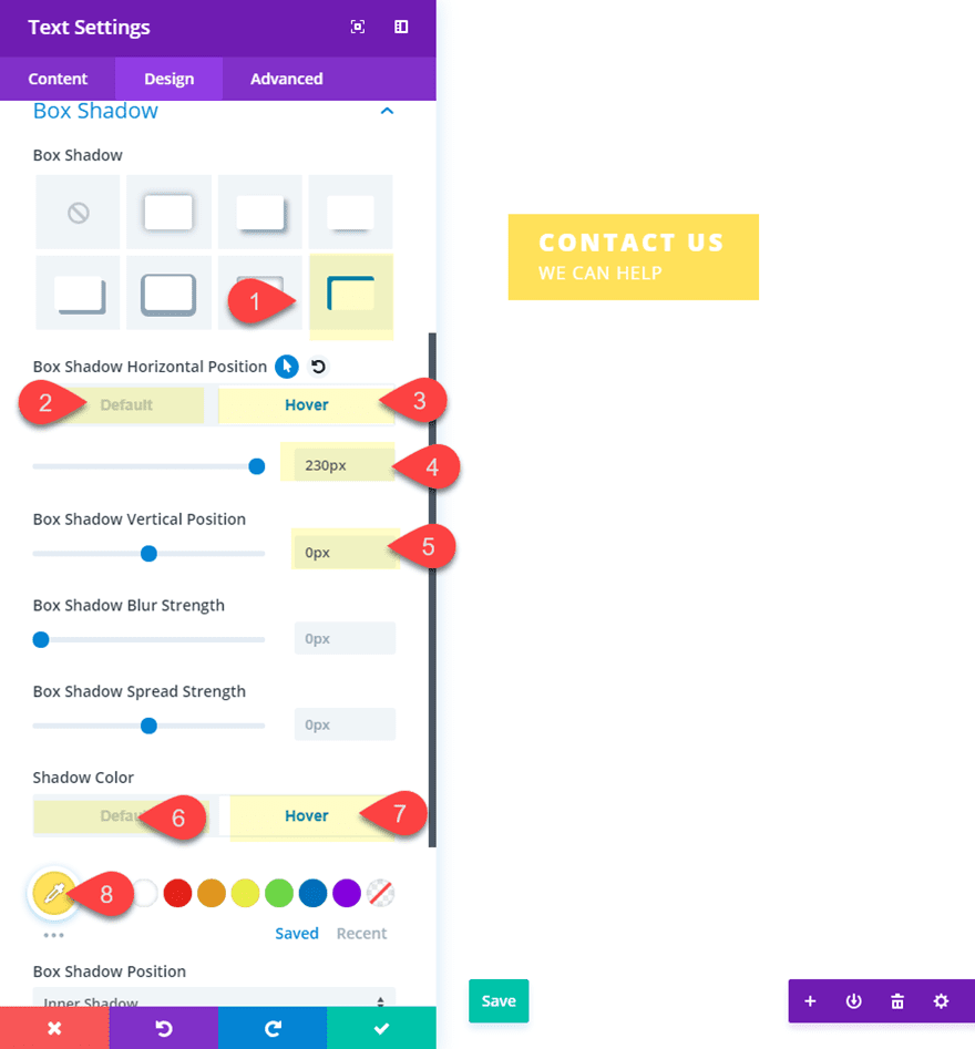
Here is what it looks like on hover.
Because text modules allow you to add lists (unordered or ordered) to the content, you can take advantage of this featured to create a list button. Basically, all you need to do is create a list with one list element inside the content box. Then wrap your list item in a heading tag so that you can style the list bullet item and the heading text separately.
If you haven’t already, create a new page and deploy the visual builder. Choose the option “Build from Scratch”. Then create a new section a one-column row. Then add a text module to the row.
Then add the following html in the text tab of your content settings:
<ol><li><h3>Contact Us</h3></li></ol>
It is important to wrap the list item text in a heading tag so that we can style the list item bullet/number separately from the text.
Now jump over to the design tab and finish designing the text module as a button:
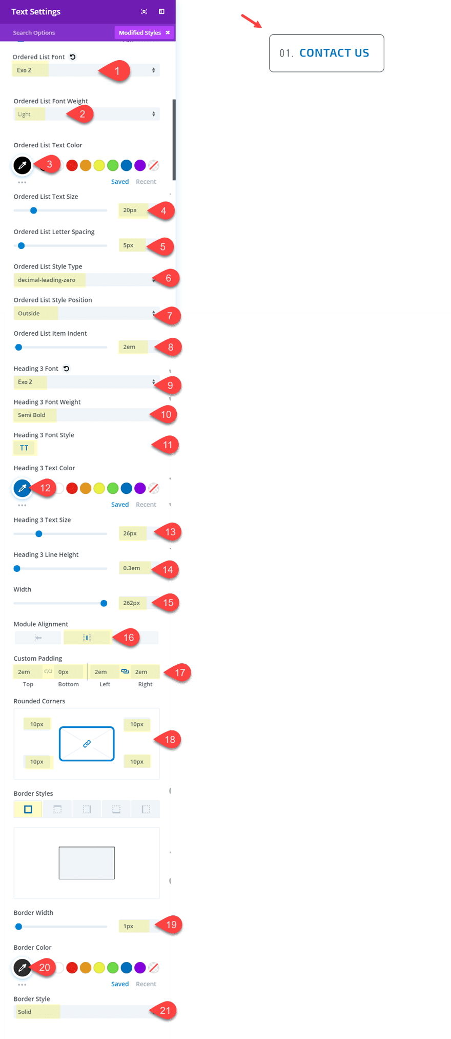
Under the text settings category, select the ordered list tab and update the following:
Ordered List Font: Exo 2
Ordered List Font Weight: Light
Ordered List Text Color: #000000
Ordered List Text Size: 20px
Ordered List Letter Spacing: 5px
Ordered List Style Type: decimal-leading-zero
Ordered List Style Position: Outside
Ordered List item indent: 2em
Under the Heading Text category, click the H3 tab and update the following:
Heading 3 Font: Exo 2
Heading 3 Font Weight: Semi Bold
Heading 3 Font Style: TT
Heading 3 Text Color: #0c71c3
Heading 3 Text Size: 26px
Heading 3 Line Height: 0.3em
Next, change the width of the module and give it a border and spacing to make is look like a button:
Width (of module): 262px
Module alignment: center
Custom Padding: 2em top, 0px bottom, 2em left, 2em right
Rounded corners: 10px2em
Border width: 1px
Border color: #000000
Border style: solid
And don’t forget to add a link to your module to the designated URL of your choice.
Here is the final design.
Feel free to explore new list style types (like Upper Roman) for unique list button designs.
For this next design, we are going to take advantage to the rounded corner design setting within a text module. The basic idea is to set different corner radius values to create uniquely shaped buttons. In this example, I’m going to shape our module to look like a leaf button.
If you haven’t already, create a new page and deploy the visual builder. Choose the option “Build from Scratch”. Then create a new section a one-column row. Then add a text module to the row.
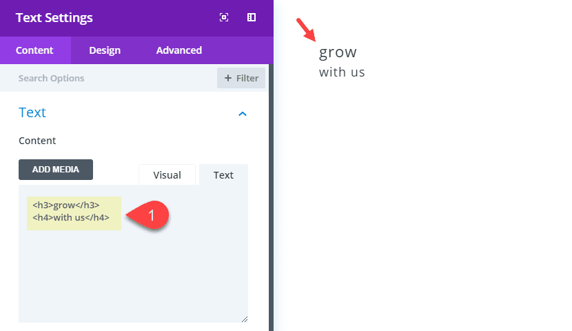
Open the text module settings and enter the following html in the text tab of the content box:
<h3>grow</h3>
<h4>with us</h4>
This allows us to put the button text on two lines (cutting down on vertical width) and style them independently.
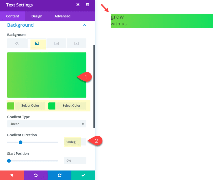
Next add a gradient background with a more “leaf-like” color.
Background gradient left color: #7cda24
Background gradient right color: #26e051
Gradient direction: 90deg
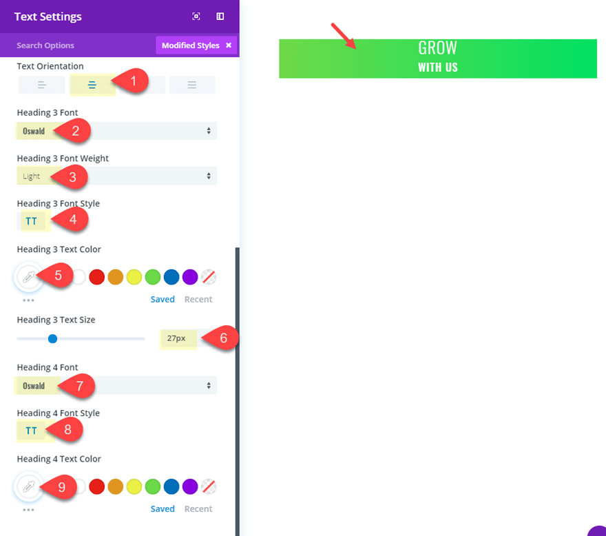
Now let’s jump over to the design settings to center our text and style the heading tags. you will need to select the h3 tab to design the h3 heading and select the h4 tab to design the h4 heading:
Text Orientation: center
Heading 3 Font: Oswald
Heading 3 Font Weight: Light
Heading 3 Font Style: TT
Heading 3 Text Color: #ffffff
Heading 3 Text Size: 27px
Heading 4 Font: Oswald
Heading 4 Font Style: TT
Heading 4 Text Color: #ffffff
Continue updating the design to give your text module the proper width and spacing for a button.
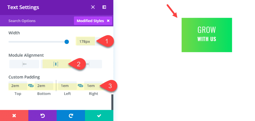
Width: 178px
Module alignment: center
Custom Padding: 2em top, 2em bottom, 1em left, 1em right
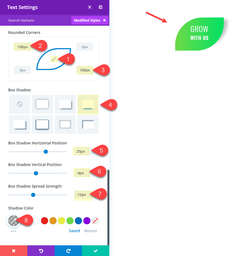
Finally, we can add our custom rounded corners to give the module a leaf shape and then add a box shadow to make the leaf more life like. To do this update the following:
First unlock the rounded corner option so you can assign individual values to each corner.
Top Left Corner: 100px
Bottom Right Corner: 100px
Then add a box shadow…
Box Shadow: see screenshot
Box Shadow Horizontal Position: 25px
Box Shadow Vertical Position: -4px
Box Shadow Spread Strength: -12px
Shadow Color: rgba(0,0,0,0.25)
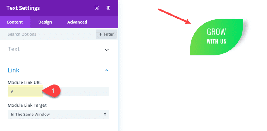
Don’t forget to add your Module Link URL so that your module links to the desired location.
Here is the final design.

For a hover effect, you could alternate the rounded corner values to put the button design in the opposite direction on hover:
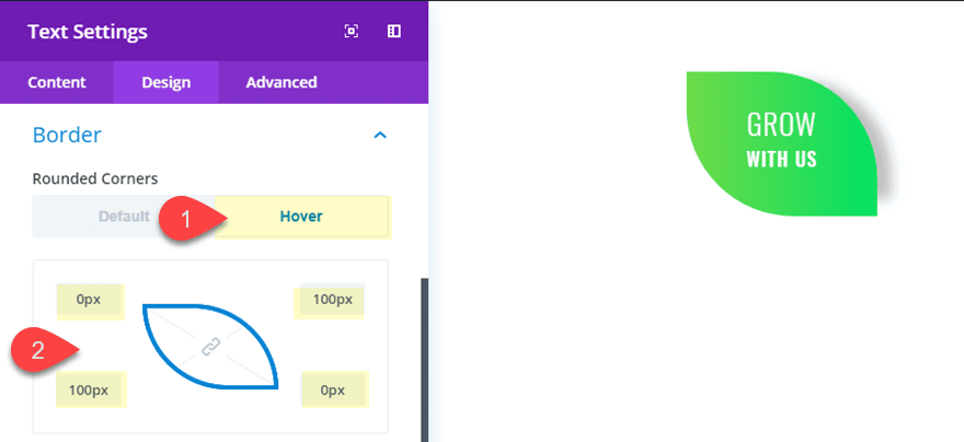
And here is what the hover effect looks like.
Final Thoughts
It is always nice to think outside the box every once in a while when it comes to designing websites with Divi. Hopefully, this tutorial well help think of new and creative divi buttons designs using the text module. In fact, I would suggest exploring other modules (like the Blurb Module) for even more design options.
I look forward to hearing from you in the comments.
Cheers!


Awesome tutorial Jason! Is there a way to style corners as a “straight cut” (like a folded corner of a piece of paper), rather than rounded? I imagine it’s some custom CSS. Do you know how to achieve this look?
Nice informative blog to get latest updates on UI designs.
thanks for sharing the useful tips, appreciate your efforts
Nice. Love outside the box stuff like this. MORE!
Thanks Britt! I’ll work on it.
Rounded corners to make a leaf button is great! Perfect for a landscaper or gardeners website.
Great Idea!
That’s superb. Love all the options and the clear tutorial. Wonder if we could do something similar using section dividers to create even more uniquely shaped buttons.
Love this tutorial. Thanks a lot
Thanks Alfred! Glad you liked it.