Getting Started With The Divi Builder
Divi is best used in visual mode, allowing you to build your page on the front-end of your website.
What is the Divi Visual Builder?
Divi is a modern no-code visual drag-and-drop website builder for WordPress. With Divi, you can build stunning websites from the ground up without touching a single line of code (unless you want to!). Divi harnesses the power of complex web development and lets you design custom websites by using the Divi Visual Builder so you can see the changes you are making in real time.
All Divi Builder Settings and Features Explained
Let’s explore all of the features, settings, and functionality available within the Divi Visual Builder.
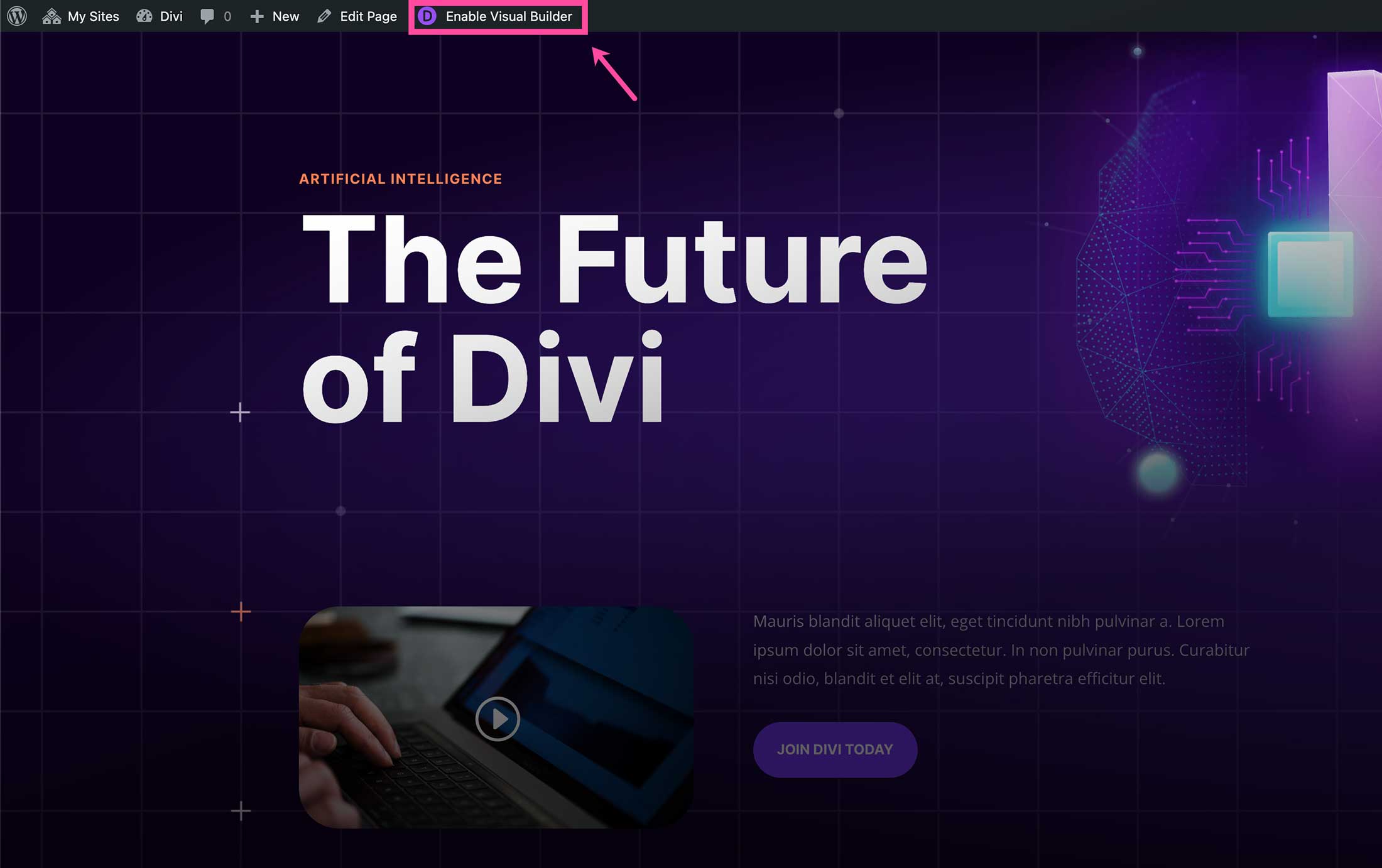
How To Load The Visual Builder
Once you have Divi installed on your website, you’ll be able to access the Visual Builder on every page of your website. To do so, navigate to any page and click “Enable Visual Builder” on the top admin bar.
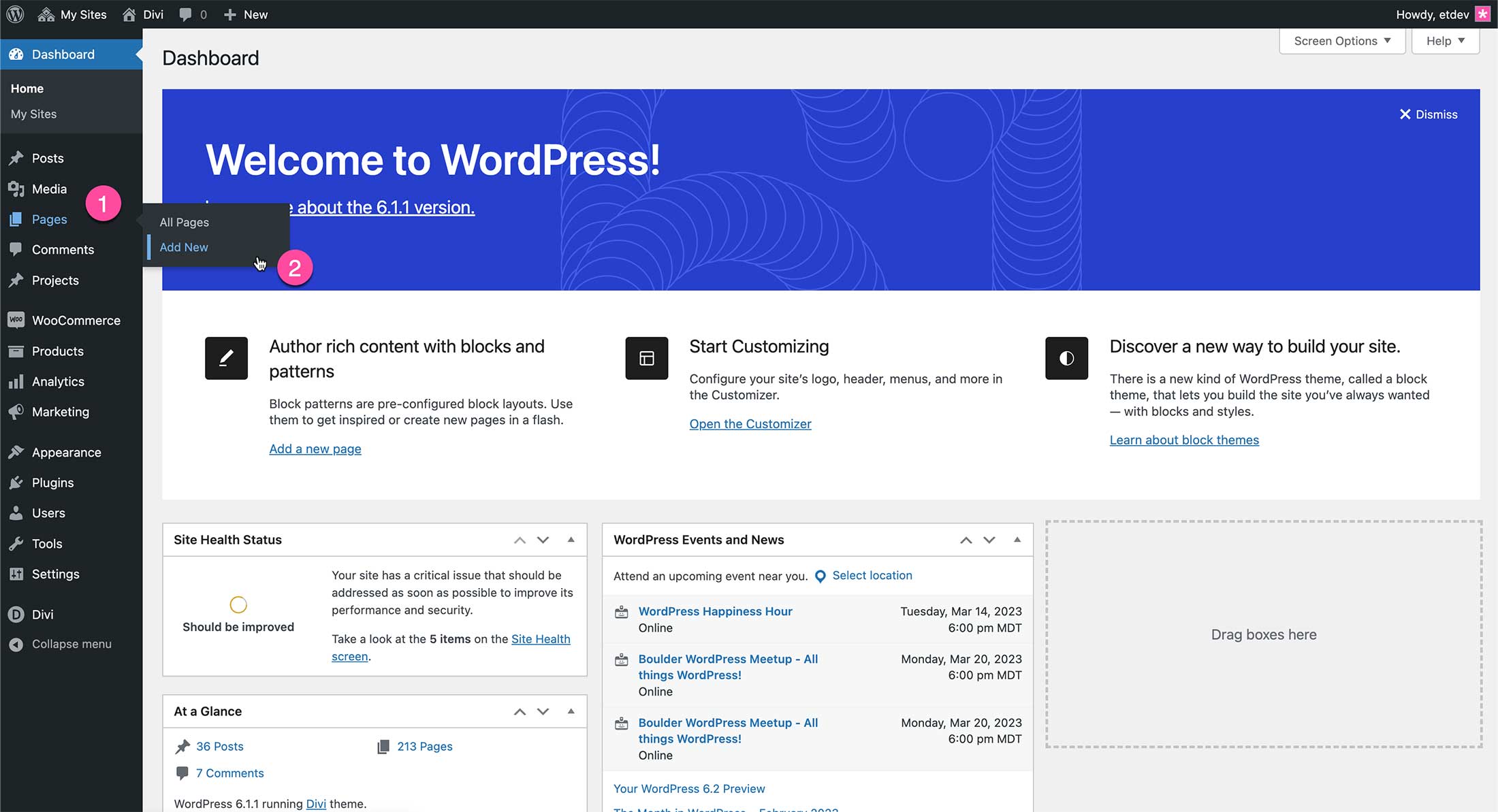
Creating a New Page and Enabling the Visual Builder
To start fresh on a blank page, navigate to your WordPress dashboard and click Page > Add New.
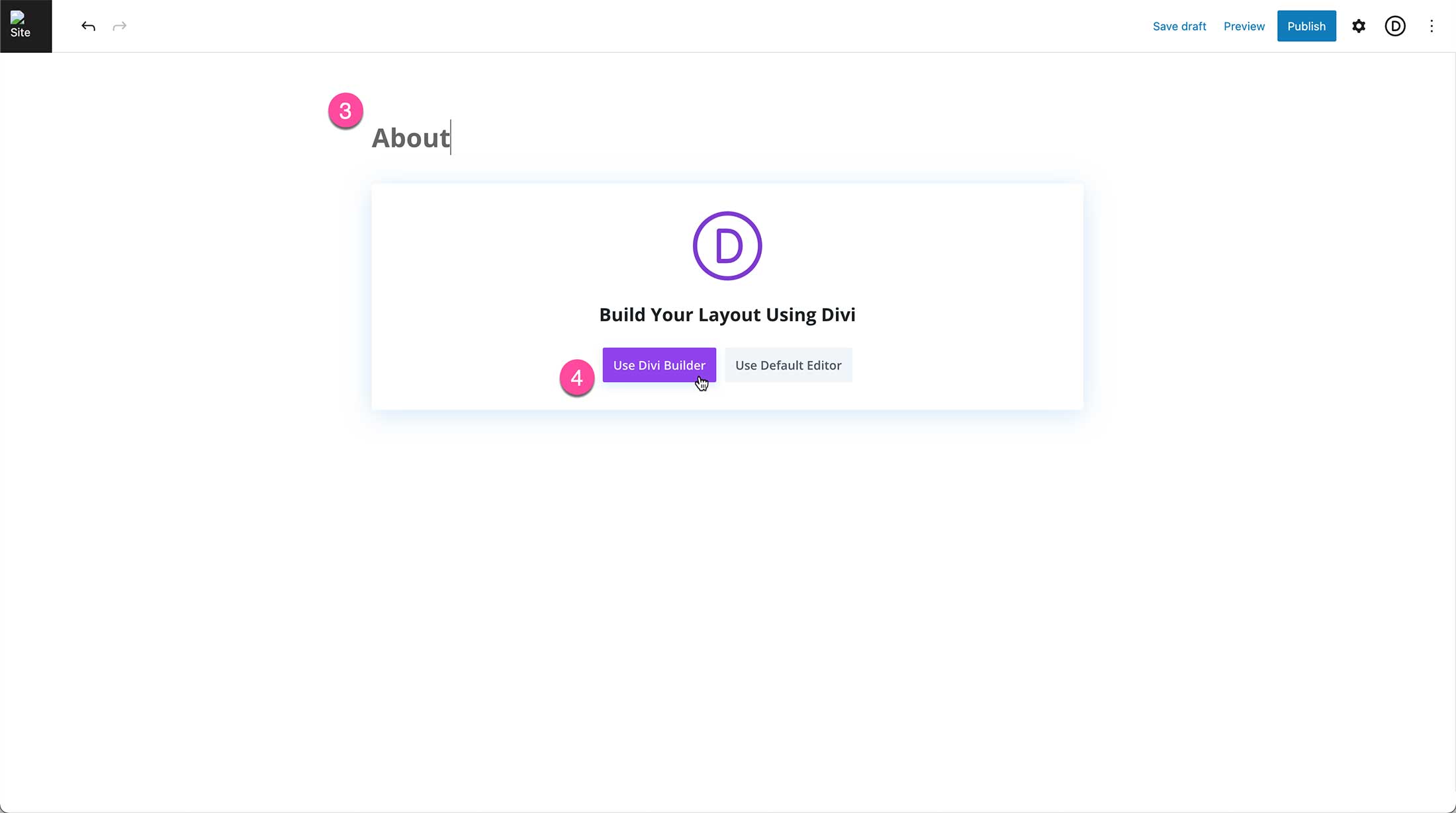
Give your page a title, then click “Use Divi Builder”. This will re-load the page onto the front end of the website with the Divi Visual Builder enabled.
As your page reloads, you’ll notice three options that come up: Build From Scratch, Choose A Premade Layout, and Clone An Existing Page.
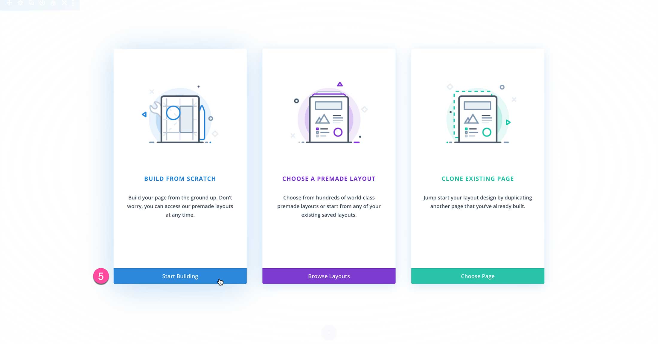
Build From Scratch
This option loads the Divi Builder with a blank page design. Choose this option if you’d like to start your page design from scratch.
Choose a Premade Layout
If you’d like to start your design with one of your saved layouts or a premade layout pack from Divi, choose this option. It will load the Divi Library where you can browse premade layout packs, your previously saved designs, and existing pages on your website.
Clone an Existing Page
You can also start your design by cloning an existing page on your website. Select this option if you’d like to load a page design from an existing page on your website as your starting point.
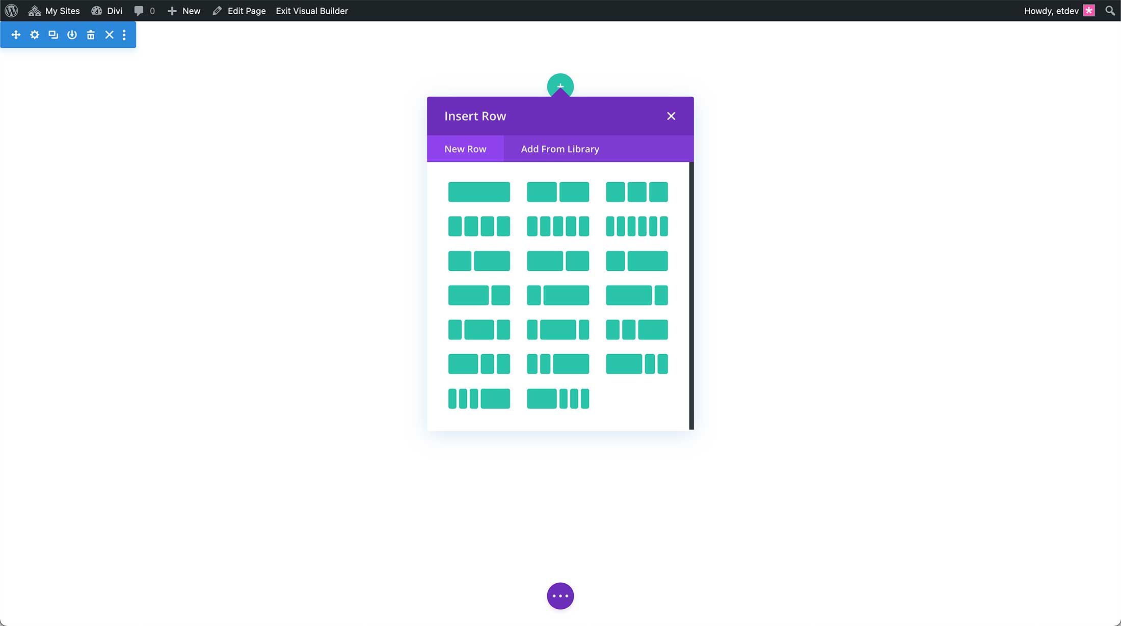
Select, Build From Scratch.
By default, a standard section is automatically added to the page.
Divi Visual Builder Basics
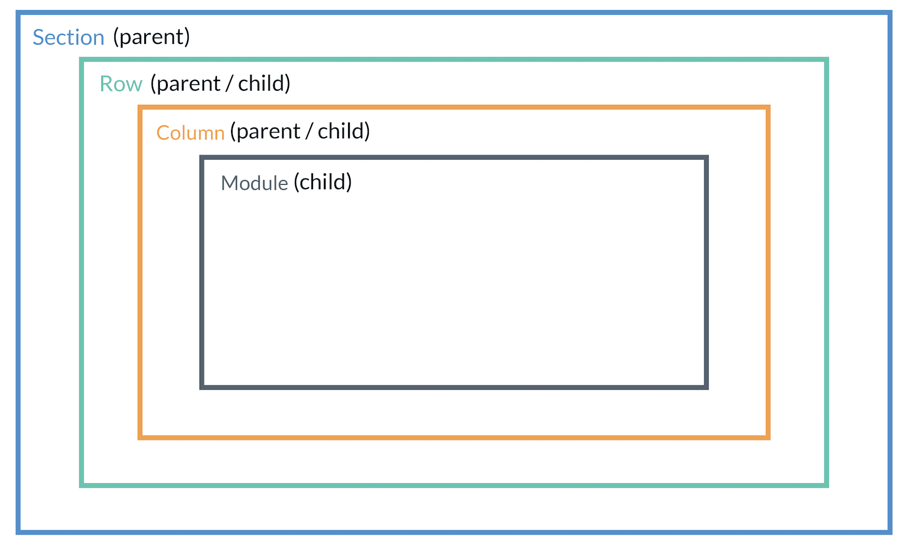
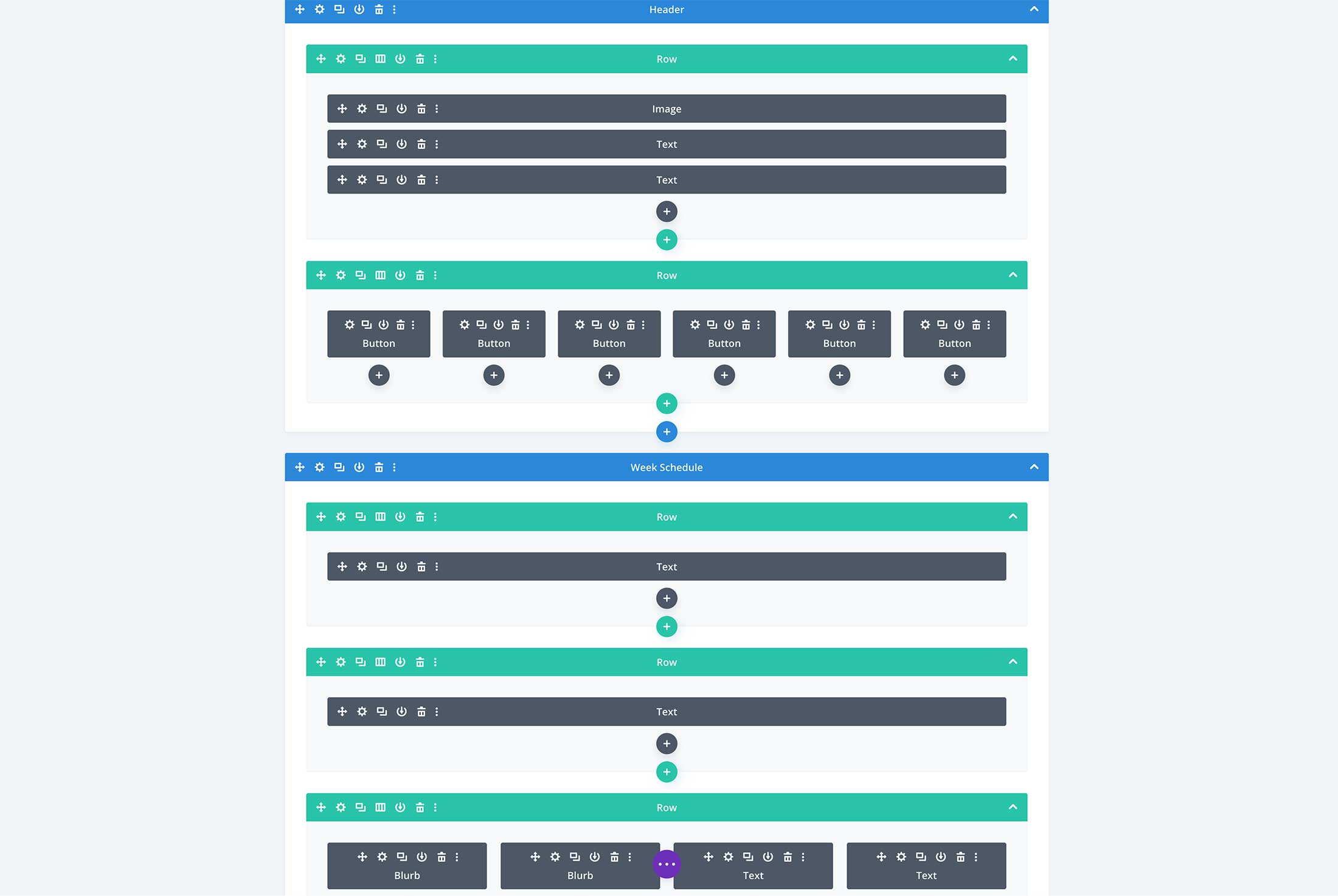
Let’s start with the basics. The building blocks of Divi. The main building blocks of Divi are sections, rows, columns, and modules. Sections contain rows, which contain columns, which contain modules.
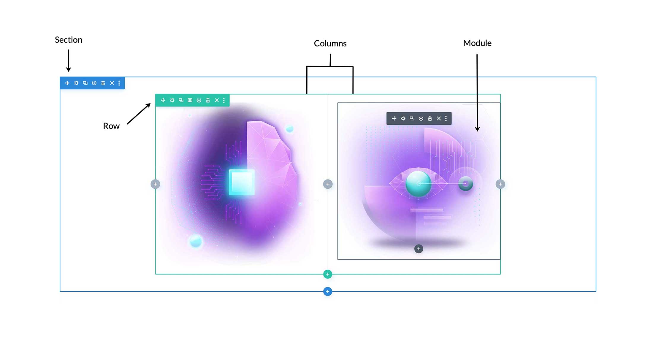
Sections
In Divi, everything you build starts with a section. Sections are the biggest building block in the Divi builder. You can think of them as horizontal stacking blocks that can group your content into visually distinguishable areas. This content wrapper has various settings that can be used to do some really awesome things.
There are three types of sections: Standard, Fullwidth, and Specialty.
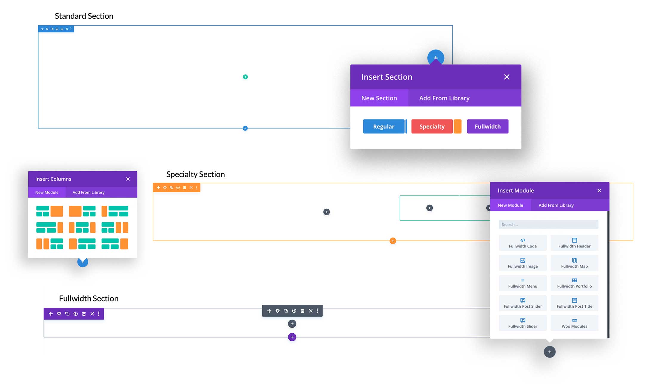
Standard Sections
Standard sections are the most commonly used section within Divi. It expands to the width of the browser and contains a row that is set to 80% width by default. However, there is a lot of customization options available within the standard section to get it to do whatever you want.
Fullwidth Sections
Fullwidth sections give you access to a set of Fullwidth Modules. These modules act a little differently because they take advantage of the full width of the browser. Fullwidth modules can only be placed within Fullwidth sections.
Specialty Sections
Specialty sections allow for more advanced column structures. When you select “Specialty” you’ll see all the available column structures available.
Unlike normal sections, when you use a specialty section, you can add complex column variations next to full-spanning vertical sidebars, without adding unwanted breaks to the page. These types of layouts are not possible using normal sections. Below is an example of a Speciality Section in action.
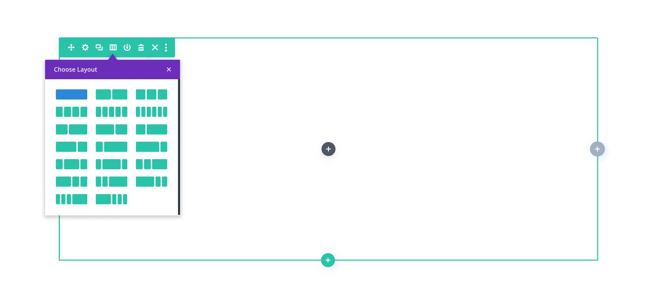
Rows
Rows are nested inside sections and can contain a variety of column layouts that help structure your content. Learn More: A Complete Overview of Divi Rows & Columns
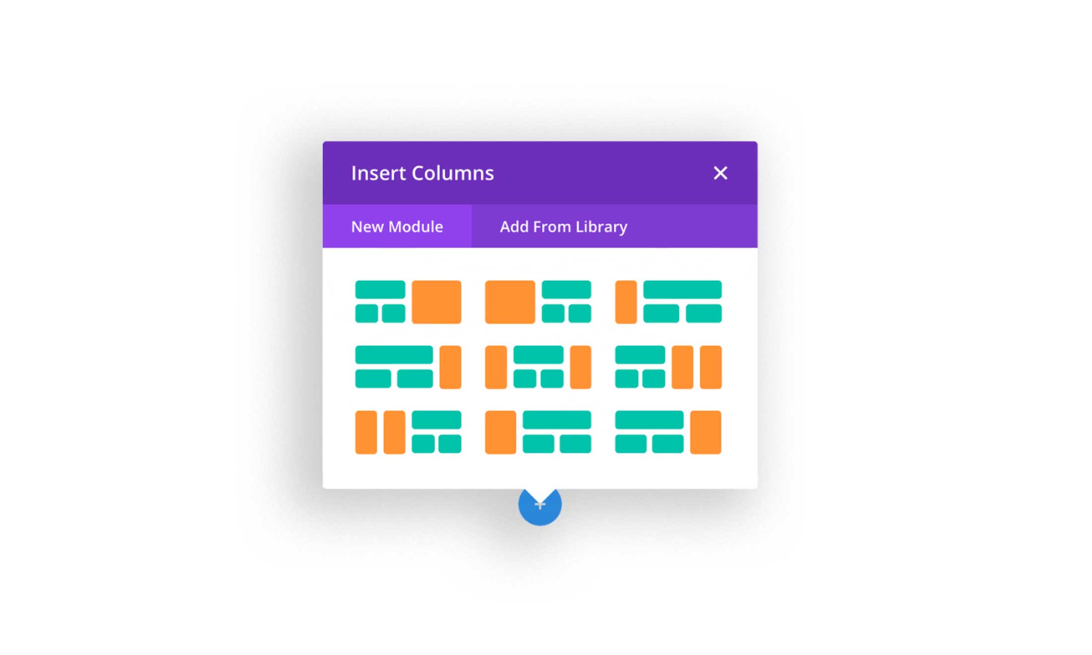
Columns
Columns are nested inside rows and create a basic boxed structure for your content. Every row has a column, even if it’s just one column.
Learn More: A Complete Overview of Divi Rows & Columns
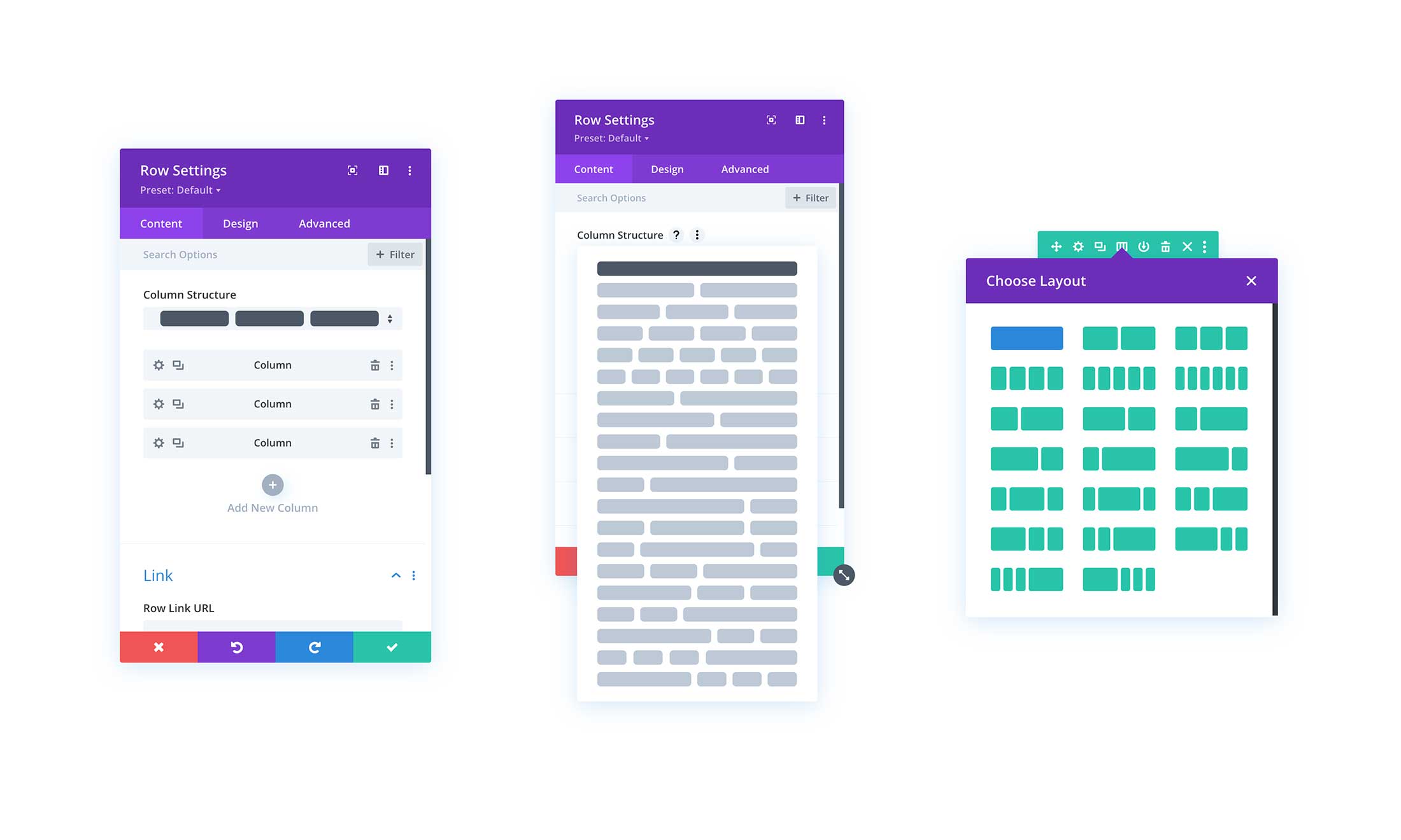
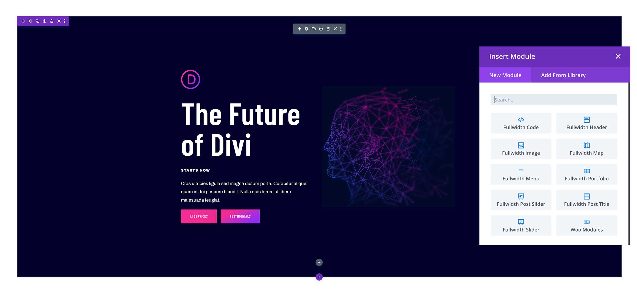
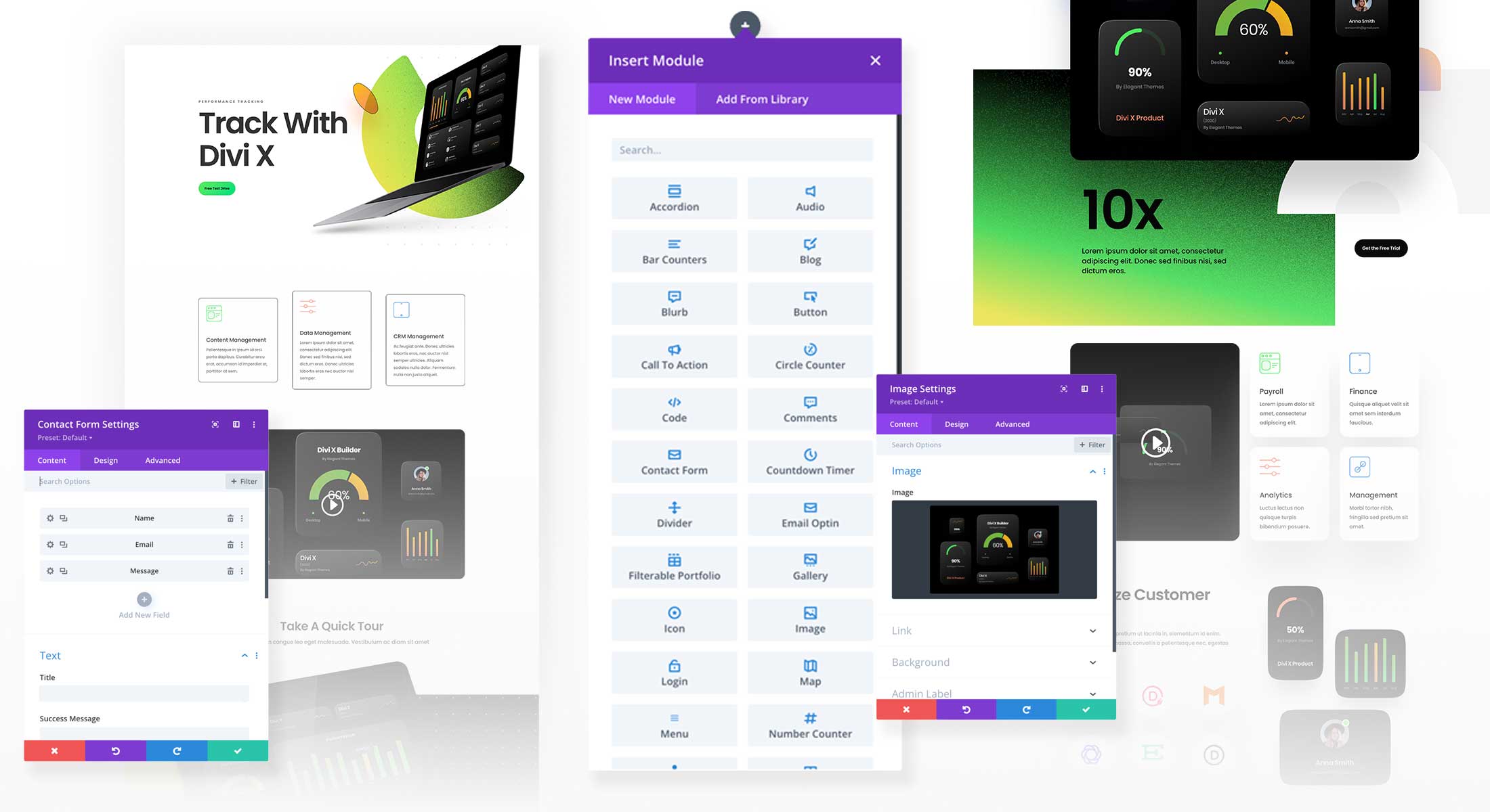
Modules
Modules are the content blocks of Divi. So Contact Forms, Images, Text, Sliers, Blurbs and more are all examples of modules. Check out all the modules Divi has to offer here. To learn how to use the modules check out our Module Documentation.
Parent / Child Element Hierarchy in Divi Builder Elements
When adjusting settings and applying styles in Divi it’s important to remember the hierarchy of Divi’s sections, rows, columns, and modules. Sections contain rows, rows contain columns, and columns contain modules. These are called parent and child elements. Child elements are nested inside parent elements and are affected by any design styling you apply to the parent element.
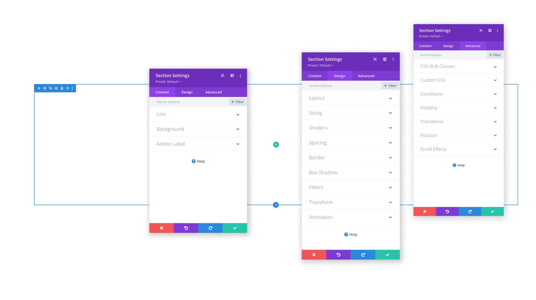
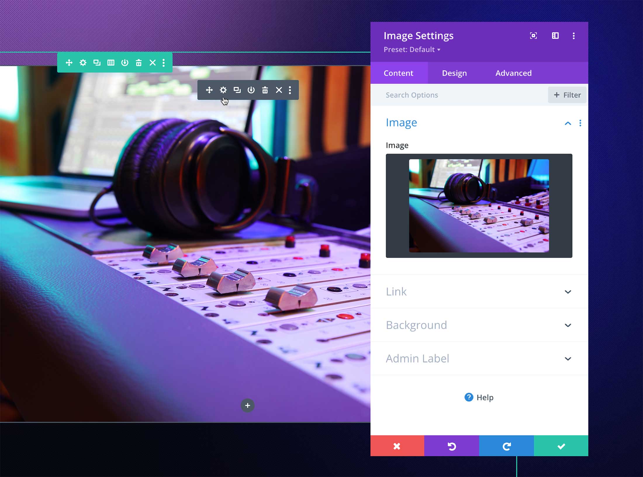
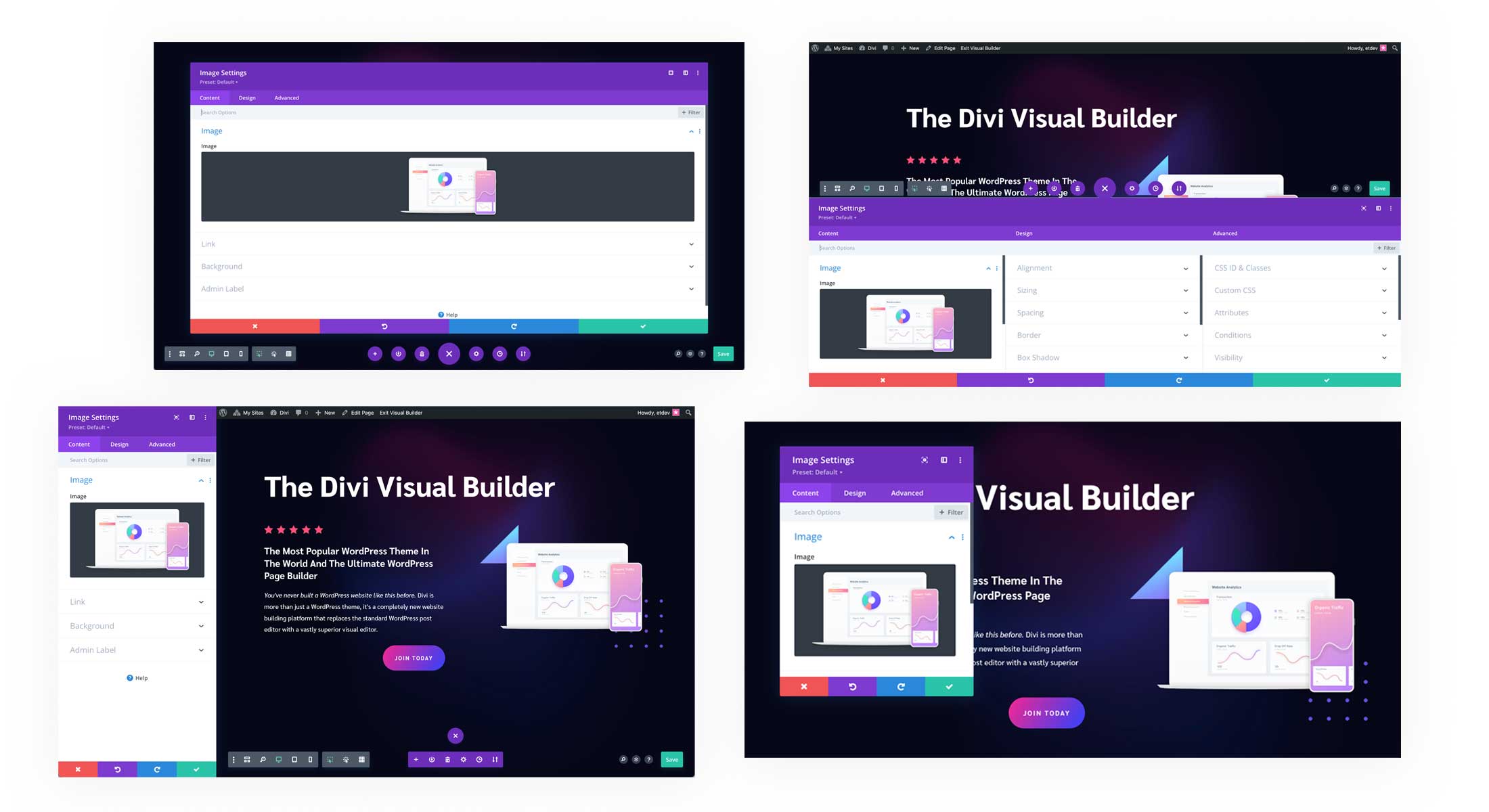
The Element Settings Window Pop-Up
Whenever you open an element’s settings, a window will pop up with all of the content, design, and advanced settings available to that element. Let’s take a closer look at what’s available.
Name of the Element
At the top left you’ll see the name of the builder element you’re working on. That could be a section, row, column, module, page settings, etc. If you ever get confused about what element you’re currently editing, look here and it will tell you!
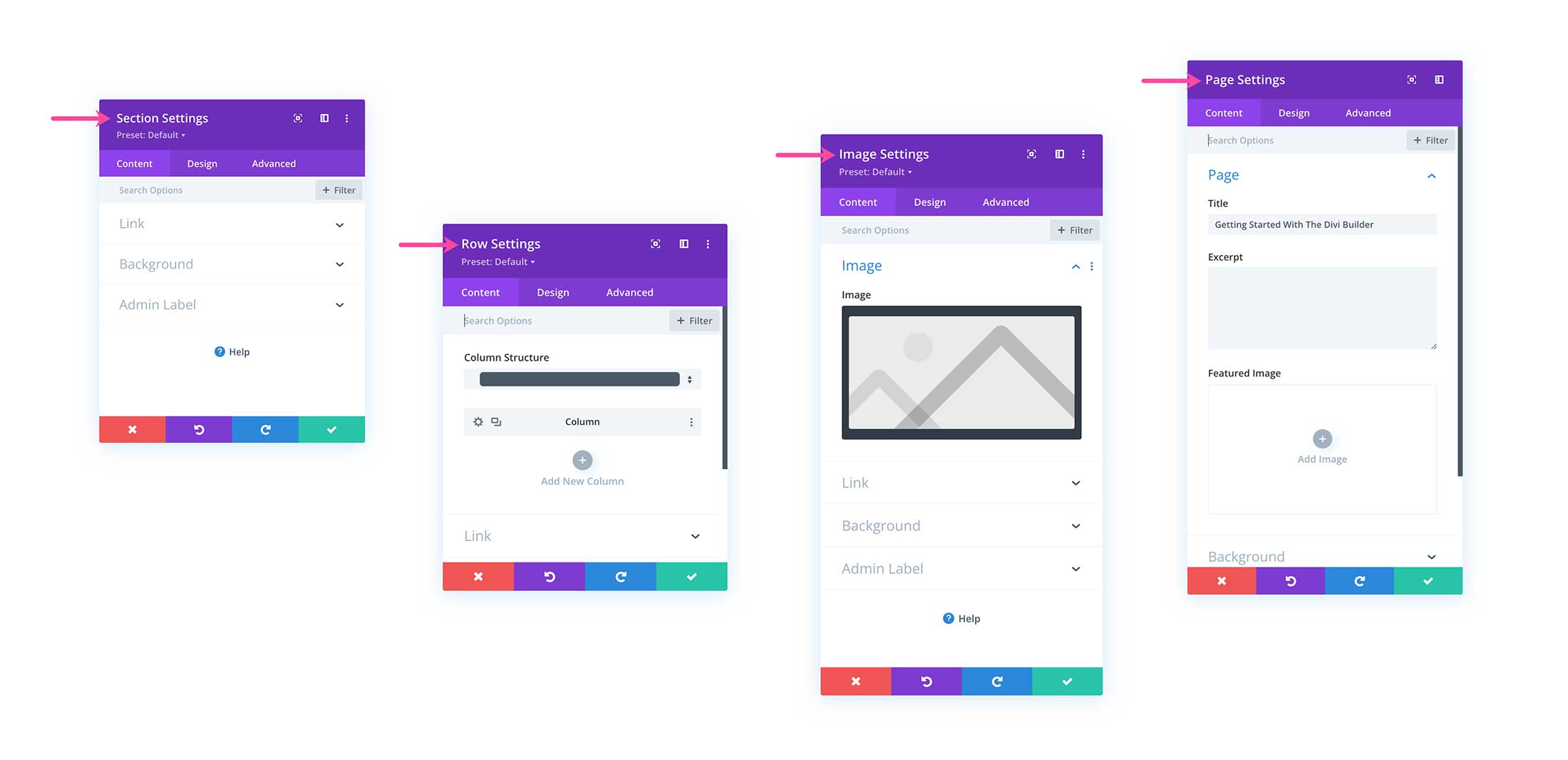
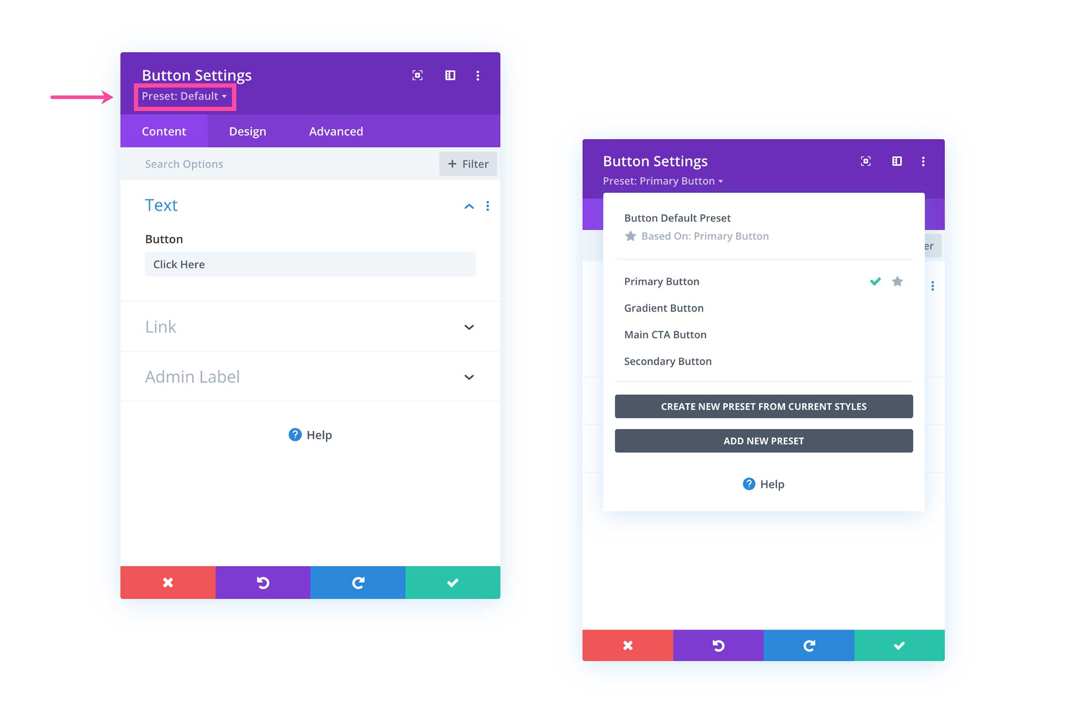
Presets
Underneath the name of the module is where you can access Global Presets. Click on the dropdown to load a saved preset, create a new preset, or delete a preset. Presets are pre-designed and saved settings for any section, row, column, or module within Divi. Learn all about Global Presets here.
Expand Modal
The next icon expands the modal to the width of your browser.
Snap or Separate Modal
The next icon either snaps or separates the modal. Snap affixes the modal to the left of your browser window and does not hover over your page’s content, but adjusts next to it. To exit the left sidebar position of the snapped modal, click the icon again and it will separate and return to the position it was before.
Other Settings
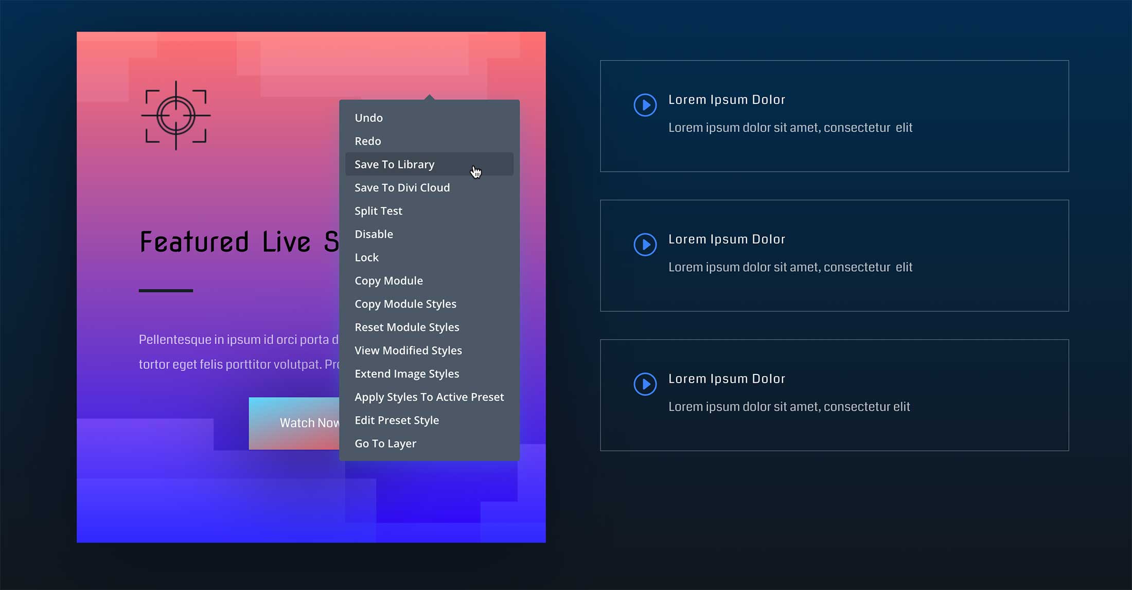
When clicked, the three vertical ellipses icon gives you access to even more settings for that element.
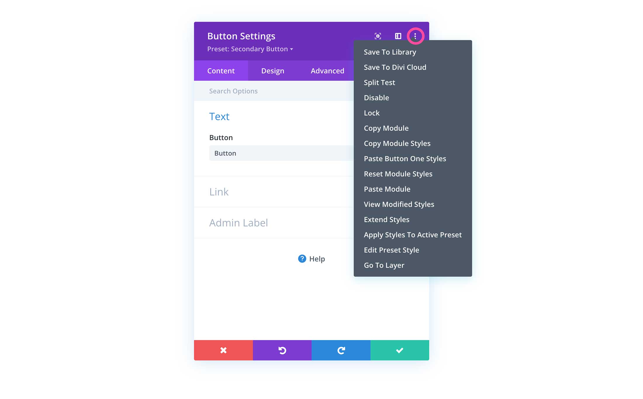
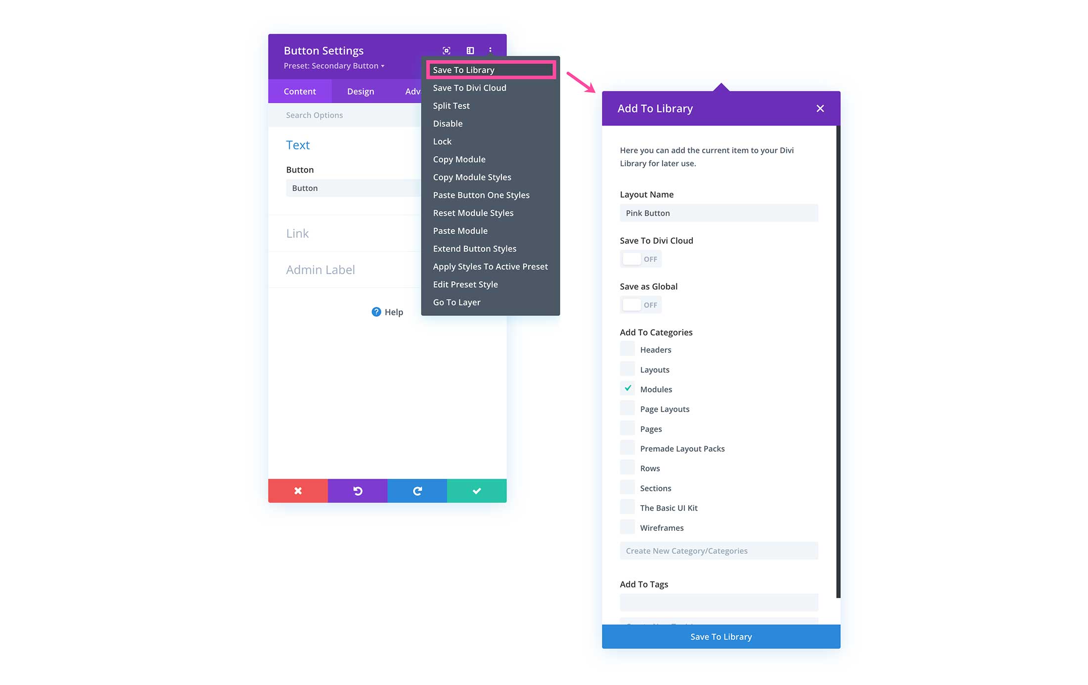
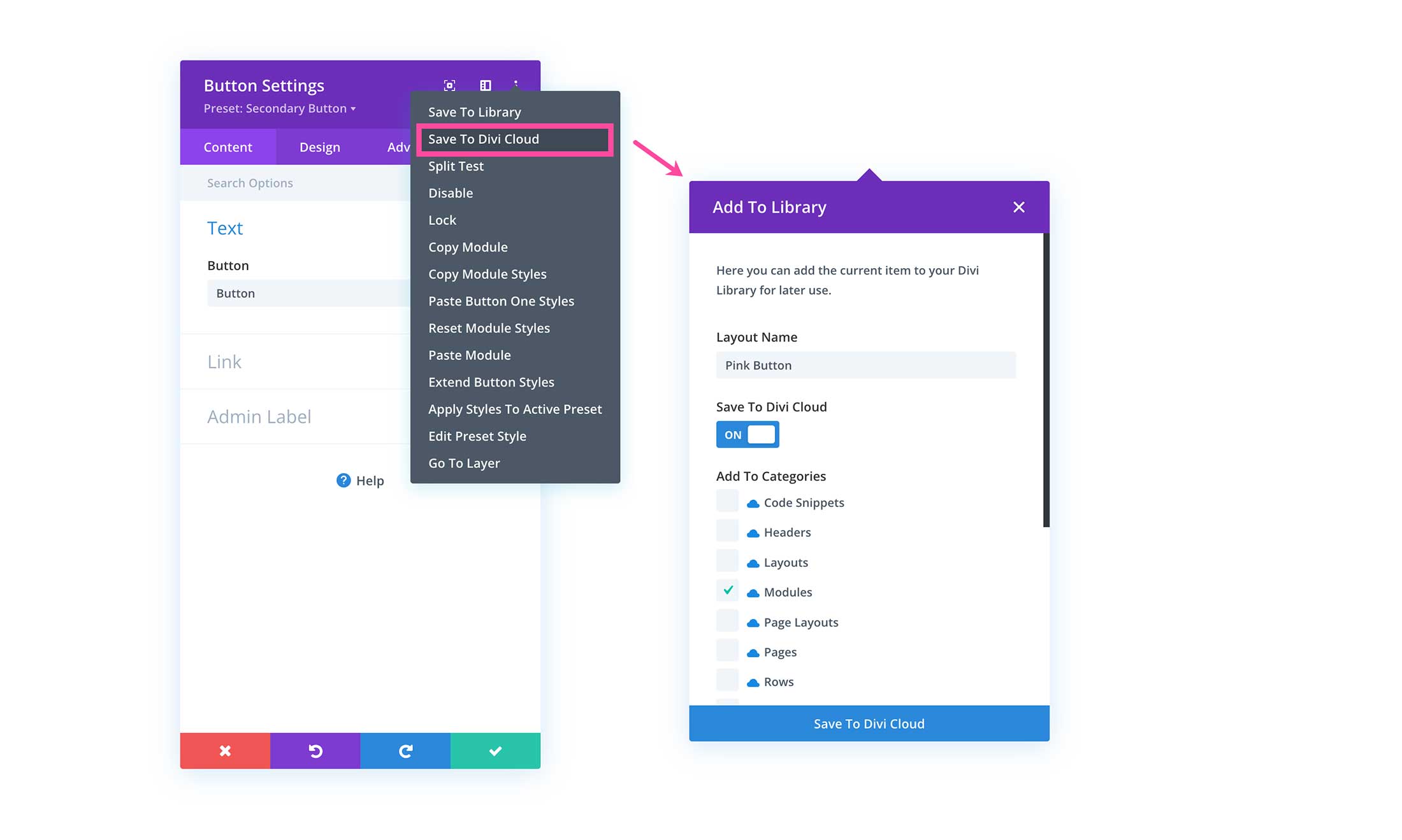
Save To Libray – Saves this element to your library.
Save To Divi Cloud – Saves this element to your Divi Cloud.
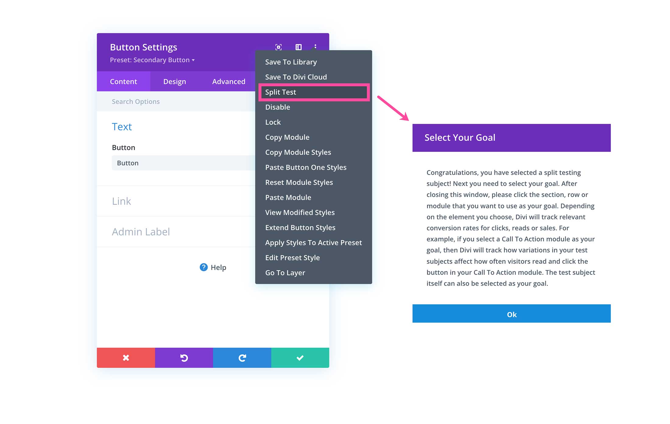
Split Test – Conduct a split test with this modal. Learn how to split test here.
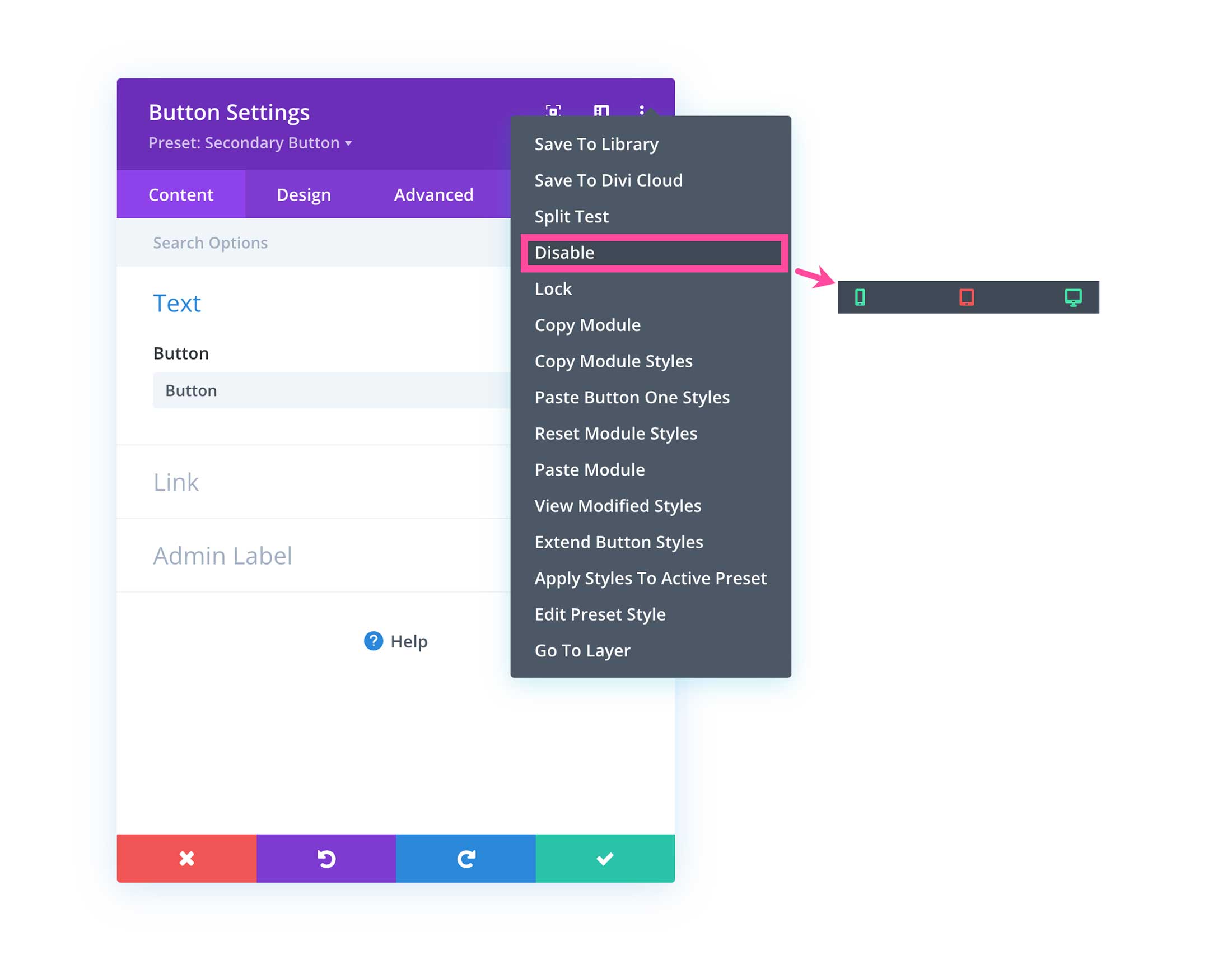
Disable – Quickly disable the element on a desktop, tablet, or mobile device. When an icon is green that means it’s visible. When it’s red, it’s hidden.a
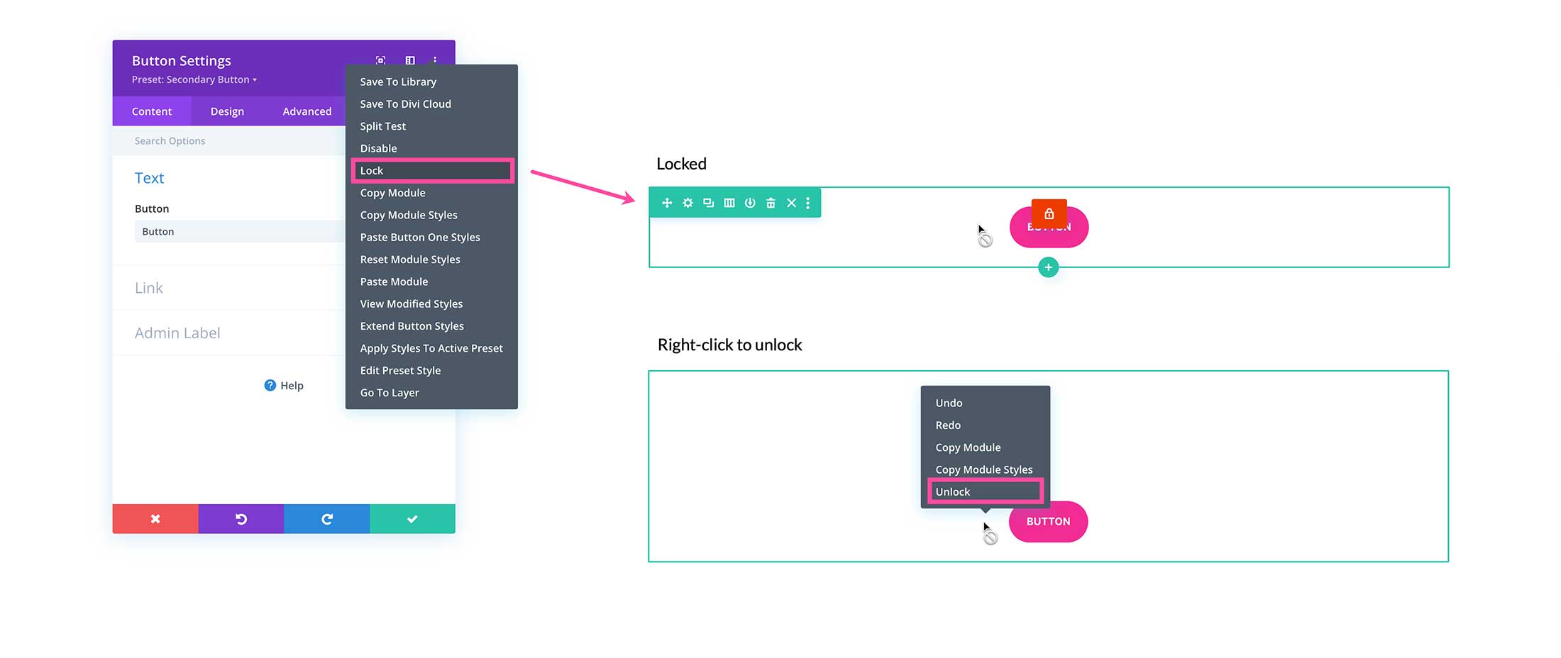
Lock – Locks the element so no design styles and settings are changed. To unlock, right-click on the element and click “Unlock”.
Copy Module – Copies the module to your clipboard so you can paste it anywhere on the page.
Copy Module Styles – Copies the module’s styles and settings so you can apply them to another same module.
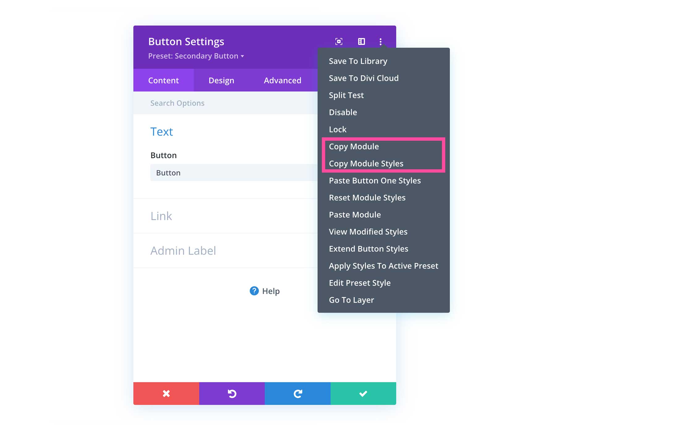
Paste Button One Styles – Pastes styles from the button. This will only take effect if you have copied the styles first by clicking the above option “Copy Module Styles”.
Reset Module Styles – Resets the module’s styles to the default styling. This removes any customization you did to the module.
Paste Module – After you’ve copied the module, click this to paste the module anywhere on your website. For this to work, you must first click “Copy Module”.
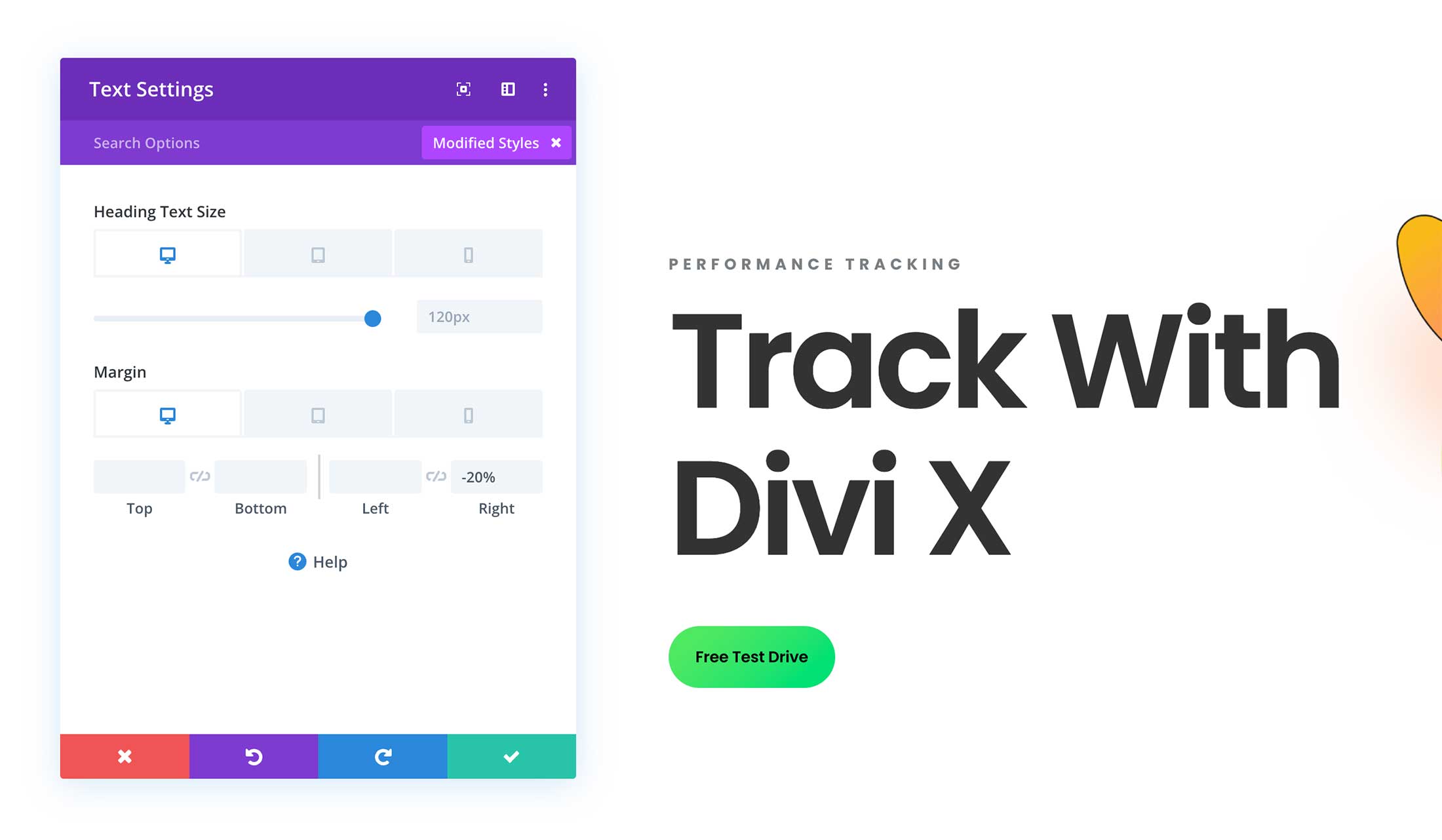
View Modified Styles – Selecting this option will only display the settings of that module that have been modified. This is helpful when you’ve made a lot of changes or you’ve forgotten which changes you’ve made because it quickly shows the settings that have been modified within that module allowing you to make fast updates.
Extend Button Styles – When extending a module’s styles you have the option to extend those styles throughout the entire page including headers and footers, just the page design, just the section, just the row, or just the column that module is in.
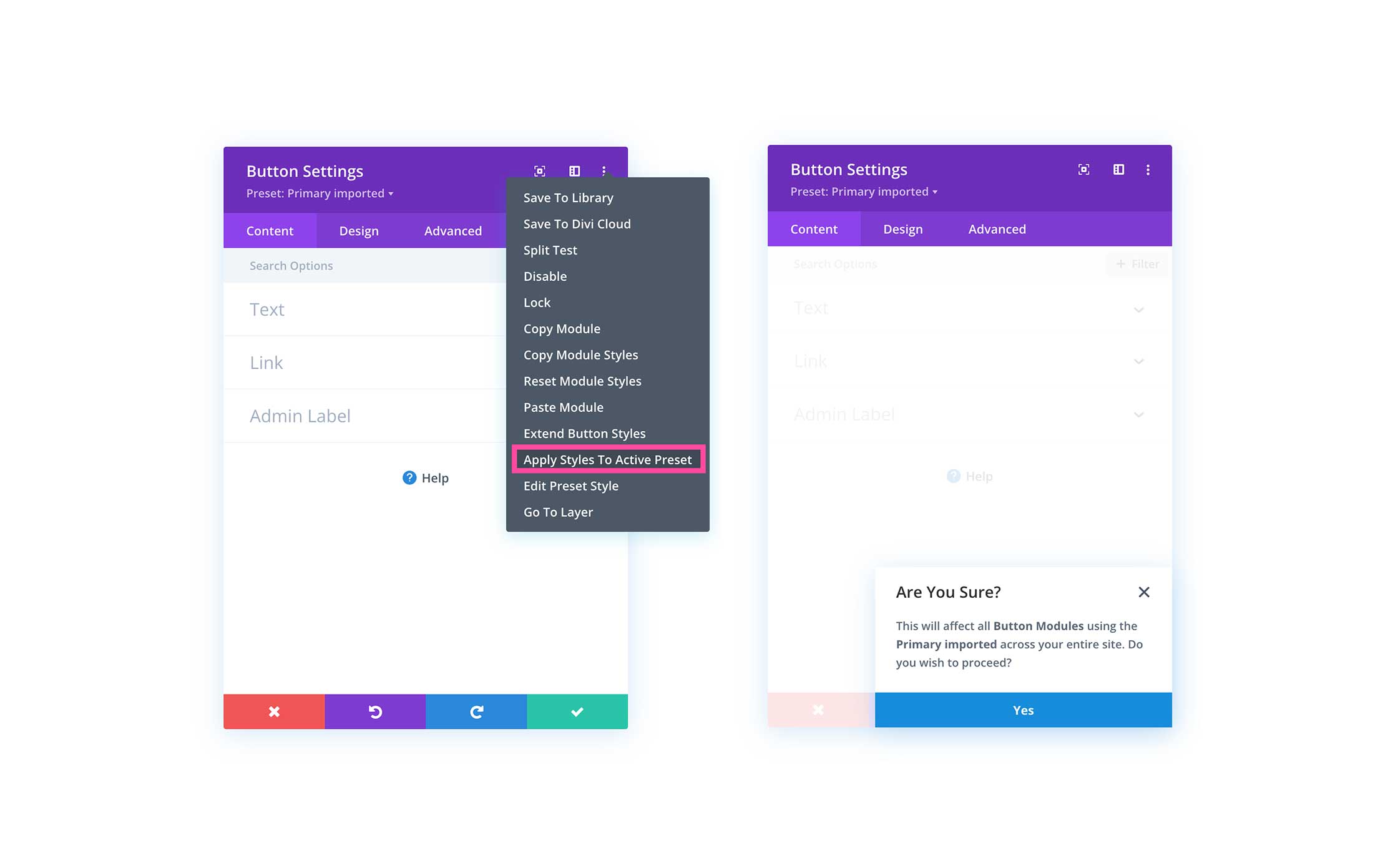
Apply Styles To Active Preset –
Edit Preset Style – Selecting this option will allow you to access the current preset’s settings and stylings.
Go To Layer – Once clicked, the Layers panel will open up and go to the layer that the design element is in. This is helpful to quickly access builder elements to access their settings, rearrange them, and more.
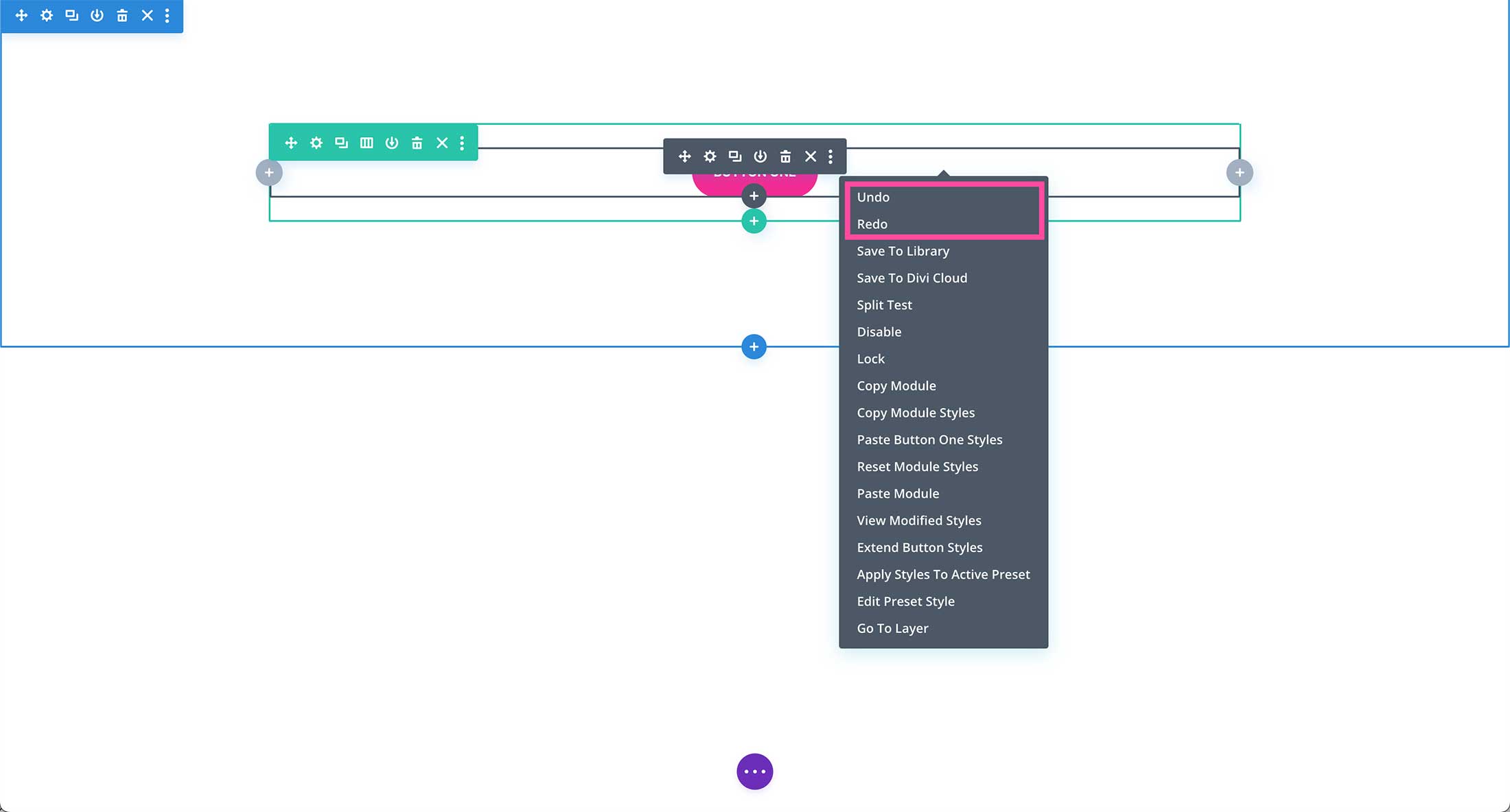
You can also access these settings by right-clicking on the design element you’re working on. When right-clicking to access these settings, you’ll notice Undo and Redo are added at the top of the list. This is handy for when you want to quickly undo or redo a certain action.
Search Options Bar
Next in the module window is the Search Bar. You can use the search back to quickly find and access settings and styles. Simply type what you’re looking for to search.
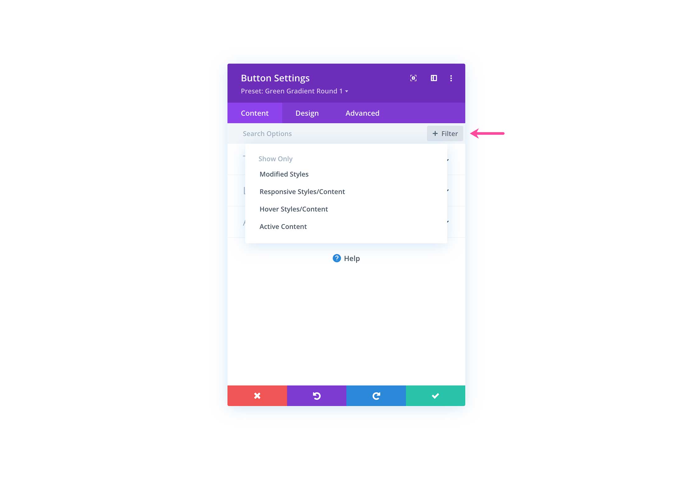
+ Filter
The filter button works similarly to the search function in that it allows you to quickly access modified styles, responsive styles, hover state styles, and active content.
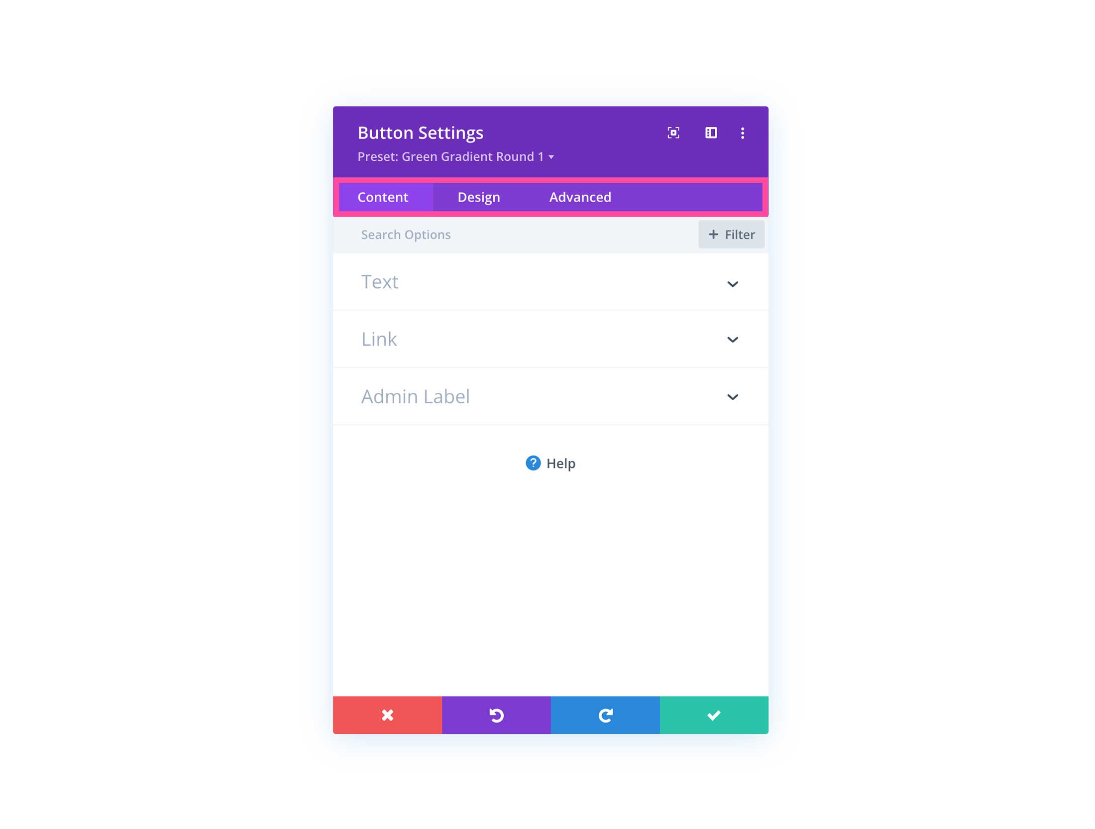
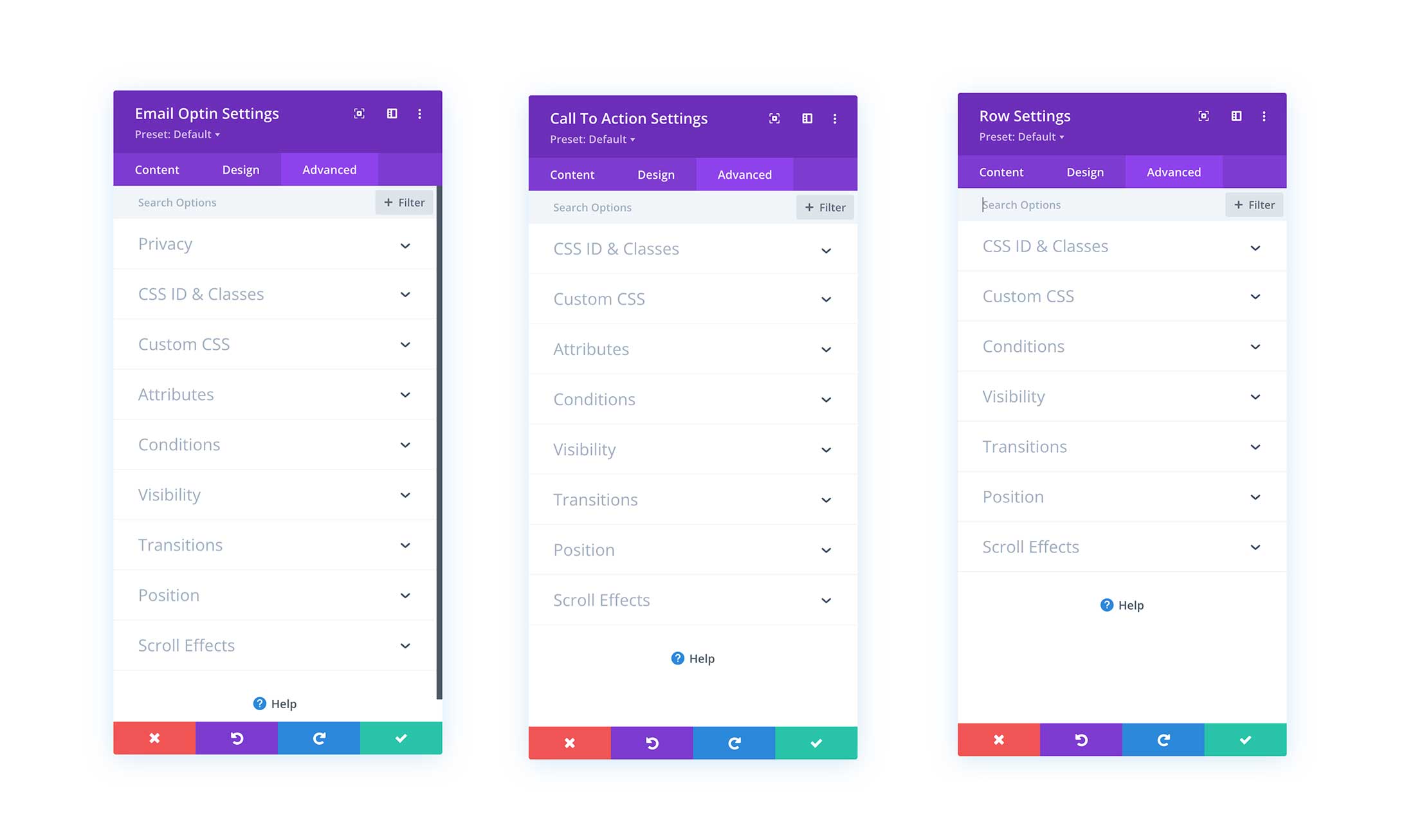
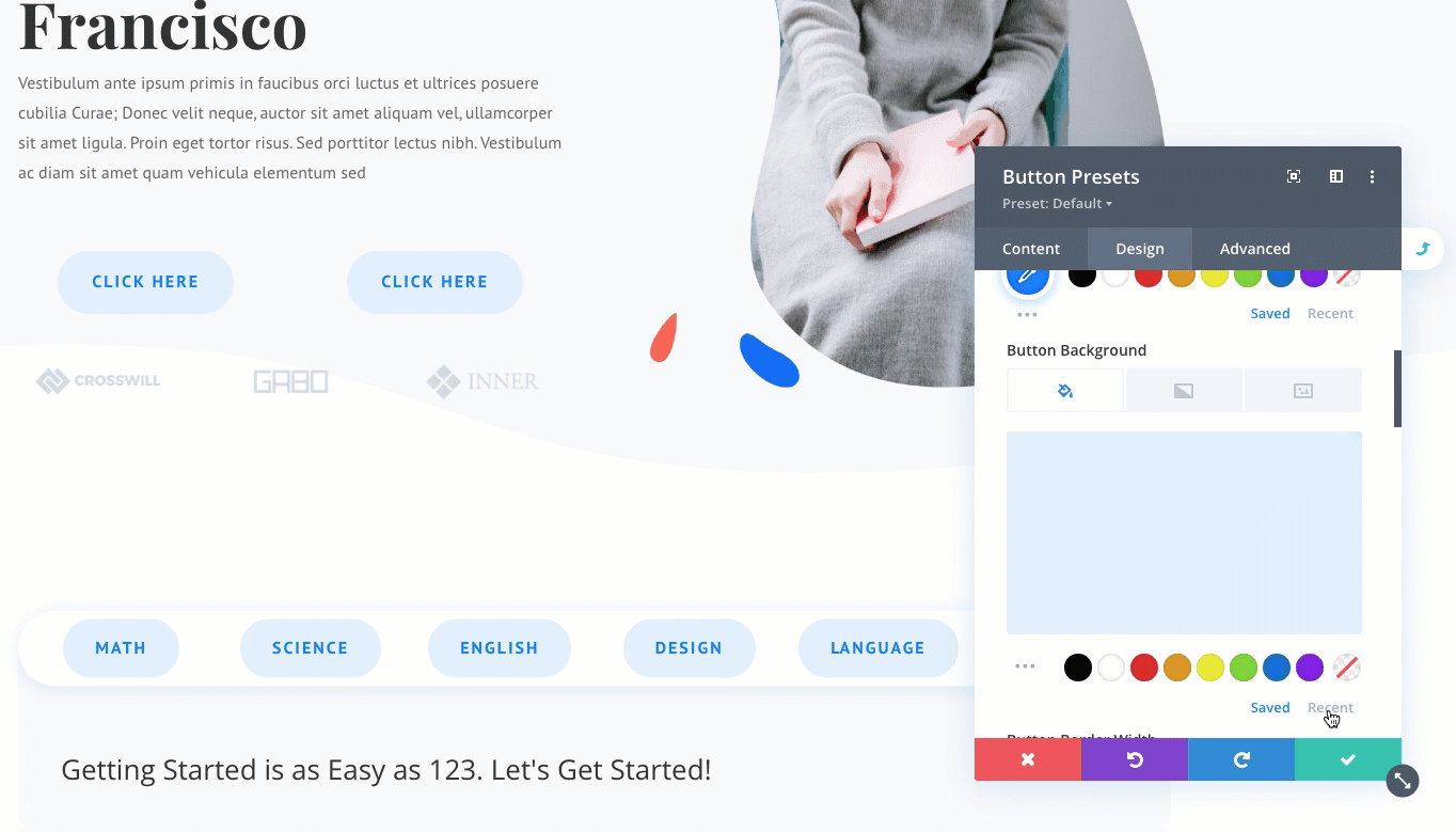
Tabs: Content, Design, Advanced.
All modal windows have three tabs: Content, Design, and Advanced. This is where the content settings, design settings, and advanced settings are for any Divi Builder element you’re working on (whether that be a section, row, columnn, or module).
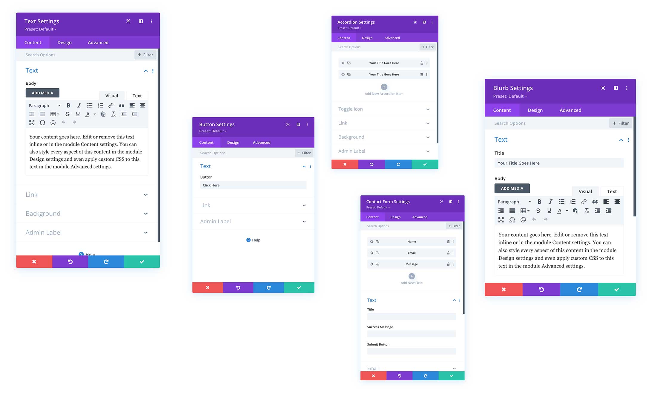
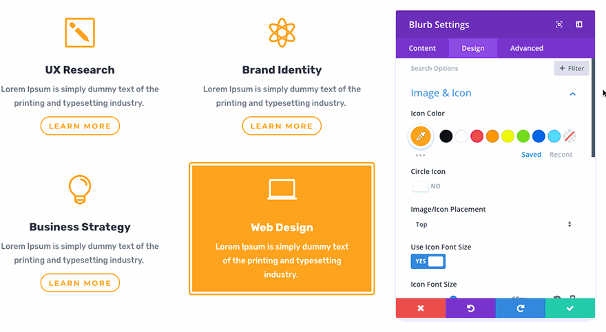
Content
The Content tab is where you can adjust the content settings of the Divi Builder element you’re working on. What’s in the Content tab varies depending on which element you are working on.
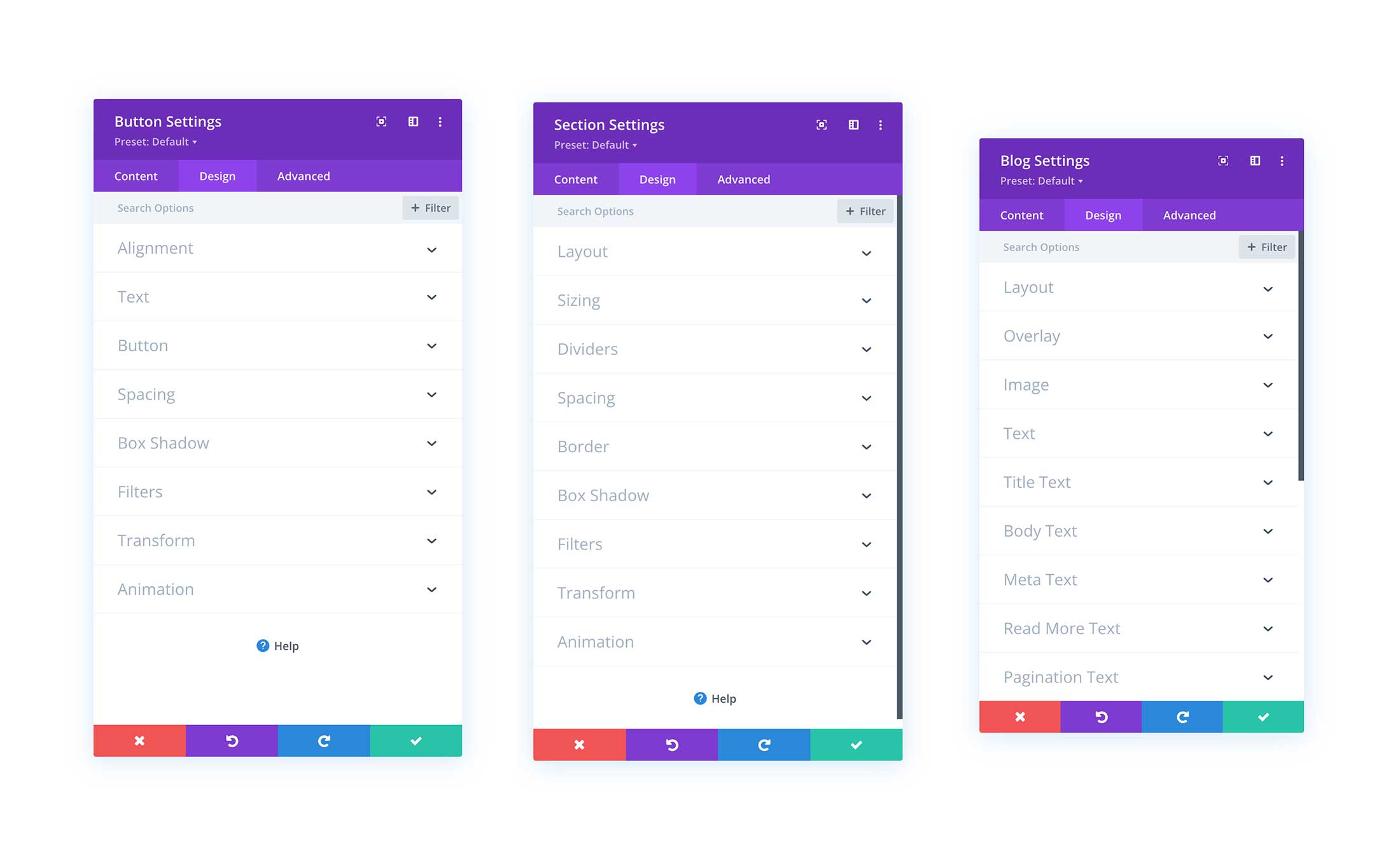
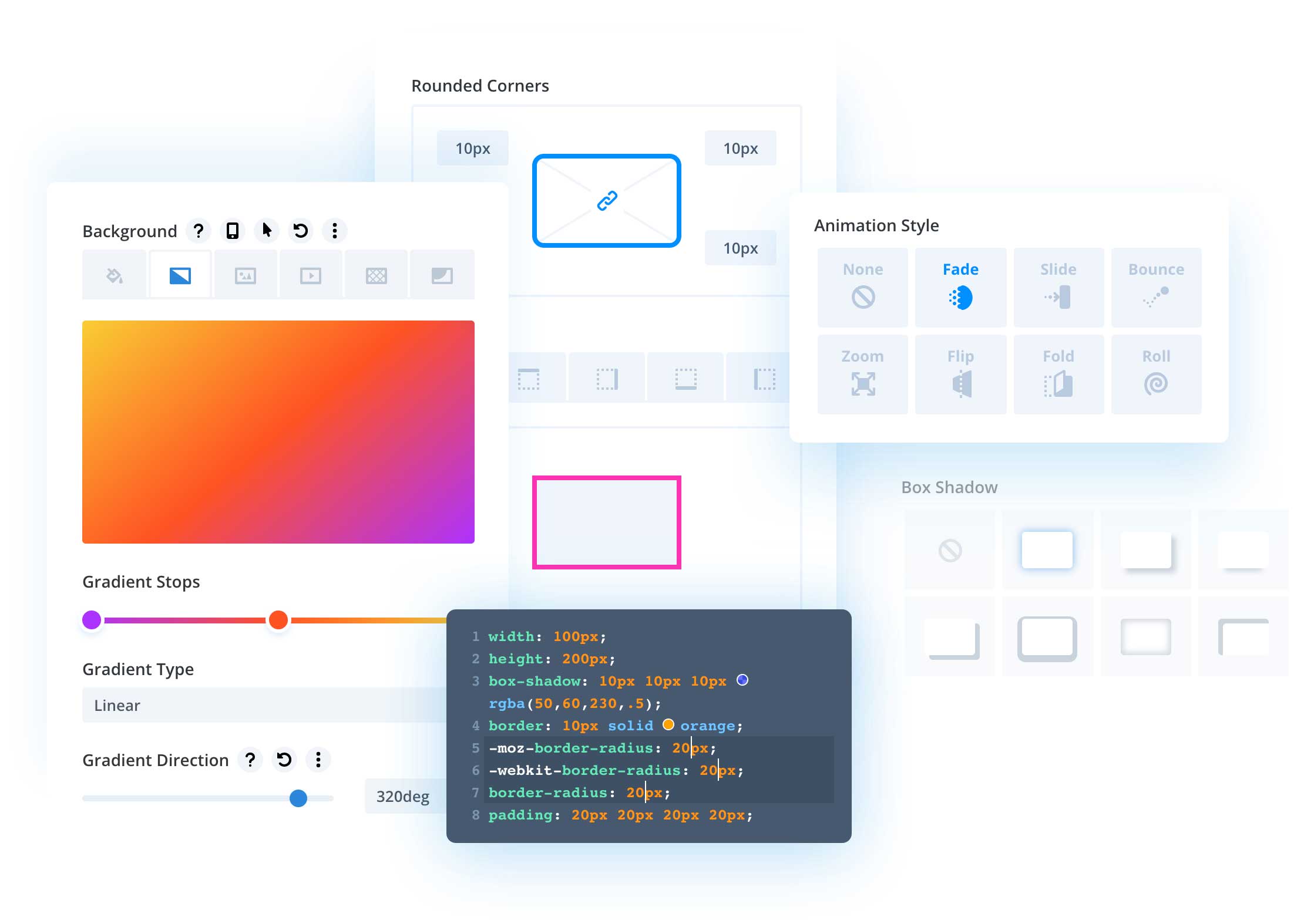
Design
The Design tab is where you can adjust the design settings for the Divi Builder element you are working on.
Advanced
The Advanced tab is where you can access the advanced settings for whatever Divi Builder element you’re working on. Settings like Custom CSS, Visibility, Scroll Effects, Conditions, and more.
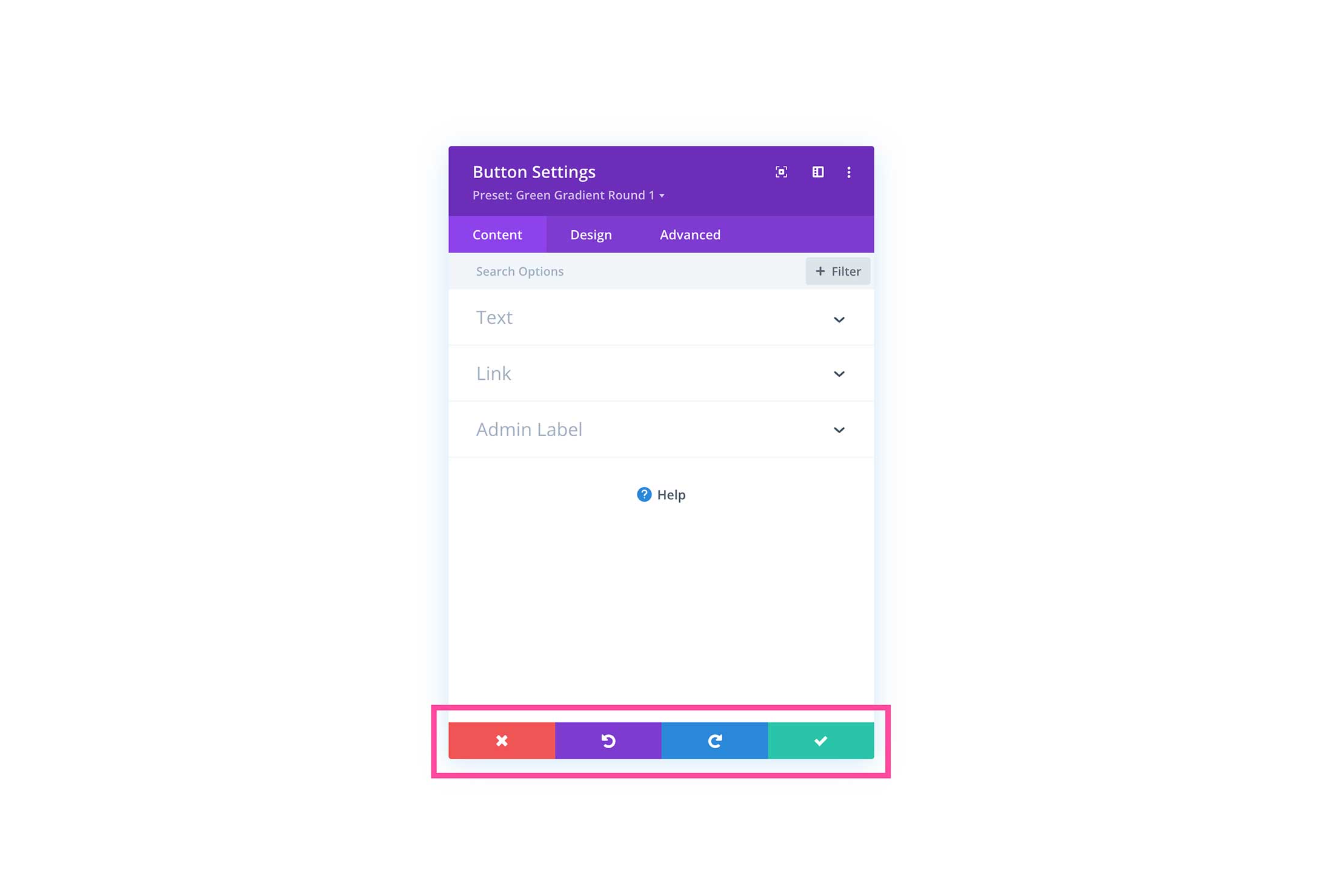
Bottom Buttons: Exit, Undo, Redo, Save.
At the bottom of the modal window, you’ll see 4 buttons from left to right: Exit (red), Undo (purple), Redo (blue), and Save (green).
Exit – If you exit the modal window without saving your changes first, they will be lost.
Undo – Undoes previous actions.
Redo – Redoes undone actions.
Save – Click this button to save your settings.
Tour the Divi Visual Builder
In this section, we’ll review the interface of the Divi Visual Builder and explain what each option does.
Bottom Divi Toolbar
The bottom toolbar is where you can access a variety of settings. Let’s look at what each of these icons means.
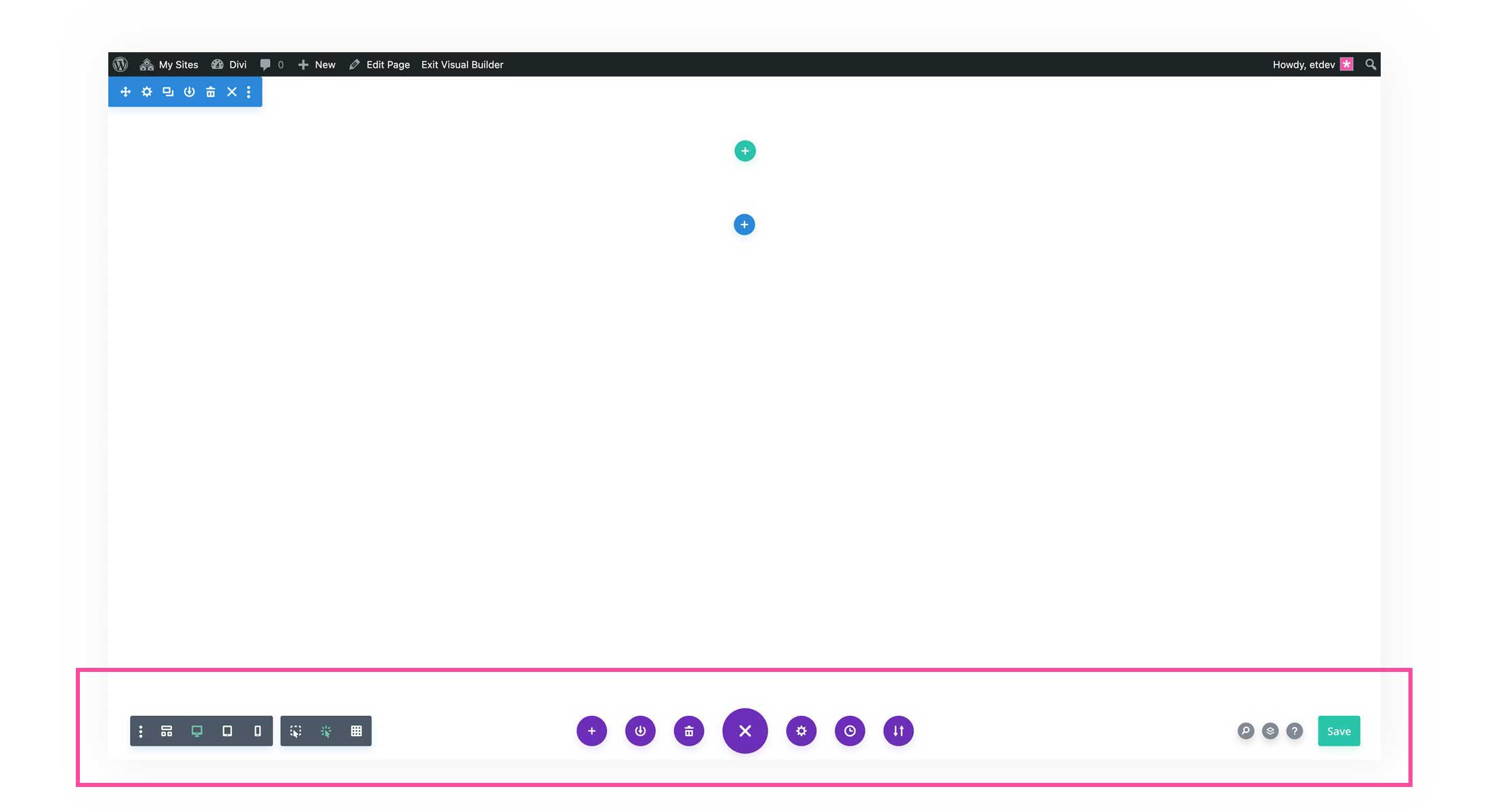
Leftside of the Toolbar
We’ll start from the left, and work our way to the right side of the Divi toolbar.
Three Dots: Builder Settings
Click the three docs to access settings that customize the Divi Builder interface. Here you can customize what icons are on the bottom toolbar, the Builder default view mode, the modal default position, and more.
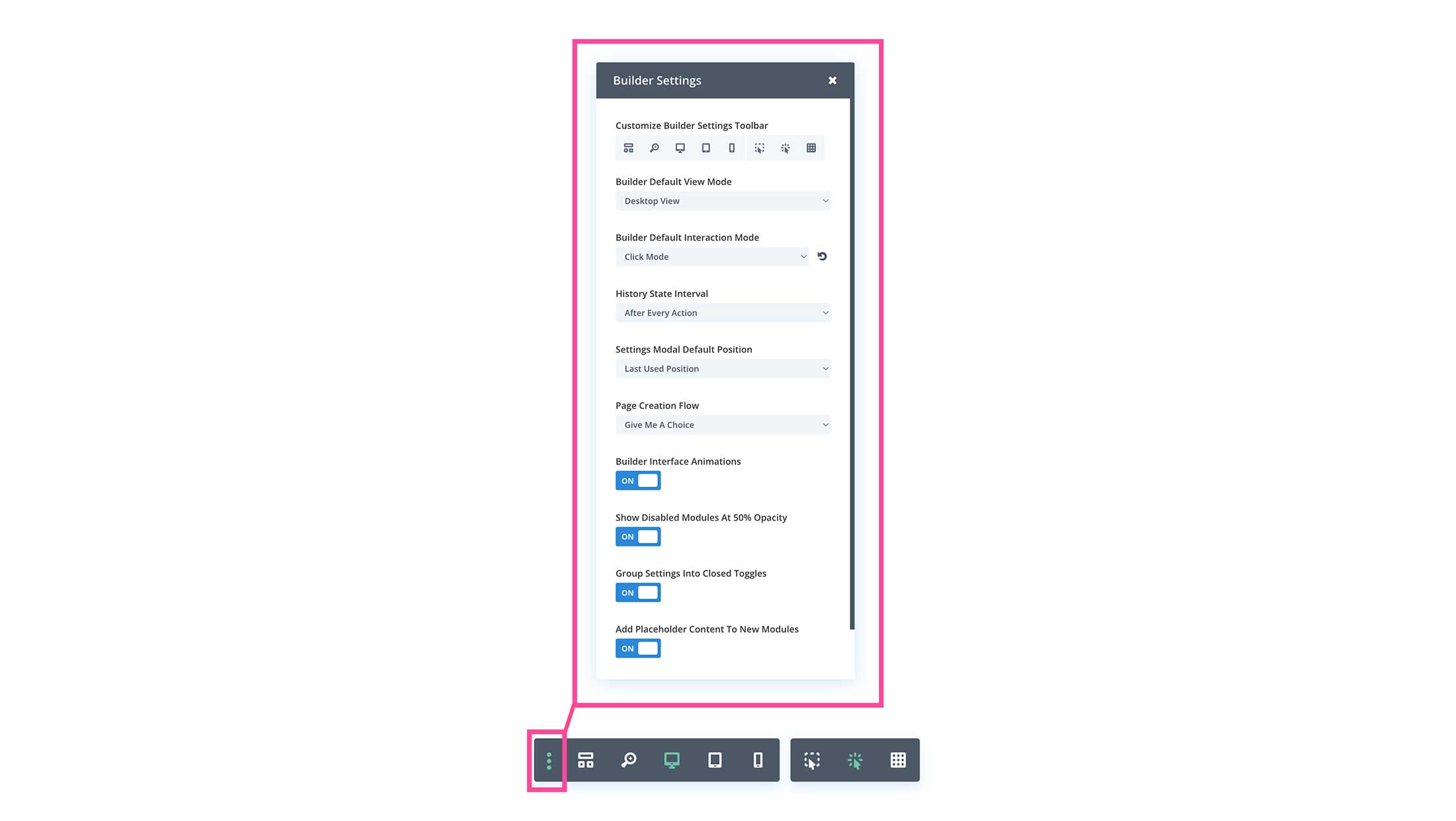
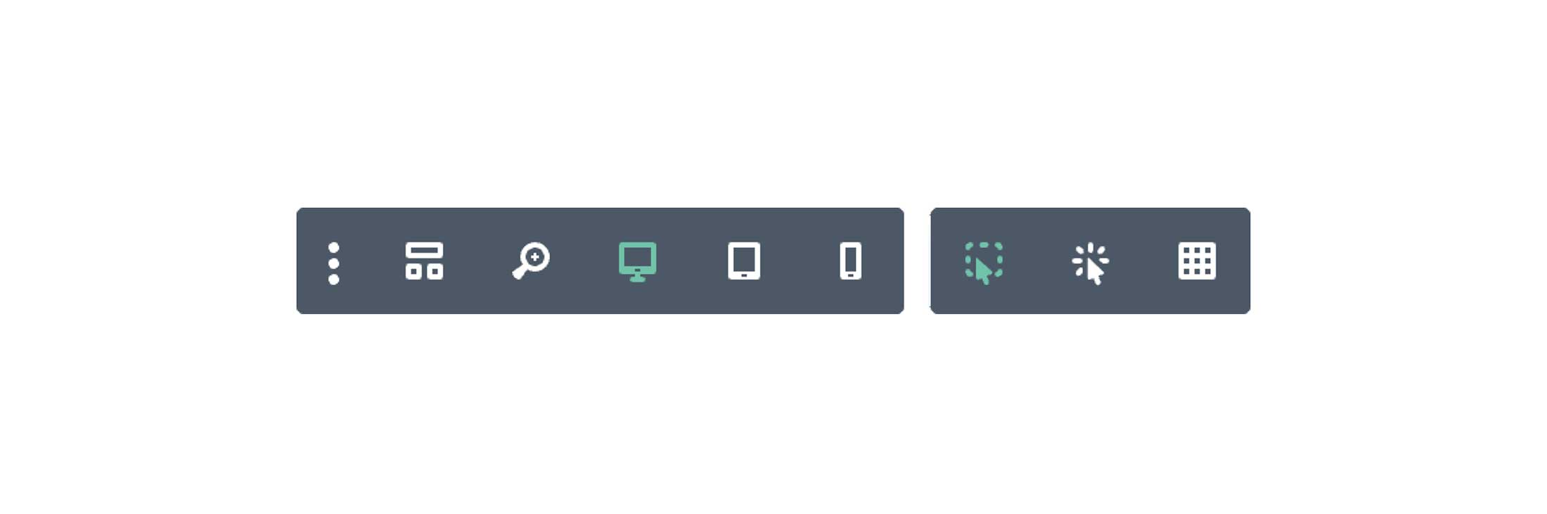
Customize Builder Settings Toolbar
Here you can choose to show or hide icons on the toolbar for quick access. Simply click the icon to show or hide it on the toolbar.
From left to right the icons are:
Wireframe View – Click to view the wireframe layout of the page you are working on.
Zoom in / Zoom Out – Click this icon to zoom in or out on your page design.
Desktop View – Click this to realize the Builder window to the size of a Desktop computer.
Tablet View – Click this to realize the Builder window to the size of tablet devices.
Mobile View – Click this to realize the Builder window to the size of mobile devices.
Hover Mode – When the hover mode is one, the element settings toolbar shows on hover, rather than on-click.
Click Mode – When the click mode is on, the element settings toolbar will show on-click, rather than on-hover.
Grid Mode – When gride mode is on, all of the element settings toolbars and containers will be visible without having to hover or click on them.
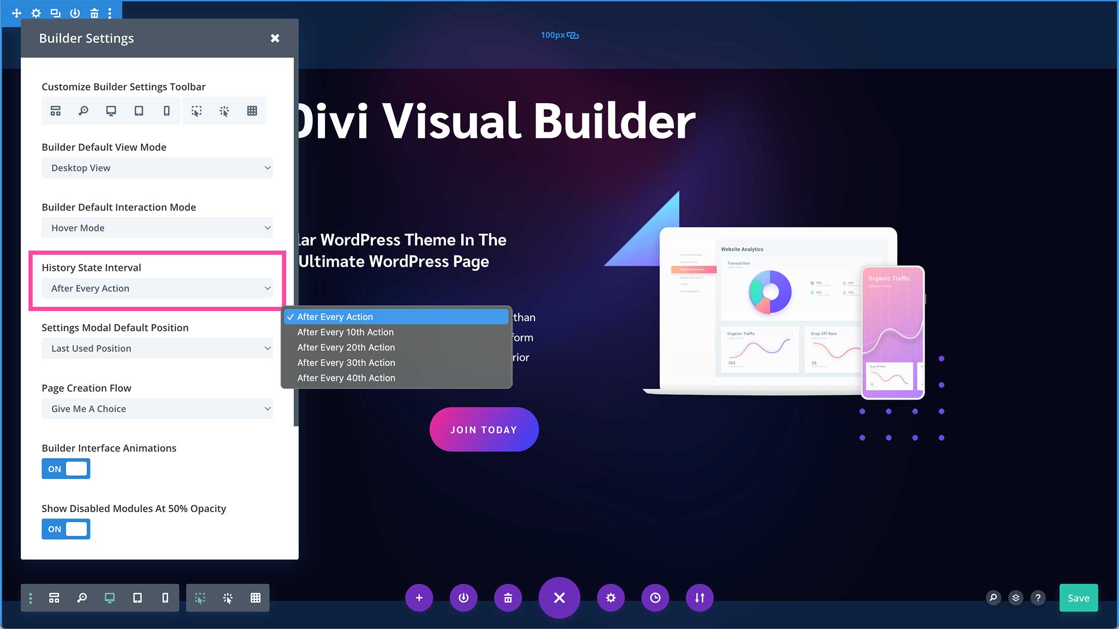
History State Interval
The History State Interval determines how often Divi auto-saves your page design. You can choose it to auto-save after every action you take, or every 10, 20, 30, or 40 actions.
Settings Modal Default Position
Here you can set the default position of the modal when it’s opened.
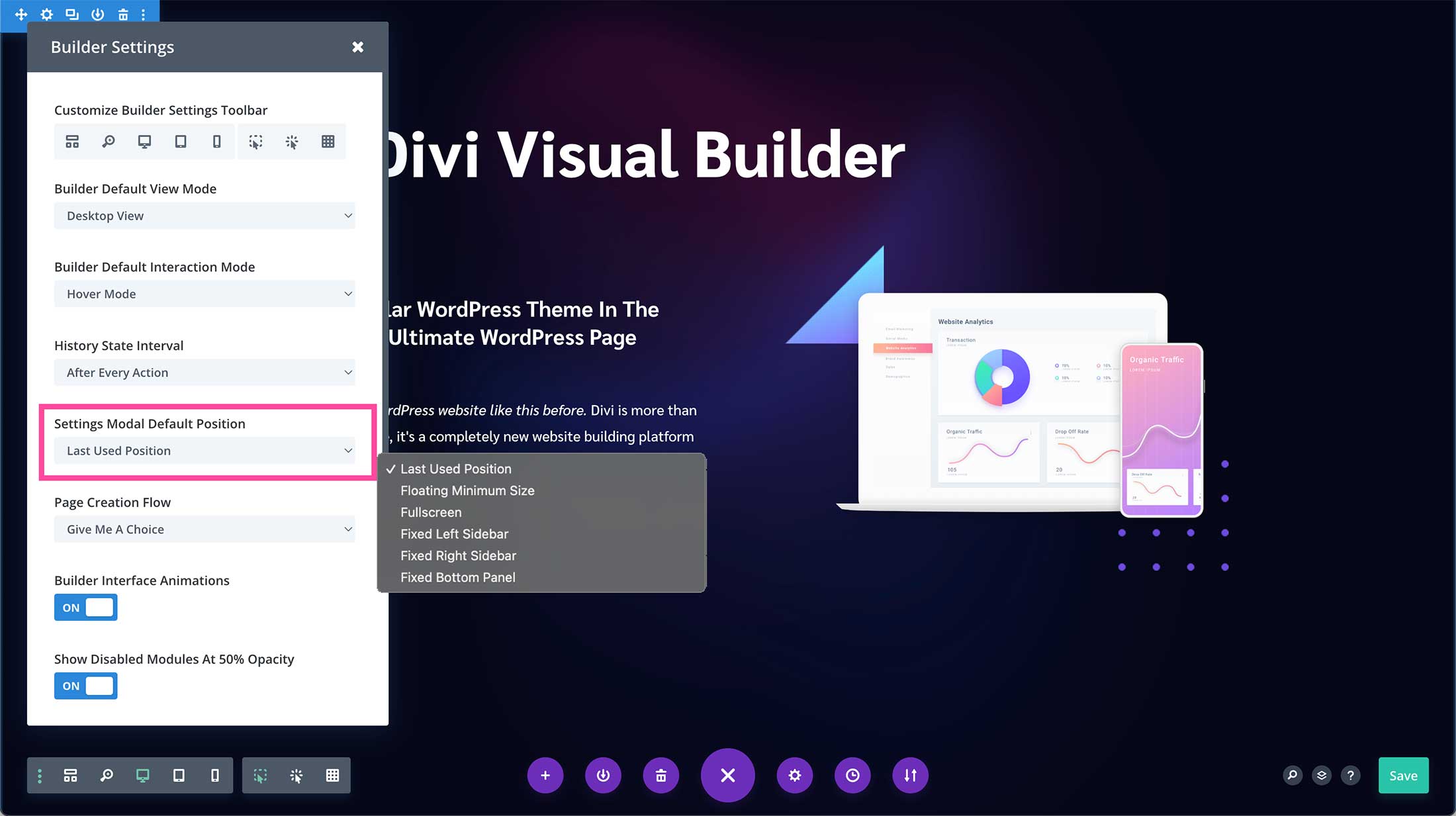
You can choose from Last Used Position, Floating Minimum Size, Fullscreen, Fixed Left Sidebar, Fixed Right Sidebar, or Fixed Bottom Panel.
Page Creation Flow
Here you can choose how new pages are loaded. You can choose for the page to load as a build-from-scratch page, or with the Divi Library window open, by cloning an existing page, or with the three options presented with Give Me a Choice.

Builder Interface Animations
Toggle this option on or off to enable or disable the Divi Builder animations that happen when you click an object.
img
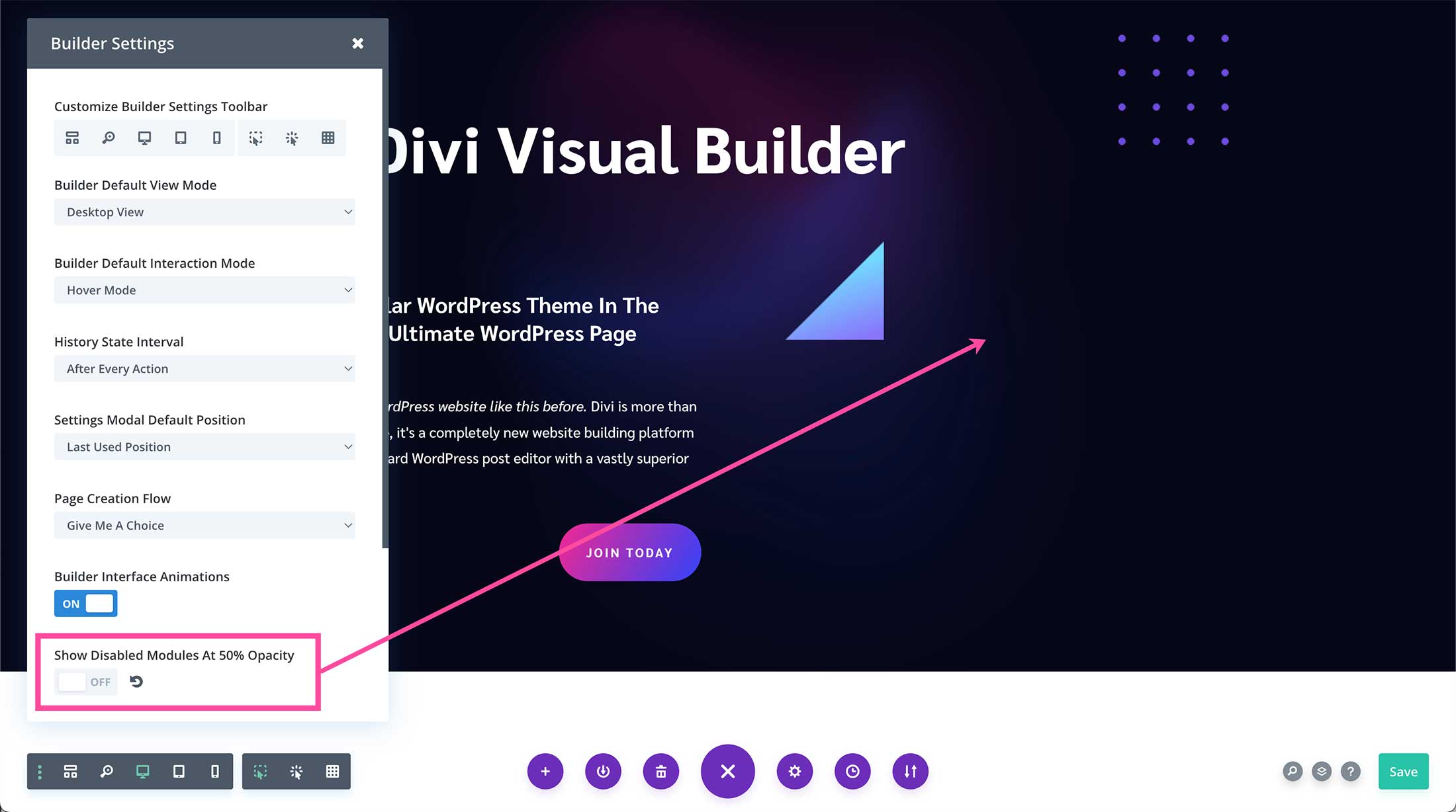
Show Disabled Modules at 50% Opacity
Toggle this option on to show disabled modules at 50% opacity. Disabled modules are modules that are hidden from view depending on what device is being used (desktop, tablet, or mobile). When you’re working within the Visual Builder, it’s helpful to have disabled modules displayed at 50% opacity so you know they are disabled for the view just by looking at them.
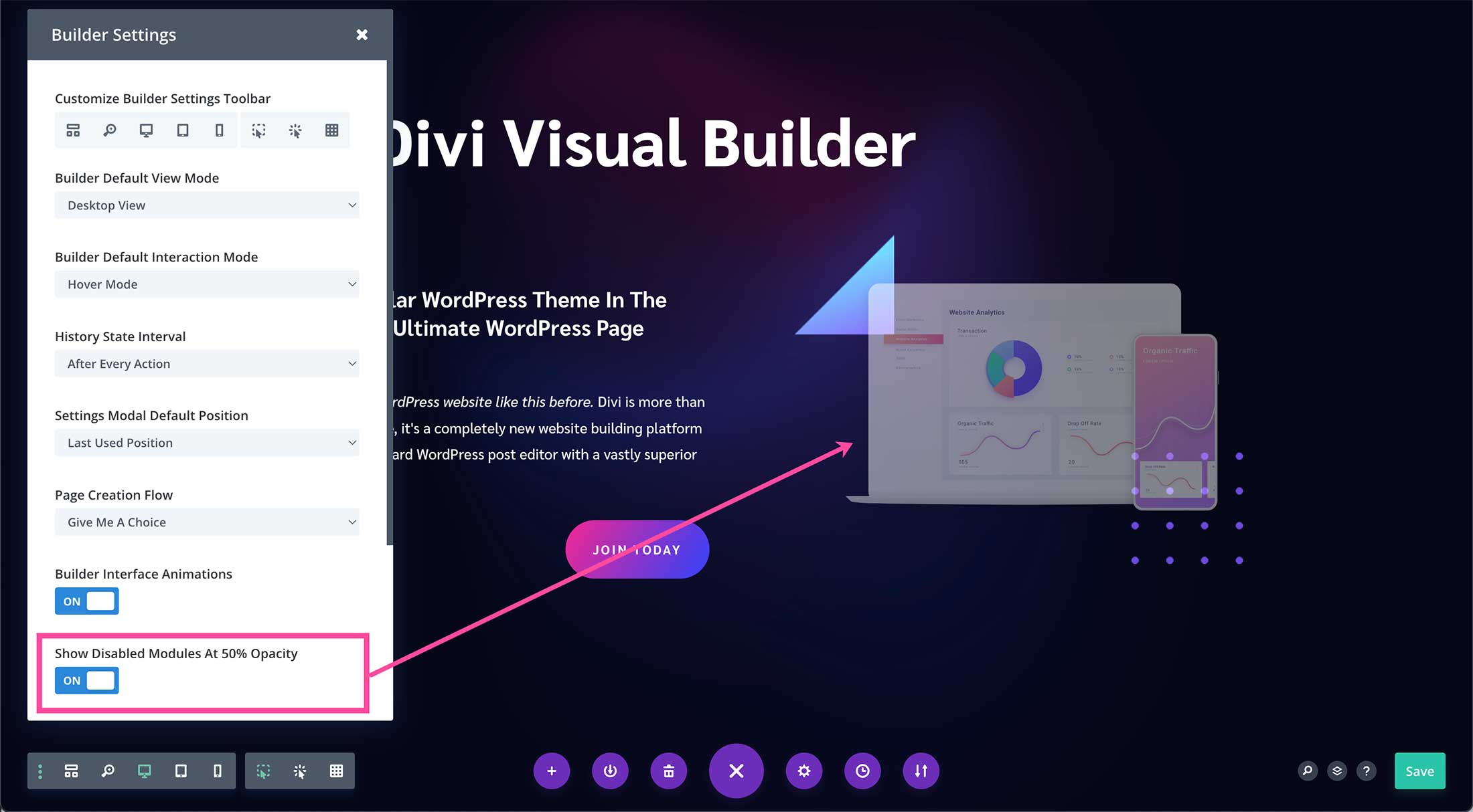
If this option is toggled off, then the disabled element will not show in the view mode it’s disabled on. For example, below I have the image module disabled on Desktop view and the show disabled modules at 50% opacity setting off. The result is the image is not showing.
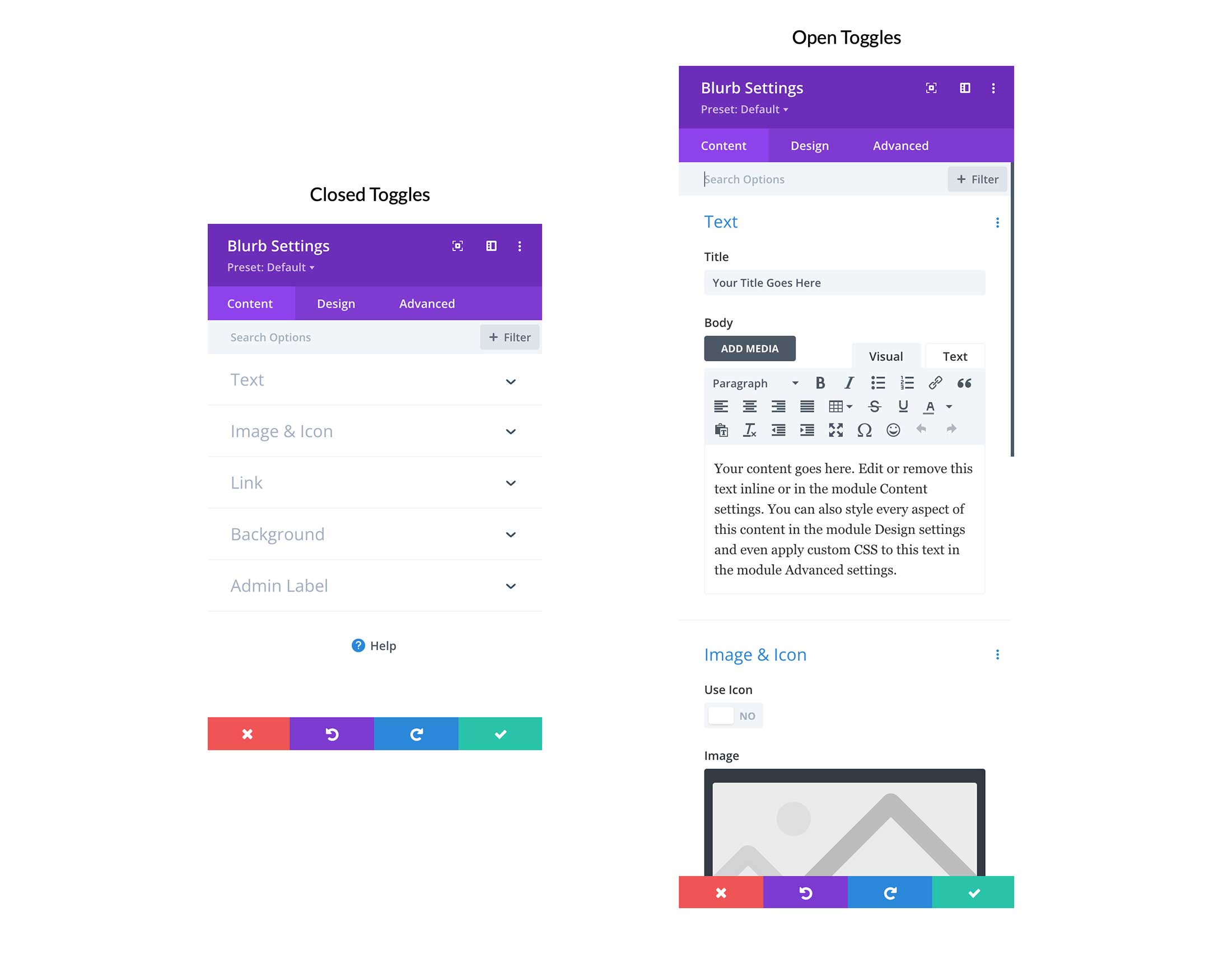
Group Settings Into Closed Toggles
When this setting is toggled on it will show module settings as closed toggles. If this setting is toggled off it will show the module settings as open toggles.
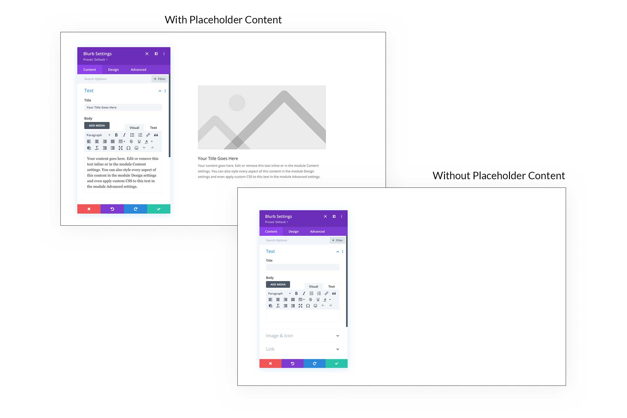
Add Placeholder Content to New Modules
This option allows you to choose whether or not you want modules to display placeholder content when you add them to your page. If you toggle this option off, new modules added to your page will not display placeholder content, as shown below.
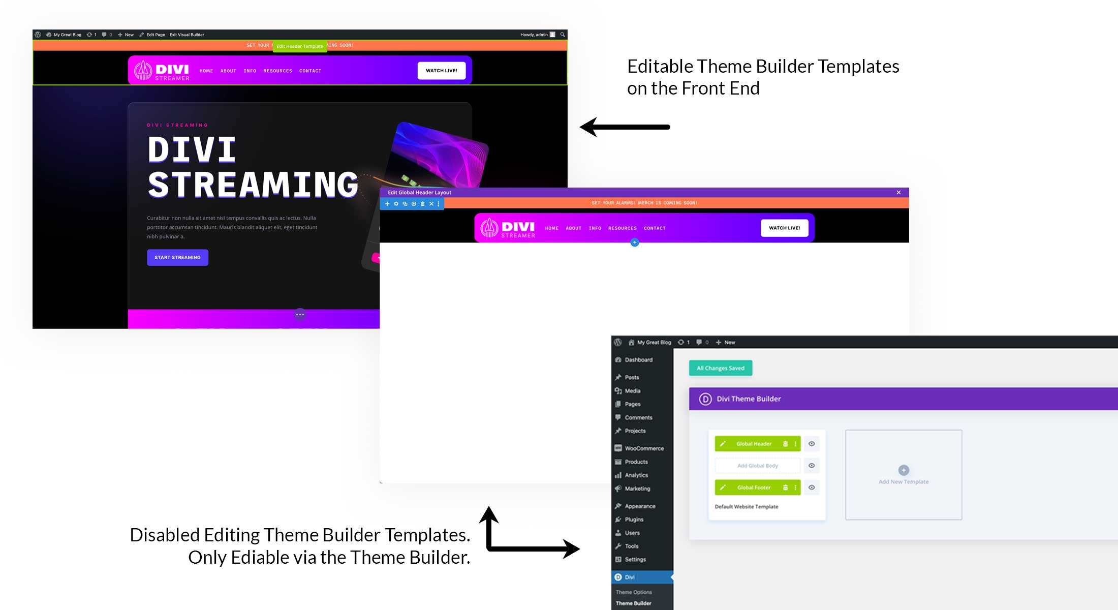
Theme Builder Template Editing
This setting allows you to choose whether or not you’d like to be able to edit Theme Builder templates in the Visual Builder. If you only want those templates to be editable through the dashboard Theme Builder, then toggle this option off.
Middle Toolbar Section
Now let’s look at the icons in the middle section of the Divi Toolbar.
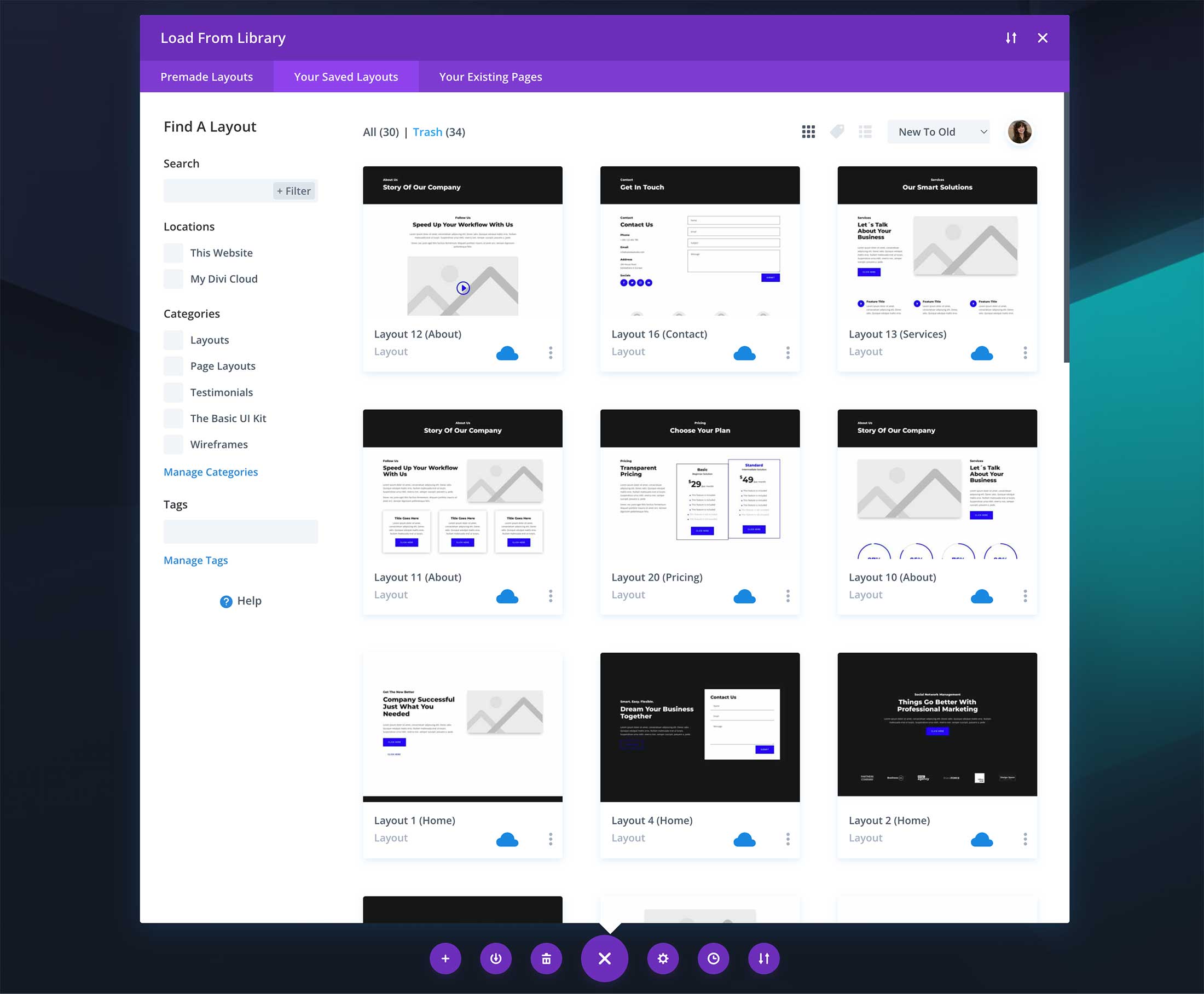
Load From Library
The plus icon loads the Divi Library when clicked. Here you have three choices: Premade Layouts, Your Saved Layouts, or Clone an Existing Page.
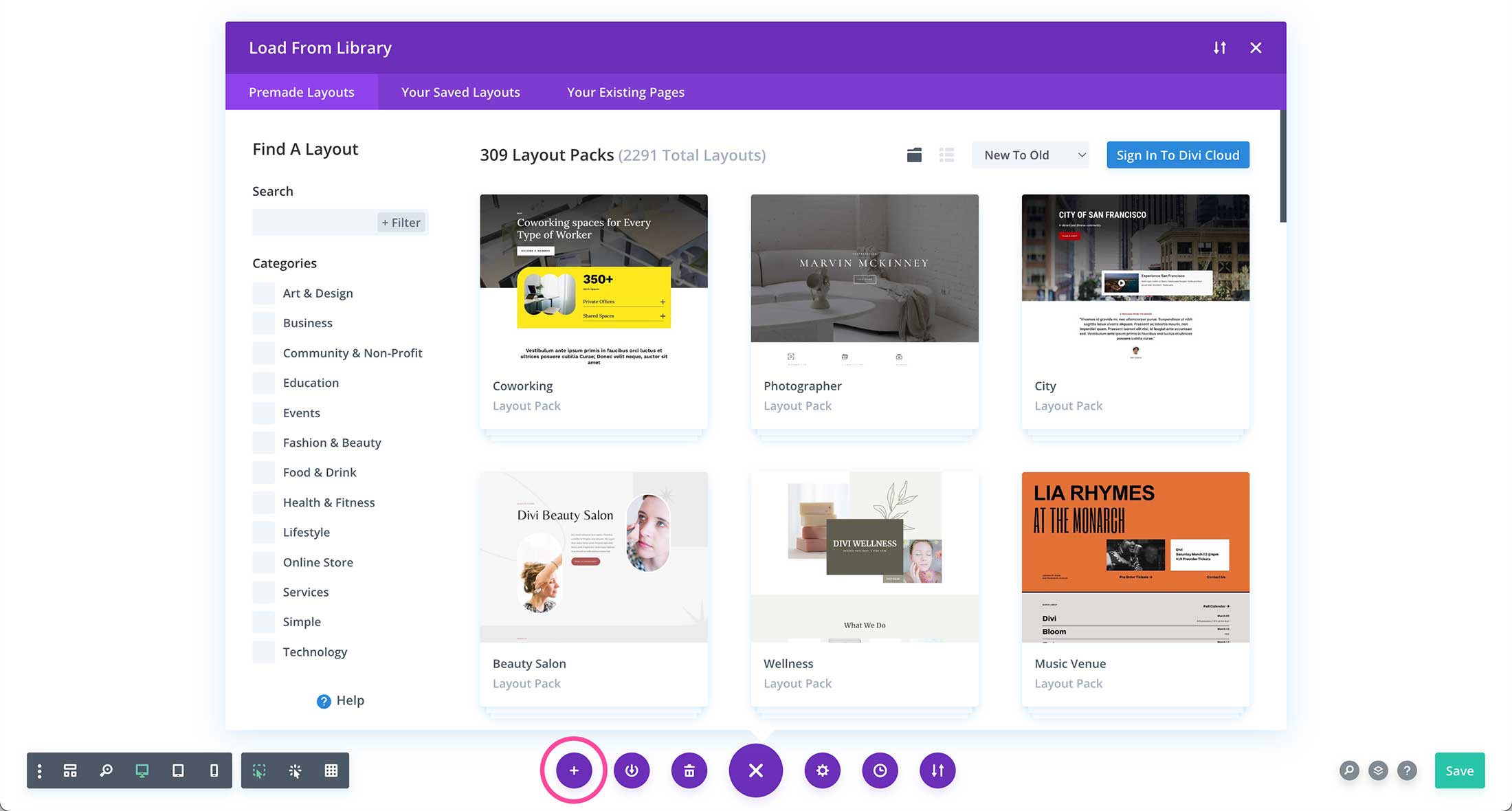
Premade Layouts
Divi comes packed with hundreds of free Layout Packs designed by our in-house design team just for you! If you’d like to use a pre-made layout on your page, click the Premade Layouts tab at the top of the Divi Library window and browse through the hundreds of available designs. You can even use the sidebar on the left to filter through categories or the search bar to find what you’re looking for.
Learn More: How to Use a Premade Layout Pack on Your Divi Website.
Your Saved Lyouts
In this section, you can load any layouts you have saved to your library and from your Divi Cloud. Click the “Your Saved Layouts” tab to view your saved layouts and use the sidebar options to sort and filter through your saved layouts. One way to use this feature is to create tempalted wireframes that you can save as a layout and then load onto new websites. Make this even easier by saving and loading from Divi Cloud which you can access on any Divi website that’s signed in with your account.
Learn More: Save and Loading Custom Layouts With Divi Library.
Clone Existing Page
This feature is handy when you’ve already designed a page layout you like and want to use the same layout on another page. To clone an existing page, click the “Clone Existing Page” tab and navigate to the page you want to clone.
What this does and when/why you’d want to use it.
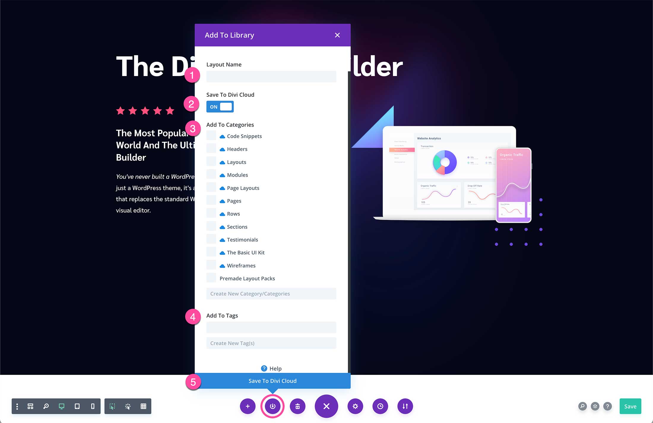
Downward Arrow – Save to Library
The downward arrow allows you to save your page layout to your Divi Library and/or your Divi Cloud Library. Once clicked, an options window will pop up where you can name your layout, assign it to certain categories and tags and save it to your Divi Cloud.
- Layout Name – Give the layout a name that’s descriptive and memorable. For example, Home Page Light Mode
- Save to Divi Cloud – To save this layout to your Divi Cloud toggle this option on.
- Add to Categories – Assign a category to this page to keep things organized. Categories that have a blue cloud icon next to them signify that they are Divi Cloud Categories.
- Add to Tags – Further sort and organize page templates by assigning tags to the page template you’re saving. Ex: Light Mode, Dark Mode, Holiday, Seasonal. You can also create new tags.
- Save to Library – Click this button to save the page template to your library.
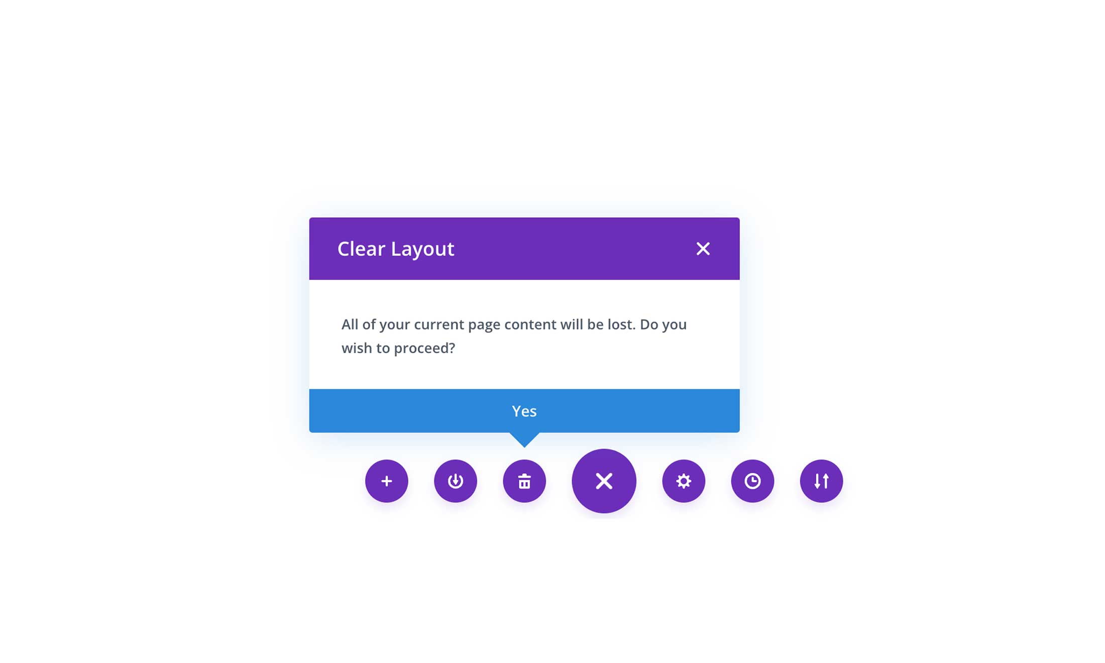
Trash Icon – Delete Page Layout
If you’d like to wipe your page clean and start fresh, simply click the trash can icon to delete the entire page design.
X Icon
This is the icon that either loads or closes the Divi Toolbar. When the toolbar is open and expand you’ll see an X and when it’s closed you’ll see a + to open and expand it.
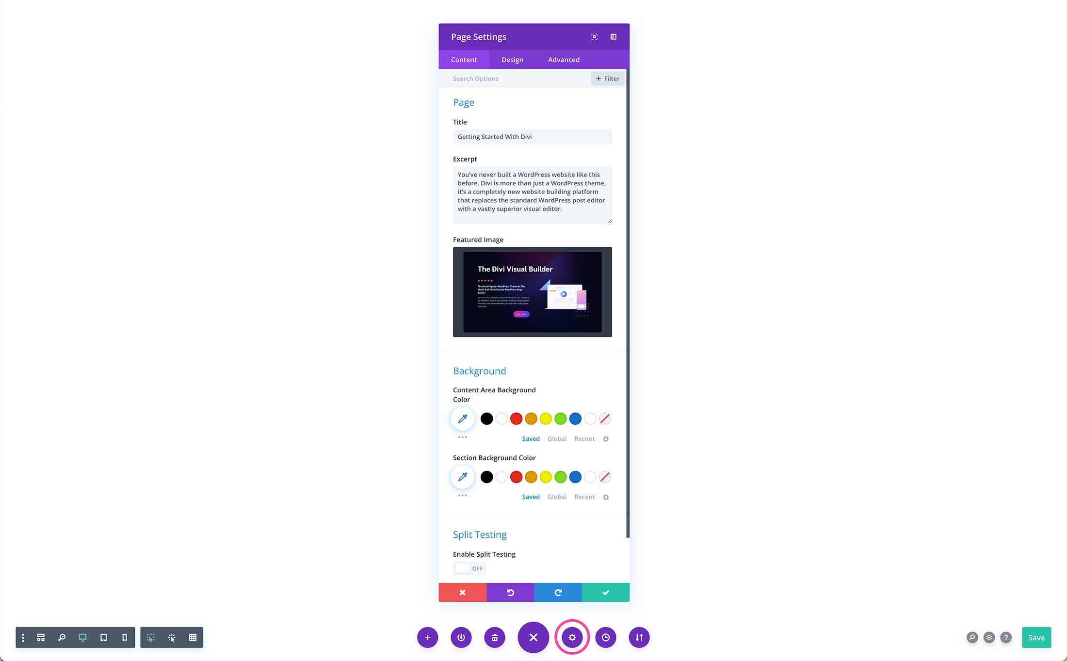
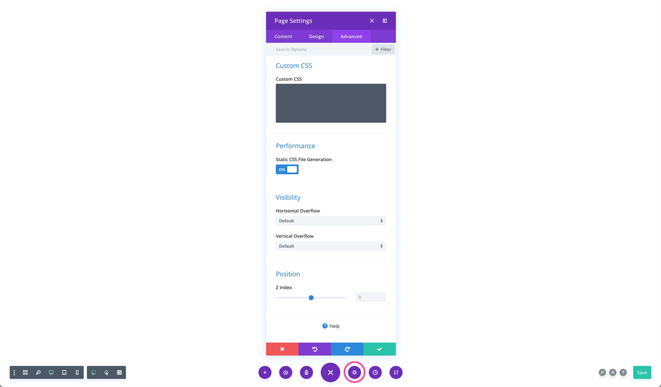
Gear Icon – Page Settings
The gear icon brings up the Page Settings window. This is where you can apply custom settings to that page only. These are not global settings, but will only apply to the page you are working on.
Page Content Settings
- Title – This is your Page’s title. You can edit it here or on the backend too.
- Excerpt – This is the excerpt description for the page.
- Background – You can add
- Split Testing – You can even do a split test on pages! Learn more about Split Testing here.
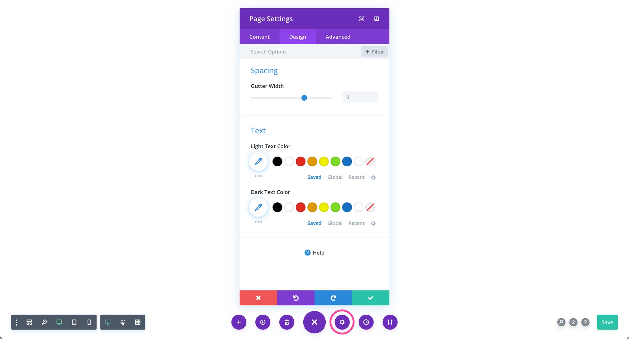
Page Design Settings
- Spacing – Gutter width is the amount of space in-between columns. The higher the number, the more space. IF you’d like to decrease gutter width spacing, type in a lower number or drag the range slider to the left.
- Text – For this page you can set a custom light text color and a custom dark text color.
Page Advanced Settings
- Custom CSS – Here you can type custom CSS to apply only to this page.
- Performance – By default, this option is toggled on. Generating a static CSS file improves the speed and performance of the page by compiling any CSS on the page into minified static CSS files that can be served more efficiently and cached without your visitor’s browser.
- Visibility – Adjust the visibility options on your page here. Learn more about Visibility Options here.
- Position – The z-index controls the element position on the Z axis. Elements with a higher z-index number will sit atop elements with lower z-index values. Learn more about Position Options here.
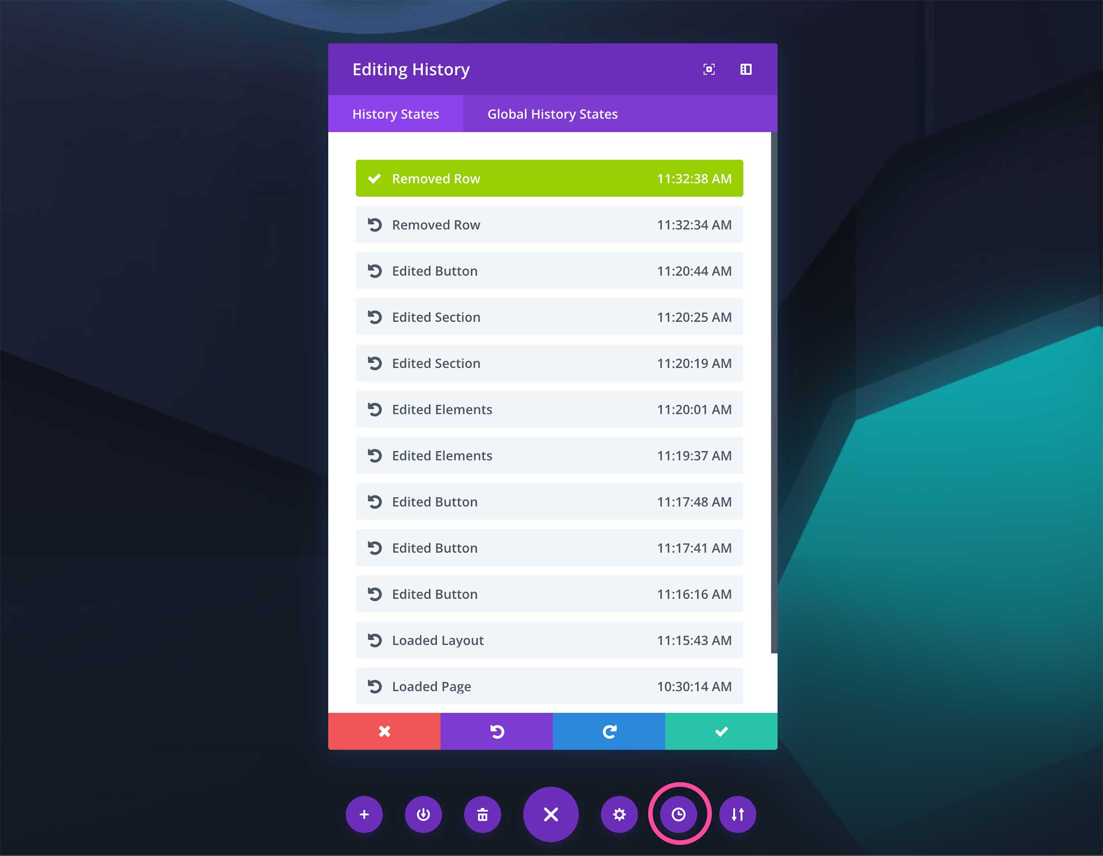
Clock Icon – Revision History
Click this icon to view the revisions to made to the page. Here you can easily view history states for the page you’re working on and global history states (like eidts to a global footer, header, or module).
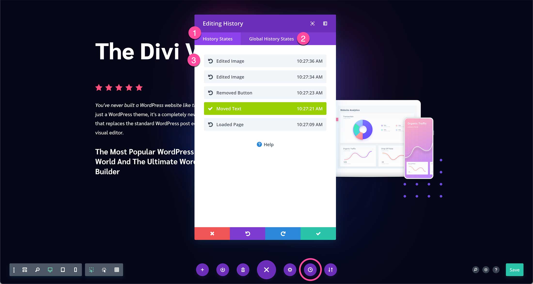
To view the changes you’ve made so far, click on the action toggle.
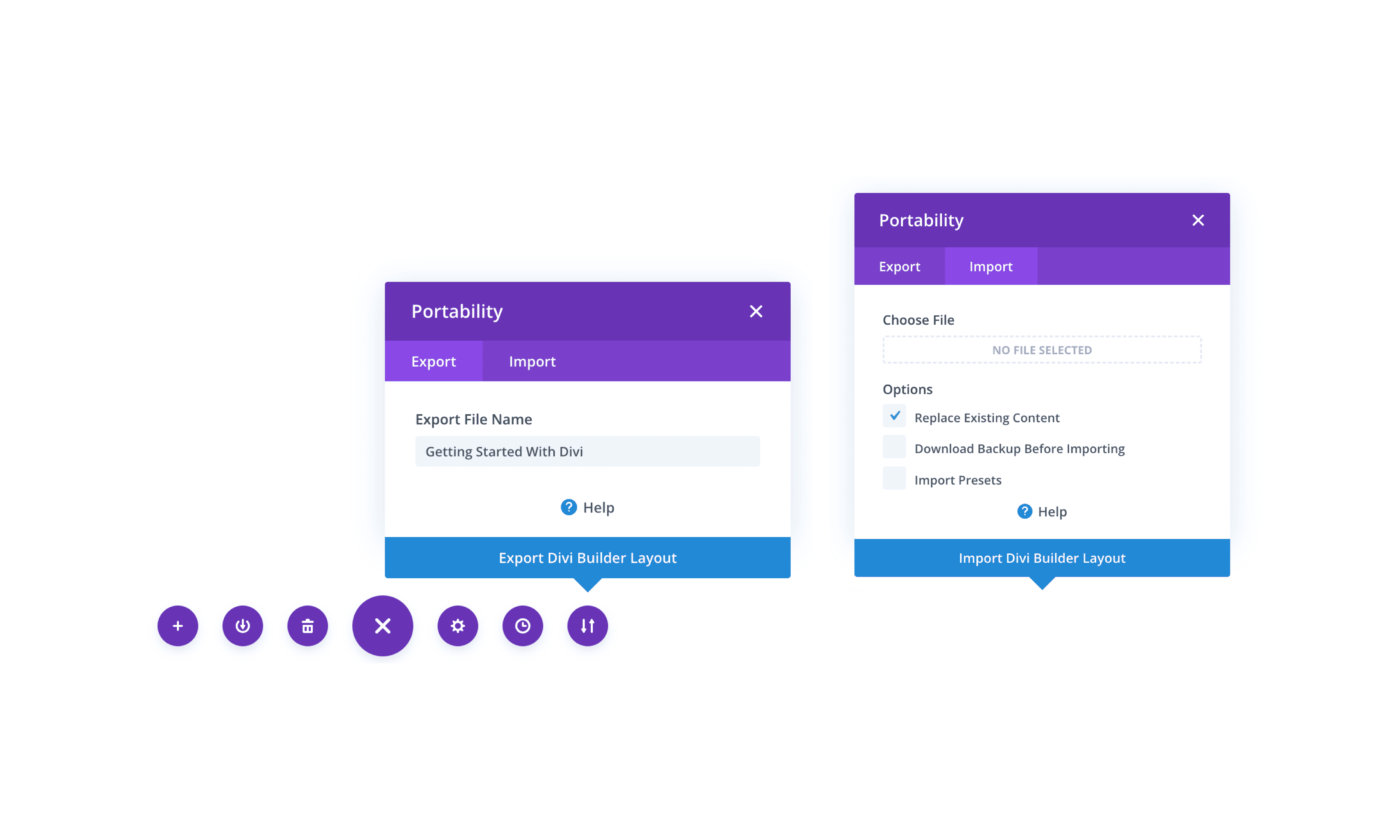
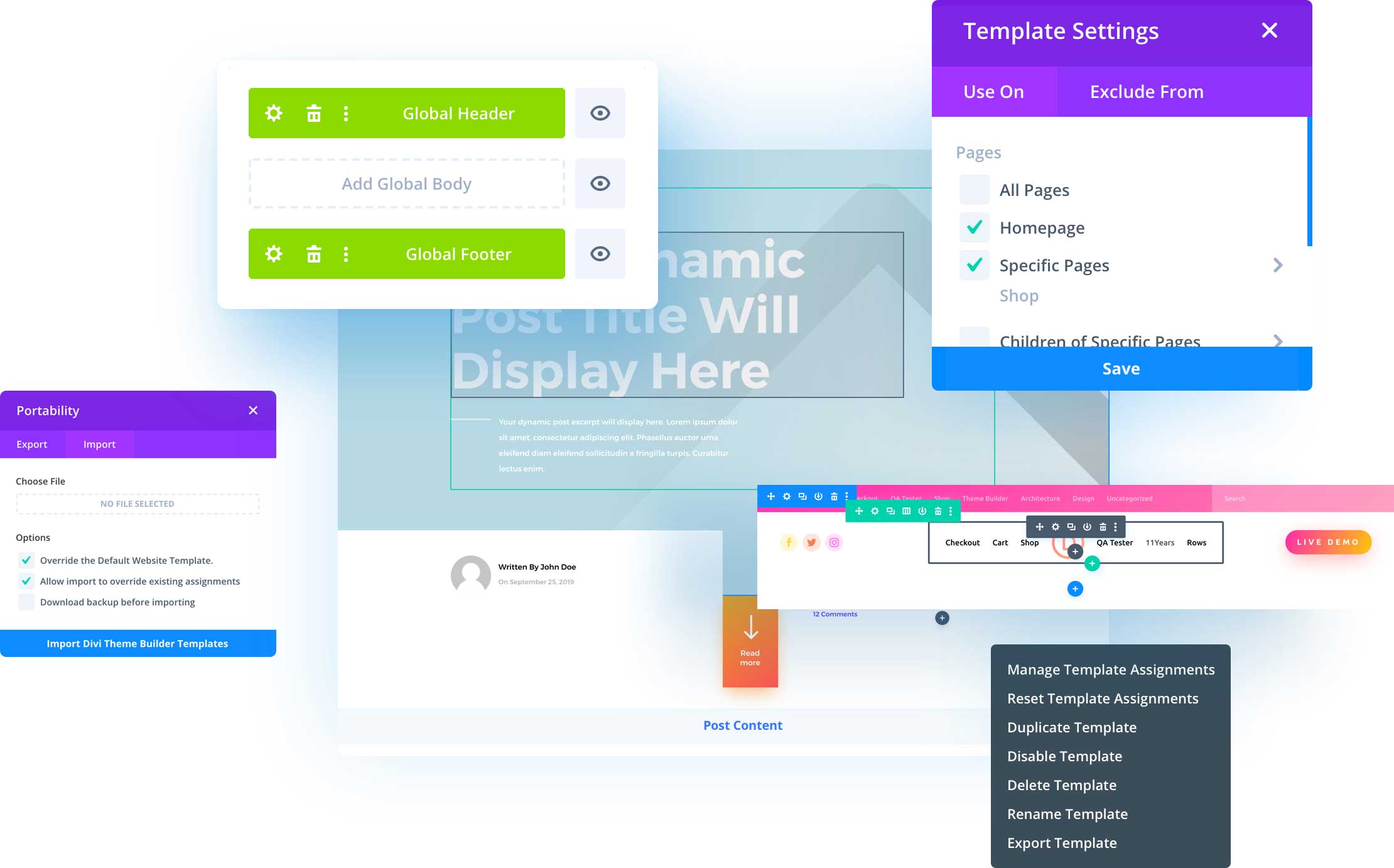
Portability Icon
Click this icon to Export or Import page layouts. Learn More Here: Importing & Exporting Divi Builder Layouts & Library Collections.
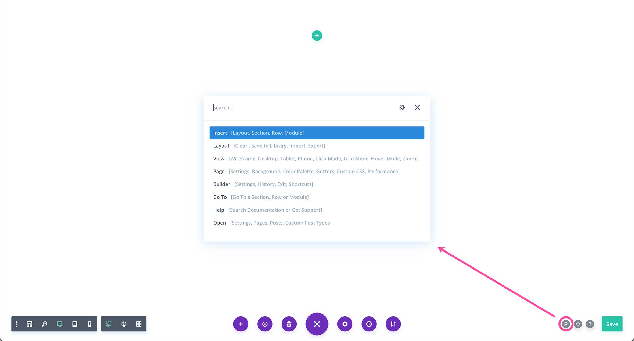
Search Icon
The search icon helps you quickly access what you’re looking for. You can change your device view, manage the page layout, access builder settings, search documentation, open elements, and more. If you’re ever looking for something within the builder and don’t know where it is, use this search feature to find it.
Layers Icon
Click this icon to view the design layers on your page. You can open and close all of the layers and use the filter function to quickly find the design element you’re looking for.
Drag and drop the layers to rearrange the page design, or use the icons on the layers to access settings, duplicate that item, or delete it.
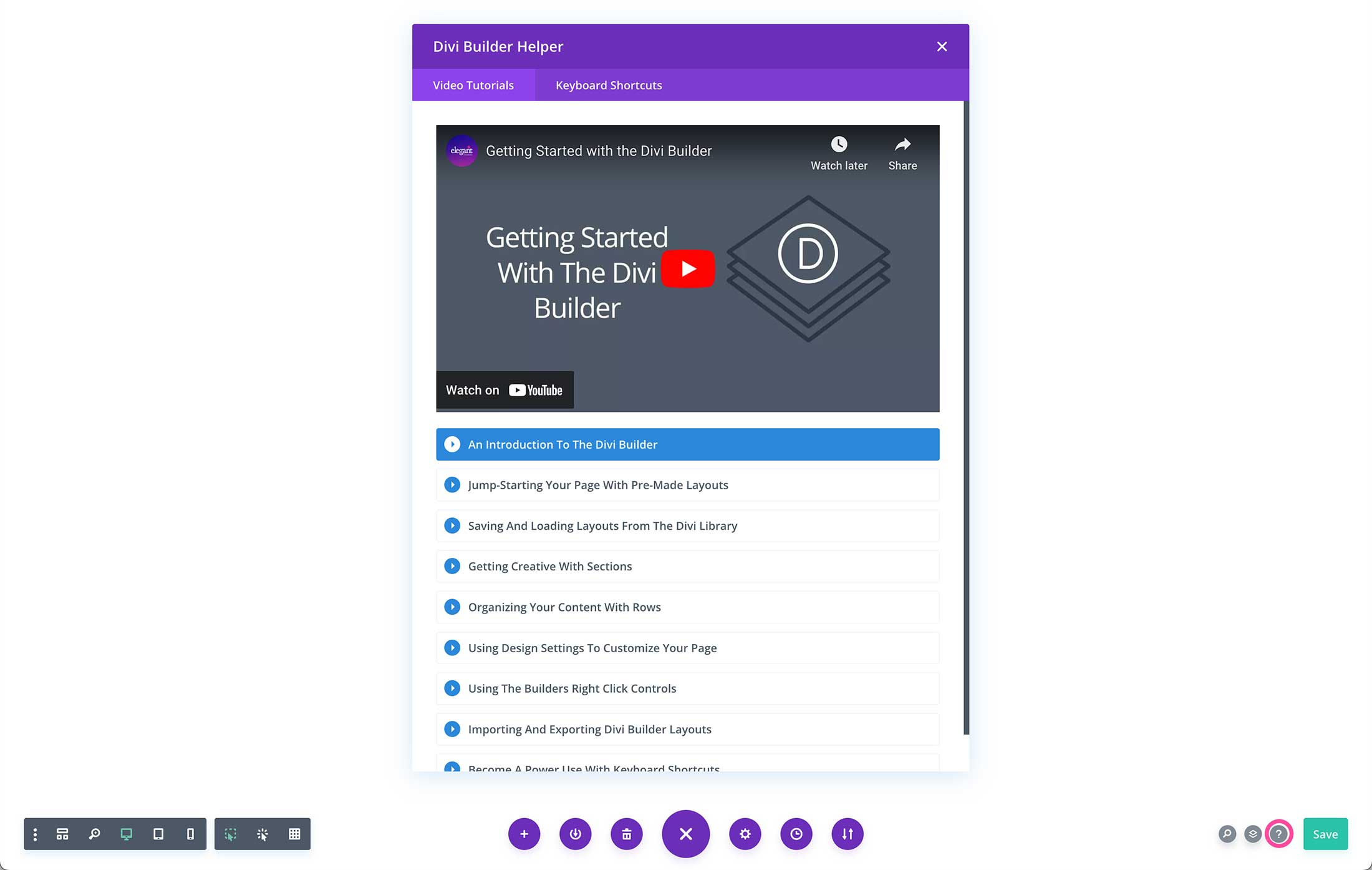
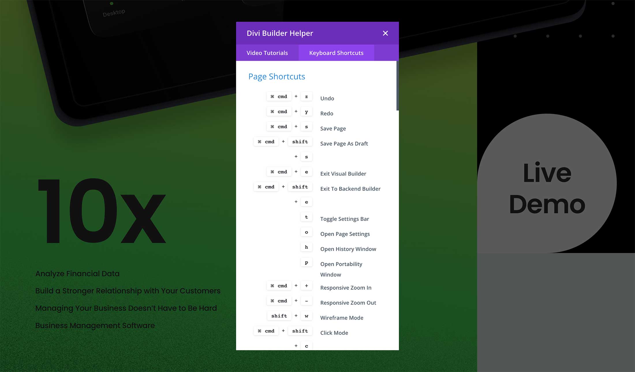
Divi Builder Helper
This question mark icon loads the Divi Builder Helper when clicked. Here you can browse Divi’s documentation, watch how-to videos, and look up keyboard shortcuts.
In the Video Tutorials tab, click on the topic you’re interested in and watch the video on-screen right there. To view all of Divi’s Documentation, visit Divi’s Documentation Hub.
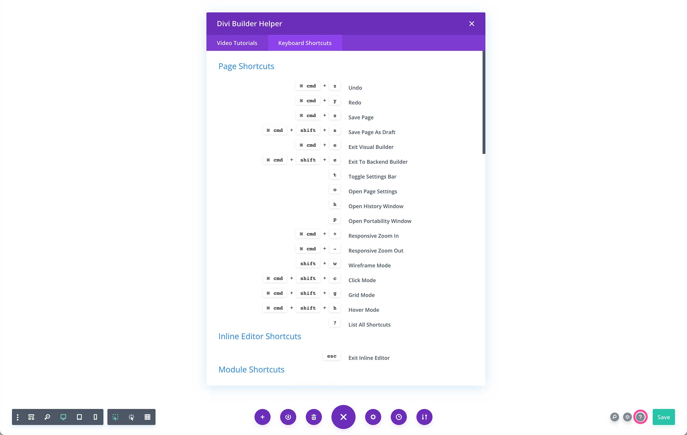
In the Keyboard Shortcuts tab are listed all of the keyboard shortcuts available on both Mac and PC. Mastering keyboard shortcuts can help speed up your design process and quick access and edit elements. Learn More: Divi Keyboard Shortcuts.
Save
And of course, there is the Save button! A feature you’ll use often. Before exiting the Visual Builder it’s important to save your design. Divi automatically saves your design periodically, but this button is here for instant saves too.
Save Divi Visual Builder Settings
Always make sure to save your work! The Divi Builder periodically auto-saves your work, however it’s best to do a final manual save before exiting the Visual Builder.
To save your design you can click the green Save button at th bottom right of the screen, or use the keyboard shortcut cmd + (mac) or ctl + s (PC). Then click “Exit Visual Builder” on the top toolbar to exist the Visual Builder.
Divi Builder Capabilities
Let’s take a look at what you can do with the Divi Builder!
Divi Gives You Complete Design Control
Divi isn’t just a WordPress theme, it’s a complete design framework that allows you to design and customize every part of your website from the ground up. You have control over everything down to the finest detail. Create the perfect websites for you and your clients. Explore all the design features that Divi has to offer!
Responsive Editing
Making responsive websites is easy with Divi. Divi is responsive by default but takes responsive design a step further by giving you complete control over every design setting on each mobile device. This allows you to perfectly tailor the appearance of each element on computers, tablets and smartphones.
Let’s explore some of the core features that makes Divi, Divi!
Essential Features of the Divi Visual Builder
Let’s take a look at the essential features of Divi’s Visual Builder and what’s available to you at your fingertips.
Design Visually on the Front End
With Divi’s Visual Builder, you’re able to drag and drop elements, format text, resize design elements, adjust responsive sizing, and show or hide elements based on the device being used.
The Theme Builder
Divi’s Theme Builder is a powerful way to build your website templating system using the power of Divis’ Visual Builder to design your website’s header, footer, product templates, blog post templates, category pages, project templates, 404 page, and more.
Drag and Drop to Move and Resize Elements
With Divi, you’re able to design complex layouts by dragging and dropping elements on the front end. That way you can see how your changes look visually before saving and publishing your design. You can also resize elements on your website by dragging the sides of the elements to adjust settings like height, width, padding, and margins.
Copy and Paste Styles
In Divi, anything can be copied from one element and pasted onto another. You can copy individual settings, groups of settings or even copy an element’s entire design and transfer it to another element on the page. No need to open up design settings and edit things over and over again. Design it once, and then just copy and paste.
Extendable Stlyes
If you have a design style that you just created, and you want to use that elsewhere on the page, or even across the entire page, you can simply extend that style automatically to your desired location. Update hundreds of elements at once! Control exactly where and to which elements your styles should be extended to. For example, let’s say you just crafted the perfect button style, but you have dozens of buttons on the page. You can extend that style to the rest of the buttons instantly by extending the style.
Keyboard Shortucts
Keyboard shorcuts are the key to ultimate efficiency. Divi comes with a full range of keyboard shortcuts that advanced users can use to speed up their work flow significantly. Once you get the hang of using shortcuts, you will wonder how you ever lived without them!
Multi-Select & Bulk Editing
If you want to edit multiple elements at one time like a group of images, then use Divi’s multi-select bulk editing capabilities! To select multiple elements press Cmd or Ctrl and click each element you want to edit on the page at once. You can then edit these elements at the same time, changing their style and content together or moving them to different locations on the page as a group.
Find & Replace Styles
Make sweeping changes across your entire page instantly, saving you hours upon hours of editing time. Using find and replace allows you to change any design value, such as colors or fonts, across the entire page or within specific locations. Instead of opening up each element individually and changing colors over and over again, just find and replace across the entire document.
Global Website Styles
Customize your website with its own overarching design system by editing the default design of any element. When you modify a module’s default design, it updates across your whole website at once. Site-wide theme building plus site-wide design editing is the ultimate combo.
Global Website Colors
Divi lets you create a global color palette for your website. These global colors are dynamic and can be changed at any time. This allows you to quickly transform your website’s color scheme in just a few moments.
Advanced Code Editing
While you don’t need to know code to use Divi, you still have the option to write and edit code if you desire! Divi comes with a a fully-featured code editor that makes writing and editing code so much easier and enjoyable. Features include syntax highlighting, error reporting, auto-complete, color picking, multi-line select, search, find and replace and more. Add custom CSS to any element or add your own code to any page using the Divi code module or Page Settings Custom CSS area.
Build Your Design Library
Each installation of Divi comes with access to the Divi Library where you can save design elements, page layouts, headers and footers, and more for easy access when you’re building websites. Divi also comes with thousands of premade layouts you can use any time!
Global Elements and Dynamic Content
With Divi, you’re able to save builder elements (sections, rows, modules) as global designs across your website. That means whenever you update a global element, it will automatically synch those changes anywhere else that element appears on your website, saving you time and headaches! Divi also has the capability to display dynamic content (like your logo, a blog post’s title, search results, and more) so that you can spend less time editing every single page and instead make changes with one click.
Mobile and Wireframe View Modes
There are multiple ways to build with Divi. You can freely switch between different view modes, choosing the one that best suits you or your current project. Zoom in and out, toggle through mobile device views, switch between unique interaction modes or build your page structures quickly in wire-frame mode. It’s up to you.
History, Auto Saves & Browser Backups
Divi has your back. Every action you perform while building is saved into your editing history. You can undo, redo and explore revisions with ease. If something goes wrong, like your internet going down or your computer crashing, Divi will automatically save your progress so that you can restore it.
Right Click Options
Divi also comes with powerful right-click options that make designing even faster! Learn all about what’s possible with Divi’s right-click options here.
Divi Builder Best Tips & Practices
There are many ways to use Divi in your design business and each Divi designer and developer will have their own method and workflow that works for them and we encourage you to find what process works best for you! However, we have a few recommendations on ways you can maximize Divi, simplify your workflow, and streamline your design processes.
Switch Back and Forth Between Visual Builder & Wireframe Mode
One of the great things about Divi’s Visual Builder is that it’s easy to switch between editing on the frontend and editing on the backend. Changing between both views takes literally less than one second. Switching between viewing your design on the frontend and viewing the wireframe layout can help you quickly drag and drop elements and view the structure of your design.
Use the Zoom Out Feature
I’m sure you’ve done it too – taken a screen shot of your page design to see how everything looks together. The Zoom icon on the Divi toolbar allows you to quickly take a bird’s eye view of your design instead of having to save, exit, and take a screenshot.
Divi Builder Resources
- 7 Divi UX Best Practices You Should Keep in Mind
- 7 Practical Tips for the Divi Theme Builder
- Divi Keyboard Shortcuts