Using Divi Visibility Options
The Divi Visibility Options give you control over when elements are visible or hidden.
The Divi Visibility Options give you control over when elements are visible or hidden. This is helpful when you want to show or hide certain content based on what device your visitor is using. Within the Divi Visibility Options, you have the power to show or hide content based on viewport device size. You also have the option to control how you display overflow content. Inside the Divi Visibility Options, you’ll find two different ways to help you gain control over how your design looks and works across all screen sizes.
How To Access Visibility Options
Visibility options are available in all sections, rows, columns, and modules. There are several ways to access the Divi Visibility Options. Let’s take a look at the options.
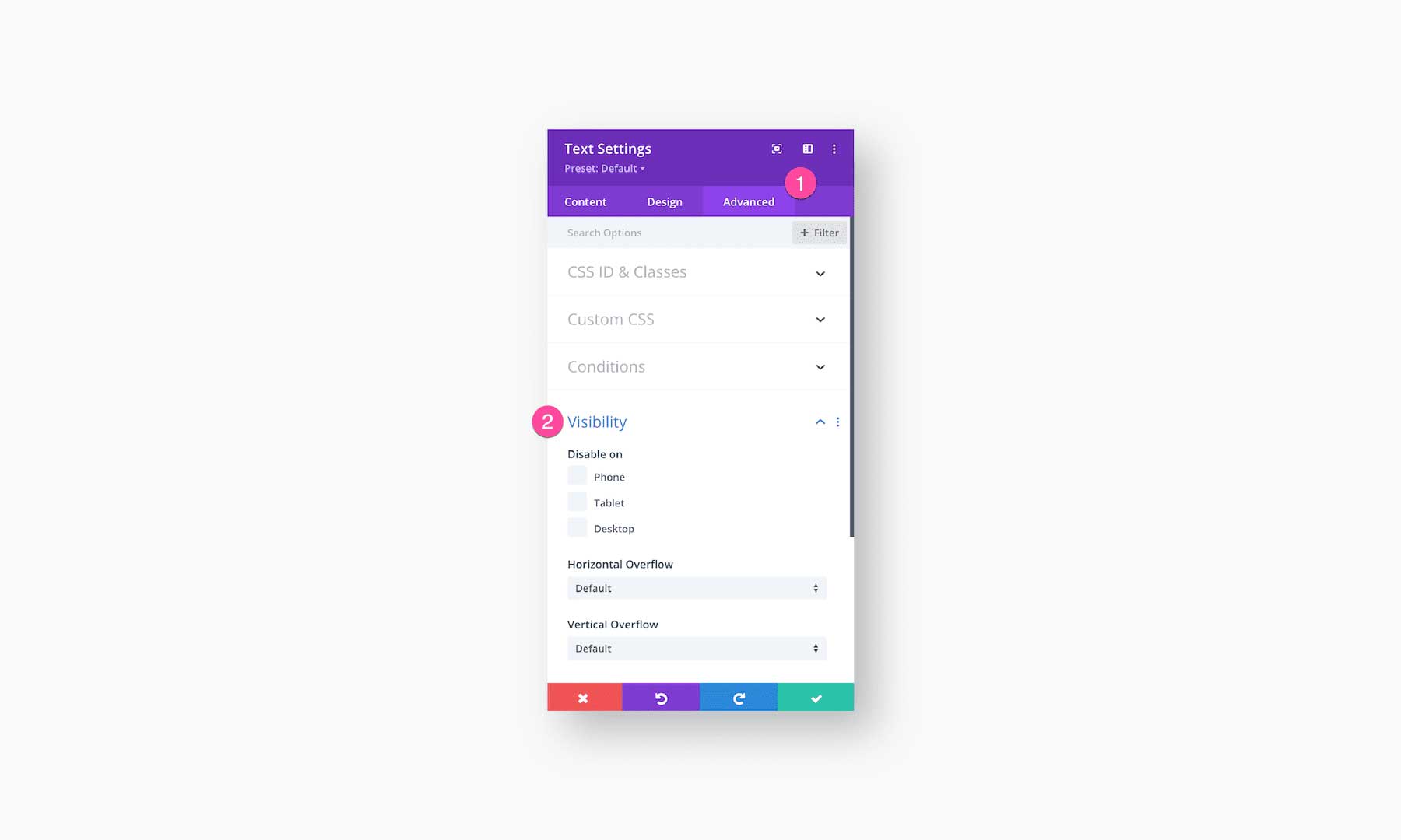
Within the Element’s Settings
Open up the element’s settings and navigate to Advanced > Visibility. Here, you’ll have the option to disable that element on Phone, Tablet, or Desktop by clicking the corresponding checkmarks.
Right-Click
You can also quickly access the Divi visibility options by right-clicking on the design element. Continue by clicking on Design and selecting which devices you want the element to be hidden on.
Disabled Elements Display At 50% Opacity
When you choose to disable an element, that element will display at 50% opacity in the Visual Builder when you view it on the specified viewport. For example, if you choose to hide an element on a Tablet size device, that element will be at 50% opacity on a tablet preview, but at 100% opacity on a desktop preview.
How the Divi Visibility Options Work
The Divi Visibility options include hiding elements on device viewport sizes, but also the option to hide or show overflow content. Let’s take a look at both of these settings.
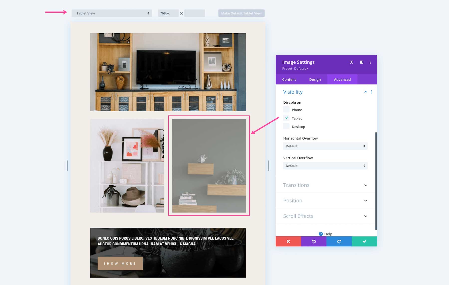
Disabling an Element on a Device
With the Divi Visibility Options, you can choose to hide elements on a specific device. This is helpful when a design element looks great on a desktop but not so great on mobile devices. In this case, you can use the Divi Visibility Options to hide that element on phone and tablet devices.
To disable an element per device, simply click the checkbox next to the device you want the element disabled on.
Device Viewport Sizes
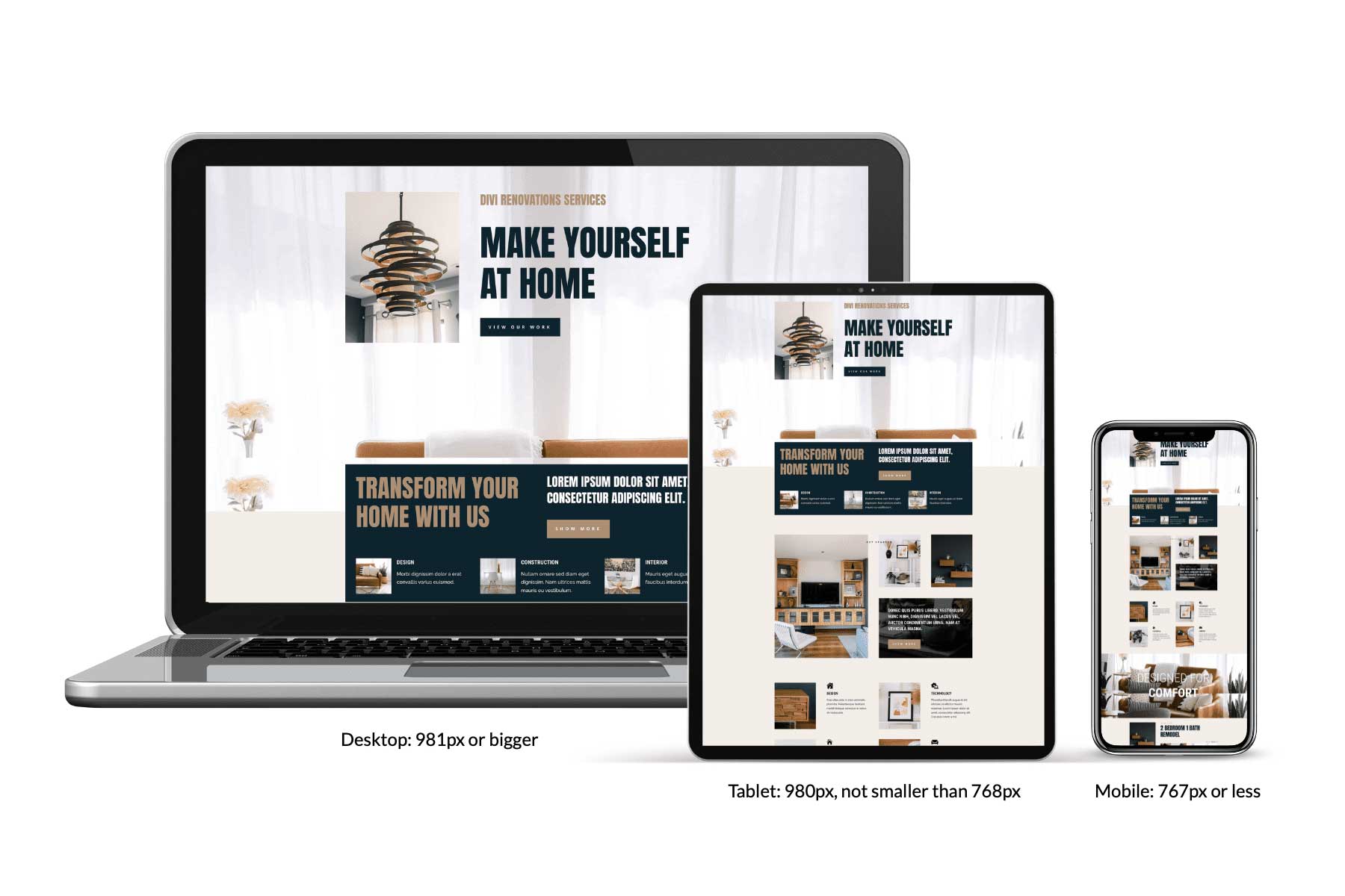
Divi determines device viewport sizes (the width of the device) as follows:
Desktop: 981px or bigger
Tablet: 980px and not smaller than 768px
Phone: 767px or less
Setting the Content Overflow of Elements
In CSS, everything is in a box. When content goes outside of that box it’s called overflow. There are two types of overflow: vertical (the y axis) and horizontal (the x axis). Within the Divi Visibility Options, you have the choice of how you display overflow content. Setting the overflow property determines what happens to the overflow content (whether it’s hidden or a scroll bar appears, etc). Take a look at the visual aid below for a demonstration of the overflow property options: default, visible, scroll, hidden, and auto.
Horizontal Overflow
Horizontal overflow is when the content exceeds the x-axis of its parent element (aka the content is too wide for the container it’s in). This can occur when the parent element has a specified width or max-weidth that is too small to contain all of the content.
Setting an element’s horizontal overflow determines what should happen if the content overflows an element’s container on the X axis (the horizontal axis).
- Default and Visible means the overflow content is not clipped, it will render outside of the element’s container.
- Scroll means a scroll bar will appear for the overflow content.
- Hidden means the overflow content is clipped and invisible.
- Auto means if overflow content is clipped a scrollbar should appear to see the rest of the content.
For Example: The example below shows text content that is too wide for the parent element with a max-width of 600px. Below are two examples of horizontal overflow: hidden and scroll.
Vertical Overflow
Vertical overflow is when the content exceeds the y-axis of its parent element (aka the content is too tall for the container it’s in). This can occur when the parent element has a specified height or max-height that is too small to contain all of the content.
Setting an element’s vertical overflow determines what should happen if the content overflows an element’s container on the Y axis (the vertical axis).
- Default and Visible means the overflow content is not clipped, it will render outside of the element’s container.
- Scroll means a scroll bar will appear for the overflow content.
- Hidden means the overflow content is clipped and invisible.
- Auto means if overflow content is clipped a scrollbar should appear to see the rest of the content.
For Example: The illustration below shows a text module with a height of 150px and a vertical overflow set to scroll. Here you can see that the content is too long for the box, so a scroll bar appears in order to show the rest of the content.
Tips & Best Practices for Using Divi’s Visibility Options
Simplify Mobile Design
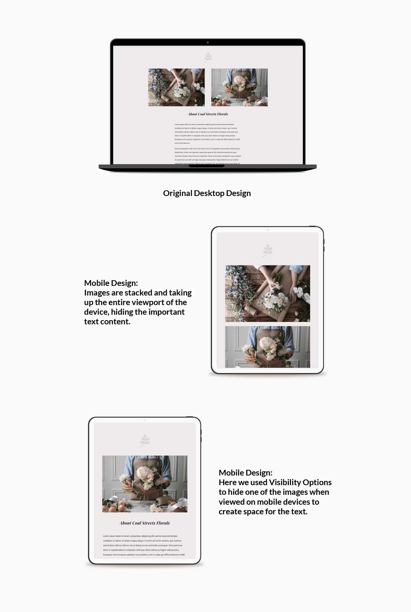
What looks great on desktops doesn’t always look great on mobile. Elements can become smushed, too small, and not render well. Simplifying your design for mobile devices is easy with the Divi Visibility Options.
Check out the example below. Here we have a section designed with two images and a body of text beneath it. On mobile, stacking two images on one another is not necessary and takes up too much visual space on small mobile devices. Disabling one image from showing on mobile devices delivers a simplified version of your design that looks great for mobile.