

Inspiration can disappear when you need it most. In a perfect world, we would all just wait until inspiration strikes again. Sadly, the world rarely works that way. Most of us need to deal with clients and deadlines on a weekly basis.
Like other writers and designers, I have spent long periods of time staring at a computer screen, waiting for something to happen. This frequently occurs when I have not had a good night’s sleep or when I have not done enough research on a topic. To avoid writer’s block, I do my utmost to stay up with the latest news and events. I also research every subject thoroughly before attempting to write an article.
Similar techniques can be used by designers. I believe that like writing, the hardest part of design is sometimes the idea, not the implementation.
Truth be told, I am a terrible designer. Beyond making basic edits to images and creating simple logos, I am fairly useless. The famous art quote “I don’t know anything about art, but I know what I like” was written specifically about me. Once I see a design, I know if I like it or not; however explaining to a designer what kind of design I need for a project has proved difficult in the past.
Over time, I learned how to find inspiration for web designs. Just like preparing an article, the key is to do your homework beforehand so that you know what you want and what you do not.
In this article, I would like to share with you some of the tips and tricks I have learned over the years that have helped me form a concept. I hope these tips prove useful to designers and non-designers alike 🙂
The Purpose of the Design
Every website design needs to have a purpose. You need to look at what your visitors need and then build the design around those requirements.
Practicality and usability should have a high priority. I have seen many corporate websites that use flashy banners and overcomplicated menu systems. While the designs looked good, they made it difficult to navigate the website. A classic case of form over function.
Bloggers frequently make mistakes with their designs too, such as adding too many advertising banners and images. These images distract the reader from the content area and increase your page loading time. It is also common for blog designs to lack important features such as a search box, archives links, and subscription links.
A practical way of reviewing what functionality your website design needs is to examine the design of websites within your niche. Break down what each design offers and what it does not. This will help you understand what works, and perhaps more important, what does not.
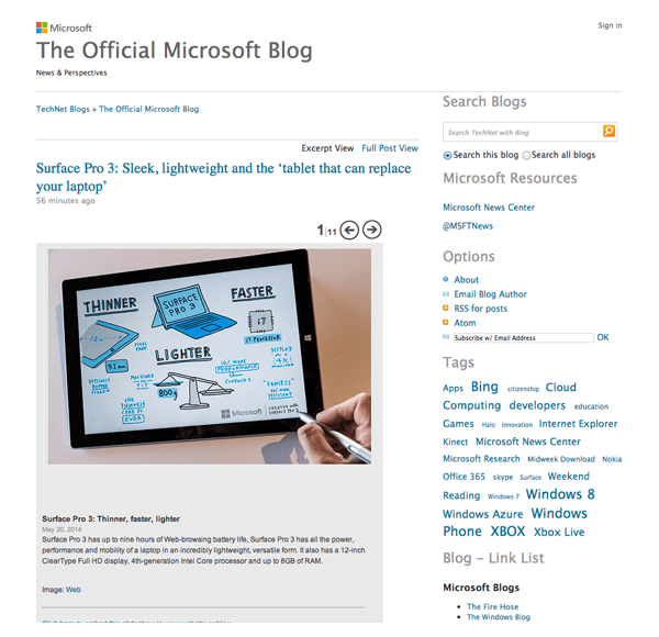
The Microsoft Blog has a clean practical design.
A great example of a good blog design is the official Microsoft blog. It has a clean and minimal design that is easy to read and easy to navigate. The central column displays the blog name and permalinks at the top; with posts underneath displaying large featured images.
The sidebar is a great example of what a blog sidebar should contain. It displays a search bar at the top, followed by a Twitter link, RSS subscription links, tag archives, links to other Microsoft blogs and tech blogs, and date archive links. All of this helps visitors find the information they want. There is no unnecessary widgets or banners.
When you are thinking about the structure of your website design, think about what is required, and what is not. A professional design is important; but the design still needs to be functional.
Choose Your Color Scheme
Colors play a big part on how a website is received by visitors. It is therefore important to think about color schemes when you are thinking about your logo and website design.
Gregory Ciotti published an interesting article last year that delved into The Psychology of Color in Marketing and Branding.
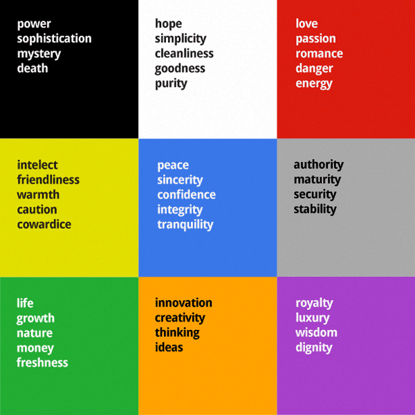
He noted that men and women prefer different colors. While blue is the favorite gender of both sexes, there was some variation in other colors. For example, with 23% of women listing purple as their favorite color, it is second in the popularity stakes after blue. In contrast, purple did not even make it into the favorite color list for men. In fact, in a questionnaire about their least favorite color, 22% of men chose purple. This illustrates that one color can attract one gender, but put off another.
Other colors are best avoided altogether. Brown and orange, for example, topped the least favorite color list for both men and women.
It has been shown that color schemes can affect the conversion rates of your products and services. In a case study on Performable, they changed the green action button to red. You may expect a green button to get more conversions as it usually signifies GO, while red signifies STOP; however that was not the case.
They actually found that the red button improved conversions by 21%. They believe this happened because the button color changed, but the main color scheme did not. This allowed the red button to stand out more than the green button that blended into the matching background colors.
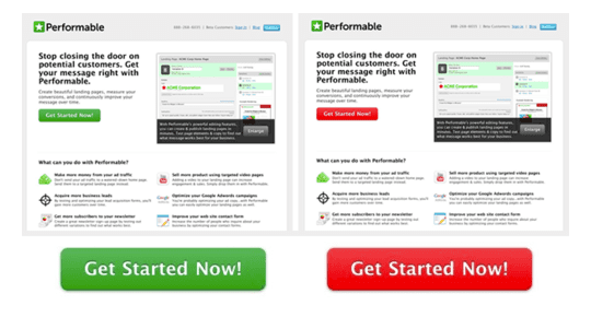
The green and red button test illustrated how colors can influence reader habits.
I do not profess to know a lot about the psychology of colors myself; though it is clear that the color of your website can dictate how visitors perceive you and your company. It can also influence conversion rates. It is therefore in your interests to understand what the colors of a particular color pallete signify.
For inspiration on your design’s color scheme, I recommend checking out Colour Lovers and Color Combos.
Find Design Inspiration
Looking at great designs can give you inspiration for your own project. You can find design inspiration in every day items such as magazines, business cards, album covers, book covers, and more.
If you are still struggling to find your groove, take a trip to your local art gallery or museum. The quiet nature of museums and galleries can help you block out the noise of every day life and focus on the art itself. Just sit back and be inspired 🙂
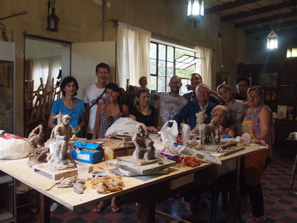
I was lucky enough to visit the Gabriel Dubois Art Museum in Alta Gracia, Argentina. Gabriel Dubois’s assistant still worked there. He is a world class sculptor and a man who was clearly has a passion for his work. It was truly inspiring.
Design blogs regularly publish beautiful collections of website designs and logos. These can help you understand current trends and let you see what other website owners and designers are doing.
Below is a small collection of design blogs that I recommend checking out.
- Design Shack
- Wallpaper
- Ab
- Just Creative
- Spoon Graphics Blog
- David Airey
- Design Modo
- This Isn’t Happiness
- Creative Bloq
- The DSGN Blog
Design galleries are also a great place to view beautiful website designs. You can use the galleries listed below to view thousands of professional website designs. They are sure to give you ideas about your own project.
- Design Bombs
- The FWA
- CSS Remix
- Admire the Web
- The Best Designs
- Best Website Gallery
- HTML Inspiration
- Site Inspire
- Pattern Tap
- Awwwrds
- CSS Heaven
- One Page Love
Final Thoughts
When you work online, you cannot afford to wait until inspiration comes to you. You need to be proactive.
Review what is important to your website’s functionality and throw away anything that is not important. You can then look at examples of website designs to help give you ideas on what you can do with your own design.
If you enjoyed this article, please subscribe to the Elegant Themes blog in order to receive updates of our future articles.
Article thumbnail image by Dooder / shutterstock.com


Hey Kevin nice Article! I like the parallax effect on your site. I just want to share that Time by time every work will become monotonous, so will be the creative* work, but the designer should proactively towards its passion & knowledge.
Thanks for the huge collection of blogs and galleries for giving my design passion an extra boost!
For design, in general, whether print or the web, http://bamagazine.com offers many free articles and videos. This is as good as it comes as to layout, color, fonts, object relationships, etc.
You can find pdfs to buy around $4 each for something that might interest you, or buy collections. I purchased the entire collection group for $99 when it was on sale, but it’s increased in price to $150 or more.
Thanks for the article Kevin. I agree to a degree that we should look at other websites that are doing well in our niche but that sometimes cages the creativity and instills fear of failure from doing something new.
One of our designers got negative feedback from his social circle, which mostly had programmers, designers, web designers and marketing teachers, when he used kitchen, dinning room etc backgrounds to show wedding dresses.
All of the them said this has not been done in our country before so, people won’t like it.
We went with it and guess what? Most people liked it. People on Facebook told us that it’s breath of fresh air to see cloths in unusual settings.
Great tips and a good list.
I used to browse through the designs on CSS Zen Garden (www.csszengarden.com). Every design has the same content, but because of the use of css, the designs change. Worth a shot.
Thanks RvdS. Thanks for the suggestion about CSS Zen Garden.
No Pinterest or Abuzzedo? dezignus or dribbble?
Very good point. Pinterest is a great place to find inspiration.
I don’t use it much myself, though I do realise that many people post great designs there.
Really impressive and very useful post for any designer or developer. Like specially design galleries. Thanks Kevin !!!
You’re welcome Dipak.
Sometimes, when we look for inspirations for clients, we end up cloning the inspiration itself. Then I’ll have to rework and make it unique. Is this something you guys too encounter?
Thank you.
I usually look for inspiration from the internet or maybe a little look at the old archives 🙂
Very good article with great links. Also, a good reminder for me about color choices. I just finished a site using bronze and gold, but it’s pretty close to brown and orange which I personally like, but apparently isn’t too popular with most people. Also, a nice reminder about buttons. I usually blend the buttons with the site, but that’s not the best way — maybe choose a third complimentary color so they stand out.
Thanks again for the great blogs.
Thanks Kirk.
I am normally quite unadventurous with colour schemes. Most of my websites feature a white background 🙂
Nick and Crew,
When will ElegantThemes.com be getting a redesign? I’d love to see what your team can do with Divi 2 as the basic theme. Also, elevating these amazing blog posts to the home page as well as freebies offered in the past year (and more) would emphasize how ET is a community, not just some run of the mill theme site.
The current site looks alright, but having a responsive site, spotlight on the a design gallery featuring ET designers, searchable themes and more would help set ET apart from the others.
As always, thanks for this inspiration and continual support. We’re ALL excited about what’s next!
Great article Kevin.
I like using hex-colors.com as it gives you the Monochromatic Colours, Triadic Colours, Split Complementary Colours, Analogous Colours and Complementary Colours of any hex colour.
[yes I know I’ve spelt colour the British way even though the site above uses the American spelling but it just looks too weird to me without the u!] lol
Quite often client will have an idea of the primary colour they would like but start looking blank when you ask them about things like secondary colours.
Don’t worry about that. I am Scottish so I use colour instead of color too. I usually use American English when writing for websites with a large North American audience (though I don’t think many people care what people use as they can still understand it.
The last days I found this:
http://usepanda.com/app/
Great links to use! I’ll be adding them to my collection. I find that it is harder to start from a template (Such as Divi 2.0) to build a custom site than to start from scratch at times. Though using a template can speed development time significantly, it is also 100 times easier to just roll with something you are familiar with and not create something unique and new.
Thanks for the great post!
Glad you liked the post Joseph.
Thanks for the interesting article and especially for the web design galleries. Awwwards is my typical go-to web for fresh ideas.
You’re welcome Daniela 🙂
You put into words exactly how I feel. I know what’s good, I am just unable to do it myself. I supposed a lot of us feel that way. Maybe one day. I have two resources I regularly visit when I’m about to make design changes:
A color scheme website. You input your primary colory and it will give you colors that go well with it – http://colorschemedesigner.com/
and another design gallery to add to your collection. I didn’t realize there were so many – http://unmatchedstyle.com/gallery
Yeah I am sure designers hate us. I know why designers hate design auction websites such as 99designs, but I always found them useful as it allowed me to see many different design concepts.
Nice work Brad! I love that color scheme site!!! its now in my favourites.
First class again. Grt ideas for sorting design block. Sometimes for the non-designer don’t over-engineer it. Follow examples such as Divi templates and saved layouts. Thanks Kevin!
Thanks Angus.
I must admit that before tackling this topic, I wasn’t sure if I could do it justice as design is not my strong point. Though it is something I need to deal with when working on a new project 🙂
As I venture out into my own freelance business, I find myself having to juggle creativity with admin, accounts, emails and other non-creative tasks. Jumping between different frames of mind can be a daunting task at times, but with the right collection of inspiration, I’m sure I’ll be all set to at least keep the creative engine running. Thanks for this article!!!
No problem Bonita. Glad you enjoyed the article 🙂
No problem Bonita. Glad you enjoyed the article 🙂
Great article. Thanks Kevin. It’s always important to be looking out for inspiration all the time because you never know what is going to inspire. Sometimes it’s the colors of a building, a business card or just browsing the web.
One of my favorite inspiration tools is an app called Zite. I dont know exactly how to describe it but when you set it up, you choose as many categories as you want. I set mine up initially with all kinds of design topics. So whenever I get free time, I can open it up on my iphone or ipad and just see whats new.
When I find something that inspires, whether its design, colors, blogging inspiration, tips or free tuts, I forward it to my email for further actions to be taken when I am at my desk.
I find myself forwarding 2-3 articles a day to my email and sometimes its things I want to try on a website, a blog post, to post on one of my social media accounts, or just some useful resource I want to stock away for later. Much like I do with all your posts.
Anyways, just thought I would share this tool as it is one of the most practical ways to be inspired without going and revisiting so many bookmarked sites.
Thanks for sharing the tool Geno.
For the benefit of others, this is the tool Geno is referring to – http://zite.com/
I just saw that Zite has been taken over by Flipboard 🙂
I use Zite (news reader) with Pocket (bookmarking app) to avoid emailing all the URLs to myself (which I used to do). I now send the articles I find on Zite to Pocket to read later.
Another much appreciated article!
I’m just gotten to the point with my site where I can begin changing things from ‘hey, I got it working!’ to ‘hey, let’s make it look pretty!’.
Actually something else worth noting about colour schemes etc and men in general. One in four men suffer from colour deficiency (colour blindness).
Hmm, that Performable case study is interesting. To be honest I would’ve clicked the green button but yeah obviously things that stand out get noticed more.
Btw the Microsoft blog looks clean but there are tons of other minimalist/simple designs that are better (plus the MS blog isn’t responsive). 😉
Ahhh, I hadn’t checked if it was responsive. My bad.
Yeah there are thousands of other great designs out there. When I am trying to use an example, I usually have to search a lot of designs. Sods law means that whenever I do try and find the perfect example for supporting my point, I cannot actually find the appropriate design 🙂
Though I do really love the Microsoft blog design. I think the minimalistic approach that themes that Divi use is much better than the flashy designs that many portfolio websites use.
Very interesting about the colours and conversion rates etc. I’ll keep that in mind.
Kevin,
Although I’ve been enjoying divi I have missed your posts over the past week. This post in particular speaks to my current state, as I am redesigning my site being careful to make it user friendly and maximize conversion opportunities. It can be easy to go overboard, especially when working with a theme like divi that offers so many options. I also replaced my logo using blue and orange instead of black only. Judging by the descriptions above, I may have chosen the ones that best represent me and my business. Ill call it intuition 🙂
I saw that you mentioned the spoon graphics blog. I’m a big fan of Chris’ work and I actually modified one of his vintage logos for use on my homepage banner just the other day. I will have to check out some of the other websites you mentioned here as well.
I’m curious to know your thoughts about my site’s new design with divi 2.0. If you have a minute to spare and feel like taking a look I would be very grateful. I welcome constructive criticism as an opportunity to learn, grow and improve. Thanks!
What a great design using Divi. Well done!
Hey Adam,
I hadn’t noticed that one of my posts hadn’t published for six days. I have three more great posts, including a fantastic guide on using WordPress multisite. More articles will follow next week 🙂
I love the look of your website. You have integrated your portfolio into the design really well. Was it much different with Divi 1.0?
Kevin
It was quite different although the portfolio is one of the few things I haven’t changed… yet. I just have to get around to making mock ups of all the new designs.
Ill look out for your new stuff. It’s convenient that I’m usually at my desk right around the time your posts go up everyday. 🙂
I really like the new logo and banner image you have put in. The logo is much better than the one you had there last week
The parallax effect in your site is awesome!
I tried a lot to make cool design like that but never got nothing close to it haha
James, your blurb icons are not visible on your home page.
I am running chrome on Windows.
Rgds,
John.
Thanks. I appreciate the input. Its easy to lose objectivity when you labor over something for so long.
I like how well you use the parallax effect in on your site. I tried it a few times but I haven’t quite gotten it right yet
Kevin, you’re right. Inspiration is a volatile gift. However, customers don’t want to wait. Thanks for the good post.
You’re welcome Paolo.