
WordPress is well-suited to take on the challenge of responsive images. Its default media uploader is complex, and supports image resizing, thumbnail cropping, and fine control over alt text and captions. And with a little help from plugins, image optimization is also a cinch. The time has come to start taking advantage of these features. Responsive images have found their way into the HTML Standards Specification and with the Picturefill polyfill, we can start using responsive images today.
A Short History of Responsive Images
Responsive images are images that adapt to the size and display density of the screen they exist on. Mobile phones, for instance, should not be downloading 1920px wide images, six times wider than the screen itself. We need a way to serve proper image sizes to all devices while still being responsible about bandwidth and quality.
Discussions about responsive images were of little relevance before the proliferation of mobile devices, tablets of all sizes, and gigantic smart TV’s. However, after Ethan Marcotte’s landmark book, Responsive Web Design, developers began to seriously consider how we can ensure that devices are only downloading the bytes they need. And since images are, on average, the largest part of your page coming down the wire, they were a good place to start.
Conversations happened. Working groups were formed. Developers appeared to favor picture, a newly created element, based on the video element, which used media queries to specify which image should be downloaded. Browser developers, on the other hand, preferred an extension of the existing img tag in the form of srcset, a syntax which had developers list out the images available, leaving the decision up to browsers as to which to download.

This went on for quite a while. In the meantime, developers at Filament Group began putting together a polyfill labeled “Picturefill,” embracing the former syntax.
But lo and behold, a solution has been reached. Or rather, a compromise. The HTML specification now has a slightly modified versions of both syntaxes, and they are already being implemented in browsers. And just recently, Picturefill 2.0 was released to reflect changes in the spec.
In this article, we’ll go over how to implement both versions of responsive images according to the HTML specification, using Picturefill 2.0 to ensure full browser support and WordPress’ built-in media features. We’ll also go over a plugin that can help do this task for you.
There’s a lot of code that follows. I’ve compiled it all into a gist for future reference.
Getting Started
First things first, responsive images will only work if you are using a responsive theme. Most themes from Elegant Themes are responsive by default. I will be using the Divi theme throughout this tutorial, but this code will work, with some modifications, for any theme that is responsive.
The first thing you want to do is figure out where your responsive breakpoints currently exist. These are the screen sizes at which a layout will change and are specified in your theme’s CSS stylesheet. For Divi, these major breakpoints exist at:
1405px, 981px, 768px, 479px
If you don’t know your theme’s breakpoints, try searching the “style.css” file for @media. The above breakpoints should work just fine on Elegant Themes.
The next step is to make sure that images are being created at these various sizes. When you upload an image to WordPress, multiple sizes will automatically be created. We can take advantage of this functionality to create images ready for Picturefill.
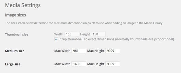
The easiest way to change these media sizes is to go to Settings -> Media. Here, you will see three image sizes: Thumbnail, Medium and Large. Thumbnail is often used in various contexts, so keep this as is. But Medium and Large can be used to get started.
In the Large Size box, we are going to specify our largest breakpoint in the max width text field: 1405. For max height, enter in “9999”. This lets WordPress know that you want the height to be proportional to the width, instead of cropping it. We can use the Medium size for our next breakpoint, 981px, again setting max height to “9999”.
Editing the Media settings
We’ve run into our first problem. There are not enough default sizes in WordPress to accommodate all of our breakpoints. We’ll have to create a few of our own.
Creating Image Sizes
It’s time to get into some actual code. This code should be added to the bottom of your theme’s functions.php file. Of course, all of the following code can also be specified in a custom plugin and will work just the same.
We are going to use the add_image_size WordPress function to create image sizes for the remaining breakpoints. These sizes will be automatically created whenever a new image is uploaded to WordPress.
// Create three new image sizes
add_image_size('smallest', 479, 9999);
add_image_size('small', 768, 9999);
add_image_size('largest', 1800, 9999);
Here, I created three new image sizes to reflect the remaining smaller breakpoints. For each, I specified a name, followed by a width and height (which I left at 9999 for auto). You will notice that I specified a “largest” size that doesn’t correspond to any breakpoint. This is a sort of catch all size for images larger than 1405 pixels.
This also might be a good time to install the Regenerate Thumbnails plugin, which will recreate thumbnails for existing images based on the sizes added.
Enqueuing Picturefill
Picturefill is a polyfill that ensures responsive images work everywhere, even in older browsers where new standards are not implemented. It uses Javascript to do its magic, so we’ll have to make sure that we enqueue the script file into our theme. First, go to the Picturefill download page, and download the compressed, minified version of the library. Then, add that file to your theme’s “js” folder.
After that, go to your theme’s functions.php file and enqueue the script. In the themes from Elegant Themes, simply add this line of code to the existing scripts and styles load function. In the Divi theme, add this at line 153 of functions.php.
wp_enqueue_script( 'picturefill', $template_dir . '/js/picturefill.min.js', '', $theme_version, true );
If you are using a different theme, you’ll want to create a new function and add the wp_enqueue_scripts action to register it.
function picturefill_script() {
    wp_enqueue_script( 'picturefill', get_stylesheet_uri() . '/js/picturefill.min.js', '', '', true );
}
add_action( 'wp_enqueue_scripts', 'picturefill_script' );
This simply adds the Picturefill library to the footer of your page so you can start using it.
Getting an Image Alt Tag
When modifying our media output, we’ll want to make sure that we are retrieving the alt text assigned to the image and placing it within our code. We’ll do this by setting up a function which retrieves alt text and returns it for us.
// Get Image Alt - Used for Picturefill
function get_img_alt( $image ) {
    $img_alt = trim( strip_tags( get_post_meta( $image, '_wp_attachment_image_alt', true ) ) );
    return $img_alt;
}
All we are doing here is using the get_post_meta WordPress function to get an image’s alt text and formatting it. At anytime we can simply use get_image_alt($image_ID), and output the specified image’s alt text. We’ll be using this in a short while.
Using the picture Element
Ok, it’s time to actually start using Picturefill. We’ll begin with using the picture element syntax. Later, we’ll go over how to use the img syntax.
When using the picture element with Picturefill, the HTML should look like this.
<picture>
	<!--[if IE 9]><video style="display: none;"><![endif]-->
	<source srcset="examples/images/large.jpg" media="(min-width: 800px)">
	<source srcset="examples/images/medium.jpg" media="(min-width: 400px)">
	<!--[if IE 9]></video><![endif]-->
	<img srcset="examples/images/small.jpg" alt="A giant stone face at The Bayon temple in Angkor Thom, Cambodia">
</picture>
Basically, for each image we introduce a source element, where we specify the image and a corresponding media query. When a screen size matches the media query you specify, then that image will be pulled and used. In this example, “large.jpg” will be served on screens larger than 800 pixels and “medium.jpg” will be served on screens between 400 and 799 pixels. The img tag is used for all other cases, usually the smallest image.
If you’re wondering why there is a strange video tag within the markup, that’s a fix for a bug in Internet Explorer 9. It won’t effect any other browsers, but ensures that the code works there.
Building Our Sources Array
We’ll start implementing the picture element by building an array of source srcset tags based on the image sizes created by WordPress. Let’s create a function, that when passed an image ID, builds up a string that includes all of the image sizes and media queries.
// Setting up Picturefill
function add_picture_sources( $image ) {
	$img_small = wp_get_attachment_image_src($image, 'small');
	$img_med = wp_get_attachment_image_src($image, 'medium');
	$img_large = wp_get_attachment_image_src($image, 'large');
	$img_largest = wp_get_attachment_image_src($image, 'largest');

	$srcset =  '<source srcset ="' . $img_largest[0] . '" media="(min-width: 1405px)">';
	$srcset .= '<source srcset ="' . $img_large[0] . '" media="(min-width: 981px)">';
	$srcset .= '<source srcset ="' . $img_med[0] . '" media="(min-width: 768px)">';
	$srcset .=  '<source srcset ="' . $img_small[0] . '" media="(min-width: 468px)">';

	return $srcset;
}
For each image size, we are retrieving the image’s source URL using wp_get_attachment_image_src, a built-in WordPress function, and storing this in a variable. Then, we are creating a new string, $srcset, which includes each image URL from wp_get_attachment_image_src and a corresponding media query. You’ll notice I didn’t get the URL for the “smallest” image size. That’s by design. More on that in a bit.
For the media queries on each image size, I am using the size below it as a minimum width. As you’ll recall the “small” image size creates an image that is 768 pixels. For the media query associated with $img_small, I am using “min-width: 468px”. So as soon as the screen size reaches 468 pixels, the 768px image will be loaded in, and so on. This ensures that the next size up is always loaded.
Feel free to tweak these values to match your site as necessary, or remove image sizes from the string you don’t need.
Building a Responsive Image Shortcode
The next step is to use the functions we created to actually implement the picture element. The most efficient way to do this is to create a shortcode, that given an image ID and caption, outputs the proper code for the picture element. The reason we use a shortcode is to ensure that HTML output is not modified automatically by WordPress, and is relatively future proof.
We ultimately want our shortcode to look like this:
[resp_image id='123' caption='My Caption Here']
To do this, we create a function which passes the shortcode attributes to a function, then builds the required HTML and creates a shortcode for it. Altogether, it looks like this:
// Create Shortcode
function responsive_insert_image($atts) {

    extract( shortcode_atts( array(
        'id'    => 1,
        'caption' => ''
    ), $atts ) );

	$sources = add_picture_sources($id);

return '<figure class="responsive_img">
<picture>
<!--[if IE 9]><video style="display: none;"><![endif]-->' .
$sources .
'<!--[if IE 9]></video><![endif]-->
<img srcset="' . wp_get_attachment_image_src($id, 'smallest')[0] . '" alt ="' . get_img_alt($id) . '">
</picture><figcaption class="et_pb_text et_pb_text_align_center">' . $caption . '</figcaption></figure>';

}
add_shortcode( 'resp_image', 'responsive_insert_image' );
The add_shortcode action here accepts an attributes variable. Using that variable, we extract the shortcode attributes, provide defaults for both, and then convert the id attribute to the variable $id and caption to $caption.
We then pass this ID to add_picture_sources, the function we created in the last step and output the string within the syntax itself. Next, we add an img tag, using wp_get_attachment_image_src again to retrieve the smallest image, so that it is used in all extraneous cases. After that, we output the caption in a tag and use our get_img_alt function from eariler to output alt text.
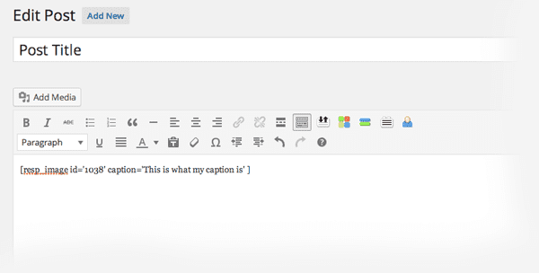
We’re all set. Given the [resp_image] shortocde, with an ID and optional caption, we’ll be able to output a fully structured and working picture implementation.
Modifying the Post Editor Output
The last step is to use this shortcode whenever a new image is inserted in the post editor. We’ll use the image_send_to_editor filter to modify the output of the Media Uploader.
function responsive_editor_filter($html, $id, $caption, $title, $align, $url) {
	return "[resp_image id='$id' caption='" . $caption . "' ]";
}
add_filter('image_send_to_editor', 'responsive_editor_filter', 10, 9);
This function does just one thing. It takes the $id and $caption from the uploaded image and populates the shortcode we created in the last step.
After saving this code, you can create a new post, and use the media uploader to upload an image like you would any other. Instead of the normal image output, you’ll see your shortcode inserted. When you publish or preview the post, you’ll see responsive images on your site in action. Scale your page to different sizes to see how media queries effect which image is loaded in.
Using the img Syntax
Of course, picture isn’t the only way to include responsive images on your page. There’s also an implementation that uses the img srcset tag to provide a range of images and their corresponding sizes. This allows the browser to choose which image to download. The output HTML for Picturefill looks like this.
<img sizes="(min-width: 1405px) 50vw, (min-width: 981px) 75vw, 90vw"
srcset="examples/images/small.jpg 375w, examples/images/medium.jpg 480w, examples/images/large.jpg 768w" alt="Sample alt text">
This might seem a bit foreign, but it’s actually relatively straightforward. The first attribute is “sizes”. Here we’re telling the browser how much room our image is taking up. The unit “vw” describes the percentage of a viewport. In the above example, I’m saying that when the screen size is over 1405 pixels, images take up about 50% of the viewport in our layout (because the sidebar and padding take up the other 50%). On slightly smaller screens, between 981px and 1405px, images take up 75% of the screen, and finally at the lowest screen sizes, they take up 90%.
In the srcset we are simply providing a list of images with their widths next to them. Given this information, the browser decides which image to use based on size and pixel density of the screen. So instead of you, as the developer, specifying which image to use, you are simply providing the browser with as much information about the images as possible, and letting it decide.
This syntax actually fits in with WordPress a bit better, and in unless you need fine grained control, it is probably the way to go. It allows the browser to make intelligent decisions in regards to retina displays, low bandwidth situations, and unusual contexts.
Building our Srcset Array
Much like the previous example, we are going to build an array of images that can be used for the “srcset” attribute. What we need to do is list out each image with the width of that image next to it, and output this as a list.
function add_srcset_element($image) {

	$sizes = array('smallest', 'small', 'medium', 'large', 'largest');
	$arr = array();
	$get_sizes = wp_get_attachment_metadata($image);

	foreach($sizes as $size) {
			$image_src = wp_get_attachment_image_src($image, $size);

			if(array_key_exists($size, $get_sizes['sizes'])) {
				$image_size = $get_sizes['sizes'][$size]['width'];
				$arr[] = $image_src[0] . ' ' . $image_size . 'w';
			}
		}

	return implode(', ', $arr);
}
Just like the picture element, we are creating a function, and passing it an image ID. From there, things get a bit different. We start by listing the sizes we want to use in a simple array, starting with the smallest then moving to the largest. From there, we use wp_get_attachment_metadata to get the metadata information associated with the image.
Then, using a foreach loop, we check the key to make sure that a size exists for the given image, then extract the image source (using wp_get_attachment_image_src) and the width of the image from wp_get_attachment_metadata. The final step is simply to build out a new array of these images, one by one, specifying the image URL and width, then returning the array, which we will use in our shortcode function.
In the end our function outputs something like:
http://yoursite.com/image-400x350.jpg 400w, http://yoursite.com/image-800-430.jpg 800w, etc.
Building the Shortcode
The next step is to create a shortcode that will output the proper HTML. We are going to use the same shortcode syntax as before:
[resp_image id='123' caption='My Caption Here']
We’ll also use a similar function to create our shortcode, but return different HTML.
function responsive_insert_image($atts) {

	extract( shortcode_atts( array(
	  'id'    => 1,
	  'caption' => ''
	), $atts ) );

	$srcsets = add_srcset_element($id);

	return '<figure>
	<img sizes="(min-width: 1405px) 50vw, 75vw" srcset="'
	. $srcsets . '" alt="'
	. get_img_alt($id) . '">
	<figcaption class="et_pb_text et_pb_text_align_center">' . $caption . '</figcaption></figure>';

}
add_shortcode( 'resp_image', 'responsive_insert_image' );
Once again, we are extracting the necessary shortcode parameters as variables. Then we are passing the image ID to the add_srcset_element function we created in the last step to get our list of images and associated widths.
From there, we are creating the actual HTML, starting with the sizes attribute, which you should modify based on your own breakpoints and sizes. After outputting our image list in the srcset attribute and the alt text with our handy get_img_alt function, we add the caption in a figcaption element. We end by creating the shortcode itself using add_action.
Modifying Post Editor Output
Since our shortcode syntax is exactly the same as before, there is nothing to change about our existing function.
function responsive_editor_filter($html, $id, $caption, $title, $align, $url) {
	return "[resp_image id='$id' caption='" . $caption . "' ]";
}

add_filter('image_send_to_editor', 'responsive_editor_filter', 10, 9);
We simply filter out the media editor output to insert our created shortcode instead. You can now go to the post editor, insert a new image, and see the img srcset syntax in action.
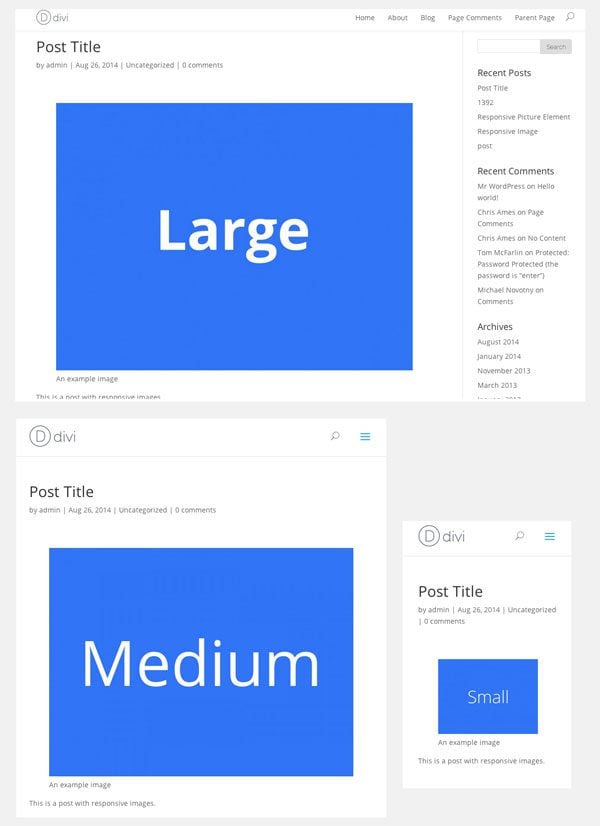
Images at different sizes
Using the Picturefill.WP Plugin
Responsive Images are still pretty new, so we have not seen widespread use. But if you’re looking for a plugin with a good implementation of Picturefill, there’s only one that I’ve seen: Picturefill.WP.
The version of this plugin on WordPress.org still uses the older implementation of Picturefill, but there is an experimental master branch on GitHub which uses Picturefill 2.0. Bugs are still being worked out, but I haven’t ran into any major problems.
To use it, download the file from GitHub, and then upload it as a new plugin on your site. Picturefill.WP uses the img srcset syntax from the second example above. In order to get everything to work properly you’ll want to register the sizes and srcsets attributes properly, using the picturefill_wp_register_srcset function that the plugin gives you access to. Just add this code snippet to your functions.php file:
function register_respsonive_attrs(){
  picturefill_wp_register_srcset('full-srcset', array('smallest', 'small', 'medium', 'large', 'largest'), 'full');
  picturefill_wp_register_sizes('full-sizes', '(min-width: 1405px) 50vw, 75vw', 'full');
}

add_filter('picturefill_wp_register_srcset', 'register_respsonive_attrs');
This will register an array of image sizes we want to use with the plugin, including the custom image sizes that we created. It will also modify the sizes attribute of the output HTML. The last parameter in each is “full” which indicates that these parameters should be assigned to any image that has been attached to a post as “full”.
The great thing about Picturefill.WP is that works on existing images within posts retroactively, and uses some smart caching to make sure that pages still load quickly.
If you’re a bit hesitant about using the beta version, the current stable version of the plugin still works very well, and will most likely see an update in the near future.
Looking Ahead
Now that responsive images have been standardized, we’ll begin seeing them implemented more and more. One day, we might even see them in WordPress core. For now, there’s still a lot experimentation to be done. So go ahead and get started, and report back what you find!
If you’d like to view the code for this article, all in one place, I put it all in a single gist.


This wound up being the perfect solution for my site. Is there any way to link the responsive image to a url? The link-to feature in the editor doesn’t seem to work because it just spits out the shortcode. I’m assuming I’d need to edit the php to add a link as another feature ala the caption?
I am getting the error on my site that there is an unexpected ‘[‘ on the line 15 of the “create shortcode” section. Any thoughts?
This works really well, but, how do I make it work with a CDN?
Right now it is only the srcset that is delivered by the CDN, all of the other references are fetched from my own host, resulting in longer load times before the image is loaded.
Could it be me who set up the CDN wrong, or is this something that is in the picturefill handling?
I am currently halfway through redesigning my site using Divi and all of a sudden the fluid output stopped…no more resized images in the layout. They were there one minute and gone the next.
You target Divi in your article. Is this common to lose the responsive elements
This is a great post.
Not only does it talk you through setting up the picture element in a sustainable way, but explains why you’re doing it and how to make shortcodes as well.
This is gold for a noob(ish) WP developer.
Big thank you Jay
Great post.
Thanks for this post.
Hello Jay,
How to enable support for featured images?
Thanks!
I have been wanting to implement adaptive images into my Divi 2 site for awhile now.
I had thought about using the Adaptive Images jQuery script by Matt Wilcox (http://adaptive-images.com/) since the WordPress plugin, New Nine Adaptive Images, isn’t available anywhere anymore. The plugin was recommended by WPMUDEV here: http://premium.wpmudev.org/blog/adaptive-image-optimization-for-responsive-wordpress-themes/
Would just using the Picturefill.WP Plugin (non-experimental version) be the EASIEST way to go? No adding code to the Functions.php file with this plugin as opposed to your other recommendations above?
I would like something that won’t accidentally break anything on my client’s site. 🙂
Thanks!
Deb
I use Adaptive Images in sites where I don’t have a CDN enabled. 😉
Picturefill is a nice alternative! Never heard of it before. Too bad it won’t work with all other images (in Divi modules etc.)
Awesome post, I am new to WP and this was very helpful. It gives me an idea of how to integrate other JS projects seamlessly into WordPress.
Seems like it works on Chrome only? There is no picture is shown on IE11 and Safari…(I followed the instruction and added certain code to function.php for divi theme…)
Hmm, should work. Did you make sure to enqueue the Picturefill library? Are you using the picture or img srcset implementation?
Good to know about this. It will be suitable to make up with today’s trend.
Hi Jay,
What a nice and informative article this is ! I did not know anything about PictureFill but I’m really thinking about implementing this. The only disadvantage seems to be that I cannot use the media manager in the editor anymore…
Bart
Great Tutorial and something, I knew I had to take care of and always putted it aside ;-).
But I’m currios, if I modifiy all those files like for example functions.php… and so on. I would have to do it again, as soon as you release a update, right?
In that case it ain’t actually practable if you have to handle more then one installation of wordpress, divi, wathever.
ChildTheme solves it to a certain point, depense on how strong you update…
So I would always go for a plugin if there is a smart one.
What do you think?
My thoughts exactly Thomas, for all the same reasons.
Thumbs up here for a plugin, but from my read-through, might be a doable albeit arduous task in coordination of the pieces-parts of the code.
Hence, besides tossing in a thumbs up, I’d be willing to pay for a plug-in should you build one Jay. 🙂
Yea, that’s actually not bad advice. I’ll have to think through this a bit, but I would think plugins can be the right way to go (or a child theme).
How does this relate to Divi’s builder, images for sections, images for blurbs, gallery module and its images etc.?
If I understand correctly, this only affects images loaded in the wp editor. Most of the images on my site are loaded through divi modules, or set as backgrounds of divi modules, so I dont think this will help me much. Will Elegant Themes build this functionality into all the divi modules eventually?
Yes, you are correct, this is really just a primer on how everything works. Responsive Images are very, very new, and haven’t even been brought into most browsers yet. It’s still time for experimentation, so this article is just a way of getting started.
Hi Jay,
In the “Modifying Post Editor Output” section you call the add_filter() function with a 4 parameter “9”, but the function responsive_editor_filter() only takes 6 arguments. I am new to WordPress filters, is that something intended or a typo?
Jay thanks for your informative article that educated me. I am not advanced at code and will have to cut and paste into the responsive.images.php page.
I appreciate you providing a link to the single gist, really helps.
So, do I copy the single gist entirely and paste it at the bottom of the php. then save the changes and that is all I have to do in the .php file.
I can edit the Media Settings with the information provided :).
I am using the WordPress 3.9.2 Divi Theme 2.1.2
Thanks.
If you are going to copy and paste from the gist, copy everything above “Implementation of Picturefill using the picture element”.
Then copy either everything in the “Implementation of Picturefill using the picture element” or everything in the “Implementation of Picturefill using the img element”, but not both. I would recommend the latter.