

How site visitors experience your website—more concisely known as the user experience or UX—is something you absolutely must consider. Without a good UX, no one will get to appreciate your innovative ideas, cool graphics, or top-notch products. And it’s not because they don’t try. Rather, it’s because a bad layout and design is difficult to navigate and your most important information might not be visible or easy to find.
And that’s really unfortunate. Way too many decent businesses are irreparably hurt by poor web design and UX decisions. The good news, however, is that within WordPress it’s pretty simple to avoid the damage and put forward a UX that serves your target audience well. You just need to know what to prioritize and some of the things you should definitely avoid doing if you want to see success.
Okay, without further adieu, here are the top WordPress UX rules I think every site should follow:
Rule #1: Never (Ever!) Make Site Visitors Work for Information
You can never use the excuse that visitors just didn’t look in the right place to find your contact information. Or that they just didn’t look hard enough for those pertinent product details. It is your responsibility as the site owner to ensure everything is easy to find and where site visitors expect them to be. A few things you need to pay particular attention to include:
Usually positioned in the header or along the lefthand side of your site, your menus need to be easy to find and use. That means easy clicking here, folks! Unruly drop down menus and secondary toolbars that vanish as soon as you navigate a millimeter away from them are annoying, yes, but they also seriously inhibit your visitors ability to interact with your site. Can you say increased bounce rate? I know I’ve skipped town on several sites when I couldn’t get a handle on their unwieldy menus.
If you’re dealing with this problem on your site, WPMU Dev actually offers a helpful tutorial on fixing this issue, however. And it’s not that complicated, I promise!
Another thing you need to watch out for is steering clear of putting too many options in your menus. Drop-downs are fine and dandy but when they drop down to reveal twenty links that practically fill the entire browser screen? Yeah, that’s not so user-friendly and can make your site look really disorganized and cluttered. Limit primary navigation to your most important pages and use secondary menus for listing out your less important content.
A major part of the modern website user experience is social integration. That means it’s vital you put those social profile icons in a place where people can easily see them and where they are expected. In the header space next to the navigation is a good option. Even better is placing them in your sidebar. Just make sure users don’t have to scroll to see them. Keep those icons above the fold.
Same goes with social share icons. Put them where people expect them—the top or bottom of posts usually works, Share buttons that overlay your content in some way work, too. A floating share bar can be effective like Floating Social Bar or AddThis. These appear (usually) along the lefthand side of your site and “float” on top of your content as the user scrolls.
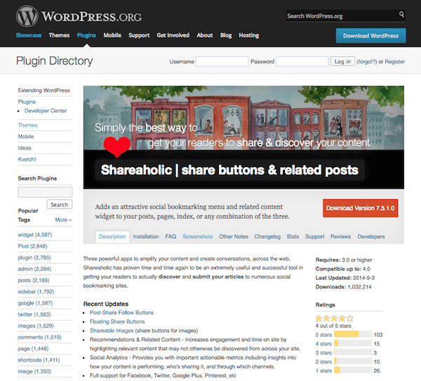
Or you can use a plugin to add more stylish social share buttons than what come standard like Shareaholic. Don’t be afraid to explore your options. And you might want to keep tabs on the development status of our own social share plugin, Monarch, while you’re at it.
Clear calls-to-action
Whether you’re trying to sell a product or get people to sign up for your newsletter, making sure your call-to-action is highly visible means a world of difference when it comes to conversions. But remember, a major part of UX is functionality, too. Don’t make your newsletter signup form, for instance, overly complicated. The fewer steps a visitor has to complete to perform the task you want them to, the better. Often, just an email address will suffice.
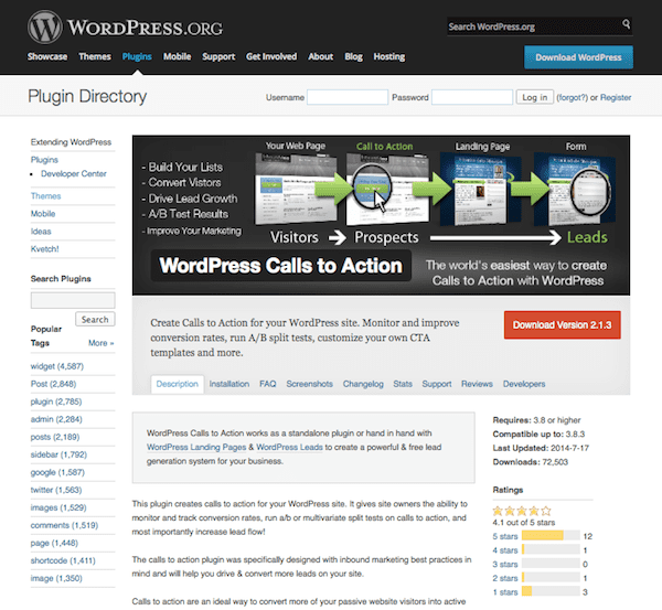
If you need help implementing a compelling CTA on your site, there are quite a few plugin solutions out there. You can embed them within your content or even feature them as a triggered-on-scroll box. Something like WordPress Calls to Action or Hello Bar work very well.
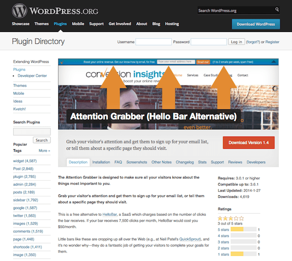
And if you don’t feel like paying for the latter, there’s always Attention Grabber for adding a stylish bar across the top of your site that appears when the user scrolls down.
Prominent contact and about info
Even though an about page and a contact page are website staples, you’d be surprised by how many site owners think there’s is the exception to the rule and leave them off altogether. This is a bad move. If you want to instill trust in your visitors, which is especially important when you’re trying to encourage them to open their wallets, you need to put as much information about yourself out there upfront.
Don’t make people click through several pages to get to your bio. Don’t make them scroll down to your footer and squint at the tiny print to find your contact information. Put these things on their own pages in your primary navigation menu to boost visitors’ confidence in your site. I mean, who would you be more likely to purchase from, a company with established information about its core team members or a company that’s run by shadowy, unknown figures? It’s not that hard to suss out, now is it?
Rule #2: Use the “Above the Fold” Rule
This term comes from ye olde newspaper days. When a newspaper is folded and laying in the bin waiting to be picked up, there’s usually a main headline that’s in full view. Presumably, this is the most important story of the day. That space is called “above the fold” because it is literally above the crease in the paper. It has since been applied to websites, however, and refers to the space that is viewable immediately after a site loads.
Before the user scrolls or does anything, what’s visible on your site? It should be your most important information, otherwise you’re not utilizing the space effectively and you’re not giving visitors adequate direction about what you want them to do. If you sell kitchen gadgets, make sure that’s abundantly clear at first glance. An eye-catching image, links to your best content, and your primary navigation all should be visible within the browser viewport.
Rule #3: Less is More
This can be a hard rule to follow, but trust me on this: less is more. You don’t need every single bell and whistle out there. Yes there are tons of nifty plugins and you just have to try them all. I get it. But once you do, make sure you only implement those that actually add something substantial to your site. Stick with those fancy features that are most effective, fit your design and industry, and do something for you. Features for feature’s sake are useless.
Plus, too many features can be distracting. Think of the old school web design days. Animated gifs everywhere! And I’m not talking those high quality renderings of your favorite movies you can find on Tumblr nowadays. No, I’m talking about dancing bananas, spinning “@” symbols, and sparkly backgrounds. They were a UI and UX nightmare. So don’t rock your website like it’s 1997. Keep it current and keep it minimal.
Do you suffer from never-ending scroll syndrome? Just because your home page or blog index is long, doesn’t mean your sidebar needs to be stuffed full of information and extend the entire length of your posts. It doesn’t need to contain every single social media API. And it certainly doesn’t need your Categories, Recent Posts, Featured Posts, and a Tag Cloud! Pick the most important items to feature here and stick with those. Your site visitors will thank you by hanging around longer. Basically, don’t make your visitors feel inundated with information.
Rule #5: Increase Site Speed
While UX is often conflated with visual presentation, it also includes a site’s speed. How quickly your content loads can spell the difference between engaged users that want to stick around for a while and those that would rather jump ship.
You can increase your site’s speed in a number of ways. For instance, you can:
- Use a CDN. A content delivery network can dramatically speed up your site, making your content more accessible to a greater number of people at once.
- Limit plugins. While plugins can offer a whole host of functionality to your WordPress site, too many can make for seriously lagging load times. Be selective in the plugins you use. Only install those that add significant features to your site. And remember: even plugins that aren’t active can bog down your site. Delete anything you’re not using!
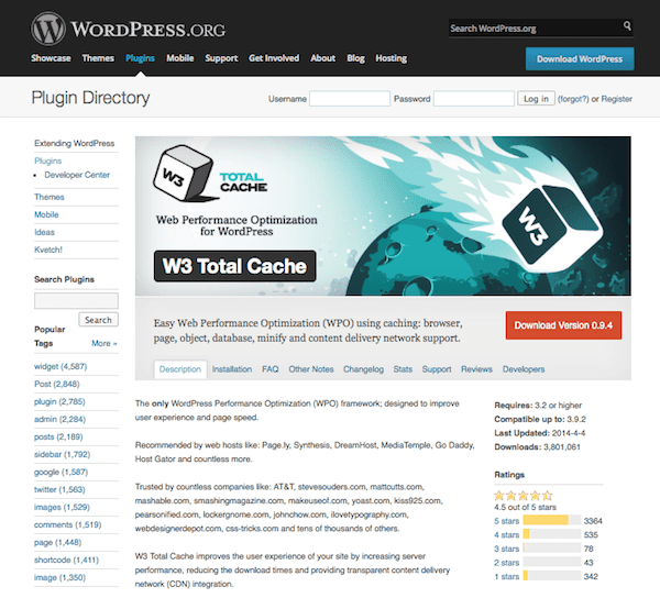
- Use caching. Now here I go recommending a plugin as soon as I told you to limit plugin usage. But these are important, I promise. Using a caching plugin can increase site speed dramatically. W3 Total Cache and WP Super Cache are two of the most popular options out there right now because they are effective.
- Use excerpts. Rather than using full posts on your home page, use excerpts, The content will load much faster this way.
- Condense images. Smaller images load faster, plain and simple. If you use a lot of screencaps in your posts or PNGs, you should use something like TinyPNG to condense your images to the smallest size possible. This will save you on storage space, too.
If you need more tips, be sure to check out the extensive walkthrough we wrote a while back all about improving site load speeds.
Rule #6: Don’t Be Afraid to Shun the Trends
Trends can be UX killers. Don’t believe me? Here, I’ll give you a current example. How many times have you heard that sliders don’t work? I’ve heard it at least a dozen times, all from different sources. Study after study shows they don’t work. In fact, they’ve been found to have a click-through rate of just 1%. This can largely be blamed on the fact that people just ignore sliders altogether. The mere sight of them triggers banner blindness.
And yet, how many themes do you see out there that still include them? I can definitely see sliders having their place, perhaps as a way to highlight your latest or best blog content. But featured at the top of your site just below the header? Yeah, that just doesn’t convert. And the science backs it up. Sliders are bad for SEO, even!
My point here is that people tend to avoid this advice because sliders are really popular right now. People seek out themes that include them for this very reason. But UX isn’t about popularity. You might have to go against the grain and resist the trends to keep your site ultimately usable, functional, and conversion-friendly. To do otherwise is to put trends before your visitors and customers. And when you think about it, that doesn’t make a whole lot of sense, does it?
What does make sense is creating a site that makes your target visitor’s life easier. And if sliders or other trendy doodads don’t fit into that equation, so be it.
Wrapping Up
Prioritizing the user experience might feel initially like you have to sacrifice fun design decisions. But that’s actually not the case at all. Good UX looks great and functions great. It’s intuitive and easy-to-use for your visitors and it looks good while doing it. Yes, that might mean doing a little more work to get it all perfect, but isn’t the prospect of building a site that truly works in your favor worth the extra effort?
What things have you done to improve the UX of your WordPress site? Did I miss anything here? I’d love to hear your ideas!
Article thumbnail image by venimo / shutterstock.com


Great and will written info Brenda. Keep up the good work. Does anyone know a release date for Extra”?
Brenda, I always enjoy your posts. Thank you for the UX advice. I laughed when I read #3 Less is More and then I noticed that the ElegantThemes post page where your post is hosted had Categories and Recent Posts on the sidebar 😉
Expert advice delivered with excellence. Educative for the beginners and a nice reminder for “not-beginners”. Keep it up Brenda!
Personally I like blog posts having better loading speed, less but informative content and easiest sharing option to share blog with my friends or in my network. Most of the points you described are also found in this blog post apart from Social Sharing option. Thank you very much for sharing.
I am a new web designer and have been with ET for only a month. I find the blog posts very helpful but, I have to say, THIS blog post is the most informative, jammed packed, easy to understand post I’ve read as of yet. GREATLY APPRECIATED!
Getting ripped ?
Well we are not planning to renew our annual subscription. Instead we are just going to convert it to the lifetime membership 😀
Great post, full of useful tips. Really appreciate the great content being published by Elegant Themes. Thanks very much!
Marvelous post Brenda and thanks for the reminder. Precisely enjoying ET blog post…shake more legs guys.
I love the informative posts. Trying to startup my own web design business, this blog has been invaluable to me. I don’t always agree with everything posted, but I always open to new ideas. Keep up the good work!!!
Every single post is worth much more than 100. Congratulatios Brenda!
I love the ET themes but it can be a little tricky to follow the rule about “above the fold”. For example, on divi, all the full width sections seem to be quite tall.
I am currently using nimble but trying to migrate to divi – one of the main issues with nimble is the really large header area which leaves most of my content “below the fold”.
If divi could have some areas that are not so tall it would be good (or perhaps the ability to control how much space is left around a module’s content.
Above the fold doesn’t mean that everything needs to be above the fold, it just means that what IS about the fold needs to grab the visitor’s attention, and direct them to engage (whether that means clicking a button, or continuing to scroll down). A single CTA or Slider module does this nicely in Divi. Usually a big headline that is relevant and explains clearly and compellingly what your website is about is enough.
Hi. Thanks for this article. I’ve heard many times about sliders. But, propably, I had to see this advice once again. And I’ve just killed slider on my website. Thanks!
I am in no way getting sick of these blog posts! I look forward to them every day! When there are topics I am not interested in, I simply delete the e-mail. On the contrary, for topics that I am really interested in, I make sure to read it once, save it in my e-mail and read it again!
Thanks for all the helpful tips!
I am loving this post, keep it up! Learned a lot reading this 🙂
I feel these rules are coinciding with what I too had in mind all the time. Ultimately this depends on the intention of the website too. These rules are absolutely true for business websites. I have to redo my website considering all these rules. Sliders are also needed, but need not be full width sliders. Wasting the prime space for fashion show is not a good idea. Thanks for such informative blog posts.
Nice post with screen shots.
Awesome article
We never think about UX enough … If you are using internet for your job, you must probably come across websites that are all but user friendly ( That’s often and it’s all good for you…). Sometimes I just can’t believe that some web designers are still doing that! You can’t even find contact details! and you have to navigate trough 1 to 2 useless intro pages before to finally reach some content where you have to find the menu and kill your eyes because of a bad color chart while torturing your ears with a loud autoplay MP3! ( true story!).
A simple and safe Layout for a good UX experience is number one priority. People don’t come to your website to find a crazy nice design … they want to easily find details about your business … If the website is nice, it’s even better …
Good post.
By the way, I think that it’s worth waiting in order to get themes like DIVI . It’s an amazing tool that can help you become the best web designer in town!
Thanks Brenda for reminding me to keep my sidebars clean (er)
Hello World [ and ET ] !
Another awesome post! But I couldn’t help notice an anomaly [ maybe ]!
Please see: Rule #6: Don’t Be Afraid to Shun the Trends. The author talks about the uselessness of adding a slider on the front page, just below the navigation menu. Yet almost every ET theme has precisely this feature! A slider [ from post categories or from pages ] is almost an ubiquitous presence in ET themes! The author argues [ and rightly ] that the click-through from a slider is alarmingly low, I quote her “a click-through rate of just 1%”.
It will be interesting to know the thoughts of Nick [ and other ET-ians ] on this!
Cheers!
~ Ari
I love the blog posts! I have learned and implemented a ton! (Now after reading this I have to uninstall a lot of what I learned.)
A-W-E-S-O-M-E article. Very nice and helpful. Thank you.
Nice article Brenda. UX is undeniably important for business websites today. Ensuring great UX can mean the difference between being remembered and being forgotten.
Indeed, Adam! You never want to give a potential customer the chance to bounce because of UX problems.
Avoid the InboundNow CTA plugin. It has been very buggy for a long time and is way overbuilt. The developers are trying to make it easier to design CTAs without coding, but the result so far is not very usable — it completely breaks in Firefox and will conflict with other plugins.
Useful and instructive post as ever from Brenda and I have to agree with Mike…
“The Blog side is free, for all the internet to use, you have not paid for it and never will have to pay for it, and to be fair, its some of the best and most helpful content out there!”
Keep up the WordPress related posts guys – very useful.
Couldn’t agree more – especially with “less is more!”
Less is more as eye catching, usability and user experience, but for SEO the more content the better. So less is no more. good Content, good content, good content is the key to get highly rated by google.
I agree with you a lot, but the sliders are not that bad, it could be a good tool for presenting our best post in a stunning way. Off course you have to use it properly, I mean, not put more than 3 or 5,and use big thumbnails, so it let’s the user watch a preview and navigate it. The sliders give you a high visual engagement if you to use it. And with plugin like revolution slider you can include crawl able sliders, which have text and don’t overcharge your site weight.
Excellent post Brenda. This is a much appreciated article. These are great resources that I share with others when asked questions about stuff like this, I always have an Elegant Theme Blog post to point them to so that they can make better informed decisions regarding their website strategies. I no longer have to create from scratch 🙂
Not to mention the great resources I get from the product reviews, and creative resources ET creates and gives out free 🙂
That’s a high compliment, Geno. Thanks so much!
These blogs are great but this is one of the best! I especially like the slider data. It would be nice to get more data related info in the future! Thanks!
Excellent themes and excellent blog, I have differents sources suscriptions themes and you guys are the best in everything, I love work with Divi theme.
About the UX , great tips to put into practice, thank you
Nice article Brenda! All the 6 rules are so helpful.
Blog speed is not only important for good user experience, but also helps to rank better on Search Engines. So, I always use a Cache plugin on my blog.
Thanks, Dheeraj! And that’s a very important tip!
I’m not sure about anyone else but I am getting sick of seeing blog posts, while they may be informative (nothing against the posts authors), and want to see more of what I paid to get. I know I didn’t pay to get blog posts all the time but I did pay for I believe the deal was one new theme a month. I think I have seen ONE new theme this YEAR?
I’m feeling a little ripped and burnt… not tryin’ to ruffle any feathers… just sayin’
I am in no way getting sick of these posts, in fact I am LOVING them!!! I love the ET blog, and have been reading a lot of posts, and have been learning a ton. I love what ET is doing. Keep it up!
Nope, not getting sick of informative blog posts.
Not feeling ripped.
Not feeling burnt.
Not at all.
Same as above – what i paid for what i get i am the winner. Full support many updates. Go searching for another site that provides you the same and you won’t! I researched themeforest but heard there was a lot of just “rebundle” work going on there. The themes here are bloody awesome. Blog posts are VERY in-depth so it saves you searching for topics you want to know or never knew you wanted to know.
I run 2 sites.
http://www.jwpictures.co.uk – Photography
http://www.poshpawskennels.com – Just started making..
And guess what, both are DIVI and many a time i had to research tips and tricks through elegant theme blog instead of google.
Thank you elegant themes for your continued hard work on themes and your blog, i and many others appreciate it.
Regards
A happy customer.
I am sorry that you feel that way Richard, but I think that our new development philosophy, which has lead to great new themes such as Divi (albeit more slowly), is in the best interest of our customers.
You can simply unsubscribe from the blog if you don’t want to read the blog posts. The blog authors are not part of our development team, and this blog has no affect on our theme production.
We don’t guarantee one theme per month, and I can promise you that we will never will. Such a release schedule would not allow us to create themes like Divi and Extra, and these are the types of game-changing themes that we are focused on.
You are correct that we produced 1 theme in the past year. Since you are lucky enough to be grandfathered in at the price of $39 per year, you paid $39 for that theme (and for support, and for access to our 87 other themes, and our continued efforts to update and improve these themes).
I still wager that’s an amazing deal, considering the fact that even one theme alone will cost you more than $39 anywhere else. You can unsubscribe from within the members area if you wish to cancel your subscription.
Hi Nick,
I may have been thinking of another service that does provide one theme a month but I believe when I signed up years ago ( I have been a VERY loyal customer and have brought some of my clients in too) there were many more themes being released.
I appreciate being grandfathered in and as I stated above I have been a customer for a number of years now. I have not been a come and go customer of which I am sure you have had a few.
The blog posts are great and very informative and I apologize for posting on this post. No intended disrespect to the author, the administrators or the other members.
I just needed to vent my frustration. I understand what you are saying about the theme prices.
It’s a little concerning that I voice my opinion and all of a sudden you are threatening to cancel me… sign of the times I guess.
BTW if you check your support logs you will see I am NOT a support baby… I normally opt to figure things out myself without bugging you or your staff with questions that can probably be found in the codex or with a skillful google search.
Again I appreciate the service, I really do but I know I used to see more themes a year coming out. And you are right this was an amazing deal when I signed up three or four years ago and continues to be a decent deal but with very few new themes coming out I may have to rethink my subscription this year.
Obviously I do not want my current subscription canceled… that would be silly of me.
Thanks for your time and please have a great day.
Richard, Back when you and I joined Elegant Themes new themes were coming at the rate of once a month or about 10-11 a year. Honestly, they were not the quality that Nick and the others are producing now.
Nick, By the way, I have been waiting for Extra since June. When are you going to release it?
For the Future: I would love to have a good plugin or directory theme with faceted search.
When you cancel, your account still remains active for the rest of the year that you paid for, so you don’t have to worry about that 🙂 It just stops the renewal from occurring next year. You can always renew after your account expires if you change your mind, and we produce something that’s of value to you.
You can’t please everyone. You still produced the nicest themes out there, hands down. Keep on keeping on! 🙂
Whilst I understand your frustration, I do believe Elegant Themes have never promised a theme a month! As a member for several years, I know this for a fact.
Divi has been the major release for Elegant Themes this year, and whilst they did drop loads of themes the year before, Divi is simply put, head and shoulders above the other themes released.
The Blog side is free, for all the internet to use, you have not paid for it and never will have to pay for it, and to be fair, its some of the best and most helpful content out there!
Not trying to “ruffle your Feathers” but you do still have access to all the themes and plugins and support you have paid for which placed against competition is far better value for money.
Quality over quantity.