Even if your WordPress website is Derek Zoolander (ridiculously good looking), you still have to consider how your designs will impact the experience of your visitors from a usability standpoint. After all, it doesn’t matter how awesome a WordPress website looks if no one can make heads or tails of its intended function.
So how exactly can you figure out what works? Experience is part of the equation, but there is no need to rely on intuition – not when you have access to testing tools that provide you with precise information to base your designs on. We’re referring, of course, to usability testing.
If you’re not quite sure what usability testing entails, you’ve come to the right place. First, let’s talk about how it differs from regular user testing, then move onto its fundamentals and how they fit into common testing procedures.
The Difference Between User and Usability Testing
The line between both of these subjects often gets blurred, since there’s a bit of overlap – but in reality, testing for each field will tell you a completely different story.
Let’s take A/B testing, for example. If you design a test with a number of variations of a call to action button, showing them to a random sampling of participants, you should obtain an answer for which option leads to higher conversions (as long as your sample size is large enough). A/B testing falls under the category of user testing, alongside other similar examples, such as focus groups.
Usability testing, on the other hand, isn’t as much concerned with what looks better, as whether stuff works properly in the first place. To build upon our previous example, after having run that A/B test, we would know which variation users prefer, but we wouldn’t have obtained any additional information as to whether its design is confusing in terms of interaction, or if users understand where clicking on it would lead them to. Both of these are usability issues, and they’re simply two out of many.
With that being said, both user and usability testing are crucial to the development process of a well-researched WordPress project. If you can devote the necessary time and resources to both of these methodologies, you’ll be rewarded with a wealth of information upon which you can improve your website. Later on, we’ll cover a few specific usability tests that should be simple to implement even if you don’t have a wealth of resources at your disposal, but first, let’s review the fundamentals of usability.
The 6 Fundamentals of Usability Testing
1. Ease of Learning

Users should be able to learn the ins and outs of a website quickly. That is to say, what does each button do? If it requires you to register or log in to access critical functions, are these options easily located?
Let’s use a simple example. You’ve worked on the design of a WordPress site, with scheduling and booking functions for a small picturesque inn (the fact that it’s picturesque is irrelevant, but immersion is important!), and you require users to register in order to make their bookings and keep better track of the inn’s customers.
A prospective user would then have to locate the signup function, login, find the booking section, select their desired date, book it, and potentially pay directly through your site or use a third-party service. Testing for ease of learning would provide us with information about how the design impacts the manner in which customers interact with our site, whether they have difficulties identifying what they need to do at each step, and whether it’s clear to them when they’ve successfully completed the process.
All of these factors become more difficult to test for as the functions of your WordPress project multiply, but one thing remains true at any scale – if your site has a steep learning curve, you might scare users away.

This one is pretty self-explanatory. A visitor shouldn’t require a map and a compass in order to successfully navigate your website and find the information they’re looking for.
Take the Elegant Themes Blog, for example. Quite the handsome devil, isn’t it? Self-promotion aside, the blog does happen to provide a good example of an intuitive navigational layout. All of the site’s main sections are available on a visible top bar, properly labeled, with a prominent call to action, highlighted thanks to the contrast in colors.
Further on, the titles of each post are accentuated due to their size, as well as the View Full Post buttons, so you know exactly where to click. On the right side, we have clearly labeled categories for more in-depth searches, a search bar which clearly states its own function, and simple social media icons with recognizable labels.
We don’t claim to be reinventing the wheel here, but it’s pretty fair to say that no one is likely to get lost while browsing the blog, and that’s important from a usability standpoint. If a visitor can’t find what he’s looking for, he’s likely to get frustrated and simply find his way back to Google’s search result page to look at the competition.
3. Efficiency of Use

This factor ties into the other two we’ve covered so far. If a WordPress project is both easy to use and navigate, it’s probably pretty efficient overall. However, there are additional criteria that apply.
If we were to return to the example of the picturesque inn we laid out in point number one, we would need to retool our testing procedures in order to determine whether, on top of being easy to understand, the booking and scheduling process is also efficient. So what would this mean?
We would want to minimize the number of steps involved in the entire process, which would mean you’d have fewer screens to design, and users would have to contend with fewer procedures in order to successfully complete it.
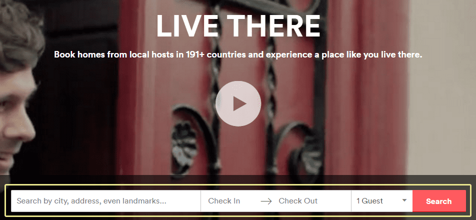
For an example of how to pull this off well, let’s take a look at one of the big dogs in the field of renting out places – Airbnb. They enable you to start your booking procedure right from the main page, by selecting where you’d like to look for available listings, and choosing your check-in and out dates – all within a single bar.

An inefficient website, on the other hand, would hypothetically start things off by asking which property you’d like to rent, before proceeding to a new screen to confirm and verify the date. It would then show you additional information, before finally moving to the payment procedure. If a process takes too long or is too convoluted, users will feel frustrated and may drop it altogether.
Knowing this, a proper efficiency test pertaining to usability should determine whether users feel satisfied with the efficiency of your site, or the particular processes which make up the whole. You should use this information in order to streamline as many functions as possible, as shown in the Airbnb example, where instead of asking users where they wanted to go and only then moving onto the details, they just cut right to the chase and asked “Where do you want to be and when?” That’s pretty darn efficient, if you ask us.
4. Brand Perception

Brand perception as it relates to usability refers to two things: whether your project is properly branded, so users can make an association between the quality of your content and your overall brand, and which kinds of feelings they associate with it.
Testing for brand perception won’t necessarily help you revitalize a brand with negative associations, but it will tell you whether you’re doing things properly or not.
5. Attention Levels

When testing for attention levels, you’re going to be focusing on which parts of your designs attract the attention of your participants, and how long they hold it for. This data is useful when it comes to determining what specific areas attract more attention, and whether this matches up with the most critical functions of your site.
These kinds of results can get pretty subjective. For example, if you use eye tracking to determine whether a given area of your site is underperforming in comparison with the rest, you’re still left with the task of figuring out exactly why it’s not doing well, and whether that matches with your expectations. This would necessitate a combination of usability and user testing, but that crossover is a topic for another time.
6. Participant Selection

So far we’ve talked about the five fundamentals of usability, which underline the testing process itself. Now it’s time we turn to the technicalities, such as how to choose the participants for whichever tests you choose to run (we’ll get to that part soon).
When it comes to participant selection for usability testing, there are just two basic criteria you should consider. The first is basic demographic information – age, income, gender, and country, for example – narrowed down to fit your key groups of users. Whether they are middle-aged male accountants, or old ladies who breakdance for nickels is up to you to determine – which should be pretty easy if you have any sort of analytics solution on your WordPress site.
The second criteria is whether the participants of your tests have any sort of experience with other projects that share common functionalities with your own website. What does this mean exactly? Well, if you’re still working on the site for that small inn (we like to double down on our examples here at Elegant Themes), then someone who has previously booked a room successfully on another website is more likely to be able to complete your own booking process without running into any issues.
Thus, including participants with previous working knowledge of your field could potentially skew the results of your tests upwards, and leave you with the false impression that your site displays no usability flaws. We’re not saying that it necessarily does, but wouldn’t you rather be absolutely sure?
Knowing this, it stands to reason that an ideal group of testers would be comprised of members from your key demographics who aren’t that experienced with the field of the project you’re testing. With that being said, let’s move onto a brief overview of some simple usability tests to put what we’ve learned so far into action.
5 Common Usability Tests (and How to Execute Them)

1. Brand Perception Test
Let’s kick things off with a simple one. A brand perception test, as its name implies, should provide you with information about how your participants perceive your brand, and whether your project accurately reflects its association within its design.
One way to do this is to provide your participants with mockups of your design, and ask them which adjectives they would use to describe them. This will provide you with a wide range of feedback to help you improve the usability of your designs.
2. Closed Card Sort Test
This test is designed to measure whether your site can be navigated intuitively, or whether it should be guarded by a minotaur. In order to pull it off, all you have to do is provide your participants with the navigational structure of your website, which can be shown using a simple brain map, and ask them in which sections they would look to find certain function or information.
If, for example, you were to ask a participant where to find contact information, the first thing they’d look for would be a contact section or a footer. If it can’t be found on either, you might have a navigational problem on your hands.
3. Expectancy Test
An expectancy test doesn’t involve direct interaction with your WordPress site, either. What it does is measure how users expect certain actions of your site to be executed.
To be more specific, you could ask users how they think individual sections of a site would react if clicked on, or what they would expect to find under each category.
4. Eye Tracking Test
Eye tracking tests are a great tool when it comes to measuring attention levels, since they answer many of the key questions behind the principles of usability. What are the areas which hold their interest the most? How long are they looking at each section? Is there an order to the sections they’re looking at?
Now, this is a tricky test to pull off, so you might have to settle for heat maps, which should provide you with a similar body of information and can be easily implemented into WordPress. On the other hand, if you do have the resources to conduct one of these, they can provide you with a wealth of information.
5. Free Exploration Test
As we’ve all no doubt experienced at some point, some fantastic insights usually come when we’re not looking for them, and that’s why free exploration tests can prove to be so informative. During a free exploration test, your participants should be given a predetermined window of time to just browse and interact freely with your site while they speak out loud.
The point here is to gain a firsthand look into how users actually behave during a normal session, and how they perceive the individual elements of your designs while not being given rigid test constraints.
Conclusion
Figuring out how to maximize the usability of your designs is one of those things that most designers pick up along the way, but no matter how experienced you might be, sometimes the only way to be absolutely certain of any given hypothesis is to test it thoroughly.
When it comes to usability, there are six fundamental factors that you should measure during your testing procedures in order to determine whether your WordPress project passes the bar:
- Ease of learning.
- Intuitive navigation.
- Efficiency of use.
- Brand perception.
- Attention levels.
- Participant selection.
How do you personally select the participants for your usability tests? Subscribe and share your process with us in the comments section below!
Article thumbnail image by aurielaki / shutterstock.com. Images by Dooder, Vector Goddess, LWY Partnership, Alexandr III, Sentavio, Oxy_gen, ProStockStudio / shutterstock.com.


This was a good read Tom. Too many times we focus on content, graphics and look yet it’s actually the issues you have noted here that are making us lose money. I wonder how many frustrated users actually leave a website (with their money) simply because they could not find some expected navigational menu like a contact us.
Thanks for highlighting this Tom
Angie, companies spend untold amounts on figuring all of this stuff out – it’s very important for them to get answers and fix the issues for future visitors.
Thanks for the kind words. 🙂
“Take the Elegant Themes Blog, for example. Quite the handsome devil, isn’t it?”
Handsome and intuitive, maybe, but it looks like the ET site is going to be the last one on earth to go responsive…
Great information about web deign testing as a webite designer i would recomend 6 Fundamentals of Usability Testing steps to all designers.
Hello Tom, It has offered me correct guidance while I was preparing a website for my client. The usability tests are explained in such a simple way that it becomes very easy to follow them. It is not only handy but the information provided is also very useful. It has helped to build websites in a more efficient manner. Thank you.
Thanks for the kind words 🙂
Thank you for the usability testing steps that needs to be taken for my site and my clients sites. It is very handy and I will implement it from now on.
Thanks, Jasa!
Tom you write a very fine article on WordPress Web Design, although i am interested to say something about “Custom Website Design” –
“Target your customers with custom website design”: In today’s competitive business scenario, a website is very crucial for a business house. Many of the businesses might not be aware of the technology aspects and complex web pattern that are required to design an appealing website. This might lead to the designing of a bad site. Not only that a website should be designed keeping in mind the business goals and the taste of the target audience. So, going for a custom website design can be the best solution for the businesses where the site is designed based on the business need and customer’s taste.
Great article, Tom! The usability tests are explained very well. It’s so easy to follow.
Thank you for the article!
Thanks for your comment!
Great help, thanks.
Complete all. Provide guidance to me when designing a website for a client. thank you
Great article. I would also recommend checking out Inspectlet.
Yes, Inspectlet is one of the best eye tracking tools out there. Thanks for your comment, Dave!