Using Divi Spacing Options
It’s easy to customize spacing in sections, rows, and modules with Divi’s Spacing Options.
Spacing is an important element in web design. It helps organize your content and keep things clear and balanced. With Divi, it’s easy to customize spacing in sections, rows, and modules with Divi’s Spacing Options. In this doc, we’ll look at all of Divi’s Spacing options available within the Visual Builder.
In this doc, we’ll cover:
- The Difference Between Margin and Padding
- How to Add Margin and Padding to Elements in Divi
- Responsive Settings for Margin and Padding
- Understanding Divi’s Default Spacing
- Mobile Spacing Settings Within Theme Customizer
- Margin and Padding Tips and Best Practices
- Continue Learning
The Difference Between Margin and Padding
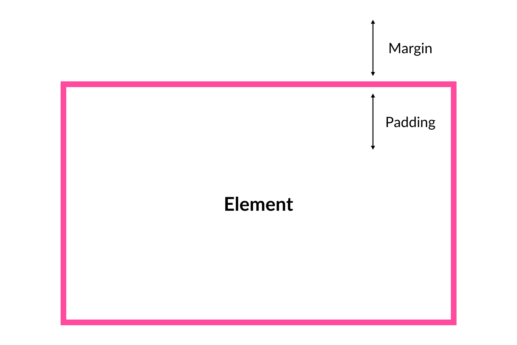
There are two fundamental spacing measurements in web design: margin and padding. In Divi’s Spacing Options you’re able to adjust both.
Margins control the space around an object while padding controls the space inside an element. The higher the number, the more space, the lower the number, the less space.
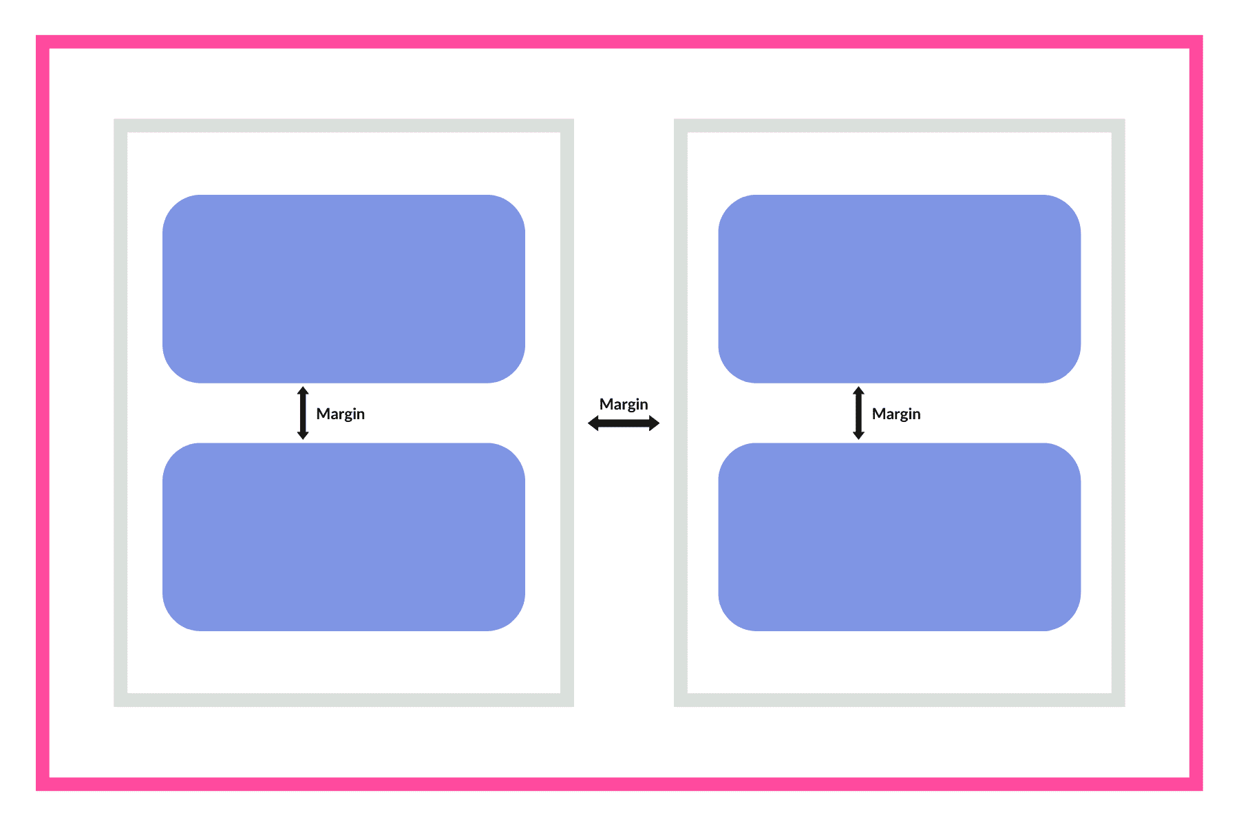
When To Use Margins
Because margins are for adding space outside of an element, they are often used for creating separation between elements. For example, it is best practice to use a margin to create spacing between multiple columns in a row. Another common use case would be to use a margin to separate elements (or modules) within a column.
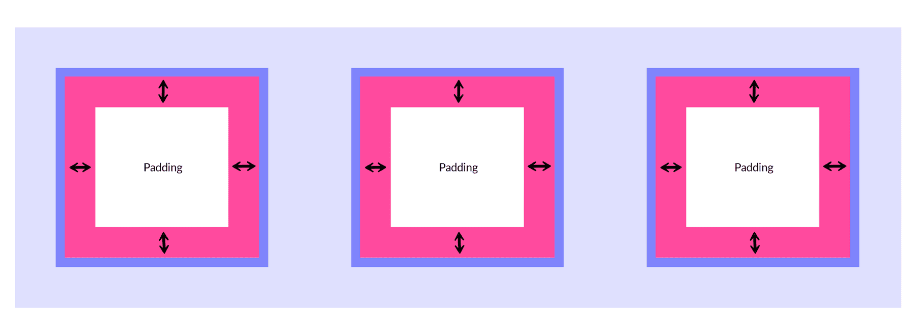
When To Use Padding
Padding adds space within an element to create separation between the child element(s) it contains. For example, adding padding to a row would create spacing around the column(s) it contains. Adding padding to a column would create spacing around any elements it contains. And so on. If you want to add space inside an element and create more space between the element’s content and the element’s border, then use padding.
How to Add Margin and Padding to Elements with Divi Spacing Options
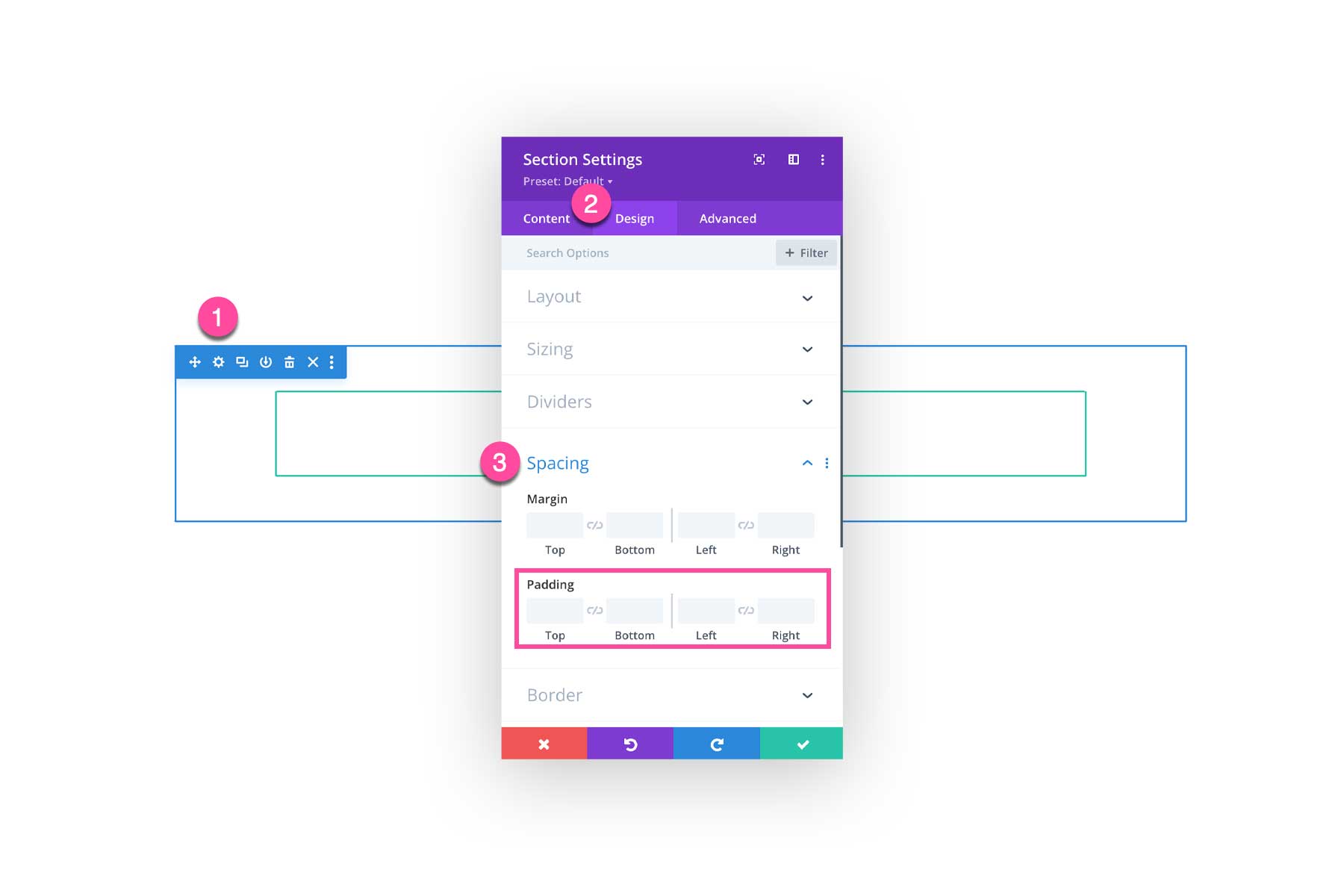
In Divi, you can use the Divi Builder to add Margin and Padding to any Divi Element (Sections, Rows, Columns, Modules, etc.) To do this, open the settings of the Divi element, navigate to the Design tab, and select the Spacing settings group.

Adding Margin in Divi
You can add margins in Divi by typing in a numerical value or using the arrows to adjust the margin higher or lower.
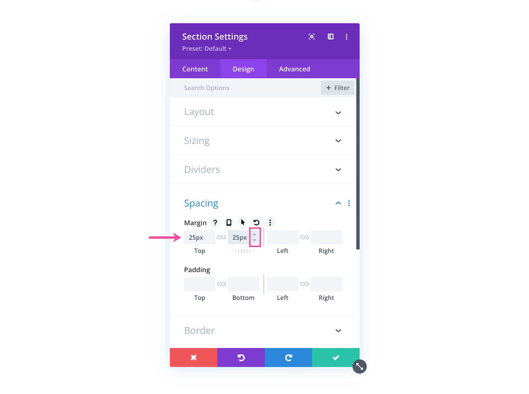
If you want the top and bottom values to stay the same as each other, then click the chainlink icon in between them to link the values.
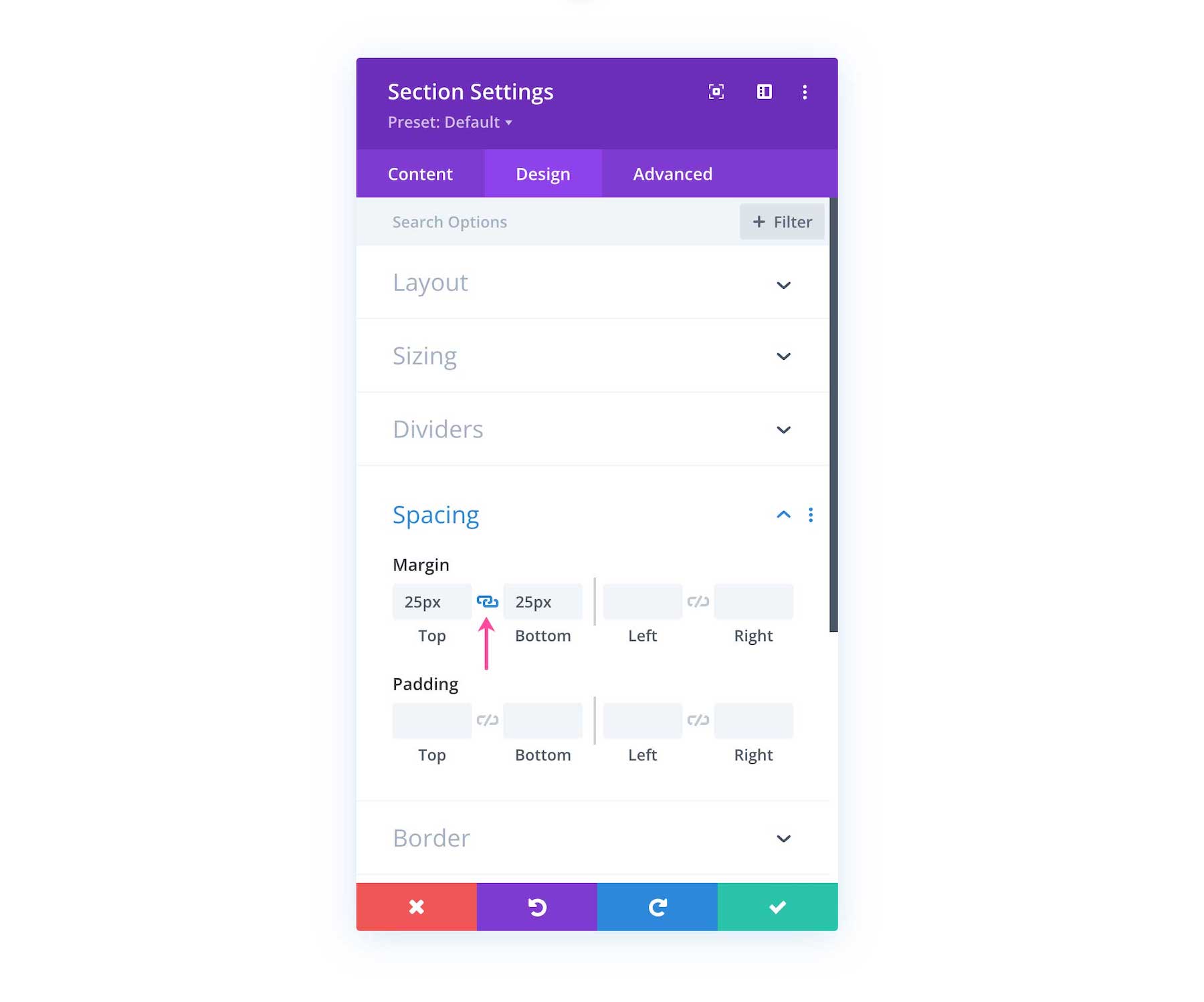
This means when you increase or decrease one value, the other one will increase or decrease as well. This helps keep your margins consistent and balanced.
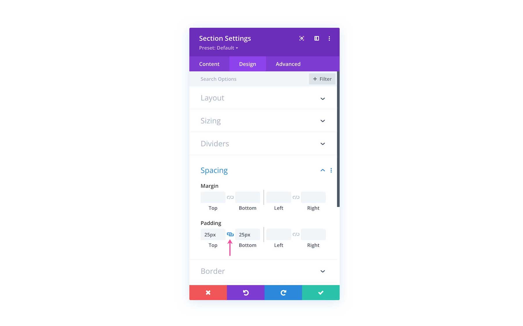
Adding Padding in Divi
To add padding to an element in Divi open up that element’s settings by clicking the gear icon, then navigate to the Design tab and click on the Spacing settings group.
Just like with margin, to add padding, type in a numerical value or use the up and down arrows to adjust the padding higher or lower.
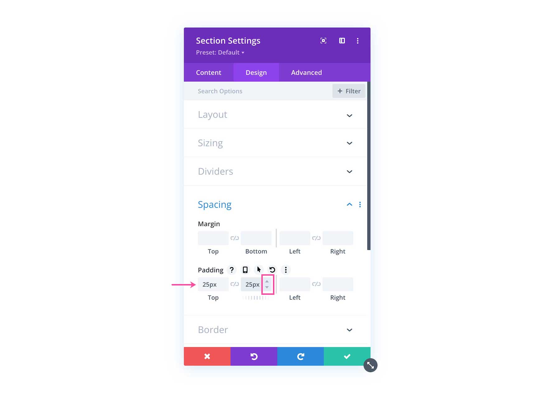
You can click the chainlink icon to link the top and bottom values as well as the left and right values so you can easily adjust both sides at once for consistency.
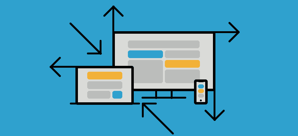
Responsive Settings for Margin and Padding in Divi Spacing Options
It’s easy to set mobile-specific margin settings for margin and padding with Divi. Simply hover over the margin or padding area and click the phone icon, triggering the tablet and phone settings options to appear. Three tabs will appear: Desktop, Tablet, and Phone. Tab through them to set moble-specific margins and padding. By default, mobile spacing will inherit what is set on the Desktop view, however with this option you have the choice to set unique margins for mobile.
Understanding Divi’s Default Spacing
By default, Divi comes with default spacing values to help jumpstart the design process. However, you’re able to override these default values in the Theme Customizer. To adjust these settings, navigate to Theme Customizer > General Setting > Layout Settings
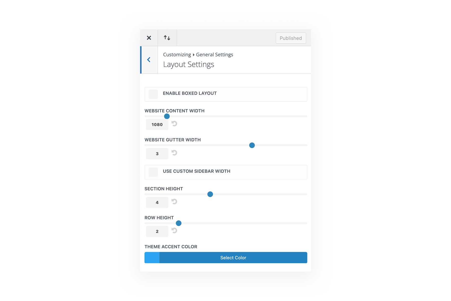
Website Gutter Width
Gutter width is the margin space you want between columns. You can increase or decrease the gutter width by typing in a numerical value or dragging the range slider. The gutter width is set as a percentage and you have the option to set the gutter width from 1-4.
1 = 0 margin between columns
2 = 3% right margin between columns
3 = 5.5% right margin between columns
4 = 8% right margin between columns
Note: You can also set the gutter width of rows individually inside the row settings.
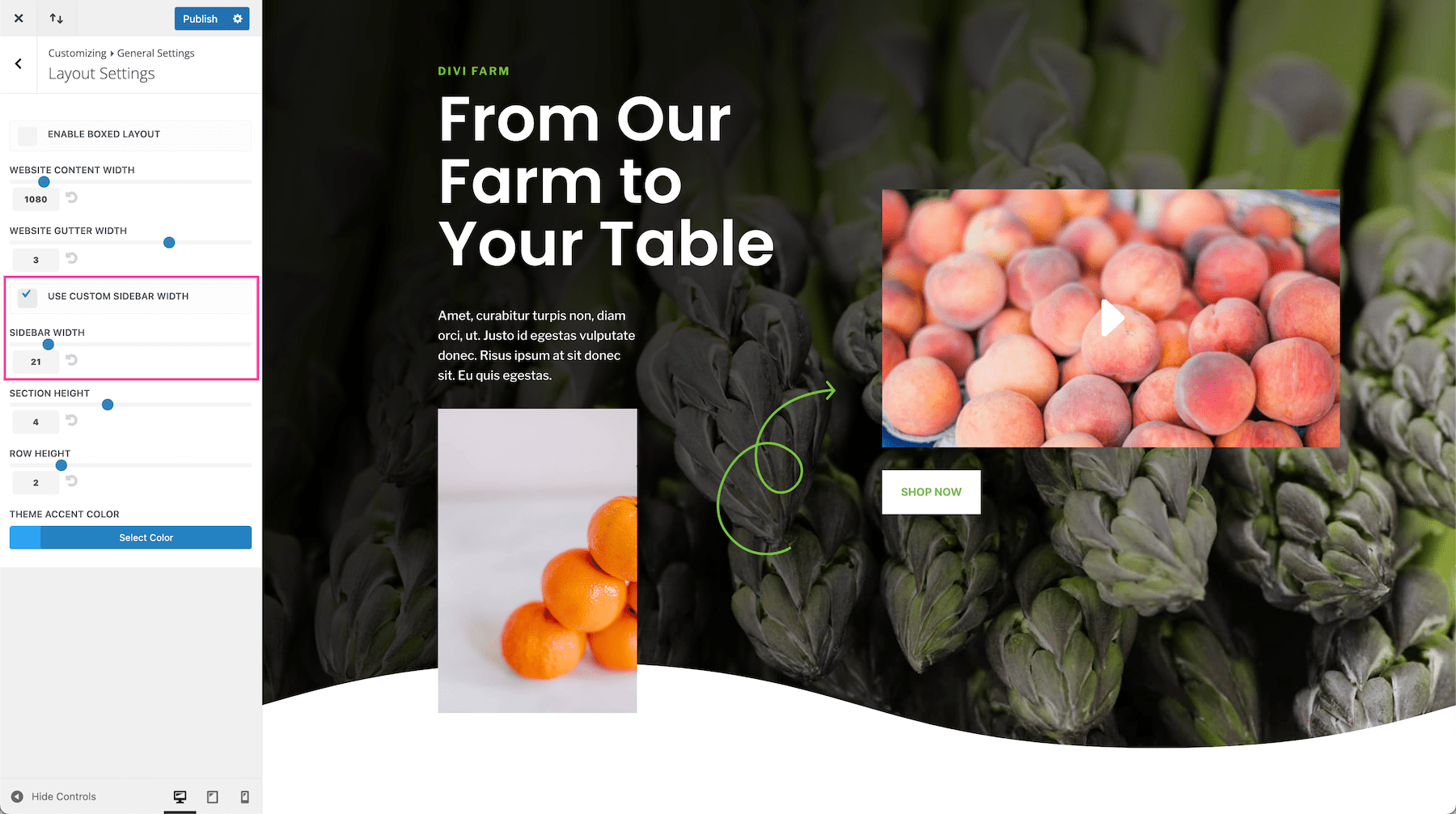
Use Custom Sidebar Width
To set a custom width for the default sidebar on blog posts, then use the range slider to adjust the value or type in a numerical number.
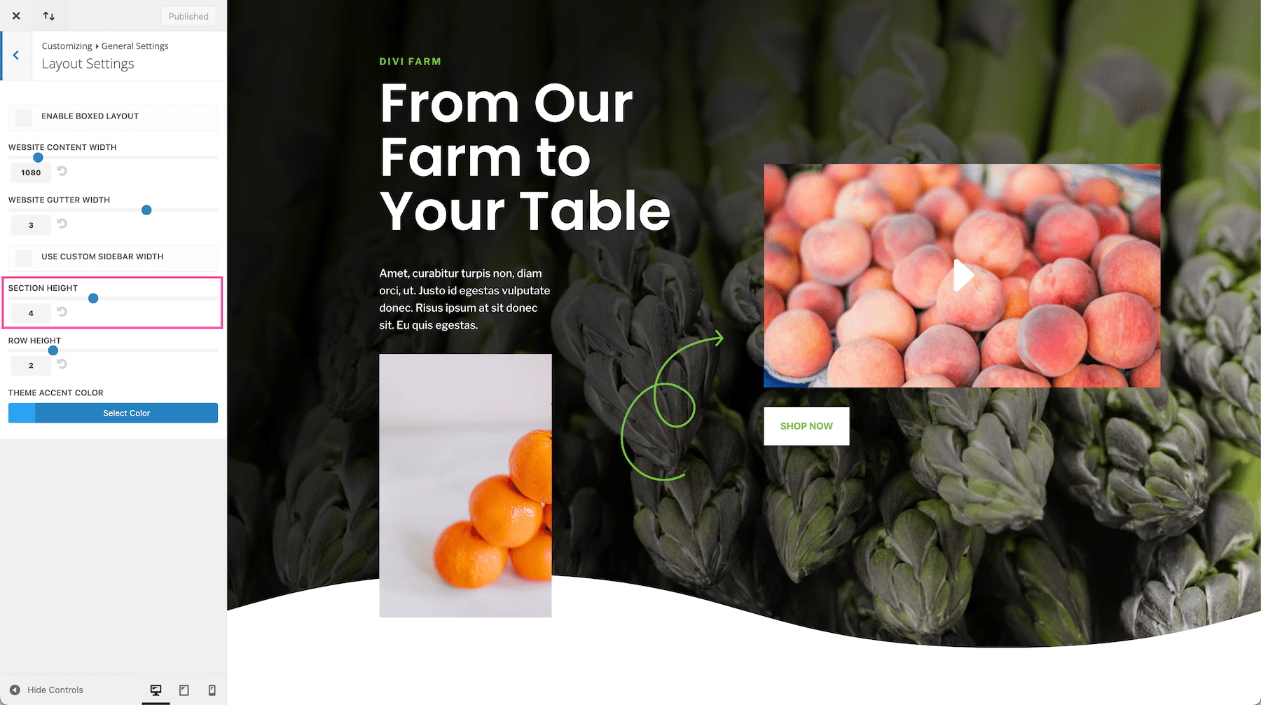
Section Height
This determines the height of sections based on a percentage. By default, section heights are set to 4. You can increase or decrease this value by typing in a numerical number or dragging the range slider. This will increase or decrease the default height of sections in Divi.
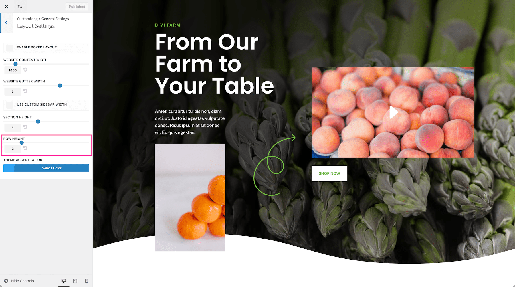
Row Height
This determines the default height of rows based on a percentage. By default, row heights are set to 2. You can increase or decrease this value by typing in a numerical number or dragging the range slider. This will increase or decrease the default height of rows within Divi.
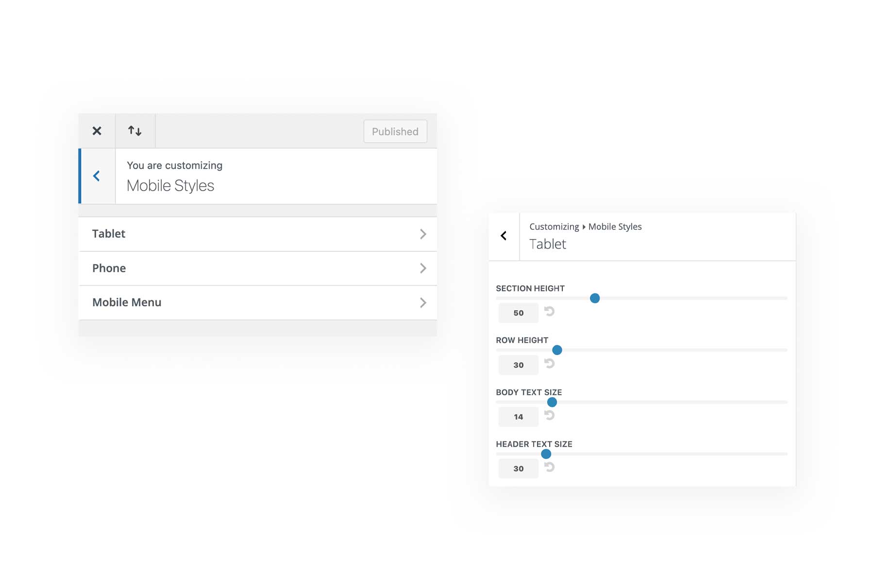
Mobile Spacing Settings Within the Theme Customizer
Divi also comes with built-in spacing values for mobile devices within the Theme Customer. Navigate to Theme Customizer > Mobile Styles where you can tweak settings for tablet devices and phone devices. Simply drag and drop the range slider or type in a numerical value to adjust the settings.
Divi Spacing Options Tips and Best Practices
Use Proper CSS Length Units
There are two types of CSS length units you can use throughout Divi for sizing and spacing: absolute length units and relative length units.
Absolute length units, like px (pixels), are best for making adjustments to elements that you don’t want to change their size based on the width of the container it’s in or the browser (like font size). Absolute length is a fixed-length unit so it will not change with the browser resizing as it is not relative to anything else.
Relative length units, like %, are best for horizontal spacing as it adjusts based on the width of your browser, keeping your spacing consistent and mobile-responsive around elements. You should rarely, if ever, set horizontal padding in pixels unless you plan on adjusting that width at all of the necessary breakpoints for all mobile devices. This is simply not good practice in the world of mobile-responsive design.
To learn more about length units in web design, read our Guide to Understanding and Applying CSS Length Units in Divi.
Using Margins and Paddings For Whitespace
The use of whitespace in web design is an important technique for creating beautiful websites. Whitespace is the empty space around the content and elements in your website design. Whitespace is used to balance a page design and organize the content in a visually appealing way. Margins and padding help you create space between elements so the design is balanced and clutter-free.
Understanding Negative Margins
Giving margins a negative value allows you to draw an element closer to another element. So if you add a negative top margin, that will move the element up on the page.
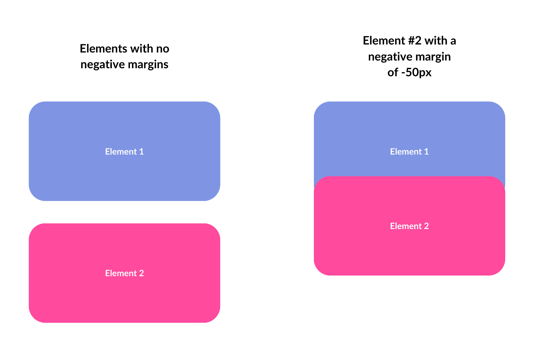
Although this can be helpful in some instances, it might be better practice to use other methods (like position or transform translate) to position elements on the page.