Using Divi Sizing Options
Divi Sizing Options make it easy to adjust the sizing of sections, rows, columns, and modules in Divi.
Divi Sizing Options make it easy to adjust the sizing of sections, rows, columns, and modules in Divi. Sizing is an essential part of building beautiful websites. Correct sizing helps to keep your website organized, well-balanced, and responsive. With Divi Sizing Options, it’s easy to adjust the height and width of elements in Divi.
In this doc, we’ll cover:
- Sizing Terms and Definitions
- Divi’s Default Sizing
- Length Units Used For Sizing
- How to Adjust Sizing In Divi
- Sections, Rows, and Module Sizing
- Tips & Best Practices For Using Divi’s Sizing Options
- Continue Learning
Sizing Terms and Definitions
The Sizing Settings Group is common across all of Divi and uses a lot of the same values and properties. Before we dive in, let’s define some of these terms so we know what we’re working with.
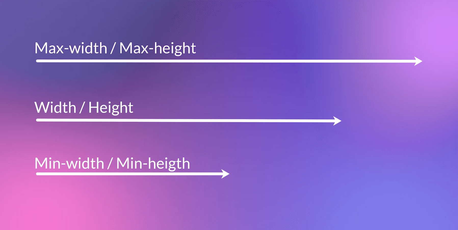
Width: This determines the actual width of an element. If this is set to 100%, then the element will be as wide as the container it’s in allows it to be. We recommend using % values when setting width so that it automatically adapts as the browser window changes. The higher the percentage, the wider the element will be, and likewise, the lower the percentage the narrower the element will be.
Max-Width: The max-width determines the absolute maximum width allowed for an element. So if the width is set to 100% and the max-width is set to 80% the element will only reach 80% because the max-width supersedes the width.
Height: This determines the actual height of the element. We recommend setting height in pixels (px) so that your design elements retain their height as the browser window changes size and becomes mobile responsive.
Min-Height: This determines the minimum height you want to assign to an element. The element will not go smaller than the minimum-height set. This supersedes the height value, so if height is set to 200px and min-height is set to 300px, then the element will be at a minimum of 300px tall.
Max-Height: The max-height determines the absolute maximum height allowed for an element. So if the height is set to 200px and the max-height is set to 150px, the element will only reach a height of 150px because the max-height supersedes the height value.
Alignment: This determines the position of the design element you’re working on. You can choose to align elements to the left, center, and right.
Note: There are a few more width and height options available within specialty sections. Those options are described in detail in the Specialty Section Sizing section of this doc.
Divi’s Default Sizing
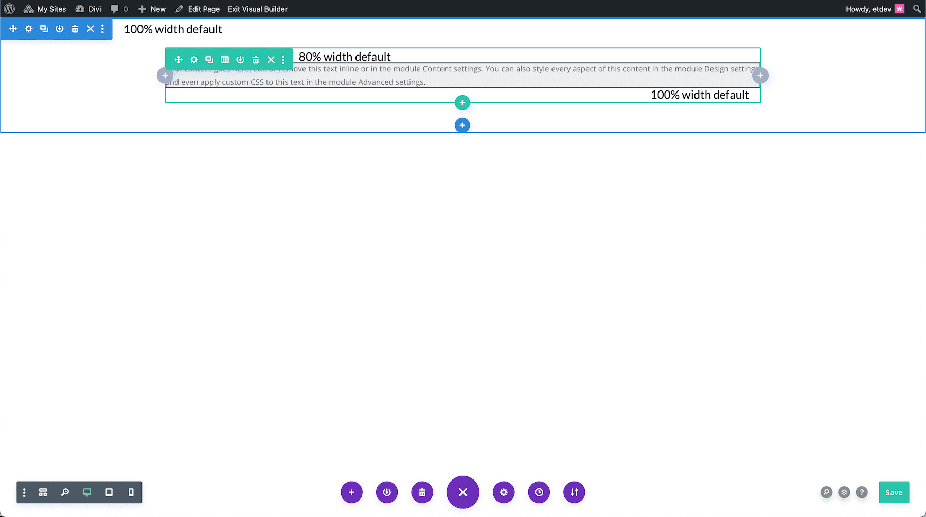
Divi comes preloaded with default sizing that helps speed up your design process. By default, all sections are set to 100% width and span the entire viewport. Rows are set to 80% width by default, columns are set to 100% width, and modules are set to 100% width by default so that they fill up the entire row container. These default sizing options remain the same for mobile devices making your design mobile-responsive from the get-go.
Length Units Used for Sizing
In the world of CSS, the size (or length) of an element is expressed by length units. Length units are small letters/symbols that follow a number value (10px, 2em, 100%, etc.) to establish the length of an element. Length units are often separated into two main categories: absolute and relative.
Absolute Length Units
Absolute length units are considered absolute because they are not relative to any other element. These units will not scale to browser size and will always remain the same size. These include the following:
pt – points
px – pixels
in – inches
cm – centimeters
mm – millimeters
pc – picas
Pixels are really the only absolute CSS length unit we should consider using for the web. The others are mostly used for physical (not digital) measurements (like print). A pixel unit refers to the size of one “dot” of your device display (which will vary slightly with each device). Because of this, pixels are commonly used for things that don’t necessarily need to scale with browser sizes.
Relative Length Units
Relative Length units are considered relative because they change/scale depending on the length of other elements. One common example is percentage, which is dependent on the length of the parent element.
em – relative to the element’s font-size
rem – relative to the root element’s font-size
vw – relative to 1% of your browser’s viewport width
vh – relative to 1% of your browser’s viewport height
vmin – relative to 1% of the smaller of the two browser viewport dimensions (height or width).
vmax – relative to 1% of the larger of the two browser viewport dimensions (height or width).
% – relative to 1/100 of the parent element’s width.
Suggested Length Units
These are the suggested length units for widths, heights, margins, and paddings.
- Widths: %, vw, and px (as max width)
- Heights: %, vw, and px (as max height)
- Margins: px, %, and vw
- Padding: px, %, em, vw and vh
A Guide to Understanding and Applying CSS Length Units in Divi
For more information on length units, please check out our A Guide to Understanding and Applying CSS Length Units in Divi.
How to Adjust Sizing in Divi
There are two ways you can adjust sizing options in Divi: via the element’s settings group or in the visual builder using the draggable controls.
Input Values & Range Slider
- Open up element settings
- Navigate to the Content tab
- Click on Sizing to expand that settings group
- Input a numeral value or drag the range slider.
Draggable Sizing Controls For Divi
If you like using the Visual Builder for most of your edits, then you’ll love the draggable sizing features Divi has to offer! Instead of having to open a settings panel and type in sizing values manually, you can instead drag to adjust the elements right on the page and see the results instantly. This new UI innovation allows you to quickly adjust the width, height, margin and padding of any module, row, or section with ease. Learn more about draggable controls here.
Sections, Rows, and Module Sizing
Let’s take a look at the Sizing Options available within Divi’s design elements.
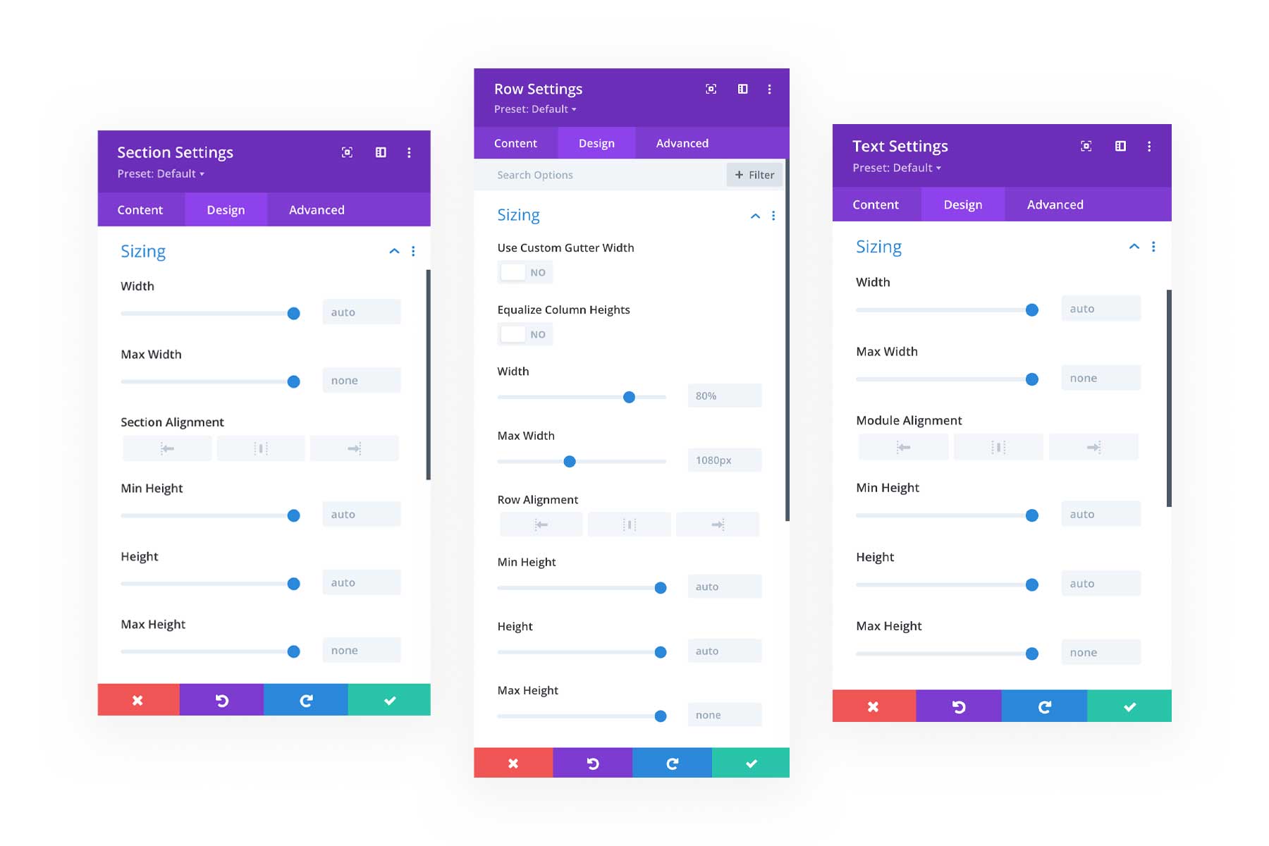
Section Sizing Options
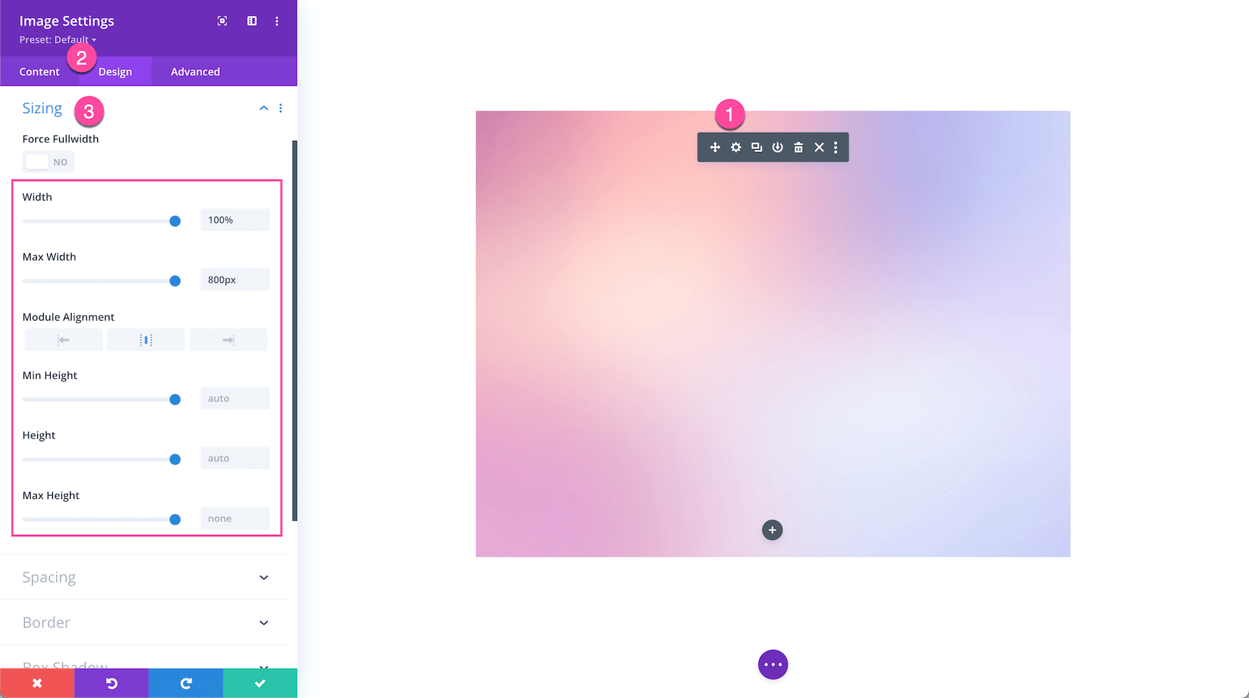
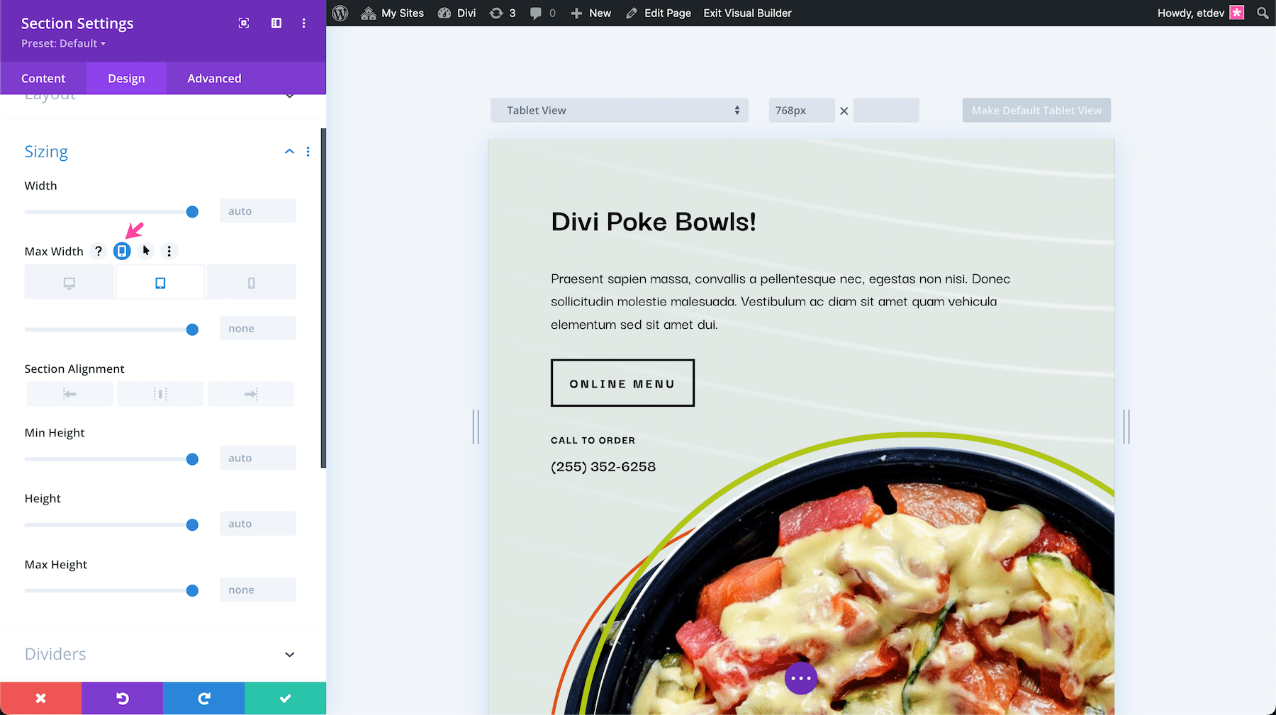
Within the section settings, you have the following sizing options: width, max-width, section alignment, min-height, height, and max-height. To edit these values you can drag the range slider or input numerical values in the input field.
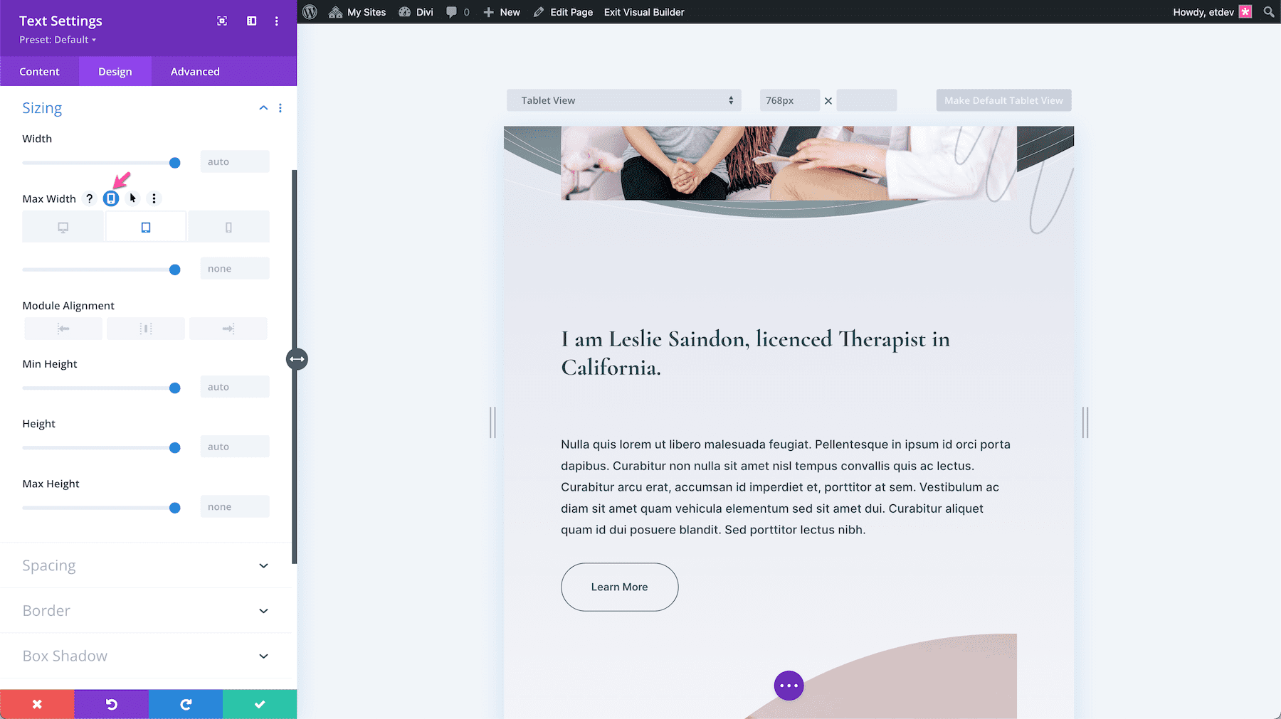
To set mobile styles simply hover over the value you want to change and click the phone icon, triggering the tablet and phone settings options to appear. Three tabs will appear: Desktop, Tablet, and Phone. Tab through them to set specific values. By default, the mobile sizing will inherit what is set on the Desktop view, however with this option you have the choice to set unique sizing values for mobile.
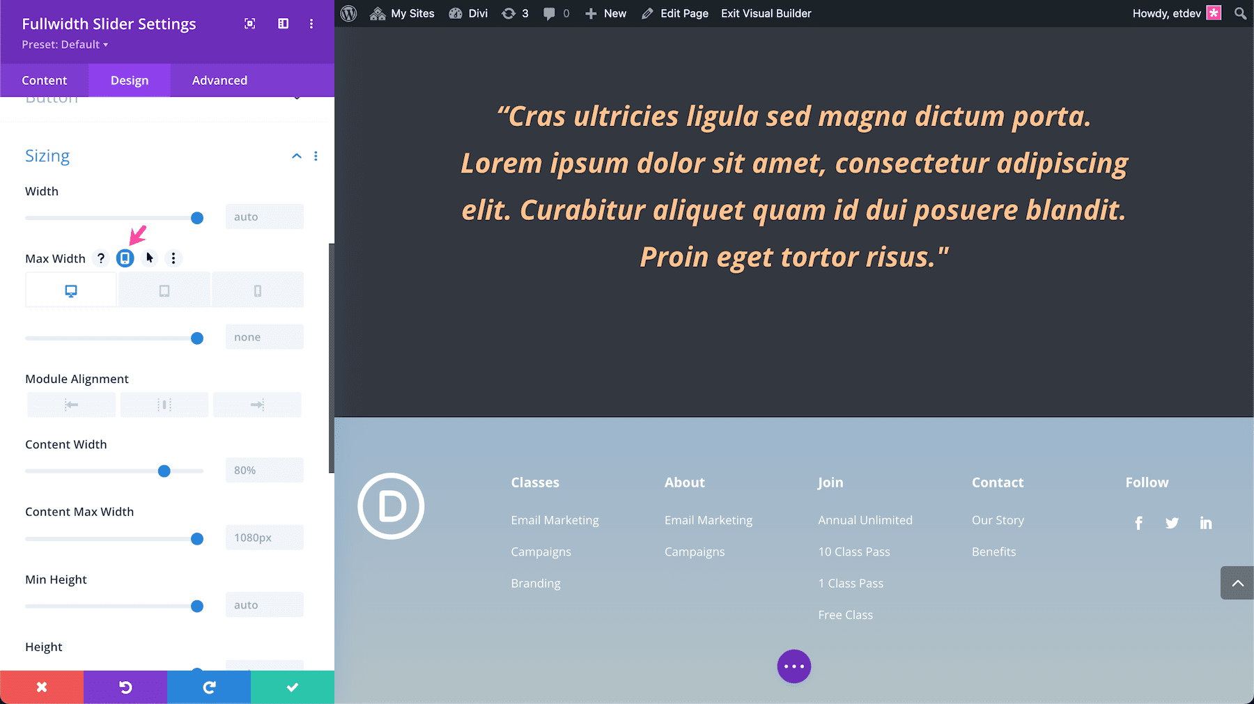
Fullwidth Sizing Options
In addition to the standard width and height options, Fullwidth sections have additional sizing options.
- Content Width: By default, elements will extend to the full width of their parent element. However, in fullwidth sections, you have the ability to adjust the width of the inside content.
- Content Max Width: Setting a maximum width for the content width will prevent the inner content from ever surpassing the value you specify here.
To set mobile styles simply hover over the value you want to change and click the phone icon, triggering the tablet and phone settings options to appear. Three tabs will appear: Desktop, Tablet, and Phone. Tab through them to set moble-specific values. By default, the mobile sizing will inherit what is set on the Desktop view, however with this option you have the choice to set unique sizing values for mobile.
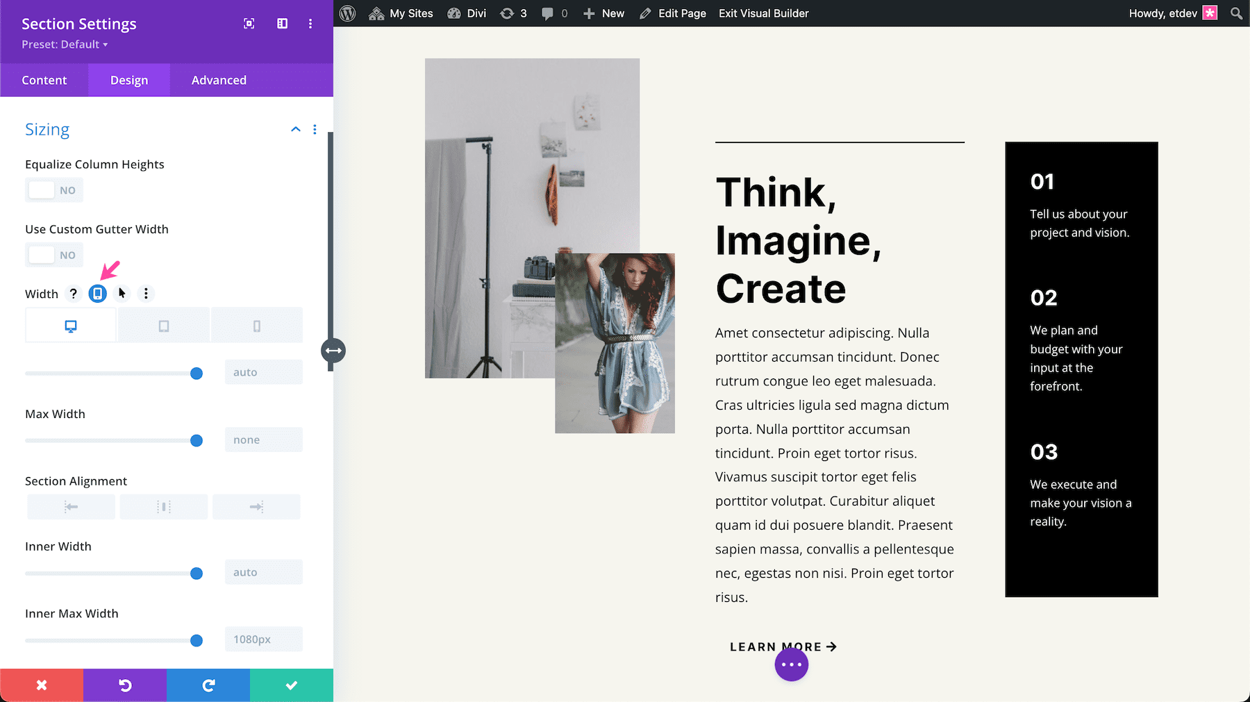
Specialty Sizing Options
In addition to the standard width and height options, Specialty sections have additional sizing options.
- Equalize Column Heights: Equalizing column heights will force all columns to assume the height of the tallest column in the row. All columns will have the same height, keeping their appearance uniform.
- Use Custom Gutter Width: Gutter width is the margin space between columns. You can increase or decrease the gutter width by typing in a numerical value or dragging the range slider. The gutter width is set as a percentage and you have the option to set the gutter width from 1-4.
- Inner Width: By default, elements will extend to the full width of their parent element. However, in specialty sections, you have the ability to adjust the width of the inner content inside specialty sections.
- Inner Max Width: Setting a maximum width for the inner content of specialty sections will prevent the inner content from ever surpassing the value you specify here.
To set mobile styles simply hover over the value you want to change and click the phone icon, triggering the tablet and phone settings options to appear. Three tabs will appear: Desktop, Tablet, and Phone. Tab through them to set moble-specific values. By default, the mobile sizing will inherit what is set on the Desktop view, however with this option you have the choice to set unique sizing values for mobile.
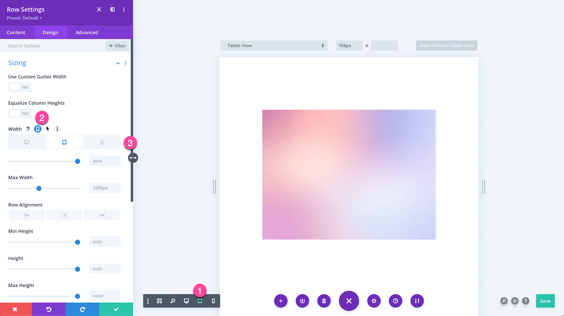
Row Sizing Options
In addition to the standard width and height options, rows have two additional options.
- Equalize Column Heights: Equalizing column heights will force all columns to assume the height of the tallest column in the row. All columns will have the same height, keeping their appearance uniform.
- Use Custom Gutter Width: Gutter width is the margin space you want between columns. You can increase or decrease the gutter width by typing in a numerical value or dragging the range slider. The gutter width is set as a percentage and you have the option to set the gutter width from 1-4.
How To Adjust Columns
Adjusting column sizes is easy in Divi. There are two ways to do it.
Option 1: Hover over the row and click the gear icon to bring up the row settings. Then click the dropdown menu under Column Structure to change the column structure. You can also drag and drop the column items to rearrange them.
Option 2: Hover over the row and click the column icon and select the column structure you want.
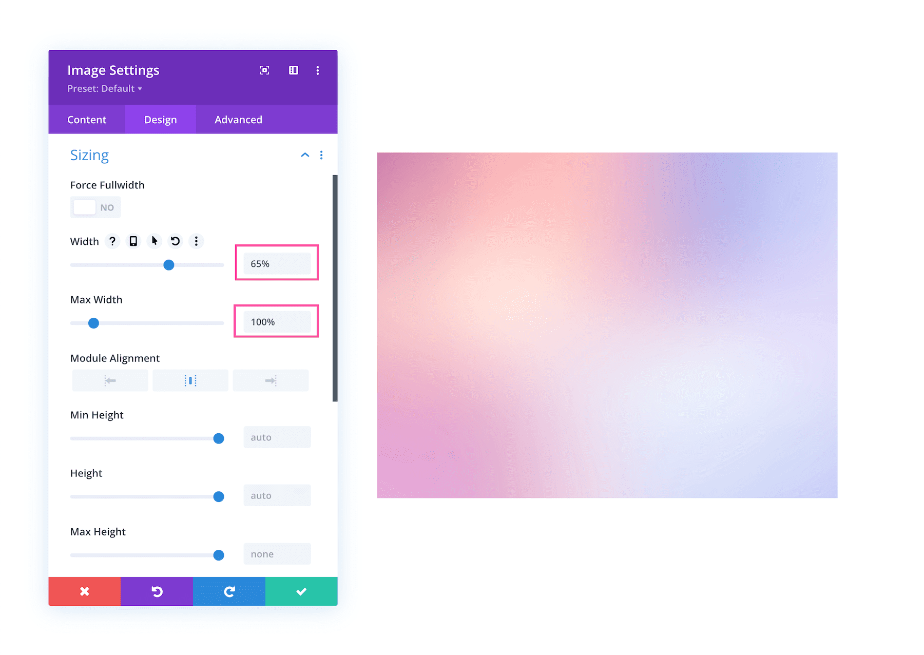
Module Sizing Options
Within the module settings, you have the following sizing options: width, max-width, section alignment, min-height, height, and max-height. To edit these values you can drag the range slider or input numerical values in the input field.
To set mobile styles simply hover over the value you want to change and click the phone icon, triggering the tablet and phone settings options to appear. Three tabs will appear: Desktop, Tablet, and Phone. Tab through them to set specific values. By default, the mobile sizing will inherit what is set on the Desktop view, however with this option you have the choice to set unique sizing values for mobile.
Tips & Best Practices for Using Sizing Options
When using Divi’s Sizing Options, keep these tips in mind!
Use Relative Length Units for Width
To keep your design mobile responsive, it’s best to use relative length units for width values like % or vw. This means the container’s width will automatically adjust based on the percentage you set or the viewport width you set. It’s an easy way to create responsive design elements!
Keep Spacing in Mind When Setting Sizing
Spacing and sizing go hand in hand in web design. While sizing controls the overall element’s size and height, spacing inside the element will add padding surrounding the content. So while your container, say a row, is set to 100% width, if you’ve added padding inside that row container then your content won’t be 100% the width of its row container.
Adjust Sizing Options for Mobile
While Divi is built to be mobile responsive, it’s always good to review your design on mobile devices. It’s easy to do so with Divi’s view mode. The first step is to enable the Visual Builder. Then click the mobile icon at the bottom left of the bottom Divi toolbar. To switch between devices, click the dropdown menu at the top.
Continue Learning
- How to Create a Fixed Contact Form Corner Popup with Divi’s Sizing Options
- How to Optimize Your Responsive Logo Sizing in Divi’s Fullwidth Menu Module
- How to Create Hover Sections with Divi’s New Sizing & Overflow Settings
- Using Divi’s New Height & Width Options to Create Responsive Design
- Better Mobile Website Design: How to Use vw, vh and, rem to Create Fluid Divi Pages