Using the Divi Responsive Preview System
Divi’s responsive preview system allows you to view what your designs will look like on a wide range of devices and viewport configurations. All without having to leave the visual builder!
Thanks to the Divi responsive preview system, it’s no longer necessary to use a third party software to test how your webpages will render on smaller screen sizes. Mobile devices are utilized by more than 60% of all internet users, so previewing how your pages will look on smaller screens is an important part of web design. Let’s take a look at how to use the repsponsive preview system by demonstrating its capabilities using the Streamer Divi Layout Pack.
How To Access the Divi Responsive Preview System
There are two ways to access Divi’s responsive preview system. The first is by activating it at the page level. This can be accomplished by viewing the page’s back end or on the front end with the Visual Builder. The second way to activate the responsive preview system is at the module, colum, row, or section level. Let’s start off by loading the preview system at the page level.
Page Level Responsive Preview Mode
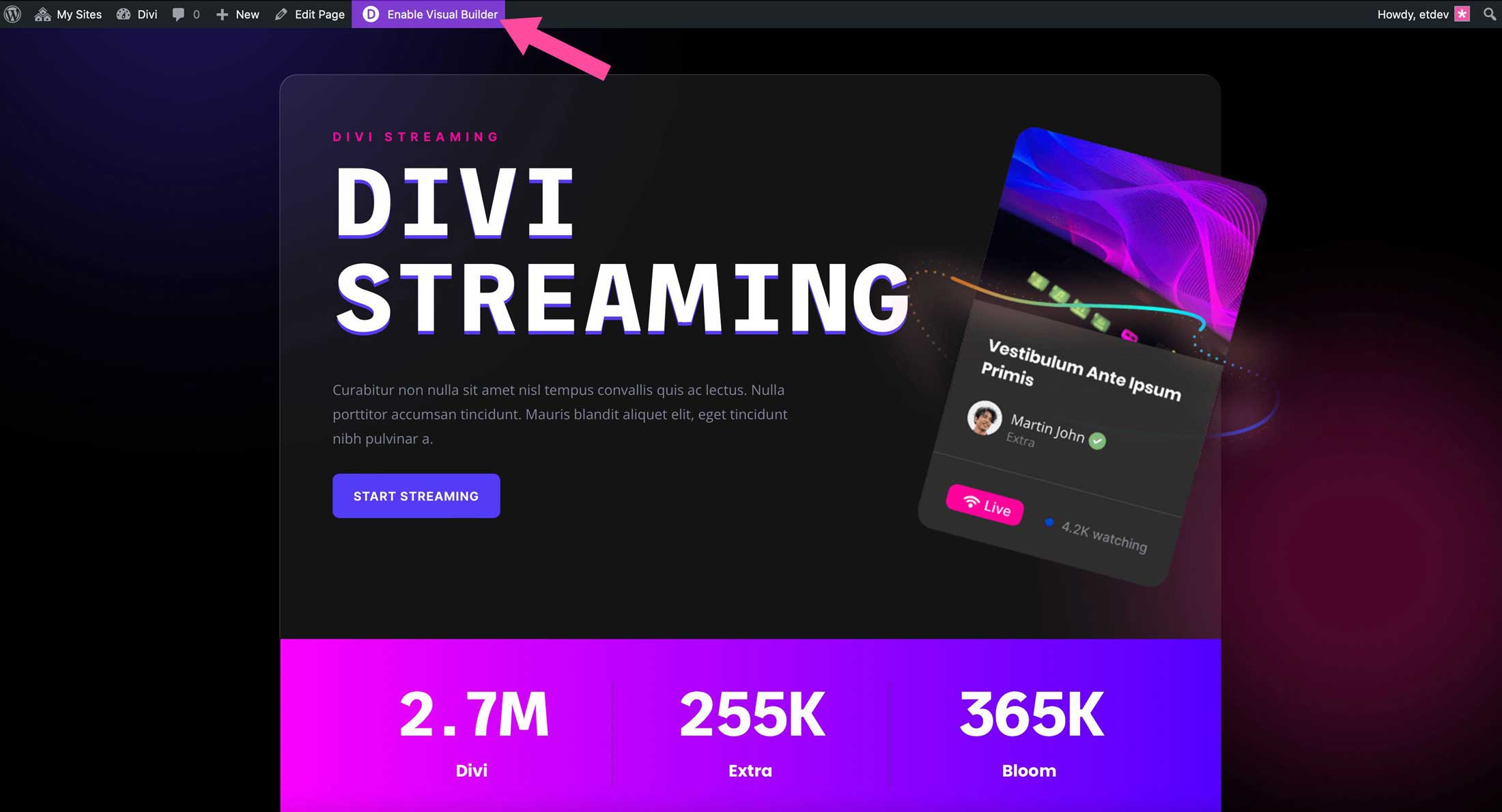
To use the reponsive preview system, log in to your Divi website and click Enable Visual Builder.
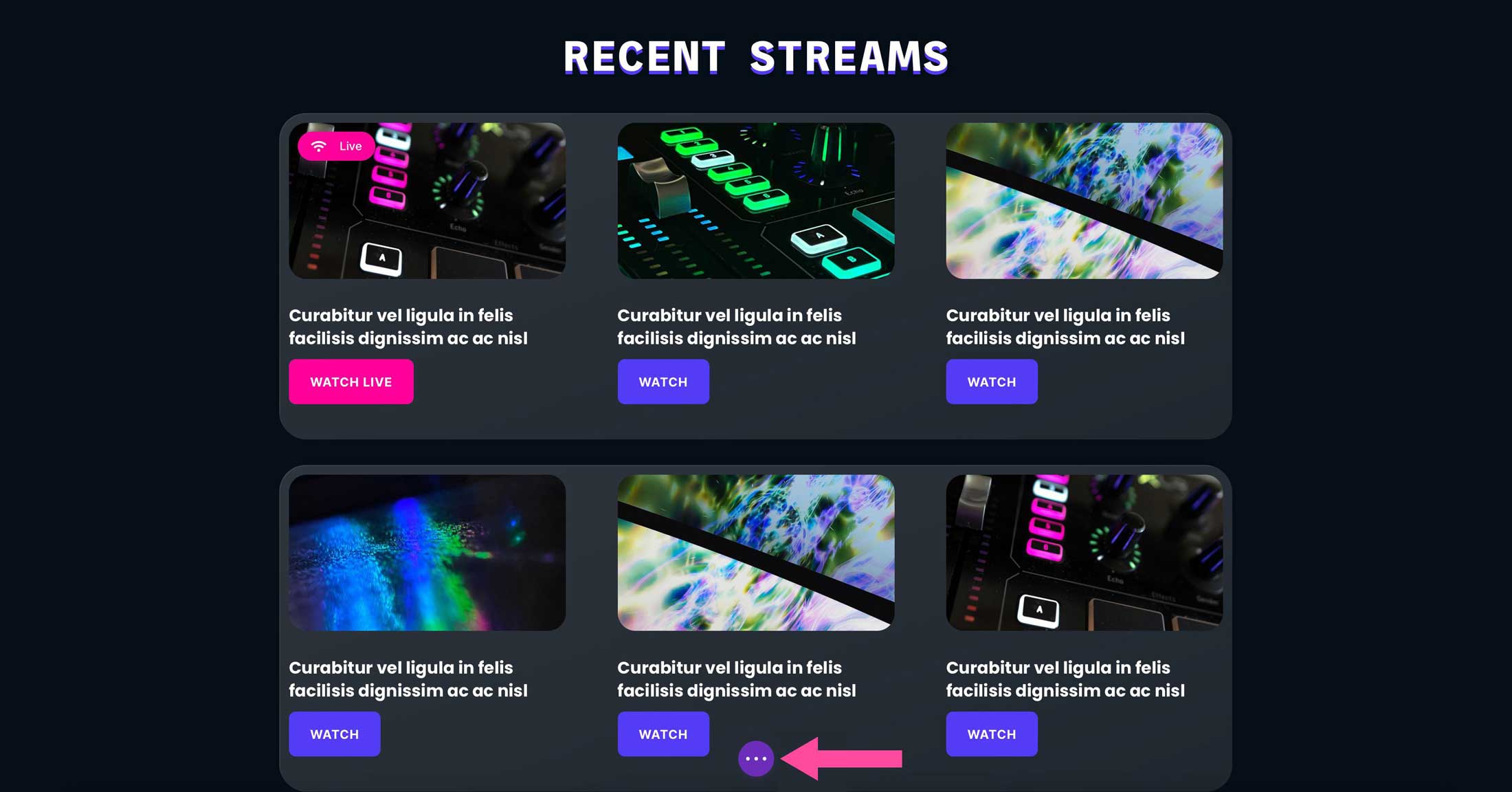
With the Visual Builder activated, click the purple ellipsis menu at the bottom center of your screen to activate the page options menu.
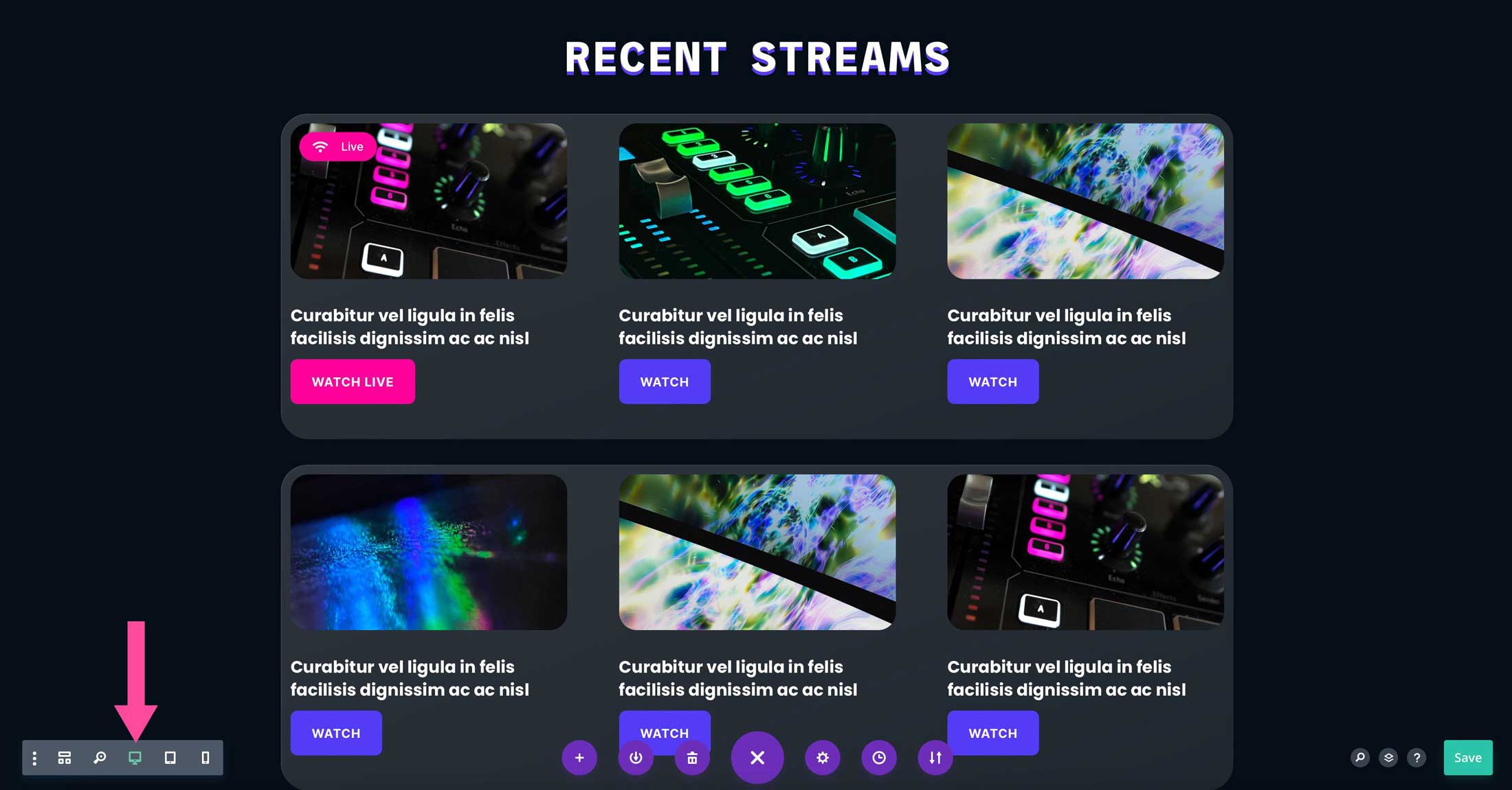
Next, click the tablet or phone icon at the bottom left corner of your screen to activate the responsive preview system.
Module Level Responsive Preview Mode
The Divi responsive preview system can be accessed in any module, column, row, or section throughout the Visual Builder. For example, click into a text module in the Visual Builder. Click on the design tab, then scroll down to view the heading font settings. Hover over heading font to reveal the responsive view menu. Next, click the tablet or phone icon to enable the respective view.
Adjusting the Divi Responsive Preview Modes
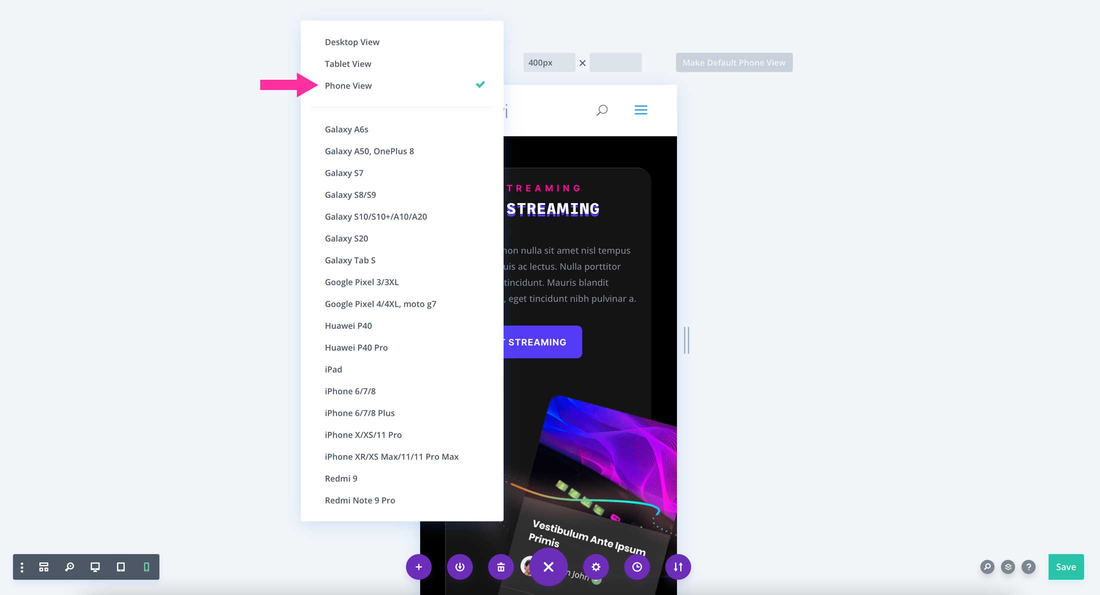
There are multiple presets available within the responsive preview system. The default preview modes are desktop view, tablet view, and mobile view. To access them, click the responsive preview menu in the lower left corner of the Visual Builder.
Divi Responsive Preview on Popular Device Presets
There are also popular device presets available to you. These presets enable you to preview how your page will display based on a specific device. To access the list of devices, click on the first dropdown menu.
From there, you’ll be able to choose from a list that includes several Apple and Android devices.
Customizing the Divi Responsive Preview Widths
In addition to default and device preview presets, you can specify a custom width for your preview. Furthermore, Divi has a click and drag resizing function that will allow you to adjust the width of your preview with ease.
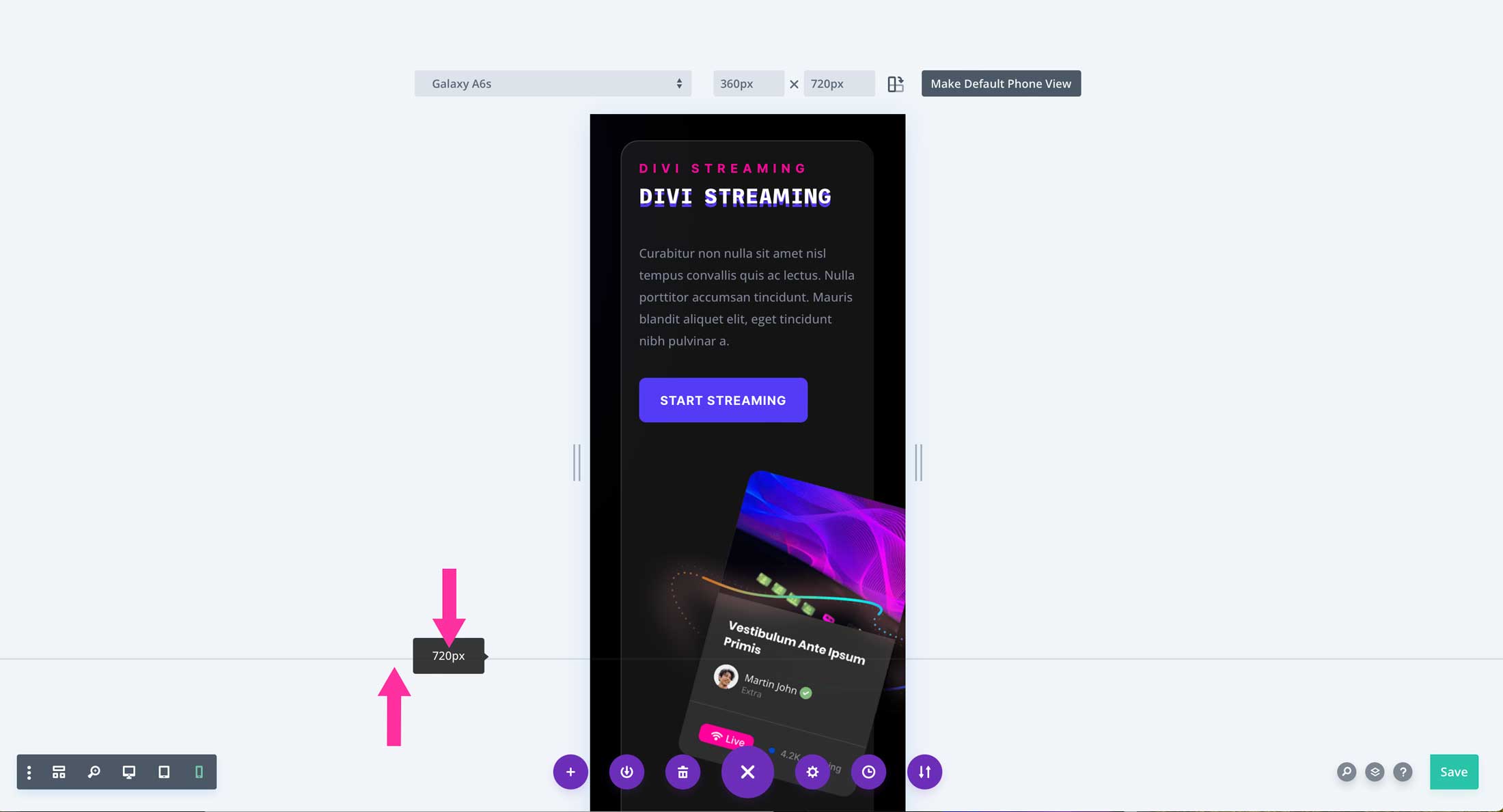
Drag To Resize the Divi Responsive Preview
To resize your preview, simply click and drag from the left hand side of the preview. As you drag the preview area, the width will automatically adjust in the dimension fields.
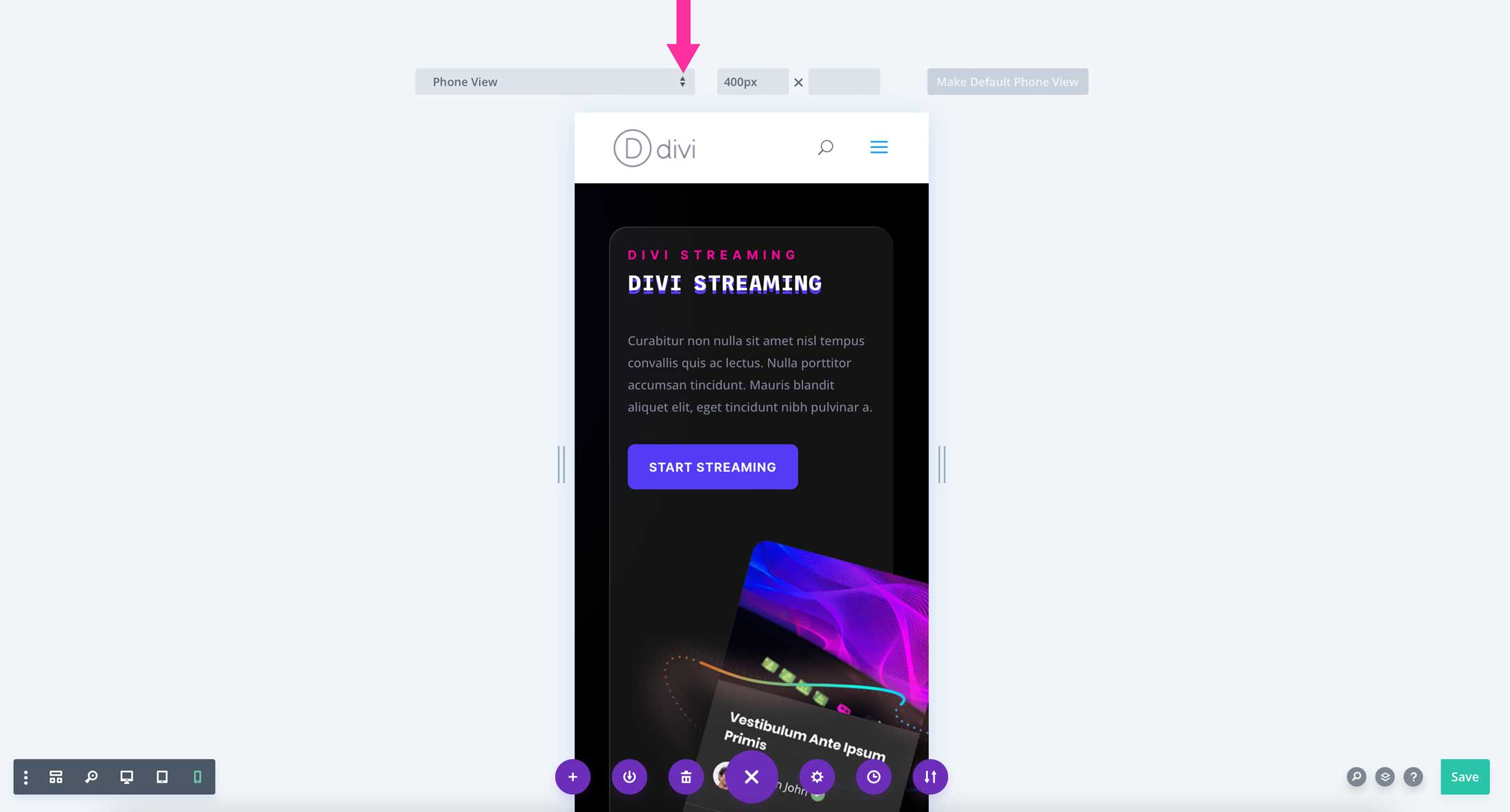
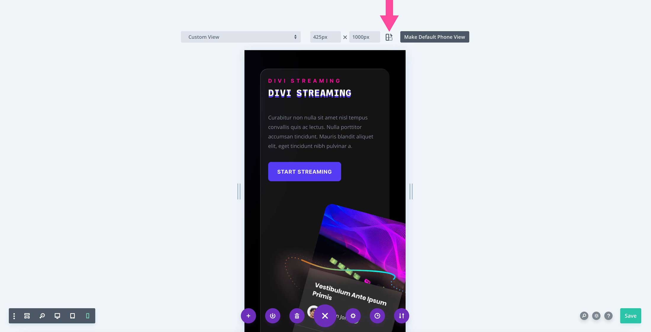
Custom Size Input
An additional way to customize your responsive preview is to manually adjust the width and height to a specific dimension. To do this, simply click into the dimension field and type in your desired width. Once you have adjusted the size to your liking, you can click the make default phone view button to make it the default preview width. If you’d like to set dimensions for the tablet preview as well, repeat the steps outlined to create a default view for tablets. Then, click the make default tablet view button to save your preset.

Above The Fold Indicator
The Divi responsive preview system has a handy above the fold indicator that enables you to determine how the elements on your page will be visible to your website’s visitors before scrolling. This is useful when you are placing important content at the top of your design. The above the fold indicator will change based on the device preset that you choose.
Portrait & Landscape Modes
Another excellent feature of the Divi responsive preview system is the ability to view your designs in either portrait or landscape mode. To access this feature, click the icon to the right of the dimension fields. Clicking the icon will switch the page orientation, enabling you to view how your page will look based on how the user is holding the device. The current orientation is indicated by the darker color.
More Resources
The Divi responsive preview system enables Divi users to preview their designs on smaller device screens quickly and effortlessly. It’s truly a great way to ensure that your content is optimized for mobile devices.
To learn some great tips for responsive design, check out these posts on the Elegant Themes blog.