The Divi Video Module
How to add, configure and customize the Divi video module.
The Divi Video Module is an easy way to display videos anywhere on your website. Videos can be uploaded directly to your website via the WordPress media library or imported by a URL if your video is hosted on a 3rd party website like YouTube or Vimeo. The Video Module is useful anywhere on your site where you need a video.
View A Live Demo Of This Module
How to Add the Divi Video Module to Your Page
Before you can add the Divi Video Module to your website, you’ll need to have the Divi theme installed on your WordPress website. Learn how to install the Divi theme on your WordPress website here. Once you have the Divi theme installed and activated, we can begin using the features and functionalities of Divi.
Add a Page and Load the Divi Builder
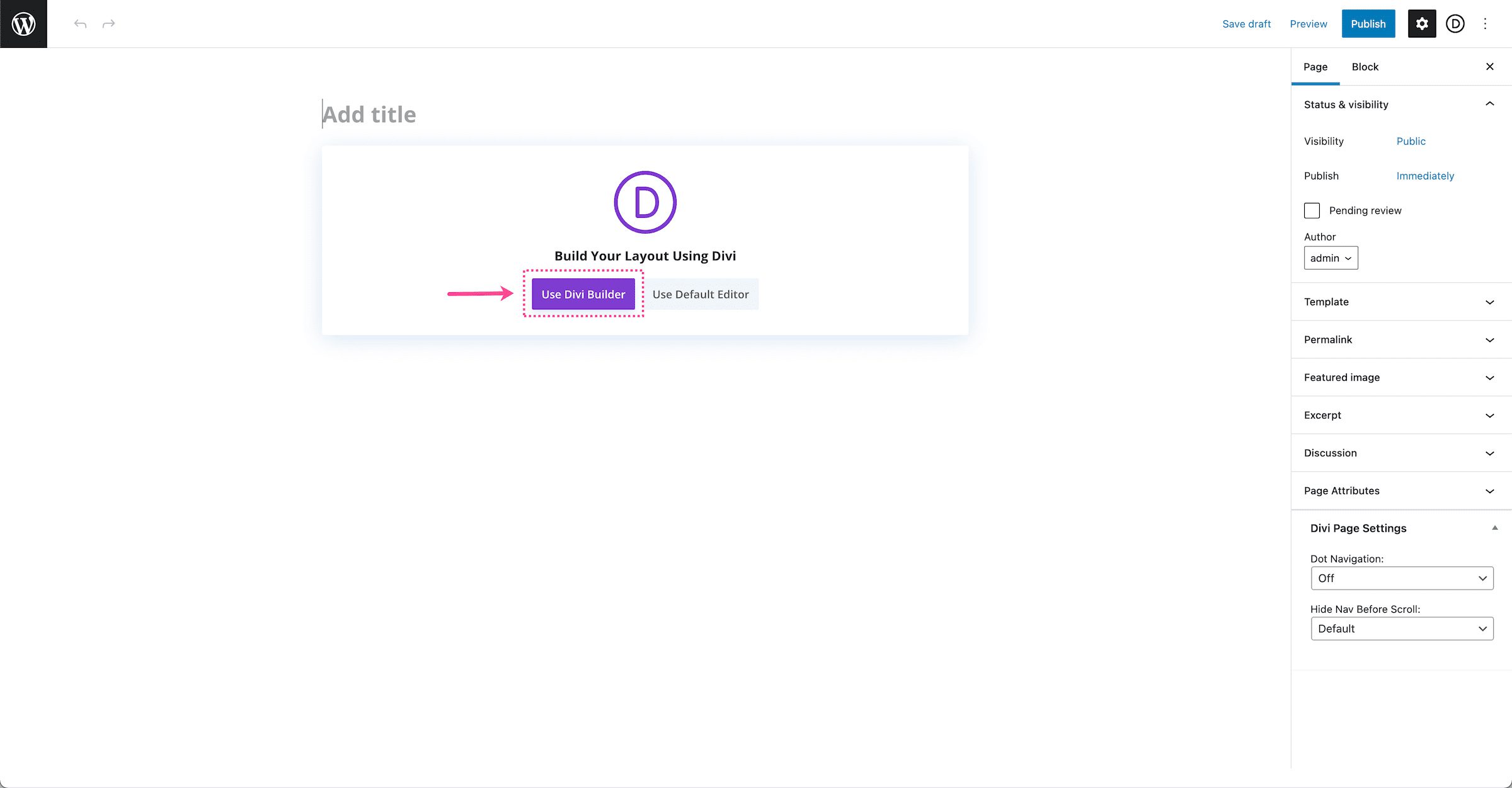
To get started, add a new page to your website. By default, the Standard Gutenberg Editor loads whenever a new post or page is added in WordPress. To load the Divi builder on any post or page, click the purple button underneath the page title that says “Use The Divi Builder”.
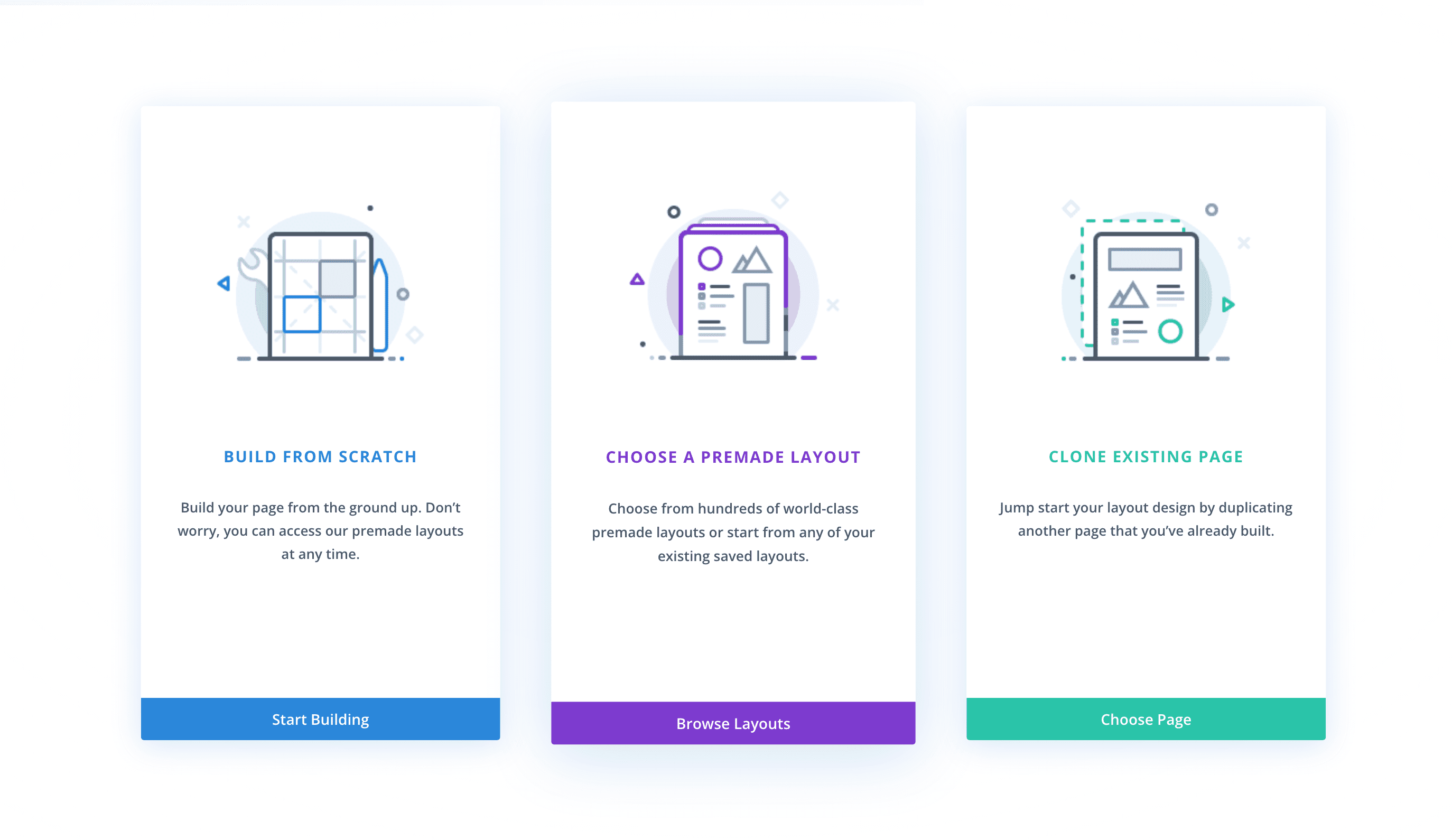
Once clicked, this will reload the page with the Divi Visual Builder. As your page reloads, you’ll notice three options that come up: Build From Scratch, Choose A Premade Layout, and Clone An Existing Page.
Build From Scratch
This option loads the Divi Builder with a blank page design. Choose this option if you’d like to start your page design from scratch.
Choose a Premade Layout
This option allows you to choose from our large library of pre-designed Divi layouts. You can choose from premade layouts by Divi, pre-made layouts you’ve designed and saved to your Divi Library, and existing pages on your website that you can clone.
Clone an Existing Page
This option allows you to copy another page design on your website and use it for the page you’re editing. Select this option if you’d like to load an exact copy of an existing page that you’ve already designed on your website.
Select, Build From Scratch.
Add the Divi Video Module
When you load the Visual Builder, Divi automatically adds a section and a row. You can learn more about how to modify and customize sections here and rows here. Once the section, row, and columns are set up, click on the grey “+” icon inside the row. This brings up the Divi Module Library which contains all the modules included with the Divi theme. Scroll down to “Video” and click on it to load the module.
Note: This module library is also searchable. Type the name of the module you want in the search bar at the top.
All Divi Video Module Options Explained
Once you’ve added the Divi Video Module, the module settings automatically pop up. This is where all of the content and design styles for this module are configured. These settings are organized into three groups via the tabs at the top of the module: Content, Design, and Advanced.
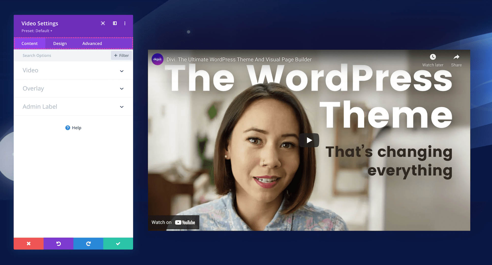
Content
Inside this tab, you’ll find the content options available for the Divi Video Module.
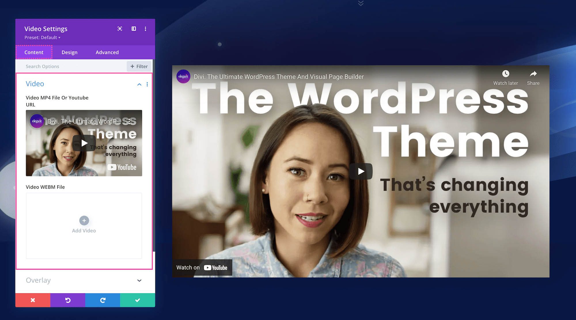
How To Add A Video To The Divi Video Module
This is where videos can be added to the module. There are two ways to add videos to this module: by uploading them directly to your website or by inserting a video from a URL.
Note: If you are uploading a video to your website, we recommend uploading both WebM and MP4 formats. WebM files are smaller file sizes (which saves space on your server) and have better compression, however, a few browsers and devices don’t support WebM, so uploading an MP4 file ensures your video will play on all browsers and devices.
- When the video module is first loaded, a demo video is automatically added to the video slider. To replace the demo video, hover over the demo video and click the trash can icon. This will remove the video.
- Then click “Add Video”. This will bring up your WordPress media library where you can browse from already uploaded videos, upload a new one, or insert from URL.
- Once you have selected the video you want, click the “Upload Video” button in the bottom right corner of the media library window.
- To use a video that’s hosted on another website (like YoutTube or Vimeo, copy the URL of that video and go to your WordPress media library. On the lefthand sidebar click “Insert from URL.” Paste the URL to your video in the textbox. Then click the “Insert Into Post” button in the bottom right corner of the media library window.
Overlay
Select an overlay for your video. You can choose an image from your media library, upload a new image, or click “Generate From Video” which will automatically use the video’s thumbnail as the overlay.
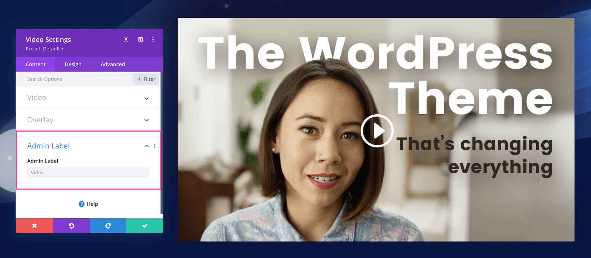
Admin Label
The Admin Label is where you can give the module a name only visible to you in order to assist in keeping things organized and easy to understand on the back end. By default, the admin label will be the name of the module. You can change the text of the admin label to reflect what you’d like.
Design
Inside this tab, you’ll find all the design styles and options for the Divi Video Module.
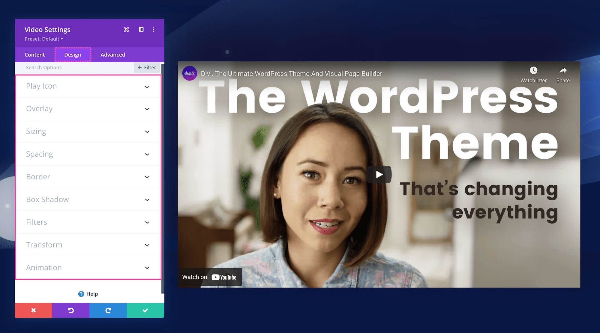
Play Icon
- Play Icon Color – Pick a color of the play icon. Select a color from your default site color palette, or click on the eyedropper icon to find a new color.
- Use Custom Icon Size – If you’d like to use a custom font size for the play icon, you can set that here. Toggle this option to “yes” and select the size you’d like by using the range slider or typing in a numerical value.
Overlay
Overlay Background Color – Choose a color for the background of the play icon that you want to display on hover. Select a color from your default site color palette, or click on the eyedropper icon to find a new color.
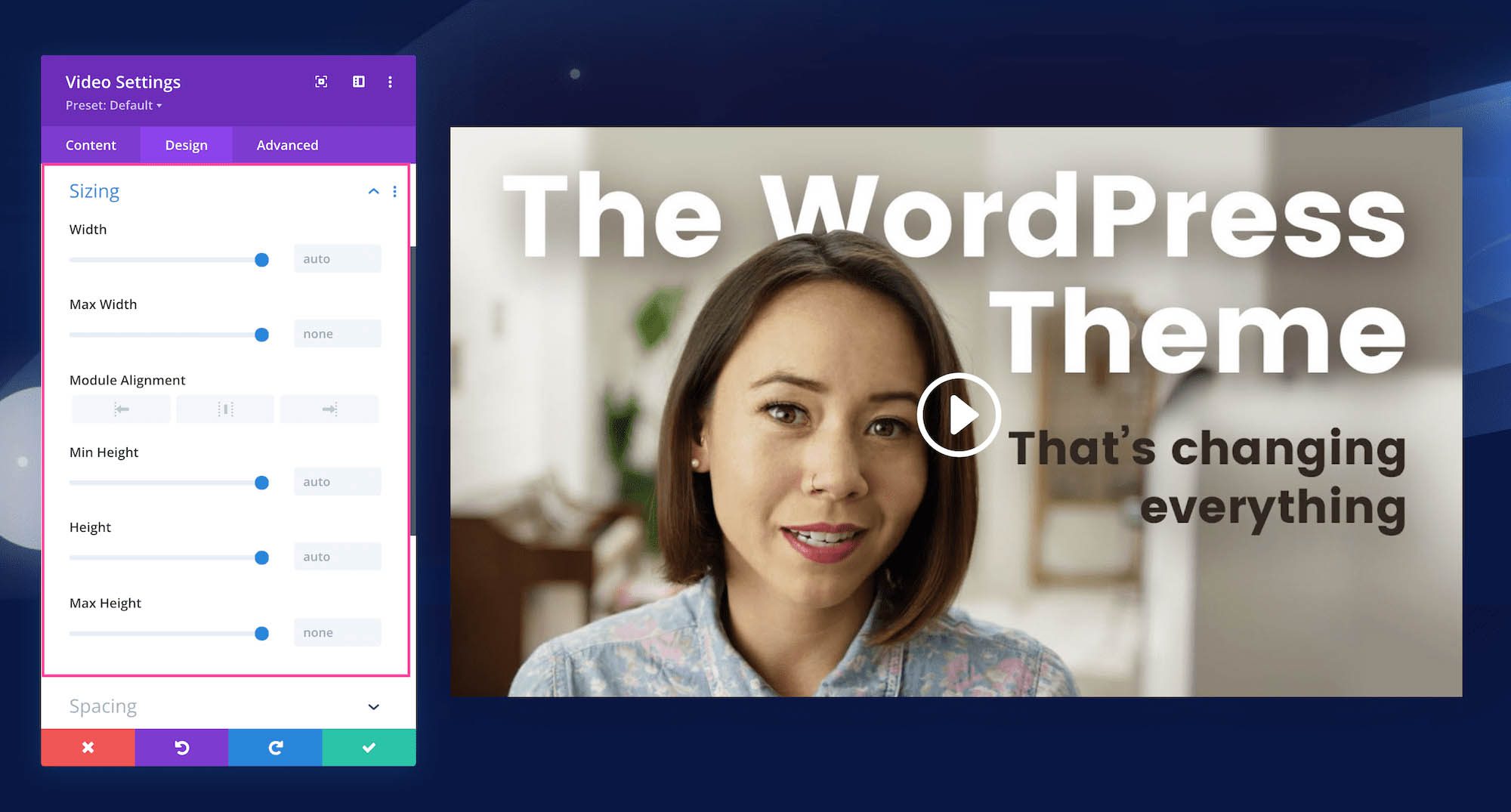
Sizing
This section defines the sizing (width and height) of the module. You can set a max-width and a max-height and a min-height for the module. Choose the module alignment (left, center, or right) by clicking the arrows. By default, modules align center.
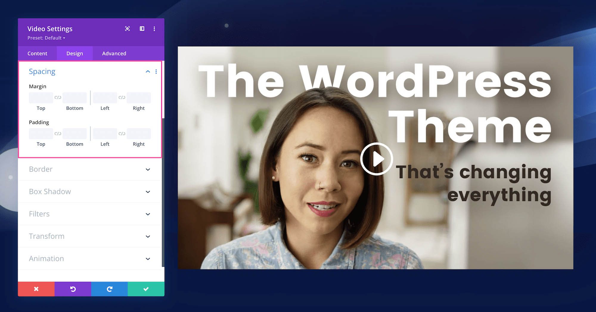
Spacing
Here is where you can add margins or spacing to this module by typing in numerical values. Margins add space outside the module element, and padding adds space inside the module element. To lock in ratios and keep the values the same, you can click the chainlink icon between the values you want to always be identical (ex: top and bottom).
Border
Add a border to the module. You can add a complete border or add a border to only one side of the module. Adjust the width via the range slider and select a color. Choose a border style by clicking the dropdown.
- Rounded Corners – If you would like to have round border corners, type in a numerical value. The higher the number, the rounder the corners will be. The corner values are automatically linked (as seen by the highlighted blue chainlink in the middle) however if you’d like to have different values for each corner, simply click the blue chainlink to unlink the values. If the values are automatically linked that means they will always have the same value and update automatically if one value is changed.
- Border Styles – Here you can add a border to all sides of the module or to individual sides (top, right, bottom, and left).
- Border Width – This is where you set the width of the border. For a thicker border, increase the number. The border width must be at least 1px in order to show.
- Border Color – This is where you can pick the color of the border. You can select a color from your default site color palette already displayed, or click on the eyedropper icon to find a new color.
- Border Style – Here you can select what style of border you’d like: solid, dashed, dotted, double, groove, ridge, inset, outset, or none.
Box Shadow
Here you can add a drop shadow to the entire module. Once a shadow style is clicked, you can customize the position of the drop shadow (horizontal and vertical), the strength of the blur, and the spread strength by adjusting the range slider or inputting numerical values. Select the drop shadow’s color from your site’s color palette or click the eyedropper to find a new color. Choose the box-shadow position to be inside the container or outside the container via the dropdown.
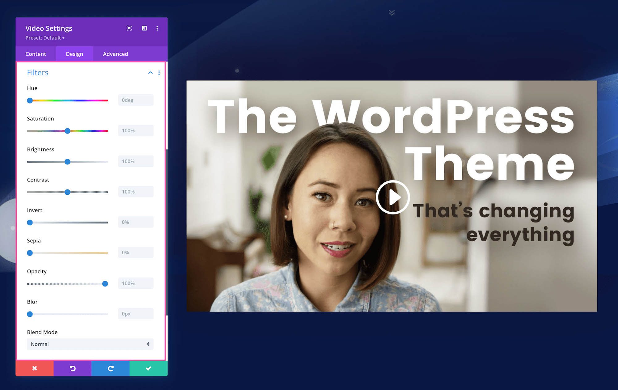
Filters
Adjust the hue, saturation, brightness, contrast, color tones (inverted colors or sepia), opacity, and blur of this module. The Blend Mode refers to how the module blends with the layers beneath it. By default, “normal” will be selected.
Transform
Scale, translate, rotate, skew, and set origin points for this module. Tab through to access each feature. Configure each feature by inputting numerical values or dragging and expanding the box or circle. You can lock in these values to always be identical by clicking the chain link icon at the bottom right.
Animation
Here you can apply animation to the module. Once you choose an option you can also adjust the duration, delay, opacity, and speed of the animation and whether you want it to continually repeat or just happen once.
Advanced
This is where the advanced customization settings are for the Divi Video Module.
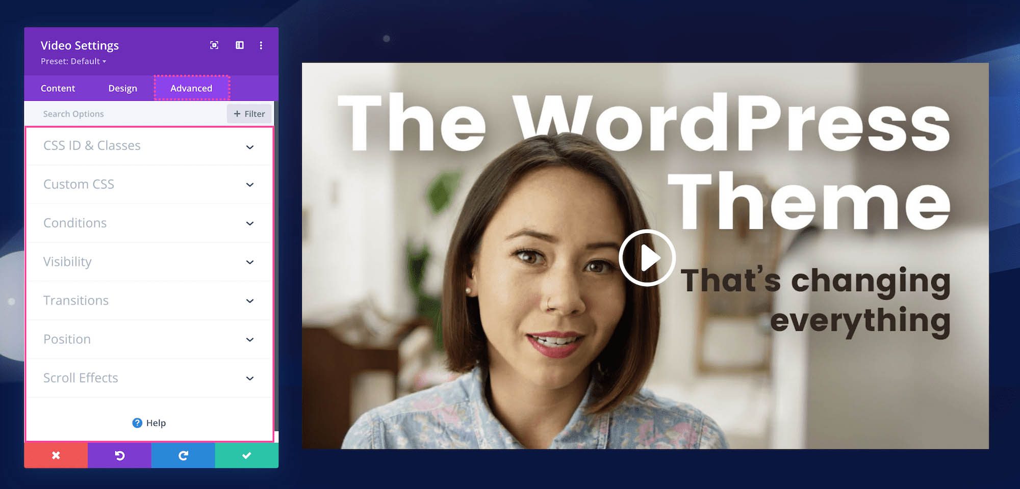
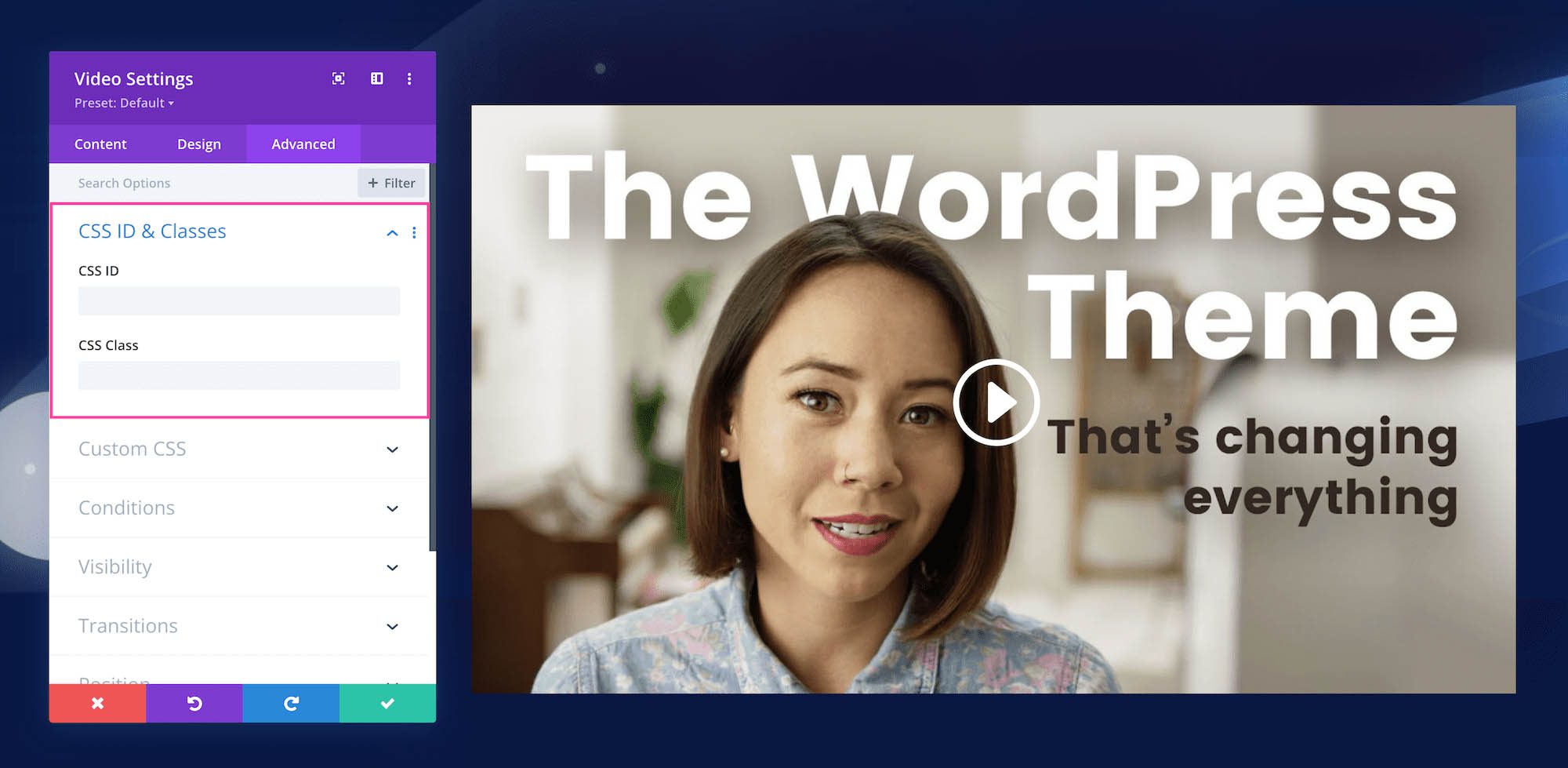
CSS ID & Classes
This is where you can assign a specific CSS ID or class to this module. This is helpful when you’d like to apply custom CSS to a module by using your child theme’s stylesheet.
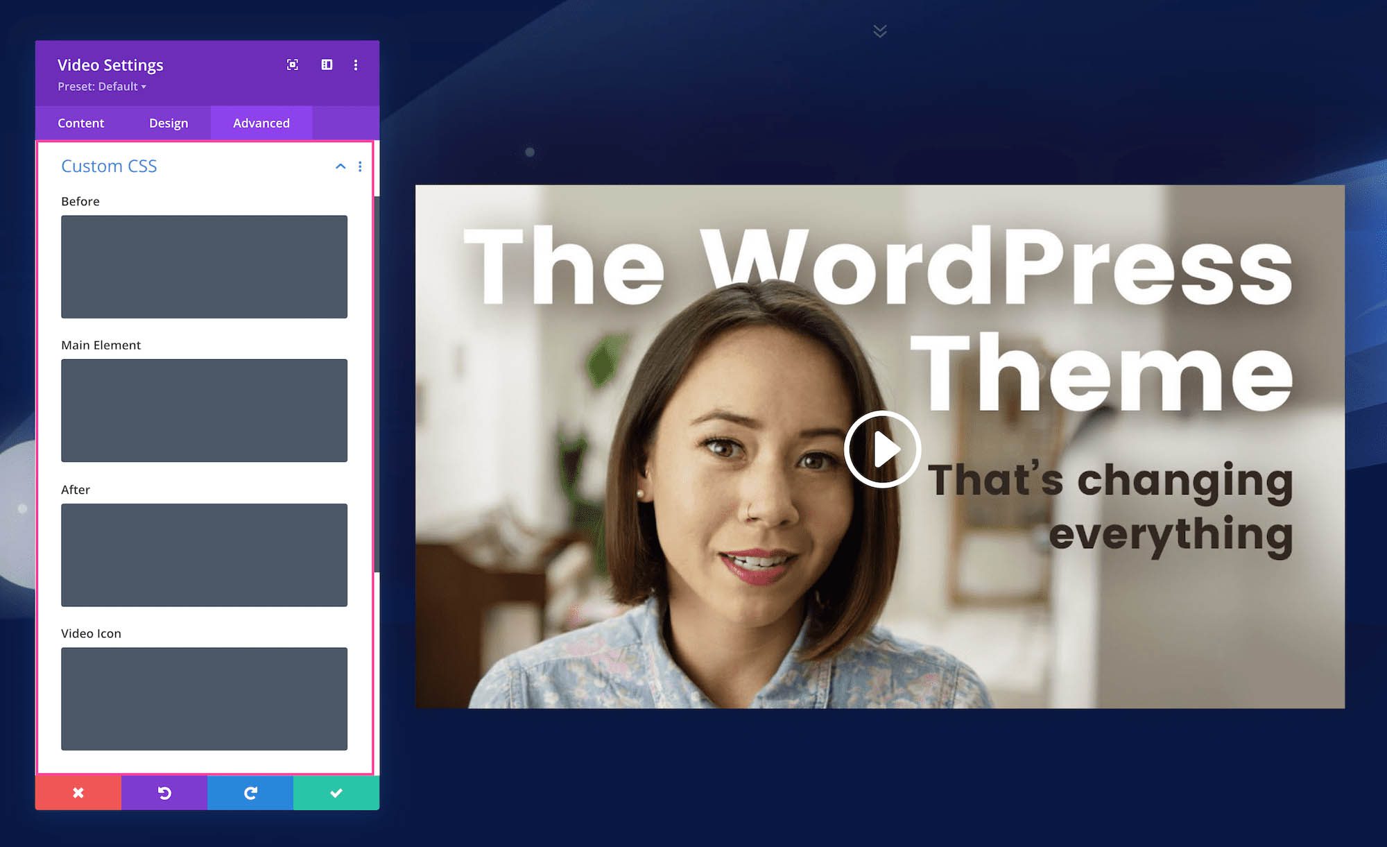
Custom CSS
You can also apply custom CSS to this module by pasting it in this tab. When you click on the Custom CSS tab, you’ll see individual sections where you can add CSS to specific elements in the module.
Conditions
This tab allows you to choose when to display this module based on a set of conditions, like what time a user is visiting the page if they’ve already purchased from your company before, what browser they are using, what operating system they’re using, and more. You can add one condition or multiple conditions.
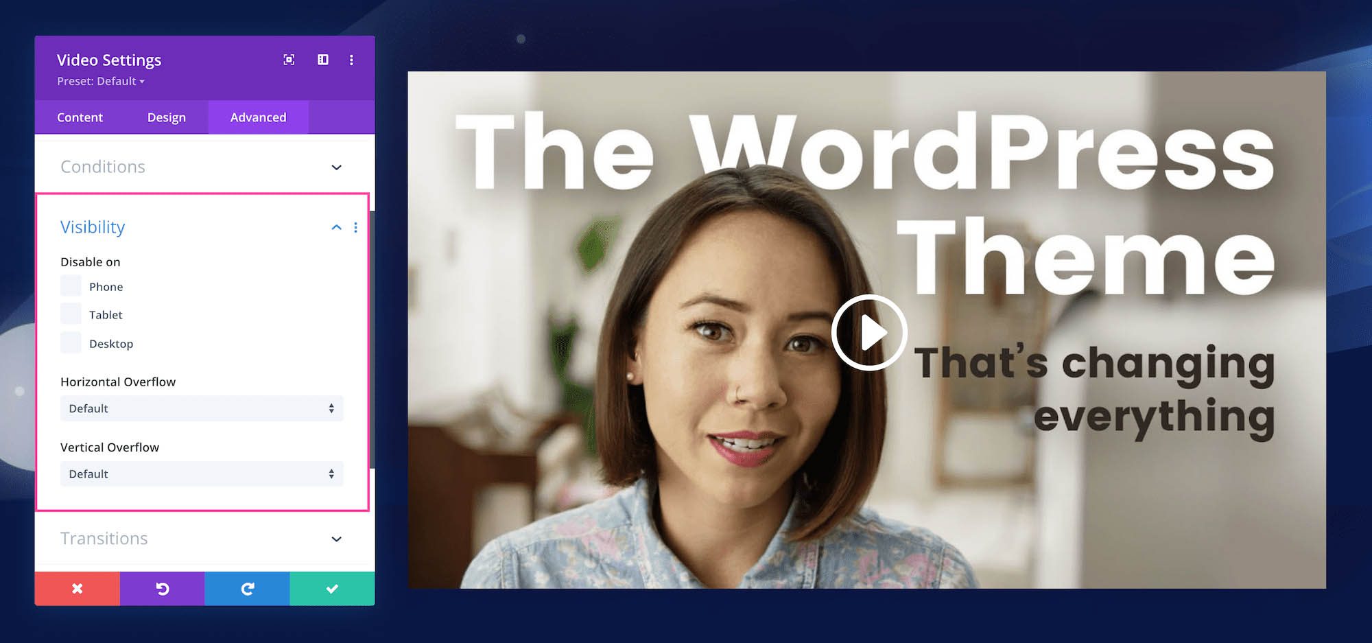
Visibility
This defines the visibility of the module. You can choose to disable it (hide it from view) when the display window is a Phone, Tablet, or Desktop by clicking the corresponding checkbox. You can also determine how you want overflow content to be displayed if the content overflows the element that it is in. You can choose visible, scroll, hidden, or auto for both horizontal and vertical content. By default, “auto” is selected.
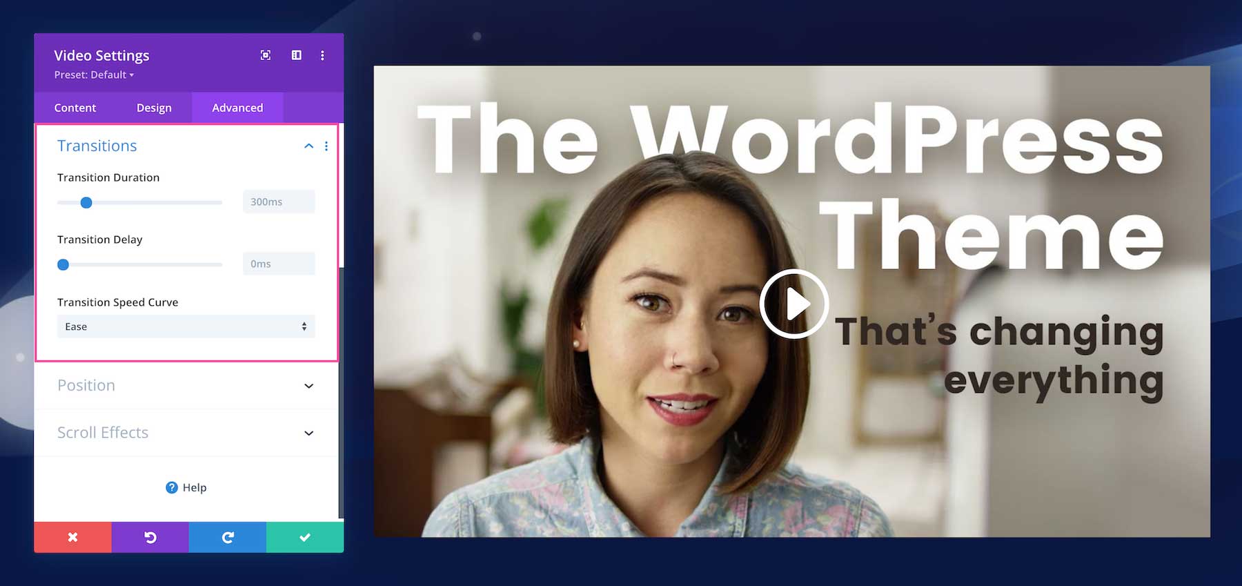
Transitions
This controls the transition duration of the hover animation as well as the delay, and speed curve.
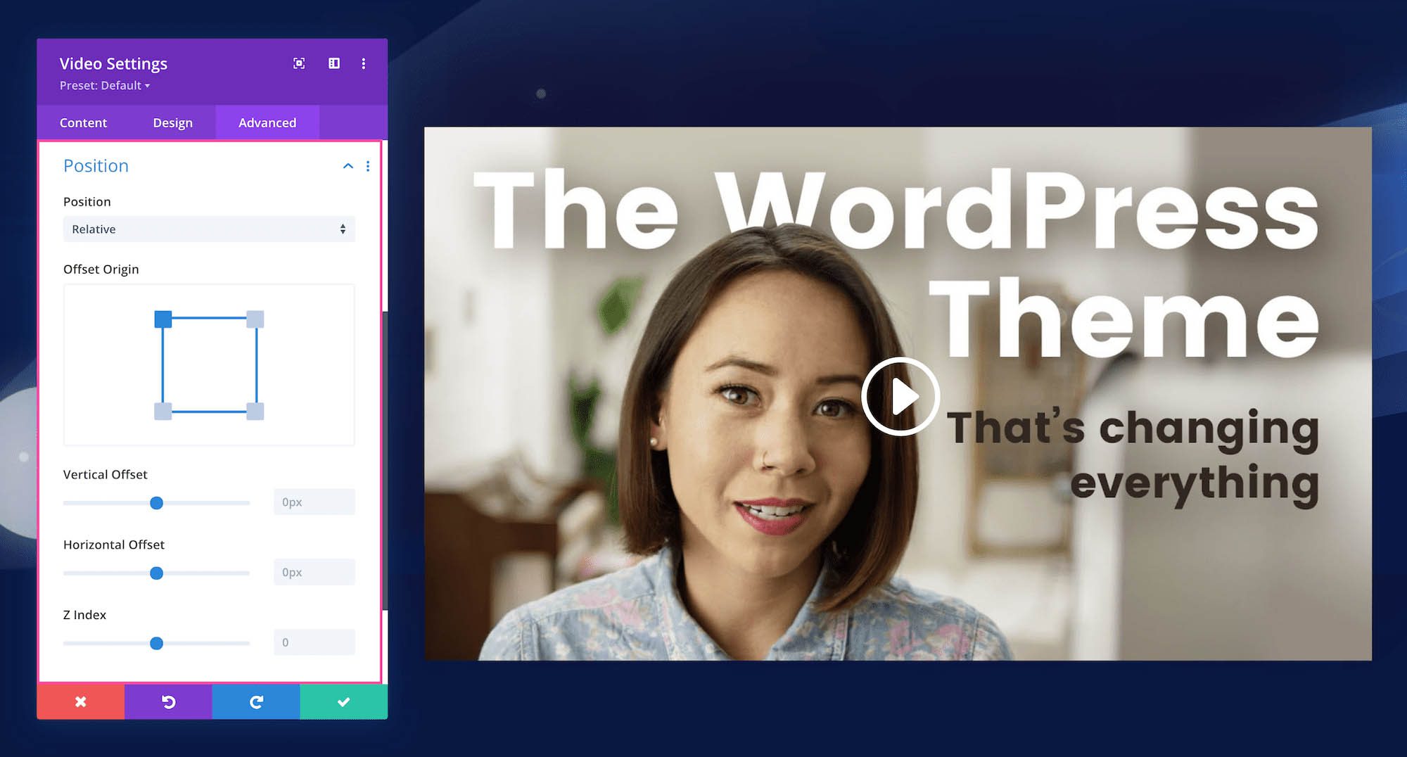
Position
This defines the position of the module as well as the offset origin, vertical and horizontal offsets, and the z-index of the module. The available positions are default (which is automatically selected), relative, absolute, and fixed. Defining the z-index allows you to specify the stack order of elements. Elements with a higher z-index number overlap elements with a lower z-index.
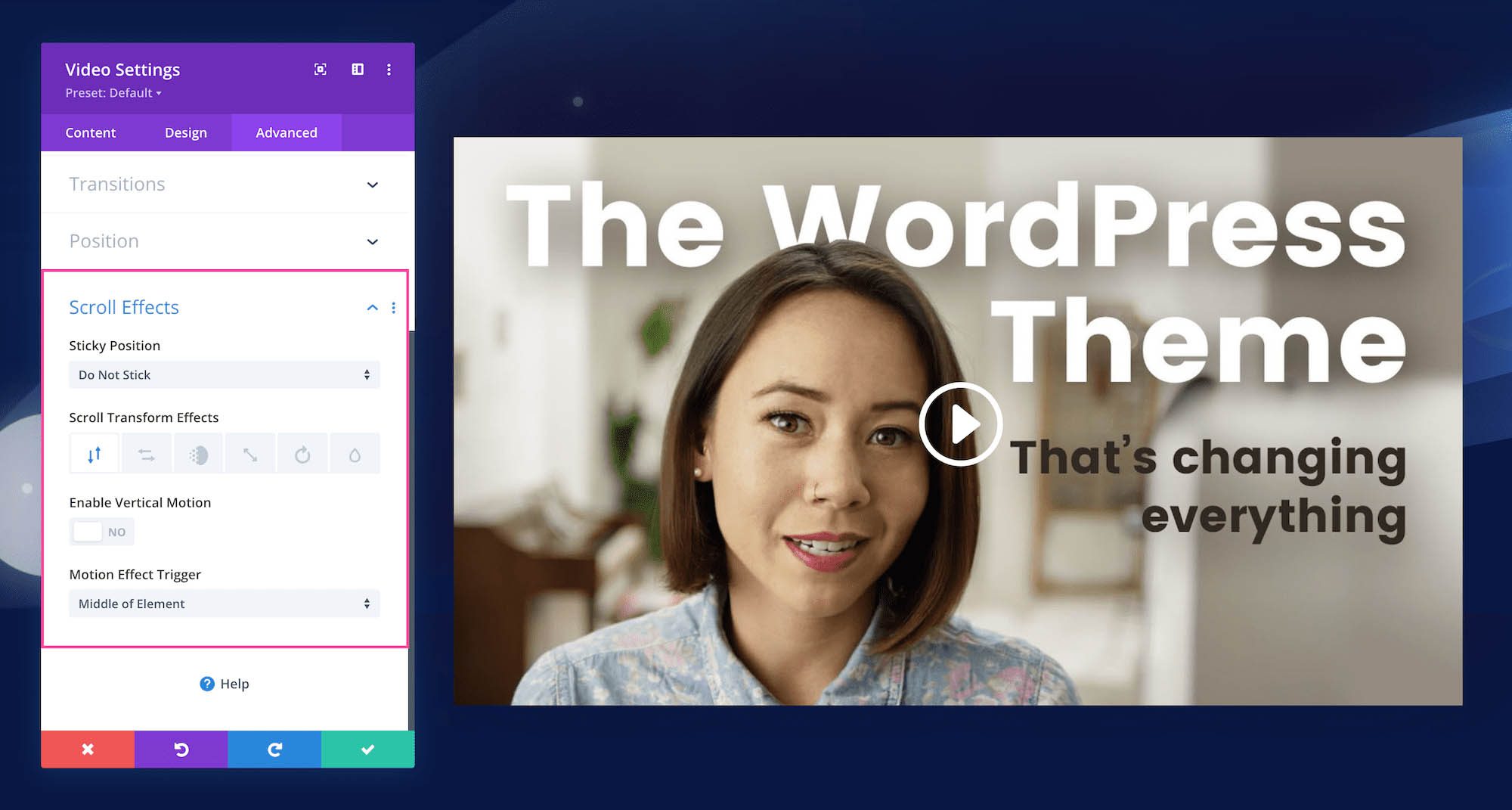
Scroll Effects
This defines how the module behaves upon scroll. You can make the module sticky (to top, bottom, or top and bottom), and choose if the module transforms upon scroll. You can also enable vertical motion on this module which allows you to adjust the speed at which this element scrolls (making it faster or slower) without affecting the surrounding elements. The Motion Trigger Effect allows you to choose when the scroll effect you just applied is triggered: when the top of the element is in view, the middle, or the bottom.
Save Your Design
Once you are finished styling and configuring the module, click the green arrow at the bottom right of the module to save your design. If you close the module without saving, your work will be lost.
Next, Save the Page Design
To save the page design, you can type CMD + S on a Mac or CTRL + S on a PC. You can also use the bottom Divi toolbar to save your page design by clicking the circle purple icon with the three dots “…” to expand the toolbar, and then clicking the green “Save” button at the bottom right.
Exit the Visual Builder
Now that all your changes are saved, click “Exit Visual Builder” on the admin toolbar at the top to exit the Visual Builder.
Continue Learning
- How to Create Stunning Grid Layouts with Divi’s Video Module (Part 1)
- How to Create Stunning Grid Layouts with Divi’s Video Module (Part 2)
- How to Create Stunning Grid Layouts with Divi’s Video Module (Part 3)
- How to Create Stunning Grid Layouts with Divi’s Video Module (Part 4)
- Browse more Divi modules documentation
- Learn The Divi Basics