Using The Divi Mobile Customizer Settings
Adjust sizes and margins for specific devices, such as tablets and smartphones.
Adjust The Layout For Mobile Devices
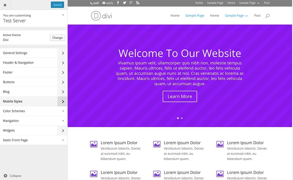
One of the Theme Customizer’s great features is that it allows you to adjust font sizes on spacing specifically for different mobile devices. You can assign unique text sizes and spacing values for smart phones and tablets, adjusting these settings independently from the general settings applied to desktop viewers.To customize your mobile styles you must first enter the Theme Customizer by clicking the Div > Theme Customizer link within your WordPress Dashboard. Next look for the Mobile Styles panel and open it to reveal the mobile styling options. You will notice 3 sections within the Mobile Styles panel: Tablet, Phone and Mobile Menu.
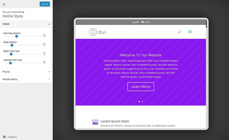
Tablet
Here you can adjust the styles seen by viewers on tablet-sized screens. You can adjust your font sizes, including body and header fonts, as well as your website spacing, such as the spacing between rows and sections.
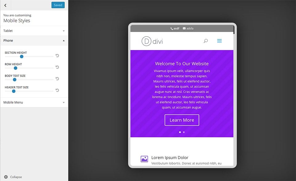
Phone
Here you can adjust the styles seen by viewers on phone-sized screens. You can adjust your font sizes, including body and header fonts, as well as your website spacing, such as the spacing between rows and sections.
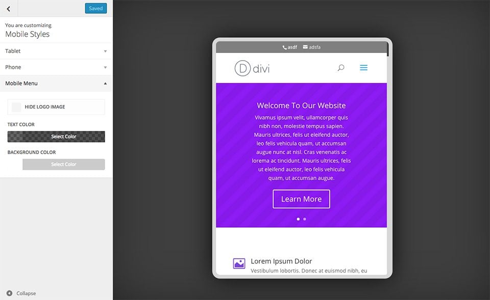
Mobile Menu
When the main mobile breakpoint is reached, the navigation menu appearance changes to a more standard mobile-style. This menu is seen by viewers on phones and tablets. Here you can adjust the appearance of this mobile menu, overriding the general styles chosen for your Primary Navigation bar within the Header & Navigation panel of the Theme Customizer.