

Responsive grid layouts are perfect for showcasing a collection of images with links (or CTAs) because they look good on every device. The Divi builder has some fantastic built-in modules which use grid displays, including the Portfolio Grid, the Blog Grid, and the Gallery Grid. But sometimes you might want to build your own custom image grid layout with CTAs. This gives you more control over the design and content you want to be displayed for each grid item without having to resort to a plugin.
Today, we’re going to show you how to create a responsive image grid layout with CTAs using Divi’s built-in design options. To do this we’ll be getting creative with how we organize the grid using a specialty section and add overlays to each image using a Call to Action module.
Let’s get started!
- 1 Sneak Peek
- 2 Download the Layout for FREE
- 3 Download For Free
- 4 You have successfully subscribed. Please check your email address to confirm your subscription and get access to free weekly Divi layout packs!
- 5 What You Need to Get Started
- 6 Creating a Responsive Image Grid Layout with CTAs and Hover Overlays in Divi
- 7 Final Result
- 8 Final Thoughts
Sneak Peek
Here is a quick look at the design we’ll build in this tutorial.
Download the Layout for FREE
To lay your hands on the designs from this tutorial, you will first need to download it using the button below. To gain access to the download you will need to subscribe to our newsletter by using the form below. As a new subscriber, you will receive even more Divi goodness and a free Divi Layout pack every Monday! If you’re already on the list, simply enter your email address below and click download. You will not be “resubscribed” or receive extra emails.

To import the section layout to your Divi Library, navigate to the Divi Library.
Click the Import button.
In the portability popup, select the import tab and choose the download file from your computer.
Then click the import button.

Once done, the section layout will be available in the Divi Builder.
Let’s get to the tutorial, shall we?
What You Need to Get Started

To get started, you will need to do the following:
- If you haven’t yet, install and activate the Divi Theme.
- Create a new page in WordPress and use the Divi Builder to edit the page on the front end (visual builder).
- Choose the option “Build From Scratch”.
After that, you will have a blank canvas to start designing in Divi.
Creating a Responsive Image Grid Layout with CTAs and Hover Overlays in Divi
Part 1: Creating the Special Section Layout
To begin, add a new specialty section with a one-third two-thirds left sidebar layout.
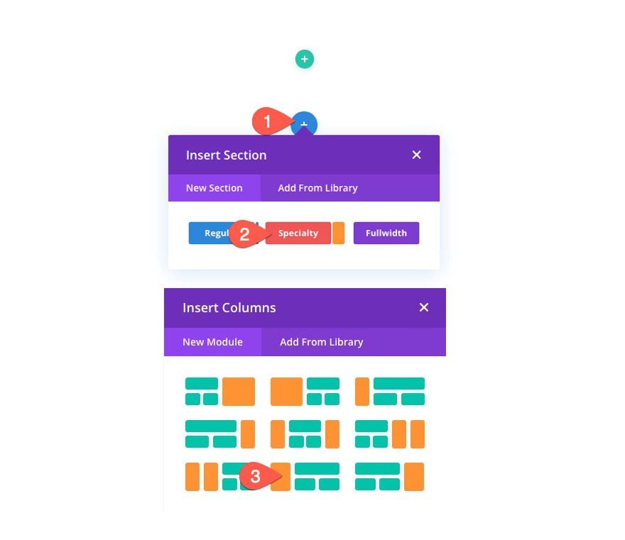
Delete the default regular section so that only the new specialty section remains.
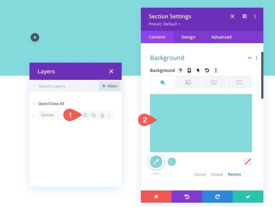
Open the section settings and update the background color as follows:
- Background Color: #84dbda
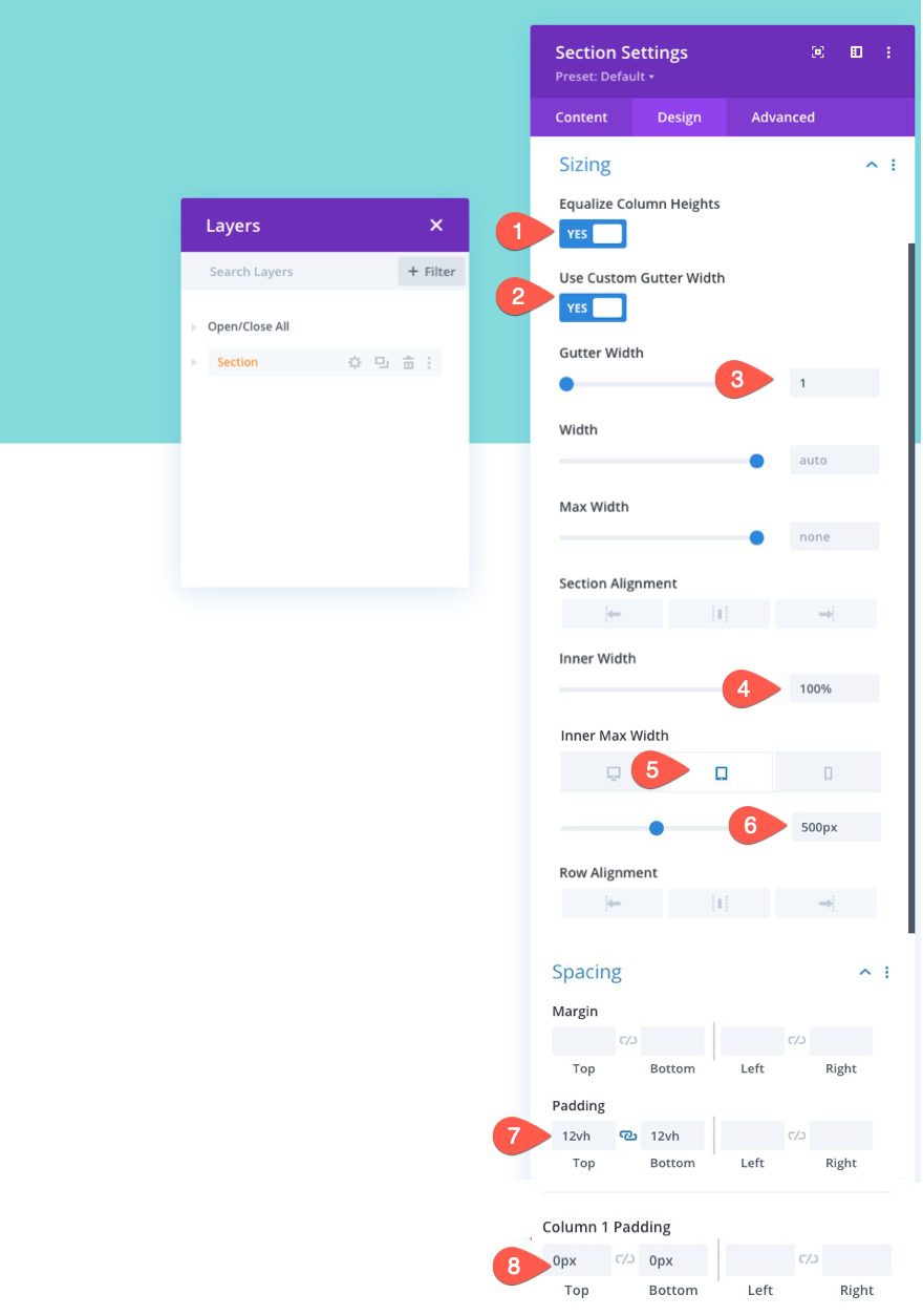
Under the design tab, update the sizing, width and padding options as follows:
- Equalize Column Heights: YES
- Use Custom Gutter Width: YES
- Gutter Width: 1
- Inner Width: 100%
- Inner Max Width: 1080px (desktop), 500px (tablet and phone)
- Padding: 12vh top, 12vh bottom
- Column 1 Padding: 0px top, 0px bottom
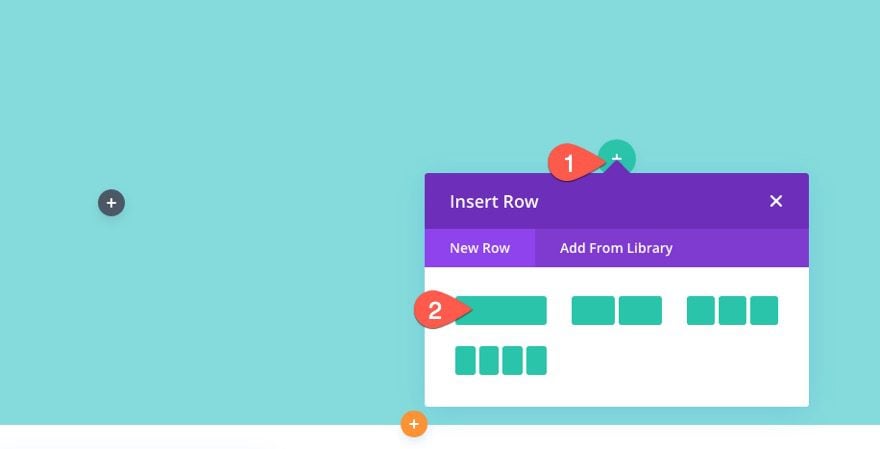
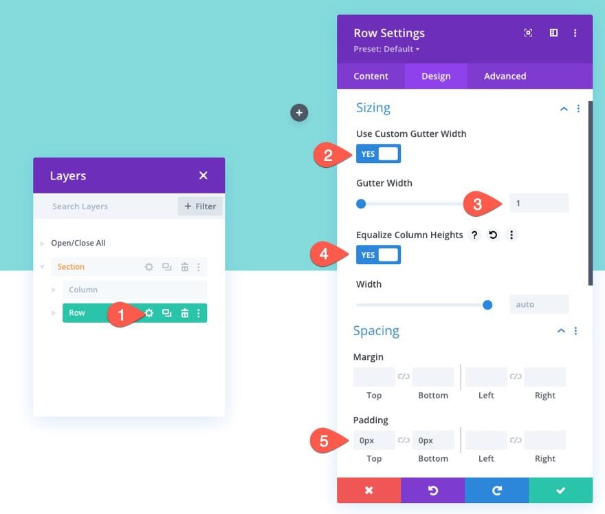
After the Section styles are in place, add a one-column row to the section.
Row Settings
Update the row settings as follows:
- Gutter Width: 1
- Equalize Column Heights: YES
- Padding: 0px top, 0px bottom
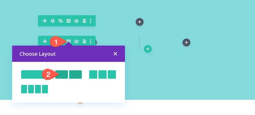
To create a second row, duplicate the first row.
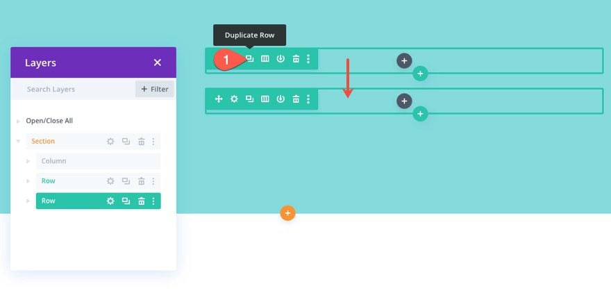
Then update the duplicate row with a two-column layout.
Part 2: Adding Images as Column Background Images
Now that all the rows and columns are in place, we are ready to add our images to our grid layout. In order to make sure the images are responsive within the grid layout, we are going to add each of our images as background images to each of the four columns throughout the section. Because each background image will have a background size of “cover”, the image will always fill the entire column when adjusting the browser size.
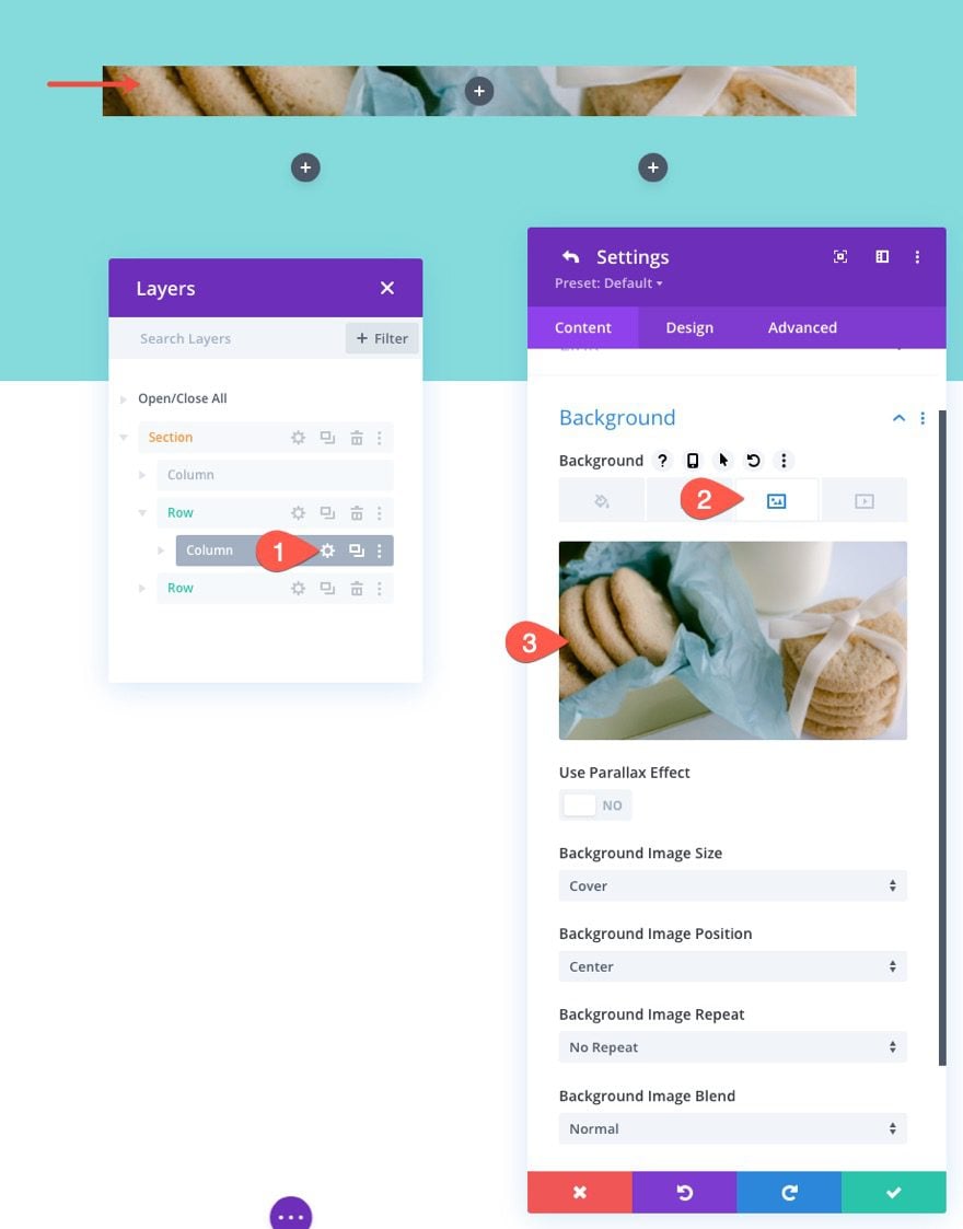
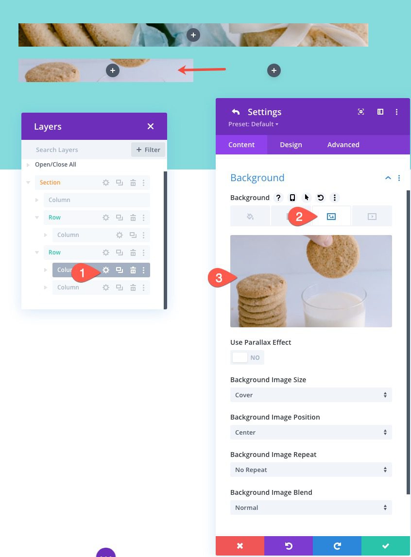
Top Row Column Background Image
To start, open the column settings for the column in the top row.
Then add a background image to the column.
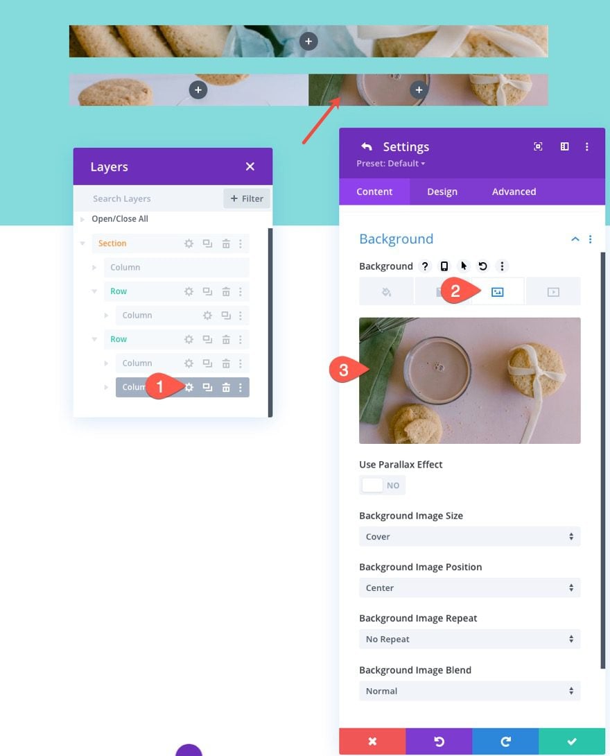
Bottom Row Columns Background Images
Next, open the settings for column 1 in the second (bottom) row and add a background image to that column as well.
Then, add a background image to column 2 in the same row.
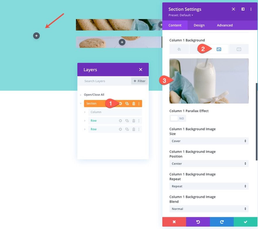
Specialy Section Column 1 Background Image
And finally, open the settings of the specialty section and add a background image to column 1.
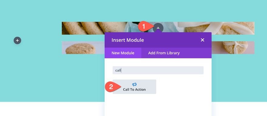
Part 3: Adding the Image Overlay Call To Action to each Column
Now that our background images have been added to each column of the grid layout, we are going to add a call to action module to each column with will serve as an overlay for the image with a button CTA. Using a call to action module as an overlay on top of the column’s background image will allow you to add custom background overlay styles and hover effects to the image with ease. Plus it gives you the option of adding a custom CTA over the image as well. For this example, we are going to simply use the button element on the Call to action module, but you can easily add to title or body content above the button as well using the content options.
Creating the Call to Action Module
To add the first image overlay call to action, add a call to action module to the column in the top row.
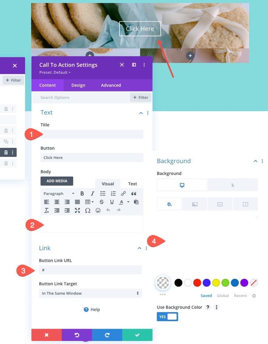
Content
The update the content for the call to action as follows:
- delete the title text
- delete the body text
- Button Link URL: #
- Background Color: transparent (desktop), rgba(255,235,77,0.5) (hover)
NOTE: Adding a “#” for the button link URL is just a filler for now so that the button shows up. Adding the semi-transparent background color on hover will give you a nice custom overlay color when hovering over the module (and the image behind it).
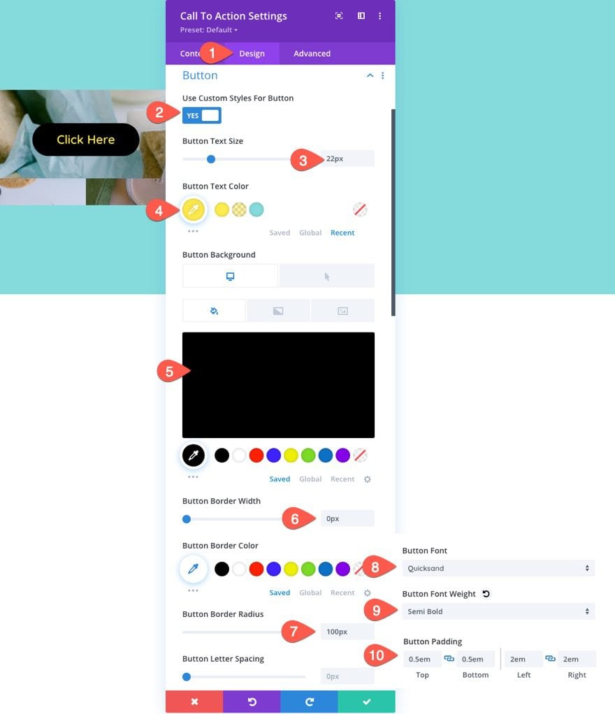
Buttton Styles
Continue update the call to action design settings for the button as follows:
- Use Custom Styles for Button: YES
- Button Text Size: 22px
- Button Text Color: #ffeb4d
- Button Background Color: #000 (desktop), #ec5f00 (hover)
- Button Border Width: 0px
- Button Border Radius: 100px
- Button Font: Quicksand
- Button Font Weight: Semi Bold
- Button Padding: 0.5em top, 0.5em bottom, 2em left, 2em right
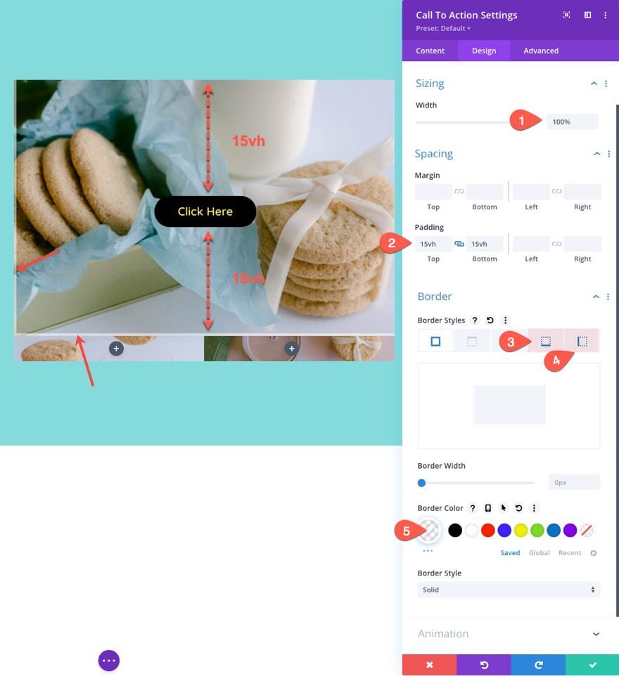
Sizing, Padding, and Border
Next, we need to make sure that our module has some height to expose the column background image behind it. To do this we will add some padding to the top and bottom of the module. We’ll also add a subtle border to the module so to give it a little separation from other images in the grid layout.
Update the following:
- Width: 100%
- Padding: 15vh top, 15vh bottom
- Bottom Border Width: 5px
- Left Border Width: 5px
- Border Color: rgba(255,255,255,0.5)
NOTE: Using the vh length unit for the padding will make the padding value relative to the browser viewport height. So, your image grid items will increase and decrease in height as the browser window increases and decreases in height.
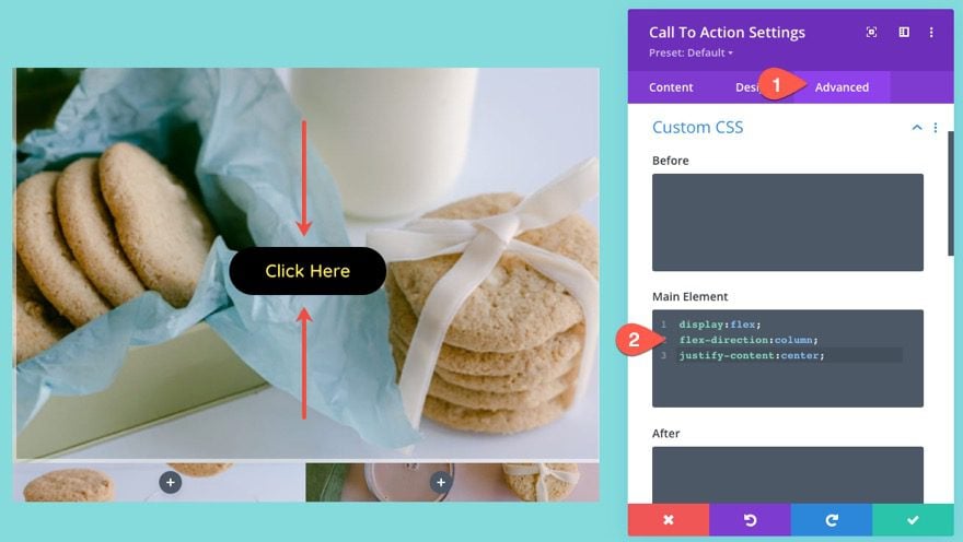
Vertically centering the CTA Content
To ensure the content within the call to action module remains vertically centered, we can add a small snippet of custom CSS using the flex property.
Under the advanced tab, add the following CSS to the Main Element:
display:flex;
flex-direction:column;
justify-content:center;
Adding the Call to Action Overlay to the other columns
Now that the first call to action module is styled, copy and paste the module to the other 3 columns throughout the layout including the 2 columns in the bottom row and column 1 in the specialty section.
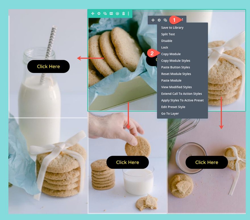
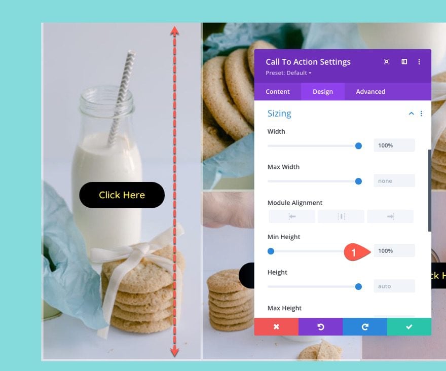
To make sure the call to action module spans the full height of column 1 in the specialty section, update the min-height to 100%.
- Min Height: 100%
Normally, this wouldn’t work for a module in a normal column. But, because of the flex property on the column, the module is essentially a flex child element, so the 100% min-height value will work.
That’s it. Let’s check out the final result.
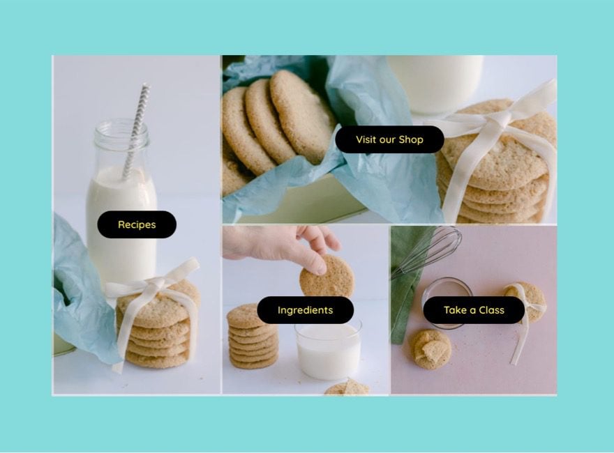
Final Result
Here is the final result of the responsive image grid layout on a live page.
And here are the hover effects.
And here is how the design responds when adjusting the browser size.
Final Thoughts
Responsive image grid layouts continue to be a popular aspect of many websites. The visual aspect provided by the background image combined with the Call to Action overlay can really make those important navigation links pop. Plus, the responsive nature of the image grid layout will look great on all devices which is always a necessity. Hope it comes in hand for your next project.
I look forward to hearing from you in the comments.
Cheers!


Thanks for sharing. After going through your article I have successfully created responsive Image grid layouts for my business website and it’s looking awesome and eye-catchy.
Responsive image grid layout with CTAs are current design trend in SEO industry