Using The Social Follow Widget In Monarch
Using the Monarch widget, you can easily add social follow buttons to your sidebar or footer.
An Overview Of The Social Follow Widget
The Monarch Follow Widget lets you display social follow buttons in any widget area on your site. You can add any number of Monarch widgets to your site, and they will all take on the settings defined here. For example, you may want to add a follow widget to both your sidebar and your footer.
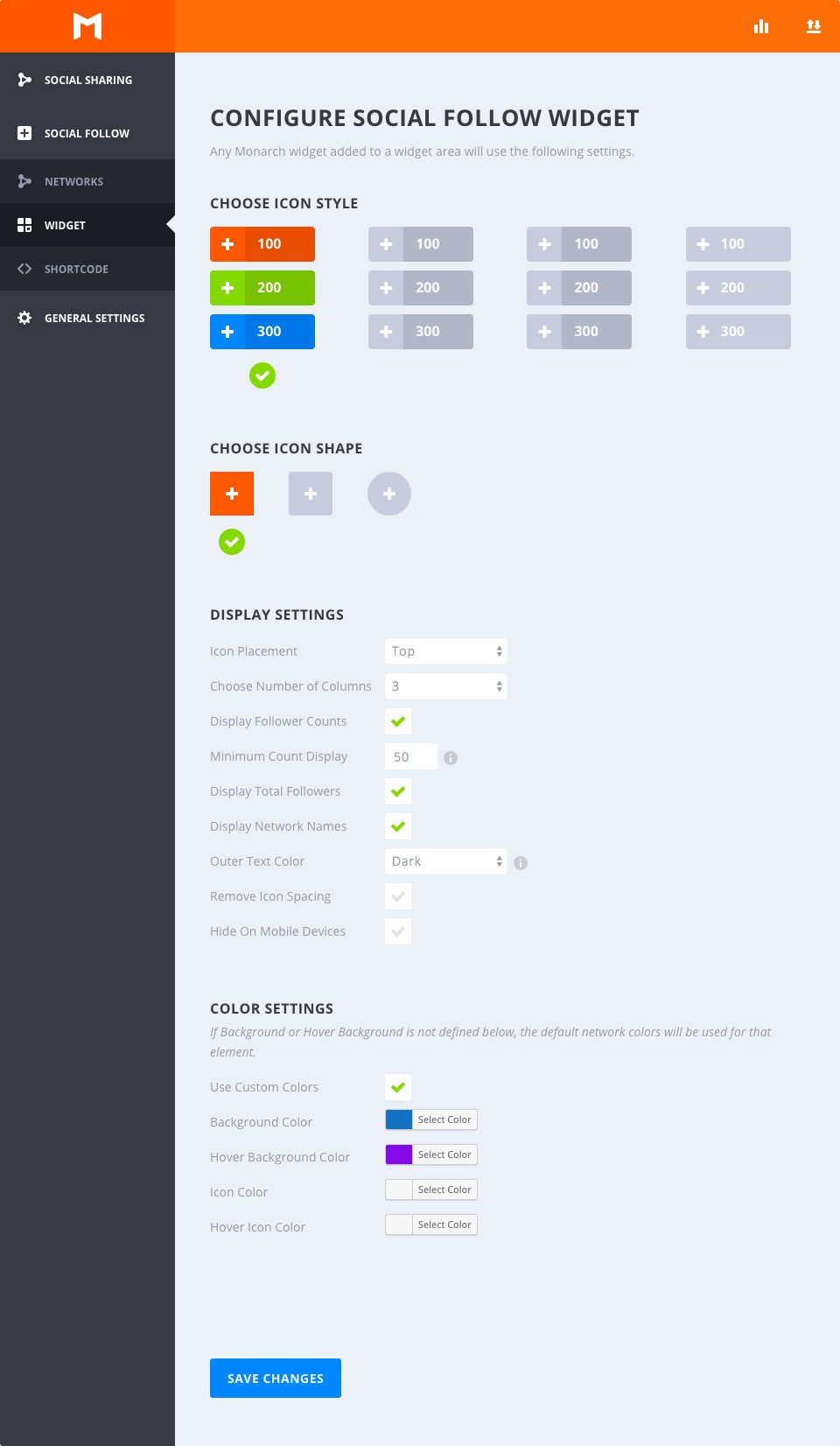
Choose Icon Style
Select Hover
This option allows you to choose from any of the available hover styles Monarch offers for Follow Buttons. You can hover over any of the options to get an example preview of the hover effect. Once you decide on an option, just click to select any style and your section will be indicated by a green checkmark.
Choose Icon Shape
Select Shape
Monarch offers 3 shapes for your icon buttons: Squared, Rounded, and Circles. Combined with the styles mentioned above you can create a variety of great looking social buttons.
Display Settings
Icon Placement
This option lets you select either ‘Left’ or ‘Centered’. Selecting left will display your button labels and/or follow counts to the right of your network icons, creating a more horizontal button shape. Selecting ‘Centered’ will place your button labels and/or follow counts below your network icons and center the button content, creating a taller button shape.
Number of Columns
Monarch offers 7 column width options. You can choose to have up to 6 equal width columns, or let your buttons take on an auto-width based on the width of your buttons’ content. No matter your selection, Monarch accommodates for small browser widths and adjusts your column selection for mobile devices.
Display Follow Counts
Displaying follow counts is a great way to show off how followers you have and even a great way to encourage visitors to click your follow links. This number will appear inside each button either to the right or below your network icons based on your ‘Icon Placement’.
Minimum Count Display
Sometimes it is better to not show counts at all than it is to show that a follow count that is under a certain threshold. This setting allows you to set the minimum follow count that Monarch will display in your follow buttons. This is a great feature for new profiles that haven’t had the opportunity to gain followers for much time.
Display Total Followers
This follow count will add up your followers across all displayed network profiles and display the total right above your buttons. This is a great way to show the totality of you social following.
Display Network Names
Check this box to display the network labels in your follow buttons. These can be customized to whatever you wish. For example, you can choose to replace the Network Name ‘Facebook’ to something like ‘Follow Us’.
Outer Text Color
If the option above is selected, this option will appear to allow you to choose your Outer Text Color. This setting will affect your Total Follower Count, and your Network Label and/or individual follow count if you have selected circular buttons, which place button text outside the background color of your buttons. Your page’s background may be light or dark in color value — this option lets you make sure your text stands out on top of your background.
Remove Icon Spacing
By default, the follow buttons are spaced out with a small margin. Checking this option lets you remove the spacing between your icons for a whole new set of design possibilities.
Hide On Mobile Devices
If you wish to not display any added follow widgets on mobile devices you can check this box.
Color Settings
Use Custom Colors
By default, Monarch uses the default network colors, but for a more custom approach you can select your own button colors. If an option below is not defined, the default setting will be used for that element.
Background Color
This color picker will define the background color of your social follow buttons
Hover Background Color
This color picker will define the background color of your social follow buttons when the user hovers over a button.
Icon Color
This color picker will define the color of your social follow buttons’ icons.
Icon Color
This color picker will define the color of your social follow buttons’ icons when the user hover over a button.