An Overview Of Social Sharing Popups In Monarch
Popups are incredibly effective, and they can be controlled using various custom triggers.
An Overview Of The Popup Settings
Automatic popups are not only extremely easy to create with Monarch, but they are one of the most effective ways to engage your users. You can fully customize your popup title and message as well as control entirely how and when they are displayed to your visitors.
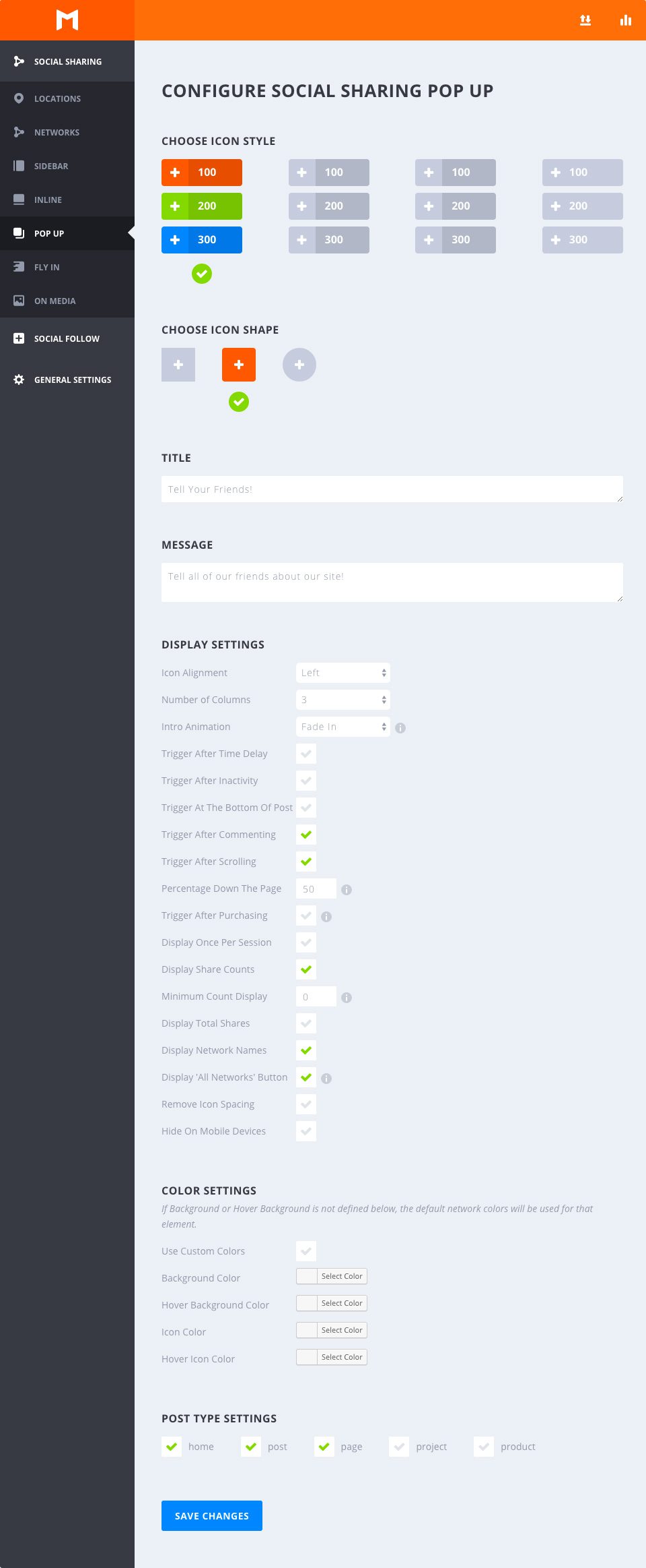
Choose Icon Style
Select Hover
This option allows you to choose from any of the available hover styles Monarch offers for PopUp Sharing Buttons. You can hover over any of the options to get an example preview of the hover effect. Once you decide on an option, just click to select any style and your section will be indicated by a green checkmark.
Choose Icon Shape
Select Shape
Monarch offers 3 shapes for your icon buttons: Squared, Rounded, and Circles. Combined with the styles mentioned above you can create a variety of great looking social buttons.
Title
Input Custom Title
Give your PopUp a Custom title to further engage your readers.
Message
Input Custom Message
Give your PopUp a Custom message for a more detailed call to action, such as “Share this page with your friends. Thanks for stopping by!”.
Display Settings
Icon Alignment
This option lets you select either ‘Left’ or ‘Centered’. Selecting left will display your button labels and/or share counts to the right of your network icons, creating a more horizontal button shape. Selecting ‘Centered’ will place your button labels and/or share counts below your network icons and center the button content, creating a taller button shape.
Number of Columns
Monarch offers 7 column width options. You can choose to have up to 6 equal width columns, or let your buttons take on an auto-width based on the width of your buttons’ content. No matter your selection, Monarch accommodates for small browser widths and adjusts your column selection for mobile devices.
Intro Animation
Boost the attention grabbing potential of your social popups with a fun and engaging intro animation! Choose from 10 great load-in animations such as Zoom, Flip, Bounce, and Swing to catch your visitors’ eye.
Enable Automatic PopUp
Enabling automatic popups will trigger sharing popups on your pages based on a timed delay. This is a great way to presented users that have been browsing your page for a specific amount of time with a social popup.
Trigger After Time Delay
If Automatic PopUps are enabled, this setting will appear, allowing you to specify the timed delay (in seconds) of your social popup.
Trigger After Inactivity
This will cause the popup to appear once the user has been inactive for a certain period of time. If the user has left their computer, or left the tab after reading your post, try reminding them toshare when they get back!
Trigger After Scrolling
This will trigger the popup after the visitor has scrolled a certain percentage down the page. Depending on the size of your page, and the content within it, you can have the popup trigger at specific points within the reading. Depending on the situation, having the flying trigger at certain percentages may be much more effective than a timing delay.
Trigger After Commenting
This is a great way to target your most engaged visitors. When this is enabled, your visitor will be greeted with a flying after they have posted a comment on your website.
Trigger After Purchasing
This is another great way to target your most engaged visitors. When this is enabled, your customers will be asked to share your website after they have successfully purchased a product using WooCommerce.
Trigger at Bottom of Poast
Just as a reader reaches the end of your page or post content is a perfect time to offer them a way to share your content. Enabling this popup trigger will auto detect the end of your content and do just that.
Triggers NOTE
No matter how many triggers you have selected above, Monarch will only use whichever trigger occurs first so that your users are not overwhelmed with popups if you have multiple triggers enabled.
Display Once Per Session
By Default, monarch will display a popup on any and every page that has popups enabled once per page view. Selecting this option will only present a visitor with one popup per session.
Session Duration
If ‘Display Once Per Session’ is selected, this option will be displayed, allowing you to define the length of time (in days) that a session lasts for. For example, if you input ‘2’ a user will only see a popup on your site every two days.
Display Share Counts
Displaying share counts is a great way to show off how many times your pages have been shared and even a great way to encourage visitors to spread your content. This number will appear inside each button either to the right or below your network icons based on your ‘Icon Alignment’.
Minimum Count Display
Sometimes it is better to not show counts at all than it is to show that your content hasn’t been shared over a certain threshold. This setting allows you to set the minimum share count that Monarch will display in your popup’s sharing buttons. This is a great feature for new content that hasn’t had the opportunity to be shared for much time.
Display Total Shares
This share count will add up the shares across all displayed networks and display the total right above your buttons. This is a great way to show the totality of how popular a given page is.
Display Network Names
Check this box to display the network labels in your sharing buttons. These can be customized to whatever you wish. For example, you can choose to replace the Network Name ‘Twitter’ to something like ‘Tweet This’ or ‘Share This’.
Remove Icon Spacing
By default, the popup icon buttons are spaced out with a small margin. Checking this option lets you remove the spacing between your icons for a whole new set of design possibilities.
Hide On Mobile Devices
If you wish to not display popups on mobile devices you can check this box.
Color Settings
Use Custom Colors
By default, Monarch uses the default network colors, but for a more custom approach you can select your own button colors. If an option below is not defined, the default setting will be used for that element.
Background Color
This color picker will define the background color of your popup sharing buttons.
Hover Background Color
This color picker will define the background color of your popup sharing buttons when the user hovers over a button.
Icon Color
This color picker will define the color of your popup sharing buttons’ icons.
Icon Color
This color picker will define the color of your popup sharing buttons’ icons when the user hover over a button.
Post Type Settings
Select Your Post Types
All post types that exist on your website will appear in the Post Type Settings, whether it is a post or page, a WooCommerce Product, a Project post from a portfolio plugin, etc. These are global settings that allow you to choose what kind of posts you would like social popups to appear on. Note that you can override any of these settings on a per post basis.