Customizing The Monarch Design
Monarch comes with some great design customization options for each integration area.
An Overview Of The Monarch Design Settings
Monarch is packed full of design options so that you can fully customize your sharing and follow buttons into your website’s design. Combining button shape options, icon placement, icon spacing, button hover effects, and unlimited color options, the design possibilities are countless.
Hover Styles
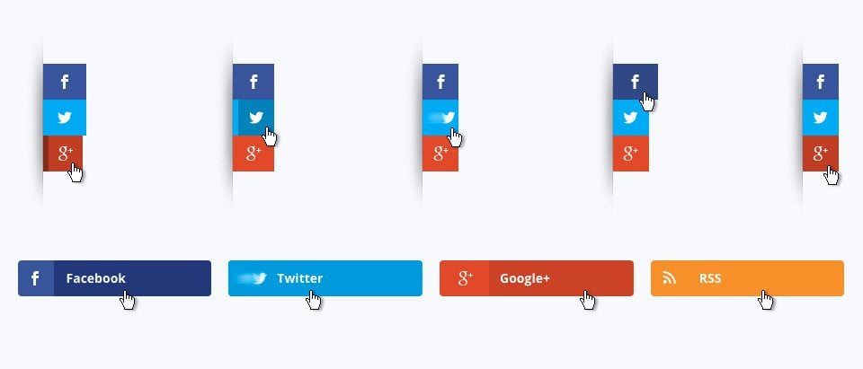
Sidebar Hover Styles
Choose from 5 hover effects for you floating sidebar. These hover effects become even more diverse as you mix them with different button shapes and button spacing as described below.
Inline Button Hover Styles
Choose from 4 hover effects for you inline sharing and following buttons. Again, these hover styles become more unique when combined with other design settings.
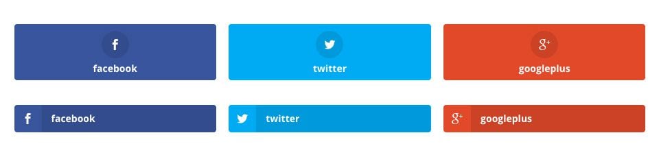
Icon Shapes
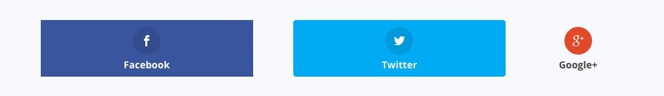
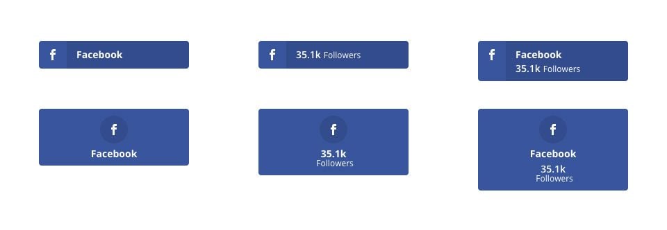
Monarch comes with three different button shapes. You can choose for you buttons to have squared corners, rounded corners, or be circles. If you choose circle shapes, your network labels and counts will appear outside of the button in contrast to the rectangular shapes which include network icons, labels, and counts all within the button.
Icon Orientation
Another great design option is your icon orientation. This doubles the design possibilities and can really effect the outcome of your custom designs. If you choose ‘Left’ Orientation, your button content will appear to the right of the network icons. If you choose a ‘Centered’ orientation, your button content will appear below your network icons. See below for info about button content
Icon Spacing
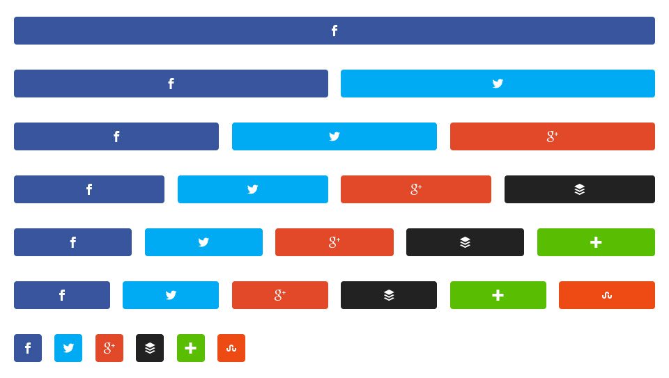
This setting lets you add a spacing between your buttons or remove it entirely for a two very different looks.
Button Content
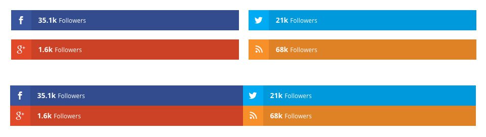
Display Follow/Share Counts
This setting lets you display either the share or follow count alongside the network icons. This is a great way to show off how popular a page or social profile is.
Minimum Count Display
Sometimes content is new and profiles are young. This setting lets you set a minimum display count so that a count will not display if it is under your defined threshold.
Display Network Labels
This setting lets you display a button label. By default, this is the network name, but it can be customized to say things like ‘Pin This’, ‘Tweet This’, or ‘follow Us’.
Column Display
Monarch comes with three different button shapes. You can choose for you buttons to have squared corners, rounded corners, or be circles. If you choose circle shapes, your network labels and counts will appear outside of the button in contrast to the rectangular shapes which include network icons, labels, and counts all within the button.
Color Settings
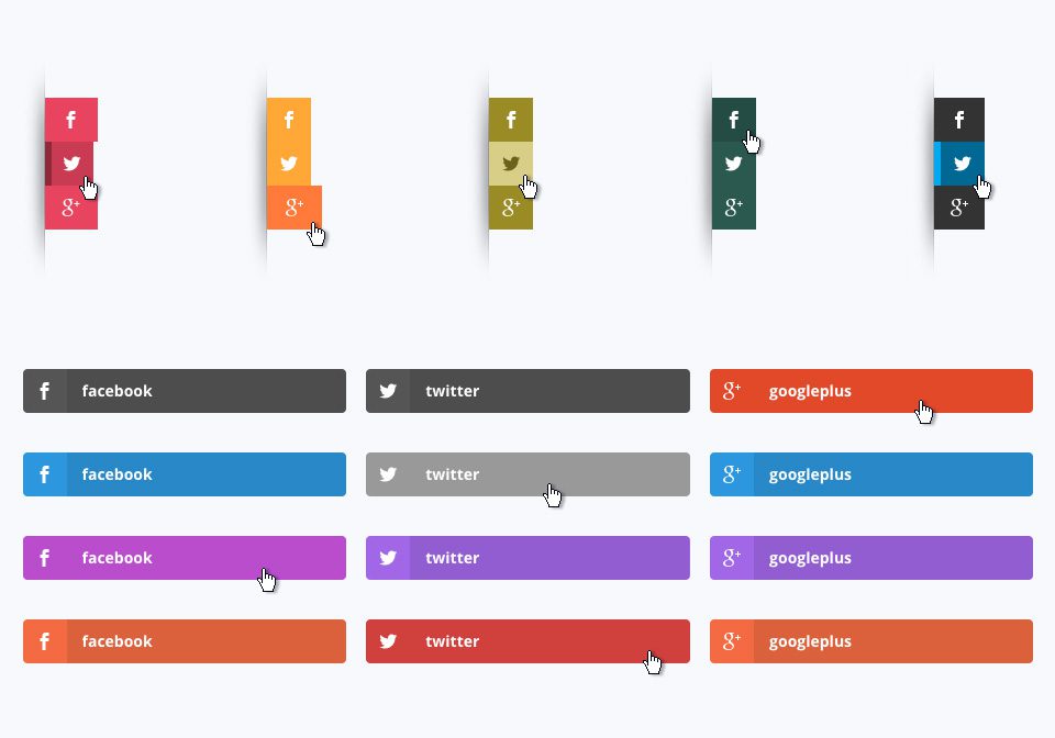
Use Custom Colors
By default, Monarch uses the default network colors, but for a more custom approach you can select your own button colors. If an option below is not defined, the default setting will be used for that element.
Background Color
This color picker will define the background color of your buttons.
Hover Background Color
This color picker will define the background color of your buttons when the user hovers over a button.
Icon Color
This color picker will define the color of your buttons’ icons.
Icon Color
This color picker will define the color of your buttons’ icons when the user hover over a button.