Using the Design Settings To Customize Your Opt-in Form
Bloom’s design settings can allow for almost unlimited variations, customized to match your site.
Bloom Lets You Customize Everything
Blooms comes with a ton of different design settings, allowing you to adjust just about every aspect of your opt-in form. After you have created a form and chosen a base template, you will be taken to the Design tab where you can continue to modify various aspects of your design, as outlined below.
Title and Message
Here you can adjust the text content that appears within your opt-in.
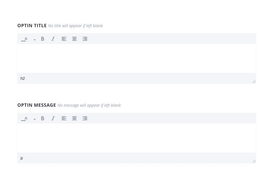
Optin Title
This is the header that will appear at the top of your form in large text.
Optin Message
This text will appear below your header, and will use a smaller font size.
The title and message fields can be used to describe your newsletter or special offer. They can also be left blank if you don’t want to include any text in your opt-in. Both the title and message can be modified using the post editor, giving you the ability to adjust font color, weight and orientation.
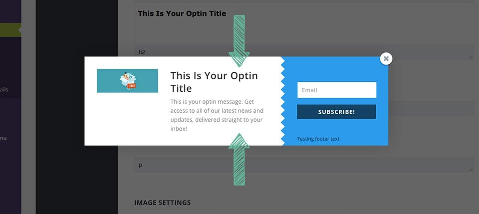
Image Settings
Here you can add an image to your opt-in, as well as adjust where that image appears within the opt-in box.
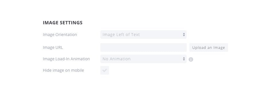
Image Orientation
This setting affects where the image appears within your opt-in form. You can choose to have the image appear above or below, or to the left or right of your title and message.
Image URL
This is the URL to the image that you would like to use within your opt-in box. You can input a custom URL to a static online resource, or you can click the “Upload Image” button to upload your own image to use in the form.
Image Load-In Animation
Images can be assigned a load-in animation. When the image is first loaded, this animation will occur. It can be a nice subtle touch that catches your visitor’s eye and encourages them to read your message and subscribe to your list.
Hide Image On Mobile
If you are worried about the size of your opt-in form on mobile, you can choose to disable the image when browsing your website on mobile devices. This will hide the image on mobile and give more room for your title, message and input fields.
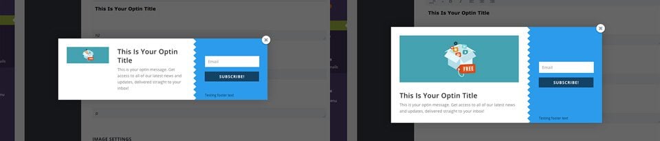
Here is an example of two opt-in forms, both of which have images enabled. One has the image placed on the left, while the second has the image placed below the text.
Opt-in Styling
These design settings affect the entire opt-in form, and constitute a set of general styles for your form.
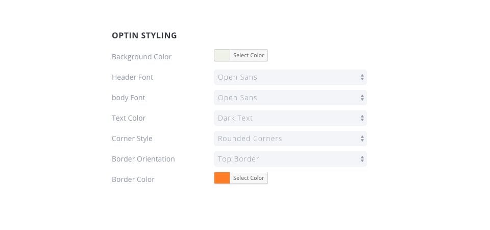
Background Color
The will change the background color of your opt-in.
Header Font
Here you can change the font that is used for your opt-in title.
Body Font
Here you can adjust the font that is used for your opt-in message.
Text Color
This will change the color of both your opt-in header and body. You can choose between “light” and “dark,” depending on the background color you have chosen. If you have chosen a dark background color, then make sure your text is set to “light” so that it will be visible. If you background is a light color, make sure you text color is set to dark.
Corner Style
Here you can choose a corner style for your op-tin. Selecting rounded corners will apply rounded corners to the outer edges of the opt-in box.
Border Orientation
Here you can add a border to your opt-in. This border can be applied to all 4 edges, or single edges.
Border Color
If you have opted to have a border on your opt-in, then this border color options will appear. Here you can select a color to be used for your opt-in border.
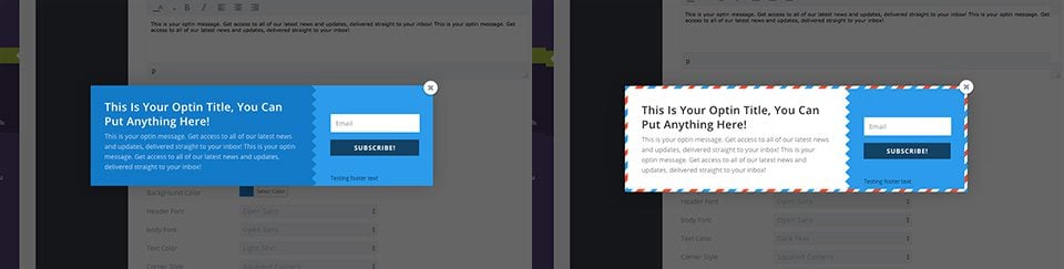
Here is an example of two opt-ins that have had their styling adjusting. The one on the left has had its background color changed to dark blue with a light text color, while the one on right has a white background color with dark text. The opt-in form on the left has no border, while the one on the right has a full border.
Border Style
If you have opted to have a border, then you can adjust the border style here. In addition to the color setting in the previous section, you can also adjust the shape of the border.
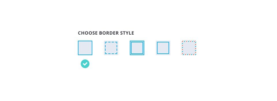
Solid
This is the most basic border style, and it creates a solid thin border around the edge of your opt-in.
Dashed
The dashed border creates an inset dashed line around the outer edge of your opt-in.
Double Stroke
The double stroke is similar to the Solid border, except it adds an additional solid inlay, creating the double bordered appearance.
Inlay
The inlay border creates a solid line border, however unlike the “solid” border, this inlay border is placed inside of the opt-in instead of on the outside edge.
Letter
This creates a more playful border, imitating a classic snail-mail letter.
Form Setup
These styles apply to the form and the input fields within the form. You can adjust their colors, as well as where the form appears within the opt-in box.
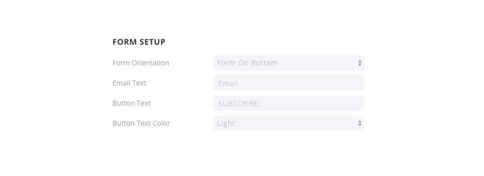
Form Orientation
This adjusts where the form fields appear within your opt-in box. You can choose to have the form appear above, below or to the left or right of your opt-in title and message.
Email Text
This adjusts the placeholder words used within the email input form.
Button Text
Here you can adjust the text that appears within the submission button.
Button Text Color
Here you can adjust the color of the text used within the submission button.
Here is an example of two different forms that have had their form setup settings adjusted. The form on the left has their form position set to bottom, while the one on the right has its form set to left.
Form Styling
These settings apply to the actual form inside of the opt-in box.
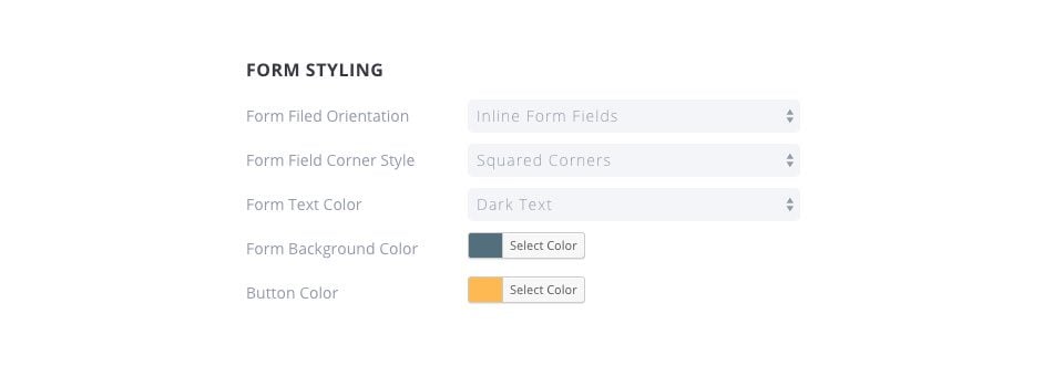
Form Field Orientation
This adjusts how the input fields appear within the form itself. You can choose to have your input fields displayed “inline” in a single row, or you can choose to have the fields stacked up on top of each other.
Form Field Corner Style
Here you can adjust the corner style of the fields, choosing between rounded or squared.
Form Text Color
Here you can adjust the color of the text that appears within the form input fields. If you are using a light background color, try use dark form field text so that it is readable.
Form Background Color
This setting allow you to change to background color of the form. This, in combination with your opt-in background color, constitute the two main colors in your opt-in box.
Form Button Color
You can adjust the color of your submission button here.
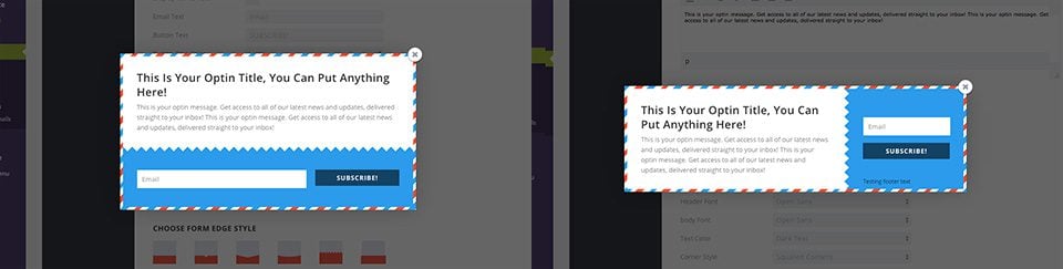
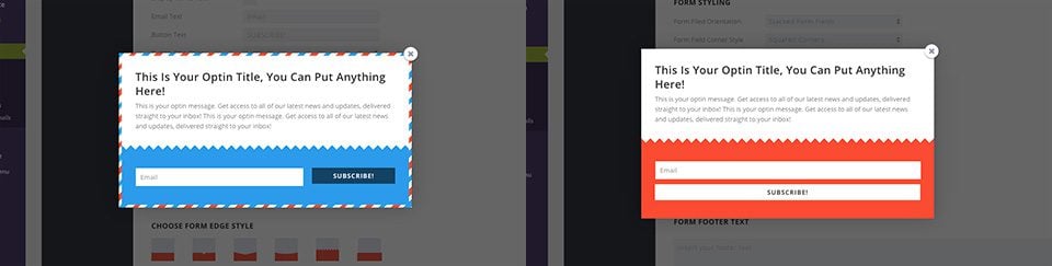
Here is an example of two different forms that have had their settings adjusted. One has stacked forms, while the other has inline forms. Both have had the opt-in form background color adjusted, and the orange form has had its button color changed to white.
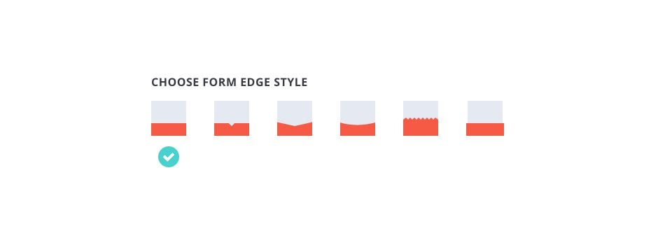
Form Edge Style
In each opt-in box, there is an edge that separates the form from the text content. Here you can apply different styles to that edge, giving your opt-in box a unique feel.
Footer Text, Success Message and Custom CSS
These settings give you extra control over the messages that appear during form submission, as well as give you the ability to add custom CSS tweaks to individual forms.
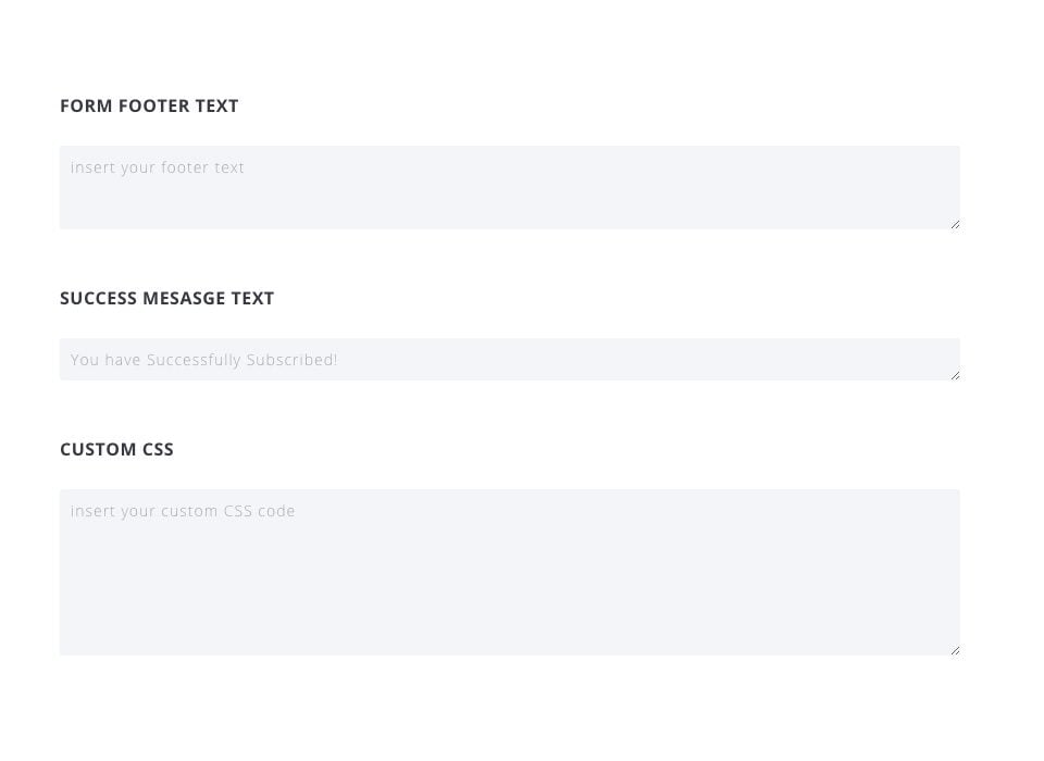
Form Footer Text
This message will appear below the form input fields. A common use might be to link to a privacy policy, or ensure your users that you will not spam or share their information.
Success Message
This is the message that appears after a visitor has successfully subscribed to your email list.
Custom CSS
Here you can add custom CSS that will apply only to the form you are building.