Using The Floating Sidebar In Monarch
Create a floating sidebar of social sharing buttons that follow your visitors as they scroll.
An Overview Of The Sidebar Settings
Social Floating Sidebars are a great way to give your readers a quick and easy way to your content no matter where they are on the page. Choose your networks, arrange them in the perfect order, and even display share counts.
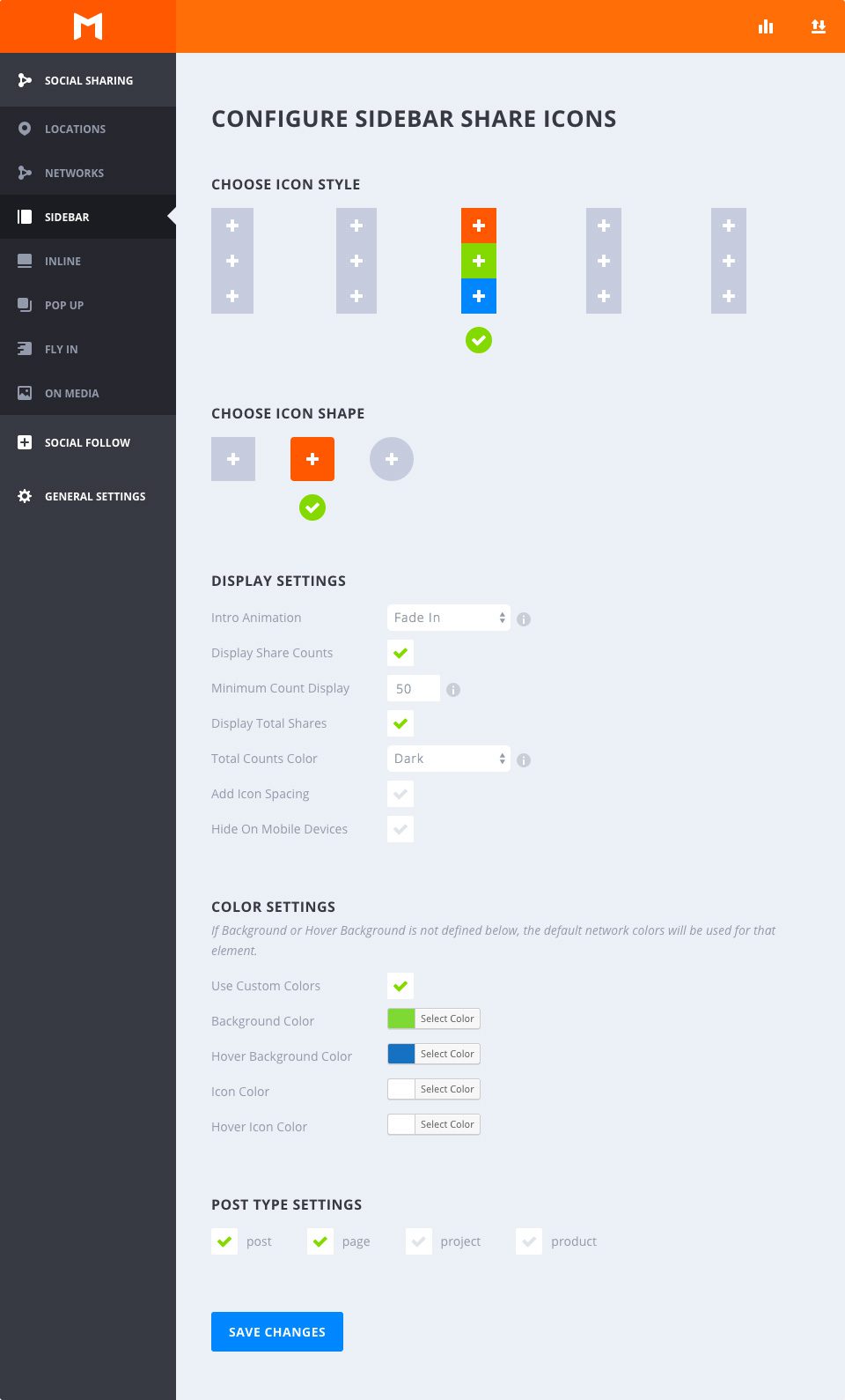
Choose Icon Style
Select Hover
This option allows you to choose from any of the available hover styles Monarch offers for floating sidebars. You can hover over any of the options to get an example preview of the hover effect. Once you decide on an option, just click to select any style and your section will be indicated by a green checkmark.
Choose Icon Shape
Select Shape
Monarch offers 3 shapes for your social buttons: Squared, Rounded, and Circles. Combined with the styles mentioned above you can create a variety of great looking social buttons.
Display Settings
Intro Animation
This dropdown contains a list of intro animations for your floating sidebar. You can choose for it to fade in statically, from the left, from the top or bottom, or choose to have no load-in animation at all.
Display Share Counts
Displaying share counts is a great way to show off how many times your pages have been shared and even a great way to encourage visitors to spread your content. This number will appear inside each button just below the network icon.
Minimum Count Display
Sometimes it is better to not show counts at all than it is to show that your content hasn’t been shared over a certain threshold. This setting allows you to set the minimum share count that Monarch will display in your floating sidebar. This is a great feature for new content that hasn’t had the opportunity to be shared for much time.
Display Total Shares
This share count will add up the shares across all of the networks in your sidebar and display the total right above your sidebar. This is a great way to show the totality of how popular a given page is.
Total Shares Text Color
If the option above is selected, this option will appear to allow you to choose your total shares text color value. Your website’s background may be light or dark in color value — this option lets you make sure your text stands out on top of your background.
Add Icon Spacing
By default, the sidebar icon buttons are displayed with no vertical spacing, except for circular buttons. Checking this option lets you add vertical spacing between your icons for a whole new set of design possibilities.
Hide On Mobile Devices
Monarch displays a subtle, non intrusive mobile sidebar, but if you wish to not display the floating share bar on mobile devices you can check this box.
Color Settings
Use Custom Colors
By default, Monarch uses the default network colors, but for a more custom approach you can select your own button colors. If an option below is not defined, the default setting will be used for that element.
Background Color
This color picker will define the background color of your sidebar buttons
Hover Background Color
This color picker will define the background color of your sidebar buttons when the user hovers over a button.
Icon Color
This color picker will define the color of your sidebar buttons’ icons.
Icon Color
This color picker will define the color of your sidebar buttons’ icons when the user hover over a button.
Post Type Settings
Select Your Post Types
All post types that exist on your website will appear in the Post Type Settings, whether it is a post or page, a WooCommerce Product, a Project post from a portfolio plugin, etc. These are global settings that allow you to choose what kind of posts you would like your floating sidebar to appear on. Note that you can override any of these settings on a per post basis.