

If you look at the most popular websites on the web, you won’t see a lot of similarities at first glance. However, a lot of those sites share underlying design and functionality fundamentals that are, in part, what makes them so successful.
In this article, we’ll take a close look at six of the most popular websites on the web. We’ll talk about what each of these sites does better than its competitors, and how use those ideas for your own projects.
Let’s get to it!
1. Keep the Design Simple (Google)
The vast majority of people who have ever used the web have spent a lot of time staring at this home page:
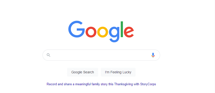
Google’s home page isn’t just one of the most popular websites – it’s also a masterclass in user-friendly design. There’s practically no unnecessary or superfluous element within that page, which is amazing considering how many services Google has under its umbrella.
Many companies would be tempted to fill the page with links to all of their other services. In contrast, Google keeps the entire focus on the search bar and three simple buttons.
The primary takeaway from Google’s home page is that if you want visitors to focus a specific feature on your site, you need to take away as many distractions as possible. In most cases, a user-friendly interface trumps a pretty design.
2. Don’t Be Afraid to Use Images (Apple)
Apple is one of the biggest companies in the world, and it offers a staggering selection of products and services that you can opt into. With such a broad selection available to the user, you might expect a website that’s cluttered with elements and links, but this isn’t the case.
For its US website, Apple manages to showcase its most popular products all on a single page, while still making each section unique. This is possible thanks to its impeccable selection of product images:
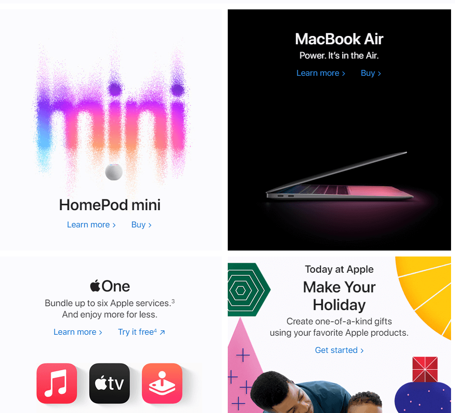
Each section includes links to learn more about the product, or to make a purchase. Here, Apple takes advantage of its brand recognition because it assumes that you’re already familiar with most of its product line.
If you take one thing away from this website, it should that using high-quality product images as a primary way of promoting your products and services can work. Although using too many images may slow down your site, there are plenty of ways to work around the issue. In any case, the benefit that you get from using great product pictures often outweighs any of the negatives.
3. Good Taxonomy is Critical for Blogs (Healthline)
Whether you take health advice from online sources or not is a personal decision. However, as far as massive blogs go, Healthline is one of the most popular websites around. This isn’t because of its advice, but its fantastic approach to using taxonomies.
On top of being one of the most popular websites in the world, Healthline also offers an incredibly comprehensive set of categories to browse:
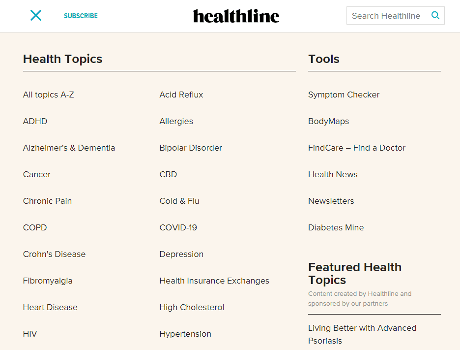
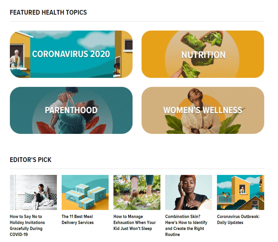
Those are only some of the options you see if you open Healthline’s primary navigation menu. However, even if you don’t open the menu, the first thing Healthline shows you are some of its featured topics and editor picks:
If you run a blog that publishes new content often across several topics or categories, your taxonomies are of the utmost importance. Without proper categorization (and search functionality), it’s nearly impossible for users to find the information they want.
As your blog grows, it’s worth spend some time considering what the best system is to classify its content. Even if you don’t publish across dozens of categories, as Healthline does, being as detailed as possible is going to be a good idea.
There are many fundamentals to follow when working on new websites. As a rule of thumb, sites that are easy to navigate, uncluttered, and simple to interact with are going to be some of the most popular websites you’ll find. However, one type of site that often breaks these rule is an online store.
When it comes to massive e-commerce sites, the fundamentals seem to get forgotten more often. For example, navigating across dozens or hundreds of categories can be a pain. Even if you do find the products that you’re looking for, finding the specifics you need to make a decision is almost never easy.
One of the few big e-commerce portals that does a great job when it comes to providing simple navigation is Target.com:
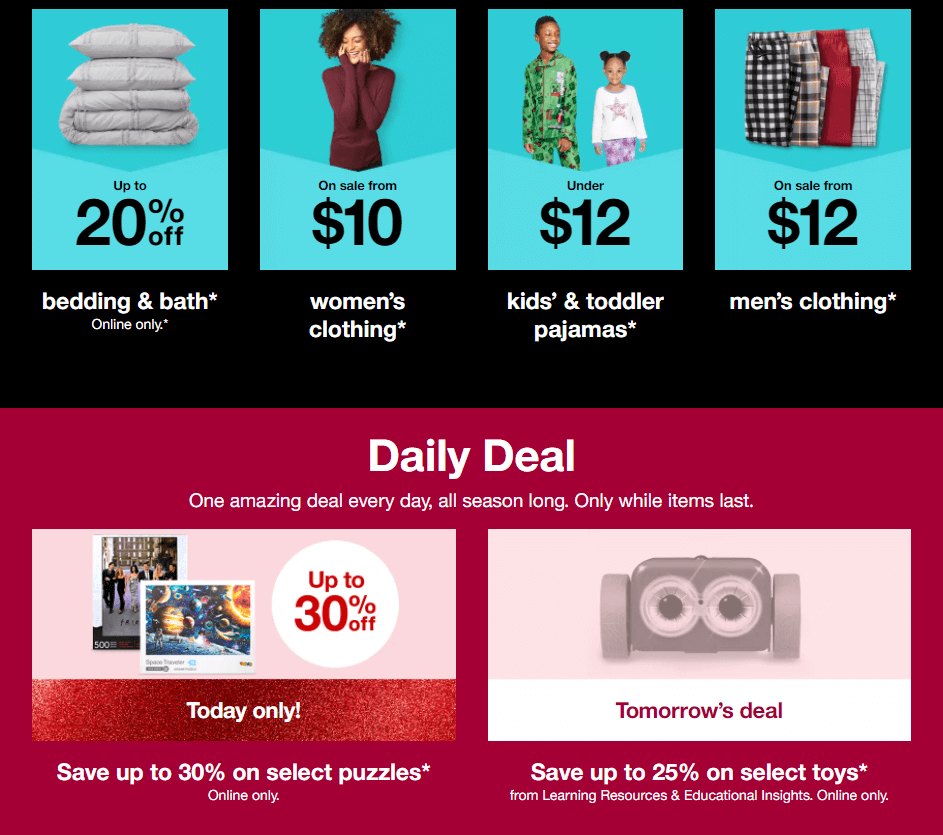
Navigating product categories on Target is straightforward, and its shop pages tend to include a lot more details than other e-commerce portals do:
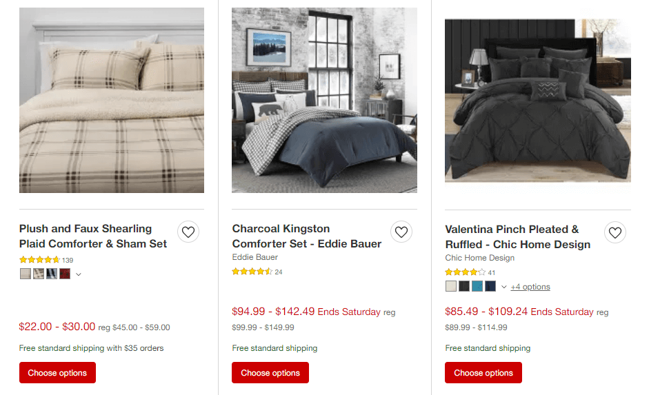
However, Target does fall into line once you look at specific product pages. There are so many details, it’s difficult to design a page that doesn’t feel overwhelming. This is the case for many sites in the niche too.
Regardless of what your favorite e-commerce portal is, there’s a lot to learn from Target. One thing to keep in mind is that negative space remains critical, even if you have thousands of products to show visitors.
By giving each section or product a little more space of its own, you can make it easier for users to find what they’re looking for. You might end up with pages that take longer to scroll, but this isn’t a dealbreaker for big online stores.
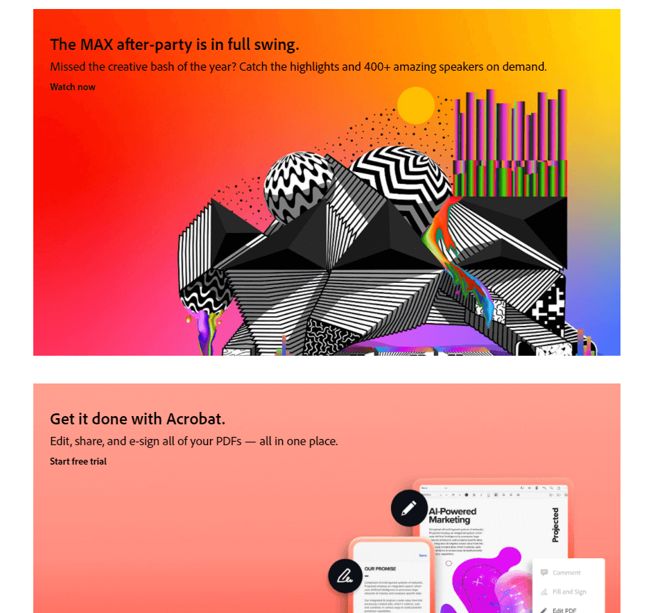
5. Be Colorful (Adobe)
It shouldn’t come as a surprise that Adobe’s website features some fantastic design choices. After all, if a graphic design suite of tools doesn’t have a stunning website, would you really want to use it for your projects?
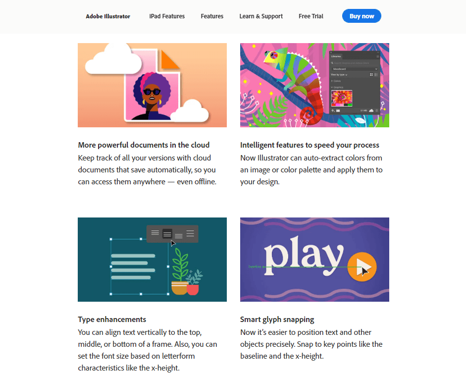
Adobe’s layout are simple. However, it stands out visually due to its excellent use of contrasting colors:
Each section of the website jumps out at you, and each product uses a unique set of colors to reinforce its identity. Take Illustrator, which is all about bold vibrant colors:
Now compare that to Lightroom’s more muted palette, which only highlights a few colors within each image:
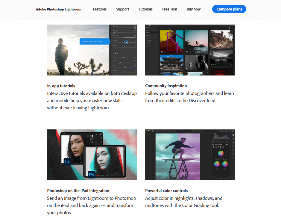
Of course, colors should never be an afterthought for any website. They’re a key component of your brand that you can use to reinforce its identity and make your pages stand out visually.
Ideally, you’ll use the same color palette throughout a website. If this happens to include some bold, contrasting colors, even better!
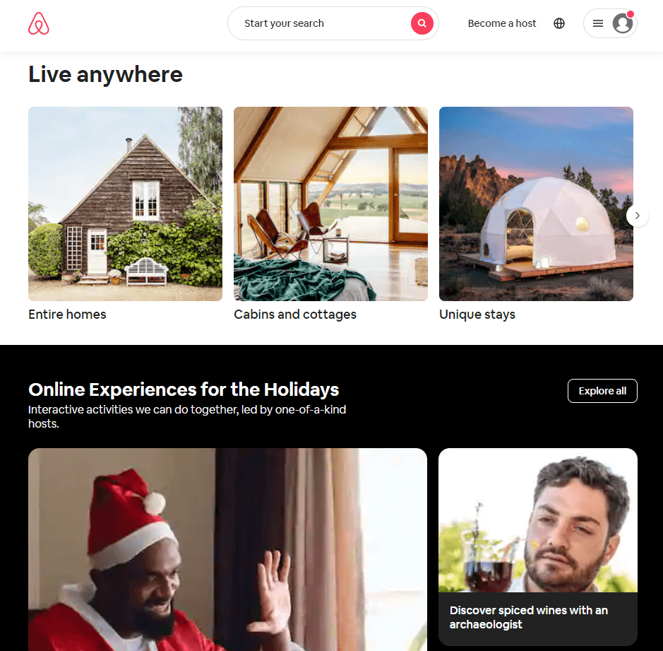
6. Be Upfront About Your Unique Value Proposition (Airbnb)
Booking a stay online can be an incredibly stressful process. However, Airbnb manages to make the process much less headache-inducing than usual, which helps it to become one of the most popular websites you can learn from. In part, this is because the entire Airbnb website doesn’t let you forget that you’re booking a ‘unique’ experience:
Once you get into looking at specific locations, AirBnB lets each item shine on its own, thanks to its images and listing titles. Each listing is its own kind of product page, and AirBnB has designed them to perfection:
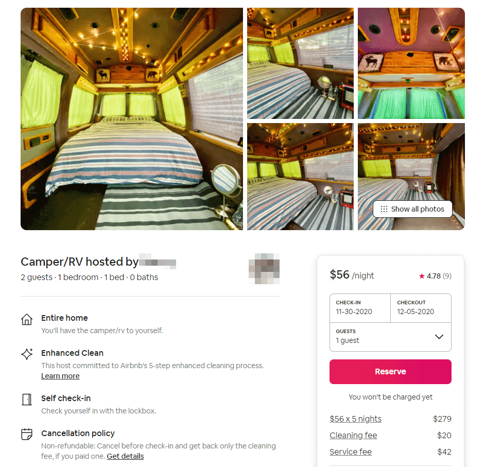
Each section is easy to peruse, the Reserve button can’t be missed, and navigating reviews is simple. Even if you don’t run a worldwide platform that enables users to find their perfect travel destinations, there’s a lot to learn from this website.
If you think about each listing as a service page, it’s easy to see what aspects you should copy. When you’re trying to convince visitors to sign up for a service, you need those pages to include as much detail as possible.
Airbnb uses plenty of lists, icons, and interactive forms within each listing to provide you with all the information that you need to make a decision. If you want to follow their lead, don’t be afraid to include as much information as possible within your service pages, and diversify from simple batches of paragraphs.
Conclusion
Many of the world’s most popular websites have got to where they are due to sheer brand strength. However, for a website to remain popular, it also has to be user friendly and offer a fun, engaging experience.
All of the six websites that we decided to feature in this article fit those characteristics. They’re easy to navigate and to use. Their designs are attractive but not overly complex, and they make excellent use of images and colors. If you can master those fundamentals, any site that you create should be a pleasure to use.
Do you have any questions about how to design a fantastic website? Let’s talk about them in the comments section below!
Article thumbnail image by venimo / shutterstock.com


Nice post, I love the examples, thank you!
Thanks, Victoria!
Well written. The examples show how well you can combine a well-thought-out UX with a great graphic design. Airbnb is my favorite one.
Thanks, Strony! Glad you enjoyed it.
Excellent post. Simple and elegant designs with relevant images are more attractive . Thank you for sharing informative post.
Thank you for the kind words, Mark!
Hi Will,
Excellent post. I use images throughout my blog for some eye candy for the reader.
Thank you, Chris. Images definitely make blog posts more interesting!
Like as always very good and simple. Elegant themes is giving good articles lately.
Thanks, Naveen!
A general comment re design: the trend on websites, and on product labels such as shampoos, etc, of white or a light coloured text on a wimpy pastel background thus being basically illegible, drives me crazy! Illegibility is apparently very fashionable and cool. Please!
Fair point, Tony. I definitely agree that being able to read the text is vital! Sometimes when you already know what they say it can be easy to overlook how difficult the words are to decipher.
I enjoyed reading your article Will 🙂 It’s always worth recapping on the fundamental basics of design and communication. Thank you.
Glad you liked it, Neil!
Very good. Keep it simple, less is more. Not one of my strengths.
I always say this is what I am going to do, but between the client and me, it usually winds up a clutter mess.
Thanks, David! Editing your designs down can be tricky, for sure. Best of luck with your future projects.
That was worth a read! Very good tips and it helped to validate my designs. I like colors and images, but I keep it simple and easy to navigate. Thanks!
Happy to hear you enjoyed it, Mary!