

Making your website as accessible as possible is important if you want to increase your potential audience. However, there are a lot of small web design mistakes you can make without realizing just how much they affect your website’s accessibility.
Web design impacts everything, from how users perceive your site, to the way they interact with it. Therefore, making good accessibility choices can increase your site’s usability. In this article, we’ll dig deeper into the importance of web design when it comes to accessibility. Then we’ll talk about four web design accessibility errors you need to avoid, discuss why, and show you how to avoid them.
Let’s talk design!
How Web Design and Accessibility Go Hand in Hand
Web accessibility is simply the practice of optimizing sites so as many people as possible can use them. In a lot of cases, this refers specifically to making sure people with disabilities can use your website or application. We’ve talked about that type of accessibility optimization before. However, for this article, we want to focus on the close relationship between web design and accessibility.
You can have an amazing website on your hands, but without an attractive design, people might not pay attention to it. Even so, when you design your site, you shouldn’t focus solely on making it as beautiful as possible. You also need to keep in mind that the design choices you make can impact how easy it is to engage with. In other words, there’s a direct correlation between excellent design and a good level of accessibility.
For example, imagine your site’s background is white, and you decide to make your text a light shade of blue:

This design choice doesn’t work because it doesn’t take accessibility into account. A far better choice would be to use a darker color for your text, so it’s clearly visible on a white background. Accessibility errors can affect your website in myriad ways, such as:
- Increasing your bounce rate. If your site is too difficult to use, visitors might just opt to look elsewhere.
- Impacting your conversion rates. Your website should convince users that converting is in their best interest, and poor accessibility choices can undermine that goal.
- Using your website won’t be enjoyable. If navigating your site is a pain due to poor design choices, a lot of people probably won’t bother coming back.
Ideally, your website should be both stylish and easy to use. If you can achieve that combination and back it up with excellent content, you’ll have a winner on your hands.
4 Web Design Accessibility Errors You Should Avoid
There are a lot of ways in which design can affect your website’s accessibility. However, avoiding these four errors should result in a site with a good baseline of accessibility. Let’s start by talking about images and text.
1. Including Text in Your Images

As a rule of thumb, you shouldn’t include text in your images unless you can ensure mobile users will be able to read it.
One of the most common errors people make in web design is including important text within images. For example, in the screenshot at the beginning of this section, you can see there’s text within the image, but since it’s just decorative, there’s no downside to using it.
However, including text that’s essential for your visitors to read within your images is usually a no-no. This is because many are probably going to be looking at your website on smaller screens, which means your text could become less readable as it scales down. Plus, search engines can’t read the text within images, so including important content within them is a lot optimization opportunity.
Here’s a good rule of thumb:
If your text is important, don’t use an image to say it.
If you have to include images with text, you could also give context using body text too. That way, even if the image is a bit hard to make out on a smaller device, the reader won’t miss anything.
2. Using Headings Incorrectly
Subheadings should always be informative, rather than just punchlines.
When you’re working on a text-heavy WordPress website, headings and subheadings are some of your best friends. A lot of people are intimidated by slabs of text, so you need to figure out ways to break them up.
Paragraph breaks are essential, of course. However, you can also use images, lists, tables, and other visual elements to break up text. In our opinion, though, the most powerful tool at your disposal for this are headings. When people scroll through your content, your headings alone should paint an accurate picture of what they’re going to find.
It’s also important you don’t just turn random text into headings since search engines use those tags to figure out what your content deals with. Here are some helpful tips to ensure you always use headings properly:
- Use subheadings to introduce new sections of your content. For example, we like to separate our article’s sections using subheadings.
- Avoid using vague subheadings. Your subheadings shouldn’t hint as to what’s inside, but rather spell it out as best as possible.
- Use fonts that are easy to read. If visitors have to make an effort to figure out what your headings say, you have a serious accessibility problem on your hands.
These days, most people skim through online content instead of reading it all. This means subheadings are particularly important since they’re more likely to catch your visitor’s eyes and guide them to the sections they care about the most.
3. Using Similar Colors Throughout Your Designs
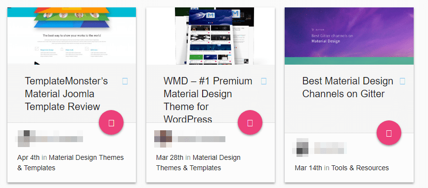
If you use colors that are too similar throughout your design, it can be difficult to make out individual sections.
The colors you choose for your website’s design matter more than you might imagine. It’s not enough to pick colors that look good together – they also need to make your content stand out to users can make out important sections easily.
At the beginning of this article, we showed you an example of what happens when you try to put light text on a white background. It makes difficult for visitors to make out each element, which is something you want to avoid. In general terms, you should aim for a decent level of contrast in order to differentiate between elements easily.
Take the example at the beginning of this section. We use a light gray background for our blog’s index. On top of that, we place white cards for each blog post, and we always like to use colorful featured images whenever possible. While white and gray are pretty similar, there’s enough contrast there that it’s easy to differentiate between each post. Plus, important elements, such as the VIEW FULL POST button stand out on their own thanks to our choice of colors. Here are a few key takeaways from our implementation that can help you improve your site’s accessibility using color:
- Aim for a decent level of contrast between your page’s elements. Your visitors should be able to make out each element of your site at a glance, so don’t be afraid to throw some strong, contrasting colors in there.
- Use a color wheel to help you pick the right tones. Color wheels make it simple for you find tones that contrast nicely with each other.
- Develop a color palette for your website and stick to it. Consistency is key if you want to create a brand identity throughout your website.
Using contrast properly is an excellent way to increase your site’s accessibility. However, you want to make sure there’s some level of consistency to the colors you pick. Otherwise, it’ll just look like you threw together a design in a hurry, and chances are the result won’t be fun for your visitors to navigate through.
4. Designing Hard to Use Forms
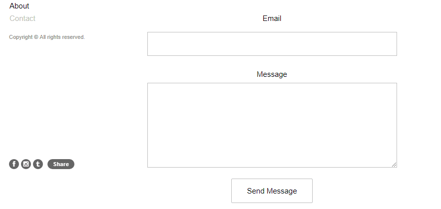
Contact forms should be easy to use, but that doesn’t mean they have to be boring.
Forms don’t get as much love as they should, especially as they’re one of the most important elements on your site. They enable users to get in touch with you without having to share your email publicly. This means they’re directly responsible – at a minimum – for a lot of conversions.
For example, you can also use forms to enable visitors to sign up to your mailing list. As you may know, mailing lists are one of the most powerful marketing tools at your disposal, so that alone should be enough reason to give more attention to your form’s design.
If your forms are unintuitive, they can directly affect how many people use them, which can hurt your conversions. However, there are a few design tips you need to keep in mind so they’re easy to use:
- Set borders for your fields whenever possible. Borderless fields in forms can look good, but they make it harder for users to figure out where each one begins.
- Add labels to your fields. With labels, visitors will know exactly what to type within each field.
- Design submission buttons that are easy to see and click. Your submission button should be easy to spot and to click, particularly from mobile devices.
The good news is your forms don’t need to be boring to be accessible. If you’re struggling for inspiration, here are some stylish form designs to help get your creative juices flowing.
Conclusion
Web design and accessibility go hand in hand. Creating a website that’s highly-accessible doesn’t mean it needs to look boring. It just means you have to keep accessibility best practices in mind, and find a way to incorporate them into your designs.
Here are four errors a lot of people make when it comes to accessibility in web design, which you should avoid:
- Including text in your images.
- Using headings incorrectly.
- Using similar colors throughout your site.
- Designing forms that are hard to use.
Do you have any questions about how to improve your website’s accessibility? Let’s talk about them in the comments section below!
Article image thumbnail by Dooder / shutterstock.com.


it was good .
i think the age of mixed color designing is over and we websites should have something like a protocol for designing .
Hi John, some really good points, I agree 100% on the form design, a poorly designed form can wreak havoc on your conversion rate.
In relation to writing on images, I agree that it is not a good approach to have text embedded in your images however I did read a number of years ago that putting text on top of images gives you a much higher chance that people will believe that text. ie, people are more likely to believe a statement if it is put on top of an image. The text should still be editable and should still be readable by Google etc.
The user must know what the site is about in seconds.Attention is one of the most valuable currencies on the Internet. If a visitor can not figure what your site is about in a couple of seconds, he will probably just go somewhere else.
What I find funny is Elegant Themes website is all of the things you mention. Hard to navigate and if you move away from the main page it asks you to sign in again. Maybe lead by example.
The endless login requests drives me mad, according to my font picker Divi uses
Poppins san serif 16px
Font weight 400
Line height 26pColour rgb(32,41,47)
Though it is not always super accurate
what is best font for good to read ?
plz ..tell me .. what is best font for good to read ….also font size
Nice article.
There is A LOT more for a site to comply with accessibility regulations.
Accessibility regulations such as section 508 and WCAG2 are already in effect in many countries including the US, many European countries and more.
Divi, for example, does not comply with the regulations and unfortunately, at the moment it is not in their priority to address this very important issue.
Great article. Want to know, what is the best fonts size on Desktop computers, that is most readable?
With the rise of larger screens these days, I’ve seen it be advised to use 16-20pt font sizes, especially for larger chunks of text (think a blog post, for example).
I’ve been told by people with disabilities with whom I work at client sites that they can readily discern if the site owner gives a “darn” about them (and people like them . . . with their type of disability) by the care taken to make the site accessible. Additionally, accessible sites become their favorites, and they share these preferences with their friends. Sounds like a neglected market to me.
What about aria labels? Is there an easy way to add them in WordPress/Divi? Our accessibility checker keeps pointing out that our full-width headers (which end up as sections in the html) are missing the aria labels, landmark roles, and section names…
Search engines can’t read the text within images??
No, only alt tags.
“For example, imagine your site’s background is white, and you decide to make your text a light shade of blue”
Or washed out grey text in Divi settings!!!. I know it is de rigueur these days in web design circles, but I find it annoying. A bit darker please.
I couldn’t agree more and is something I’ve complained about to support. The response was to adjust my contrast, I kid you not!
I ended up editing my admin to darken the text and options.
Another annoying thing is the inability to identify images used in the backgrounds, no URLs to see. Moving from staging to live is a problem because as far as I know these links can’t be edited with a plugin, they need to be done manually.
Poor usability from a designers perspective.