

The Pantone name is synonymous with color. Each year, they pick a color that exemplifies current trends in design, and this year, the honor fell to Ultra Violet. We’re talking about an intense color with a provocative name that isn’t commonly used on the web, due to the difficulty you’ll face when incorporating it into modern designs.
Ultra Violet may be intimidating, but it’s also ripe with creative opportunities when it comes to web design. In this article, we’ll introduce you to the color, talk about its parent (purple), and how it fits in web design. Then we’ll teach you a few tricks to incorporate Ultra Violet into your repertoire.
Let’s get to work!
An Introduction to Ultra Violet (And What Makes It Pantone’s Color of the Year)
Ultra violet is a bold color choice that stands out wherever you use it.
The Pantone Color Institute is a company that advises businesses on which colors to use for their brand identities and product development. They also engage in what’s known as ‘color forecasting’, essentially predicting which colors will be in vogue in the immediate future. Each year, they choose a color of the year – in part, a prediction of future design trends.
For a few years now, the Pantone Color Institute has gone with relatively safe bets for its color of the year. Some recent selections include Greenery, Rose Quartz, Serenity, and Marsala:
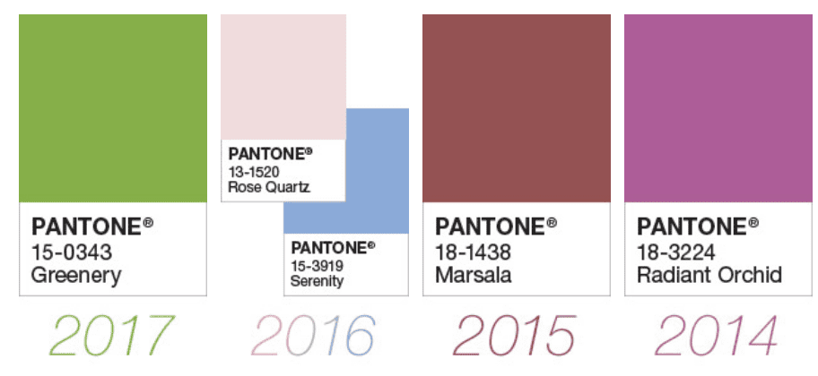
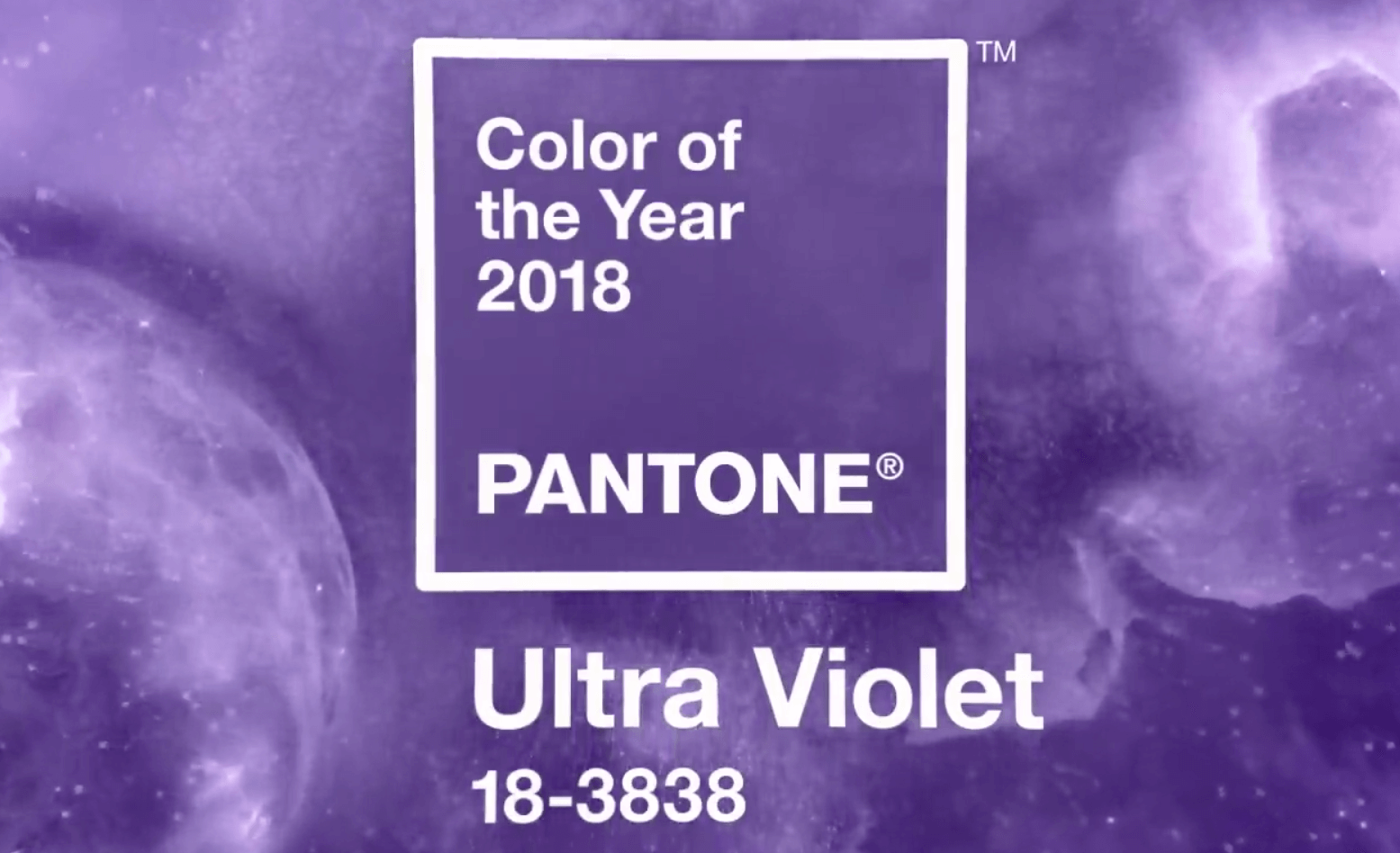
Most of those have a decidedly pastel quality to them, so the choice of Ultra Violet for 2018’s color of the year came as a surprise. It’s a rich shade of purple, with very ‘regal’ qualities. The color itself has been associated with all things ‘mystical’, and even space exploration. Pantone was also quick to point out Ultra Violet has been a staple of plenty of famous wardrobes, including Prince and David Bowie. In other words, you’re in good company if you decide to use the color in your designs. Given this, here are Ultra Violet’s color swatches:
- Pantone: 18-3838 or 2096 C
- RGB: 101 R, 78 G, 163 B
- CMYK: 76 C, 75 M, 0 Y, 0 K
- HEX: 654EA3
Before you start experimenting, you should keep reading to discover more about the traditional uses of purple in design. Plus, we’ll also provide you with a few tips on how to use Ultra Violet effectively later on.
The Role of the Color Purple in Web Design
Purple is a rare color in the ‘wild’. That same rarity is perhaps what’s made it so prevalent when it comes to symbols of power. Some examples include Roman magistrates (who wore purple vestments), as did Byzantine and Roman emperors. Violet and purple are not the same, but when it comes to design, they share many similarities in the way we use them. Take the BDDI 2018 website, which is dedicated to 3D music experiments built by designers and developers:

The site uses a predominantly violet background, which is a bold choice that gives it a bohemian feel. To keep content readable, they use contrasting colors such as white (always a safe bet) and neon green. Whether you’re using Ultra Violet or a more classic shade or purple, contrast is your friend. This brings us to our next example, Kinsta, which uses purple gradients mixed with white for its background:

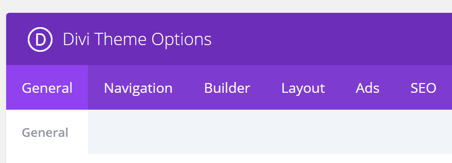
In this case, the use of purple is more subtle, and the gradient design gives the entire page a modern style. Also, note the way the website switches from purple to white, which tells your eyes you’re looking at different sections. Moving on to one last example, Divi itself uses violet for a lot of its User Interface (UI). Here’s the theme’s options menu, for example:
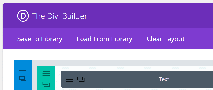
Violet also features predominantly within the Divi Builder:
Overall, the contrast between white and violet makes for a pleasant combination. Moreover, it should enable you to find the buttons and elements you need quicker since your eye should be drawn to the color. That’s not to say, of course, you should eschew all other colors in favor of violet and purple. Rather, we recommend keeping Ultra Violet in your back pocket for those situations where you want to really call attention towards a page or element.
3 Tips to Use Ultra Violet in Your Website’s Designs
There are, of course, nearly endless ways to use any color in projects. However, these three tips will enable you to make the most out of your bold color choice.
1. Use It Alongside Contrasting Colors
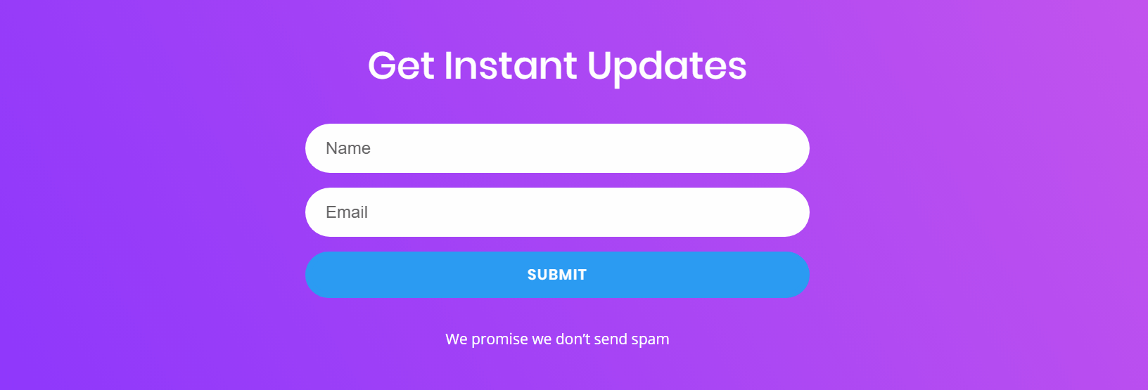
One of the best ways to make any color stand out is through contrast. For example, Ultra Violet and purple clash with orange, green, blue, and white. Here’s an example of a purple element on a blue background, which draws the eyes towards it:

To the right, you can see there’s another purple element – a button, in this case. This makes the button stand out from the white background, and it increases the readability of the white SUBMIT text on top. As we mentioned earlier, we’re big fans of shades of purple when it comes to Divi. Here’s an example from one of our layout packs that uses multiple shades of purple, which clashes with the blue elements to help each other stand out:

The key to using contrast properly is to pick the right colors and make sure there’s a balance in how much you use each of them. To help you with the former, you can use a color wheel to see what tones you find opposite of Ultra Violet.
2. Implement Gradients as Part of Your Design
Gradients are a fun way to add a lot of colors to your web designs. They stand out visually and make for excellent headers, such as the Kinsta example we showed you earlier in this article. Here’s another showcase of a Divi layout that uses a gradient background featuring the color purple:
From a functionality standpoint, there’s not much happening in the screenshot above – the page just displays a simple contact form. However, using a simple gradient background alongside a bold color choice is enough to make the section pop visually.
Implementing gradients in WordPress can be tricky though, unless you’re using the right tool for the job. Divi, for example, enables you to create gradient background overlays for any modules you use and the elements within.
3. Use Ultra Violet as an Accent Color
Earlier on, we talked about how useful contrast can be in web design. Accents are a way of using contrast to your advantage, to highlight specific elements with colors that are otherwise hidden. Take a look at this Divi pricing table, for example:

Here, we use Ultra Violet as an accent color to highlight the plan we want to lead user towards. We don’t use this color anywhere else on the other tables, and it stands out because the other tables use more muted swatches. Another good example would be this Contact Us section built with Divi:
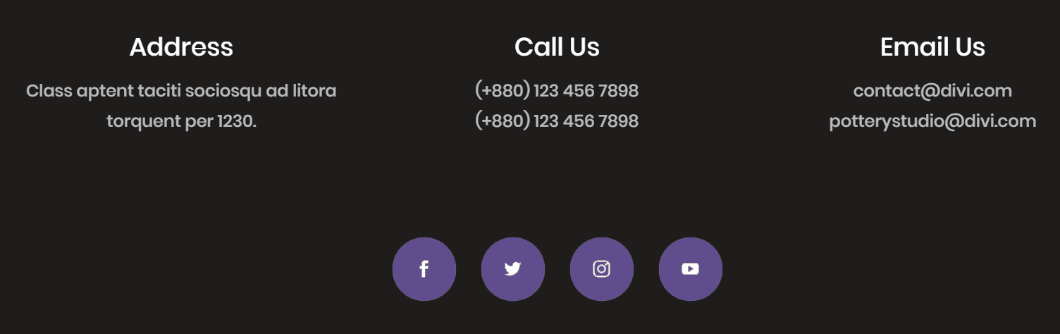
Here, we have two distinct sets of elements – contact information, and social media icons. The first stands out thanks to the contrast between the white text and dark background. However, we decided to use an accent color – Ultra Violet, of course – to make the social icons pop even more. The obvious choice would’ve been to use white for those as well, but then the four icons would’ve blended in with the text, which is a boring design choice.
The main takeaway is that accent colors should be bold and leverage the benefits of contrast. However, you should limit their use to a handful of elements per page at most, so they don’t blend in with the rest of your design.
Conclusion
There are a lot of ‘safe’ colors when it comes to web design, such as white, black, blue, and red. People are used to seeing them, so you need to use them creatively if you’re aiming for the ‘wow’ factor. With Ultra Violet, though, the color alone makes a statement, and it helps shake up your designs.
If you’re not sure how to incorporate Ultra Violet into your web designs, here are a few tips to help you get started:
- Use it alongside contrasting colors, such as orange or green.
- Implement it as part of a gradient for a stylish effect.
- Use it as an accent color on white backgrounds.
Do you have any questions about how to use Ultra Violet in your next web project? Let’s talk about it in the comments section below!
Article image thumbnail by AmzhyIttay / shutterstock.com.


I really enjoy this color, it reminds me of something that should be on a wizard’s robe. To me, it represents mastery and professionalism. However, it’s a color that should be used wisely, because it can easily become a distraction and outweigh other colors.
Being in web design we wait for the announcement every year. I love the idea of the gradient color scheme. I find that so eye-catching on designs. I wonder though if this color is so strong that it would pixel easily like reds do? It’s important to stay on top of the trends, but only if they function properly. Guess we will have to test and see!
I used to hate the color… but believe it or not, Divi made me like it… 🙂
This was such a fun read, and loved your examples of how to use the color to its potential. I do feel like Pantone’s color of the year choices are less of a prediction, and more on the influential side. Would ultra violet really be on everyone’s radar had Pantone not chosen it? Wonder if there are any studies on the impact of their color choices. (Too bad we can’t A/B test our lives, huh?)`
Hi Nicola. You’re very welcome! Thanks for the comment. 🙂
All colours and their values are perceived relative to the colours close to them.
Unfortunately it’s nightmare for people working on color-sensitive sites if they are using a UI that is violently colourful.
I believe having at least an option to subdue/desaturate the Divi’s UI candy colours to something more neutral / monochrome is a good idea. Content colours of designer’s work should take precedence over the UI. The UI can still remain Elegant and beautiful.
So…for the love of colour remove it from the UI.
SOLUTION
What would be really “divi-cool” is to have a UI setting to gradually step down/filter the saturation value of the all UI colours in a seamless manner, preserving the differences in values for UI highlights and shadows. It’s a simple fix. The same goes for backend and frontend editor.
This way Elegant can keep their visual identity while at the same time giving a great option to it’s users.
I hope this is helpful!
This is also the official colour of International Women’s Day on 8th March, so good to use if you’re building a site related to that.
Hi Andy. That’s a great point. Thanks for the comment. 🙂
I am excited about this color but am wondering, do you recommend changing the colors on your website each year; or even just accent colors?
Hi Leslie. That’s a good question. There’s typically nothing wrong with changing your color scheme, or just your accent colors, every once in a while. However, if your brand is synonymous with a particular color scheme, changing it will be a big decision that merits some consideration. Hope this helps. 🙂
Thats one of my all time favorite colors. I call it Grape Soda Can purple.
Great advice on how to use colours.
Thanks Dawn. 🙂
Thank you John for a very nice break from coding and technical software discussions. It is nice to read an article about unique color usage and artistic color selection here at ET. Thanks for sharing.
Hi John. You’re very welcome. 🙂
I love this article! Thank you for sharing previous year’s colors, and for showing examples. There is a vibrational frequency given off by colors as well… and Violet has the power to transmute negative into positive. Check out The Violet Flame. Super interesting stuff! It’s also the color of the Crown Chakra which is where we download information from outside the linear brain.
Hi Alyssa. Glad you liked it. 🙂