

Your website’s User Interface (UI) is the combination of all its visual elements. A bad interface design can make it hard for users to interact with or navigate your website. In some cases (i.e. the worst-case scenario), this means they won’t be coming back for seconds.
UI design moves along at a quick pace, so it’s important you keep up with the latest trends. In this article, we’re going to provide you with a quick introduction to UI web design. Then we’ll break down four of the most popular UI design trends so far in 2018.
Let’s talk interfaces!
A Quick Introduction to UI Design
Before we dive in any further, let’s talk about the difference between UI and User Experience (UX) since both terms are often confused. Essentially, UX refers to your collective experience with a specific product, website, or application. There are a lot of factors that can influence the experience, such as a website’s performance, content, and (of course) its design.
In contrast, UI design refers to the visual elements you interact with, including search bars, buttons, sidebars, and more. Pretty much everything you see on a website is part of its UI, including the layout.
UI design and UX go hand in hand because if you nail the former, the latter usually falls into place. Excellent design coupled with good interface practices tend to lead to positive user experiences.
To clear things up even further. It’s usually a web designer’s job to ensure the visual interfaces they create look great and are easy to use. Some people specialize in UI design, but if you’re building websites on your own using WordPress (for example), you need to learn a bit about it.
Finally, it’s worth noting there are different branches of UI design. In this article, we’re going to focus on UI web design trends. However, there’s a difference in the way we interact with websites, mobile apps, and desktop software, so they all have their own unique UI practices.
4 UI Design Trends to Look Out for in 2018
Below, you’ll find some of our favorite current UI design trends. You can use them as inspiration to help you with your next web design, or if you’re looking to freshen up one of your sites. Let’s take it from the top!
1. Seamless Interfaces
The concept of ‘seamless’ interfaces refers to websites that enable you to jump from page to page without transitions. Take the Cuberto website, for example:
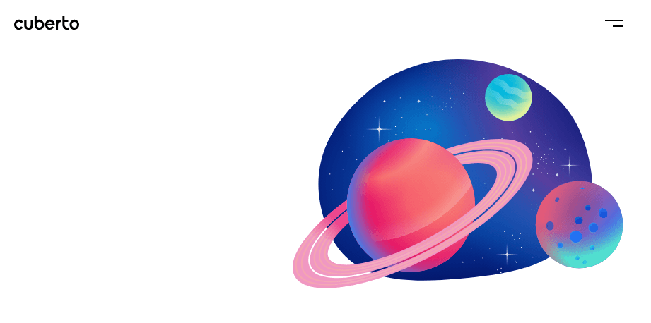
There’s only a very slight transition as you navigate the website. Despite the name of this trend, achieving the ‘seamless’ part is almost impossible since you have to load content when you jump from page to page.
In any case, if you manage to minimize these transitions, you get an experience similar to browsing a single page. In short, users shouldn’t feel like they’re waiting for your website to load, since it takes away from the immersive experience.
Seamless interfaces look great, but the functionality can be hard to implement. You can, for example, use an AJAX library such as Barba.js, but the process is a bit involved. If you’re using WordPress, your best bet is to optimize your page loading times as much as possible, so the jump from page to page isn’t as pronounced. It’s not quite the same as a seamless interface, but it still makes for an excellent UX. You may also want to try using a slider to replicate the effect, although this is more of a pseudo-seamless interface.
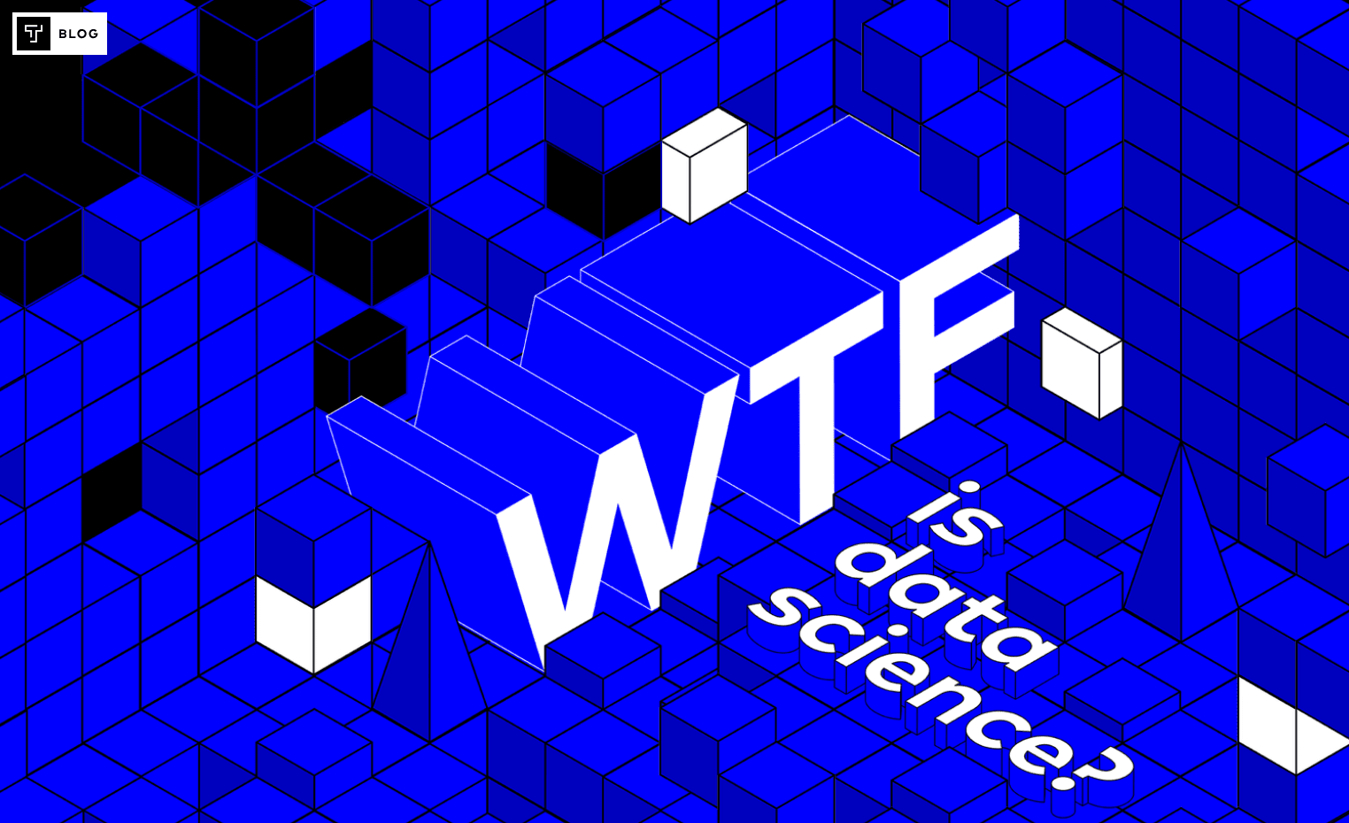
2. Geometric Layers
The past few years have seen a boost in the popularity of grid-based layouts. They use simple geometric shapes to provide a visual order for your content, and keep navigation simple. In some cases, you can even use uneven or broken grids to drive the eye to certain elements.
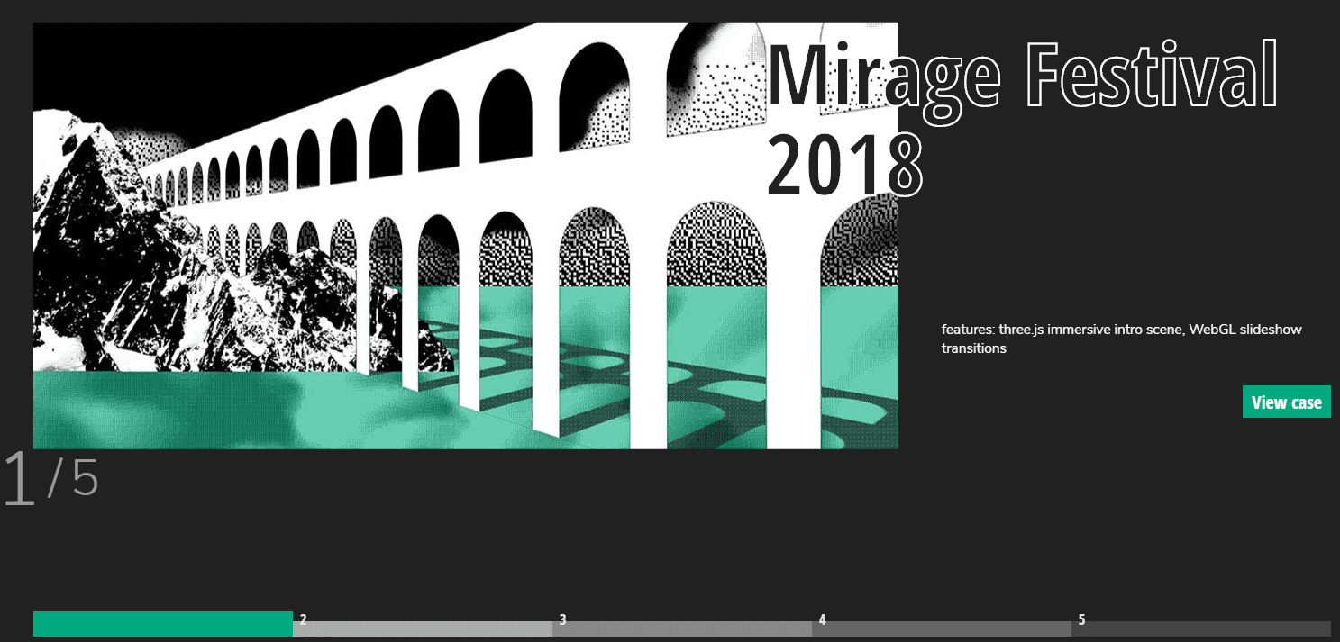
Geometric layers are an evolution of simple grid design. They go beyond boxes and rectangles, and play with more complex shapes, such as polygons, triangles, circles, and more:
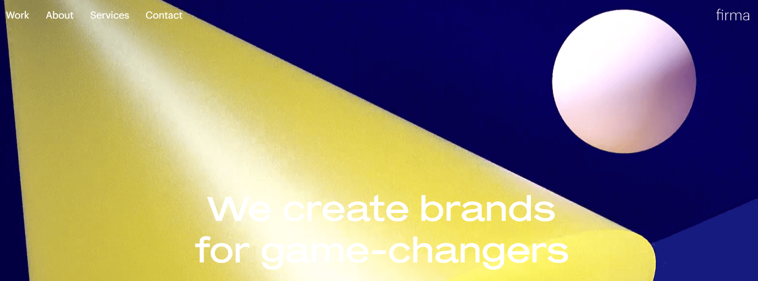
The idea behind this UI design trend is to present shapes you wouldn’t expect to see on a website. For example, you can use geometric layers to separate sections or highlight content:
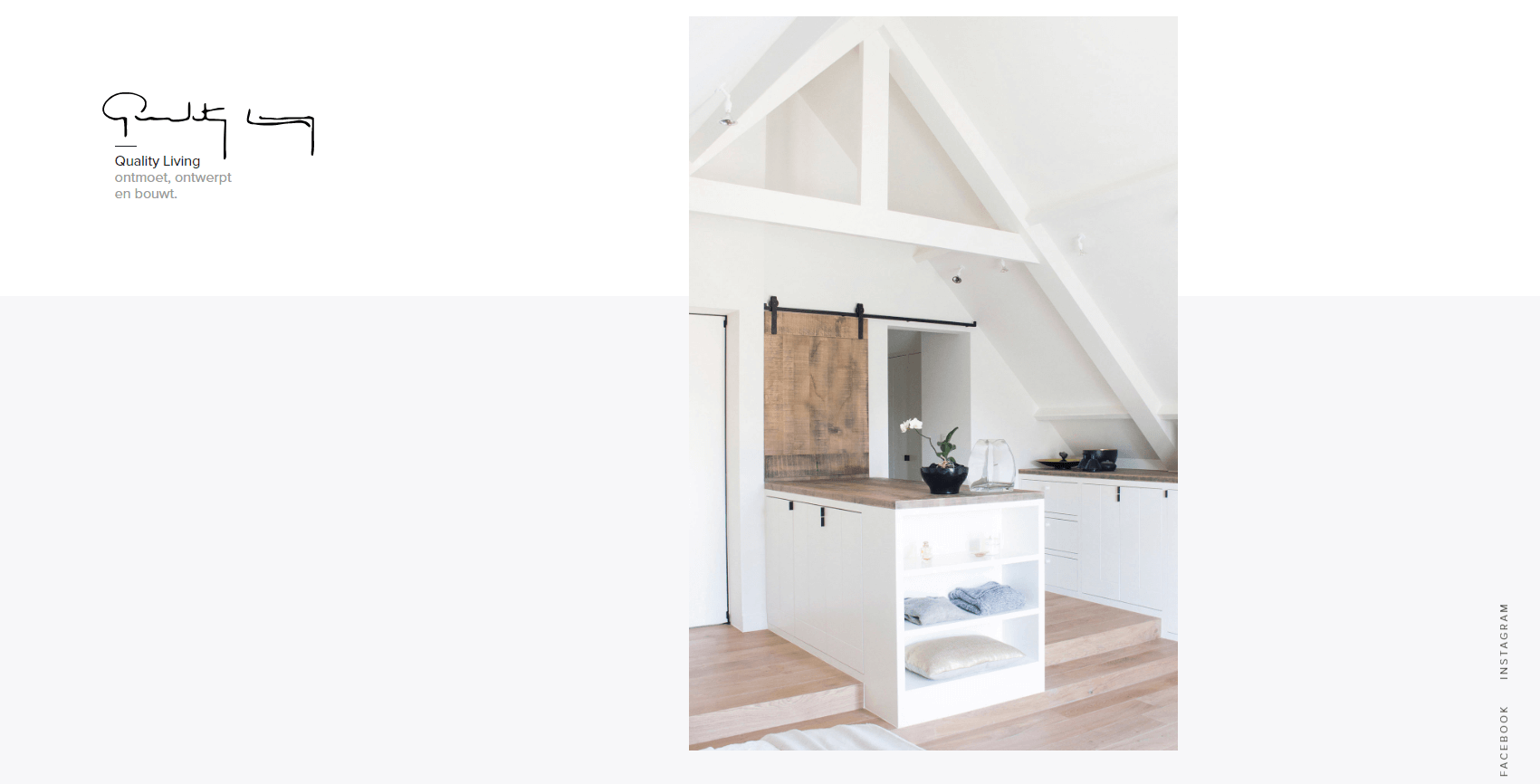
In practice using geometric layers usually makes your website look modern, but you can also play with shapes to achieve more specific styles. For example, by adding more white space for a more minimalistic look:
Or layer geometric shapes for something more eclectic:
With Divi, you have several ways of implementing geometric layers on your website. To give you an idea, here’s a quick tutorial on how to add animated geometric shapes to your pages using the Text module (no, that’s not a typo). For something simpler, you can add Shape Dividers to your Divi pages, many of which are based on simple geometric designs.
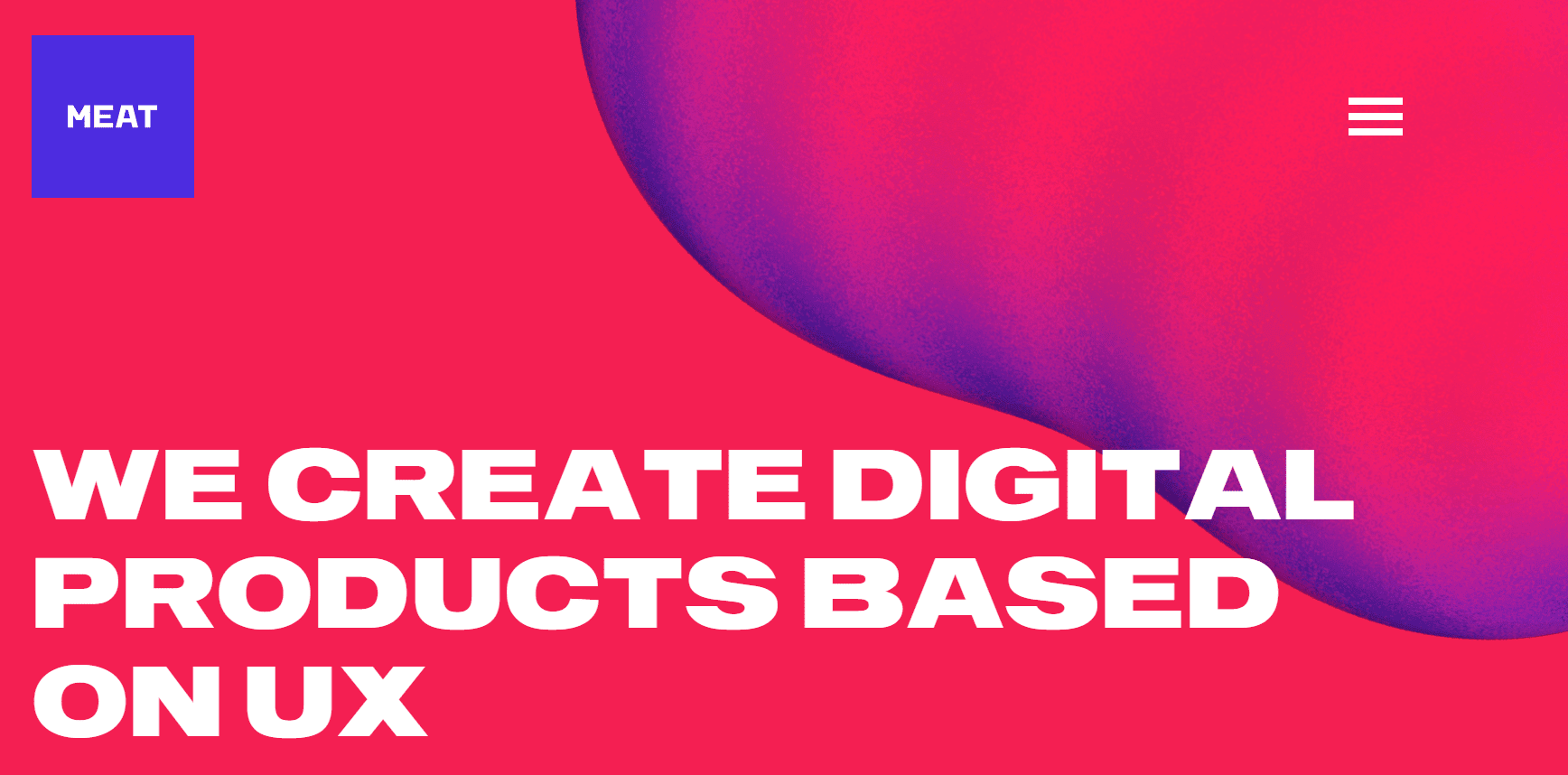
3. Bold Color Gradients
A lot of websites like to use safe color palettes for their UI designs. However, others prefer to buck the trend, and one of the best ways to do this is with a bold color gradient:
At first glance, it may seem like bold color gradients are just a way to call more attention to your website. This is only partly true since some colors are more ‘in-your-face’ than others. However, the right combination of colors can also help enhance your site’s ‘depth’:
The main thing to keep in mind here is not to choose colors randomly. Gradients, after all, should guide your visitor to the areas you want them to view using color. A great approach is to choose complementary colors using a color wheel, which makes for a smoother transition.
With Divi, you can create stunning gradient background overlays for several of our modules in a few simple steps. Just remember the rest of your site’s style should follow a similar color palette as your gradients – unless you want them to look out of place!
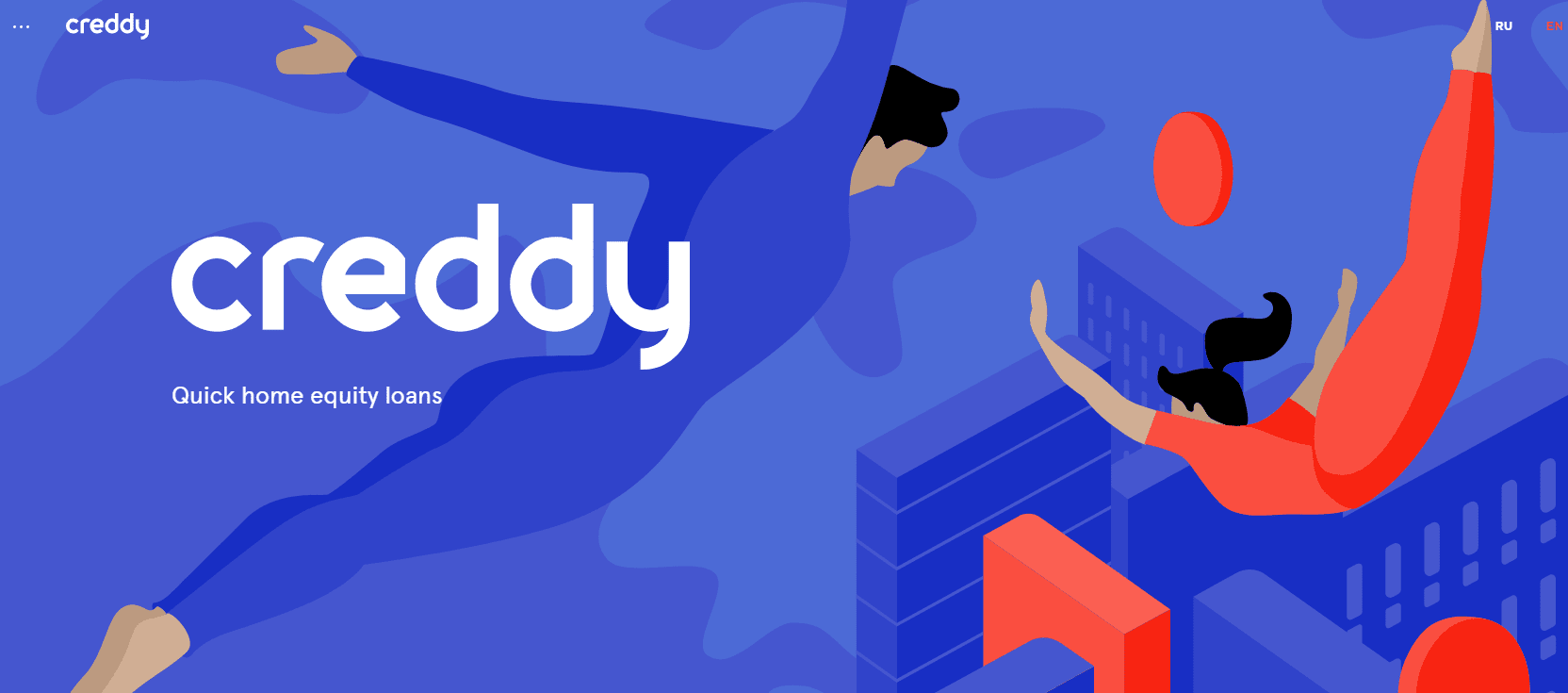
4. Microinteractions
We’ve talked a lot about microinteractions in the past from a UX perspective. They’re one of the best tools at your disposal if you want to highlight how specific elements of your website work, and they can look fantastic with a little work:
![]()
Suffice to say, microinteractions are the darlings of the UX/UI community lately, and the trend doesn’t look like it’s slowing down. After all, they’re incredibly practical, stylish, and – unlike other types of animations – they won’t slow down your website in most cases.
The key when implementing microinteractions is to remember they need to fulfill a practical purpose. Some examples of situations where it’s logical to implement them would be:
- To highlight a Call To Action (CTA).
- When selecting specific form fields so users know where they’re typing.
- To confirm an action took place on your website, such as clicking a submit button.
In most cases, adding these types of animations would require you to use CSS or advanced libraries. However, Divi enables you to implement several types of microinteractions on your website with very little code involved.
Conclusion
Your website’s UI design is an essential part of the entire package. More importantly, a great interface almost always leads to a fantastic user experience. If you pair this with excellent content, your website should be a smashing success.
Let’s sum up some of the latest UI design trends and why you should care about them:
- Seamless interfaces: Smooth transitions make for websites that feel like they don’t have loading times.
- Geometric layers: Simple geometric layers are an excellent way to organize and divide your site’s content.
- Bold color gradients: The bolder your colors, the more visitors will pay attention, and gradients enable you to add fun combinations.
- Microinteractions: These animations enable you to enhance your site’s interface and provide immediate feedback to your users.
What do you think is the most important element when it comes to designing user interfaces? Share your thoughts with us in the comments section below!
Article thumbnail image by best works / shutterstock.com.


Great information. Since last week, I am gathering details about the UI/UX DESIGN experience. There are some amazing details on your blog which I didn’t know. Thanks.
You’re welcome, Jopina! 🙂
just spent way to long mousing in/out of the planets at the top of the cuberty site!
i wonder if we could make a similar effect of their page transitions on a divi site…
“UI design moves along at a quick pace, so it’s important you keep up with the latest trends. ” – Well said & a great coverage of this topic article.
Thanks for your comment, Alex. It’s great to hear you enjoyed it. 🙂