

Worrying about how to improve time on site can seem like a waste at first. After all, does it really matter how long visitors stick around? Isn’t the main point that they come to your site at all?
Yes, it matters. However, total visitors is also a bit of a feel-good metric. Because it’s not just about getting people to your site, but also about what they do during their stay.
For that, time on site is an important indicator. It shows how visitors feel about your content and your site in general. If they don’t like it, they are out of there as quick as a gunshot. The result: an increased bounce rate and low-quality rating from Google. Plus, short time on site makes it very unlikely that visitors will convert to subscribers, paying customers, or something else.
For that reason, in this article we will show you effective strategies to keep visitors on your website. You will learn how to keep them engaged so they stick around and you have more opportunity to convert them from chance visitors to raving fans.
Sounds good? Then let’s get started.
-
1
How to Keep Visitors on Your Site Longer
- 1.1 Clean Up Your Design
- 1.2 Show Credibility Indicators
- 1.3 Improve Readability
- 1.4 Use High-Quality Visuals
- 1.5 Link Internally
- 1.6 Open External Links in a New Window
- 1.7 Offer a Content Upgrade
- 1.8 Add Calls to Action to Start a Discussion
- 1.9 Optimize Your Site for Mobile
- 1.10 Monitor Your 404s
- 2 How to Improve Time on Site in a Nutshell
How to Keep Visitors on Your Site Longer
The strategies below will help prevent your visitors from hitting the ‘back’ button in their browser.
Clean Up Your Design
Visitors decide within seconds whether to stay on a web page or not. It’s your duty to make sure that decision is positive.
Since the human brain processes visual information first, a professional and pleasant design goes a long way to make this outcome much more likely. However, on the flip side, if your design looks like a throwback to the 90s, your visitors are out of there faster than you can say “animated background image”.
Source: DPGraph
So, how do you make your design appealing? Here are a few pointers:
- Declutter — Remove unnecessary distractions such as unneeded widgets and keep things simple. Focus on what really matters. This will keep your visitors focused as well.
- Create space — Give elements enough breathing room. Cramped design is not visually appealing and will send visitors packing. Margins and padding around page elements are your friend.
- Place important content on top — Have a look at your website (including the mobile view). Is your most important content immediately visible? If not, change it. Anyone coming to your site should immediately understand their benefit of being there.
Show Credibility Indicators
Cleaning up your design is appearing professional, which is ultimately about trust. In the back of their mind users are always asking themselves “can I trust the information on this site?”. If they feel they can’t, they won’t stick around for very long.
Besides the overall look, a good way to demonstrate your trustworthiness is to use indicators of credibility. By showing proof that your content and website deliver what they claim, you can prevent a lot of site abandonment. Here are some examples:
- Testimonials — 90 percent of customers say they are influenced by online reviews before making purchasing decisions. For that reason, adding testimonials from satisfied customers to your site can greatly increase trust, especially when running a business or providing a service.
- About page — Your about page is one of the most important parts of your site. It lets people know who you are and why they should trust you. Find tips for creating killer about pages here.
- Social followers — As we can see above, humans are herd animals. Therefore, if you have large follower numbers on social networks, showing them on your site is a powerful credibility indicator. However, make sure you have the numbers, otherwise it will easily have the opposite effect.
- Trust seals — There are a number of certifications out there to make your site look better. Especially for ecommerce websites seals can make a big difference. Find more information in this article.
Improve Readability
Especially if you have a content-heavy website, it’s imperative to enable visitors to get the most out of it. One of the most important factors for that is legibility. You can write the most useful blog post of all time, if visitors have to strain their eyes to read it, many won’t stay long enough to find out.
Here’s how to make your site content a pleasure to read:
- Keep the background clean — Background images, colors and patterns can distract from your content. While it make sense in some places from a design point of view, for your main content you’d do well to offer as little distraction as possible. That’s why many websites out there (including this one) simply opt for a white background.
- Take advantage of margins and padding — Already mentioned this further above. Use CSS to create space around your content. It makes the whole reading experience more relaxing.
- Use an easy-to-read font — Social Triggers has an excellent article on font use. To make your writing appealing, make the font large enough (at least 16px) and choose a simple typeface that’s easy to read. Otherwise you risk giving your readers a headache.
- Break down content into sections — We already mentioned this in our SEO copywriting tips. Make content easier to consume by breaking it down into chunks. Use paragraphs, lists, headings and everything else in your arsenal to do so.
Use High-Quality Visuals
As pointed out earlier, humans are highly visual. For that reason, images are among the most engaging types of content out there. As a consequence, adding them to your web pages is a good way to improve time on site.
Visuals make written content more engaging, can support your argument aesthetically and are a great way to break it up. Plus, with the amount of free images on the web, there’s really no excuse not to use them.
When you do use visuals, make sure they are relevant to your topic and that you optimize them beforehand. Plus, don’t limit yourself to images and photos. Use infographics, embed videos, presentations and other visual content.
Link Internally
While the first article is the gateway for your visitors to come to your site, it can only keep attention their for so long (until they are finished reading that is). If your plan is to keep visitors on your site longer, a good strategy is to offer other parts of it they can explore.
One of the best ways to do so, of course, is to link to other relevant articles inside your post. That way, visitors are able continue their journey on your site and learn more about what you have to offer. Another possibility is to use a related posts plugin to show similar content. Or, use the sidebar to link to your most popular or latest articles.
As you can see, there are loads of opportunities. Plus, they decrease your bounce rate and improve your SEO as well!
Open External Links in a New Window
Linking to internal pages is not the only way to increase content quality. Outbound links to relevant articles provide readers with additional information and also let Google understand the topic of your content better.
However, when you do link to external sites, it’s imperative to set the links to open in a new window. Failing to do so, you will send your hard-earned traffic right on to someone else.
Fortunately, doing so is really easy in WordPress. When adding link, all you need to do open the Link options and check the box below:
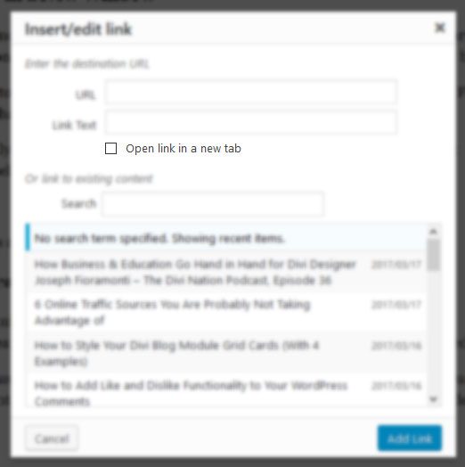
It literally takes two seconds and is one of the most simple ways to improve time on site.
Offer a Content Upgrade
Content upgrades are a technique to keep visitors on your site and increase conversion rates that has become popular in recent years. They are similar to bribes for jumping on your email list as mentioned here.
Content upgrades are a bonus that visitors receive for taking an action. However, in this case the bonus is directly related to the content they have been reading such as a PDF version of the article, a bonus video or checklist.
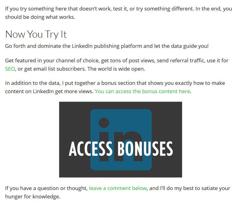
Source: OkDork.com
Of course, to access the content upgrade, users need to jump on the email list. This again makes it easier to turn them into repeat visitors. If you are interested in crafting your own bonus, you can find loads of ideas for content upgrades here and here.
Add Calls to Action to Start a Discussion
As should have become clear by now, time on site is all about engagement. The more engaged your users and visitors are, the longer they will stay around.
One of the best ways to engage someone is to make them part of the experience. The easiest way to do that: comments (which, btw, are also a great online traffic source).
WordPress comes with extensive commenting abilities baked right into the platform. However, in order to get the party started, you need to give visitors a reason to actually use them.
The most common way to do so is to add a call to action at the end of posts. Ask a specific question, request their input on the topic of your post or similar.
If you have done a good job with your writing, readers will be happy to contribute. Plus, it will make them come back to check for answers. And you better make damn sure they receive some, at least from you.
Optimize Your Site for Mobile
I probably don’t have to tell you that mobile is the way to go. It’s no secret that traffic from tablets and phones is eclipsing that from desktop machines almost everywhere in the world.
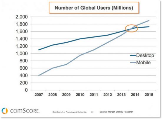
Source: ComScore
As a consequence, consumers expect your website to adapt to their needs and punish you if you don’t. One of the quickest ways to get a mobile reader to leave is to have them land on a page that doesn’t adjust to their device.
So, if your site still isn’t responsive or mobile friendly, it’s high time you changed that. Especially since Google won’t even show you in the mobile search results anymore if you don’t.
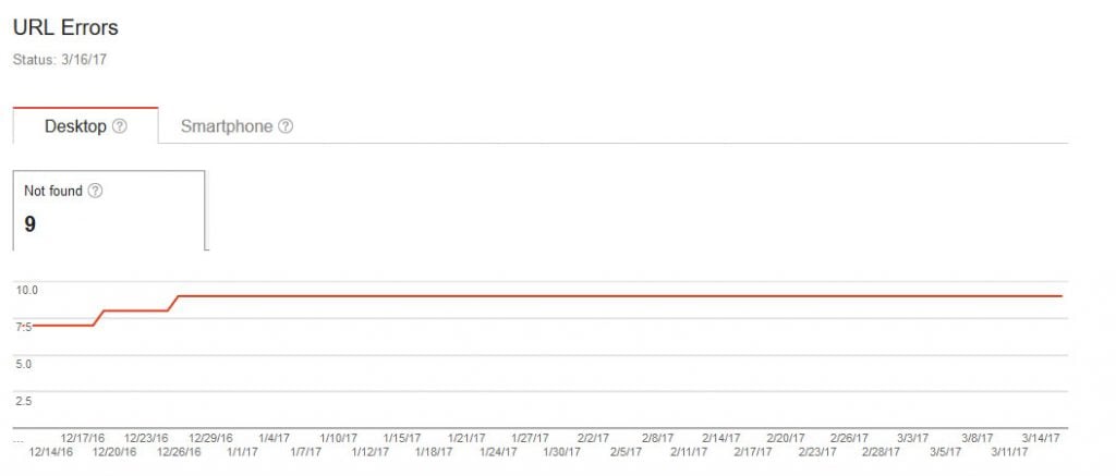
Monitor Your 404s
What do you do when you land on a page that doesn’t exist anymore? You know, the dreaded 404 – not found error? Chances are you close the browser tab. Well, your visitors aren’t any different, so you better make sure that doesn’t happen.
There are two ways of dealing with 404 errors in a way that keeps visitors on your site. The first is to create a custom 404 error page that offers them options to further explore your site. The second is to prevent this from happening again in the future by setting up redirects.
You can find all your site’s 404 errors in Google Webmaster Tools under Crawl > Crawl Errors.
With this information in hand, use the Redirection plugin to set up (301) redirects to the right pages. The cool thing: this plugin will also log whenever someone lands on a non-existent page so you can point them to the right place for the future. So, check back periodically.
How to Improve Time on Site in a Nutshell
Time on site is a strong indicator for how engaging your site is and a predictor for conversion rates and the overall success of a website. In the article above, you have seen that there are many different ways to improve it.
What should also be apparent is that pretty much every aspect of your site counts. From design to credibility indicators, content quality to technical optimization.
In the end, it all comes down to making your site as useful and appealing as possible. If you can do that, your visitors will be happy to stick around and return in the future.
Over to you. Have you used successful strategies to improve time on site? If so, please be so kind to share your experience with us in the comment section below!
Article thumbnail image by Walking-onstreet / shutterstock.com


Great post, I found it very useful! Thank you for sharing with us!
Thanks I have just made my website a bit more spaced out – and also added the same font you use on this one, I like it!
I can’t use 16px for body though it looked silly 🙂
By the way, slight error on your paragraph:
“While the first article is the gateway for your visitors to come to your site, it can only keep attention their for so long” hehe! <3
x
Hey Chrissy, thanks for pointing that out!
Hi Nick, thanks for a very useful article.
I have just published my first website (what a learning curve!) Now I need to make it look more professional; i.e. Implement every step on this list, except optimizing. Your article will be my step by step guide.
There are so few fonts available to choose from on WP. Any suggestions, please?
Thanks
Hey Clair, happy to hear you found it useful. As for the font, it really depends on your site and the rest of the design. I have some favorites that I often use like Open Sans or Lato. However, as mentioned it depends on your site whether these are fitting.
Thanks for the great post
Thanks for the great comment!
Great ways to keep customers. Thank you for sharing the author
You are most welcome. Thanks for the comment!
Hello Nick Schäferhoff
I have just started to built up my blog and this is very helpful to me.
Thanks..
Hi Waqas, happy to hear that. Glad I could help. Good luck with your blog!
Great post – lot’s of good ideas here. One suggestion I can make to theme developers and other website designers out there – please stop making your theme “Look” elegant, but hard to read – please choose Black text on a white or light background. I want to know Who decided that grey text was the new “in” thing for web & theme design. It seems like on every WordPress theme I use I have to change the default text color to black. Gray on white or gray on darker gray does not cut it. The lack of contrast is not good for younger eyes over time, but especially for older readers. Over 81.5 million people are in the 45 to 64 working (have money to spend, like to learn stuff) demographic. Thank the web gods that white text on a black background sites have mostly gone away – they look cool, but make my head hurt – (except the white text on a black background still persists on those like Skyrim’s wiki-type sites… I just checked a few and one has gone to light turquoise text an improvement, oh and the other is a very small 10 or 11 point thin/fine black font on a parchment color background – another improvement… the others still white on black. LOL )
Hey Cat, thanks for the comment. I totally agree with you. Black text on white background all the way.
+1 (a million times)
Thanks for the great article Nick. I’m pretty new to the idea of content upgrades and am now thinking how I could implement that on my websites to improve time spent. If you had to do a little content upgrade on this article, how would you do it? 😉
Hey Rob, happy you liked the article! Content upgrades are definitely a great idea. If I were to do one for this article, it might be a checklist, some extra tips (I had a few more points that fell victim to editing for length) or maybe a case study. Hope this helps!
Great summary. Lots of very wise advice in there.
Thanks Kevin, much appreciated.
…a great post! As I’m about to upgrade my own web site, this information is invaluable! A lot to think about and add but if it will improve a potential customers time on the site, hopefully it will pay off in the long run! Cheers!
Thanks for the comment, Rich! Glad you liked the post. Please come back and let us know if your implementation had any effect. Cheers!
great post!!
Thank you!
Wonderful suggestions for Time on Site increase.
The font, size and spacing are critical.
One of our sites has average Demographic 74% over 55
We use 18 pt font and meta line height 2
We still emphasize the focus on Quality content obviously.
Enjoying Avg. Session time 00:13:45 and Bounce rate of 5.61%
a little over 2 page views per visit with average 2,400 daily page views
Hey Chuck, those are very good numbers, congratulations! It also shows how important it is to know your target group. I am in my thirties now and reading on screen is getting more difficult already. Looks like you are serving your demographic perfectly. Thanks for the comment!
Hi Chuck,
What is the URL to the site with the 18 pt font, etc. that you mentioned in your comment? I’m curious how you implemented your UX.
Mike