
")
The world of typography is full of dozens of technical terms. While they may be a bit confusing and intimidating the first time you see them, behind this technical vocabulary lies knowledge that can improve the readability and appearance of any website.
To help you absorb some of this useful knowledge, this post will cover 50 essential typography terms that every web designer should know.
- 1 1. Kerning
- 2 2. Tracking
- 3 3. Leading
- 4 4. Glyph
- 5 5. Serif
- 6 6. Sans-Serif
- 7 7. Font
- 8 8. Font Family
- 9 9. Point Size
- 10 10. Weight
- 11 11. Roman
- 12 12. Italic
- 13 13. Bold
- 14 14. Baseline
- 15 15. Cap Line
- 16 16. Midline
- 17 17. X-Height
- 18 18. Stroke
- 19 19. Stem
- 20 20. Cross Stroke
- 21 21. Descender
- 22 22. Ascender
- 23 23. Ascender Line
- 24 24. Ligature
- 25 25. Joint
- 26 26. Vertex
- 27 27. Apex
- 28 28. Crotch
- 29 29. Shoulder
- 30 30. Arm
- 31 31. Bar
- 32 32. Bowl
- 33 33. Terminal
- 34 34. Counter
- 35 35. Aperture
- 36 36. Swash
- 37 37. Arc of Stem
- 38 38. Diacritic
- 39 39. Text Font
- 40 40. Display Font
- 41 41. Typographic Color
- 42 42. Contrast
- 43 43. Body Copy
- 44 44. Heading
- 45 45. Subheading
- 46 46. Hyphen
- 47 47. En-Dash
- 48 48. Em-Dash
- 49 49. Alignment
- 50 50. Justified
- 51 Conclusion
1. Kerning
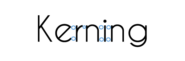
Kerning describes the spacing between individual letters in a font. Unlike tracking, which adds an equal amount of space between every letter, kerning varies between different pairs of letters.
Kerning is important to web design because it can subtly affect how people perceive text. If the kerning is off, then certain letters may seem to be too close together or too far apart.
2. Tracking
![]()
To change tracking means to uniformly change the spacing between letters in a font.
If you need your text to more completely fill a given space (such as a button), an increase in the tracking may do the trick.
3. Leading
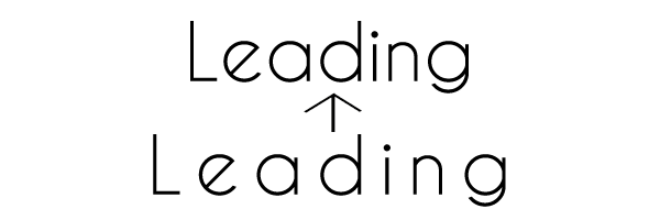
Leading describes the amount of vertical space between lines of text.
The right amount of leading helps the reader’s eye move smoothly across the page, improving readability.
4. Glyph
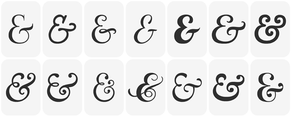
Image by Artoptimum / shutterstock.com
A glyph is the smallest unit in a font that has any meaning. Glyphs include letters, numerals, punctuation, and other characters.
If you plan to design a website that will display text in languages other than English, you should make sure that your typeface of choice has all the glyphs you will need.
5. Serif
Image by Irmy / shutterstock.com
A serif is a small line that appears at the end of a stroke in a character. In typography, you’ll usually hear it used to describe a serif font.
Traditionally, serif fonts are used for body copy, particularly in print. Consequently, using serif fonts for the body copy on your website is a good decision if you want your site to evoke the printed page.
6. Sans-Serif
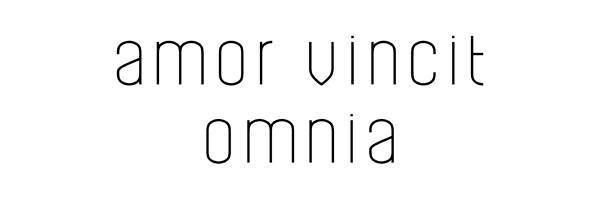
Image by aiym design / shutterstock.com
Sans-serif describes a character without serifs.
These fonts work nicely for headings, as their straightforward quality grabs the reader’s attention. Contrasting a sans-serif font with a serif font is a key principle of font pairing.
7. Font
Image by Hari Syahputra / shutterstock.com
Also known as ‘typeface,’ font is a broad term that encompasses the style, size, and weight of the text. Examples of well-known fonts include the sans-serif font Arial and the serif font Times New Roman.
Your choice of font influences the way readers perceive your website. Different fonts have different personalities, so they have a subtle (but meaningful) effect on the way readers experience your message.
8. Font Family
Image by Sashatigar / shutterstock.com
A font family is a group of fonts that contain glyphs with similar features. A font family may be as broad as serif vs. sans-serif, or broken down further into Old Style vs. Modern, for example.
Using different font families is an easy way to add contrast between your headings and body copy.
9. Point Size
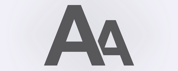
Image by MaluStudio / shutterstock.com
Point size is the numerical value that describes a font’s relative size. For instance, if a font is Times New Roman 12, the ’12’ describes the point size.
Choosing the right point size is one of the simplest things you can do to improve the readability of a web page.
10. Weight
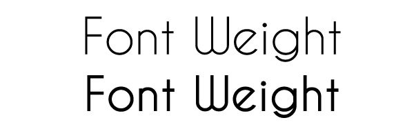
Font weight refers to the relative thickness of text. A very light font weight might be referred to as ‘light’ or ‘thin’ while a relatively heavy font weight may be referred to as ‘bold’, ‘heavy’, or ‘black.’
Fonts vary in the number of weights they offer and choosing the correct font weight is essential to making your site copy easy to read.
11. Roman
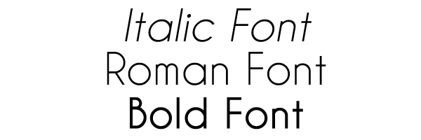
Roman describes a font in its ‘normal’ appearance, as opposed to italic or bold.
You’ll want to use a Roman font for the majority of your web page copy, as it’s more comfortable to read than italic or bold.
12. Italic
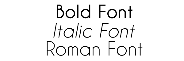
Italic describes a font that has a slanted, cursive appearance.
You should use italics sparingly when writing website copy so that the emphasis they add is all the more powerful.
13. Bold
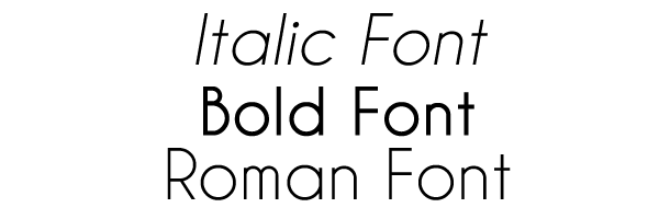
Bold describes a font that is darker and heavier than its Roman version.
Like italics, you should use bold fonts sparingly in your web typography.
14. Baseline
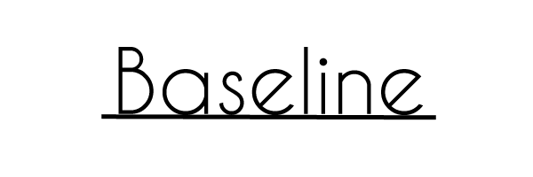
The baseline is an invisible line where all characters sit.
Baseline gives us a frame of reference for discussing other parts of typography such as descenders and x-height.
15. Cap Line
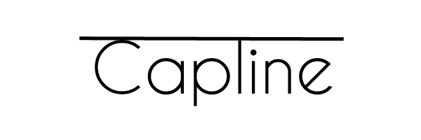
The cap line is the invisible upper boundary for capital letters in a font.
Just like the baseline, the cap line is important for discussing parts of typography such as ascenders.
16. Midline
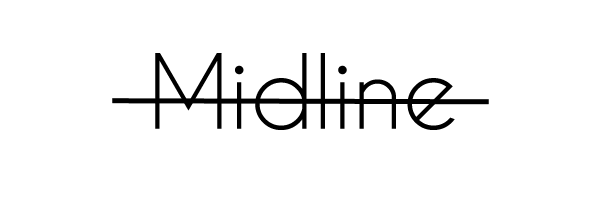
The midline is the point halfway between the baseline and the cap line.
The midline is also an important concept for discussing ascenders.
17. X-Height
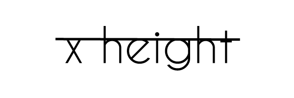
X- height is the height of the letter x in a given font.
X-height provides a metric for describing how ‘tall’ or ‘short’ a font is.
18. Stroke
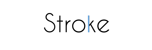
A stroke is any of the lines that make up a letter.
The way that a stroke ends determines if a font is serif or sans-serif.
19. Stem

A stem is the main stroke of a letter and is often vertical.
20. Cross Stroke
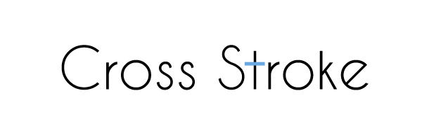
A cross stroke is a place where a stroke crosses a letter’s stem, such as in lowercase f or t. A cross stroke is similar to an arm, but different in that the stroke crosses completely through the letter while an arm does not.
21. Descender
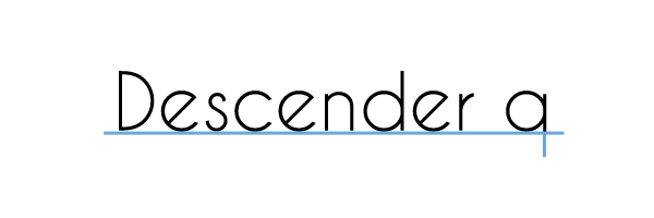
A descender is any stroke which goes below the baseline. Lowercase g, j, q, y, and p are letters with descenders.
22. Ascender
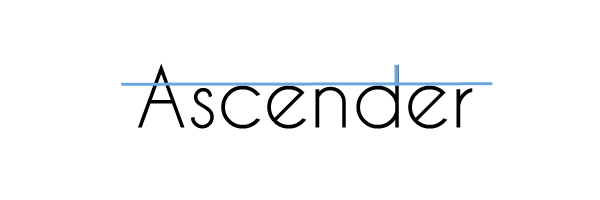
An ascender is any stroke which goes above the x-height. For example, lowercase b, f, d, k, l, and h are the letters with ascenders.
23. Ascender Line
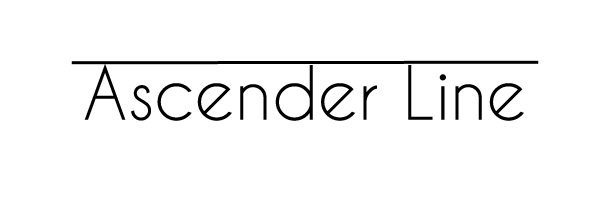
An ascender line is a part of a glyph that extends above the font’s x-height. For instance, the stem in the letter h.
24. Ligature
Image by Vaniatka / shutterstock.com
A ligature describes two or more letters combined into one glyph. For example, æ.
If your site is going to display text that requires ligatures, you should make sure that you choose a typeface that supports them.
25. Joint
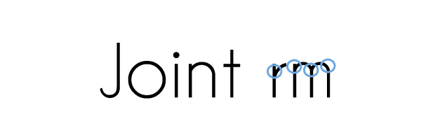
The point where a stroke connects to a stem is called a joint.
26. Vertex
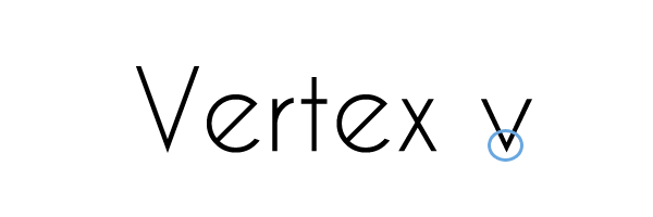
A vertex is where two strokes meet at the bottom of a glyph, such as in the letters v and w.
27. Apex
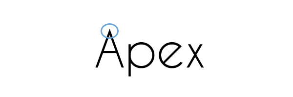
An apex occurs when two strokes meet at the top of a glyph, such as in the letter A.
28. Crotch
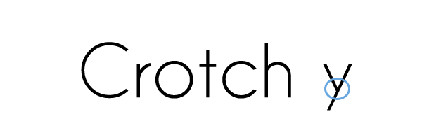
The crotch is the angle formed where two strokes meet inside a glyph, such as the inside angle of the letter y.
29. Shoulder
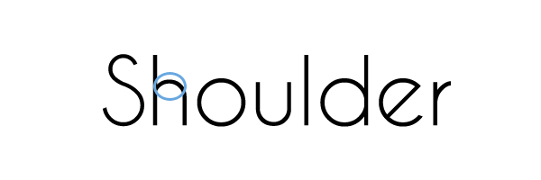
A shoulder is a stroke that makes an ‘arch’ shape within a glyph. For example, in the letters n, m, and h.
30. Arm
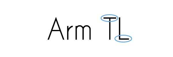
An arm is a long horizontal stroke in a glyph, such as the top of the letters E, F, and T and the bottom of L.
31. Bar
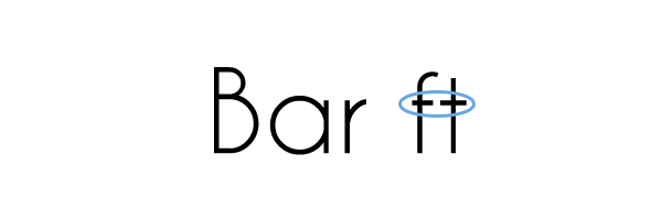
A bar is a short horizontal stroke in a glyph, such as the center of the letters f, A, , and t.
32. Bowl
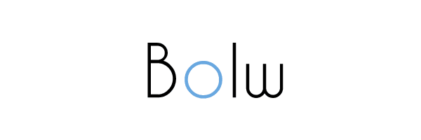
A bowl is a curved, closed stroke in a glyph. For example, in the letters b, d, and o.
33. Terminal
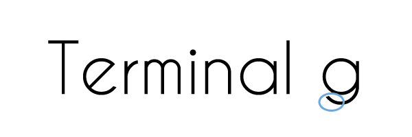
The terminal is the end of any stroke without a serif and is often a ball or tapered shape.
Artful terminals are one way to add interest to a sans-serif font.
34. Counter
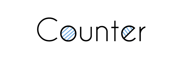
Counter refers to the negative space within glyphs, such as the middle of the letter O, for example.
A proper awareness of counters helps you to better adjust kerning, leading, and tracking.
35. Aperture
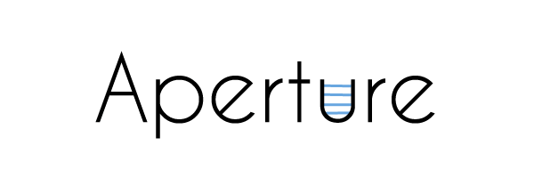
The aperture is the space that an open counter creates within a character, such as between the two terminals in the letter C.
36. Swash
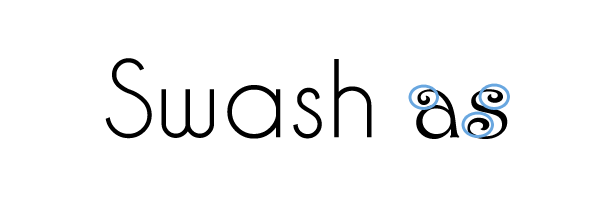
A swash is a stroke added to a glyph for decoration and embellishment.
If you want to give text an ornate, fancy appearance, then a couple well-placed swashes will often do the trick.
37. Arc of Stem
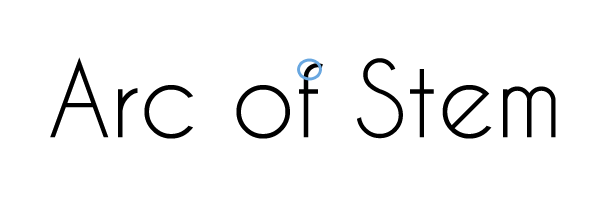
Arc of stem refers to a continuous curved stroke with a straight stem. For example, the bottom of the letters t, f, a, u, and j.
38. Diacritic
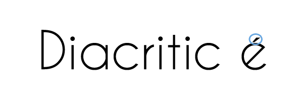
A diacritic is a mark added to a letter to specify a specific accent or pronunciation. For example, the final letter in Brontë or second letter in césped (Spanish for “lawn”).
Most common fonts include glyphs with diacritics, but it’s worth checking so you can be assured these characters will display correctly on your website.
39. Text Font
Image by d1sk / shutterstock.com
Text font refers to a category of fonts designed to work best at smaller sizes. Fonts in this category are an ideal choice for body copy.
40. Display Font
Display font refers to a type of font made to be read at large sizes. They are well-suited for headings and subheadings.
41. Typographic Color
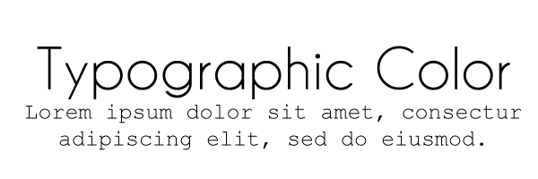
The term typographic color refers to the relative lightness and darkness of blocks of text on a page when you squint.
When designing a website, make sure that there is a sufficient difference between the typographic colors of your headings and body text.
42. Contrast
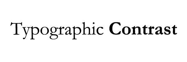
Contrast is the perceived difference in appearance between fonts. Contrast is specific to context, but common ways to contrast fonts include size, weight, family, and mood.
As it concerns web design, proper contrast between the fonts in your page copy makes the text easier to read.
43. Body Copy
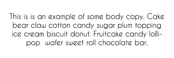
Body copy is the main part of a text, as opposed to headings or subheadings.
You should be especially careful to choose a highly readable and attractive font for your body copy, as it’s what a reader of your website will spend the most time looking at.
44. Heading
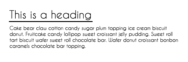
Heading refers to the text that defines the different sections of a web page. The heading is usually a different font and size than the body copy to make the distinction clear.
Proper headings are essential for breaking up text that’s longer than a couple paragraphs, or when you want to make a clear distinction between parts of an article.
45. Subheading
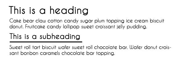
Like headings, subheadings also break up sections of a page or article. As the “sub” part of their name implies, they’re smaller than headings and appear below them.
For very long articles or pages, subheadings are useful for creating further divisions within sections already separated by headings.
46. Hyphen
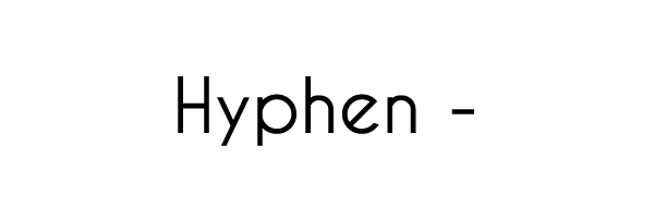
A small, narrow horizontal line that does the following:
- Creates compound words (“en-dash”, for example).
- Groups numbers (as in a phone number).
- Connects two parts of a word that break across a line (more common in print).
Your keyboard includes a key for this character.
47. En-Dash
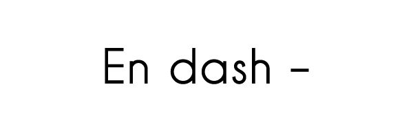
An en-dash is a horizontal line that is about the same width as the uppercase N in a font. An en-dash does the following:
- Connects numbers that refer to a range of time (1994–2016).
- Connects words that refer to a range of time (February–June 2016).
WordPress automatically renders this character when you type two hyphens between two words or numbers.
48. Em-Dash
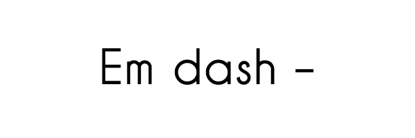
An em-dash is a horizontal line that is about the same width as the uppercase M. An em-dash does the following:
- Separates a unique but related idea from the rest of a sentence (similar to commas).
- Separates an inserted thought from the rest of a sentence (similar to parentheses).
When you type three hyphens between words, WordPress automatically converts them to an em-dash. For example, “Typography can be confusing—it’s enough to put some people off from design—but understanding it is crucial.”
49. Alignment
Alignment describes the text’s position relative to the margin (whether of a page, screen, or other division of text).
In WordPress, there are three possible alignments: Align left, Align center, and Align right. Left alignment is the default, and it suits text in any language that is read from left to right.
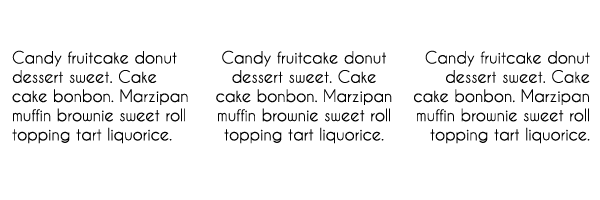
50. Justified
Image by Illustration Projects / shutterstock.com
Justified describes text that is aligned so that its left and right edges are flush with both the left and right margins.
Because it’s the standard for most printed books, justified text is a good formatting choice to use if you’re creating a site with a similar aesthetic.
Conclusion
The technical vocabulary used to describe typography includes concepts that are fundamental to good web design.
Possessing a solid understanding these key typography terms enables you to:
- Design more readable websites.
- Influence readers’ moods.
- Emphasize your most important content.
How do you use your knowledge of typography to improve your web designs? We’d love for you to let us know in the comments section below! And don’t forget to subscribe to the comments so you don’t miss out on the discussion.
Article thumbnail image by Alhovik / Shutterstock.com


Thanks, this is a good list, John! 🙂
Informative and to the point, excellent job!
Thanks, Richard!
Thank you for the refresher. I haven’t seen such a complete list since graphics art and printing class in college. Appreciate it.
No problem, Stephen. Glad you found it useful!
This is treasure! Great work! Thank you!
Thanks for your kind words, Jordan. 🙂
I learned a lot!! Thanks ET team
Thanks, Jonatan. 🙂
Fantastic list! I learned a lot 🙂 Thank you.
No problem, Jaroslava!
Good article.
Is it just me but the graphic for em-dash is show as exactly the same width as the en-dash…
That is what I saw as well.
Really enjoyed this article. Very informative. You’re never too old to learn a thing or two.
Great stuff, Terence – glad we could be of help!
Very informative and useful post. And fun!
Thanks, Peretz!
Since we’re on the subject of fonts, it would be soooooo helpful if the fonts listed in Divi Builder modules displayed the actual fonts named.
I’m just sayin’.
Meanwhile, thanks for this crash course. The ET blog is one of my favorites.
Another term to be considered: Typo
🙂
Not necessarily ‘germane’ to the article, but on point, if you will to item 23, and its inverse, 32
#23: An ascender line is a part of a glyph that extends above the font’s x-height. For instance, the stem in the letter h
– I saw no “h” in the visual example. 😉
#32: Bowl vs. Bolw
The humor aside, one of the better Typography posts I’ve read.
Thanks John!
I was going to suggest the same addition: typo, referring to “Bolw.”
And I agree: an excellent post.
No problem, Michael – and thanks for the heads-up!
Thank you so much for this. I got up to number 16 when I decided to tweet this out. Came back and continued reading. At the end I physically clapped for the article. The examples were lovely and explanations helpful.
Wow! Thank you for your kind words, Katherine – and thanks for the tweet. 🙂
Nice and concise article, explains a lot. Thank you, John!
Glad we could be of service. 🙂
Excellent list and thorough article. I remember learning a lot of these in college. Great little refresher course! Always great stuff John. Thanks!
No problem, Michael!