

Have you ever looked at pictures of people from the 1990s and wondered, “what the heck are they wearing?” I think most of us have. Because fashion trends come and go (and 90s fashion is ridiculous!), right?
Well, it’s no different with web design trends. As time goes on, new trends make their way into the picture. And as those new trends roll in, we end up with outdated web design trends that need to make their exit. Only with web design, the process happens about 10x faster than clothing!
This post is focused on those trends – the outdated web design trends that need a good kick to the curb if you want your designs to appeal to visitors.
1. Image Carousels
Thankfully, carousels are nowhere near as common as they once were. But you still see them pop up fairly regularly despite carousels having a contingent of detractors who feel strongly enough about the issue to actually create an entire website mocking carousel use.
So why are carousels so bad? Mainly because no one clicks on them and they make it hard for users to find content. While carousels with CTAs are at least marginally better than those without, they’re still typically a waste of space.
There’s tons of data that backs this up:
- Erik Runyon found that only 1% of people clicked on ND.edu’s carousel. With most of those clicks going to the first slide.
- Nielsen Norman Group found that, even when a user was looking for a specific piece of content, they couldn’t find it because of an auto-forwarding carousel.
- Wider Funnel found that carousels just plain don’t convert.
They’re distracting, confuse users, and don’t convert. And for those reasons, carousels are a bad design decision for the vast majority of websites.
2. Parallax Scrolling for Everything
Parallax scrolling is one of those things that is great in the hands of professionals but should never have been made accessible to anyone else.
Whereas it was once used tastefully to enhance designs and add depth, now it’s a standard feature of most WordPress themes. And that means it gets abused.
So when is parallax a good idea? A study in the Journal of Usability Studies found that users find a site with parallax to be “more fun,” which makes parallax ideal for lighter websites.
But at the same time, some participants in the study experienced “significant usability issues” as a result of motion sickness.
Parallax doesn’t need to completely go away, but it does require a healthy dose of restraint.
3. Obvious Stock Photos
Look, there are certainly times when you need to use a stock photo. It’s not a blanket “all stock photos are bad”. But you know what I’m talking about…
That photo of the woman with the headset that’s on 50% of websites’ “help” pages? Yeah, that’s an outdated design trend. Do you really think visitors believe the same woman works at 500,000 different companies?

A portion of the Google Image Search results for a woman with a headset. She certainly has hopped around to a number of different jobs!
Okay, maybe that’s a bit hyperbolic. But if you’re going to use stock photos in your designs, make sure that:
- They’re high quality.
- They really are the only option.
4. Overly Aggressive Popups
I wish this one were less popular than it is. But despite Google clamping down on annoying popups on mobile, popups are still unfortunately a feature of many websites, especially if you ever take a jaunt around the Internet marketing space.
So why has this design trend persisted for so long? Part of it is an unfortunate focus on conversion optimization. Webmasters think that throwing on pop ups will get more email subscribers. And while that may be true for a bit. The end result is that their site looks horrible and gives visitors an even more horrible user experience.
So if you want to focus on creating a site people actually enjoy using, kick overly aggressive popups to the curb and find another way to build your list or sell products.
5. Hamburger Icons on Desktop Sites
Hamburger icons make sense on mobile sites. There’s limited space so you need a universal way to indicate to visitors where the menu is. Totally fine with that.
But why are some desktop designs adopting the same hamburger icon for menus? Hiding navigation menus does not make your website more usable. Is it driven out of a misplaced desire for minimalism?
Instead. forcing your visitors to click an icon just to open your menu adds unnecessary friction to your site.
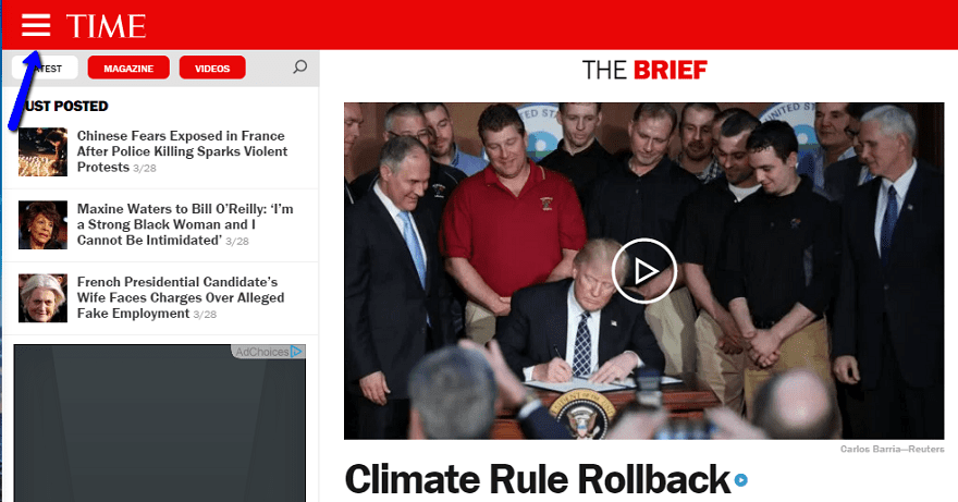
An example of a hamburger menu at Time.com.
And for that reason, you’re usually better off kicking this one to the curb and displaying your top-level navigation right away.
6. Missing Form Labels. AKA Minimalism for Minimalism’s Sake
When you design a site, your end goal should never be just to create a minimalist site for the sake of…having a minimalist site.
Instead of striving for minimalism, strive for simplicity. Simple sites are all about streamlining design to reduce friction. But that doesn’t mean they’re inherently minimalist.
Where does minimalism for minimalism’s sake usually rear its ugly head?
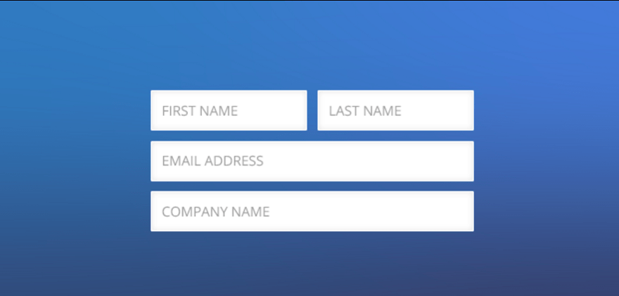
In a misguided march towards minimalist design, some web designers do things like eliminating form labels. And while that might make for a slick, minimalist design, it also causes all sorts of issues for visitors.
One of the great things about WordPress is how easy it is to add widgets and sidebars to your site. But thanks, perhaps in part, to that ease, some designers get a little too widget happy.
A widget for this, a widget for that…it adds up quickly. Trust me, I know because I was guilty of this at one point:

So repeat it after me – just because the widgets are available, that doesn’t mean you need to use them. Adding too many widgets clutters up your pages, which is why you should focus on keeping widgets to the real essentials.
8. Too Many Fonts for No Reason
There are a lot of brilliant designers out there creating beautiful fonts. Which means that when it comes time to design a site, it’s easy to feel like a kid in a candy shop. But just because a font is beautiful, doesn’t mean it deserves a spot on your site.
If matched properly, 2-3 different fonts can enhance your design. But if you start going past three, you’re just going to make your site confusing and hard to follow.
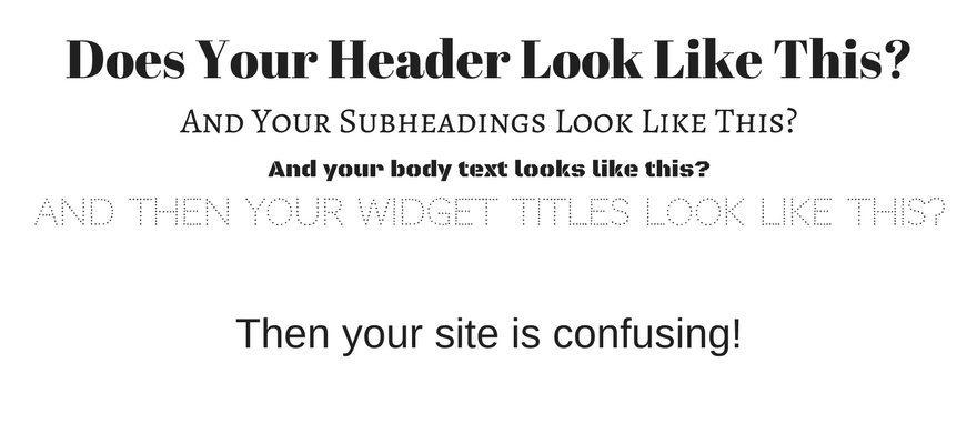
You can find some sites using more than three fonts well, but most of the time, it’s going to hurt, rather than help, your designs.
Wrapping Up
Hopefully, this post soon won’t make sense as these outdated web design trends fall out of the public consciousness. But until then, we’re stuck with them, even if it’s only a small percentage of websites.
Now over to you – what’s your biggest web design pet peeve that you wish would get kicked to the curb?
Article thumbnail image by UI / shutterstock.com


Very nice blog post. I agree with most of them especially with Parallax Scrolling but when new trends come up in technology, clients demands them and we have to do as per they demand. But Still these trends that you mentioned in here haven’t lost their effectiveness and they keep rotating one way or other.
I agree with all of these points, especially any type of carousel. The problem is that clients ask for this kind of stuff. They just love their image sliders! Even after explaining to them why they aren’t effective, they still want them. Some of these outdated design trends have to do with our clients perpetuating them as much as the designer. If I have a client that wants any of the above outdated features, I’ll try to educate them and talk them out of it, but at the end of the day I’m going to what they want to pay me to do, and what will make them happy! Oh and I totally agree with the commenters above that the super long scrolling home page must be done away with, especially if there’s no “scroll to top” arrow at the end of it! The infinity scrolling is even worse because I’m always trying to scroll to find info in a footer like a link or menu but more posts keep loading forever and ever with no footer in sight. Great article, thanks!
I agree to all points…
Hi Colin,
First of all congratulations for very informative article, I am totally agree that these are outdated web trends, well we always tend to go to some new trends.
Thanks
I’m totally agree with this article. I think more here, the trend of web design is more simple.
I totally agree: overused parallax, stockphotos and tons of widgets should be gone.
When articles don’t have a share button… like this one.
Yeah agree with all of them, endless homepages??? also. Hope to see more minimalism everything is too crowded leave more space there is nothing wrong with that, think for the user not for your client.
Hamburger icon on desktop sites…mmm…divi has 2 menu options that use hamburguer icon on desktop. Should ET follow his own advices?
Aggressive popups…I remember a web page with constant annoying popups…well…ah, ok, it was ET PAGE!!
Hamburger sucks even on mobile, a normal menu would still be better than the three lines. Divi needs to sort this.
The hamburger menu sucks, even on mobile. Loads of people just dont get it, better to have an actual menu imo, not easy on divi though.
When we needed a menu icon for the mobile version of our web app, we resisted the hamburger. After much research and usability testing, we used it – with “MENU” below it. Guess what: it works. And it works on mobile. It does not appear on the full-width site for desktops and laptops.
Another issue is the “grid” icon for selecting apps or websites from a menu or launchpad. Google, LinkedIn, and other sites have it. Outlook 365 places it in the upper left, whereas the convention is upper right (from my observation, anyway). Labeling it with “APPS” or “SITES” bolsters its usability (LinkedIn chose “Work” – not sure why), and color adds to its discoverability. This was determined after about 20 recent tests we ran. Over 70% don’t recognize it, haven’t seen it before, or have no clue what it does without a label.
Assume nothing of your users. Your website needs to not only tell “your” story, but offer the user a reward for landing there. Tell a story they’ll want to follow – and CAN follow easily. What is the happy path from A to Z — whether that’s from your homepage or, more likely than ever, from any of your subpages (where more and more guests are likely to land).
Don’t block them with intrusive pop-ups. Don’t distract them with moving carousels (manual advance *may* be better). Don’t overwhelm them with autoplay audio or video. Offer them a path that leads to a reward of value – whether a good article with insights, a free download of some kind, a discount – what have you.
Keep it simple but don’t over “minimalize.” And always, always, do a few usability tests.
* You are not the user.
* People are poor predictors of their own behavior.
* All sites and software go through usability testing: It’s up to you to control the experience.
Thank you for this very thoughtful and timely article, Colin!
I’ve never felt like the purpose of the carousel is to convert. It’s to tell a visual story in a small amount of space. Think “We’re known for x, y, and z.” Not “Buy x, y, and z.”
When the visitor comes across x, y, and z later, they know those are important concepts and will focus their attention a little more. Those are usually the pages you want to convert, right?
That being said, they can be over used or become a distraction if configured improperly.
Agree totally, sets the mood, tells a story, sets the scene for what follows
Hi,
Read with interest your post and I agree with a lot of your remarks. But I really do disagree with your statement about carousels. First of all your stats are outdated (2011 and 2013). And in the meantime the slider have a lot of more functionalities and you can even create on page websites and landing pages with them.
Somewhat right in few manner, but I think it lot depends on the industry you are from and your target audience you want to attract.
Though few points always applied on everyone like Hamburger icon for desktop sites, I have experience many people who simple doesnt understand it.
But a few will be here for sometime like carousal;
Websites should be designed by designers. Just like print ads, posters and brochures.
I sometimes use 1 typeface for the entire site (or print ad, poster or brochure). Other times I use a dozen. Beautifully.
Black, white and taxi cab yellow – a striking color scheme for one of my clients. For another, all pastels. For another, antique browns and golds.
Huge headline with 1 word. Or no headline, just an arrow pointing to a full page of solid text that does get read well (because it’s written well).
Point is, good design is good design. Each of the “trends” mentioned in the article is either not appropriate or highly effective for a given purpose. It’s a good designer that can make it work.
Guess what? I still use Helvetica, Avant Garde and Craw Clarendon. Overused by amateurs; the elements of great design by professionals.
Some of us even still use those trendy colors black and white.
Good article, very helpful. Too funny, though, that many popular ET themes emphasize and promote the use of carousel, parallax and more… And I don’t remember carousels and parallax being available in 90s webpage designs, it’s more a thing of the last decade. Probably ok for fun sites, but definitely not for business sites.
Talk about user friction, another extremely annoying trend that is also counter productive to users is FULL PAGE header images on the home page. Most of these are disorienting and cause users to have to search for a link. If I have to hire a private detective to find a nav menu on your site, I’m outathere! I’ll do business with someone who puts their users best interest first.
I could not agree more…One of the worst offenders is Apple when it comes to ridiculously over the top hyper-hipster minimalism. It’s so over the top in fact it makes their sites practically unusable. Get over yourself Apple, you’re not cool.
I agree with the comment that AUTO PLAY videos and audios are the most annoying thing I can find on a website. Fortunately, I have a mute button on my keyboard, and there’s another on the browser tab.
The second thing I can’t wait to go away is FLAT DESIGN. It seems that in their efforts to be “modern” and “cutting edge,” web designers (and desktop app designers) have removed all distinguishability from some websites. 3-D boxes, colors, borders, shadows, etc., are available because they make a site easy to visually scan and find the sections and actions you want. So what if a “gel” button looks a bit dated? It works, it stands out, and it is still eye-catching.
Change for the sake of change, or to “look modern,” is often just plain wrong.
I think the message/product should stand out, not the website design or the fancy gimmicks used on it. Turn down the design war and producing gamelike pages – I guess that’s a good side-effect of the flat design trend. Everything is better than competing with Apple design all the time or producing wild and vivid pages with blinking GIFs and embedded midi files, right?
The thing is, many pages do not support the product AND don’t respect it’s target group (you can’t design flawlessly for every possible audience). They simply hop on the trend train, putting up a 20MB Ultra HD background video fullpage, forget about goood menu setup and delivering content just to be “as cool as that tech company that currently leads the stocks”. Then another tech company says: don’t do this on mobiles or we lock you out.
Changing website designs every year has become another trend. Besides the costs, why do websites have to follow the short life cycle of TV spots or other channels? Sometimes it makes sense, but often enough people appreciate to find the same layout, menu and buttons over years. Who wants to find out where the bloody shopping cart went every other month when coming back to your favorite online store?
Personally I hate videos that replace text content. I do not have the time and mood to watch/listen to a video, when I could read the required info in a few lines. I rarely have sound on on my computer, as it annoys others around. In videos I have to wait for the required info part without any chance to scan the text quickly. Often enough I even don’t get the promised info from a video, but only good looking nonsense that doesn’t help me at all.
Pop-ups work well if the user triggers them willingly and they transport content better than loading a new page. Which is very rare. They almost never work well on small handhelds, whether they make us of responsive CSS and the like or not. Just because things can be done on tiny devices, doesn’t mean it’s a good idea to do it.
When, oh, when, will the grey fall out of fashion?
am I less hipster for disagreeing with the sliders part?
I understand trends come and go, but I can agree 100% to look cool
1. Overly Aggressive Popups
Really? Because people tend to forget how aggressive ET was with so many annoying popups even when you logged as their client? You close one – *poof* there is two more waiting behind the corner.
2. Hamburger Icons on Desktop Sites
Didnt Extra come with such menu?
Well at least now ET can follow their own advice – at least i hope they will…
YES! ET is horrible with annoying pop-ups. Alright already I’ve seen this freaking pop-up a million freaking times! I’m already a freaking customer ok? Geez! Give me a break!
Completely agree!
My first thought re pop-ups was the ET website. * THE* single most annoying site I have ever visited in this regard! And yes, even when you’re already client and logged in!
Please ET, give it a rest with the pop-ups with your existing clients
Another trend that should be “outdated” is mis-titled or worse, misleading blog post titles!
Using too many fonts has NEVER been a design trend. It’s a simply an indication of poor design, or perhaps more specifically, uneducated design.
I completely agree with all of your observations, but other than perhaps the first item about the image carousel, everything that you mention is more about bad design than it is about outdated design trends.
Misleading titles cause your site visitors to waste time – and THAT is definitely a trend to avoid.
You forgot “endlessly scrolling home pages.”
— Good article but the list can be longer.
— Where does that leave Bloom from Elegant Themes? Pop-up email list, ya know.
— I love a Testimonial Carousel plugin. A small circle with the person’s face, their compliment/testimonial. Then another face and text. Takes up minimal space. People can read it or not. It’s not meant to showcase products. But you ain’t taking that from my site.
WHY must everything convert? Maybe some things merely add some content which overall helps to convert? Or you are telling a story?
–I WISH Hamburger menus were replaced with the word MENU. I can’t tell ya how many 20-something college students/grads who have NO idea WTF it means.
I will dance on the ceiling when THAT horrible trend ends. Sadly, too many programmers hide where the hamburger icon is located. Making it impossible to replace it with the word MENU.
Pls take that suggestion into consideration. Users are totally baffled by the three little horizontal lines. Doesn’t mean menu to many.
— Colors! Why tiny light grey text? WHY white text on black background for text body? Why in fact any solid color on background which is bright and vivid? WHY the over use of light blue or orange for links? You can hardly see the light shades which too many insist on using, esp in themes.
Why lack of contrast between text and body? WHY don’t people study how people actually read? Or care if a design gives people headaches? As long as it looks cool, hip and edgy. As if.
— WHY greet people with a so-called “Hero” image? A full screen with nothing but a photo and some text. When I go to a site, I’m ready to dig in. If I want to see a full screen image, I’ll open an art book. Talk about extra clicks! You said it about Hamburger menu icon. Same with hero images. Which sadly look like stock art and too similar. How many photos of a laptop can we show or vary?
— Agree re Parallax. Those sites make me dizzy.
— Major point missing: too many sites look like they are 5, 10 or 20 or more years old. I think you aimed this towards web designers. Who else would be reading this, right? But what about the general public who change fashions, cars, food, etc quite often but their site needs major design work?
I’d like to see people encouraging the general public to the fact that a badly designed site does more harm than good. When it’s not responsive on mobile, sits on the top left side of screen and can’t be centered, too many colors and too many typefaces, puzzling navigation (hiding hours, prices, about, etc): THOSE are the real crimes in abundance.
Ok, just a few thoughts off the top of my head. I won’t create sites for others anymore. I do talk to people about it and want to teach more formally about these concepts. WHY is web design all about the actual building and not these concepts and more?
I want MY sites to be effective. Most of all, I don’t want to be aghast at too many sites, from old designs to newer trends like parallax and hamburger menus. Which means I am spending too much time trying to find whatever info which sent me to the site.
THANKS again. You all take care!!
THANK YOU. Good discussion. Let’s continue it. I’m not saying as a designer only. But end user as well. I really love information. But nothing turns me off as a badly designed site. Whether color or content, so close but so far off, ya know.
I agree. Unfortunately, too many designers are out to make a design statement by trying to outdo each other with cute css tricks and gimmicks. In doing so, they often lose track of their priorities as professionals, by putting form before function. Cartwheeling letters and jumping headers might be cool for a minute or two, but good grief man. It reminds me of the “animated gif” 90’s.
NEWS ALERT: This does nothing to improve the user experience! Not then, and not now!
Sadly, these techniques are extremely prevalent in the OVER-THE-TOP-TRENDY WP theme industry. Will somebody please stop the insanity!!!
All sites must convert so in brings in more sales or blog viewers.
Sliders to me are not that bad. Maybe you need one with a random random start point selected to mix things up a bit.
Parallax to me is fine for one section at most on the home page.
I think the one big problem with design is that the first thing on the home page under the main menu has to blow you minds. Sure it is all nice to chase trends, but that can lead to ugly design.
A site that is 5 years old can still work and work and function. Do we really have to change it up that quickly all the time??
Jenny – I meant to post my comment separately. Just want to say that I enjoyed your comment. I appreciate and support your expanded list.
I was shocked when Yoast first “outed” the uselessness of a feature slider. Featured sliders were fascinating and cutting edge when they first came out.
In few years we will be looking at trendy huge hero photos and long scrolling “sectioned” home pages as dated and ineffective as the next trend will have caught our eyes.
How do know when a trend has run its course? When the trend has been pushed to its extreme. Think fashion. Remember 1980’s shoulder pads – when they were pushed to the size we all looked like football players they were replaced by a new trend.
I am always looking forward to the next trend as change is exciting.
Yay, Jenny!
You hit many, many of my pet peeves. Low contrast text is a huge one.
Tiny text is another. Especially for sites for older audiences. And for sites frequented by people with larger monitors. As an older user with a 27″ monitor, I find I’m constantly running sites at 150% mag to get readable text.
Don’t let your designer choose your font if they’re into making the site “pretty” and “elegant” with no regard to usability. I worked with a designer who was a great designer. Her designs all looked fabulous. But her type choices were all minuscule. So, I bumped up the font size to readable. Went back to the designer for revisions. The font size came back even smaller than the first time. Looked like ants crawling on the screen! Had to have a sit down with the site runner to hash it out. The site runner chose a slightly too small font size and locked it down. The designer never spoke to me again. Some of these design schools need to get with the 21st century. Pretty is good. But usability RULES.
Thank you Colin for legitimizing a number of tweaks I have already arrived at for page loading optimization. On a personal level I putt along at 1.5 mbps and have to squeeze every little piece of efficiency I can out of a website, just to keep things from timing out. Carousels, popups and loads of unnecessary widgets just drive people away, for more than just esthetic reasons.
My comment in English.
Agree with the poster and the replies to date.For me it has to agressive and intrusive pop-ups.This becomes even more annoying and intrusive on mobile screens when the pop-up fills the whole view.I will simply close the browser tab down and move on.
As for stock photos.I agree with your point about over use however, there are amazing photos out there for those of use with neither photo skills nor the budget to pay for a professional photographer.I place a impactful photo as a full screen header to individual posts emphasizing the subject.That’s it, everything is my own for better or worse.
Great post, Colin! I totally agree, but have to confess that, as an amateur, I cannot resist dabbling in Parallax Scrolling – and, through a lot of trial and error, have sometimes gotten some good results.
One other item that I would add to your excellent list is auto-play multimedia. People should be able to choose whether or not they want to see/hear what is often just a piece of distracting fluff. (And I include animated gifs in this, too!)
Right on, Gary! Auto-play media are super annoying and potentially life changing in a very bad way. If your auto-play video starts blaring on the computer of someone at work, they might just be looking for work the next day. Not the way to endear yourself to users.
An even worse design practice is the auto-play video playlist. One annoying video starts. You stop it. You go off to do something else. A minute or two later you’ve got some annoying audio yammering out of your speaker from the next auto-play video in the playlist, but you can’t find it since you’ve got too many tabs open to see the speaker icon in the tabs. Grrrrr. You turn your speakers down but not off and search and search and find the offending URL, note it, and close it to NEVER return again. This is ridiculously frequent on news sites. A common practice that should be BANNED!
I agree and I hate going to a site for the first time, and before I can even see the first page, I get the “sign up” popup – I don’t even know yet if I like your web site!
BTW the form fields below ‘Leave a Reply”do not appear to have labels…
For many reasons I have never really cared for Image Carousels. However, I have a customer who has many advertisers and we have not been able to come up with a more effective way of adding multiple advertisers in a small space on the home page. Do you have suggests for this perennial problem?
One large graphic that showcases all sponsor logos in a grayscale with a large call-to-action and a button that says View all sponsors. Then on the landing page use responsive cards or blurbs and showcase all advertisers on one page. Then if advertisers want to be “called out” upsell the main graphic space to increase revenue.
Thanks Kenny. That sounds interesting. Do you have a URL for an example of what that looks like in action?
I am astonished, because a lot of these “outdated” features are still favorised by DIVI, what is the difference between an accordeon and a slider, from the users’ view?
What about aggressive popups, CTAs everwhere?
A lot of DIVI-blog-recipies use these outdated oldfashioned features ;=)
Well said i was thinking the same..
Yes, this. Aren’t sliders the same as carousels? If not, what is the difference?
By the way, I do like my sliders.
Sliders and carousels are generally the same thing. From the end users point of view, they are all too often confusing. Motion actually distracts the user, so manual-advance sliders may work better allowing the user to page through at their pace. They tend to serve the notion that stakeholders and product managers can know they are represented on the home page. A better approach is a home page that quarterly or even monthly has an updated feature placement. It communicates that the site is maintained, rather than left on auto pilot.
The fact that Divi includes this and other features speaks to meeting demand, but that doesn’t correlate with its use being a good idea. For best results, install and measure analytics to see what response YOUR site gets from the carousel/slider. That’s what matters most!
Thank you, Colin, for this comprehensive article. 100% agree with your suggestions.
Big truths here. Too many sites are built with too many of these mentioned elements because the client has seen similar things and thinks there must be a reason. In truth, it may just be a designer’s preference and not based on research or performance metrics.
Bottom line: Know your target audience, place elements based on need, test like a mofo!
Great article .. I’d agree with all your points. Our clients need to understand we build sites for their visitors not for them. Good navigation, clear calls to action, and the science is in > large image carousels are a turn-off. Cheers!
I completely agree, Colin. Maybe you could have added tabled design but certainly that’s not even simply an “outdated design trend” but crime.
YES. I am guilty of some of these without even realizing it LOL
Time to knock it off!
Thanks for a great article. I totally agree with sliders/carousebeing outdated. I think the issue is, a lot of clients who want websites built this way are wanting them to please their own design ideas and not thinking of the end user. I find this a lot. Then when you explain to them the reason why they are not so good anymore they understand.
I can now share your article to get the message through. Thanks again
I am totally there with you. I do enjoy parallax, but it can be overdone by a lot of people. And I have never been a fan of sliders, just for the reason you mention: they don’t convert. On top of that, they usually hide content that you want your visitors to see, but they never get the chance to because it’s not highlighted properly. I’m glad that I don’t see them as often as I did.
I went to a conference yesterday where a presenting designer recommended using sliders to replace menus, and it took a lot of strength to just sit there and not be “that guy.”