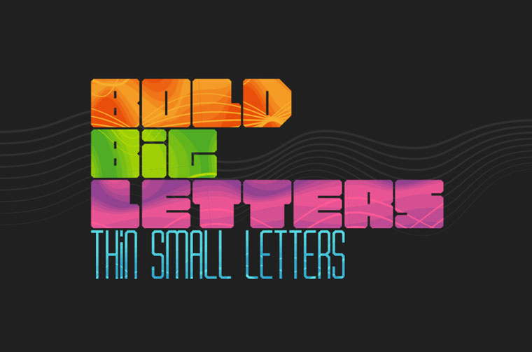
Kerning vs tracking. As a designer you can wish to create a beautiful typeface but before doing that you need to know the fundamental rules of typography design. No matter how experienced and expert you are, it's always great to invigorate your skills about the basics of typography. Concepts like the anatomy of typography or the basic difference between essential aspects aren't really something that you totally need to know but it will surely sound amazing when you can prove your client about your knowledge. Words like ascender, descender, kerning, leading, x-height, tracking, serif, and sanserif should be in your typography vocabulary. Knocking your grey cells, why? Wel, you should not forget that you're a designer! My fundamental goal here is to highlight the basic difference between three essential concepts of typography, i.e. Leading, Kerning & Tracking so you can impart some good practice with basics in your head.
Kerning vs tracking
The principle of perfecting typeface in a website design begins with adjusting three elements, respectively as leading, kerning and tracking. In a typographical design, it is more about controlling the space between letters to make the text more appealing, optimized for readability and proportionately sized.
Leading, kerning and tracking are the three ways to adjust the letter spacing to deliver aesthetically appealing and readability optimized layout. With the spatial adjustment by these methods, one can boost the typographical design and make contents on the web or on mobile app more readability optimized. Until you know using these spatial adjustments to boost the look and feel of the typeface, the so called choice of beautiful font alone cannot deliver the expected design output.
Leading
The spacing between the baselines of the typeface is referred as Leading. The word leading has been originated from the lead strips that were used in the old hand set printing presses. The lead strips in the older letterpress used to serve the same purpose as Leading in modern typeface design. Through the adjustment of the space within a page can be utilized properly. By bigger or shorter leading space the aesthetics of typographical design can also be changed to a great extent.
Give fascinating effects to the design by altering the leading of a font and ultimately increase or decrease the decipherability of the type
Now let us explain how can you adjust the leading of your typeface through Photoshop. Go to the character section within the Window and thereafter just by choosing the size of the leading field by choosing a number. The location of the leading field is next to the font size. When changing the font size and leading always highlight the respective text.
What is kerning?
Kerning definition. Have you come across any word or statement you are typesetting and felt there’s something weird about the font? May be it just be a kerning issue.
Kerning refers to the space between individual characters and as most fonts come with a default kerning there is a limit to adjust this space. Kerning is important to ensure natural space between individual letters within words. Even after applying kerning the change is expected to be very subtle and almost imperceptible. In most cases without looking intently on the typeface people cannot realize the change in the space between individual letters.
Kerning completely changes the typography-focused projects by bringing a more polished look. It plays an essential role in large & greatly visible fonts like logos or headlines
Now let us see, how you can apply kerning by using Photoshop. You need to go to the same character palette you have earlier used for leading. The respective field to apply kerning is located just under the size of the typeface. Instead of using this you can hold the cursor button between letters and press the option key and thereafter can move the letters sidewards with the left and right arrows.
Few Kerning tips you need to keep in mind –
Be careful about specific letter combinations.
Identify and understand the relationship between space & font shape.
Pay attention to point size
Err on the side of over-kerning.
Learn when to kern
Tracking
Do you find some fonts real awkward just because of the large or real less spacing between them? Don’t despair tracking exists!
Tracking is another effective method of spatial adjustment much like the kerning but in this case instead of adjusting space between individual letters space between groups of letters is more focused on. In simple words, it uniformly manages the space between all letters in terms of text. With more tracking space you can make the overall density of typeface lower while with less tracking space you can make the character density appear higher. Adjusting tracking space can have the significant impact on readability. Through tracking, you can easily eliminate orphan lines and make them appear neatly organized.
Tracking in typography is usually required to make lines of type even with a specific goal to evacuate hyphenation or windows and orphans from paragraphs
Let us now see the way you can adjust tracking in Photoshop. All you need is to go to the character section in the Photoshop and can just change the value just below the kerning. Similarly, like changing the kerning you can use the shortcut. Just select the text and hold on to the option key and then by pressing the left and right arrow adjusts the tracking space.
Time To Think About The Spatial Relationships Between Letters
Few essential tips that will help you to create awesome font style –
Orphans and Widows should be avoided when potential
Evade large number of words in a line
Use consistent typeface and weights
Make use of serifs for long paragraphs
Understand the different value of colors and pair accordingly
Acknowledge the color contrast
Start using a dash (-), rather than taking help of two hyphens (--). You tend to make the design attractive with two hyphens, however, it looks untidy & messy. Moreover, it actually interrupts your text.
While considering the spacing – change the letter, word and line spacing in headlines. As the bigger the fonts the bigger the spaces and thus the more attractive the headline.
Don’t size the text in terms of PX and PT. You need to start measuring it with Ems. It is relative measurement and can easily fiddle with the reader zooms in and out.
At the time of considering paragraph alignment on a web page, make sure you don’t use justified text. Web page content with justified text will space-out the text in the completely gawkily way and thus there will be trouble in reading. Try to use left alignment for main body or center at times, depending on the graphics on the page.
Make sure the hierarchy is well structured as a string hierarchy will make the navigation easy for readers.
Avoid using all caps for the entire content body
Always use two typefaces or max 3 at times.
Will designing, ensure you never squash or stretch fonts in one direction. Always resize the fonts uniformly.
Choose the font wisely according to mood of piece
Steer clear of using 12 point type for body copy
To conclude, all these types of spatial adjustments like leading, kerning and tracking will help making your text appear beautiful and optimized for readability. The subtle spatial changes between the baselines, fonts, and the group of letters will ultimately help to boost the aesthetics and readability.
So, now you have an idea about three significant subtleties, such as tracking vs kerning, changing of which can help turn a mediocre font into a web design tool that will highlight the conception of your website and make it unique.
A logical question appears: where to find a font that will complete such an important task? An old good TemplateMonster marketplace with 750+ fonts for different tastes and pockets comes in handy!
Classy, fancy, modern, futuristic, old-school, suitable for business, stores, personal blogs – a collection is full of options for different purposes. Let’s explore the best of them!
Top 3 Newbies with a promising Future
Let’s give a chance to newbies to win the heart of the quirky graphic designer as there are worthy options indeed.
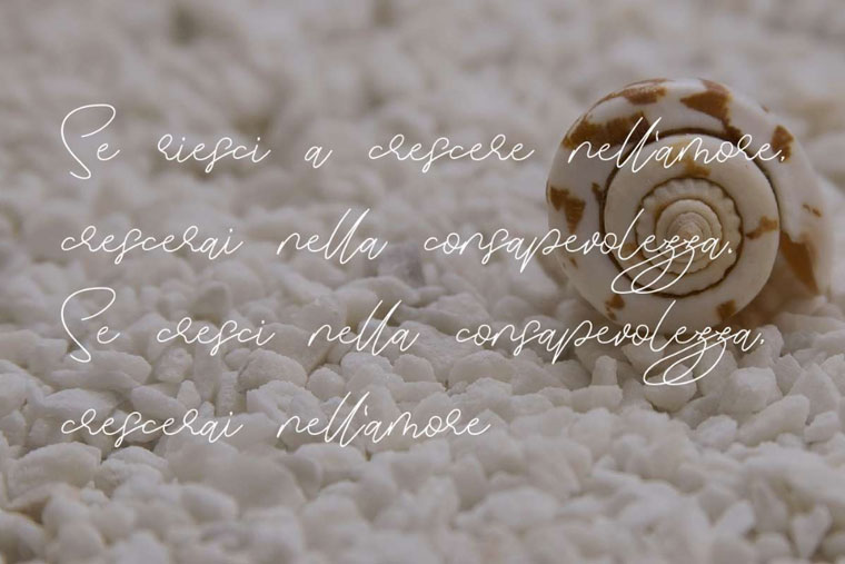
Looking for something elegant and imponderable? Zephira font might the right choice then. It’s a natural handwriting signature font.
It looks like if someone made a mild stroke with a pen and started tracing out each letter painstakingly. A text with Zephira font looks like a letter to a special someone: discreet, tremulous, full of love and gentleness…
This font especially suits personal blogs (lifestyle, travel, fashion blogs), eCommerce stores, portfolios, designers and design studios, photographers, artists, and musicians. If you are a creative personality, this font will be able to highlight that.
Also, it will look awesome on the card, postcard, invitation, flyer, brochure. A logo will also look splendid with this font.
You will get it as a zip package with:
OTF file
TTF file
Woff file
Read me txt
The installation process is fast and intuitive. Afterward, you can use it on PC and Mac. It’s compatible with Adobe Illustrator, Adobe Photoshop, Adobe InDesign, and Microsoft Word. You don’t need any additional design software.
Even if this font doesn’t cause hyper-salivation, there are high chances that the visitors of the website will get sucked into it.
From first sight, a font might look a bit extra but just imagine how cool it will look on the website of the cafe with doughnuts and milkshakes, for instance. It will also look awesome on a logo or invitation to the party. It can be used for personal blogs or websites of the designers and musicians.
In a kit, there are 52 PSD files with big and small letters on a transparent background. It’s also available in a PNG format. The template has clean layers with shadows and backgrounds.
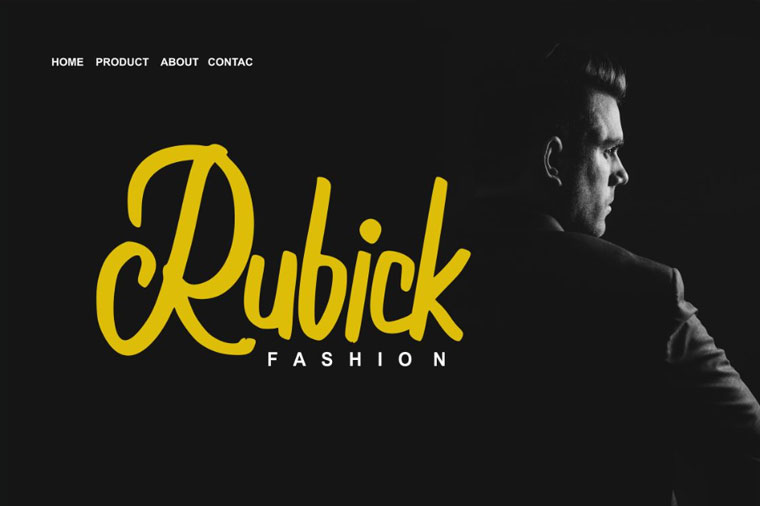
We didn’t forget about the lovers of the classic but the classic is not about Times New Roman, is it?
Moolland is a calligraphy style font. It will look splendid on invitations, postcards, business cards, posters, shoppers, logos, and other branding elements.
There are different categories of characters classified according to Open Type features. You can apply these features within such programs as Adobe Illustrator, Adobe InDesign, Adobe Photoshop Corel Draw X version, and Microsoft Word, for instance.
The kit includes:
Monotype script font (OTF and TTF files)
diverse glyphs
alternates and ligatures
PUA encoded characters
multilingual support
You can use the font whether you have a PC or Mac. The font is available without any additional design software.
Don’t forget about kerning vs tracking, so that your font would look 100% appealing.
Top 3 most affordable Fonts
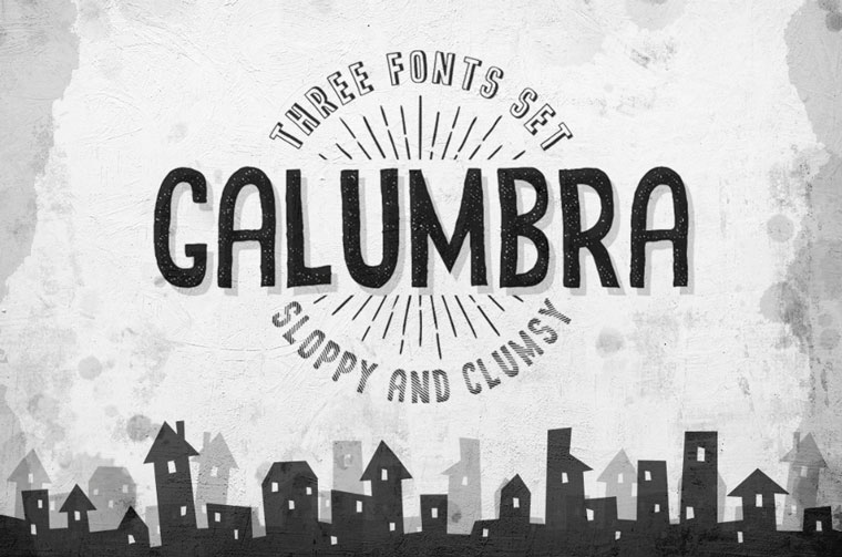
Don’t plan to pay more than $10 for an upscale font? Then, these three affordable options are for you!
Five bucks for three fonts set is an outstanding generosity, isn’t it? The sloppy and clumsy font will look awesome on the posters, banners, shoppers, on the website of almost any thematics. It’s also suitable for titles and headlines. Simplicity with a small dose of chaos is what adds particular charm to the website.
You get fonts as an OTF file and in vector EPS 10 (in curves). The kit includes only letters – no special symbols and no glyphs.
By implementing typography leading, you will make this font look even more stunning.
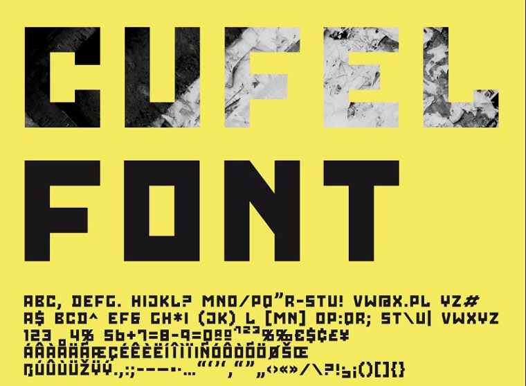
Got used to being noticed? This futuristic font can help you stand out. It reminds pixel-art posters and is, actually, a nice fit for posters, banners, expressive headlines, newspapers, T-shirts.
The basic software requirements are Adobe Flash 8+, Adobe Illustrator 8+, and 3dsMax 5.1+.
When using this font, don’t forget about the space between letters. The right spacing can make the font look differently.
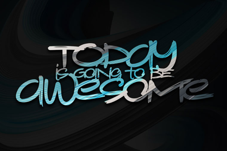
Here is another creative font that looks like graffiti. It spreads a spirit of freedom, messiness, and rebel in the best sense of this word.
It especially suits creative personalities such as designers, artists, musicians, stylists, as well as bloggers. Kerning vs tracking
As a bonus, you get 6 high-resolution abstract images each of 6000x6000px in layered PSD/JPG format. All layers are clean, so the fonts are applied without any problems. If any issue appears, there is multilingual support.
All fonts are available in OTF and TTF font files. There are also vector EPS with all characters. Kerning vs tracking
4 Bestselling Fonts
You already know about the difference between kerning and tracking – here are 4 bestselling fonts to practice your new skill.
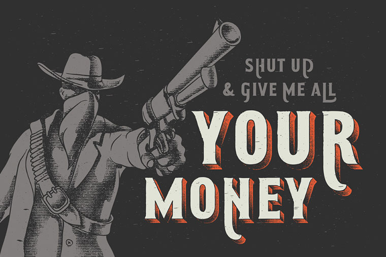
No, it’s not a Clint Eastwood movie, it’s a vintage Western font. Just imagine how fresh and unusual an online liquor store can look if you use this font for a banner on the home page, for instance! It’s especially suitable for posters.
The kit includes separated font files for base font and a textured volume effect. You can change the color of the text in a matter of clicks! The fonts are available in OTF, TTF, and WOFF formats. All characters are in vector EPS 10 format. Kerning vs tracking
Let’s switch from the vintage font to something futuristic. This conceptual modern typeface will look especially impressive on the website for a night club or on the landing page of the techno party in Berlin. Still, all the options in this collection are multipurpose. The only limitation is your imagination. So, you can also use it for your blog, presentation, flyer, brochure, and more. Kerning vs tracking
The font is available as OTF or TTF font files and compatible with Photoshop and Illustrator. It also has pattern files and vector EPS10 with all characters (only Latin).
Here is a simple line font for those, who don’t search for a fancy and daring design. The font has a textured effect but there is also a clean version without a texture. OpenType features (ligatures and alternates), as well as kerning and leading, can make the typeface more interesting.
Apart from it, there are 8 swashes that you can find in a glyphs tab.
Besides, there is a wonderful color scheme. The combination of the white, black, and orange is a classy but also winning solution.
Here is one more vintage font that comes with 9 awesome rusty textures. It also has OpenType features: 20 alternates for caps and 30 ligatures. Besides, there is a font file with swashes. There is also a simple font version for a small text that comes without a noisy effect inside the characters.
Humblest font can be used everywhere – from banners and posters to logos and other branding elements. Just imagine how amazing a poster for a barbershop or a car repair service would look like! Kerning vs tracking
Cupink is a textured brush calligraphy font. The style of this font are stylish, classic, elegant, luxury and strong brush font. Cupink will be great for any projects (with extended license) including : branding, logo, stationery, business card, signage, flyer, brochure etc. Almost all industries will be match for this typeface: wedding, events, real estate, architect, law firm, florist, gardening, makeup artist, travel, hotel, musician, etc.
These three fonts come with more ligatures, more alternate letters, new combinations, new swirls with some that even look like a script font ligatures - just check out the "st" ligature in the name of the font. In total you will have over 250 alternates and ligatures in one serif font!
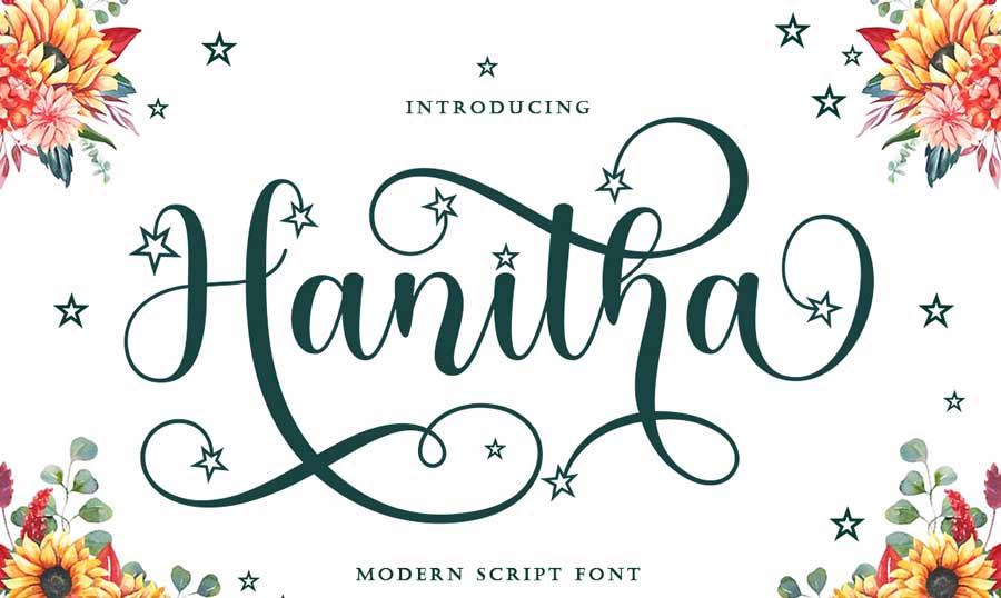
Hanitha is attractive because it is sleek, clean, feminine, sensual, glamorous, simple and very easy to read, because there are many luxurious letter joints. Classic styles are very suitable to be applied in various formal forms such as invitations, labels, restaurant menus, logos, fashion, make up, stationery, novels, magazines, books, greeting / wedding cards, packaging, labels or all kinds of advertising purposes.
That was the last item in the collection of the multipurpose fonts. High-quality, easy-to-use, affordable, and diverse fonts are at your disposal. Pick up one and highlight the conception of your website in a simple but effective way.
What’s The Difference Between Leading, Kerning and Tracking? FAQ
What is typography leading?
Leading is a distance between lines.
The concept of "leading" is associated with horizontal guiding lines in typography. Up to them the text is located. This goes back to those times when the text was printed using printing presses.
What is typography kerning?
Kerning is a space between two characters.
What is typography tracking?
Tracking is a space between groups of characters or words.
What differs between kerning and letter spacing?
Kerning is the process of adjusting the spacing between characters in a proportional font. It's main purpose is to achieve a visually pleasing result. Kerning adjusts the space between individual letterforms, while tracking (letter-spacing) adjusts spacing uniformly over a range of characters.
I always try to keep up with the freshest changes in the world of design and especially web design. Nowadays, things get outdated really fast. If you don't want to miss something - check up my articles.
LinkedIn
Get more to your email
Subscribe to our newsletter and access exclusive content and offers available only to MonsterPost subscribers.


Leave a Reply
You must be logged in to post a comment.