5 Simple CSS Snippets To Customize Divi Mobile Menu Bar
I am constantly being asked about how to customize Divi mobile menu and in this post I’ve provided answers to some of the most frequently asked questions that I am currently receiving from the users of Divi theme.
The CSS snippets provided in this post apply to Divi Default header format on mobile devices (< 980px width screens). Enjoy!
(If you need to move the mobile menu bar to the bottom of the screen then check out the Move Divi Mobile Menu Bar to the Bottom of the Screen tutorial.)
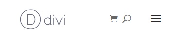
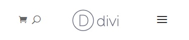
1. Move logo to right and menu to left
This CSS snippet moves the logo to right and the menu, cart and search icons to the left side of the menu bar.
Before
After
CSS
@media all and (max-width: 980px){

  /* MENU LEFT - LOGO RIGHT */
  /* move logo to right */
  .et_header_style_left .logo_container {
    text-align: right;
  }
  /* move top navigation to left */
  .et_header_style_left #et-top-navigation {
    padding-left: 0 !important;
    padding-right: 120px;
    float: left;
  }
  /* adjust the cart, search and menu hamburger icons alignment */
  .et_header_style_left #et-top-navigation .et-cart-info {
    float: right;
    margin: 5px 0 0 0;
  }
  .et_header_style_left #et_top_search {
    float: right;
    margin: 0 25px 0;
  }
  .et_header_style_left #et_mobile_nav_menu {
    float: left;
  }
  /* move search input field and 'X' icon to left */
  .et_header_style_left .et-search-form {
    left: 0;
    right: 50%;
  }
  .et_header_style_left span.et_close_search_field {
    left: 50%;
    right: auto;
  }
  /* END: MENU LEFT - LOGO RIGHT */

}
2. Left Cart & Search – Centered Logo – Right Menu
This snippet centers the logo and moves the cart and search icons to the left hand side.
The search input field width is set to 100% (it is 50% by default) and the logo is set to show/hide when the search is opened and closed, just like the rest of the header elements.
Before
After
CSS
@media all and (max-width: 980px){
/* CART&SEARCH LEFT - LOGO CENTER - MENU RIGHT */
/* center the logo */
.et_header_style_left .logo_container {
text-align: center;
}
/* hide logo when search opens */
.et_header_style_left .et_pb_menu_hidden .logo_container {
opacity: 0;
-webkit-animation: fadeOutBottom 1s 1 cubic-bezier(.77,0,.175,1);
animation: fadeOutBottom 1s 1 cubic-bezier(.77,0,.175,1);
}
/* show logo when search is closed */
.et_header_style_left .et_pb_menu_visible .logo_container {
opacity: 1;
-webkit-animation: fadeInBottom 1s 1 cubic-bezier(.77,0,.175,1);
animation: fadeInBottom 1s 1 cubic-bezier(.77,0,.175,1);
}
/* remove the top navigation left padding and adjust its width */
.et_header_style_left #et-top-navigation {
padding-left: 0 !important;
width: 100%;
}
/* adjust the search input field width */
.et_header_style_left .et-search-form {
max-width: 100% !important;
width: 100% !important;
}
/* adjust cart icon margin */
.et_header_style_left #et-top-navigation .et-cart-info {
margin: 5px 0 0 0;
}
/* END: CART&SEARCH LEFT - LOGO CENTER - MENU RIGHT */
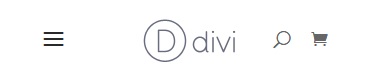
}3. Left Menu – Centered Logo – Right Cart & Search
If you need the logo to be centered but the hamburger menu on the left and the cart and search icons on the right (the opposite of the result above) then simply add these lines of CSS to the CSS from the snippet 2.
Before
After
CSS
@media all and (max-width: 980px){

  /* MENU LEFT - LOGO CENTER - CART&SEARCH RIGHT */
  /* move menu hamburger to left, and search and cart icons to right */
  .et_header_style_left #et_mobile_nav_menu {
    float: left;
  }
  .et_header_style_left #et-top-navigation .et-cart-info {
    float: right;
  }
  .et_header_style_left #et_top_search {
    float: right;
    margin: 0px 20px 0 0;
  }
  /* END: MENU LEFT - LOGO CENTER - CART&SEARCH RIGHT */

}
4. Decrease mobile menu bar height
This is the simplest one, all you need to do is to decrease the top padding of the top navigation and bottom padding of the hamburger menu icon.
Before
After
CSS
@media all and (max-width: 980px){

  /* DECREASE MOBILE HEADER BAR HEIGHT */
  /* decrease top naviagtion padding-top */
  .et_header_style_left #et-top-navigation {
    padding-top: 5px;
  }
  /* decrease menu hamburger padding-bottom */
  .et_header_style_left .mobile_menu_bar {
    padding-bottom: 5px;
  }
  /* END: DECREASE MOBILE HEADER BAR HEIGHT */

}
5. Fixed mobile header with decreasing height on scroll
This snippet will make the mobile header fixed and transition its height smoothly when the page is scrolled down, just like the fixed header on desktop with different heights applied to Primary menu and the Fixed header.
The Fixed Navigation Bar option must be enabled in Divi Theme Options.
CSS
@media all and (max-width: 980px){

  /* FIXED HEADER WITH DECREASING HEIGHT ON SCROLL */
  /* make header fixed */
  .et_header_style_left.et_fixed_nav #main-header {
    position: fixed;
  }
  /* decrease top navigation padding-top */
  .et_header_style_left .et-fixed-header #et-top-navigation {
    padding-top: 5px;
  }
  /* transition top navigation padding-top */
  .et_header_style_left #et-top-navigation {
        -webkit-transition: padding-top 0.4s ease;
        -o-transition: padding-top 0.4s ease;
        transition: padding-top 0.4s ease;
  }
  /* decrease menu hamburger padding-bottom */
  .et_header_style_left .et-fixed-header .mobile_menu_bar {
    padding-bottom: 5px;
  }
  /* transition menu hamburger padding-bottom */
  .et_header_style_left .mobile_menu_bar {
        -webkit-transition: padding-bottom 0.4s ease;
        -o-transition: padding-bottom 0.4s ease;
        transition: padding-bottom 0.4s ease;
  }
  /* END: FIXED HEADER WITH DECREASING HEIGHT ON SCROLL */

}
That’s all, hope you’ll find this tutorial useful. Share it with your friends and feel free to leave your thoughts and suggestions in the comments section below and subscribe to stay updated ;)
Hi Ivan. Great tips!
The hamburger in the mobile menu bar on my iPad and cellphone appears as a lowercase “a” and the arrow on the “back to top” slider appears as a “2”.
It might be a font issue. Would you know of a solution to that?
Also, if I only have one page-link in my menu bar, is there a way to eliminate the hamburger completely and just show the logo and the link?
I really like these tweaks, especially #5 Fixed mobile header with decreasing height on scroll. This is perfect for my client.
However, it only seems to work when I put the code on an individual page’s Advanced > Custom CSS. It doesn’t work when put in the sitewide Appearance > Customize > Additional CSS. I’m using the Divi Default header format (not Theme Builder) with the Fixed Navigation Bar option enabled.
Any thoughts?
Hi Lance.
That’s most probably a caching issue, clear all the cache after you add the CSS and check again.
How did you get the cart icon appear in the mobile menu?
This code doesn’t work for me
Hi Noman.
It works with Divi theme’s native/default header, it won’t work with the Divi Theme Builder headers.
Thanks Ivan! I like the Header Builder, but most of times, it’s a little buggy. The old header works great, and these css lines are gold.
Please update this for the new theme builder and menu module. I want my search glass icon on the left of hamburger and cart icon on the right of it on mobile. I currently have them both on the left of the hamburger on mobile. It’s the little things that drive you crazy. lol
Hi John,
I know I should update this tutorial for the Menu Module but you might want to check out the MadMenu module which will be released soon. It allows re-ordering the menu elements any way you want just in a few clicks, check out the sneak peek video here.
Hi Ivan,
Great stuff!!!
I applied the snippet “Fixed mobile header with decreasing height on scroll” and everything is ok but the hamburger icon….when you scroll it align on top, not in the middle (the logo is good)…any clue?
Hi Angelo.
Try adjusting the hamburger icon
padding-bottomfor fixed header, like this:/* fixed menu hamburger padding-bottom */.et_header_style_left .et-fixed-header .mobile_menu_bar {
padding-bottom: 5px;
}
Is this code still accurate? I can’t seem to find these same div classes in the coding for my menu on Divi 4.
Hi Eddie,
yes, this code still works but it’s for the default/native header of Divi, I haven’t updated it for the Menu module yet, that’s why it won’t work for the Theme Builder headers.
I decreased the mobile menu bar height and it worked perfectly! Only one issue :( My hamburger menu and search icon are not in line with my logo. If I could make this work my site would be perfect! Here’s the link dogsforblogs.com
thank you so much for sharing this and keep it up, thanks for this post
Hi ivan,
should be great a tutorial from inline center menu (desktop) to Left Menu – Centered Logo – Right Cart & Search (mobile)
i tried to use this tutorial https://divicio.us/tutorials/make-divi-centered-centered-inline-logo-header-bars-look-like-default-header-bar-mobile/
but i’m not able to move the icons and on the other pages the positions changes
Hi,
that’s certainly doable but it may or may not be a quick fix, I need to test it and update this tutorial for the Centered Inline Logo header format
Thanks for this nice and useful snippet! Was already looking for something like this.
You’re welcome, Herman. Glad to know this tutorial was helpful.
How can we put the menu bar at the bottom of the page?
Try applying
absolutepositioning to header bar and setbottomto0andtoptoauto, this should move the header bar to the bottom of the page.Then you’ll need to make the dropdown menu open upwards which might be a bit more challenging. Haven’t tried to do that myself but should not be too complicated. Will definitely try as soon as I have time for that :)
EDIT
I’ve made a tutorial about how to move the menu bar to the bottom of the screen, check it out: Move Divi Mobile Menu Bar to the Bottom of the Screen
That was an awesome post
Thanks, Samar.
i was just looking for these tweaks, thank you..
Glad to be helpful, Siva :)
Thank you, will most likely use these in the future!
You’re welcome, Nelson.
Superhelpful!
It’s all about the little things.
I definitely use that for my clients in the future.
Little things are very important, that’s for sure :)