

Are you having trouble with those pesky Facebook banner dimensions? Is your banner or cover photo just not looking right? We’ve got you covered.
Your Facebook cover photo says a lot about your brand. For a business to thrive online and have a social presence, it needs a good looking Facebook Page. No matter if it’s a neighborhood lunch spot or an international conglomerate. Your Facebook page needs to look inviting and recognizable when a client visits and the first thing they see is the cover photo or banner at the top. Getting the banner to look perfect takes a little bit of work and the right kind of attitude.
If you have ever created your own Facebook banner or cover photo you will have noticed that it doesn’t look the same on desktop and mobile. The sides get cut off on mobile, taking important visuals or words along with it. In this article, we will look at the best practices for getting the perfect Facebook cover photo every single time. Additionally, we will look at mistakes to avoid and things to never forget when designing your Facebook banner.
- 1 Facebook Banner Dimensions for a Perfect Fit
- 2 Download for Free
- 3 You have Successfully Subscribed!
- 4 Common Mistakes to Avoid
-
5
Best Practices For Your Brand
- 5.1 Stay on Brand with Colors, Fonts, and Message
- 5.2 Use a Focal Point to Bring Attention to The CTA Page Button
- 5.3 Use High-Quality Images Which You Have Rights to
- 5.4 Try Using a Video Instead of a Photo or Graphic
- 5.5 Add a Description with Links and Pin a Relevant Image to The Top of Your Page
- 6 Conclusion
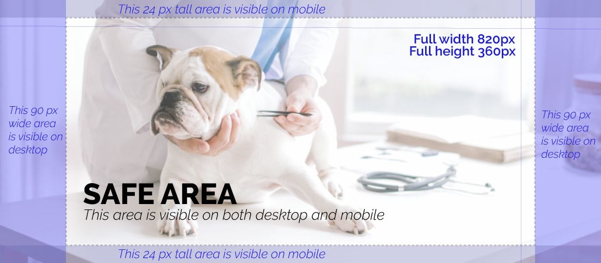
The most important thing to remember when creating a Facebook banner or cover photo is the way the size changes from mobile to desktop. In the image below you can see different sections around the main space called the “SAFE AREA.” It’s in this area where all important information should be placed, that way it shows up on both desktop and mobile.
The official size for a Facebook banner or cover photo is 820px by 360px. If you have created one before, you might have noticed that sometimes, Facebook makes your perfect image look blurry. That’s why we like to use a larger graphic with the same aspect ratio. The aspect ratio of an 820px by 360px graphic is 2.28, so to be sure that it looks perfect when you upload, you can create it at 1230px by 540px.
Download the template below for Adobe Illustrator (AI) or Photoshop (PSD). Place your image or design in the layer that says “Insert your design here” and then make all the top layers invisible before exporting the image as a web file.

Common Mistakes to Avoid
It’s easy to make silly mistakes when creating a Facebook banner. Unfortunately, these seemingly tiny mistakes can really make a difference when it comes to how people react to your Facebook cover photo. Let’s look at some of the most common mistakes you should avoid when making a Facebook banner or cover photo for your business.
Too Much Text
The old rule of “no more than 20% text” isn’t an enforced rule on Facebook cover photos anymore. Nevertheless, you should still try and keep the text to a minimum. Be mindful of the number of words you use, but mostly how much space they fill up in the Safe Area. Use only the words which are completely necessary to send a message.
Too Much Clutter
Just how you can mistakenly fill up space with too much text, it can also happen with a combination of text and visuals. Restrain from making your Facebook cover photo way too cluttered. There is no need to put tons of things in your Facebook Banner, it just has to look good. If you are promoting a specific sale or offer, only add the most important information and let the CTA button do the rest of the work.
Unappealing Color Combination
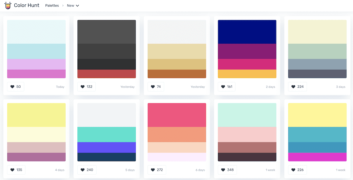
Ugly color combinations are instant visual repellents. Try not to use random colors in the graphics for your Facebook cover photo. Your best bet is to either use your brand colors or to find some appealing color palettes on Colorhunt. Simply copy and paste the hex codes from the color palette you chose to your graphics editors. If you are using a photograph, sample some colors from the image to colorize text. For visual graphic styled Facebook banners, stick to no more than three or four colors at a time.
Too Little Too Late
Another terrible mistake is to change your holiday banner at the wrong time. A good rule of thumb is to change your holiday-themed Facebook cover photo a week two before the actual holiday. If you sell products online, then you have to be especially aware of upcoming holidays so that you can promote your sales with enough time.
Best Practices For Your Brand
Now that we’ve seen the most common mistakes which you should avoid at all costs, it’s time to look at what you should always be doing. As long as you follow certain parameters, your Facebook cover photo will work for you and your brand.
Stay on Brand with Colors, Fonts, and Message
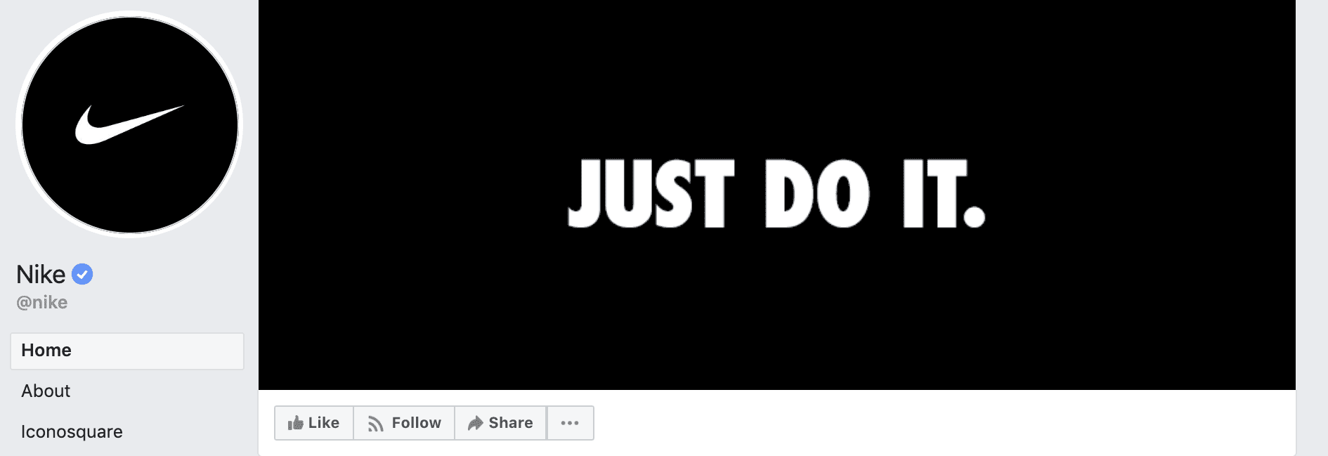
As a brand, it’s your responsibility to stay consistent from the web to social media and beyond. Your brand style guide should be the first point of reference when creating a new Facebook banner or cover photo. Use your branded colors and branded fonts. Maintain the message and the feel of your brand at all costs. Take a cue from the Nike Facebook Page, they visualize their brand with their trademark slogan; Just Do It.
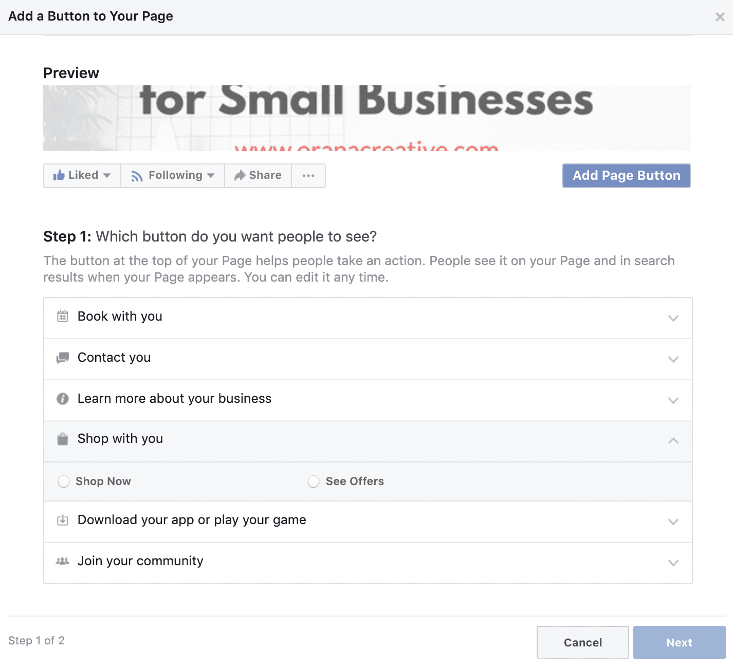
Before we look at adding a focal point for the Page button, let’s make sure you know what it is. Underneath the banner is your trusty CTA Page button. You can change it according to what you want it to do, from ‘shop now’ to ‘learn more’ and a bunch of other options. If you haven’t customized this button yet, it will say ‘Add Page Button.’ Click on it to add whichever option suits your company best.
To customize an existing CTA Page button, hover over it and a little edit pencil will show up. Click on the pencil and choose ‘edit button.’
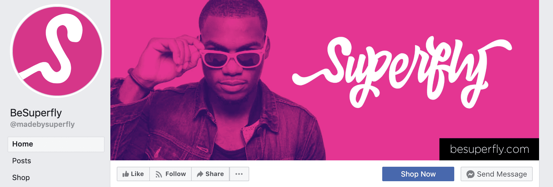
Now that you know the power of this little button, it’s time to call some attention to it. Add a little something on the bottom right corner which will grab the viewer’s attention. The folks at Superfly added a black rectangle with their website URL right above the buttons. They don’t expect you to copy that URL and paste into your browser! You just have to click the Shop Now button. You can achieve a focal point to the button in different ways, with photography, graphics, and even arrows!
Use High-Quality Images Which You Have Rights to
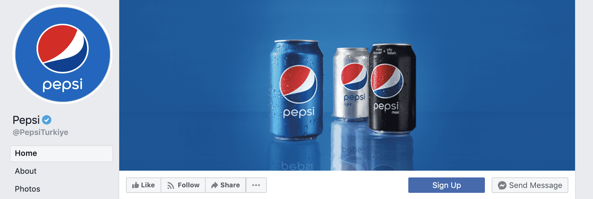
Always use photography which you have the rights to use. Not only does it follow Facebook’s guidelines, but it’s also common sense. Please don’t use imagery which you found online and simply pasted into your banner, this can get you in trouble! Use stock photography which you have paid for or free stock images from sites like Unsplash. Better yet, use your own photographs of your own products! The Pepsi Facebook banner below is a great example.
Try Using a Video Instead of a Photo or Graphic
Why not try a video instead of an image? The process to upload a video to your banner is the same as adding an image, just follow the same size guidelines. Make sure all important movement in the video is inside the ‘Safe Area’ and it’s ready to go.
Add a Description with Links and Pin a Relevant Image to The Top of Your Page
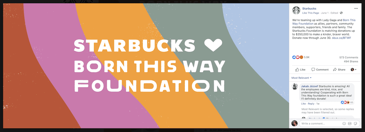
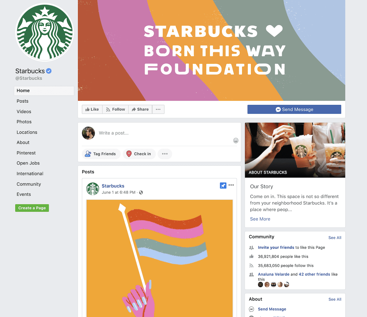
Last but not least, when you upload a new Facebook cover photo or banner, always add a description with relevant links. These will not be obvious at first glance, but when someone clicks on the image they will be able to see all the information you added. For example, the current banner for Starbucks is about the Born This Way Foundation and once you click on the banner, you see all the links and tags related to it.
Likewise, Starbucks also has a pinned image to the top of their page which gives a lot more information about the foundation in an animated GIF. What this technique does, is create a full-scale effect for your Facebook Page. When someone lands on it, they can see your three important visuals; the logo, the cover photo, and the pinned image. If everything is optimized, along with the page button, they have plenty of choices to interact.
Conclusion
Having an optimized Facebook page these days is not that hard. Use the Facebook banner dimensions template above to help you create the perfect cover photo. Avoid common mistakes and follow the best practices to create a Facebook banner, and you will have a great looking cover photo in no time! Remember to customize your page button and don’t forget to upload your graphic with a relevant description.


i love this, keep it up guys
wow great..!!!
keep it up.
Very informative and well explained post. Thanks for sharing this Orana!
Thanks for the great tips just starting a build shortly.
i love this, keep it up guys, you always surprise me
This made my day, thanks.
Do these dimensions also work for group pages?
Groups are a little different but if you follow these parameters it should work. Stick to the center of the space, that’s your best bet with Facebook Group cover images.
I don’t see the template download, either. Thought it was just me :-p
Sorry about that, it’s been added now.
Where is the template file to download?
Thought it was just me! I can’t find it either.
I don’t see a link to download either the AI or PSD file of the template?
Sorry about that, it’s been added now.
Thanks Nathan… much appreciated ?