

Mobile-friendliness has been an important factor in Search Engine Optimization (SEO) for a while. Now, Google is rolling out an update that’ll make mobile websites even more important. It’s a significant change, and it could have a negative impact on your SEO if you’re unprepared.
Google’s new update is called the ‘mobile-first index’, and it’s true to its name. With this change, the search giant will prioritize your website’s mobile version on its result pages. In this article, we’re going to dig deeper into what Google’s mobile-first index is and what it means for you. We’ll then talk about how to prepare your WordPress website for this brave new world.
Let’s dig in!
What Google’s Mobile First-Index Is (And What It Means for You)

Google’s mobile-first index will reward responsive websites.
When you use Google to search for something, you will always see the same results whether you’re using a mobile device or a desktop computer. In the past, Google only used desktop versions of each website to determine its results, which lead to some issues. For instance, this meant that mobile users were served websites that weren’t mobile-friendly or featured less content than their desktop counterparts.
Due to the growing number of searches performed on mobile devices, Google is now rolling out an update called the mobile-first index. The main change is that Google will now index and rank websites by giving priority to their mobile versions. In other words, if your WordPress website provides a shoddy mobile experience, your SEO efforts will take a hit both on desktops and mobiles.
With that in mind, let’s break down how this update will affect you depending on what kind of site you have:
- Desktop-only website. Google will still rank and index your website, but you should expect to take a hit in the Search Engine Result Pages (SERPs).
- Both mobile and desktop versions. Your mobile website will take precedence now, which means you need to work on its SEO.
- Responsive website. You should be safe since your site is already optimized to provide an excellent mobile experience.
- AMP and non-AMP pages. If available, Google will prioritize the non-AMP mobile version of your website.
If you’re a WordPress user and you’re using a modern theme, you likely don’t need to worry. After all, many popular WordPress themes these days are responsive out of the box, so your website’s already provides an equal mobile and desktop experience. If you’re using an outdated theme or one that’s not responsive, then now is the time to consider a full redesign.
The real problem is if you’re serving two (or more) versions of your website depending on the type of device your visitors use. In that case, Google’s mobile-first index will most certainly have an impact on your site, unless you prepare for it.
How to Prepare Your WordPress Website for Google’s Mobile-First Index (4 Tips)
If your website isn’t fully responsive, this should be your primary goal. However, a full redesign often takes a lot of time, and in the meantime there are other things you can do to prepare for the rollout of Google’s mobile-first index.
Keep in mind – this section assumes you have a website with both mobile and desktop versions. If you only have a desktop version, you can skip ahead to tip number three.
1. Make Sure Your Website’s Mobile Version Includes All Your Key Content
Your mobile WordPress website should include all the same content as its desktop version.
If there are two versions of your website, they both need to feature the same content. Some site owners use stripped-down versions of their sites for mobile users instead of creating mobile-friendly versions with the same content. In the past, this might have been enough, but now you need your mobile website to be as fleshed out as its desktop counterpart.
To be more specific, both your mobile and desktop websites should contain all the same information and features. This is true even if their designs are different. This way, users will still be able to find your content after the rollout of Google’s mobile-first index.
If you’re using a separate WordPress installation to serve a mobile version of your website, you need to ensure it has all the same posts and pages as the desktop alternative. The best way to do this is by exporting your desktop content and importing it into your mobile installation.
2. Add the Same Metadata to All Versions of Your Website
Your post and page’s metadata should be the same on both mobile and desktop versions of your site.
Aside from making sure both versions of your website share the same content, you also need to add identical metadata to all their pages. Metadata helps determine how search engines display your pages in the SERPs. Even if your mobile website shares the same content as the desktop version, but doesn’t have the same metadata, your SEO will still take a hit.
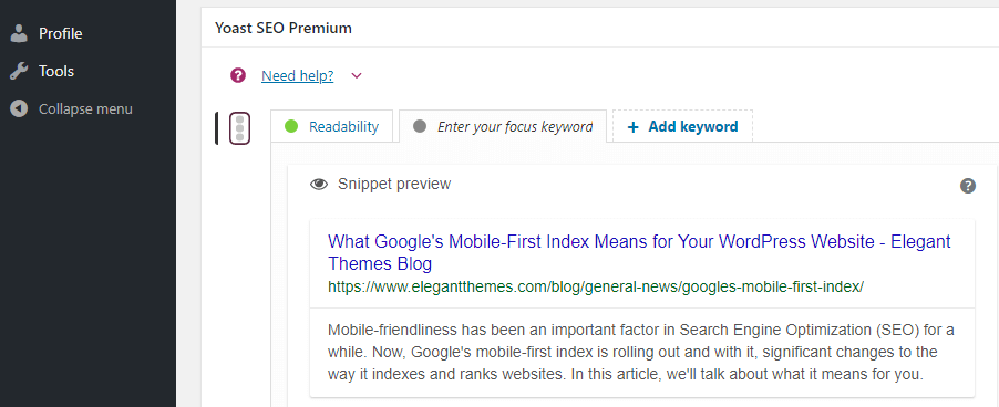
Metadata is essential to SEO since it enables you to have more control over your results. You’ve probably spent a lot of time working on your page and article’s meta descriptions, so you should make sure to include them on your mobile website.
The bad news is adding meta descriptions to your mobile content might take some time depending on how many pages your site contains. Even if you’re using an SEO plugin, you’ll still need to copy and paste each meta description into the right place manually. However, the effort is necessary since Google will be looking at your mobile site’s metadata first.
3. Continue to Focus on Website Performance
Website performance will still be important both for SEO and usability purposes.
One thing that’s not going to change with the mobile-first index is performance will still play a factor in your SEO. No one likes a slow website, whether it’s on mobile or desktop. More to the point, mobile devices sometimes have less stable connections, which makes website optimization even more critical.
Fortunately, there are a lot of ways you can make your WordPress website faster. Some quick examples include leveraging browser caching, using a Content Delivery Network (CDN), optimizing your images, and more. Fortunately for you, we’ve written extensively about WordPress optimization plugins, so you should have no problem ensuring that your website runs fast.
4. Use a Mobile-Friendly Theme to Cut Your Work in Half
Using a mobile-friendly theme is the easiest way to create a responsive website.
The easiest thing you can do to make your WordPress website more mobile-friendly is to use a responsive theme. This means that when you design a page, the theme will automatically adapt it to smaller devices, so you only have to do the work once. Almost all major WordPress themes these days are built to support mobile devices with responsive designs.
If you’re not sure what theme to pick, here are a few tips to help you choose the right one:
- Make sure the theme’s description explicitly says it’s responsive.
- Look for themes that include preview functionality for different types of devices.
- Ideally, your theme should enable you to make small adjustments depending on the devices your visitors use.
One theme that fits the bill for all three criteria is Divi. Few themes provide so much control over the way your website looks on a mobile device. It’s also easy to pick up even if you don’t have much experience with WordPress. This will make it lot easier to ensure that your site provides a great mobile experience.
Conclusion
Mobile traffic has been on the rise for a long time and that trend isn’t likely to reverse anytime soon. Google’s mobile-first index is another confirmation that for mobile is king, which means that you need to make sure your site is adapted to the new standard.
In this article, we’ve discussed some ways you can ensure this update doesn’t affect your site’s SEO negatively. These include:
- Make sure your website’s mobile version includes the same content.
- Add the same metadata to all versions of your website.
- Continue to focus on website performance.
- Use a mobile-friendly theme if you want to save yourself some headaches.
Do you think Google made the right call by launching its mobile-first index update now? Share your thoughts with us in the comments section below!
Article image thumbnail by tandaV / shutterstock.com


The Divi Café screenshot exposes a small flaw in Divi: The second button (“Live Site”) is pushed a bit to the right in mobile. This happens when using the Divi full width header module. This is easily fixed with CSS. Maybe something for the dev team to look into in order to improve the mobile experience?
Hi there. Will this change also have an impact on Google AdWords also?
I am a wee bit lost and unsure what is happening…
I use the divi theme for my website and when I check if it is mobile friendly on google it comes back saying it is not friendly and the screenshot is very different to what I am seeing on my mobile. I know that other people are seeing what I am seeing too but google appears to be seeing something else. Hopefully someone can help me. BTW, I am not a programmer at all.
This is a great point. Deeply disconcerting to me. I’ll be doing some research on my some client websites I control that use Divi on later today.
Displaying different content on different devices is a HUGE no-no for all search engines. In fact it’s typically considered a spam signal. Besides, it’s just bad form usually (but not always) for public facing web apps and websites.
Oh man, I luv you guys! Every last friggin’ one of ya!
You’re welcome, Mark. Glad you found the article useful.
Can I just confirm one thing that I am not quite sure about…
Currently my website does not display the product description on the smallest vertical position mobile screen size. It does show for horizontal or all other screen sizes.
So in terms of SEO will Google consider the full description content to not be there(& not visible). Or will the description content/text still be evident in website code for SEO & it will not affect website ranking?
Hello Chris. Thanks for your question.
Even though your content is not visible on the smallest vertical position mobile screen size, Google should still consider the full description content to be there.
You can find more handy SEO assessment tips in this article:
https://www.elegantthemes.com/blog/tips-tricks/how-to-conduct-an-seo-audit-of-your-website
Hope this helps.
CDNs have their own issues as well, particularly if it’s not at your hosting company. If you have an active site, a CDN can be trying to load a page that’s changed since the last time it was cached.
Actually the term “Mobile First” in terms of this update are misleading. Very.
They actually prefer responsive design. Phew! Oh and don’t take my word for it, here’s what Google says:
https://twitter.com/methode/status/853845802770464769
Si I guess I don’t have to worry because I have the DIVI theme that works great on mobile, so not worried at all right?
exactly, see my comment below
Can’t get your “test your URL” link to take any input in Firefox, Chrome or Edge!
Whats the best/easiset way to implement AMP while keeping theme styling?
With the AMP plugin I have been able to activate AMP but design is not consistent with non-AMP page versions.
I’m assuming CSS but use Divi because it removes much of the need for knowing CSS in my uses. Any insight here?
And typically, unless you are trying to get into Google news or the google feed, there really no reason to use AMP.
If you use Yoast SEO you can also use their Yoast Glue plugin/addon (free) to add a little bit of styling to the AMP pages. However, like Texx mentioned, there are certain cases where AMP is good and then there are instances where it isn’t needed.
Look for resources that help you determine if AMP is right for your site and go from there. If you feel it is needed, make it work. But the main thing to realize about AMP is that it is principled in simplicity and doing so requires the stripping of most CSS and JS from a site to make it load in an accelerated fashion. Maybe start by researching and understanding what AMP is in its entirety before you just assume it is the answer to getting some kind of better ranking in Google because that is not actually the case with it at all.
Understand it’s more used for news sites. I work for one outside of my own web development and the design feel between AMP and non-AMP is much closer than what I have gotten using the AMP WP plugin.
Has puzzled me on how to tweak the AMP version of a page to more closely resemble or have continuity with the regular page.
You often just can’t. That’s kinda the point of AMP.
Are there any plans for adaptative image deliverability in Divi?
I know they ARE responsive, but serving the 1000px wide image to mobile 320px wide screen isn’t the best optimisation practice around.
Great idea!
Agree
Dear Divi Team, Nickolas is talking just what I have been thinking a lot about.
Do you have plans to implement adaptive serving practices? This would be a monumental plus for Divi!
Your conclusion that Google will prioritize the non-amp version is not correct. Google will prioritize the amp version.
Every article that I’ve read including the release notes from Google have stated, “If available, Google will prioritize the non-AMP mobile version of your website”. Look into for yourself if you don’t believe it, but never assume that just because Google created AMP that it is going to force the use of it as well. AMP doesn’t work for every type of website out there and as such is also recommended to research if it is right for your site before setting it. You can even find resources from bloggers and various designers that setup AMP on their sites only to take it back out within a few months of running it because it did nothing for them.
Actually, I think it just isn’t explained in detail enough. My understanding is that AMP pages are only used when there isn’t a non amp version OR when the page is to be displayed in one of Google’s apps like “Google News”
hello
you said : ” AMP and non-AMP pages. If available, Google will prioritize the non-AMP mobile version of your website.”
i don’t understant AMP is product by Google, and he will not prioritize this ?
My understanding on this is the Google only uses AMP pages in their mobile apps like Google News and the “Google Feed”. The priority mentioned here is talking about search results.
Hope that helps.
Yeah, I was wondering about that too. I think its a typo.
Hi John,
I have ticked all the boxes with my site, barring serving from a CDN, and was getting a 5 second Good score from Google’s mobile 3G test site. Likewise a 96% score on pingdom. This wa good considering the site is for my fine art prints with a home page weighing in at 2MB.
Since going more secure with https the test on Google’s mobile 3G is showing a much worse result for load times. Pingdom remains the same though. I am using SiteGround caching and forced https. Is there another site that I can test on?
Hi Irish etcher,
I use gtmetrix.com and if you create a free account you can choose a user location to test against. The closest one to Ireland is London, which is much better than the default Canada option.
Also, take a look at what search url you are entering. I have found occasions where a test for “mysite.com” gets redirected to “www.mysite.com” and then to “https://mysite.com”, so it’s worth checking and comparing the times for each variation.
Hope this helps.
Thanks Donal
I find Pingdom to occasionally be unreliable. It’s still a great tool, but I use GTMetrix for more detailed results. Remember to choose a test location closest to your host location!
Thanks for the tips. ?
GTMetrix.com and webpagetest.org are sites I use alongside tools.pingdom.com.
The 3G score will be harsher and there is variance in looking at these tests. Its worst case scenario and used globally.
Google’s test my site is powered by webpagetest.org.
Lastly Lighthouse is another tool that you can use with Chrome dev tools and there is a browser extension for it.