

Divi and its Transform controls make it really easy to position and style the elements of your page to create unique layouts. Divi’s blurb module is one of the most common elements for featuring items on a website. So, I thought I would show how to put those Transform effects to use by creating a couple of unique layouts featuring the blurb module. Sure, you can accomplish similar positioning using margins and padding, but the process would be much more involved and not near as much fun. Plus, the transform controls allow you to add additional styling to scale and rotate your blurbs for even more unique designs.
In this tutorial, I’m going to show you how to position and rotate blurbs in creative ways using Divi’s transform controls.
Let’s get started.
Gettings Started
For this tutorial, all you really need is Divi. To set things up, go ahead and create a new page. Give your page a title and deploy the Divi builder on the front end to build a page from scratch.
Now you are ready to start.
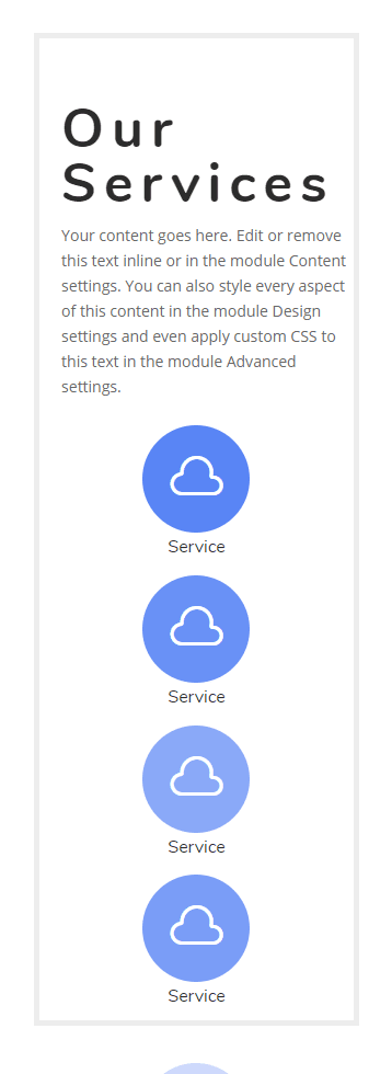
Creating Blurb Layout Design #1
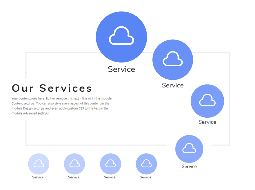
In this first layout design, we are going to structure our blurbs using two different rows. Then we are going to use the Divi Transform options to scale and position the blurb modules to create a unique blurb module layout.
Create the First Row
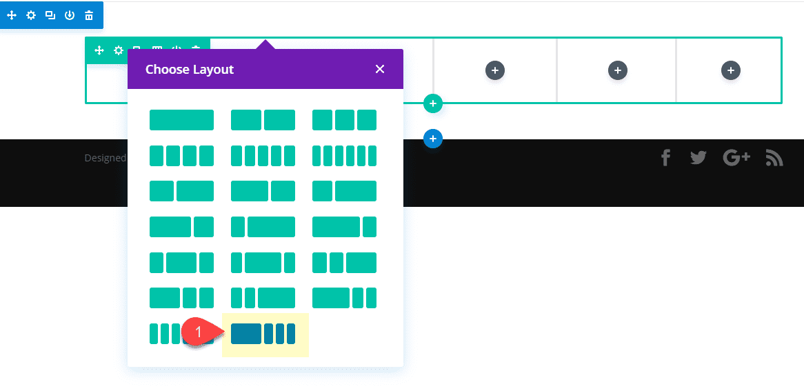
To get started, create a regular section then add the following column layout for the row: 1/2 1/6 1/6 1/6
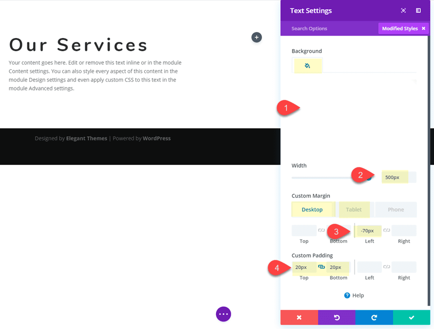
Add and Style the Text Module
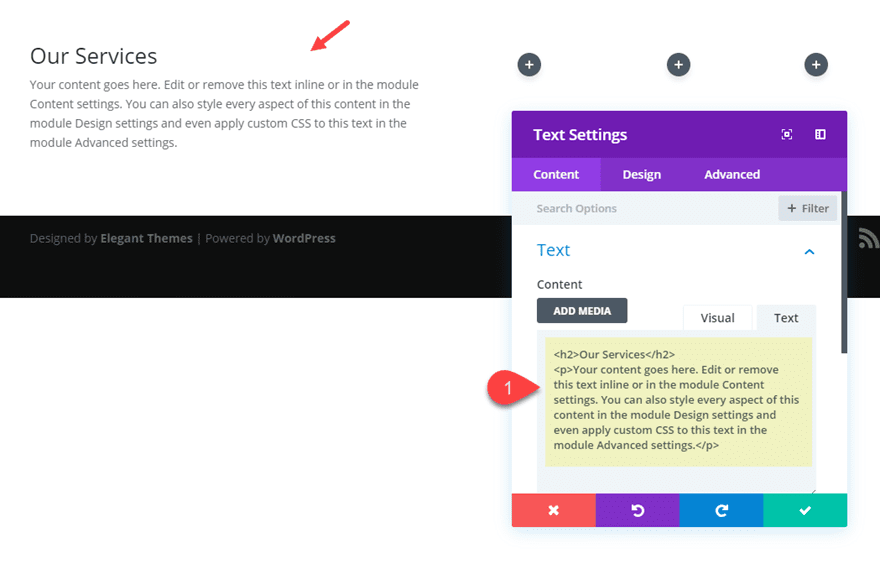
In the 1/2 column on the left, add a text module with the following content:
<h2>Our Services</h2>
<p>Your content goes here. Edit or remove this text inline or in the module Content settings. You can also style every aspect of this content in the module Design settings and even apply custom CSS to this text in the module Advanced settings.</p>
Then update the following design settings:
Background Color: #ffffff
Width: 500px
Custom Margin (desktop): -70px left
Custom Margin (tablet): 20px left
Custom Padding: 20px top, 20px bottom
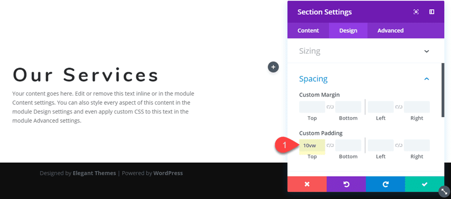
Update Section Padding
Next, we need to add some padding to our section. Open the section settings and update the following:
Custom Padding: 20vw top
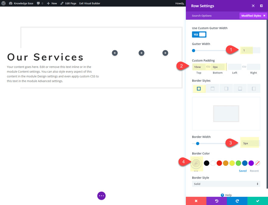
Update Settings for First Row
Next, update the row settings as follows:
Gutter Width: 1
Custom Padding: 10vw top, 0px bottom
Border Width: 5px
Border Color: #eeeeee
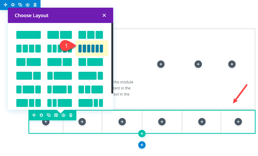
Add the Second Row
Next add another row under the row you just customized. Give it a six-column layout.
Create and Style The Blurb Modules
Now it’s time to start creating the blurb modules that we will eventually position using the transform controls. Add a blurb module column 2 of the first (top) row you created.
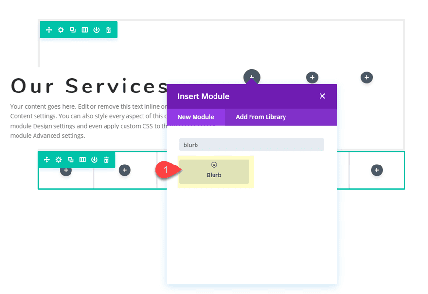
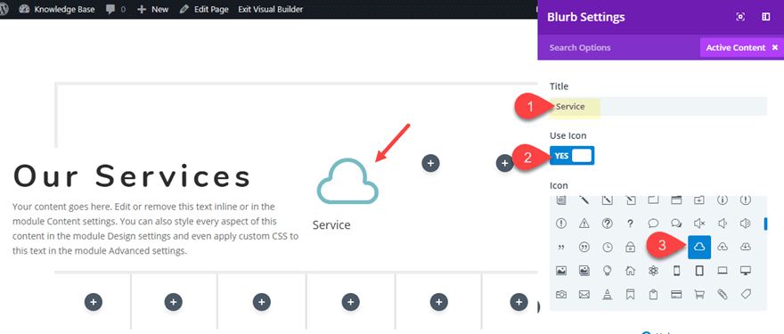
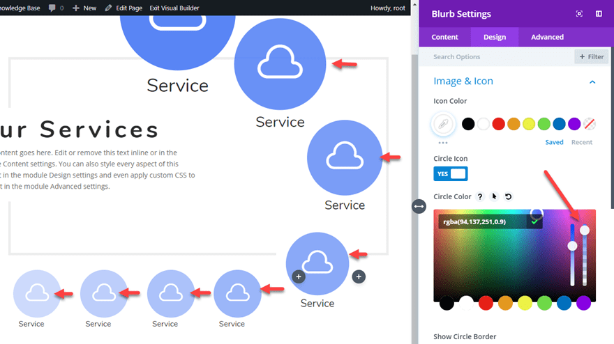
In the blurb settings, delete the content and update the Title text with the word “Services”. Then click to use an icon instead of an image. For this example, I’m using the cloud icon.
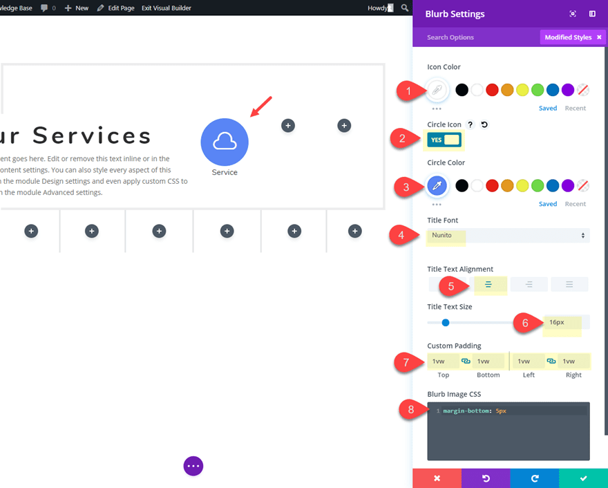
Update the rest of the blurb settings as follows:
Icon Color: #ffffff
Circle Icon: YES
Circle Color: #5e89fb
Title Font: Nunito
Title Text Alignment: Center
Title Text Size: 16px
Custom Padding: 1vw top, 1vw bottom, 1vw left, 1vw right
Then update the default margin under the blurb icon by adding the following CSS to the Blurb Image CSS box under the advanced tab:
margin-bottom: 5px
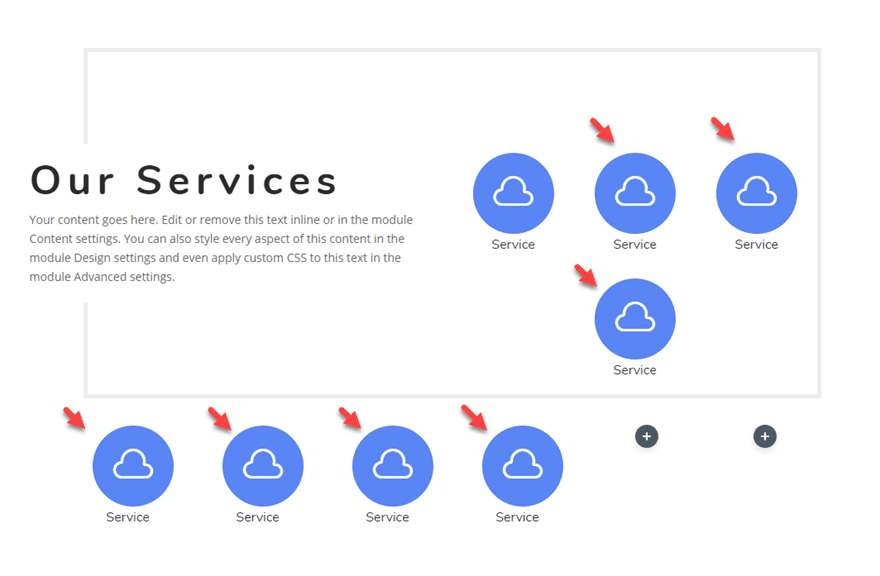
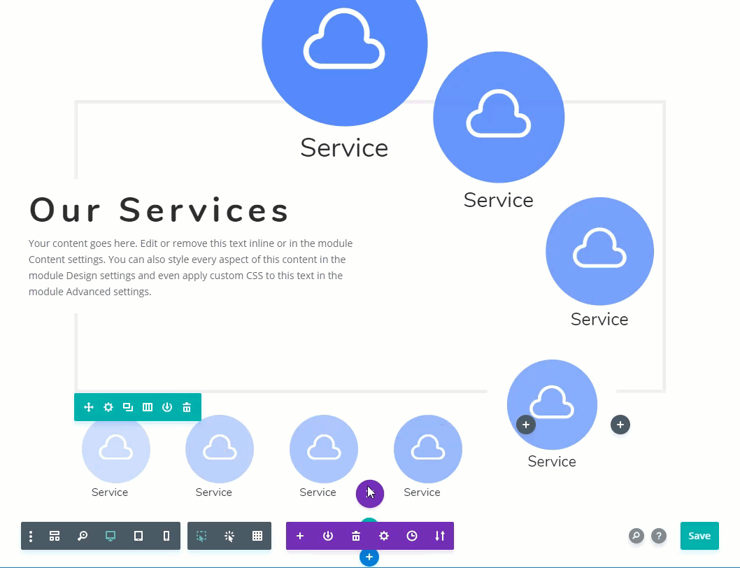
Next, copy the blurb module you just created and paste it into each of the columns making sure you have two blurb module in column 3 of the top row and you leave columns 5 and 6 empty in the second row.
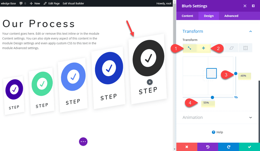
Add Transform Effects to Scale and Position the Blurbs
Now we are ready to use the transform controls to position and scale the blurbs into a unique design.
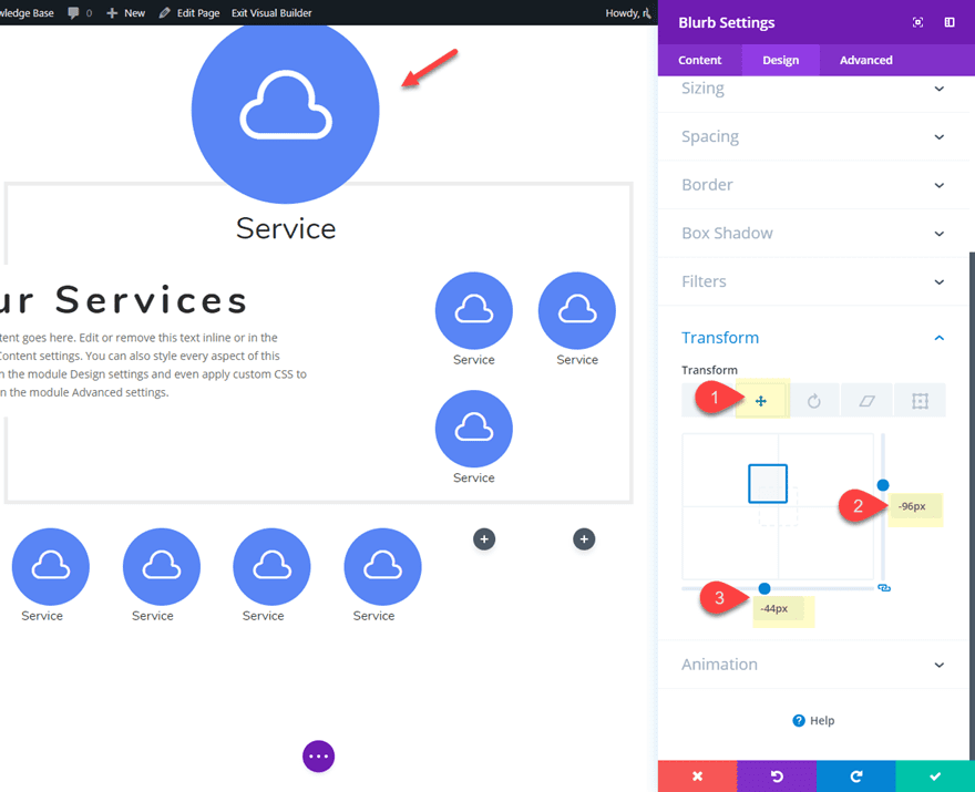
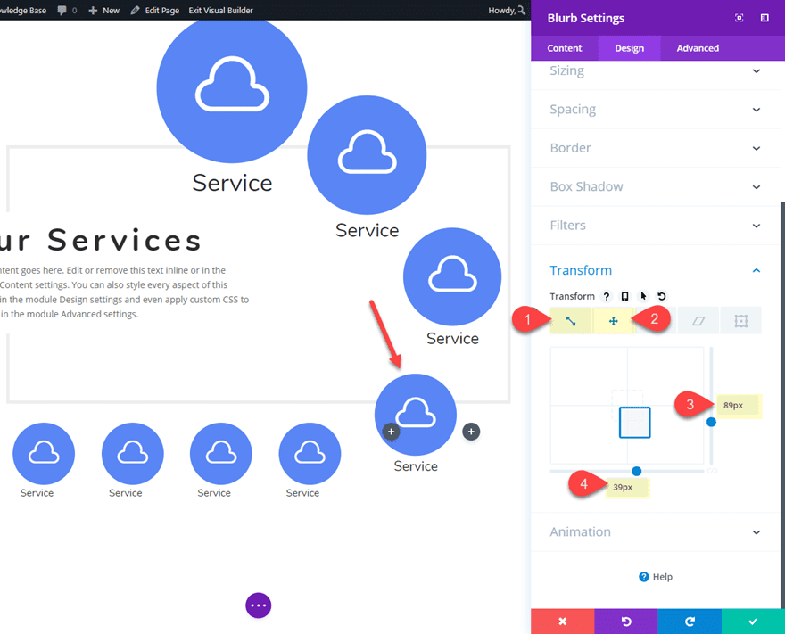
First, open the blurb setting of the blurb in column 2 of the top row and update the transform controls as follows:
Transform Scale X-axis: 242%
Transform Scale Y-axis: 242%
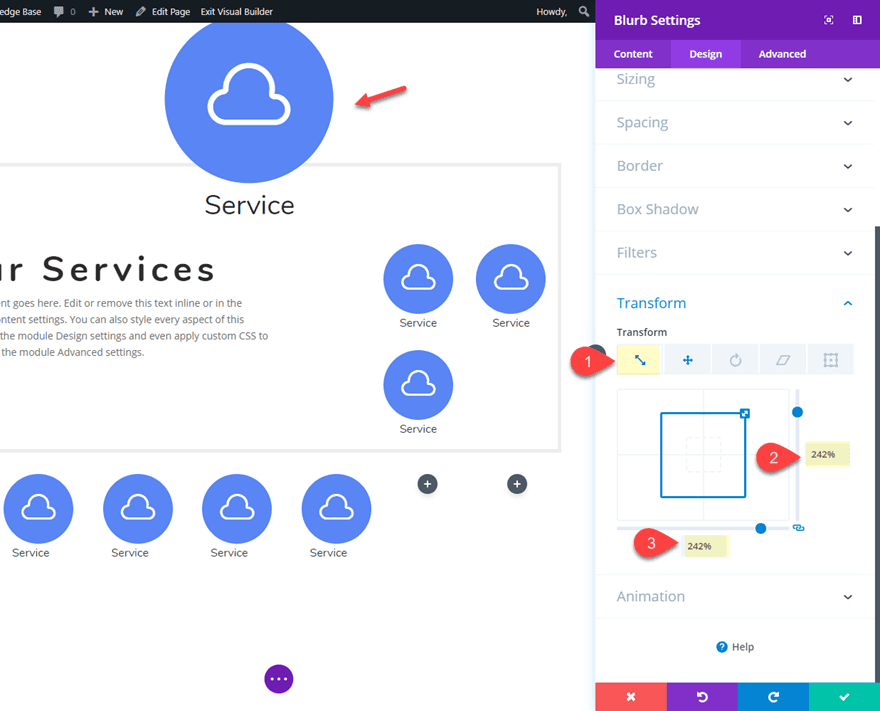
Transform Translate X-axis: -96px
Transform Translate Y-axis: -44px
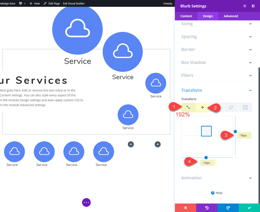
Next, update the settings of the top Blurb module in column 3 of the first row as follows:
Transform Scale X-axis: 192%
Transform Scale Y-axis: 192%
Transform Translate X-axis: -70px
Transform Translate Y-axis: -13px
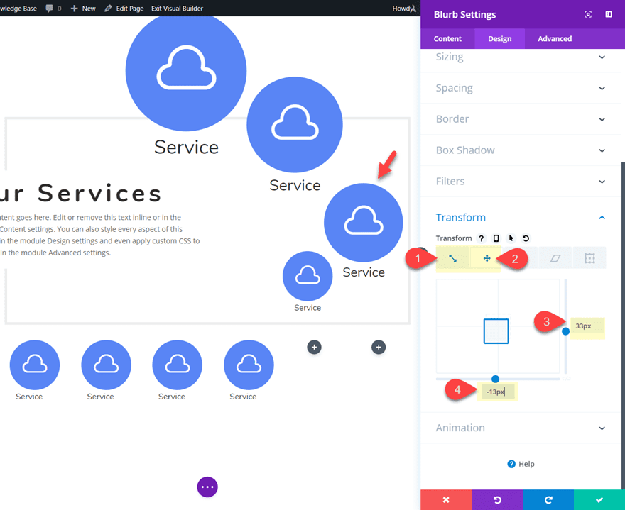
Then, update the blurb module in column 4 of the top row as follows:
Transform Scale X-axis: 158%
Transform Scale Y-axis: 158%
Transform Translate X-axis: 33px
Transform Translate Y-axis: -13px
Next, update the bottom blurb module in column 3 of the top row as follows:
Transform Scale X-axis: 132%
Transform Scale Y-axis: 132%
Transform Translate X-axis: 89px
Transform Translate Y-axis: 39px
Then give it a the following background color to create a break in the row border for a subtle design element:
Background Color: #ffffff
That’s it!
For an additional design element, you can gradually increase the opacity of the circle color on each of the icons used throughout the layout.
Mobile Adjustments
To adjust the blurb module layout for tablet and phone displays, we can simply set the transformation effects back to the original state so that the blurbs return to their original size and will be positioned inside the columns nicely. To do this we can use Divi’s multi-select feature. Since it may be difficult to click on the modules that have been positioned with the transform property, it is a good time to enable the grid mode in your builder settings. This will allow you to see the blurb modules in their original position. Once you are in grid mode, go ahead and hold down ctrl or cmd and then click on each of the modules that have a transformation effect. Then click the gear icon of any of the modules selected to open the element settings modal.
In the Element Settings modal, update the following:
Transform Scale X-axis: 100%
Transform Scale Y-axis: 100%
Transform Translate X-axis: 0px
Transform Translate Y-axis: 0px
This will restore the original position and scale of the blurbs on tablet and phone displays.
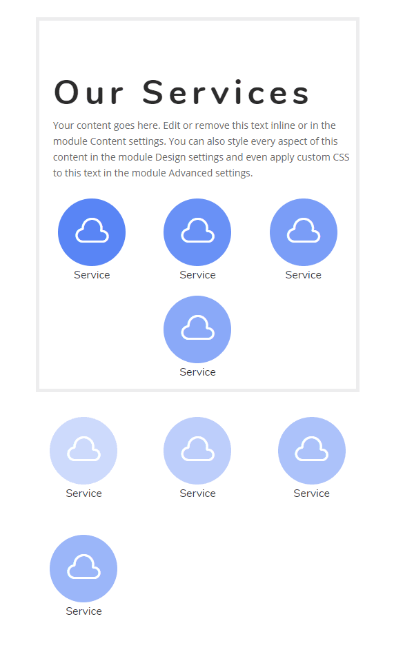
Final Result
Here is the final design.
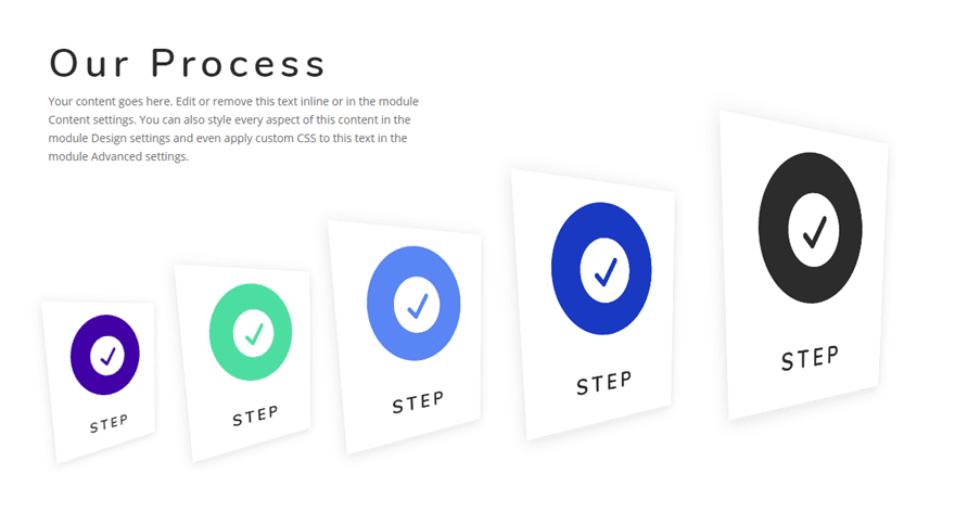
Creating Blurb Module Layout #2
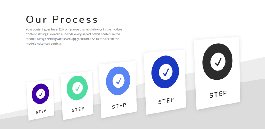
In this next example, I’m going to show you a unique blurb module layout using Divi’s scale, translate and rotate transform options. I’ll also throw in a bonus CSS snippet that adds perspective to each of the blurbs. Here’s how to do it.
Create the Heading
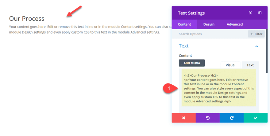
First, add a new regular section with a one-column row. Then add a text module to the row with the following content:
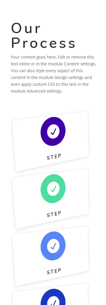
<h2>Our Process</h2>
<p>Your content goes here. Edit or remove this text inline or in the module Content settings. You can also style every aspect of this content in the module Design settings and even apply custom CSS to this text in the module Advanced settings.</p>
Then update the rest of the text module settings as follows:
Heading 2 Font: Nunito
Heading 2 Font Weight: Semi Bold
Heading 2 Text Size: 50px
Heading 2 Letter Spacing: 7px
Width: 500px
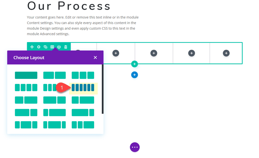
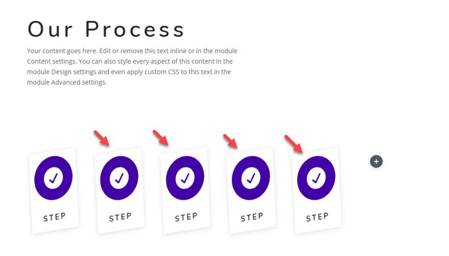
Creating the Blurb Layout with a Six-Column Row
That takes care of the heading. Now it’s time to add the row for our blurb module layout. Go ahead and create a new row with a six-column layout directly under the current row.
Styling the Blurb Module
In the first column, add a new blurb module and update the settings as follows:
Delete the body text in the content box and update the title text with the word “Step”.
Then Click to use an icon and choose the circle check icon.
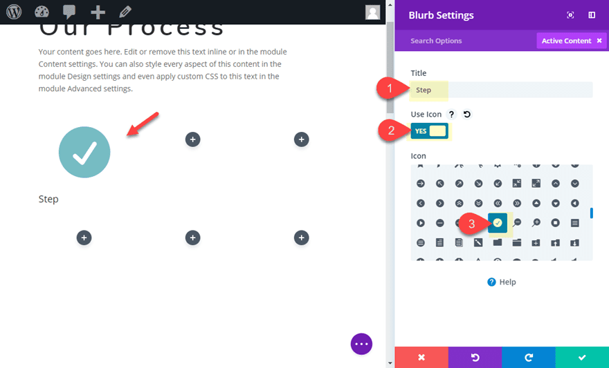
Give the Blurb a white background color as follows:
Background Color: #ffffff
Then update the design settings:
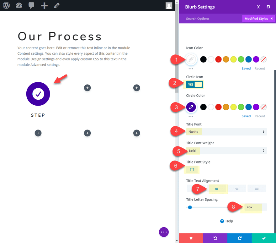
Icon Color: #ffffff
Circle Icon: YES
Circle Color: #3d0dad
Title Font: Nunito
Title Font Weight: Bold
Title Font Style: TT
Title Text Alignment: Center
Title Letter Spacing: 4px
Then, give the blurb a box shadow as follows:
Box Shadow: See Screenshot
Shadow Color: rgba(0,0,0,0.12)
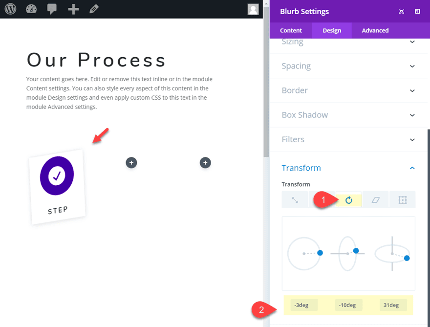
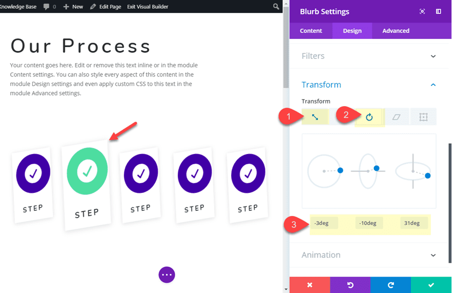
And finally, add the rotate transformation effect to the blurb module:
Transform Rotate X-axis: -3deg
Transform Rotate Y-axis: -10deg
Transform Rotate Z-axis: 31deg
That takes care of our first blurb module.
Update Row Settings
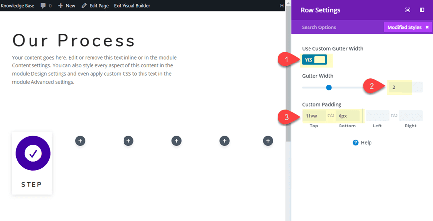
Now before we start duplicating our blurb module, we need to update the row settings as follows:
Gutter Width: 2
Custom Padding: 11vw top, 0px bottom
This will help use with spacing the blurbs in the layout.
Duplicating and Styling The Rest of the Blurbs
Now we are ready to duplicate and customize the rest of the blurbs. Go ahead and copy the blurb module in column 1 and paste it into all of the remaining columns except the last column (column 6). We will leave column 6 empty to leave more space for the blurbs to be moved to the right.
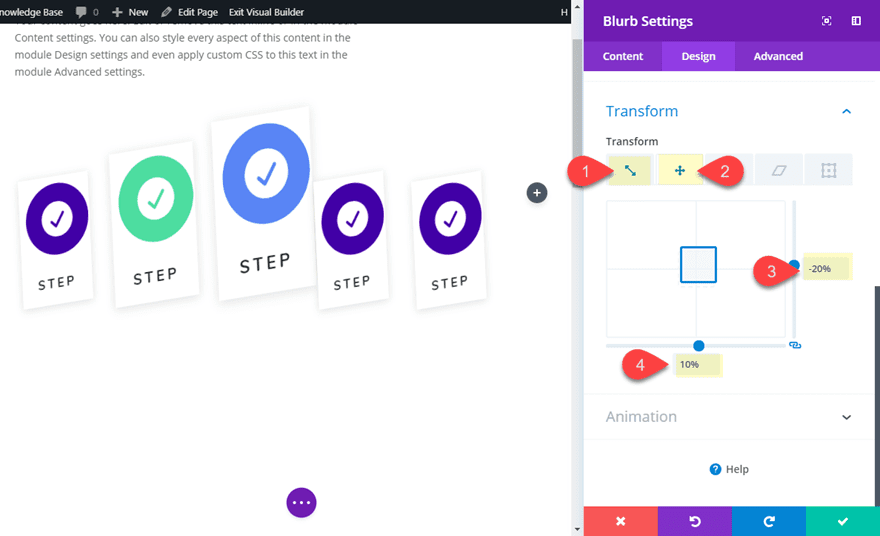
Now open the blurb module setting in column 2 and update the following:
Circle Color: #62de9d
Transform Scale X-axis: 120%
Transform Scale Y-axis: 120%
Transform Translate Y-axis: -10% (make sure to type in the percentage value here)
Next, update the blurb module in column 3 as follows:
Circle Color: #5e89fb
Transform Scale X-axis: 140%
Transform Scale Y-axis: 140%
Transform Translate Y-axis: -20%
Transform Translate X-axis: 10%
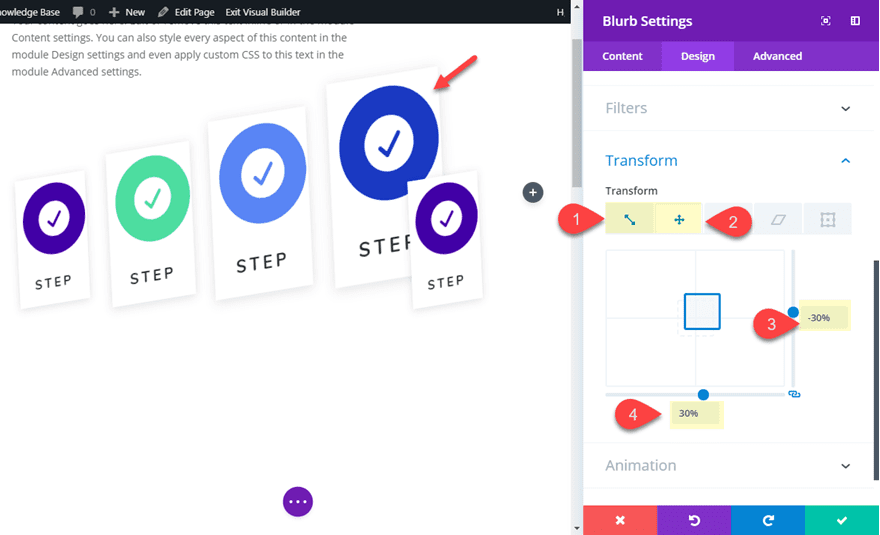
Update the blurb module in column 4 as follows:
Circle Color: #2a3fc9
Transform Scale X-axis: 160%
Transform Scale Y-axis: 160%
Transform Translate Y-axis: -30%
Transform Translate X-axis: 30%
And finally, update the blurb module in column 5 as follows:
Circle Color: #62de9d
Transform Scale X-axis: 180%
Transform Scale Y-axis: 180%
Transform Translate Y-axis: -40%
Transform Translate X-axis: 55%
As you can see, each of the blurbs will increase size by 20% from left to right. And the Transform translate percentage values make sure blurbs stay lined up nicely.
Since the design overflows into the last column (column 6) we will leave it blank. But you can always add another blurb in column 6 if you increase the size of the row.
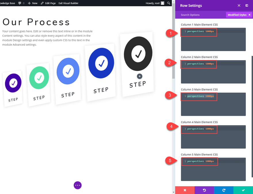
Adding the Perspective Property to Each Column
In CSS, the perspective property is used to give a 3D-positioned element some perspective in Z-Space. Basically it defines how far the object appears away from the user as they look at the screen. The perspective property must be applied to the parent container of that which has the 3D-position which in this case is our blurb module. Therefore, we must add the perspective to each of the columns using a small snippet of CSS as follows.
Add the following CSS to the Column Main Element CSS box for each of the 5 Columns as follows:
Column 1 Main Element:
perspective: 1000px
Column 2 Main Element:
perspective: 1000px
Column 3 Main Element:
perspective: 1000px
Column 4 Main Element:
perspective: 1000px
Column 5 Main Element:
perspective: 1000px
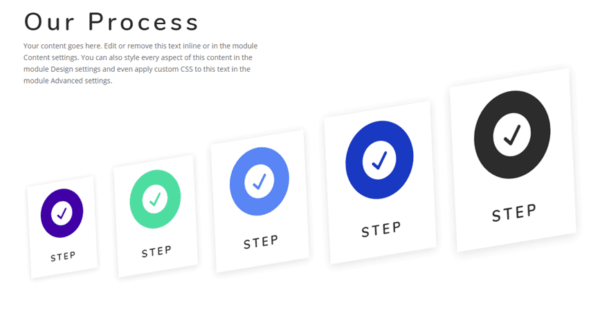
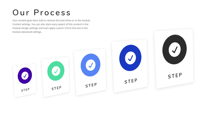
In this case, the change is very subtle but worth the additional effort in my opinion.
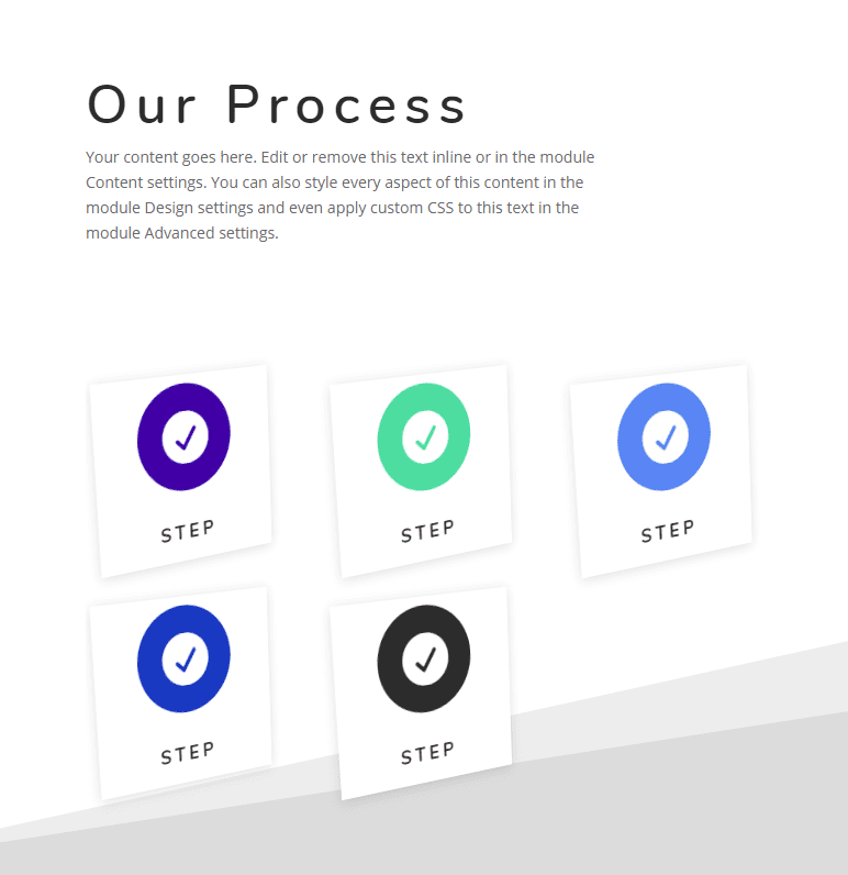
Here is the blurb module layout design without perspective.
And here it is with the perspective in place.
If you want to make the blurbs appear closer to the user, you can decrease the perspective value. For example, this is what the blurbs will look like with “perspective: 400px” added to each column.
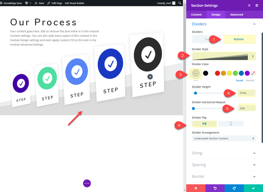
Adding a Divider Background to the Section
In order to make the blurbs appear to be standing on a surface, we can add a divider background to the section. Open the section settings and update the following:
Bottom Divider Style: see screenshot
Bottom Divider Color: #dddddd
Bottom Divider Height: 27vw
Bottom Divider Horizontal Repeat: 0.8x
Bottom Divider Flip: horizontal
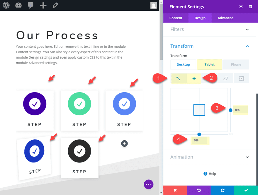
To adjust the layout for tablet and phone displays, you will need to multi-select each of the blurb modules and update the following transform options in the Element settings for tablet display:
Transform Scale X-axis: 100%
Transform Scale Y-axis: 100%
Transform Translate Y-axis: 0%
Transform Translate X-axis: 0%
Final Result
Now let’s check out the final result of the blurb module layout.
Final Thoughts
With Divi’s transform controls, you have the ability to place your blurb modules in precise areas of your page with great ease. This makes it fun to experiment and create new blurb module layouts for featuring services, process steps, and countless other uses. I hope this tutorial gives you a little inspiration for testing out these design techniques yourself.
For more inspiration, check out these 5 creative blurb module designs.
I look forward to hearing from you in the comments.
Cheers!


Good morning, I do not see the options of transformation in the settings of Blurb, in the column of designs these titles appear in this order: border, shadows, filters and animation.
I am doing something wrong?.
Thank you
Alexander
Buenos dias, no me aparece las opciones de transformacion en la configuracion de anuncios, en la columna de diseños aparecen estos titulos en este orden: borde, sombras, filtros y animacion.
Estoy haciendo algo mal.
Muchas gracias
Alejandro
Good morning, I do not see the options of transformation in the settings of Blurb, in the column of designs these titles appear in this order: border, shadows, filters and animation.
I am doing something wrong?.
Thank you
Alexander
Alejandro,
Please make sure you have updated Divi to the latest version. If you have already done so, I would contact support for further assistance.
Thanks
Y’all need to really stop complaining about the lack of preview.
The screenshot at the top of the page should be enough for you to make a decision. Do you really want everything for free and no effort at all? Come one guys.
Any preview / test link ?
Any preview / test link ?
i like divi so much.soon i going to buy it
A JSON file possible please?
Thank you 🙂
Nicely done- Jason (as always). Thanks for taking the time to share.
Yes, please can you show us a preview? Thanks.
This is great! I’ve had to hack away with CSS in order to do this kind of thing in the past. This is literally not only a time saver but because it’s more integrated with the theme, it’s more likely to work on different devices of different size, etc.
Is there a preview somewhere? Before launching into the tutorial it would be great to see what the final result will be. Pictures of the blurbs only gives you a hint of how they will behave. Thanks.
Agree also. Why not even link to a secure ET site for demo purposes where this can be seen LIVE? With transformations it is hard to impossible to grasp what the outcome is. I am still unsure about the first one in particular.
Agreed! There never seem to be previews or live demos. At the very least, it would be great to have a “demo template” section so we can download and pick apart the examples, before spending lots of time working to implement by following step-by-step instructions.
Thanks!
je suis d’accord i agreed
je suis d’accord i agreed
Agreed!! Its a lot of work and we thanks Jason, but without a preview…