

Although they’re usually not the first thing visitors notice about your website, width and height CSS properties help keep your website together and looking awesome. And now, with Divi and its new draggable sizing options, you can literally control every element’s width, max width, min height, height and max height inside the builder itself. This gives you the freedom to create websites that are highly responsive across different screen sizes.
Now, all of this sounds great, but how does this translate into a beautiful website, practically speaking? That’s exactly what we’re going to talk about in this post. We’ll begin by first explaining the difference between all the height and width properties available within the Divi settings and then use them in different scenarios to make our page designs behave exactly the way we want them to.
Let’s get to it!
Subscribe To Our Youtube Channel
Understanding the Difference Between Properties
Before using width and max width in our daily design processes, it’s important to understand what they do. This is what the theoretical explanation is:
Width – The actual width of a design element. If this is 100%, it’s as wide as the container allows it to be. Width is usually expressed using %. The lower the percentage for the width, the narrower the design element will be.
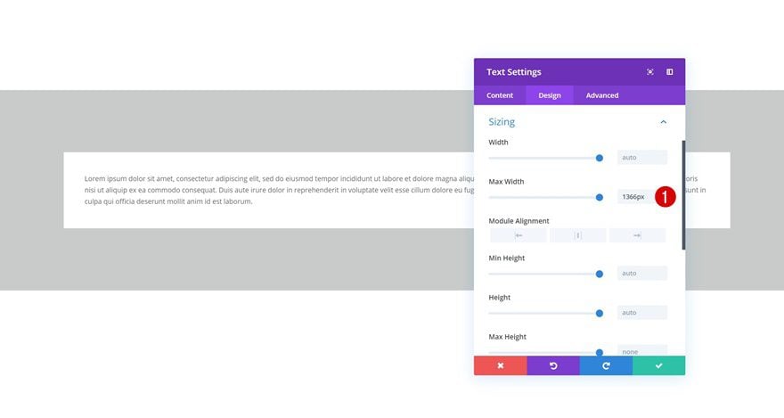
Max Width – The max width has power over the width. If the width of a module is set to 100%, it’ll adhere to that value as long as it stays below the max width value. Once the max width value is reached, it won’t exceed it.
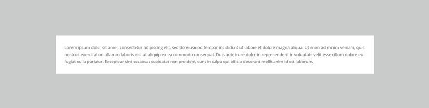
But how does that translate into responsive design? To help explain the difference, we’re going to create a visual comparison by enabling the Visual Builder on a brand new page. We’ll add a section with a one-column row. Then, insert a Text Module with some content, a background color and some custom padding.
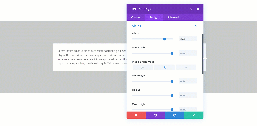
Changing the Width
When you change the width of the Text Module to 80%, you’ll see the Text Module shrink in size. A possibility to align the module however you want shows up as well.
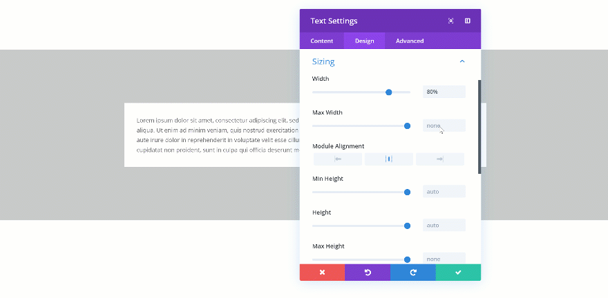
Changing the Max Width
When you change the max width, the assigned value will only start applying from the moment the actual width exceeds the max width value. Let’s demonstrate that really quick:
Not Exceeded
Exceeded
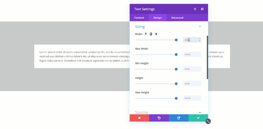
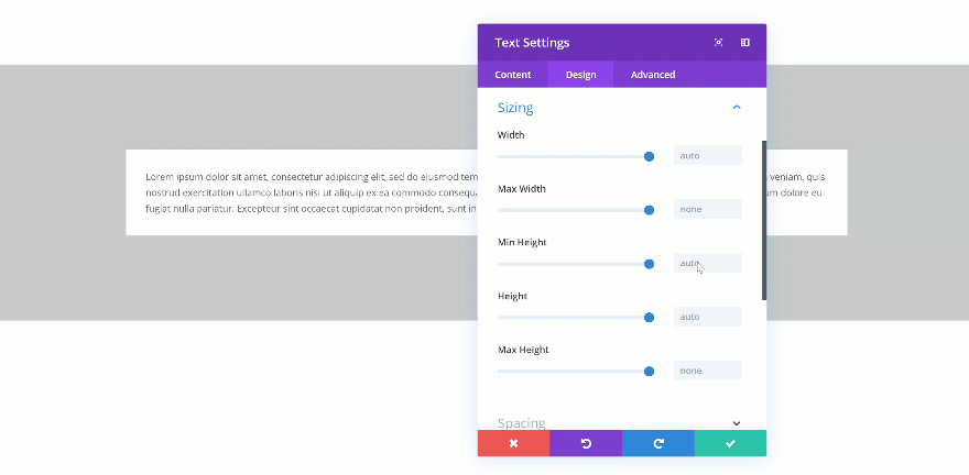
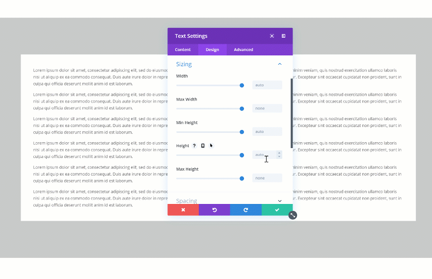
Besides width and max width, you’ll also be able to find min height, height and max height in the sizing settings of each element. This is what you can theoretically understand from these terms:
Min Height – The minimum height you want to assign to an element. If this value is larger than the height input, the min height input will dominate.
Height – This defines the actual height you want to assign to the element.
Max Height – This value becomes the new height once the height exceeds the value that was assigned to the height.
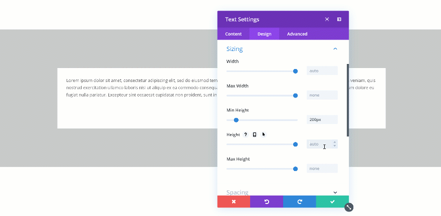
Changing the Min Height
If you change the min height of an element, that value becomes the norm. When testing it out, you’ll automatically see the height of the Text Module change in real time.
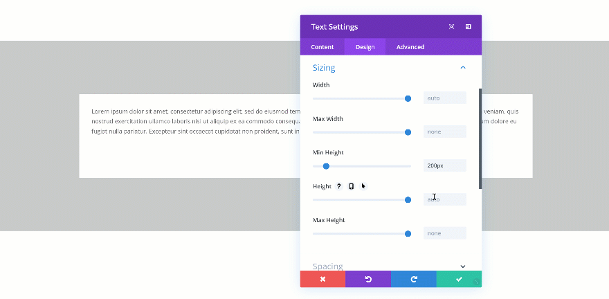
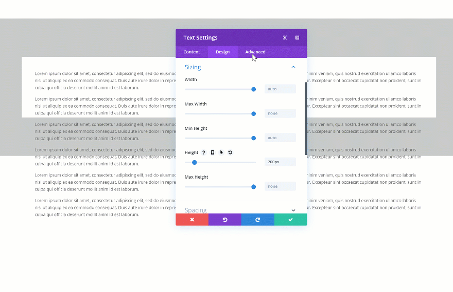
Changing the Height
If you’re combining a min height and a height, you’ll have to make sure the height is bigger than the min height. If not, the height will be ignored. In the two GIFs below, you’ll be able to see the difference in real time.
Doesn’t Exceed
Exceeds
Changing the Max Height
The max height takes over if it exceeds the min height but is smaller than the height. If, for instance, you’d assign a higher value to the min height than to the max height, the min height would dominate.
Changing the Max Width for Rows
One of the best practices in web design is deciding on one particular max width for your entire website. This helps keep everything looking responsive across different screen sizes. It also helps designers create accurate wireframes.
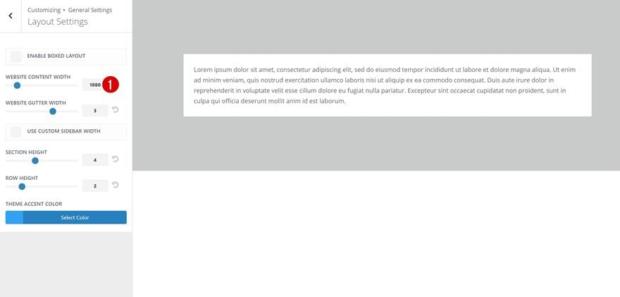
Changing the Global Max Width
You might or might not know that you can set a certain default max width for your content in the Theme Customizer by going to the General Settings and continuing to the Layout Settings. Keeping the max width persistent helps empower responsiveness.
Change the Max Width for One Row in Particular
With the new draggable sizing update, you also get the opportunity to individually define a max width for rows. This is great for exceptions where it makes more sense to go with a higher max width.
Giving Modules The Same Height
Another technique you should keep in mind focuses on giving similar elements the same height. This is aesthetically pleasing to the eye and helps visitors scan for content easily. There are two common ways to approach this:
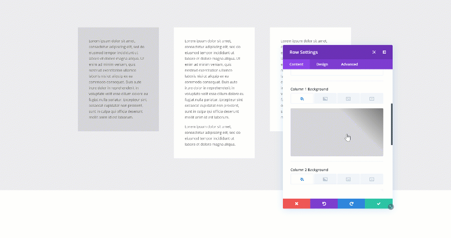
Using Column Equalizer
The first method is one that has been with Divi for a long time. If you want to create the same height for each one of the columns in your row, you can enable the Column Equalizer in the sizing settings of your row. If you’re using column background colors, you’ll quickly notice the difference.
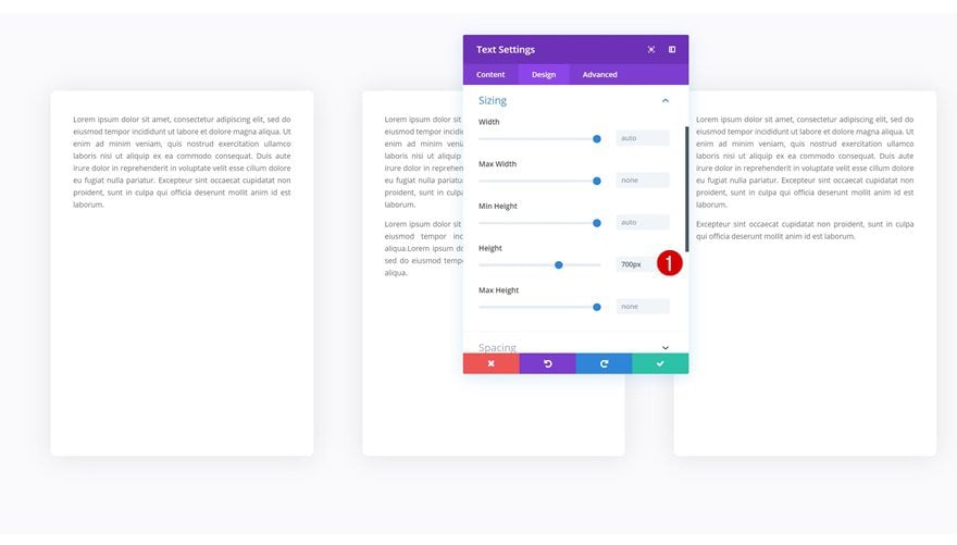
Assigning Height to Each Module
Another way to approach it is by assigning a predefined height to the modules you’re adding.
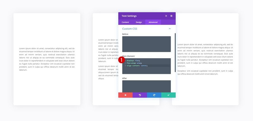
Aligning Content within a Module
Once you’ve assigned a height to all the modules, you can play around with the alignment of the content as well. To do that, you can either use custom padding to manually determine the whitespace in a module, or use a few lines of CSS code to automatically align content.
display: flex;
flex-wrap: wrap;
align-content: center;
Choosing Design Element Height or Width & Turn Overflow into Scroll
Another cool thing you can do with the new draggable sizing options is turning overflow into scroll. This will easily help you save space on your pages and add extra interaction. There are two steps to this; settings a height for your element and changing the overflow in the visibility settings. Start by changing the height of your element.
Then, go to the visibility settings of your element and change the vertical overflow into scroll.
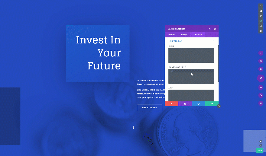
Creating a Fullscreen Hero Section Across all Screen Sizes
On to the next and last tip! Want to create a fullscreen hero section? Open the hero section on your page, go to the sizing settings and change the height. It’s important you use the height viewport unit for this to make sure everything remains responsive across all screen sizes.
- Height: 100vh

Want to centrally align the content in your fullscreen hero section? Add the following custom CSS code lines to the main element of your section as well:
display: flex;
flex-wrap: wrap;
align-content: center;
Final Thoughts
In this post, we’ve gone over the new width an height options that come with Divi’s draggable sizing update. We’ve shown you how they work and how you can use them to create responsive page design for any kind of website you’re building. If you have any questions or suggestions, make sure you leave a comment in the comment section below!
If you’re eager to learn more about Divi and get more Divi freebies, make sure you subscribe to our email newsletter and YouTube channel so you’ll always be one of the first people to know and get benefits from this free content.


I keep getting more an more confused as to where your heads are at – why are there no vw and vh units in DIVI as this is the proper unit to use in CSS for responsive design. I may be heading back to bootstrap for future projects, which is sad because I was thrilled when I found DIVI 🙁
You can use viewport units in Divi, there are a bunch of tutorials on our blog that were created using them! 🙂
This one, for example: https://www.elegantthemes.com/blog/divi-resources/download-a-free-book-preview-divi-landing-page-layout-including-anchor-links-ctas
Customization is great .Either we can use custom padding to manually determine the whitespace in a module, or use a few lines of CSS code to automatically align content.
Great tutorials.
I’d just add a comment: I’m looking at the tutorial screenshots and gifs and they always show slightly blurred or at a lower definition compared to the rest of the page and text.
I read every single post with high interest but honestly, my eyesight strains every time I take a look at the screenshots and gifs. I wish this point could be solved to keep enjoying all your tutorials!
Thanks for your tips!
Nice to see Divi keeps adding new options to it’s theme. Keep it up!
“This gives you the freedom to create websites that are highly responsive across different screen sizes.”
Surely in 2019, it should be a GIVEN that a theme is fully responsive out of the box? Why should we NEED to customize a theme to MAKE it responsive? This is why I think the developers of Divi Theme are losing their way.
Could you do a tutorial to explain when to use the various units? I am not clear when to use Vh, pixels, or %. And what’s the difference between 50Vh and simply 50%?
I see (somewhat) how these apply to modules (text). What happens with a Blurb module or a Blog module if we use these? I have had problems with the blog module showing HUGE images.
Thank you so much
Chris
This link may help you!
https://www.elegantthemes.com/blog/divi-resources/a-guide-to-understanding-and-applying-css-length-units-in-divi
Please don’t set the Height: 100vh to create a hero section. Instead set the min-height: 100vh
if you set the height to 100vh then it could be that the section is not high enough to show all the content (smartphone landscape). if you set the min-height you don’ t have this problem…
Please don’t set the Height: 100vh to create a hero section. Instead set the min-height: 100vh
if you set the height to 100vh then it could be that the section is not high enough to show all the content (smartphone landscape). if you set the min-height you don’ t have this problem…
Thanks for the tip!
Thank you for this and the flex CSS tips.
I agree more on vh/vw/percent/pix would be helpful, but this was also very good: https://www.elegantthemes.com/blog/divi-resources/a-guide-to-understanding-and-applying-css-length-units-in-divi
This is very helpful as there are many new options.
Could you ou clarify, or do a follow up post on when to use percent, vh, pixels?
I had issues in the past with these but it seems they work better now.
Chris
BRAVO, that you care more about showing us how to optimally adapt to mobility.
BUT – why don’t you still offer the fourth view to make the tablet landscape view (1024px) perfect. You seem to completely underestimate how important this format is!
Have a look at your layouts and check them for 1024. There are some grotesque paginations, which make some modules lose their sense. In addition, it is visually very unfavorable that the font size of the desktop view is adopted for titles in the 1024 view. The additional setting possibility is also missing here.
Of course you can solve all this with CSS classes. However, this costs unnecessary time and 75% of DIVI users would not even know how this works.
It would be nice if my constructive criticism would be accompanied by an official statement from you. Because the mentioned topic is not a MimimI on my part, but the still “missing link”. 😉
THX – Eric
+1
I think Eric’s talking about this format,
some layouts are broken with the 1024.
There is of course CSS, but it’s a lot of time
just for one format.
Thank you for this interesting tutorial.
It would have a great benefit if this tutorial would have shown the changes that would apply on phone, tablet and desktop to bring the “ responsiveness” into clarity! Perhaps a redo/ update to bring this point home!
Kind regards