

Welcome to part 2 of this 5 part series that will teach you how use Divi and its new Animation options to design awesome page sections. I’m going to be walking you through how to build the different sections of our live demo page in order to show you techniques for adding animations to your website. The Animation features truly are fun and easy to use. And with the Visual Builder, you can see your creation come to life every stage of the way. Come and join me as we explore the power of Divi animations.
In part 1 of our series, we created the first two sections of the animation demo page. The design and animation of the header in the first section showcased a unique way to animate the elements of a text module inside of a fullscreen standard section. In building the second section, we discovered a way to incorporate subtle and harmonious animations to rows of content that could easily be used to feature content on a landing page in an engaging way.
Today we are continuing our journey to design section layouts that use animation effectively (and creatively) when scrolling through the page. We will be building the third and fourth sections of our live demo page showcasing the power of Divi’s animation features. Both of these sections have layouts that can easily be adopted for your own projects to showcase products or services.
Let’s get started.
- 1 Here is a Sneak Peek of What We Will Be Building in Today’s Post
- 2 Preparing the Design Elements
- 3 Using Divi’s Animations to Unfold Content with Sliding Images
- 4 Building Section 3 of the Demo
- 5 Building Section 4 of the Demo
- 6 Bonus: Download These Sections for Easy Import
- 7 Download For Free
- 8 You have successfully subscribed. Please check your email address to confirm your subscription and get access to free weekly Divi layout packs!
- 9 Wrapping Up
- 10 Coming Up
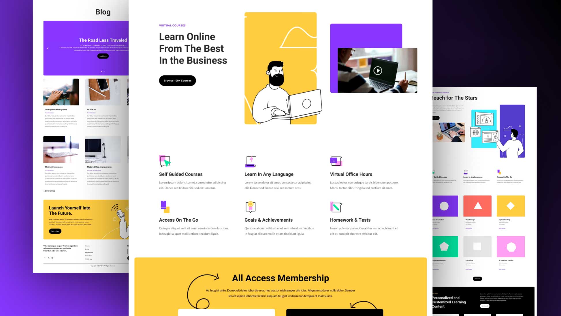
Here is a Sneak Peek of What We Will Be Building in Today’s Post
Section 3

Section 4

Preparing the Design Elements
Get Your Images Ready
For the third section, you are going to need two images. The first one needs to be around 880×600 and the second around 790×880. These image sizes don’t have to be exact. I’m just including these dimensions to give you an idea.
When building the fourth section, you will also two images around 600×400.
Use the Visual Builder
No need for advanced code here. We will be using only the Visual Builder to design the next two sections of our page we created in part 1 of this series. Since your page is already setup, you are ready to go.
Using Divi’s Animations to Unfold Content with Sliding Images
Subscribe To Our Youtube Channel
Building Section 3 of the Demo
Section 3 is a great example of how to design and animate the Call to Action Module with an accompanying image.
Let’s dive in.
Using the Visual Builder, add a regular section with a two-column row. In the left column add an image module.
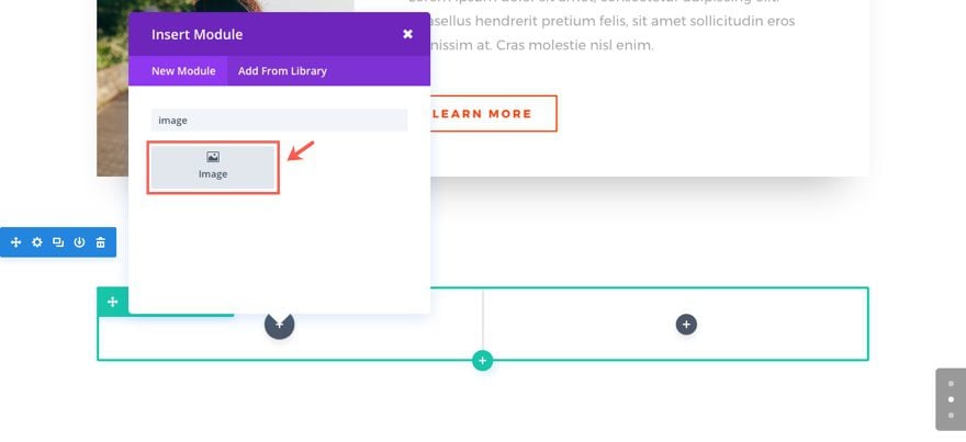
Update the Image Settings as follows:
Under the Content tab…
Image URL: [insert your 880×600 image]
Under the Design tab…
Force Fullwidth: YES
Animation Style: Slide
Animation Direction: Left
Animation Intensity: 20%
Animation Starting Opacity: 100%
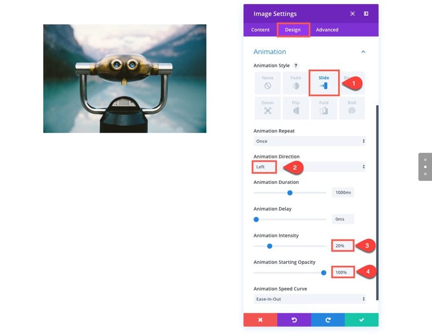
Save Settings
Add Divider Module
In the right column, we are going to showcase our content using the divider module and the Call to Action Module. The divider module will be used to add a short divider line above the text.
Add a divider module to the right column.
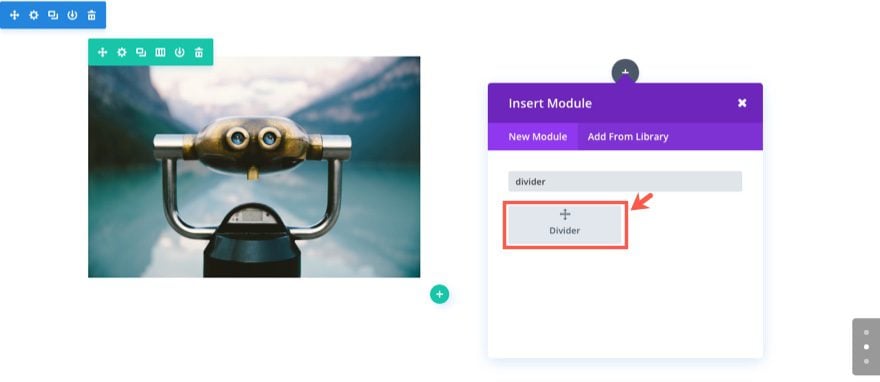
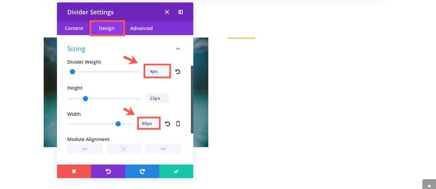
Then update the settings as follows:
Under the Content tab…
Show Divider: YES
Under the Design tab…
Color: #e4ca77
Divider Weight: 4px
Width: 80px (you have to type this value in since the default is percentage)
Module Alignment: default (left)
Custom Margin: 60px Top, 0px Bottom
Animation Style: Fold
Animation Direction: Right
Animation Duration: 1200ms
Animation Delay: 50ms
Animation Intensity: 70%
Animation Starting Opacity: 0%
Save Settings
Add a Call to Action Module
Under the Divider Module add a Call to Action Module with the following settings:
Under the Content tab…
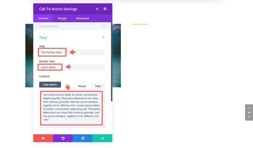
Title: “The Perfect View”
Button Text: “Learn More”
Content: “Lorem ipsum dolor sit amet, consectetur adipiscing elit. Phasellus bibendum est vitae felis rhoncus gravida. Sed nec purus tempus, sagittis mi id, efficitur nisl. Lorem ipsum dolor sit amet, consectetur adipiscing elit. Phasellus bibendum est vitae felis rhoncus gravida. Sed nec purus tempus, sagittis mi id, efficitur nisi.”
Link: #
Use Background Color: NO
Under the Design tab…
Text Color: Dark
Text Orientation: Left
Header Font: Lato, Uppercase (TT)
Header Font Size: 38px
Header Text Color: #0c0c0c
Header Letter Spacing: 0.2em
Header Line Height: 1.4em
Body Font: Lato
Body Font Size: 18px
Body Text Color: #9e9e9e
Body Line Height: 1.8em
Use Custom Styles for Button: YES
Button Text Size: 15px
Button Text Color: #000000
Button Background Color: rgba(225,225,225,0)
Button Border Width: 0px
Button Letter Spacing: 2px
Button Font: Lato, Bold (B), Uppercase (TT)
Button Icon: right arrow
Only show Icon On Hover for Button: NO
Button Hover Letter Spacing: 0px
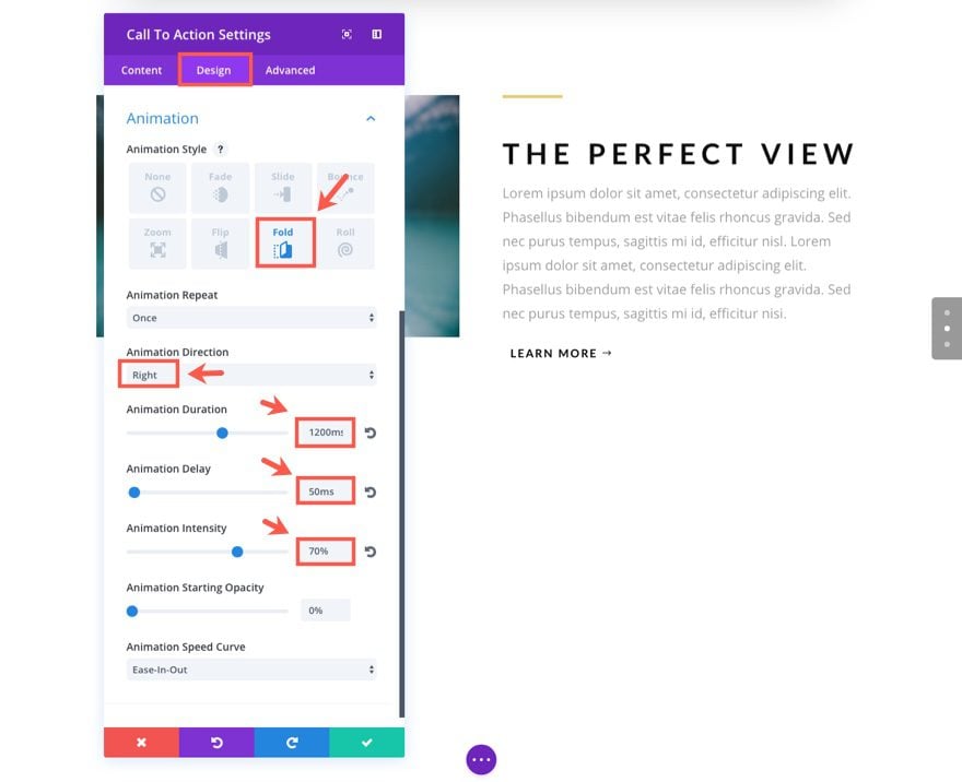
Animation Style: Fold
Animation Direction: Right
Animation Duration: 1200ms
Animation Delay: 50ms
Animation Intensity: 70%
Animation Starting Opacity: 0%
Save Settings
Now click to edit the Row Settings and update the following:
Under the Design tab…
Use Custom Width: YES
Custom Width: 1366px
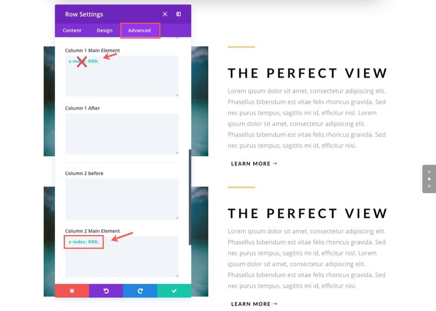
Under the Advanced tab…
Add the following custom CSS to the Column 1 Main Element box:
z-index: 999;
Save Settings
Duplicate Your Row and Update It
That’s it for the first row. To save time creating the second row, duplicate the row you just created.
Edit the duplicated row settings as follows:
Under the Advanced tab…
Take out the Custom CSS in Column 1 Main Element and add it to the Column 2 Main Element box:
z-index: 999;
Since our image is going to be on the right column, we need that column to stay on top of the text animating on the left.
Save Settings
Update Image Module and Call to Action Module in the Second Row
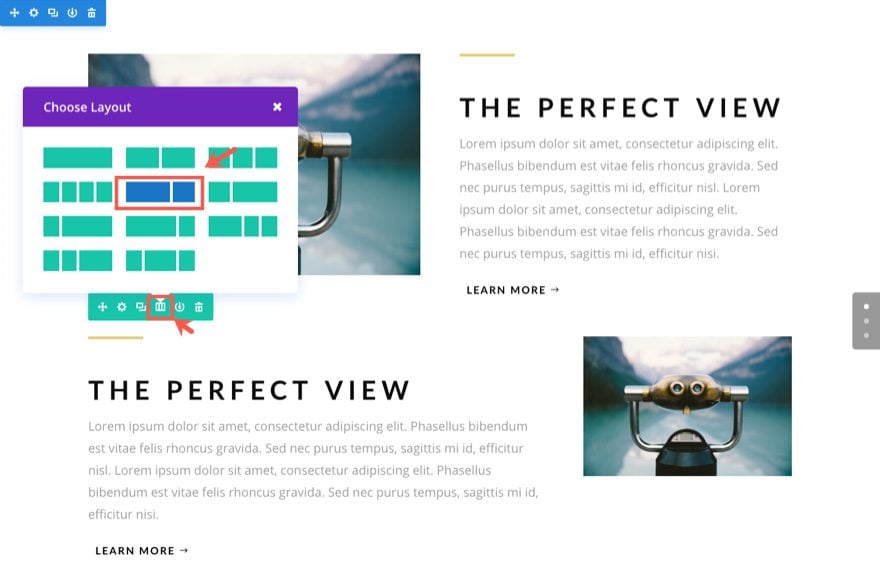
Next drag the image module to the right column and drag the divider module and call to action module to the left column.
This section is going to have a slightly different column structure. Click the Change Column Structure Row Icon (next to the duplicate row icon) and select a two-thirds one-third column layout.
Now all we need to do is revisit each of the modules inside of the row and make a few changes.
First, update the Divider Module settings as follows:
Under the Design tab…
Module Alignment: Right
Animation Direction: Left
Save Settings
Next update the Call to Action Module Settings as follows:
Title: “Speaks For Itself”
Text Orientation: Right
Header Text Alignment: Right
Width: 700px (type this in)
Animation Direction: Left
Save Settings
Next update the Image Module in the right column with your new 790×880 image.
That’s it for section 3!
Check out your result.
Building Section 4 of the Demo
Section 4 takes the design of the Image Module to another level with a few advanced CSS tricks. And, stacking text modules to fold them on a hinge is combines well with the delivery. Let’s dive in.
Using the Visual Builder, add a regular section with a two-column (one-half one-half) row. Before we add our first module, let’s add a background color to our section. Click to edit the section settings.
Under the content tab, select the background color tab and enter the color #262938.
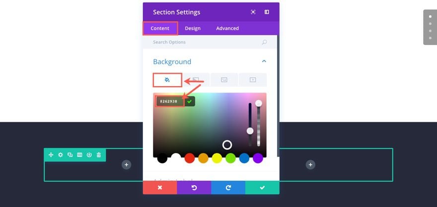
Save Settings
Add the First Text Module
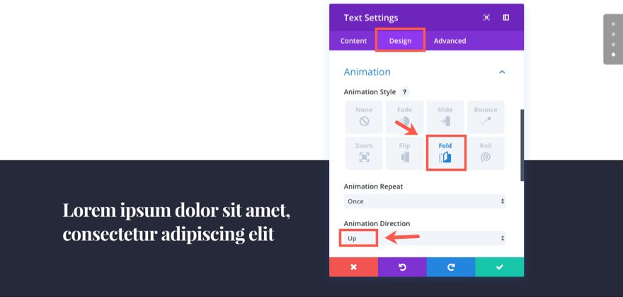
In the left column add a Text Module and update the Text Settings as follows:
Under the Content tab…
Enter the following html in the text tab of the content box:
<h1>Lorem ipsum dolor sit amet, consectetur adipiscing elit</h1>
Under the Design tab…
Text Color: Light
Header Font: Playfair Display, Bold (B)
Header Font Size: 38px
Header Line Height: 1.3em
Custom Margin: 20px Bottom
Animation: Fold
Animation Direction: Up
Add the Second Text Module
Next add another text module directly under the current text module. Then update the settings as follows:
Under the Content tab…
Content: “Lorem ipsum dolor sit amet, consectetur adipiscing elit. Phasellus bibendum est vitae felis rhoncus gravida. Sed nec purus tempus, sagittis mi id, efficitur nisl. Sed nec purus tempus, sagittis mi id, efficitur nisl.”
Under the Design tab…
Text Color: Light
Text Font Size: 18px
Text Text Color: rgba(255,255,255,0.66)
Text Line Height: 1.9em
Custom Margin: 40px Bottom
Animation Style: Fold
Animation Direction: Down
Animation Delay: 150ms
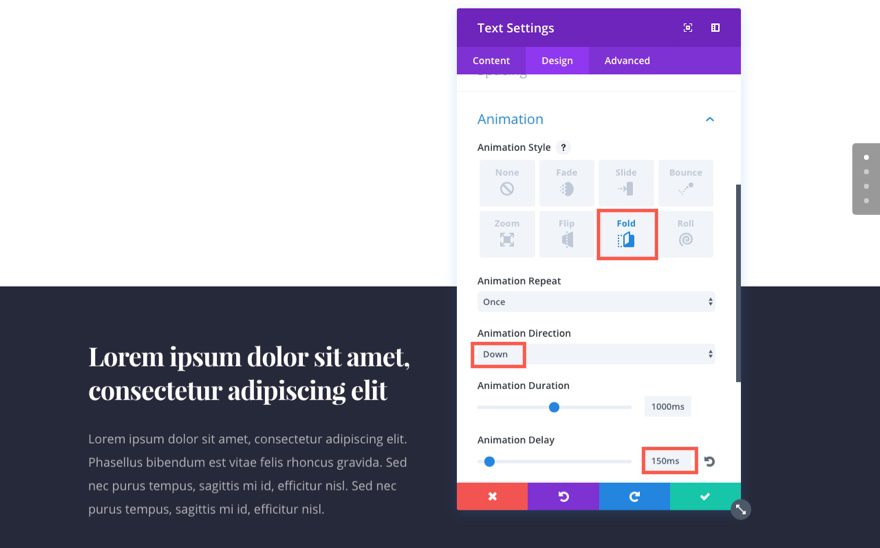
Save Settings
Add a button module under the last text module and update the settings as follows:
Button Text: Learn More
Button URL: #
Use Custom Styles for Button: YES
Button Text Size: 15px
Button Text color: #01254c
Button Background Color: #ffffff
Button Border Radius: 0px
Button Font: Bold (B), Uppercase (TT)
Custom Padding: 10px Top, 30px Right, 10px Bottom, 30px Left
Animation Style: Slide
Animation Direction: Down
Animation Duration: 1600ms
Animation Delay: 150ms
Animation Intensity: 20%
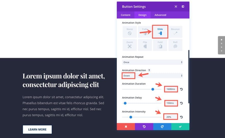
Save Settings
Add Image Module to Right Column
That’s it for that column. Now we need to add an Image Module to the right column. Then update the settings as follows:
Under the Content tab…
Image URL: [insert your 600×400 image]
Under the Design tab…
Force Fullwidth: YES
Animation Style: Slide
Animation Direction: Right
Animation Delay: 800ms
Animation Intensity: 20%
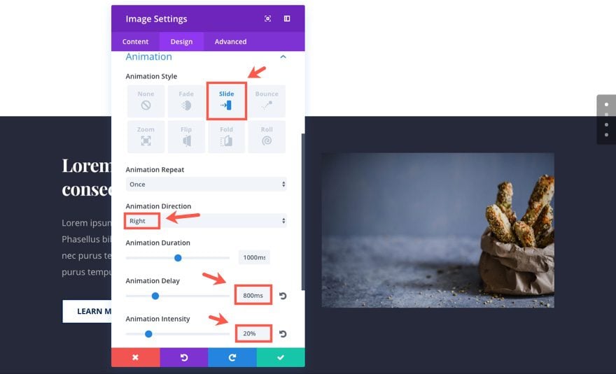
Save Settings
Update Row Settings
Now click to edit the Row Settings and update the following:
Under the Design tab…
Use Custom Width: YES
Custom Width: 1366px
Custom Padding: 27px Top, 0px Right, 170px Bottom, 0px Left
Column 1 Custom Padding: 6% Top
Under the Advanced tab…
Add the following custom CSS to the Column 1 Main Element box:
z-index: 999;
This css adds makes sure the text stays on top of the image during animation.
Then add the following custom CSS to the Column 2 Main Element box:
transform: scale(1.3);
transform-origin: top right;
This css adds a clever design to scale up (increase) the size of everything in column 2 (the image). The transform origin property tells the column to scale from the top right of the row. This creates a slight overlapping of the text on the left and the image.
Save Settings
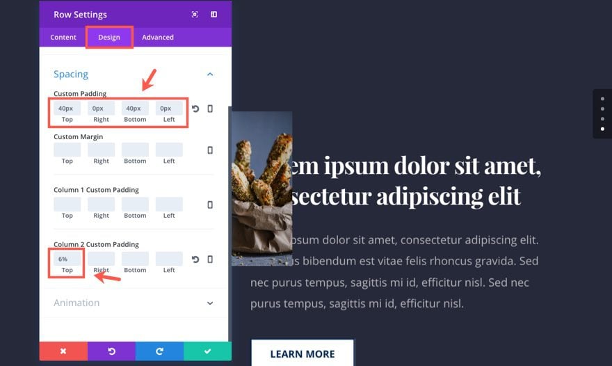
Duplicate and Update your Row
Now just like we did in section 3, we are going to duplicate the row. After duplicating the row, drag the 2 text modules and the button module from the left column into the right. And drag the image module from the right column to the left. Now all we need to do is make some minor updates to our duplicated row and its contents.
First, let’s update the row settings with the following:
Under the Design tab…
Custom Padding: 40px Top, 0px Right, 40px Bottom, 0px Left
Column 1 Custom Padding: [restore to default; erase 6% Top]
Column 2 Custom Padding: 6% Top
Under the Advanced tab…
Erase the custom CSS from the Column 1 Main Element Box and the Column 2 Main Element Box. This was carried over from the duplication and we don’t need it anymore.
Update Image Module
Next, update the Image Module (now in the left column) with the following:
Under the Content tab…
Image URL: [insert your new 600×400 image]
Under the Design tab…
Animation Direction: Left
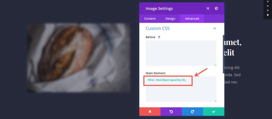
Under the Advanced tab…
If you were thinking that this image was already blurred. think again! All you need to do to add this blur effect is add the following line of custom CSS to the Main Element box:
filter: blur(5px) opacity(.6);
In addition to the blur effect, this css also makes the image semi-transpararent with a 60% opacity.
Save Settings
Update Text Module in Right Column
Moving over to the right column, update the top Text Module content with a shorter h1 header:
<h1>Consectetur adipiscing elit</h1>
Save Settings
And voila! We are all done with section 4. Let’s check out our final result.
Bonus: Download These Sections for Easy Import
As a bonus perk we’ve packaged the sections built in today’s tutorial into a free download that you can get using the email opt-in form below. Simply enter your email and the download button will appear. Don’t worry about “re-subscribing” if you’re already part of our Divi Newsletter. Re-enter your email will not result in more emails or duplicates. It will simply reveal the download.
Enjoy!

To use these downloads, start by locating the zipped file called Animation_Effects_Part_2.zip in our downloads folder. Unzip it to reveal the following imports.
Animation Effects Part 2 (section 1).json
Animation Effects Part 2 (section 2).json
Navigate in your WordPress Admin to Divi > Divi Library > Import & Export. When the portability modal pops up, click the import tab and the button labeled choose file.
Select the json file you prefer and click “Import Divi Builder Layouts”. Once the import is complete navigate to the post or page you would like to add one of the above sections to.
Activate the visual builder. Navigate to the part of the page you would like to add one of the above sections to. When you click the add new section icon, you will be presented with the option to “Add From Library”. Choose this option and select the layout you want.
Wrapping Up
In addition to making me kinda hungry for carbs, this section showcases creative ways to display and animate images. Also, the text modules folding out on a hinge with the delayed button slide further entices the user to click the CTA.
Coming Up

In part 3 of this series, I will be showing you a beautiful way to design and animate blurb modules. This section layout can be used for a variety of purposes. I can see this being a way to showcase the process of your service or a list of your services or products.
Looking forward to it.
Don’t forget to reach out in the comments below!


Yes, handle animations with greatest shy care, but great post full of useful stuff.
Only one thing I’m missing: The link to part one of the series, that would be great, also for the upcoming episodes!
Thanks…
That’s a nice update.
Great post, this might fix well in my current project .. thank you
Hi There,
All these animations look clunky and really outdated to me.
Only a waste of time.
I think ET should focus on more interesting things.
One of them could be providing a way to update production site from dev site by selecting the pages (or other items like menus…) to update using a “Save on production site” button close to the item save button.
This would really make a major difference in favor of Divi.
(compared to the latest animation and background style updates that look superficial and make Divi more complex for no good reasons. If you continue on this path you will end creating controls an menus for each elementary css property. I.e a monster).
Chris
Chris
You can use BackupBuddy if you want to develop remotely and push changes to a live site. I really think that Divi’s developers should focus on eliminating bugs that have been around for ages, and improving speed and image management before adding dev-to-production functionality. Or adding more animations!
BackupBuddy like all other WP backup utilities performs a complete backup / restore of a wp site / site database. The production wp database is overwritten with the content of the dev database.
What we are talking about here is different: The ability to perform granular updates of pages or other items like menus.
Being forced to update the entire site database when you have updated a couple of pages is a pain. particularly if your production site has a life (creation of records in the production database) or uses plugins with particular settings stored in the site database (the update destroys these records). Plus it puts your site offline the time the database is updated while a granular update process would not need to.
I vote for the “Push to production site” button. I spent a few hours trying to develop it by myself. It’s not simple!
I’m afraid that with Safari 11.0 the live demo page is a complete mess. Nothing to be seen there. At least definitely nothing anybody would want to build. Same goes for Safari on iOS.
Unless you did something to the demo page, today’s Safari 11 update fixed the issue for me on El Capitan.
Really? It works fine for me on Safari 11 on iMac, MacBook air and iPhone SE. It did take several seconds for it to load however. (DIVI had issues with Safari not too long ago but now seems fine.)
Yes, I see. Means that that all these animations did not work on Safari?
But the article is great!
None of it works for me on Safari. It looks good on Firefox though.
Hi,
Great post, I will experiment animations with these new ideas you posted.
By the way, reading a post related to divi´s full wide slider, I wanted to ask something about it, but it does not have the comments form to post.
Anyways, my question is the following:
I was wondering how I can reduce the padding or space between the text and the edges of the slider?.. I mean, I have used CSS in the configurations box to manipulate these two (title and text), But when It comes to a mobile device it reaches certain space not allowing the text getting near to the edges. It does leave like a 20-25% margins to the sides.
The only choice I have is to reduce the font size, but they usually look tiny compared to the background image. On the contrary, a regular section or fullwide header lets me control the margins and padding just fine to display the content within as I want on a mobile device.
Also, If there is a way, how do I prevent text words from breaking apart in a small screen?.. I mean, in general it is always like that, but in the slider the problem gets bigger due to the spaces Im talking about.
I really like divi and it has taken my work into a higher level. I do appreciate all the work you have done so far, Im not that experimented yet, but im doing my best to get the most out of it.
Thank you for all, I appreciate it.
As Ernie mentioned, the key is to use these responsibly – there’s a fine line between quality and tacky.
It’s when we don’t notice it – the finer subtleties of detail we experience when loading a well-designed web page – that is what contributes to user experience and Brand appeal. This work shouldn’t be discounted.
#divirocks
Thank you.
Sometimes this new interest in site animation reminds me of the early days of the internet. All type seemed to flash and there were little gif animations running all over the place.
AS with all good design, you should have a sound creative reason for this animation, does it add the the message? And all things in moderation.
Or just keep it simple and stick to a good concept.
ernie
Thanks for the comment Ernest. I completely agree that you should always have a reason for these animations. This series is meant to inspire those who are interested. For most, I would imagine that they will only use animation in small doses when it makes sense. The examples given in this series may look “busy” because it is meant to inspire and educate about the use of animation with Divi.