

Looking for a creative way to add descriptions to images? With Divi and its built-in hover options, it’s now easier than ever. You can use this approach for various purposes on your website, from testimonials to team member descriptions and more. In this tutorial, we’ll go over 4 different examples that’ll help you achieve stunning web design. We’re creating all four examples using Divi’s built-in options only.
Let’s get to it!
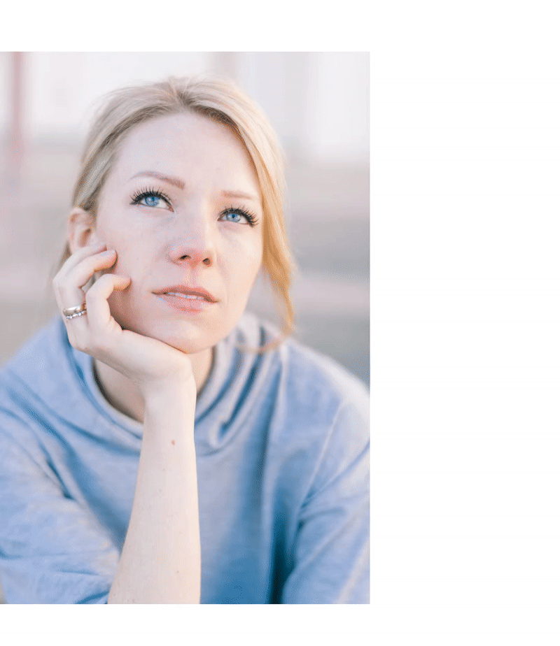
Preview
Before we dive into the step-by-step tutorial, let’s take a quick look at the end result on different screen sizes.
Desktop

Mobile
General Steps
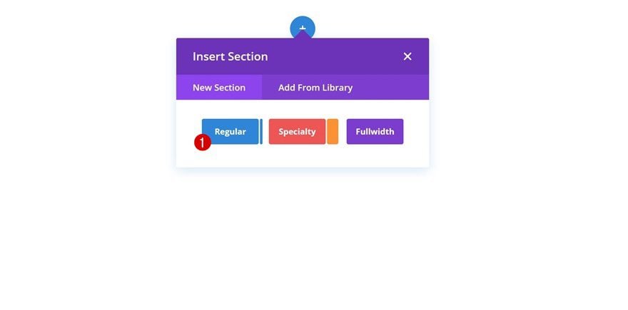
Add New Section
To make this tutorial easier to follow, we’ll start with some general steps. Afterwards, we’ll handle the steps that are unique to each one of the examples. Start by adding a new regular section to a new or existing page.
Add Row
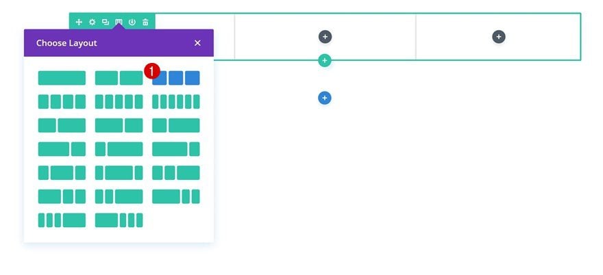
Column Structure
Go ahead and choose the following column structure (you can make this work with other column structures too):
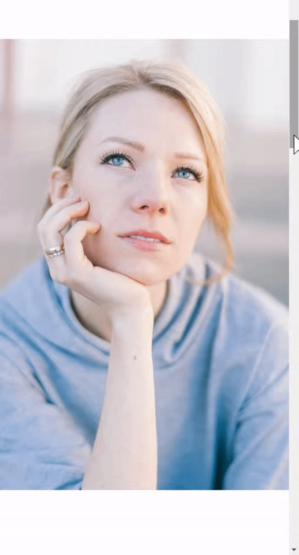
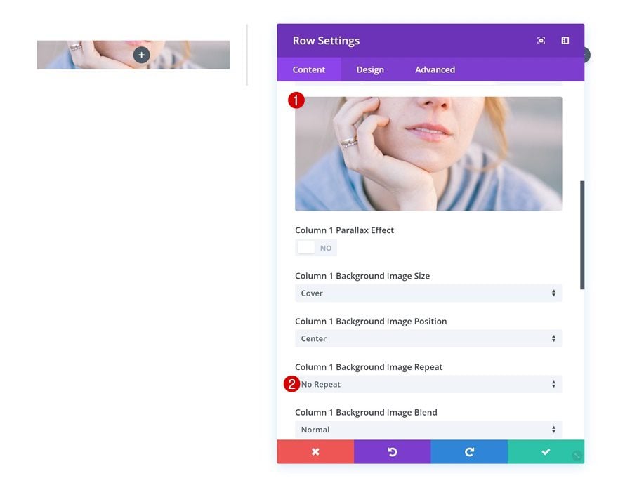
Column 1 Background Image
Without adding any modules yet, open the row settings and add a background image to the first column.
- Column 1 Background Image Repeat: No Repeat
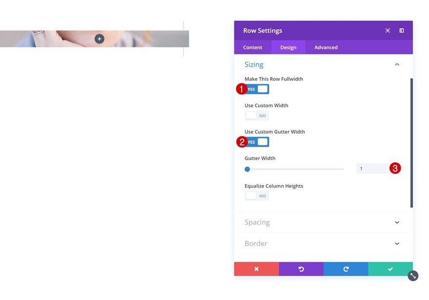
Sizing
Continue by changing the sizing settings of the row.
- Make This Row Fullwidth: Yes
- Use Custom Gutter Width: Yes
- Gutter Width: 1
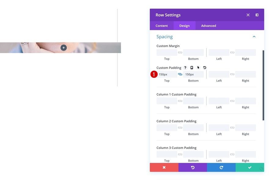
Spacing
And add some custom padding values next.
- Top Padding: 150px
- Bottom Padding: 150px
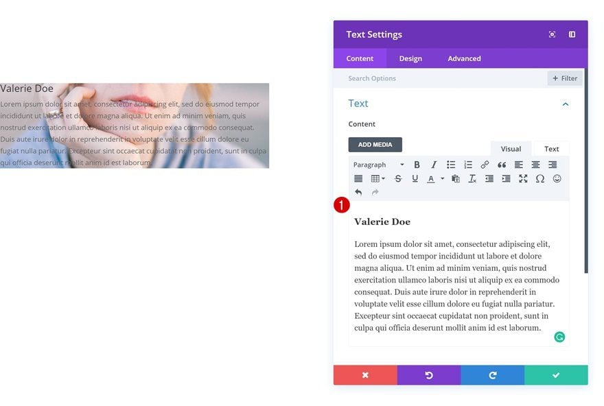
Add Text Module to Column 1
Add Content
To show the description on hover, we’ll be using a Text Module for each one of the four examples. Go ahead and add this Text Module to the same column you’ve added a background image to.
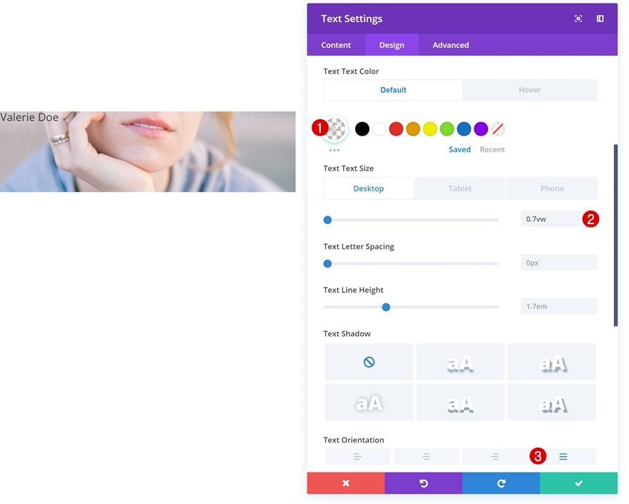
Default Text Settings
Then, go to the text settings and make some changes.
- Text Color: rgba(255,255,255,0)
- Text Size: 0.7vw (Desktop), 12px (Tablet & Phone)
- Text Orientation: Justify
Hover Text Settings
Change the text color on hover.
- Text Color: #000000
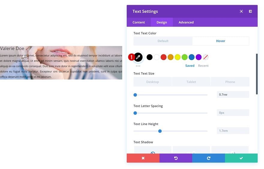
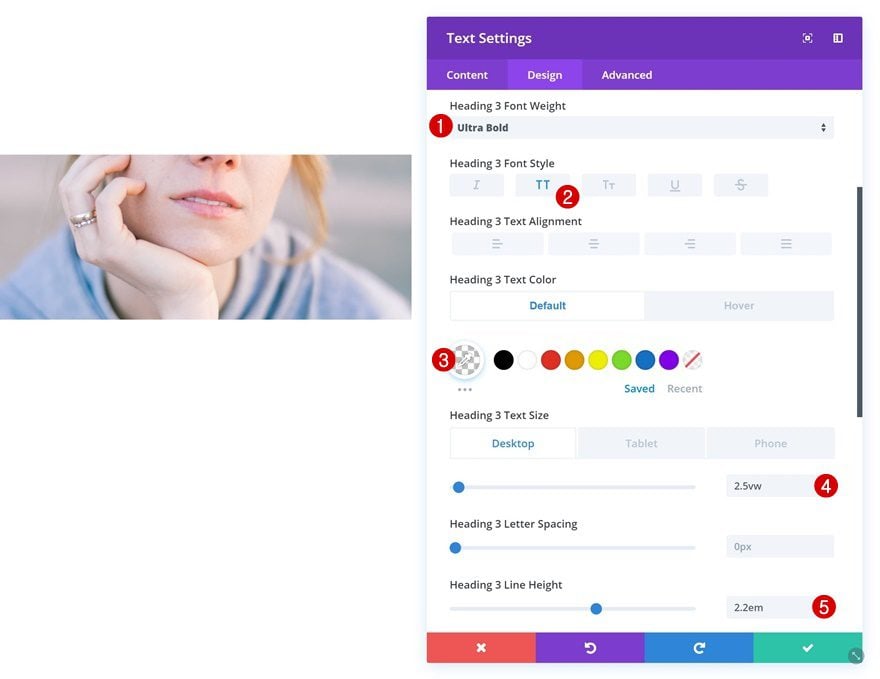
Default Heading Text Settings
Change the H3 text settings as well.
- Heading 3 Font Weight: Ultra Bold
- Heading 3 Font Style: Uppercase
- Heading 3 Text Color: rgba(255,255,255,0)
- Heading 3 Text Size: 2.5vw (Desktop), 40px (Tablet), 30px (Phone)
- Heading 3 Line Height: 2.2em
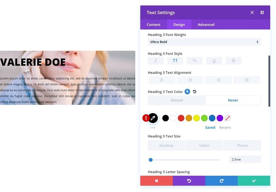
Hover Heading Text Settings
And apply a different H3 text color on hover.
- Heading 3 Text Color: #000000
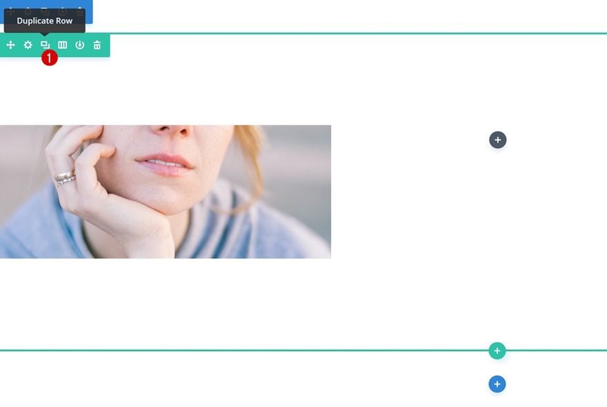
Clone Row 3 Times
Now that we’ve gone through all the general steps, we can go ahead and clone the row we’ve created three times which will allow us to have one row for each one of the four examples. Make sure that at the beginning of each example, you move on to the next row.
Example #1
Change Text Module
Default Background Color
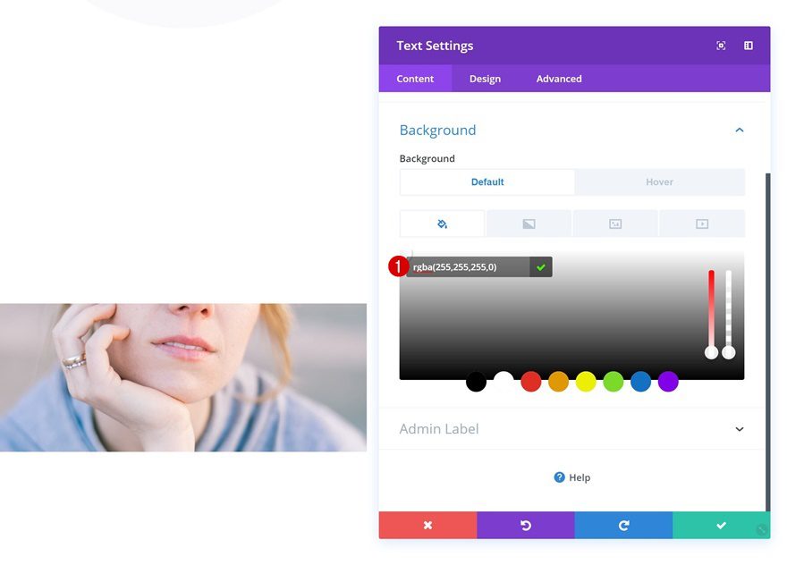
Let’s get started with the first example! Open the Text Module in the first column and add a background color.
- Background Color: rgba(255,255,255,0)
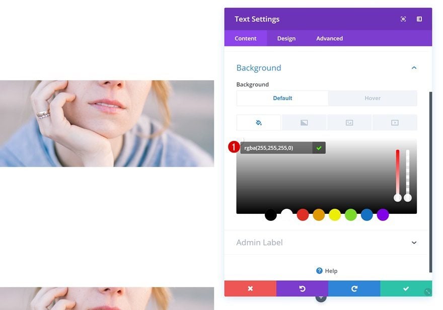
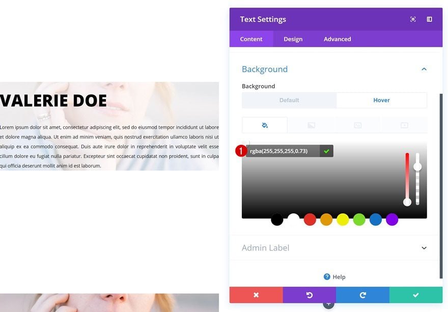
Hover Background Color
Change this background color on hover.
- Background Color: rgba(255,255,255,0.73)
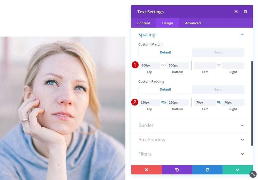
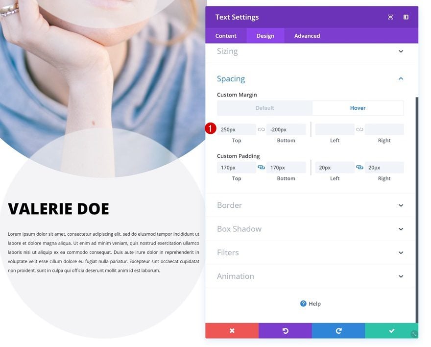
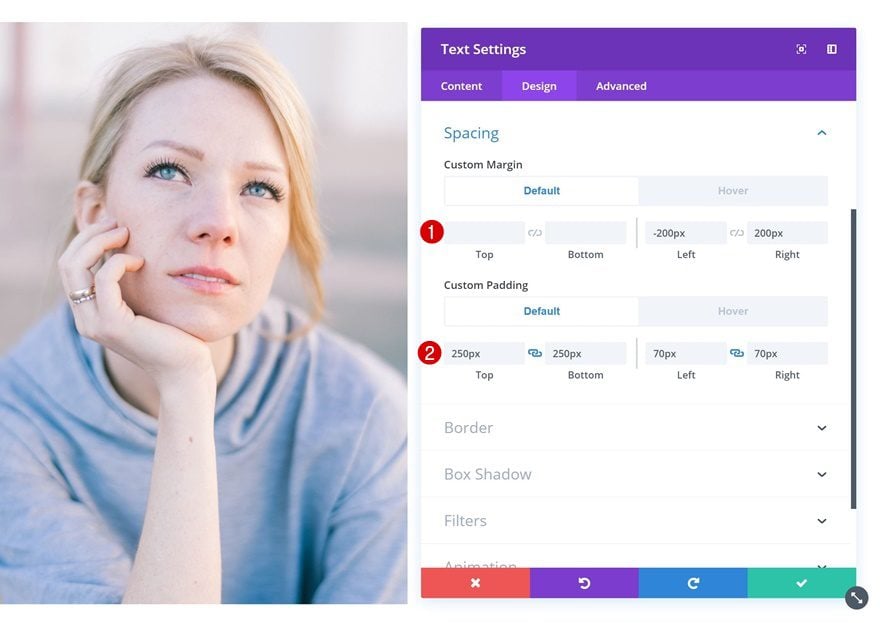
Default Spacing
Add some custom margin and padding next.
- Top Margin: -500px
- Bottom Margin: 500px
- Top Padding: 250px
- Bottom Padding: 250px
- Left Padding: 70px
- Right Padding: 70px
Hover Spacing
Change the values on hover.
- Top Margin: 0px
- Bottom Margin: 0px
- Top Padding: 100px
- Bottom Padding: 100px
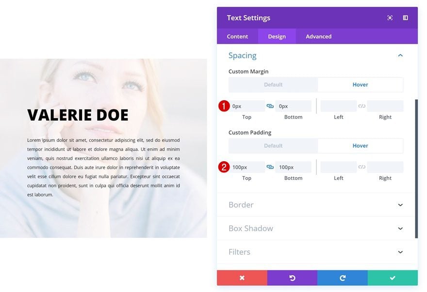
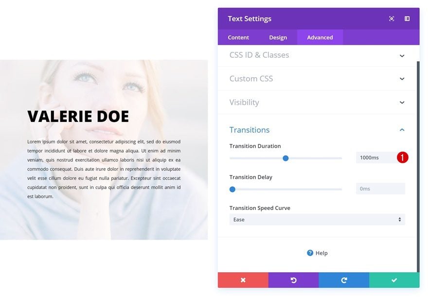
Transitions
Lastly, create a smooth transition by increasing the transition duration in the advanced tab.
- Transition Duration: 1000ms
Example #2
Change Text Module
Default Background Color
On to the next example! Open the Text Module in the first column and add a background color.
- Background Color: rgba(255,255,255,0)
Hover Background Color
Change the background color on hover.
- Background Color: rgba(226,246,255,0.85)
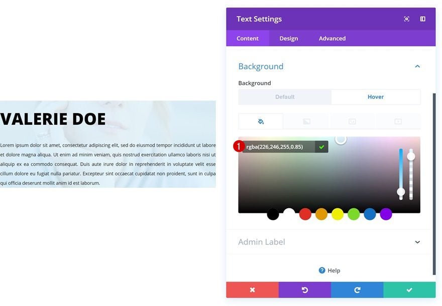
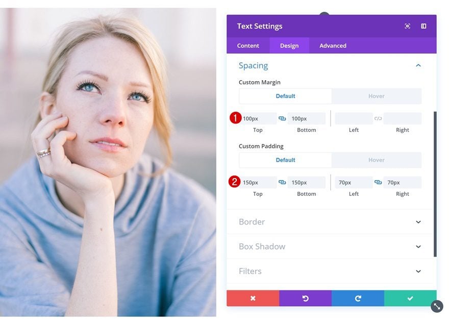
Default Spacing
Add some custom margin and padding values next.
- Top Margin: 100px
- Bottom Margin: 100px
- Top Padding: 150px
- Bottom Padding: 150px
- Left Padding: 70px
- Right Padding: 70px
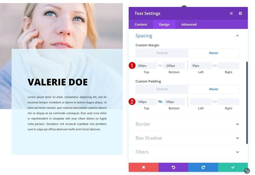
Hover Spacing
Change these values on hover.
- Top Margin: 200px
- Bottom Margin: -200px
- Left Margin: 50px
- Top Padding: 100px
- Bottom Padding: 100px
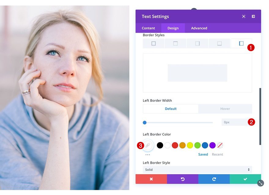
Default Border
Continue by adding a border to the Text Module.
- Left Border Width: 0px
- Left Border Color: #ffffff
Hover Border
And change the border width on hover.
- Left Border Width: 8px
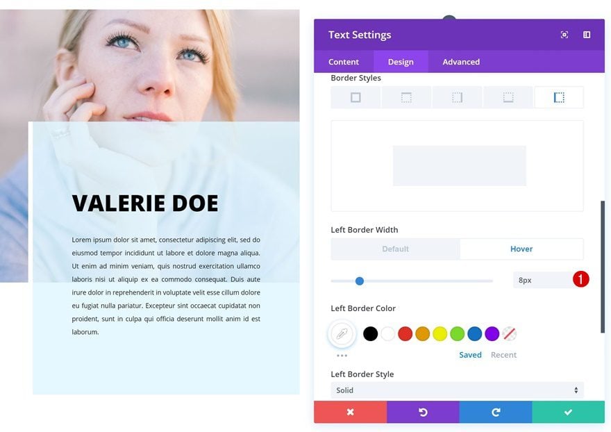
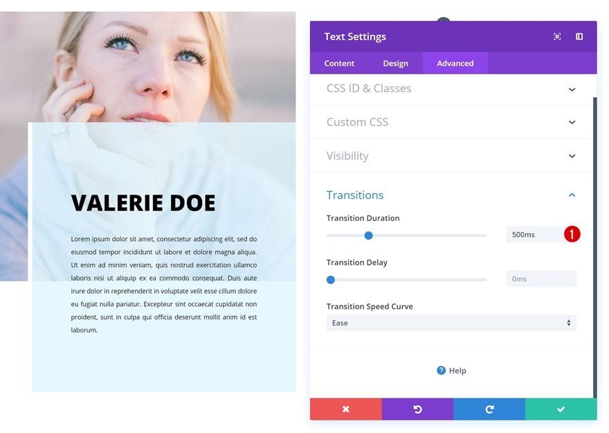
Transitions
Last but not least, increase the transition duration for a smooth transition.
- Transition Duration: 500ms
Example #3
Clone Text Module
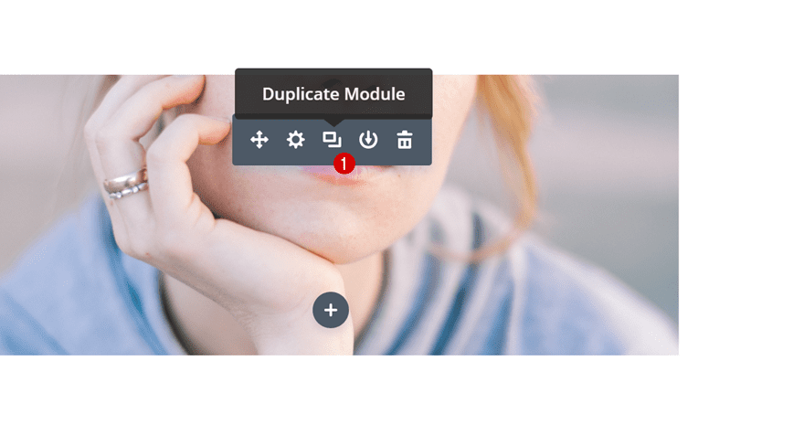
On to the third example! For this example, we’ll need to create a separate version for smaller screen sizes. Clone the Text Module in the first column.
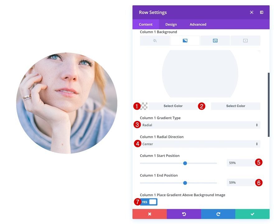
Add Column 1 Gradient Background
Then, open the row settings and add a gradient background to the first column using the following settings:
- Color 1: rgba(43,135,218,0)
- Color 2: #ffffff
- Column 1 Gradient Type: Radial
- Column 1 Radial Direction: Center
- Column 1 Start Position: 59%
- Column 1 End Position: 59%
- Column 1 Place Gradient Above Background Image: Yes
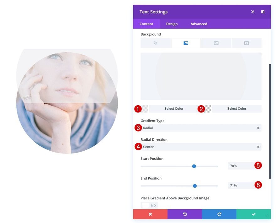
Change Text Module #1
Gradient Background
Open the first Text Module in column 1. This will be the description that appears on desktop. Add a gradient background.
- Color 1: rgba(239,239,239,0.65)
- Color 2: rgba(255,255,255,0)
- Gradient Type: Radial
- Radial Direction: Center
- Start Position: 70%
- End Position: 71%
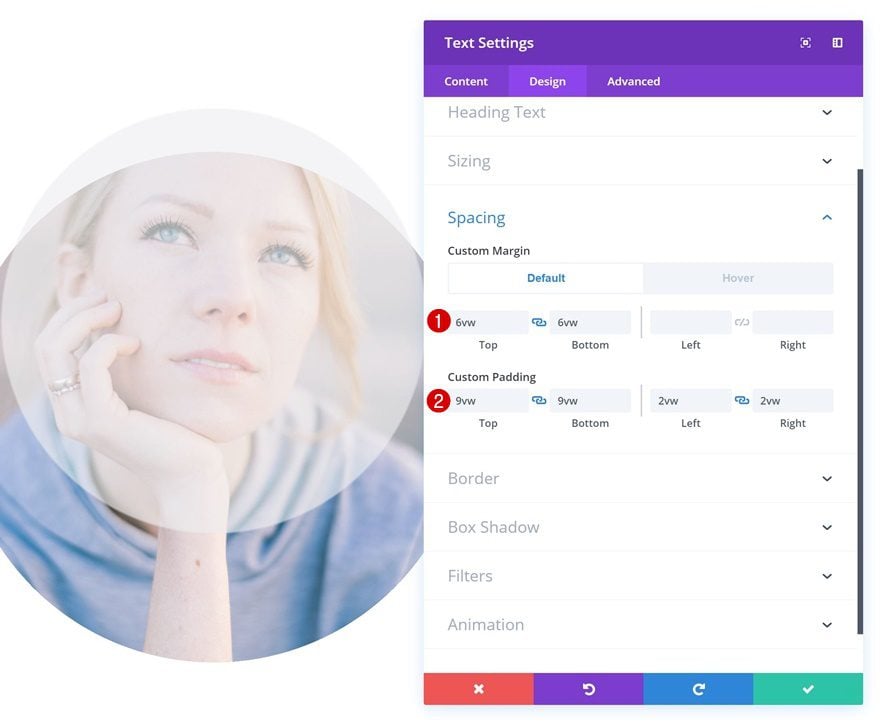
Default Spacing
Then, add some custom margin and padding values.
- Top Margin: 6vw
- Bottom Margin: 6vw
- Top Padding: 9vw
- Bottom Padding: 9vw
- Left Padding: 2vw
- Right Padding: 2vw
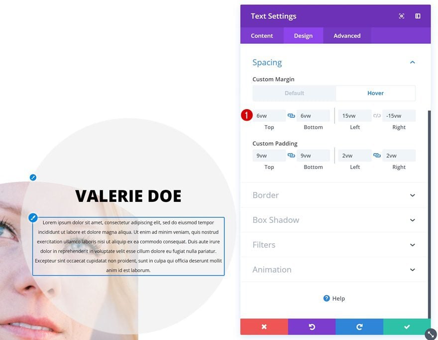
Hover Spacing
Change the margin values on hover.
- Left Margin: 15vw
- Right Margin: -15vw
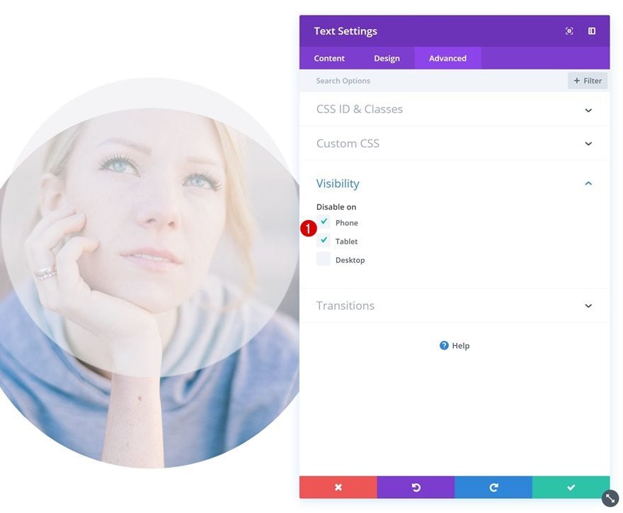
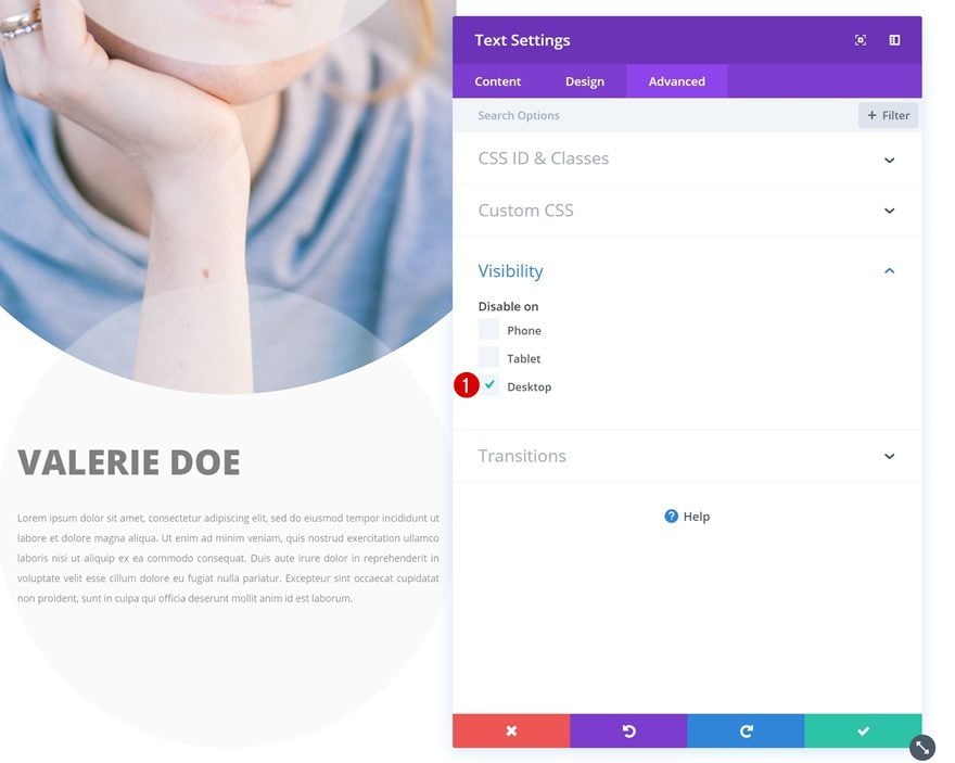
Visibility
And disable the module on tablet and phone.
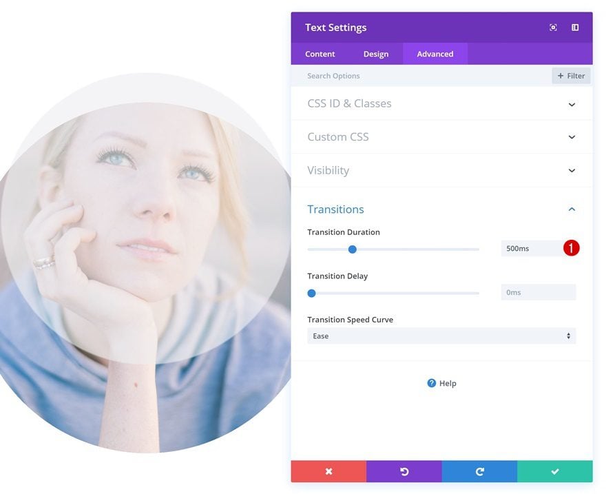
Transitions
Increase the transition duration as well.
- Transition Duration: 500ms
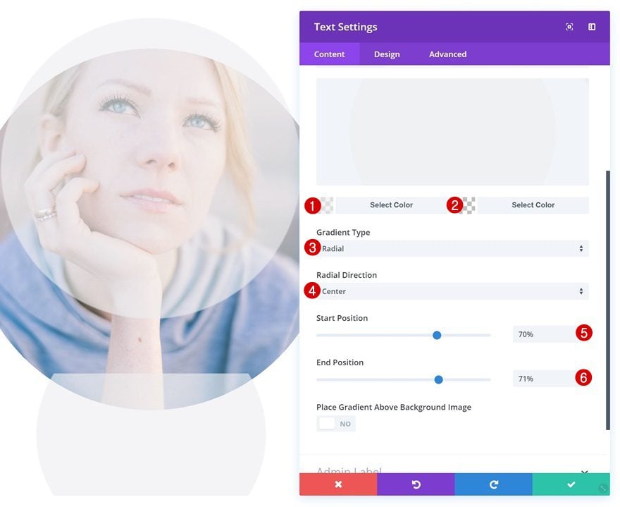
Change Text Module #2
Gradient Background
The second module in column 1 is the description that’ll appear on smaller screen sizes. Start by adding a gradient background.
- Color 1: rgba(239,239,239,0.65)
- Color 2: rgba(255,255,255,0)
- Gradient Type: Radial
- Radial Direction: Center
- Start Position: 70%
- End Position: 71%
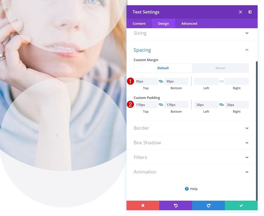
Default Spacing
Add some custom margin and padding values next.
- Top Margin: 95px
- Bottom Margin: 95px
- Top Padding: 170px
- Bottom Padding: 170px
- Left Padding: 20px
- Right Padding: 20px
Hover Spacing
Change the margin values on hover.
- Top Margin: 250px
- Bottom Margin: -200px
Visibility
And disable the module on desktop.
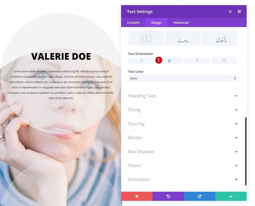
Change Text Orientation of Both Text Modules
Last but not least, make sure you change the text orientation of both modules as well to achieve the desired outcome.
- Text Orientation: Center
Example #4
Change Text Module
Default Background Color
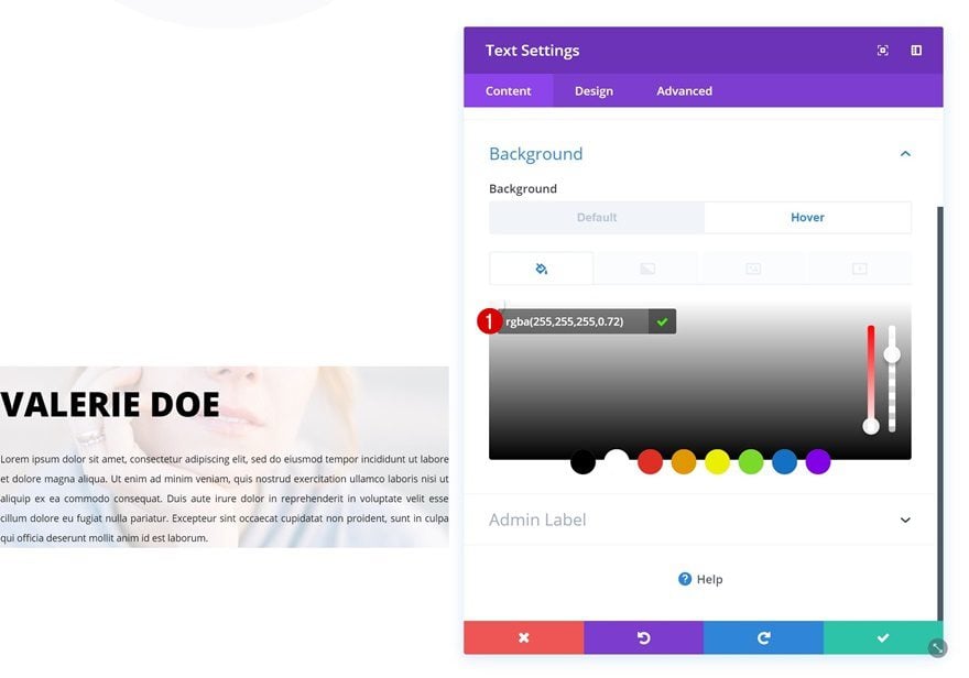
On to the fourth and last example! Add the following background color to the Text Module in column 1:
- Background Color: rgba(255,255,255,0)
Hover Background Color
Change this background color on hover.
- Background Color: rgba(255,255,255,0.72)
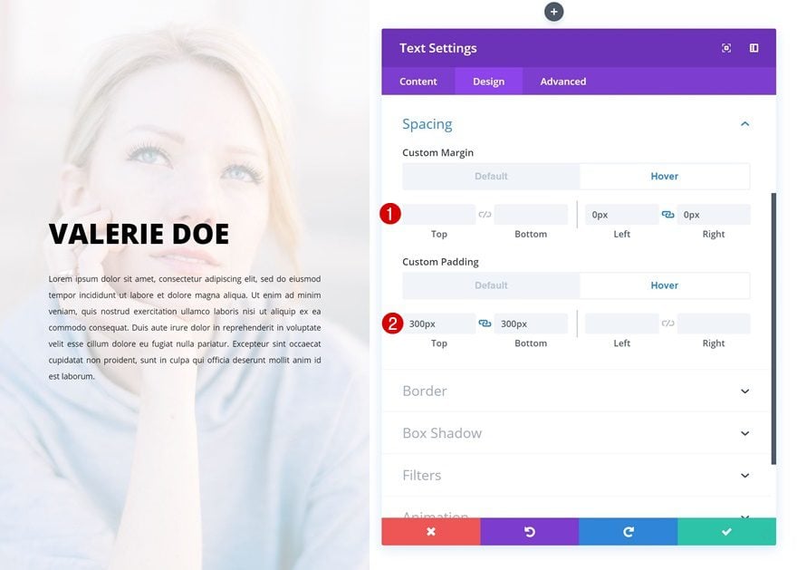
Default Spacing
Go to the spacing settings next and add some custom margin and padding values there.
- Left Margin: -200px
- Right Margin: 200px
- Top Padding: 250px
- Bottom Padding: 250px
- Left Padding: 70px
- Right Padding: 70px
Hover Spacing
Modify these values on hover.
- Left Margin: 0px
- Right Margin: 0px
- Top Padding: 300px
- Bottom Padding: 300px
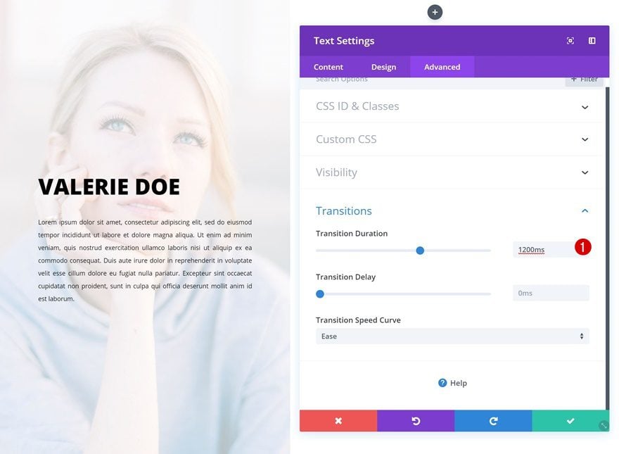
Transitions
Last but not least, increase the transition duration for a smooth transition.
- Transition Duration: 1200ms
Preview
Now that we’ve gone through all the steps, let’s take a final look at the outcome on different screen sizes.
Desktop
Mobile
Final Thoughts
In this post, we’ve shown you how you can creatively use Divi’s hover options to showcase person descriptions on hover. With these four examples, you are ready to transform any testimonial or team member description into an interactive design element on your page. If you have any questions or suggestions, make sure you leave a comment in the comment section below!


Is there a way to have the text module dismissed when the User taps on the same photo when on a mobile? I have noticed that when hovering over the photos some of the examples don’t have the text module covering all of the photo so there are some miss hits if the user dose not hover over the right place. Is there away to fix this?
Thanks Vuni, you are ever creative!
When there are three sets like this in a row and the first one hovers with a right move, what happens? Do the other two images move away or get covered?
Great question! I make this mine as well.
Would be helpful to show adding social media and email icons with links… would appreciate it.
tks
Loved this. Very helpful!
today I see your blog very useful I like this guide for my blog, btw nice keep it up and share more knowledge like this…
Another amazing Divi tutorial, thanks a lot for sharing 🙂
Wow, pretty cool. Thanks a lot.
Marvelous feature by Divi. A problem came to end with this solution. Now it will be easy in transforming text modules. Loving it.
I like this feature, but have some questions (anyone feel free to answer):
– does Google and other search engines crawl hovered content?
– how do hover elements work on touchscreens?
Yes, google can crawl that, all content is in the source code and the only difference is that it’s presented on hover with some css…
It seems easy. Thanks a lot.
Awesome blog and i have never ever seen like this one which is full of informative for both mens and womens.
You can never underestimate the value that these tutorials add to using the Divi theme and the membership.
A suggestion for a future tutorial and one I spent a while working out today: the hover over the cyber Monday Huge Sale call outs on:
https://www.elegantthemes.com/cyber-monday-2018/
There is some subtle styling and a future feature update that includes overflow controls/styling comes in handy.