

Using text as an abstract design element can be a great way to give a unique look to your site without having to create custom graphics or images. You can use the text for strictly abstract aesthetic appeal or you can have them serve as a creative and subtle message to your viewers.
Today, I’m going to show you how you can use Divi and its text module to add any text content you want as an abstract design element on your website. I’m going to include a couple of examples that will hopefully be an inspiration for your future projects.
Let’s get started.
Sneak Peek
Here is a peek of the designs we will create in this tutorial.
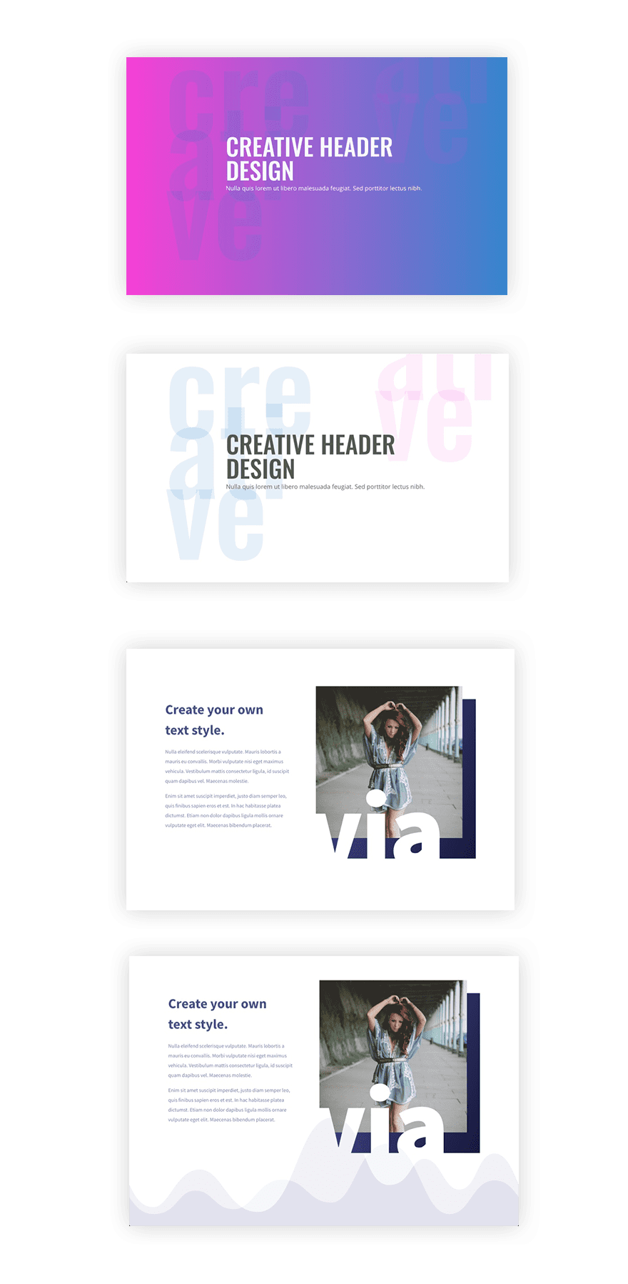
How to Use Text as an Abstract Design Element in Divi
Subscribe To Our Youtube Channel
How to Use Large Text as a Header Background
Using large text to create a unique background is a great way to spice up a plain background color and add a texture element. Here’s how to do it.
First, create a regular section with a one-column row.
Then add your first text module which will include the header for your page.
In the text module settings, add whatever text you want to add to the content field. For this example I’m going to use the word “creative”. Since I want to break up the word, I’m going to use the text tab of the content field and add some html with break tags.
Add the following html under the text tab of the content field…
<p>cre<br>ati</br>ve</p>
Next update the design tab options…
Text Font: Oswald
Text Text Size: 400px (Desktop) and 200px (tablet)
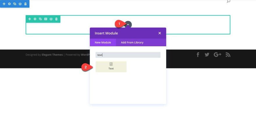
Text Text Color: rgba(12,113,195,0.11)
Text Line Height: 0.5em
The text line height is actually where we occomplish overlapping of the text. This overlapping combined with the semi-transparent color of the text adds a cool effect. But if you would rather the text not overlap, simply increase the line height.
You can also add a text shadow to your text to create a duplicate of the text that can be placed anywhere on the section. You can even give it a different color as well.
Text Shadow Horizontal Length: 1.72em
Text Shadow Vertical Length: -0.81em
Text Shadow Color: rgba(244,0,204,0.08)
Save Settings.
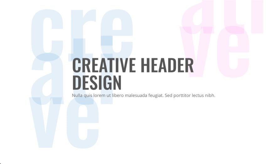
Here is what we have so far.
Now we need to add our text module that will hold our actual header text. Simply add a text module under the text module used for your background text. Then update the settings as follows:
Content:
<h1>Creative Header<br />Design</h1>
Nulla quis lorem ut libero malesuada feugiat. Sed porttitor lectus nibh.
Text Font: Open Sans
Text Text Size: 20px
Heading Font: Oswald
Heading text Size: 80px (Desktop) and 42px (Tablet)
Heading text color: #555555
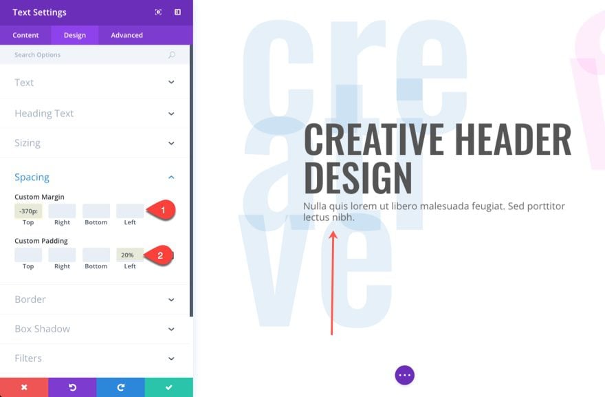
Custom Margin: -370px Top (desktop) and -240px (tablet)
Custom Padding: 20% Left (desktop) and 0% (tablet)
The negative top margin is used to vertically center the header text over the background text. I also adjusted the margin and padding for mobile as well.
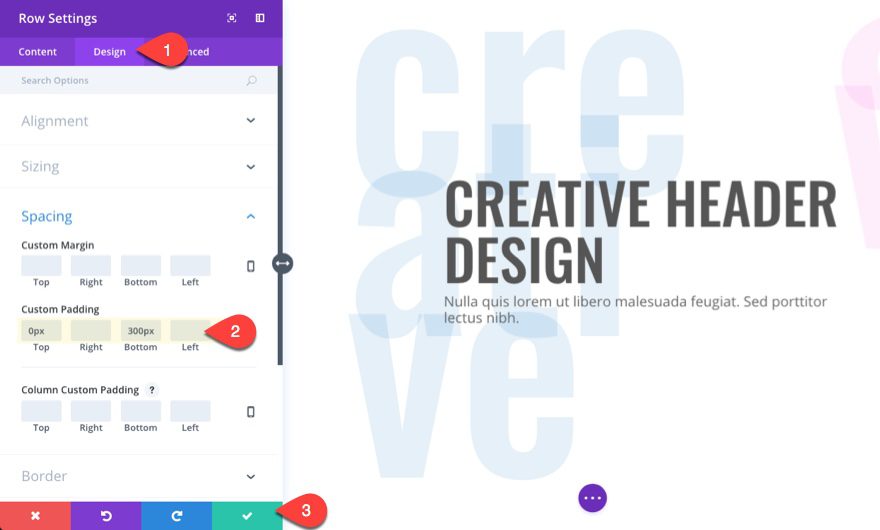
Since the negative margin value pulled our margin up 370px, we need to add some space back by adding bottom padding to our row. Go to the row settings and update the following:
Custom Padding (desktop): 0px Top, 300px Bottom
Custom Padding (tablet): 0px Top, 150px Bottom
The 0px Top padding pulls the content up so that you have more room above the fold. The 300px bottom padding adds the space to fill in for the text module’s -370px top margin.
Save your settings.
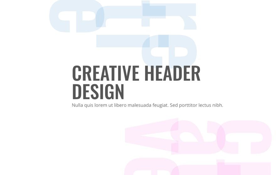
Now you are done. Check out the result.
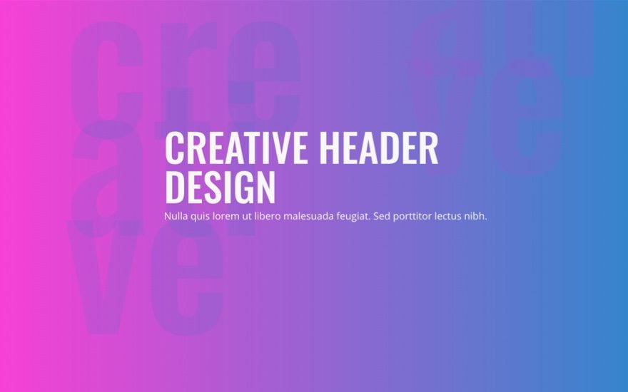
Feel free to adjust the settings to create your own custom design. For example, I added a background gradient to the section with the following:
Colors: rgba(244,0,204,0.82) and rgba(12,113,195,0.86)
Gradient Direction: 90deg
Then I changed my header text to white and created a unique design with the background text adding a nice colorful texture.
You can always rotate your text in order to create even more unique backgrounds. All you would need to do is add a short snippet of CSS.
To add the CSS, go to the text module settings and enter the following Custom CSS code in the Main Element box under the Advanced tab.
transform: rotate(90deg)
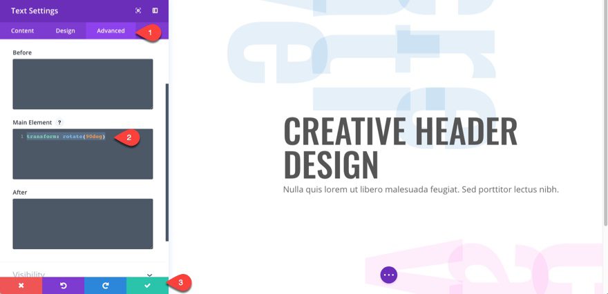
This css sets the text module content to rotate 90 degrees from its original position. The result is vertical text.
But you can adjust the degree to whatever value you want for different designs.
Here is the result.
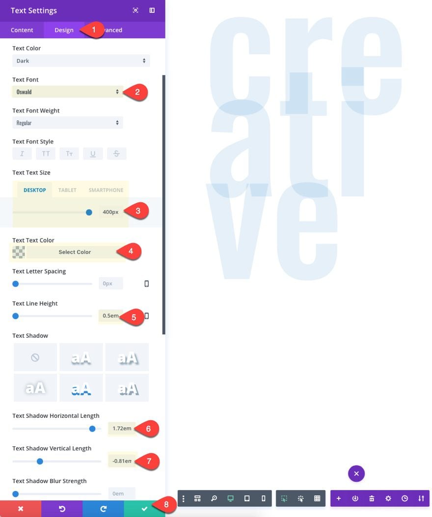
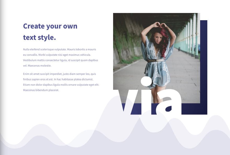
How to Use Text as Unique Image Overlays
Using text as an image overlay is a great way to add a little extra style to your your images.
To complete this design, let’s use one of our premade layouts. Create a new page, deploy the visual builder, and add the Fashion Landing Page Layout to your page.
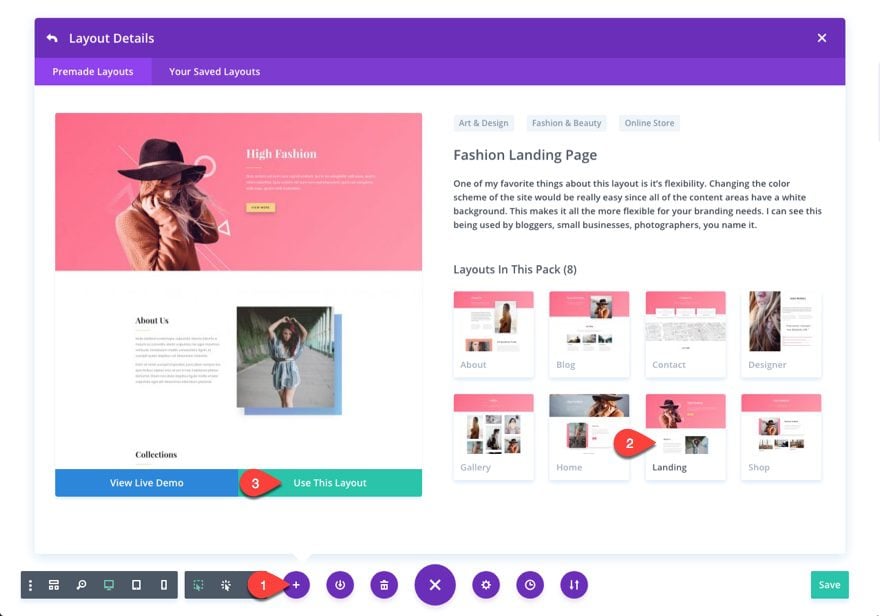
Then delete all of the sections except for the “About Us” section below the main header section.
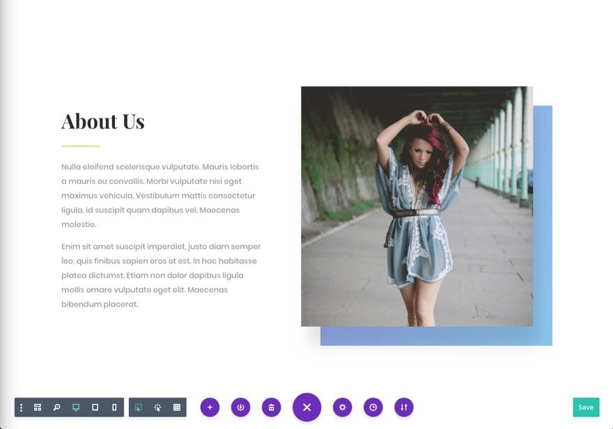
Now we are going to add a text module below the image in the right column of the row.
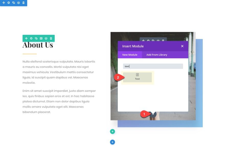
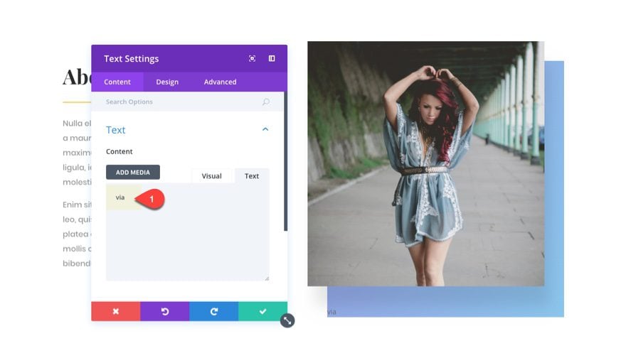
In the content field, add the letters “via”.
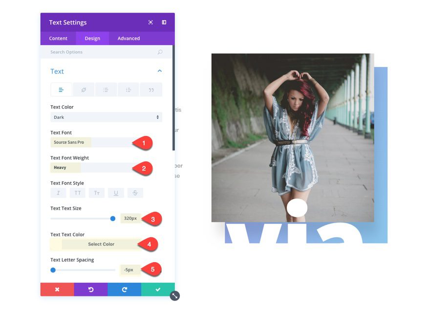
Then update the design tab settings as follows:
Text Font: Source Sans Pro
Text Font Weight: Heavy
Text Text Size: 320px (desktop) and 290px (tablet)
Text Color: white (#ffffff)
Text Letter Spacing: -5px
The text color should be the same color as the section background color in order to hide the bottom portion of the text not overlapping the image.
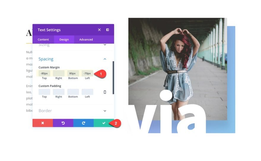
Now we need to add some custom margins to position the text over the image.
Custom Padding: -80px Top, 80px Bottom, -70px Left
The text overlay is done. Now we need to update the design of the rest of the section content to give it a more polished look.
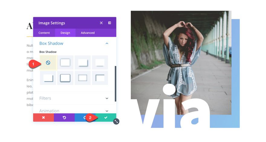
Update the image module in the right column by getting rid of the box shadow.
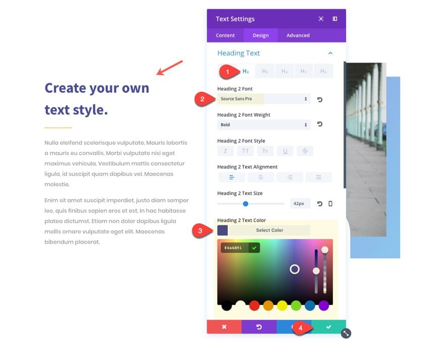
Next, update the settings for the text module at the top of the left column with the following:
Content:
<h2>Create your own<br />text style.</h2>
Heading 2 Font: Source Sans Pro
Heading 2 Text Color: #4a4d91
Delete the divider module directly under the text module you just updated.
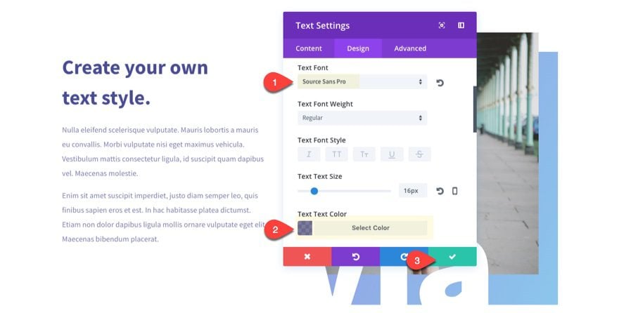
Then update the last text module in the left column with a font to match the design.
Text Font: Source Sans Pro
Text Text Color: rgba(74,77,145,0.73)
Now we need to change the color of our column 2 gradient background. To do that, edit the row settings and change the background gradient colors to the following:
Column 2 Background Gradient: #4a4d91 and #181a3d
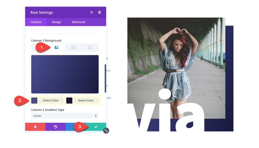
Now the colors of the text and gradient match and offer a nice contrast to our text overlay.
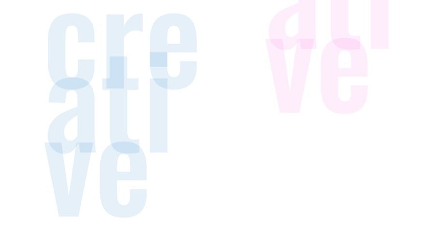
If you want, you can add a section divider at the bottom that will overlay the bottom of your section content and give the impression that the text is floating.
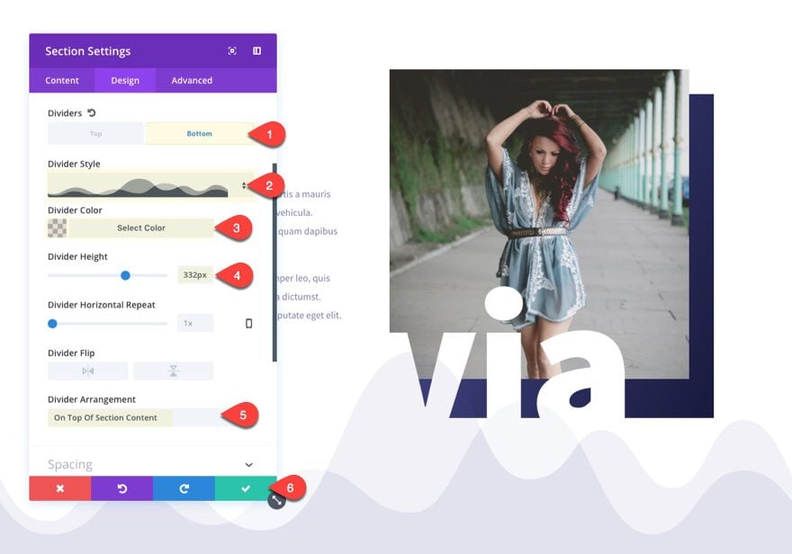
To create the section divider, go to the section settings under the design tab. Select the to edit the Bottom divider. Then update the following:
Divider style: see screenshot
Divider Color: rgba(74,77,145,0.16)
Divider Height: 332px
Divder Arrangement: On Top Of Section Content
Custom Padding: 200px Bottom
The trick here is to set your divider arrangment on top of the section content so that it overlays your text that is sitting on top of the image.
Here is the final result.
Final Thoughts
With the hundreds of fonts and design combinations availble in Divi, you have a great design resource for adding abstract text elements on your website. And unlike images, you can change the text and design easily from within the Divi builder without have to use a photo editor. But keep in mind that you will need to make sure and adjust the text sizes and spacing for your mobile devices to make sure the design is responsive.
So go ahead and try it out. Add a new abstract text design to you next project.
I look forward to hearing from you in the comments.
Cheers!


wow!
Great nugget, Jason! It’s been a while since I’ve updated my Divi site, and I’m going to add this to some pages later this month.
Thanks Jason, I really enjoyed playing around with these, especially the first one .. really nice effect.
Just letting you know that the instructions for adding the custom margins to the text say “margins” and then the specific line with settings says “padding” instead. No big deal as the picture shows the correct one but it threw me for a minute.
Otherwise, a great, simple and effective tutorial. 🙂
I LOVE this post.
THANK YOU SO MUCH!
These tutorials are getting very good. Thank you. Will definitely be using this.
abstract design id gives a great look
Love you guys!
Really enjoyed running these up on my test site. When you do the three variations of the first example one after the other the abstracted text overlaps nicely from one section to the next. Nice!
I concur with what Britt is saying. All these tutorials and the layout pack are not something we necessarily need to use straight out of the box. We can use them as a source of inspiration for our own creations.
Keep up the good work!
So good to hear! Being a source of design inspiration was definitely the goal here. Thanks.
Wew, thanks alot Jason, thats great tutorial
Looove it.. ??
Fascinating tip, looks awesome, thank you 🙂
Thumbs Up 😉
Now this is something really interesting to see, thanks Jason Champagne for sharing this wonderful post in easy readable format.
You are very welcome. Glad you liked it.
Great tutorial. I like it, Because its very helpful in my work
Nice and Useful article. Thanks ET!
Now this is what I’ve been talking about with wanting to see more creative out of the box stuff. Love it!
Nice!
Cooooooooooooooooooooooooooooooool
So many clever ideas and a great looking final effect…
Thanks Jason
I LOVE this! Thank you.
YES!! Thank you!
Fantastic!! Thank you for the nice nugget!