

Divi’s text and list style options are a common feature available within most Divi Modules. This opens new opportunities to design creative content and list designs within modules (like the toggle and accordion module) that were previously only possible within the text module. The trick is to setup your content with the appropriate html so that you can target those items using the built-in design settings.
In this tutorial, I’m going to show you how to use Divi’s text and list style options for unique toggle and accordion content designs. This will come in handy whenever you want incorporate different text designs without having to use CSS classes or inline css.
Let’s get started.
- 1 Sneak Peek
- 2 Download the List Style Designs for Toggles and Accordions Layout for FREE
- 3 Download For Free
- 4 You have successfully subscribed. Please check your email address to confirm your subscription and get access to free weekly Divi layout packs!
- 5 What You Need to Get Started
- 6 Part 1: Using List Styles in Toggle Modules
- 7 Part 2: Using List Styles in Accordion Modules
- 8 Part 3: Using List Styles to Create Multiple Column content in a Toggle Module
- 9 Final Thoughts
Sneak Peek
Here is a quick look at the designs we will build using Divi’s text and list style options.
Download the List Style Designs for Toggles and Accordions Layout for FREE
To lay your hands on the designs from this tutorial, you will first need to download it using the button below. To gain access to the download you will need to subscribe to our newsletter by using the form below. As a new subscriber, you will receive even more Divi goodness and a free Divi Layout pack every Monday! If you’re already on the list, simply enter your email address below and click download. You will not be “resubscribed” or receive extra emails.

To import the layout to your page, simply extract the zip file and drag the json file into the Divi Builder.
Let’s get to the tutorial shall we?
What You Need to Get Started
To get started, you will need to have the following:
- The Divi Theme installed and active
- A new page created to build from scratch on the front end (visual builder)
- Images to be used for mock content
After that, you will have a blank canvas to start designing in Divi.
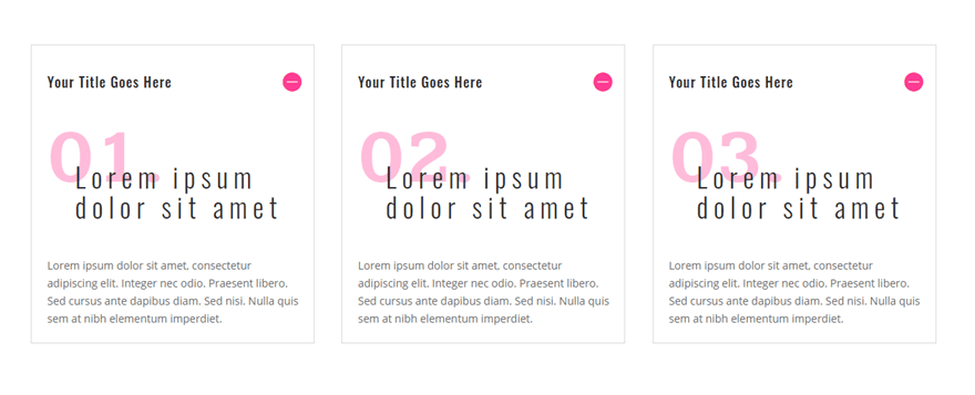
Part 1: Using List Styles in Toggle Modules
In this first part of the tutorial, we are going to create three toggles that each have content designed using list style options. This will be useful for separating your list items in separate toggles almost like a custom blurb of content.
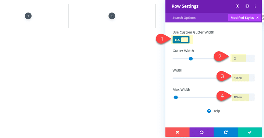
First create a regular section with a three-column row. Then update the row settings as follows:
Gutter Width: 2
Width: 100%
Max Width: 90vw
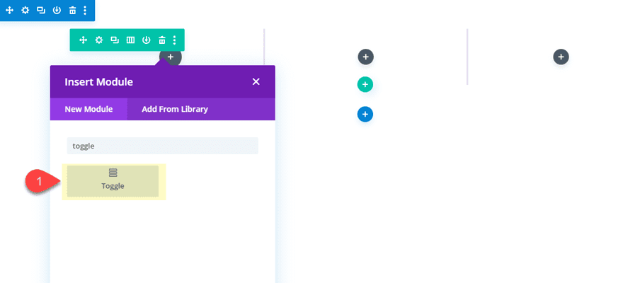
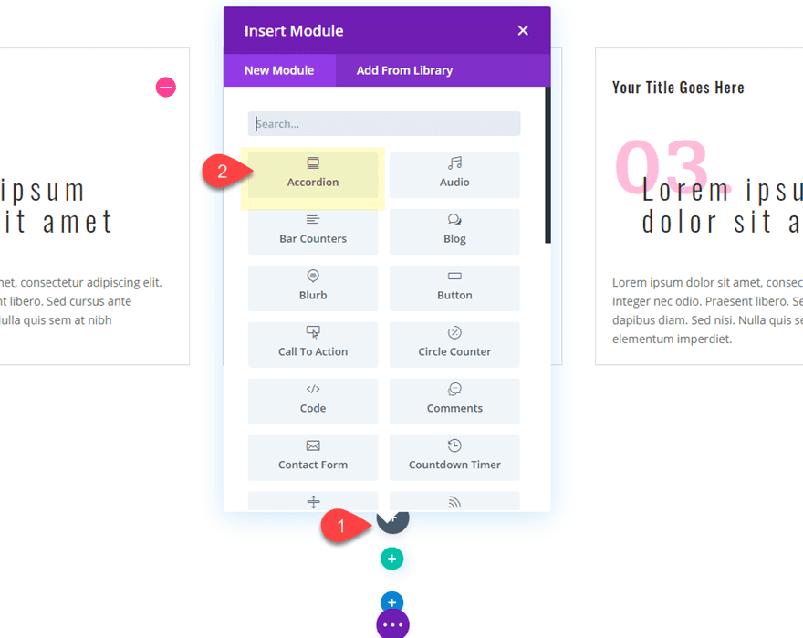
Add a Toggle Module
Next, add a toggle module to column 1. This will be the first of three toggle modules that will be added to each of the three columns.
Add the Toggle HTML Content
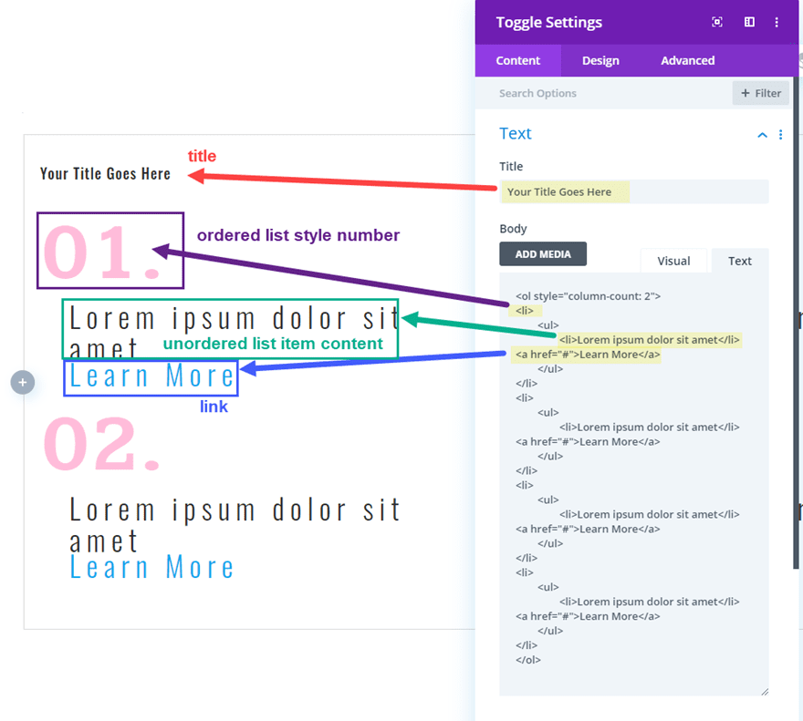
The HTML content is key to this design. In order for us to take advantage of the different list styles within the Divi toggle settings, we need to add HTML lists to our content box.
Go ahead and paste the following HTML into the
Body content box.
<ol start="1">
    <li>
        <ul style="margin-top: -1.5em;">
            <li>Lorem ipsum dolor sit amet</li>
        </ul>
    </li>
</ol>
<p>Lorem ipsum dolor sit amet, consectetur adipiscing elit. Integer nec odio. Praesent libero. Sed cursus ante dapibus diam. Sed nisi. Nulla quis sem at nibh elementum imperdiet.</p>
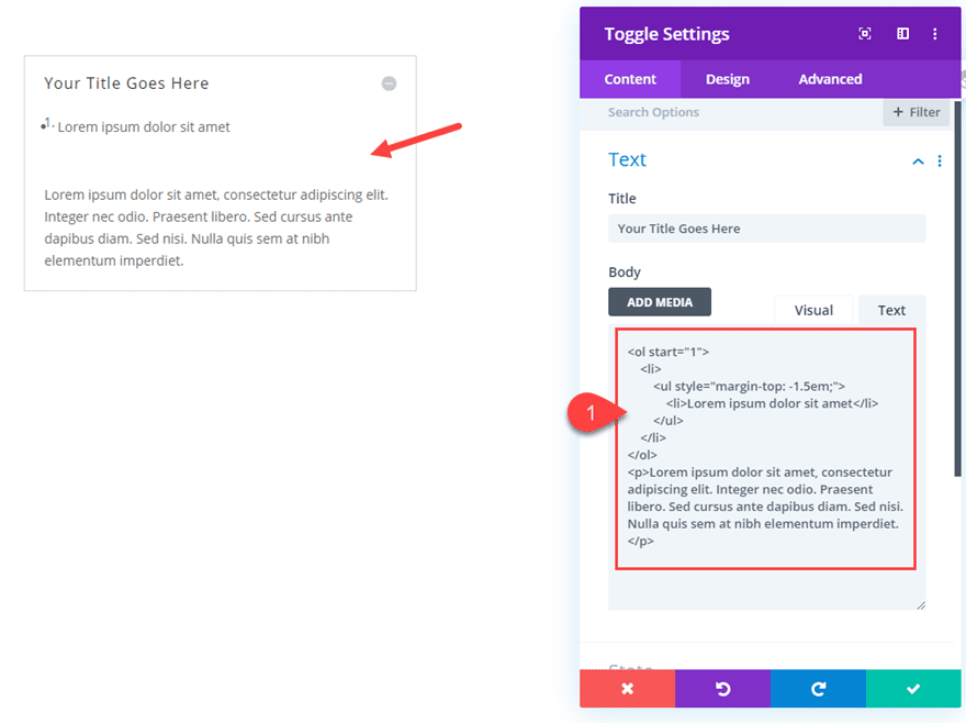
Now this piece of HTML code creates an ordered list using the ol tag. The ordered list has only one list item (li) which is a nested unordered list (ul) with one list item (li) that has some mock content. Under the ordered list is a basic paragraph of text.
With this setup, we can target each of those tags (ol, ul, p) for different styling using Divi’s built in text styles which include list styles.
Notice the beginning ol tag has start=”1″ inside it. This tells the list which number to start with listing the numbers of the ordered list with each list item. Technically, this is not necessary for the first number because it will automatically start with 1 by default. But we will need it for the next toggles we will add.
Also, the unordered list tag has some inline styling to bring the ul content up a bit using negative margin. This is how we will overlap number of the ordered list with the text of the unordered list in the design.
Styling the Content
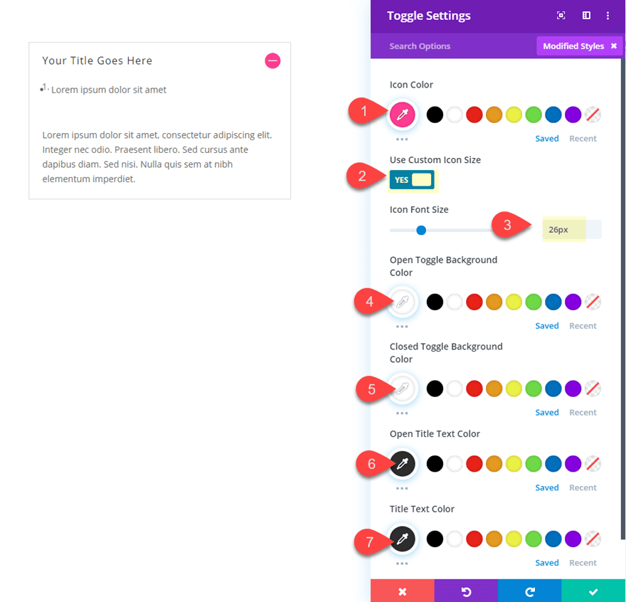
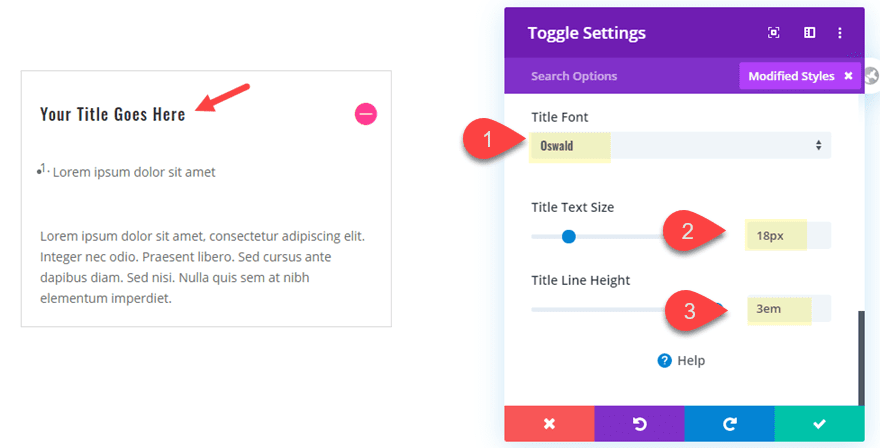
Now we can start adding some colors and font styles using the built-in settings and list styles. Update the toggle design settings as follows:
Icon Color: #ff3d97
Icon Font Size: 26px
Open Toggle Background Color: #ffffff
Closed Toggle Background Color: #ffffff
Open Title Text Color: #333333
Title Text Color: #333333
Title Font: Oswald
Title Text Size: 18px
Title Line Height: 3em
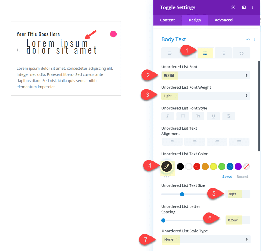
Unordered List Font: Oswald
Unordered List Font Weight: Light
Unordered List Text Color: #333333
Unordered List Text Size: 36px
Unordered List Style Type: None
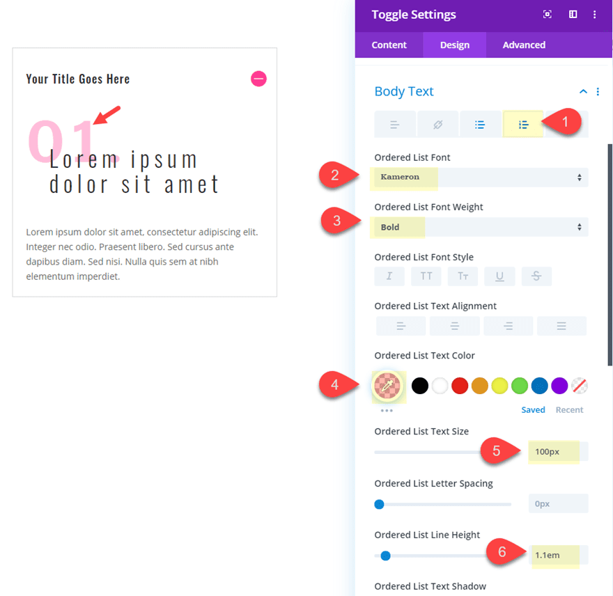
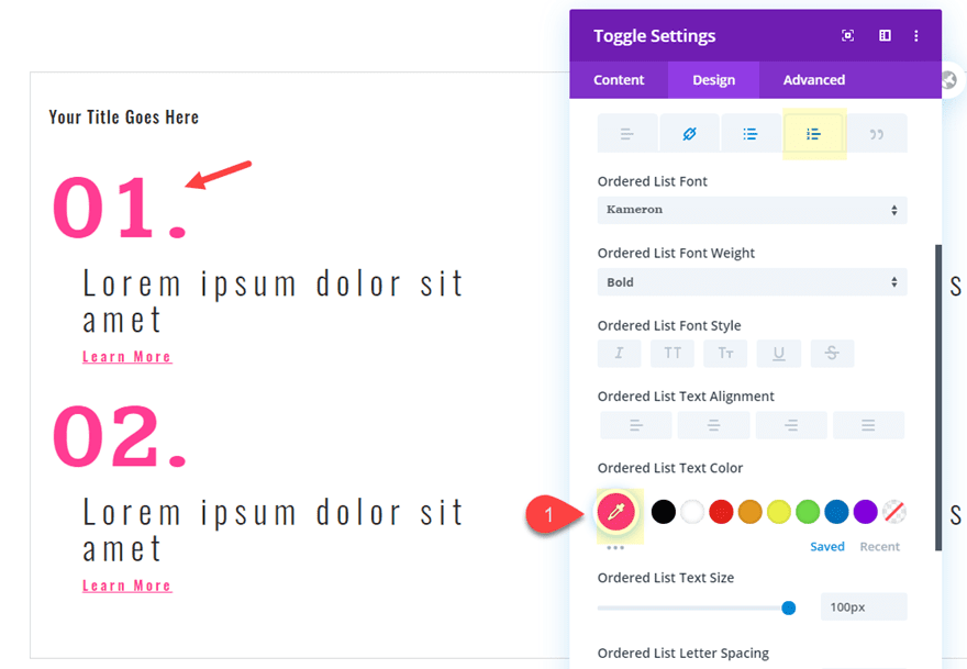
Ordered List Font: Kameron
Ordered List Font Weight: Bold
Ordered List Text Color: rgba(255,61,151,0.34)
Ordered List Text Size: 100px
Ordered List Line Height: 1.1em
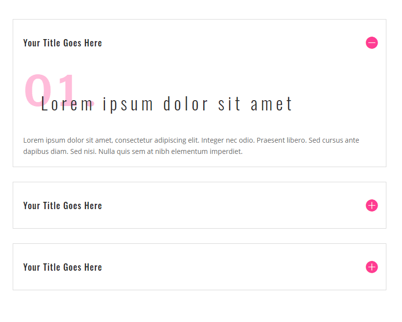
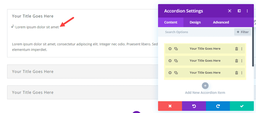
Duplicate First Toggle Module to Create the Other Toggles
To create the toggles for column 2 and 3, we are going to duplicate the toggle module we just finished designing. Then we can drag those into each column so that each column has the same toggle module.
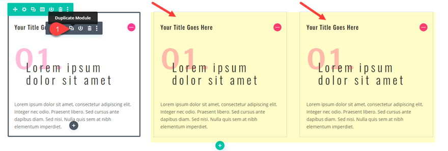
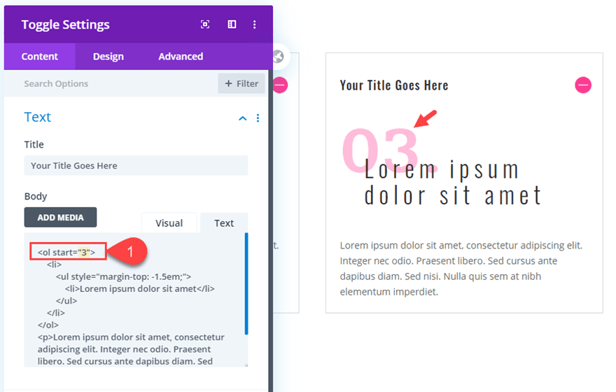
Update the Ordered List Start Numbers
For the duplicate toggle in column 2, we need to have the ordered list start with the number “2” instead of “1”. To change this, open the toggle module settings and change the start number in the ol tag to “2”.
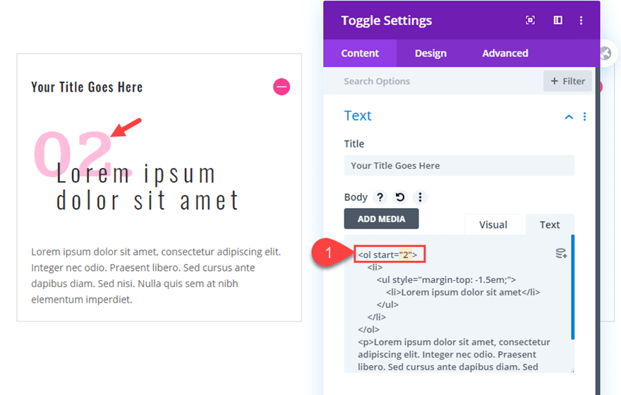
You will also need to update the toggle in column 3 with the ordered list start number of “3”.
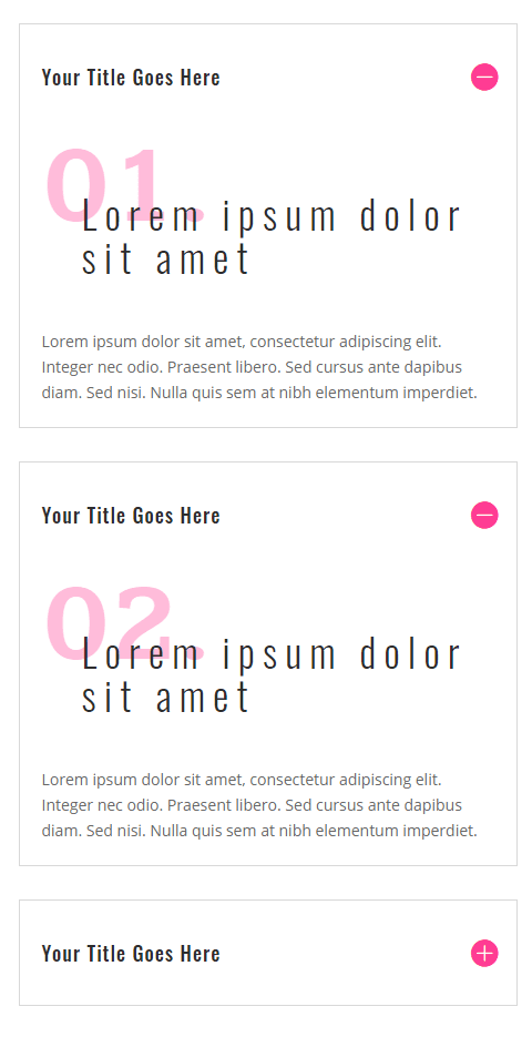
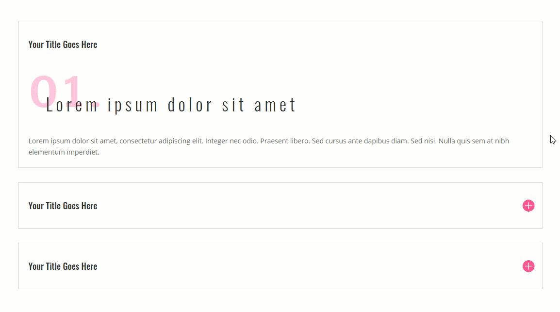
Final Design
Now let’s check out the final design.
Part 2: Using List Styles in Accordion Modules
In this second part of the tutorial, I’ll show you a quick and easy way to bring the list style content designs from the toggle module to an accordion module. The process is easy because you can use the same text and list styles in an accordion module (or pretty much any module) that we used in our previous toggles. To do this, first create a new section with a one-column row. Then add an accordion module to the row.
Then duplicate one of the two default accordions under the content tab for a total of three accordions. Then update the content for each individual accordion with the same exact toggle html content within each of the three toggles we created earlier.
Extend Toggle Styles to the Accordion
One quick way to carry over the styling from the toggles we created over to the accordion module is to use the extend styles feature. To do this, open up one of the toggle modules and right click on the icon style category and select “extend icon styles” from the right click menu. Then select to extend this icon’s styles to “All Accordions” throughout “This Page”.
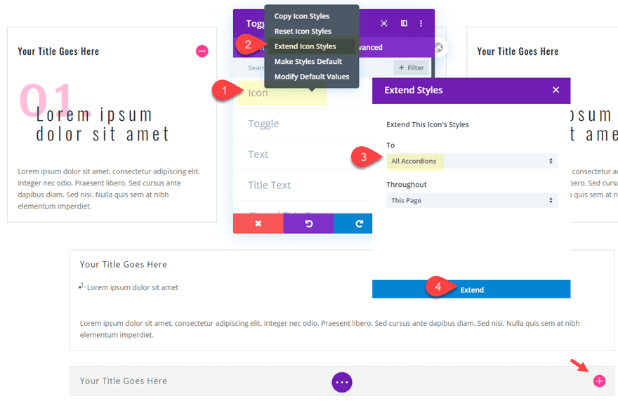
Then do the same for each of the design categories that have custom styling that needs to be extended to the accordion module. These include styling for “Toggle” “Title Text”, and “Body Text”.
Then check out the final result for the accordion design.
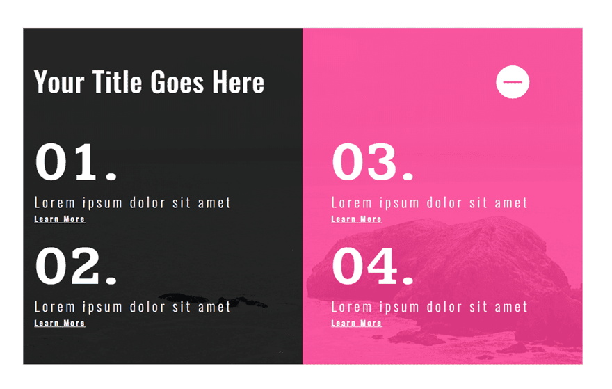
Part 3: Using List Styles to Create Multiple Column content in a Toggle Module
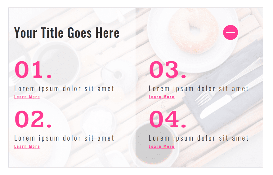
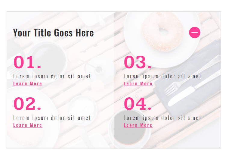
In this third part of the tutorial, I’m going to show you how you can create multiple columns of content for your list style designs.
First, create a new section with a one-column row. Then copy and paste one of the toggle modules we created earlier into the row.
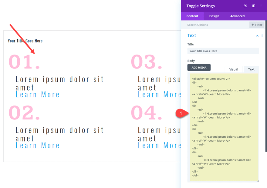
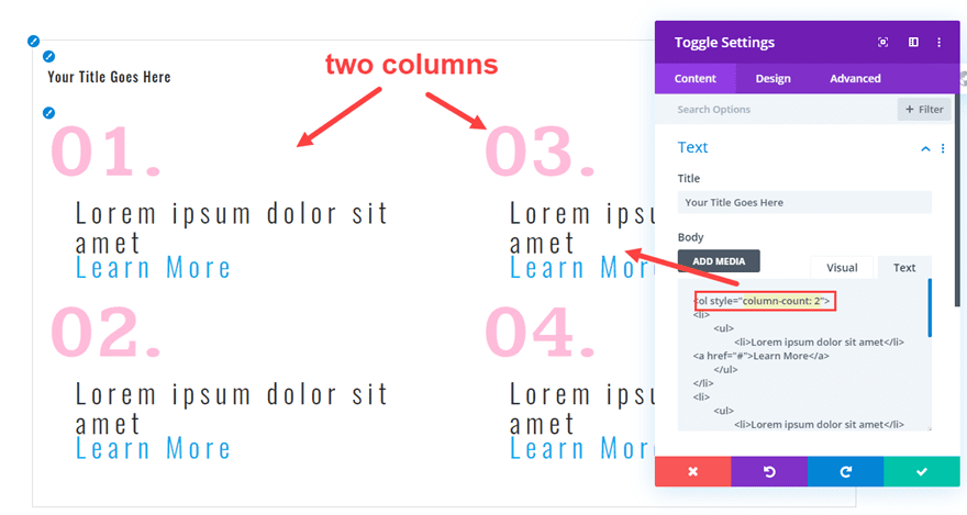
Then update the toggle module body content with some new HTML as follows:
<ol style="column-count: 2">
<li>
        <ul>
	        <li>Lorem ipsum dolor sit amet</li>
<a href="#">Learn More</a>
        </ul>
</li>
<li>
        <ul>
	        <li>Lorem ipsum dolor sit amet</li>
<a href="#">Learn More</a>
        </ul>
</li>
<li>
        <ul>
	        <li>Lorem ipsum dolor sit amet</li>
<a href="#">Learn More</a>
        </ul>
</li>
<li>
        <ul>
	        <li>Lorem ipsum dolor sit amet</li>
<a href="#">Learn More</a>
        </ul>
</li>
</ol>
Notice the “column-count:2” inline style attribute that has been added to the beginning ol tag. This will allow the ordered list content to be structured into two columns instead of one. You can change this to any number for more columns as needed.
And notice how we have the ability to use Divi’s built-in design settings for the title, link, and list styles.
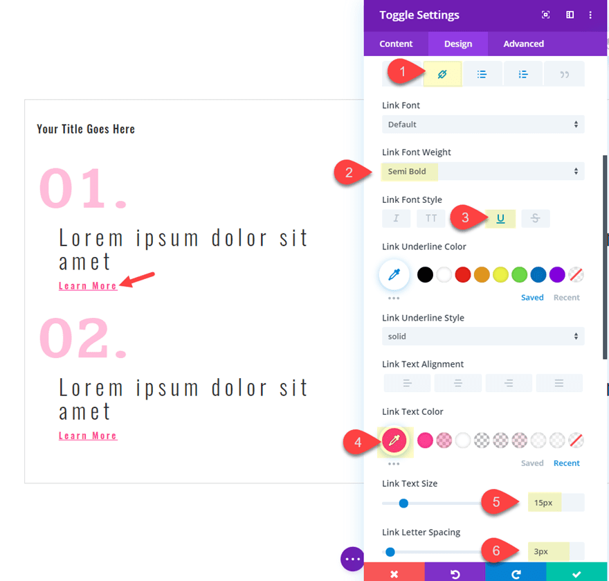
Styling the Link Text
Since the title and list styles are already in place from the previous design, all we need to do is add some design for the link text.
Open the toggle settings and update the following:
Link Font Weight: Semi Bold
Link Font Style: Underline
Link Text Color: #ff3d97
Link Text Size: 15px
And since we aren’t overlapping any text with this design, go ahead and give the ordered list style numbers a brighter color as follows:
Ordered List Text Color: #ff3d97
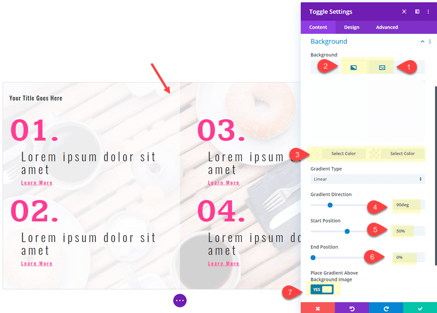
Add a Background to the toggle
To finish the design, we can add a custom background to our toggle. To do this, update the following toggle settings:
Background Image: [upload image of your choice]
Background Gradient Left Color: rgba(255,255,255,0.92)
Background Gradient Right Color: rgba(255,255,255,0.8)
Gradient Direction: 90deg
Start Position: 50%
End Position: 0%
Place Gradient Above Background Image: YES
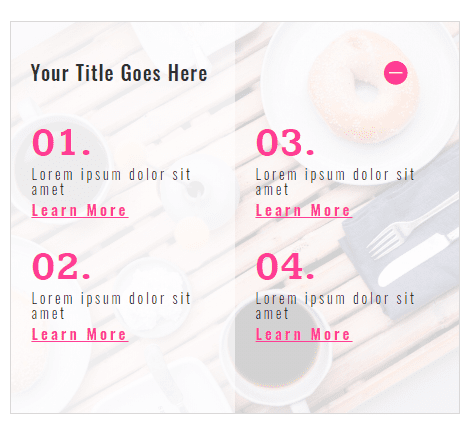
Adding Responsive Elements to the two column toggle
Since the toggle content is now two columns, let’s update the design with some responsive styles to make it scale nicely on mobile.
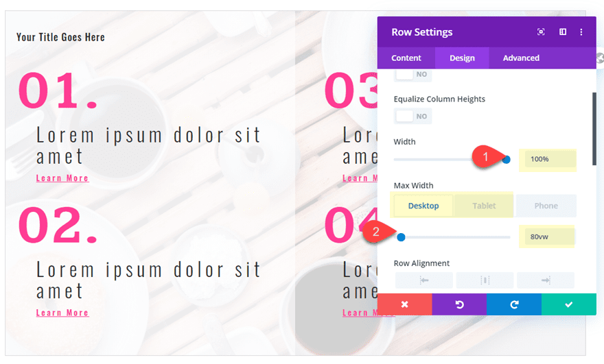
First, update the row settings as follows:
Width: 100%
Max Width: 89vw (desktop), 90vw (tablet and phone)
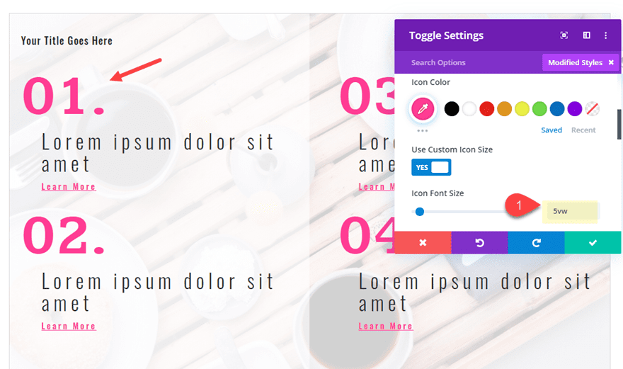
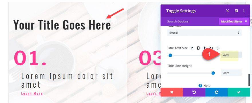
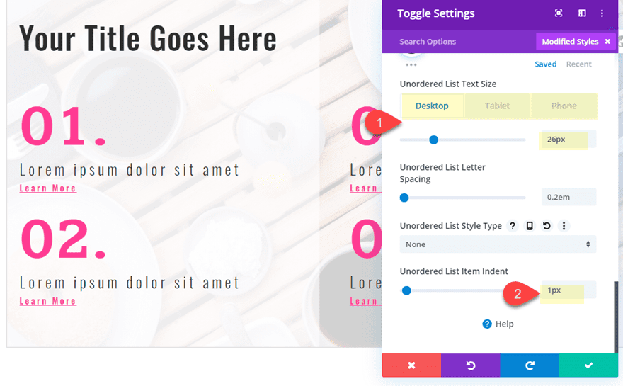
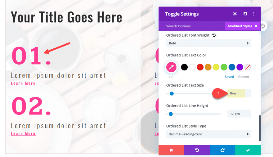
The open the toggle settings and update the following:
Icon Font Size: 5vw
Title Text Size: 4vw
Unordered List Text Size: 26px (desktop), 18px (tablet), 14px (phone)
Unordered List Item Indent: 1px
Ordered List Text Size: 8vw
Final Design of the Multi-Column Toggle Content
Here is the design on tablet and phone displays.
And here is the same design with a darker background and white text colors.
Final Thoughts
Most of the time, toggles and accordions will have basic body content that really doesn’t require creative design. But if the time does come when you want to spice up your toggle and accordion content, you can take advantage of Divi’s built-in text and list style options. Once you have your html in place, you can target those html tags for different designs without having to use external custom CSS or classes. This is also a great way to display creative list styles within any module using the Divi builder because these same list style options are available in all modules.
Have fun exploring new designs.
I look forward to hearing from you in the comments.
Cheers!


I tried, and I even imported the json, but my unordered list is taking the ordered list styles. There’s no way… 🙁
I advise you to get in touch with the Support Team so they can look into this.
Point me to the changelog for Divi, please. I have an old version and was just wondering if I should renew the membership.
Very nice use of list in toggles. One Question. The magic numbers. At some point during the tutorial the numbers for the ordered list gain a leading 0. How do you do this?
Ok. Under the ordered list set the Ordered List Style Type to decimal leading zero
Stephen,
Good catch. I totally skipped that step. Sorry. I’ll try and update the post asap. Thanks.
Wow, Jason, very creative!