
")
Divi and its new border style options are part of one of the most recent updates. Within the announcement blog post, we’ve shared some amazing designs you can achieve with these new options without having to use any additional CSS. The chances are that you’ve liked some of those designs and that you want to learn how to make these borders for your next website. That’s why we’re going to show you exactly how you can recreate all of the border options.
Instead of showing you all the specific design options of each one of the modules that are being used in these examples, we’re rather going to focus on what border settings are necessary to make these designs work. After that, you’ll be able to add the modules and modify it to your needs.
- 1 The Examples We’ll be Recreating in This Post
- 2 How to Use Divi’s New Border Style Options on Your Website (Part 1)
- 3 Recreate Borders of Example #1
- 4 Recreate Borders of Example #2
- 5 Recreate Borders of Example #3
- 6 Recreate Borders of Example #4
- 7 Recreate Borders of Example #5
- 8 Recreate Borders of Example #6
- 9 Recreate Borders of Example #7
- 10 Final Thoughts
The Examples We’ll be Recreating in This Post
Example #1

Example #2

Example #3
Example #4
Example #5
Example #6

Example #7

How to Use Divi’s New Border Style Options on Your Website (Part 1)
Subscribe To Our Youtube Channel
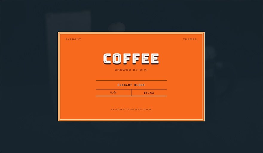
Recreate Borders of Example #1
The Border Concept
The border settings that you can notice within the print screen above are part of a row, although, at first sight, it might seem like they have been added to the different modules. To achieve this kind of result, the gutter width and row spacing are indispensable.
Row Settings
Row Column Structure
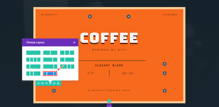
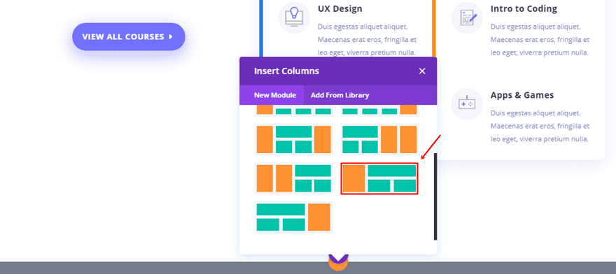
The first thing you’ll have to do is add a new row to an existing section. Choose the following column structure for this row:
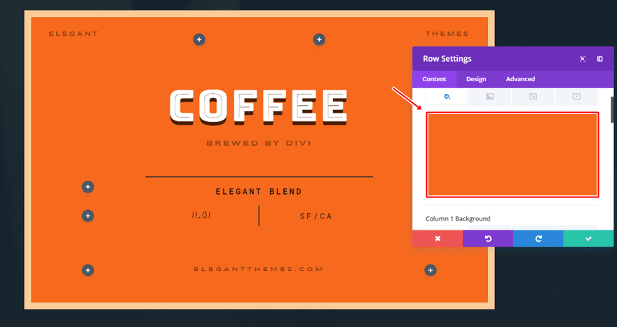
Row Background Color
Then, open the row settings and use ‘#ffffff’ as the background color.
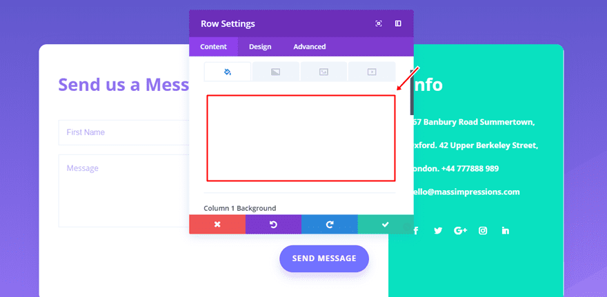
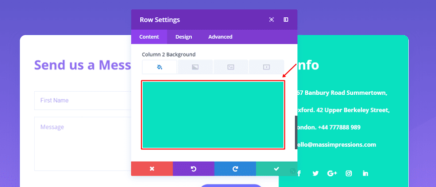
Column 2 Background Colors
Scroll down the same tab and use ‘#09e1c0’ as the background color for the second column.
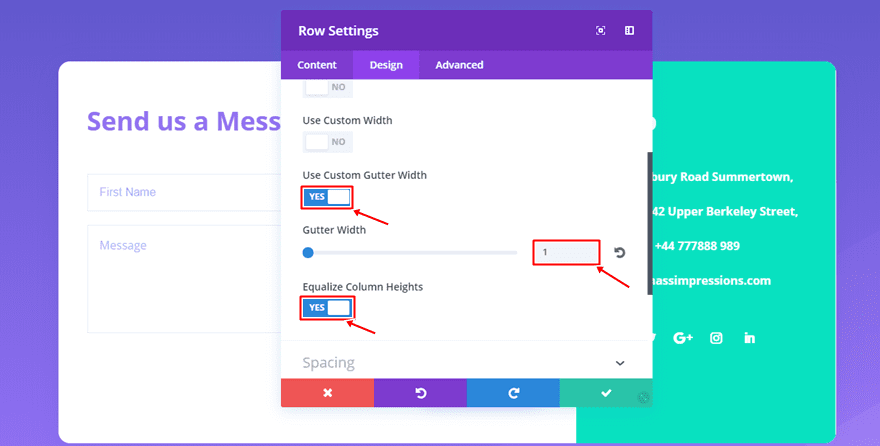
Row Sizing
Then, move on to the Design tab and use the following settings for the Sizing subcategory:
- Use Custom Gutter Width: Yes
- Gutter Width: 1
- Equalize Column Heights: Yes
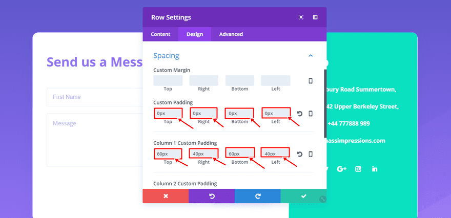
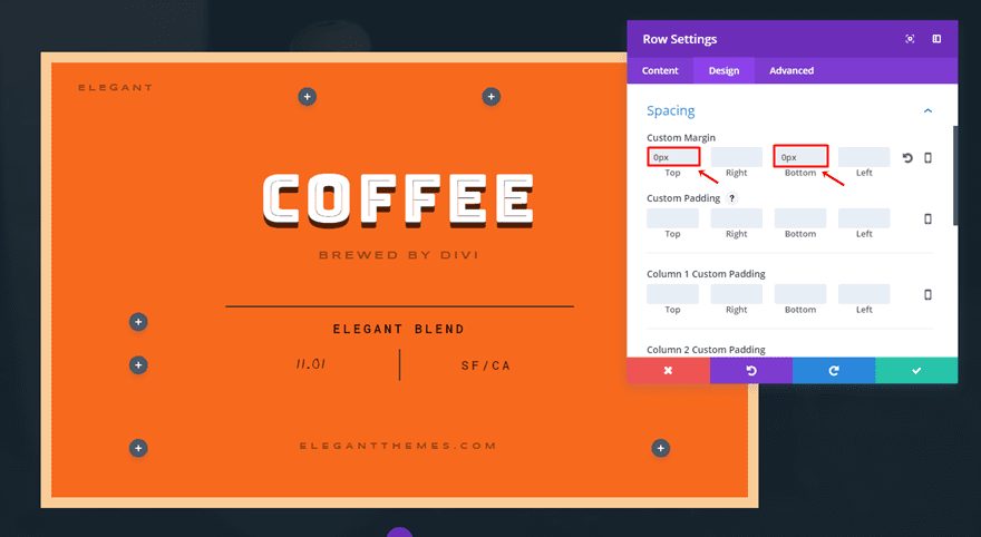
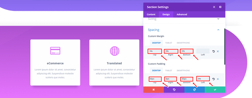
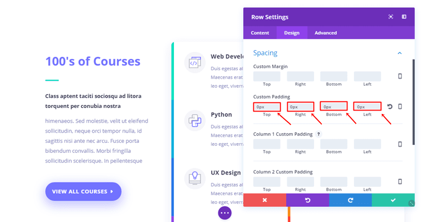
Row Spacing
Next, open the Spacing subcategory and use the following settings:
- Top, Right, Bottom & Left Padding: 0px
- Column 1 & 2 Top & Bottom Padding: 60px
- Column 1 & 2 Right & Left Padding: 40px
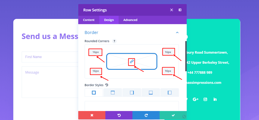
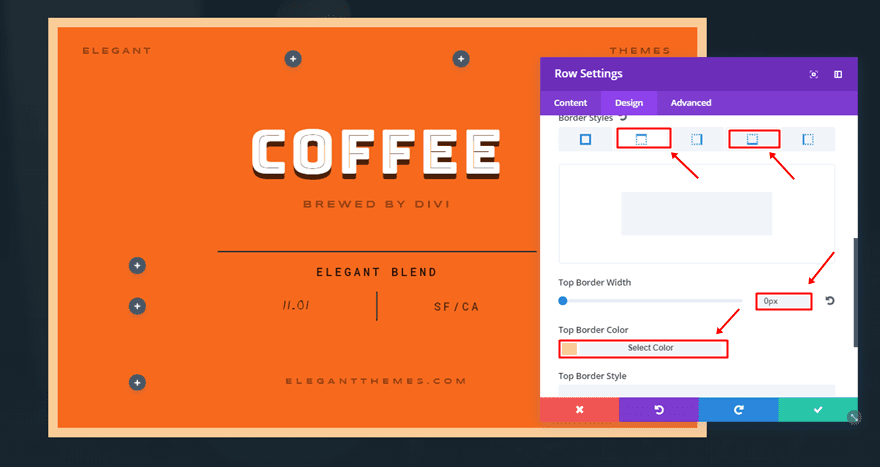
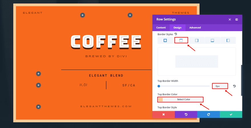
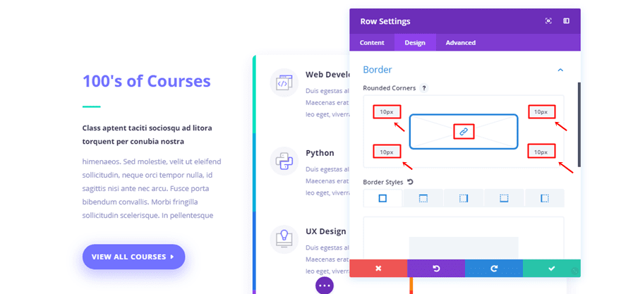
Row Border
Continue by adding ’16px’ to all of your corners within the Border subcategory.
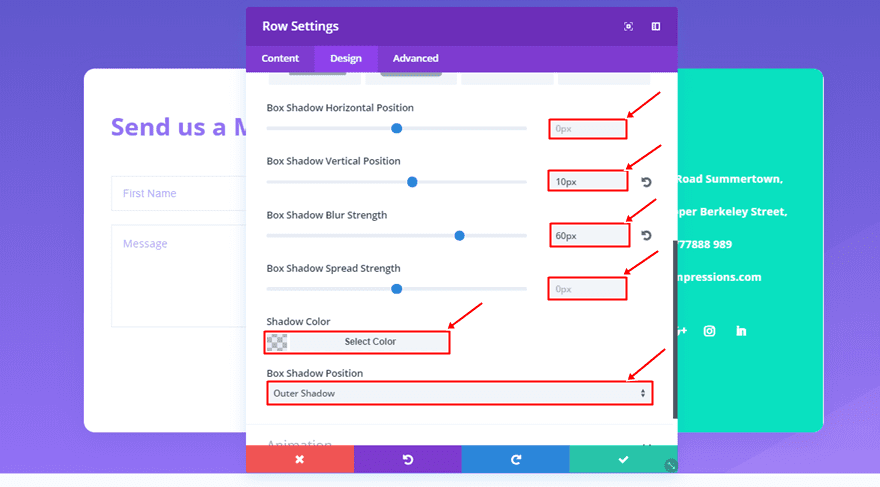
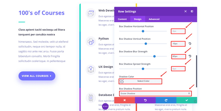
Row Box Shadow
Lastly, add the following settings to the Box Shadow subcategory:
- Box Shadow Horizontal Position: 0px
- Box Shadow Vertical Position: 10px
- Box Shadow Blur Strength: 60px
- Box Shadow Spread Strength: 0px
- Shadow Color: rgba(71,74,182,0.12)
- Box Shadow Position: Outer Shadow
Add Modules to Columns
Now, depending on the modules you want to use within the columns, you add them and change the design settings according to your needs.
Recreate Borders of Example #2
The Border Concept
For the second example, we’re making use of two Image Modules to create the phone and tablet effect. We’re using a border and a box shadow at the same time. Using the new border settings will make it easy to create the ‘mockup’ effect without having to make use of mockup files.
Mobile Image Module
Prefered Image Dimensions
The image dimensions that are preferred for your print screen are in this case ‘374px’ for the width and ‘668px’ for the height.
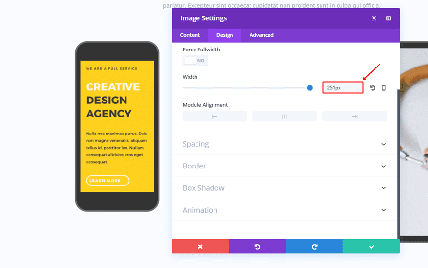
Sizing
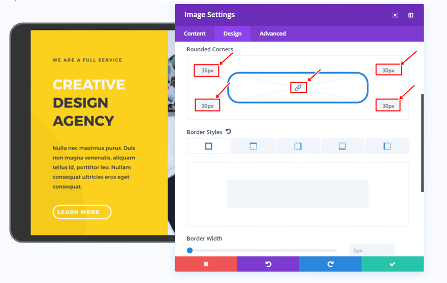
Once you add the Image Module and the image, go to the Design tab and add ‘251px’ to the Width within the Sizing subcategory.
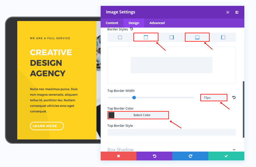
Border
Then, open the Border subcategory and add ’30px’ to all of the corners.
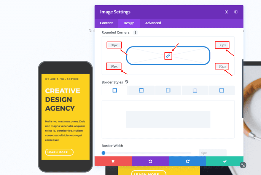
Moving on, use the following settings for the top and bottom border style:
- Border Width: 50px
- Border Color: #333333
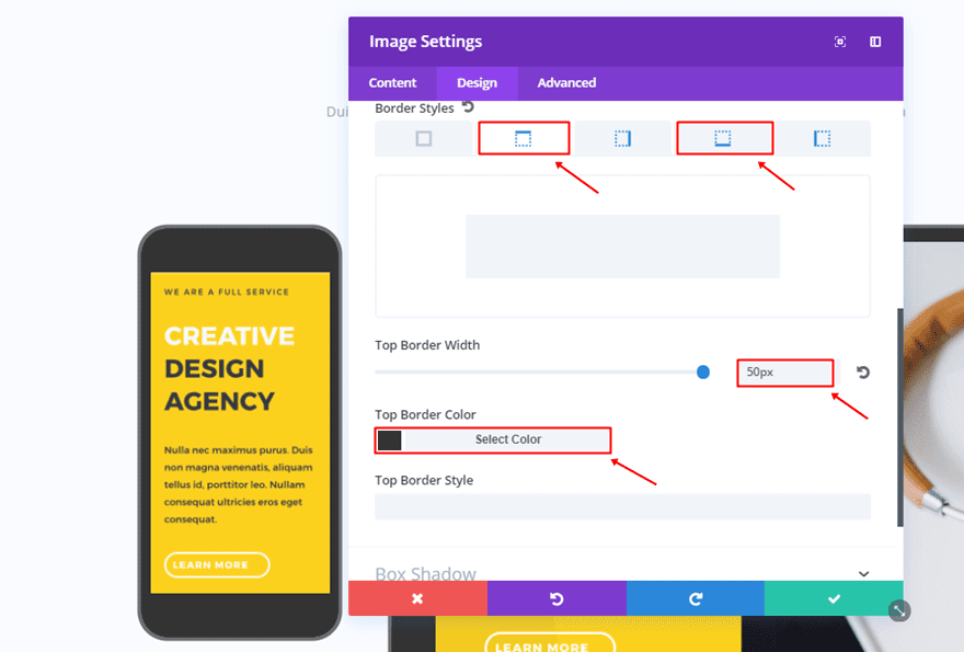
And the following settings for the right and left border style:
- Border Width: 10px
- Border Color: #333333
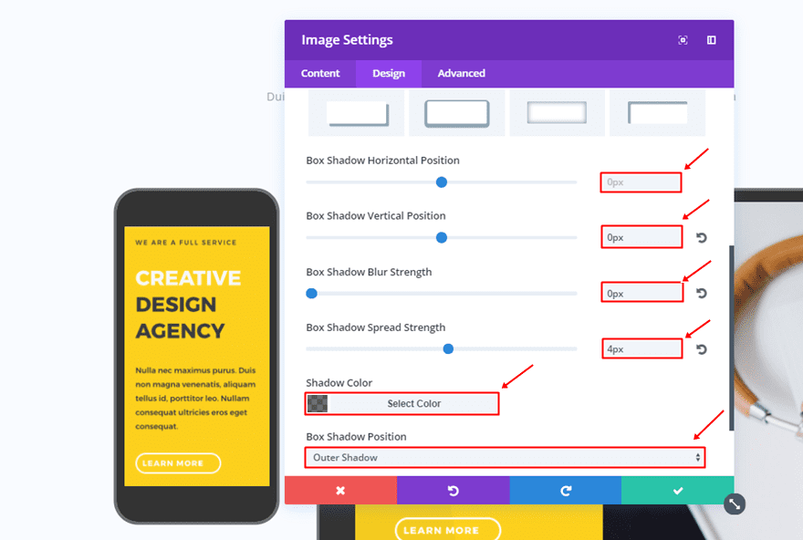
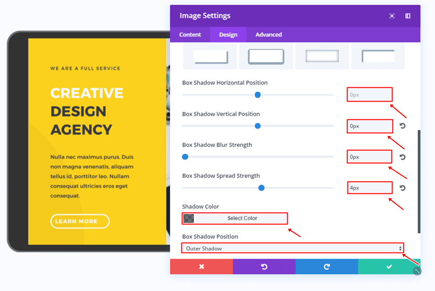
Box Shadow
Lastly, use the following box shadow for the Image Module:
- Box Shadow Horizontal Position: 0px
- Box Shadow Vertical Position: 0px
- Box Shadow Blur Strength: 0px
- Box Shadow Spread Strength: 4px
- Shadow Color: rgba(0,0,0,0.56)
- Box Shadow Position: Outer Shadow
Tablet Image Module
Prefered Image Dimensions
The tablet print screen will, preferably, need a width of ‘1024px’ and a height of ‘768px’.
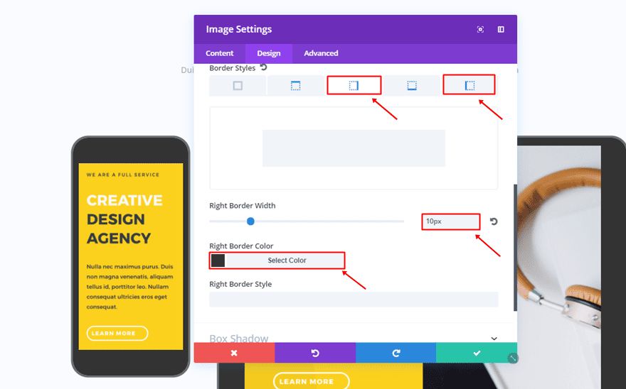
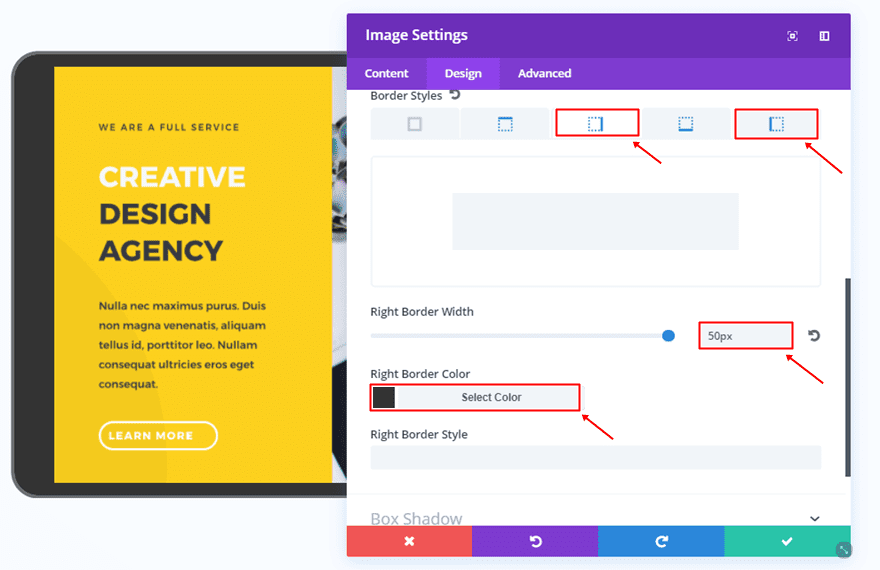
Border
Just like the mobile screen, the tablet version will need ’30px’ for all of the corners within the Border subcategory.
Then, use the following settings for the top and bottom border:
- Border Width: 15px
- Border Color: #333333
And the following settings for the right and left border:
- Border Width: 50px
- Border Color: #333333
Box Shadow
Lastly, use the same box shadow as you did for the mobile version:
- Box Shadow Horizontal Position: 0px
- Box Shadow Vertical Position: 0px
- Box Shadow Blur Strength: 0px
- Box Shadow Spread Strength: 4px
- Shadow Color: rgba(0,0,0,0.56)
- Box Shadow Position: Outer Shadow
Recreate Borders of Example #3
The Border Concept
Although this result looks like it’s one whole and one row, it is, in fact, a combination of 5 different rows. Using this kind of structure helps you make use of the various column structures. At the same time, it also allows you to create the bigger picture.
Row 1
Column Structure
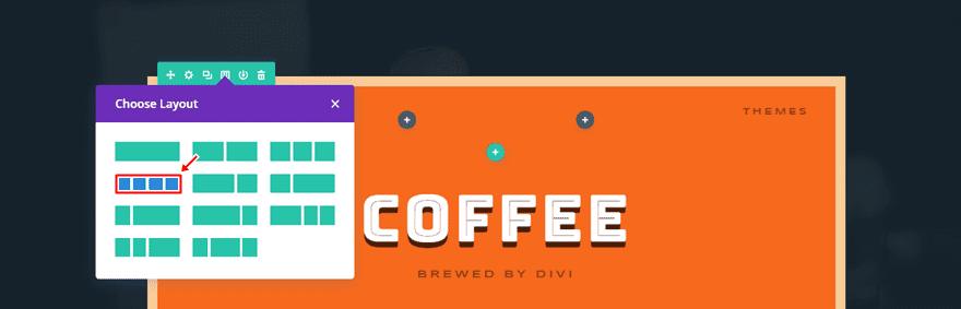
For the first column you add to an existing section, you will need four columns. Of course, you can also choose another column structure depending on your needs; it won’t affect the bigger picture.
Background Color
Then, add ‘#f7691d’ as the row background color.
Spacing
Moving on, add ‘0px’ to the top and bottom margin of the row.
Border
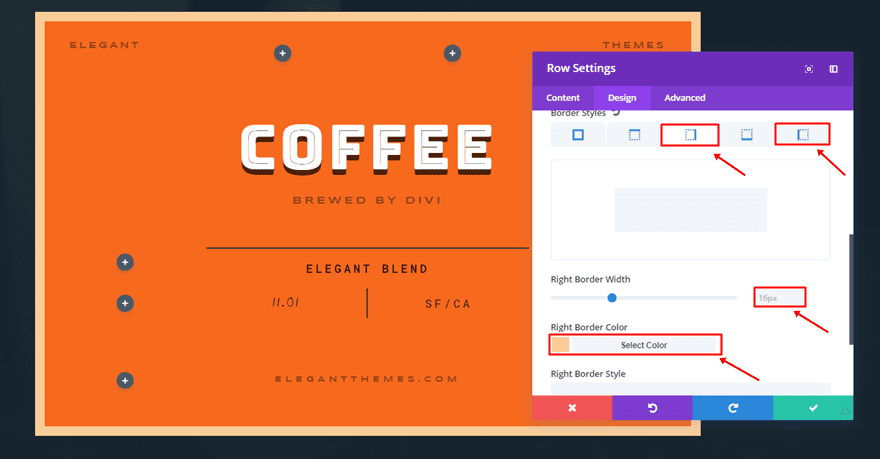
Lastly, add the following border to the row. Since this is the first row of the entire result, we’ll only need a top, right and left border style with the following settings:
- Border Width: 16px
- Border Color: #f9cc98
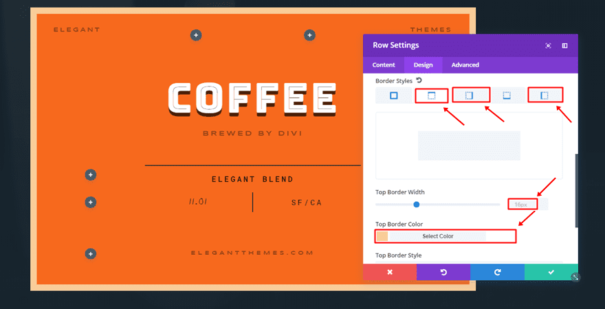
Naturally, you have to make sure that the Bottom Border Width is ‘0px’.
Row 2, 3 & 4
Column Structures
The second, third and fourth row have the same settings. The only thing that differs is the column structure. That’s why we’re going to go through the process only once. Depending on the content you’re trying to share, you can add as many of the same rows to this part of the tutorial.
Background Color
All three of the rows have ‘#f7691d’ as their background color.
Spacing
It’s important to add ‘0px’ to the top and bottom margin of the row. This helps to remove the space between the rows.
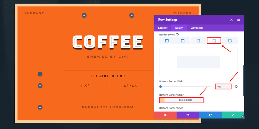
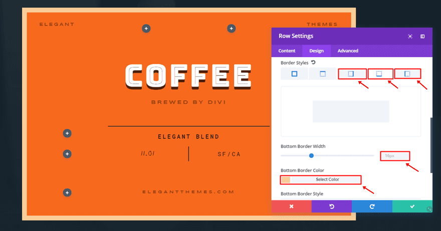
Border
Lastly, make sure the top and bottom border styles have a Border Width of ‘0px’.
And that the right and left border styles are the following:
- Border Width: 16px
- Border Color: #f9cc98
Row 5
Column Structure
The last row of this example has the following Column Structure:
Background Color
Again, ‘#f7691d’ is being used as the background color.
Spacing
Add ‘0px’ to the top and bottom margin of the last row as well.
Border
And lastly, the left, bottom and right border styles will need the following settings:
- Border Width: 16px
- Border Color: #f9cc98
Only the top border style will need ‘0px’ as its Border Width.
Add Modules to Columns
Depending on the content you want to add to this entire design, you can decide on the different column structures for each row to match the content you’re bringing. After that, add the modules to the various columns.
Recreate Borders of Example #4
The Border Concept
This example focuses on the top border which you can assign to each one of the accordion items within your Accordion Module. You’ll have to assign the top border to each one of the accordion items individually, which also allows you to play around with the colors that are being used for it.
Row Settings
Column Structure
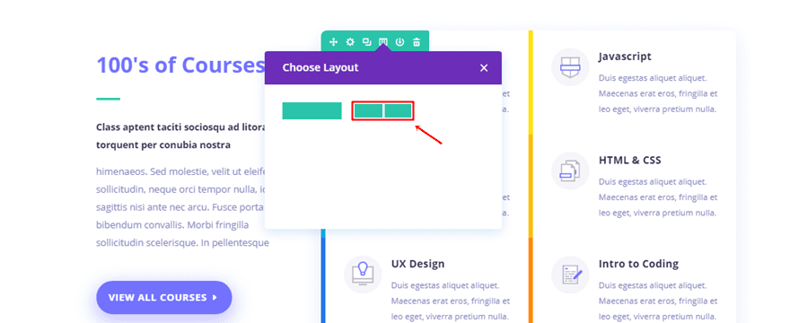
First of all, add a row with one column to your existing section.
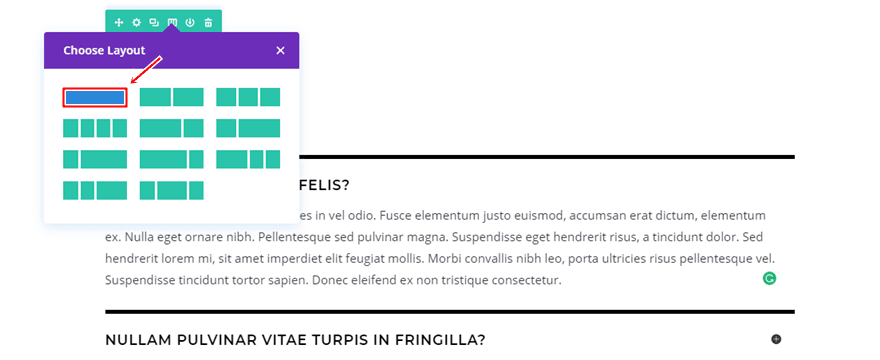
Add Accordion Module
Then, add an Accordion Module to it. Add as many items to this accordion as you need on your website.
Add Top Border & Spacing to Each Accordion Item Individually
Once you’ve added all of your accordion items, you’ll have to add the following settings to the Spacing subcategory of each Accordion Item:
- Bottom Margin: 0px
- Top Padding: 30px
- Bottom Padding: 30px
- Left Padding: 0px
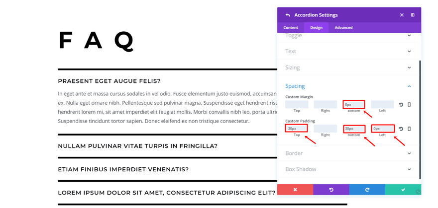
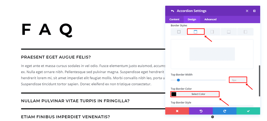
Next, you will need to add a top border style to each one of the items as well:
- Border Width: 6px
- Border Color: #000000
Recreate Borders of Example #5
The Border Concept
The new border options allow you to experiment not only with rows or modules but with sections as well. The example above is proof of that. To match the section borders, we’ve also added subtle borders to the Blurb Modules.
Section Settings
Add Background
Once you’ve added a new standard section, add a background of your need to it. This could be one color, a gradient background color or a combination of a textured background with a color or gradient color overlay.
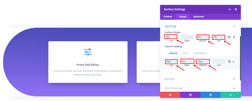
Spacing
Then, move on to the Design tab of the section and add the following settings to the Spacing subcategory:
- Top, Bottom & Left Margin: 5%
- Top Padding: 60px (Desktop & Tablet), 12% (Phone)
- Right Padding: 5% (Desktop), 0px (Tablet & Phone)
- Bottom Padding: 60px (Desktop & Tablet), 12% (Phone)
- Left Padding: 6% (Phone)
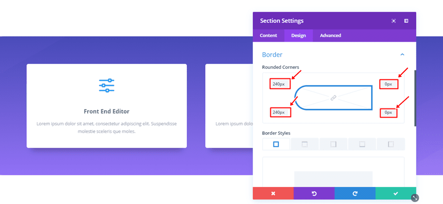
Border
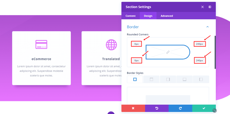
Lastly, add the following corners to the Border subcategory:
- Top Left: 240px
- Bottom Left: 240px
- Top Right: 0px
- Bottom Right: 0px
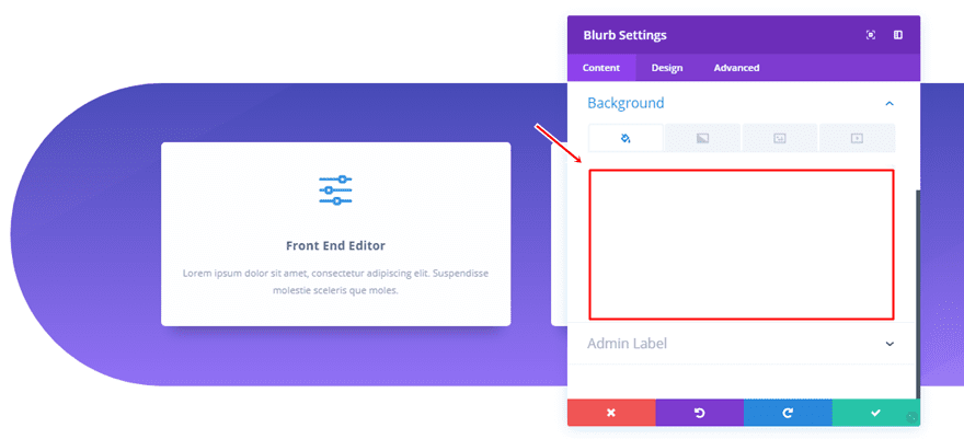
Blurb Settings
Background Color
When adding the Blurb Module, the first thing you’ll need to do is add ‘#ffffff’ as the background color.
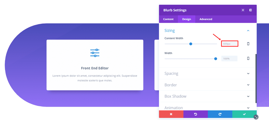
Sizing
Then, move on to the Design tab and add ‘550px’ to the Content Width.
Spacing
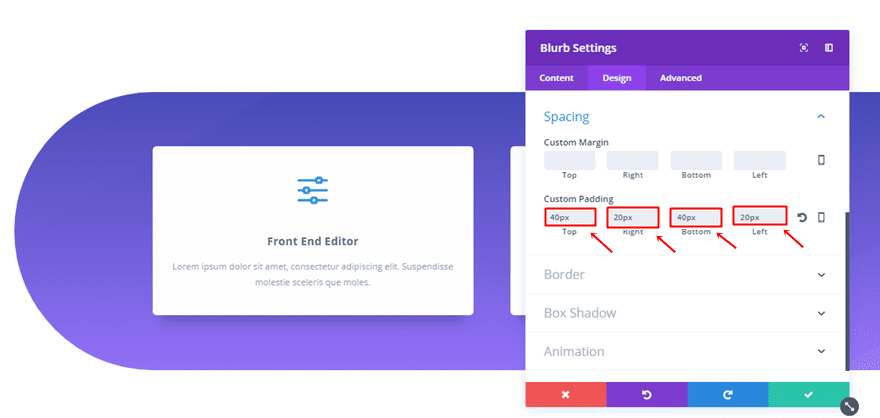
Next, add the following Custom Padding to the Spacing subcategory:
- Top & Bottom: 40px
- Right & Left: 20px
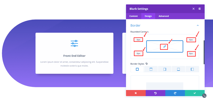
Border
The border of the Blurb Module needs ‘6px’ for every corner.
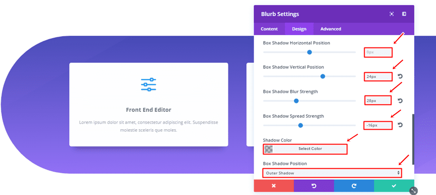
Box Shadow
And lastly, make use of the following Box Shadow:
- Box Shadow Horizontal Position: 0px
- Box Shadow Vertical Position: 24px
- Box Shadow Blur Strength: 28px
- Box Shadow Spread Strength: -16px
- Shadow Color: rgba(0,0,0,0.24)
- Box Shadow Position: Outer Shadow
Other Side Section Border
If you want the section border to apply on the other side of your section, you can simply change the rounded corners. Instead of having ‘240px’ for the top left and bottom left corner, you’ll have ‘0px’. Same counts for the top right and bottom right corner; instead of ‘0px’, they will need ‘240px’.
Other Side Section Spacing
The spacing for the section with a border on the other side is slightly different as well:
- Top, Bottom & Right Margin: 5%
- Top Padding: 60px (Desktop & Tablet), 12% (Phone)
- Right Padding: 0px (Desktop & Tablet), 6% (Phone)
- Bottom Padding: 60px (Desktop & Tablet), 12% (Phone)
- Left Padding: 5% (Desktop), 0px (Tablet & Phone)
Clone Blurb Module & Place in All Columns
Once you’re done creating section and Blurb Module, you can clone it as many times as you want, depending on the column structure you have for the row within the section.
Recreate Borders of Example #6
The Border Concept
The following example makes use of a specialty section instead of a regular section. This makes it able to add a specific border to the row that contains the Blurb Modules, instead of adding the border to the entire result. The Text Modules on the left side are placed in a column that isn’t part of the row with the Blurb Modules.
Specialty Section Structure
The structure we have chosen for this particular example is the following:
Row Settings
Column Structure
The row, which includes the Blurb Modules, has two columns.
Sizing
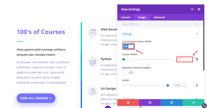
Once you’ve added the row, go to the Design tab and enable the Custom Gutter Width option. Then, add ‘1’ to the Gutter Width.
Spacing
Moving on, make sure that the Custom Padding is ‘0px’ for all of the options.
Border
Then, add ’10px’ to all of the corners within the Border subcategory.
Box Shadow
Lastly, use the following Box Shadow as well:
- Box Shadow Horizontal Position: 0px
- Box Shadow Vertical Position: 10px
- Box Shadow Blur Strength: 60px
- Box Shadow Spread Strength: 0px
- Shadow Color: rgba(71,74,182,0.12)
- Box Shadow Position: Outer Shadow
Blurb Module
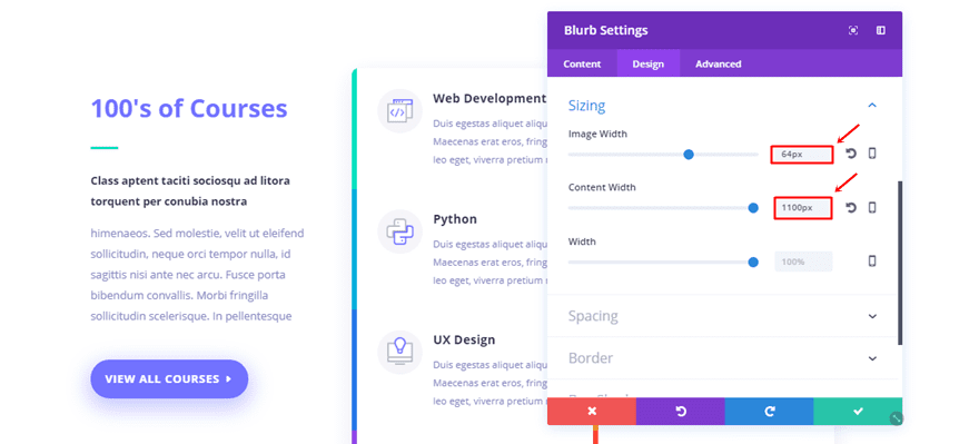
Background Color
Once the row settings are completed, you can start adding a Blurb Module to one of the columns. The blurb module needs ‘#ffffff’ as its background color.
Sizing
Then, make the following settings apply to the Sizing subcategory within the Design tab:
- Image Width: 64px
- Content Width: 1100px
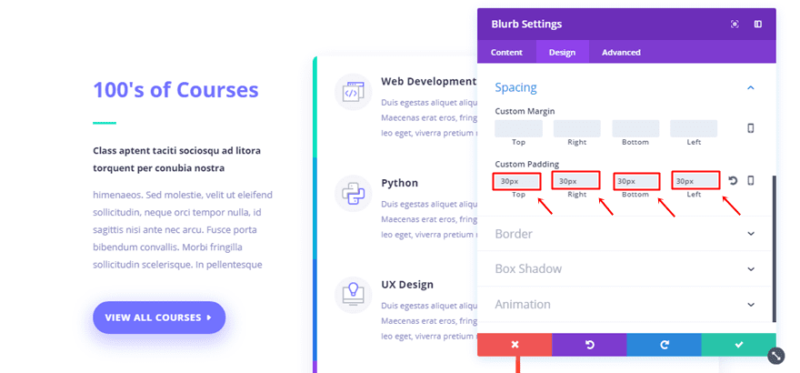
Spacing
Scroll down, open the Spacing subcategory and add ’30px’ to all of the Custom Padding options.
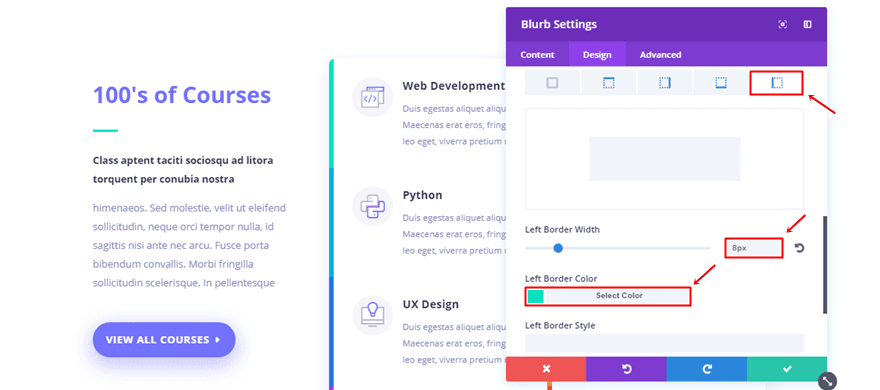
Left Border
Last but not least, add a left border of ‘8px’ with the ‘#09e1c0’ color code.
Clone Blurb Module & Place in All Columns
Once you’ve completed the Blurb Module, you can clone it as many times as you want and place it within both the columns. The only thing left to do is change the content and left border color to make each Blurb Module unique.
Recreate Borders of Example #7
The Border Concept
For the last example in this post, we have a combination of borders for the section, row and Text Module within the row. This perfectly illustrates which kinds of results you can get when you combine all of the border options within a certain section.
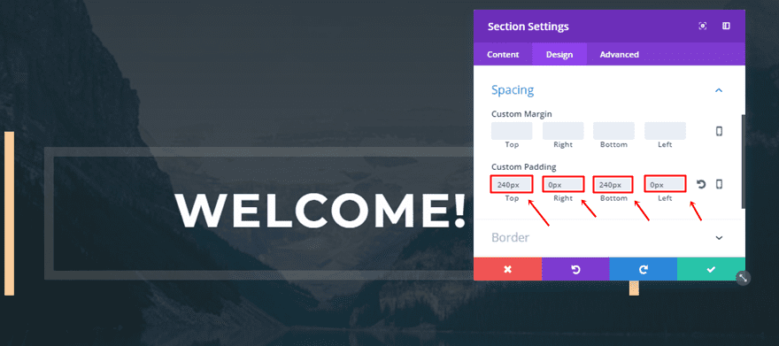
Section Settings
Spacing
Start by adding a new standard section and add the following Custom Padding to it:
- Top & Bottom: 240px
- Right & Left: 0px
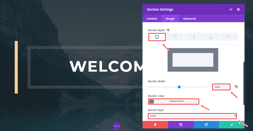
Border
Then, open the Border subcategory and make use of the following settings:
- Border Width: 26px
- Border Color:#747d88
- Border Style: Solid
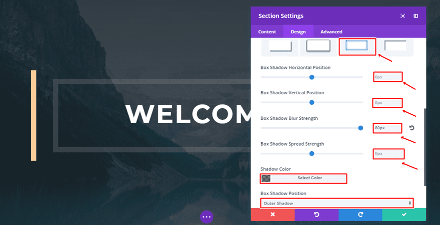
Box Shadow
Lastly, add a box shadow to the section as well:
- Box Shadow Horizontal Position: 0px
- Box Shadow Vertical Position: 0px
- Box Shadow Blur Strength: 80px
- Box Shadow Spread Strength: 0px
- Shadow Color: rgba(0,0,0,0.54)
- Box Shadow Position: Outer Shadow
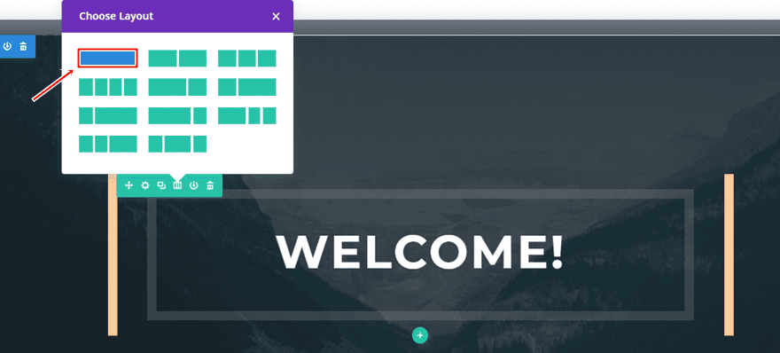
Row Settings
Column Structure
Once your section settings are done, you can add a row with one column to it.
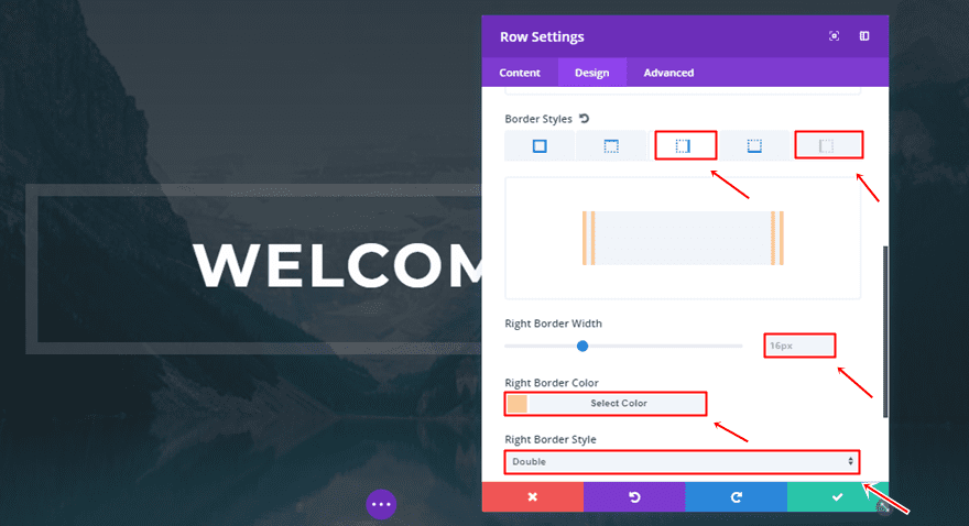
Border
Then, open the settings of this row and add the following border style to the left and right side:
- Border Width: 16px
- Border Color: #f9cc98
- Border Style: Double
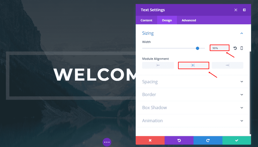
Text Module
Sizing
Now, add a Text Module to the one-column row and use the following settings for the Sizing subcategory:
- Width: 90%
- Module Alignment: Center
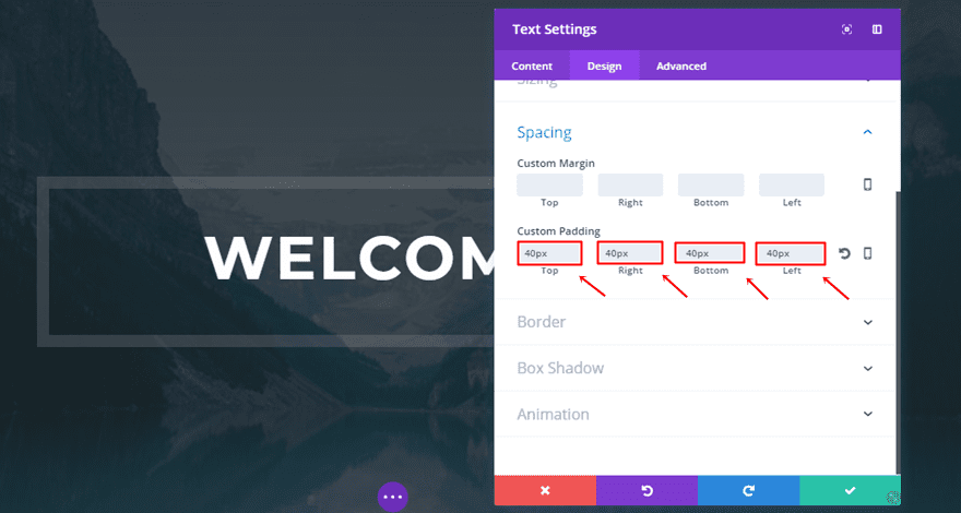
Spacing
Then, open the Spacing subcategory and add ’40px’ to all of the Custom Padding options.
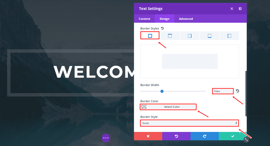
Border
Lastly, add a slightly transparent border to all of the sides with the following settings:
- Border Width: 16px
- Border Color: rgba(145,145,145,0.27)
- Border Style: Solid
Final Thoughts
The new Divi border options open a whole new experience for you while designing your websites. The examples we’ve shown you how to recreate and understand, are the same as the ones that we’re shared with you in the border announcement blog posts. In the second part of this post, we’ll be showing you how to create the remaining examples. If you have any questions or suggestions; make sure you leave a comment in the comment section below!
Featured Image by estherpoon / shutterstock.com


Hello,
This is a great post, very valuable. I am wondering if anybody have some ideas how can we do the same with slider? For example Iphone frame around slider?
Thanks.
Awesome, implementing some of this today, just too good to pass up, Thank You All!
Thanks for all the great examples, I’m really excited to try out a few of these beauties!
Thanks for some nice inspo. I like the creative and easy way to make a smartphone/iPad dummie without using images. My next project will be to make an iPhone X with just Divi modules. 🙂
Divi you make me salivate! Getting better and better every day. Awesome updates guys and girls!
Thank you very much Donjetee – nice looking examples! Well explained!