

When you display clickthrough items on your page, it’s important to make sure people know that they can choose an item and click on it. One of the most obvious ways to do that is by including a button, but if you’re looking for an additional interactive way to encourage click-throughs on your page, you’ll enjoy this tutorial. Today, we’ll show you how to turn your cursor into a button when hovering a particular clickable element, such as an image. This will add extra incentive to your visitors and results in a beautiful page interaction. You’ll be able to download the JSON file for free as well!
Let’s get to it.
Preview
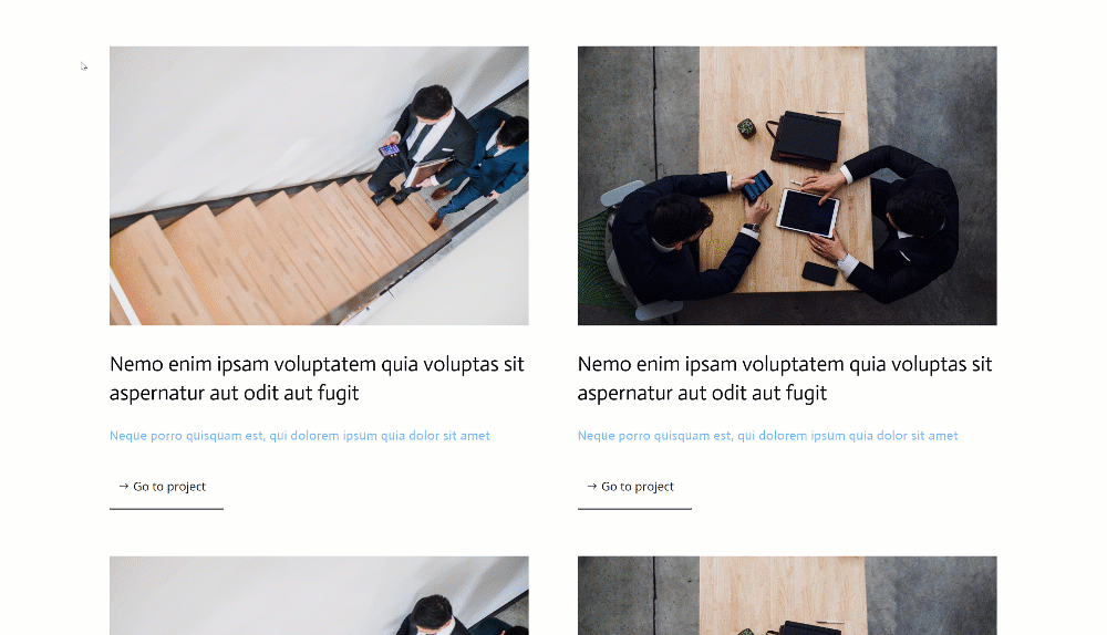
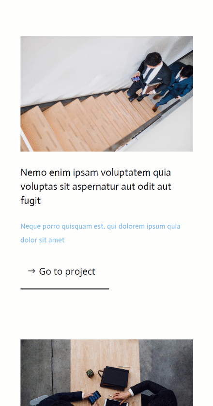
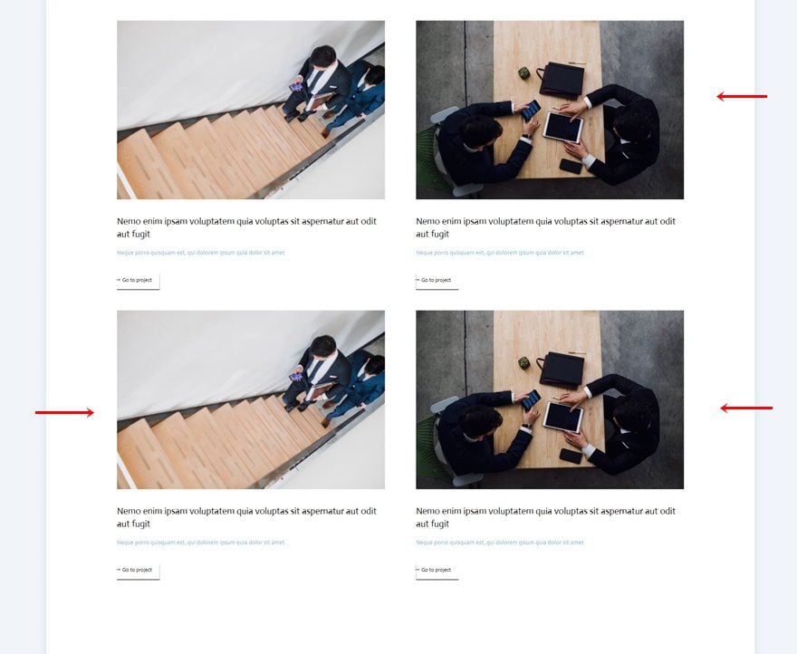
Before we dive into the tutorial, let’s take a quick look at the outcome across different screen sizes.
Desktop
Mobile
Download The Layout for FREE
To lay your hands on the free layout, you will first need to download it using the button below. To gain access to the download you will need to subscribe to our newsletter by using the form below. As a new subscriber, you will receive even more Divi goodness and a free Divi Layout pack every Monday! If you’re already on the list, simply enter your email address below and click download. You will not be “resubscribed” or receive extra emails.

Subscribe To Our Youtube Channel
1. Create Element Structure
Add New Section
Background Color
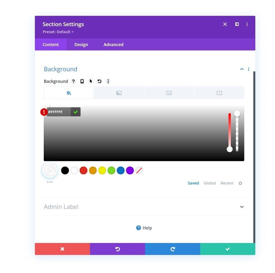
We’ll start this tutorial by building the element structure inside a Divi page. Add a new section and use a white background color for it.
- Background Color: #ffffff
Spacing
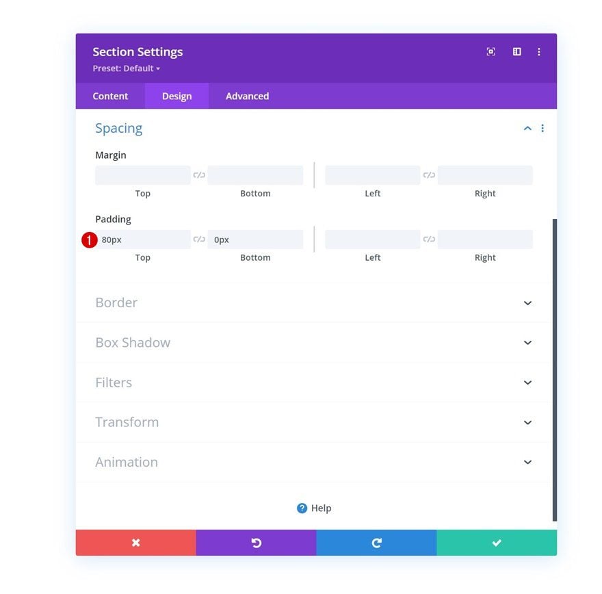
Move on to the section’s design tab and change the spacing settings as follows:
- Top Padding: 80px
- Bottom Padding: 0px
Add New Row
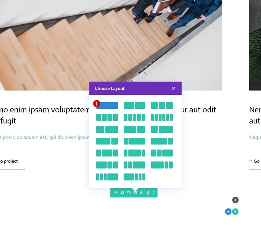
Column Structure
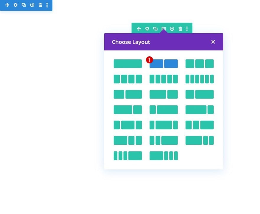
Continue by adding a new row using the following column structure:
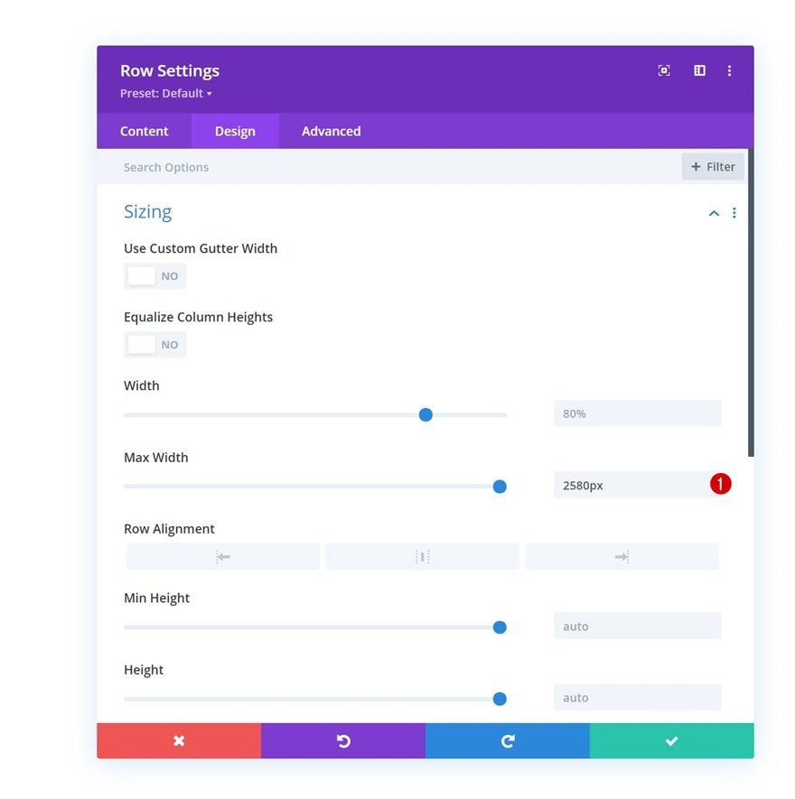
Sizing
Without adding modules yet, open the row settings and change the max width in the sizing settings.
- Max Width: 2580px
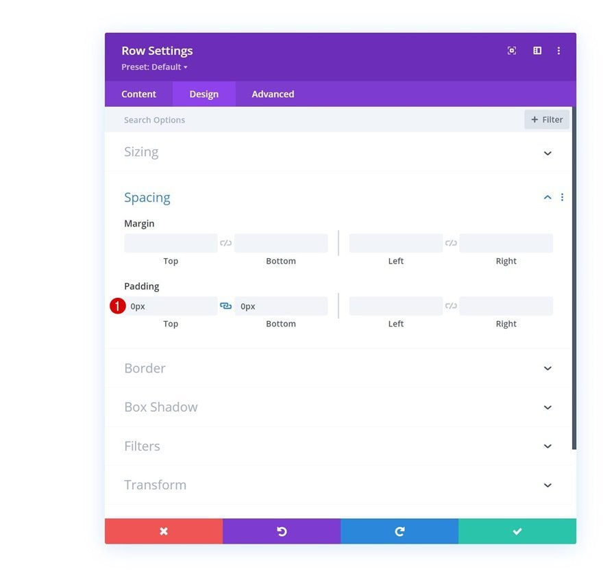
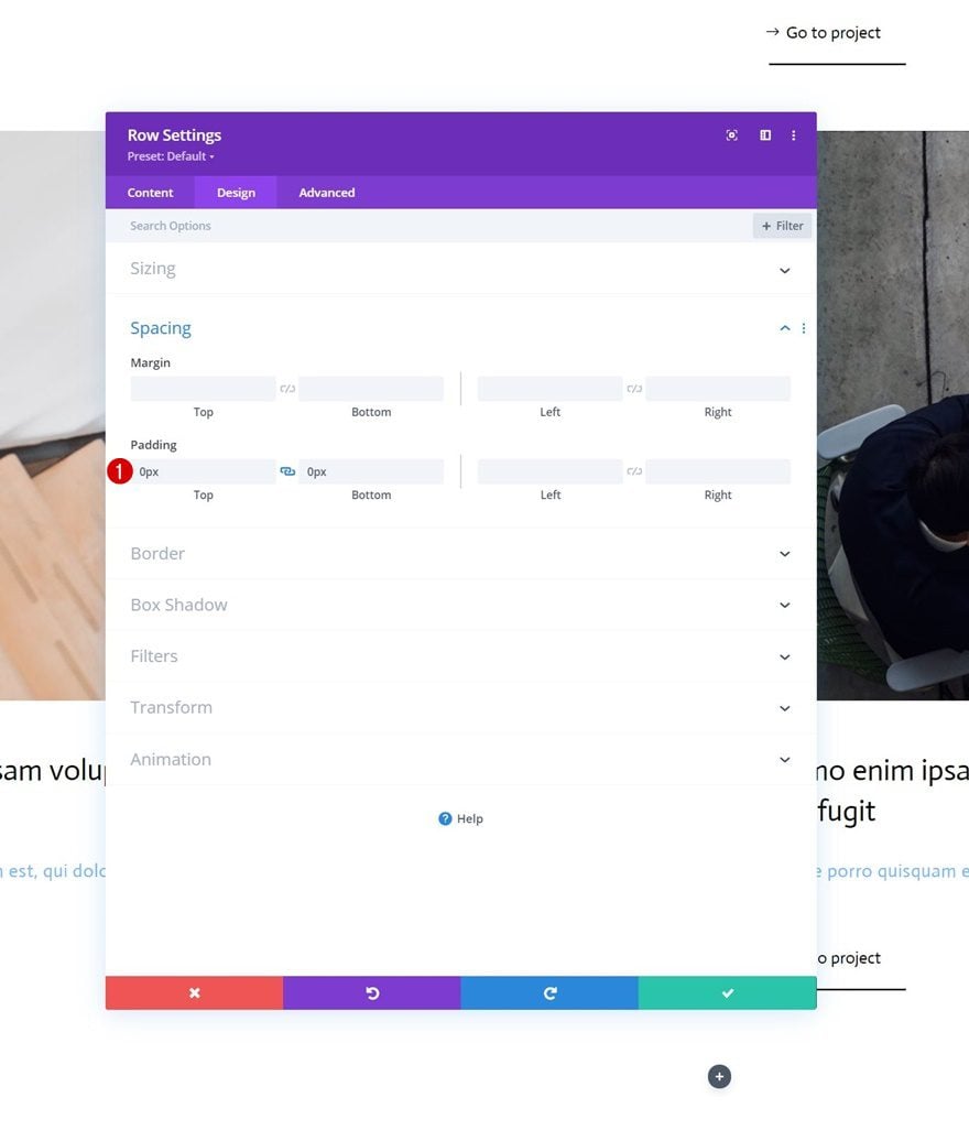
Spacing
Remove all default top and bottom padding next.
- Top Padding: 0px
- Bottom Padding: 0px
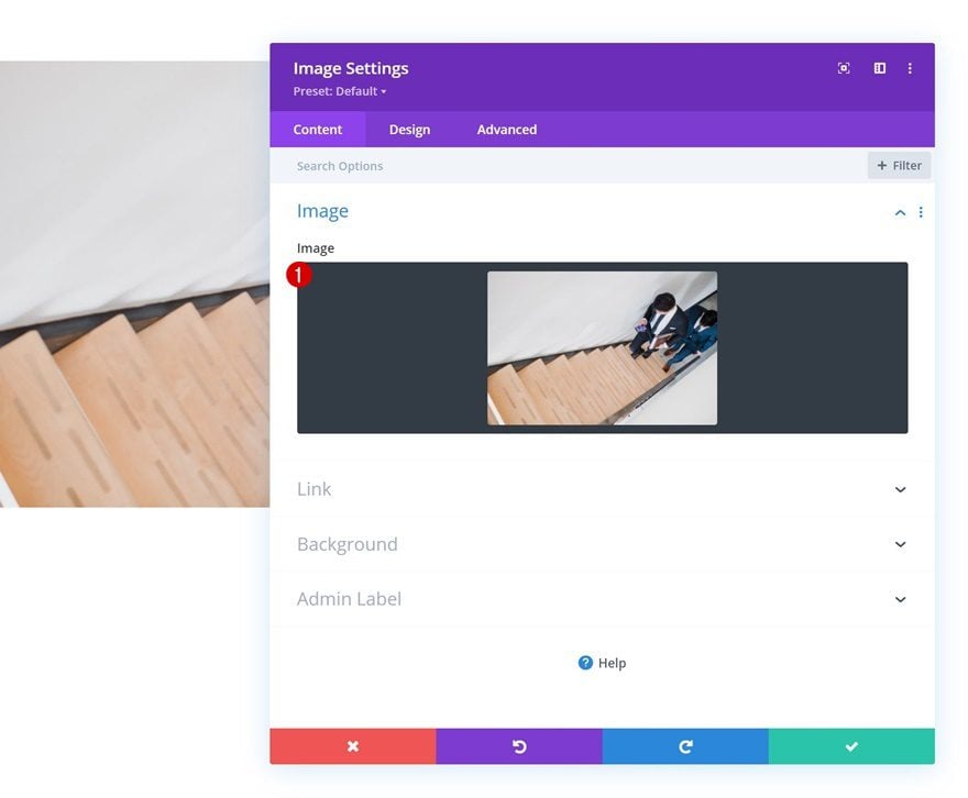
Add Image Module to Column 1
Upload Image
Let’s modules, starting with an Image Module in column 1. Upload an image of your choice.
Add Link
Add a link to the image module next.
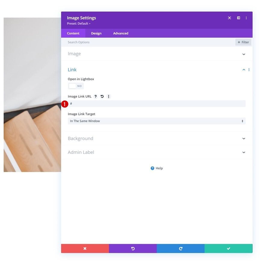
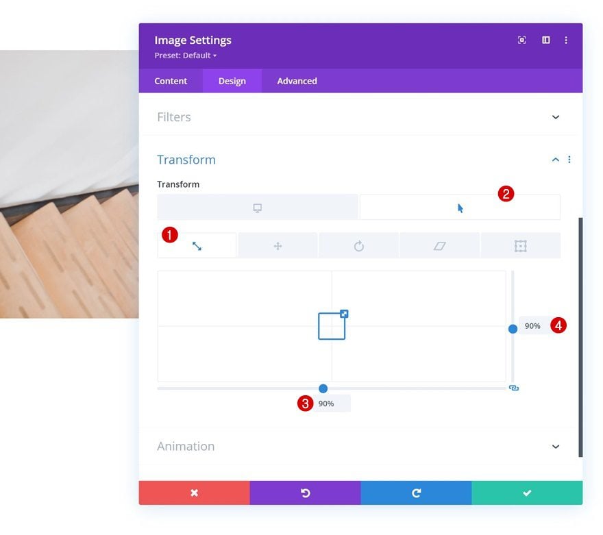
Hover Scale
Then, go to the design tab and change the hover scale settings of the module.
- Both: 90%
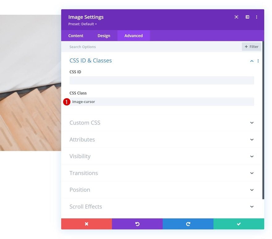
CSS Class
Complete the module settings by applying the following CSS class in the advanced tab:
- CSS Class: image-cursor
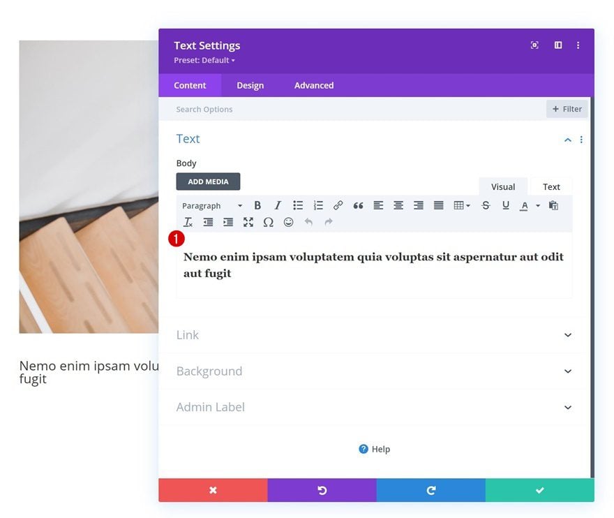
Add Text Module #1 to Column 1
Add H3 Content
On to the next module, which is a Text Module containing some H3 content of your choice.
H3 Text Settings
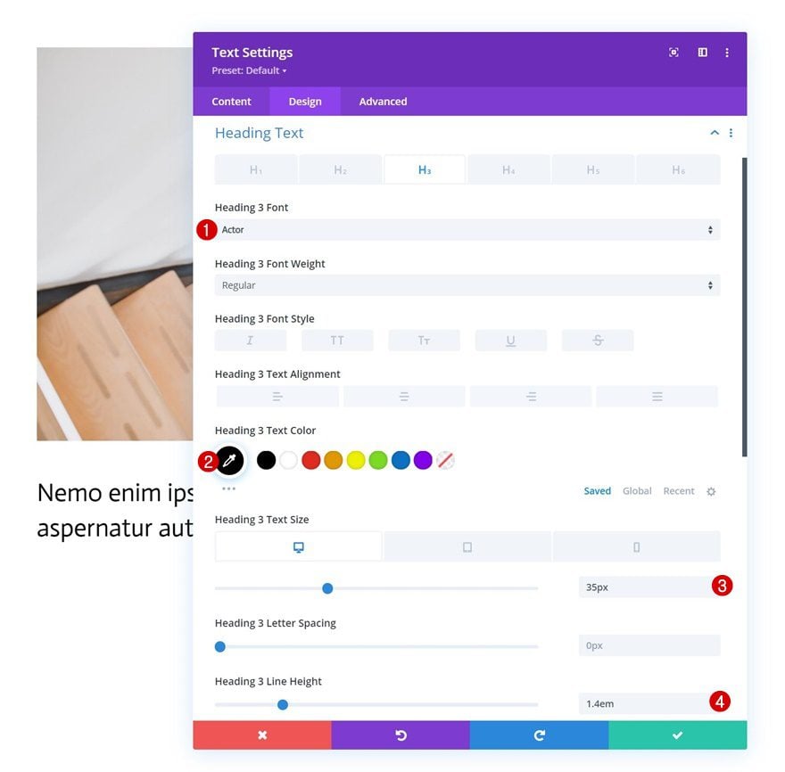
Move on to the module’s design tab and change the H3 text settings accordingly:
- Heading 3 Font: Actor
- Heading 3 Text Color: #000000
- Heading 3 Text Size:
- Desktop: 35px
- Tablet: 28px
- Phone: 22px
- Heading 3 Line Height: 1.4em
Spacing
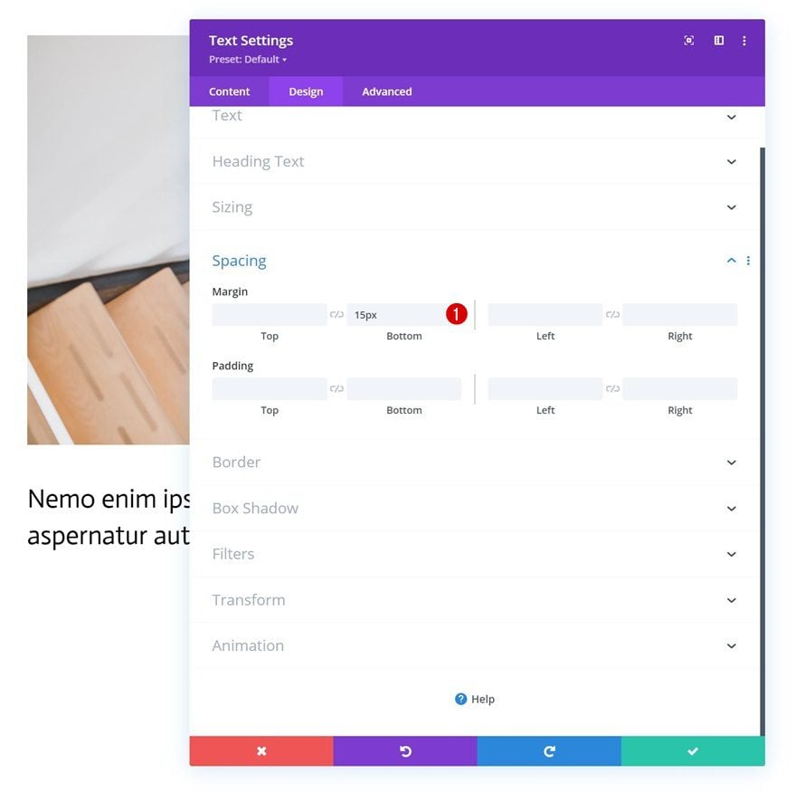
Add some bottom margin next.
- Bottom Margin: 15px
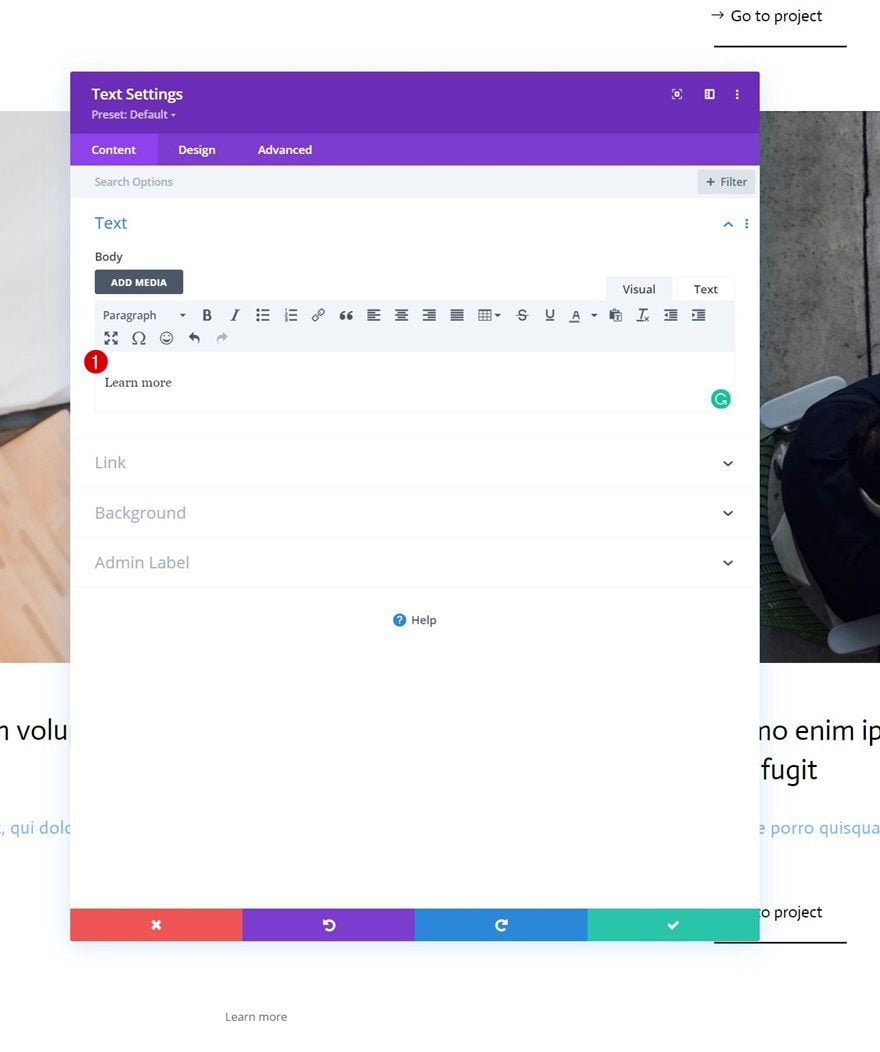
Add Text Module #2 to Column 1
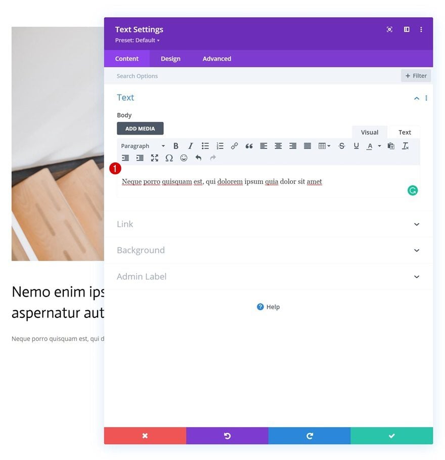
Add Content
Then, add another Text Module right below the previous one with some description content of your choice.
Text Settings
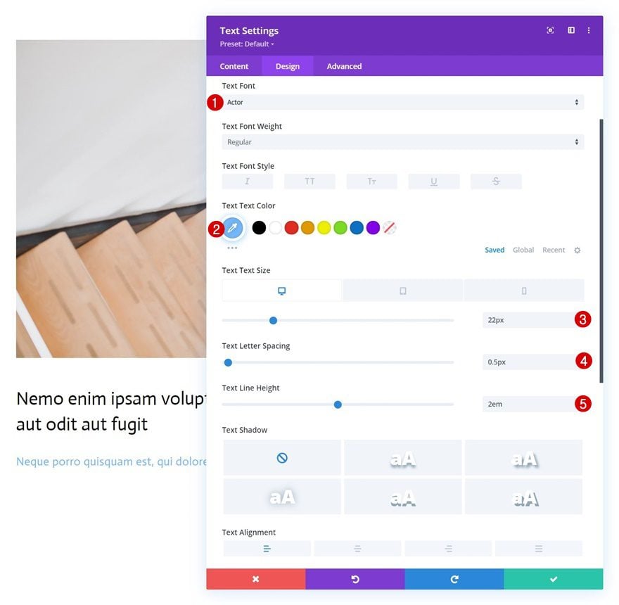
Change the module’s text settings as follows:
- Text Font: Actor
- Text Color: #75baff
- Text Size:
- Desktop: 22px
- Tablet: 18px
- Phone: 15px
- Text Letter Spacing: 0.5px
- Letter Line Height: 2em
Add Copy
The next and last module we need in this column is a Button Module. Add some copy of your choice.
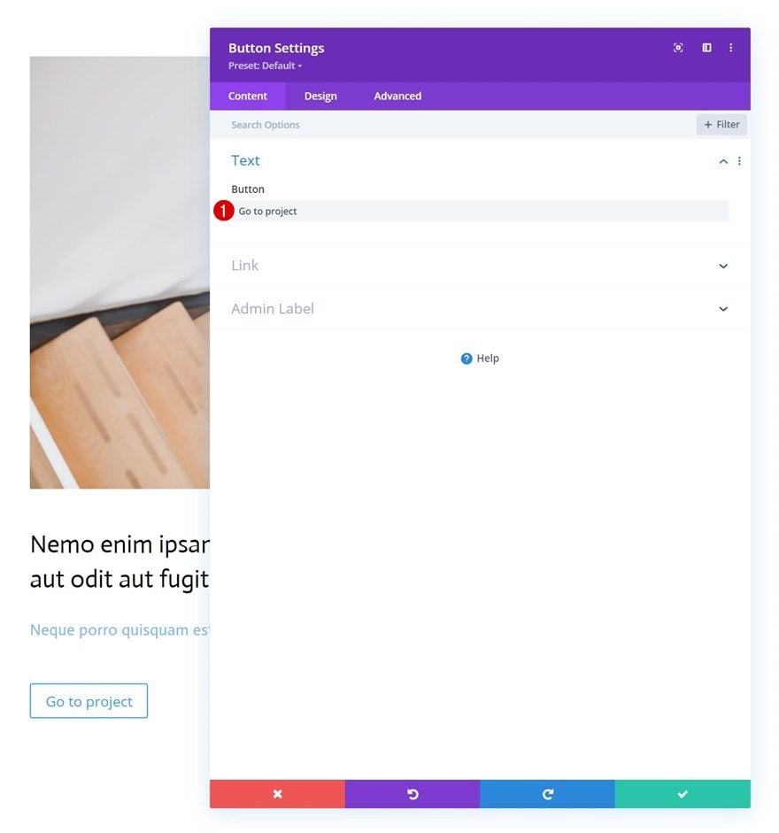
Button Settings
Move on to the module’s design tab and change the button settings accordingly:
- Use Custom Styles For Button: Yes
- Button Text Color: #000000
- Button Border Width: 0px
- Button Border Radius: 1px
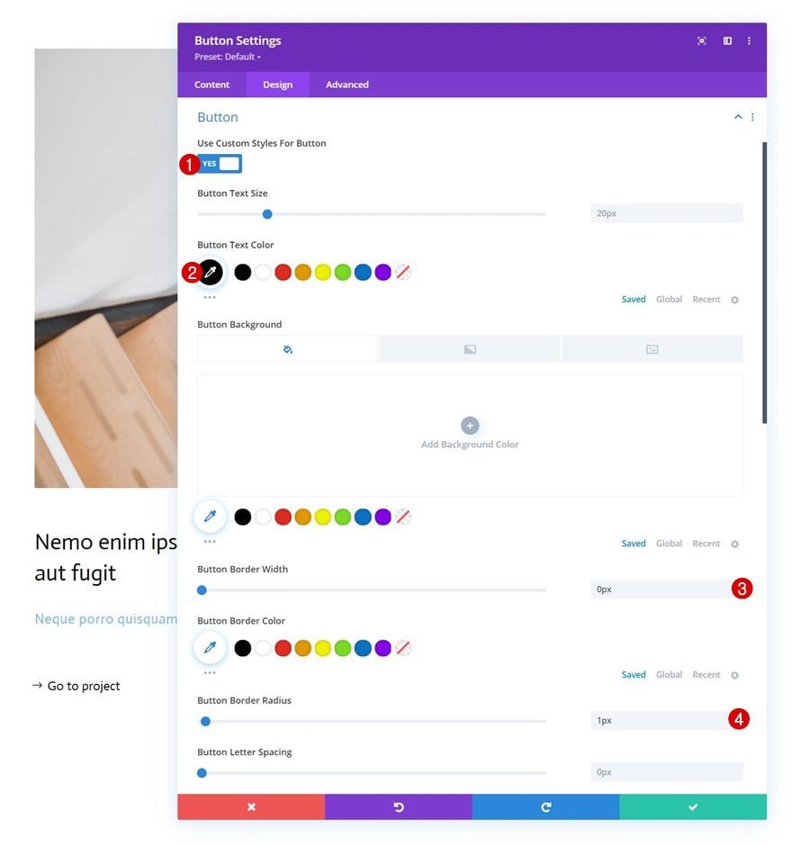
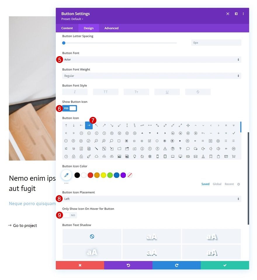
- Button Font: Actor
- Show Button Icon: Yes
- Button Icon Placement: Left
- Only Show Icon On Hover for Button: No
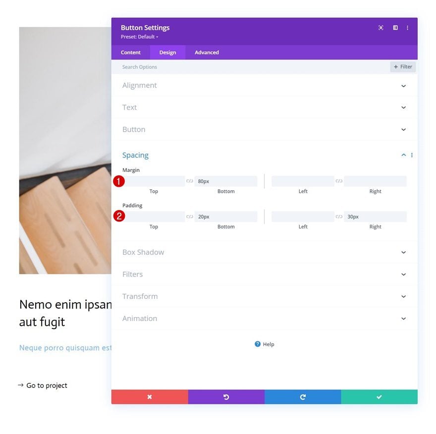
Spacing
Add some custom spacing values as well.
- Bottom Margin: 80px
- Bottom Padding: 20px
- Right Padding: 30px
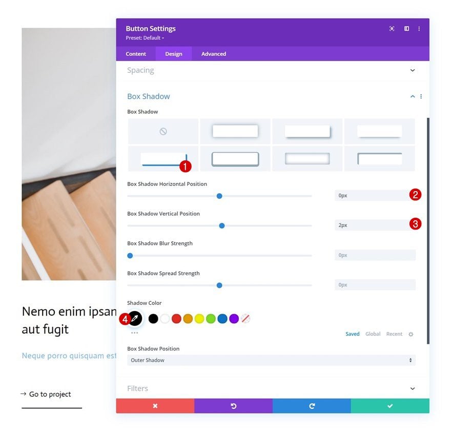
Box Shadow
And complete the module settings by applying the following box shadow settings:
- Box Shadow Horizontal Position: 0px
- Box Shadow Vertical Position: 2px
- Shadow Color: #000000
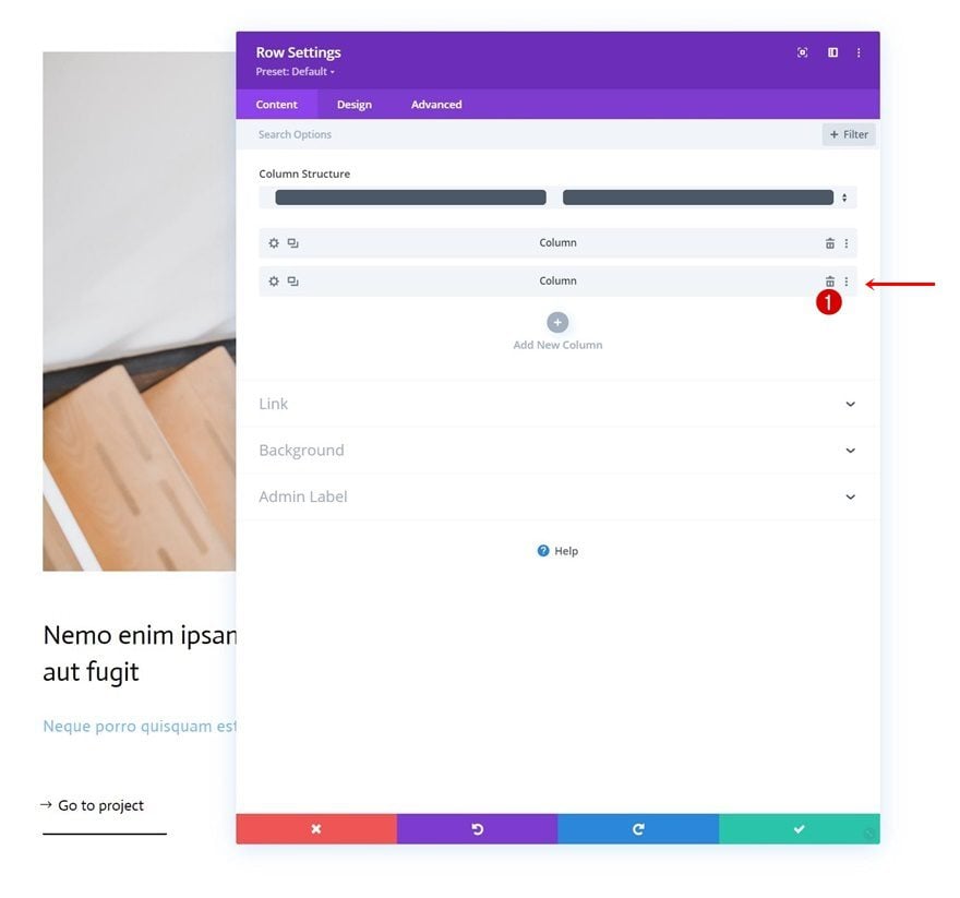
Delete Column 2
Once you’ve completed the first column and all modules inside it, delete the empty second column of the row.
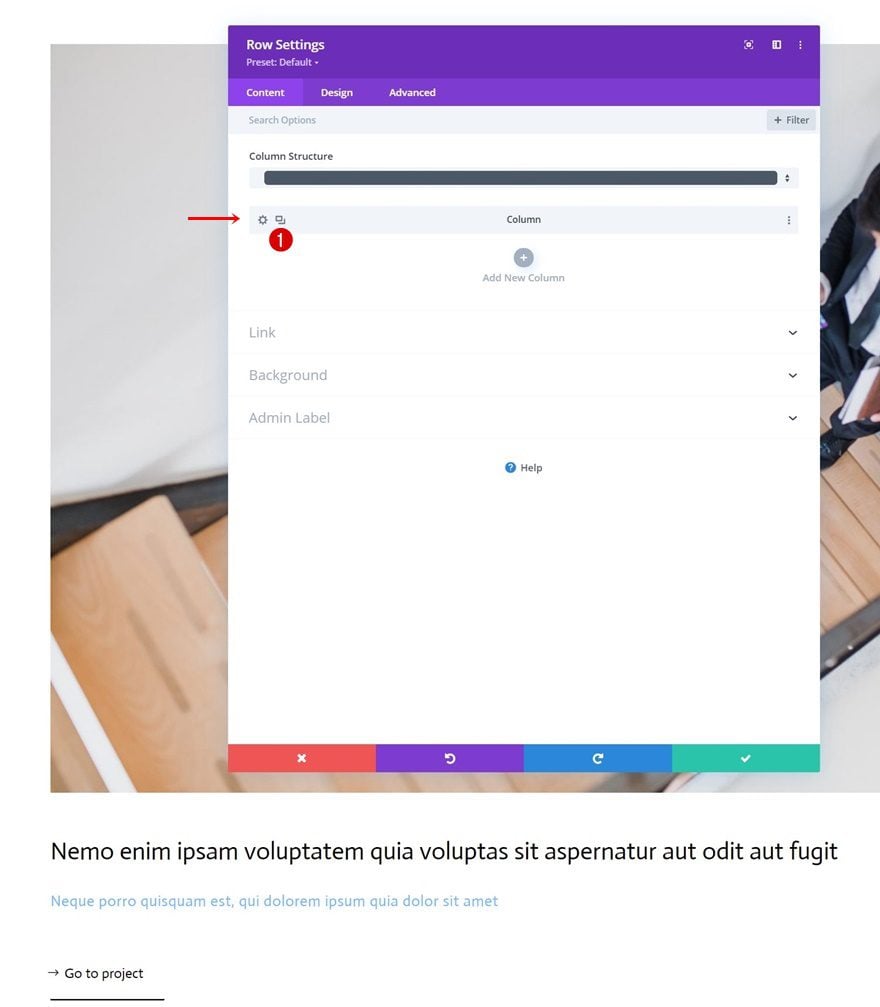
Clone Column 1
And reuse the first column by cloning it once.
Clone Entire Row
Continue by cloning the entire row once.
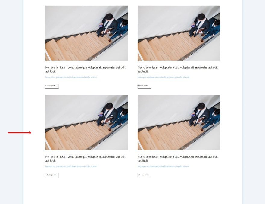
Change All Duplicate Content, Images & Links
Then, make sure you change all content, images and links in each one of the duplicate columns.
2. Add Cursor
Add New Row to Section
Column Structure
Now that we have the element structure in place, it’s time to create the cursor design. To do that, we’ll add a new row to our section using the following column structure:
Spacing
Open the row settings and remove all default top and bottom padding.
- Top Padding: 0px
- Bottom Padding: 0px
Add Cursor Text Module to New Row’s Column
Add Content
Next, add a Text Module to the new row. This Text Module will be dedicated to creating the cursor button design. Add some copy of your choice inside the content box.
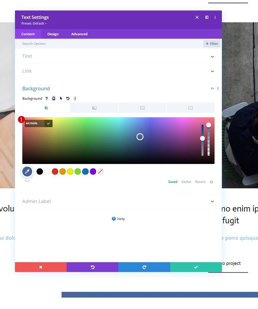
Background Color
Then, add a background color.
- Background Color: #47669b
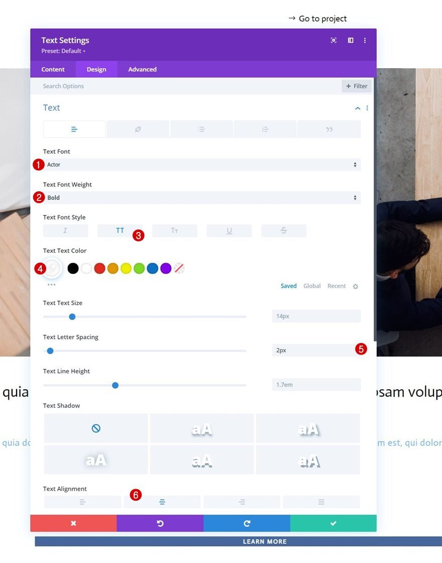
Text Settings
Move on to the design tab and style the text accordingly:
- Text Font: Actor
- Text Font Weight: Bold
- Text Font Style: Uppercase
- Text Color: #ffffff
- Text Letter Spacing: 2px
- Text Alignment: Center
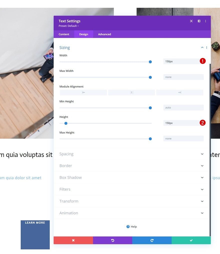
Sizing
Add a width and height value to the sizing settings next.
- Width: 150px
- Height: 150px
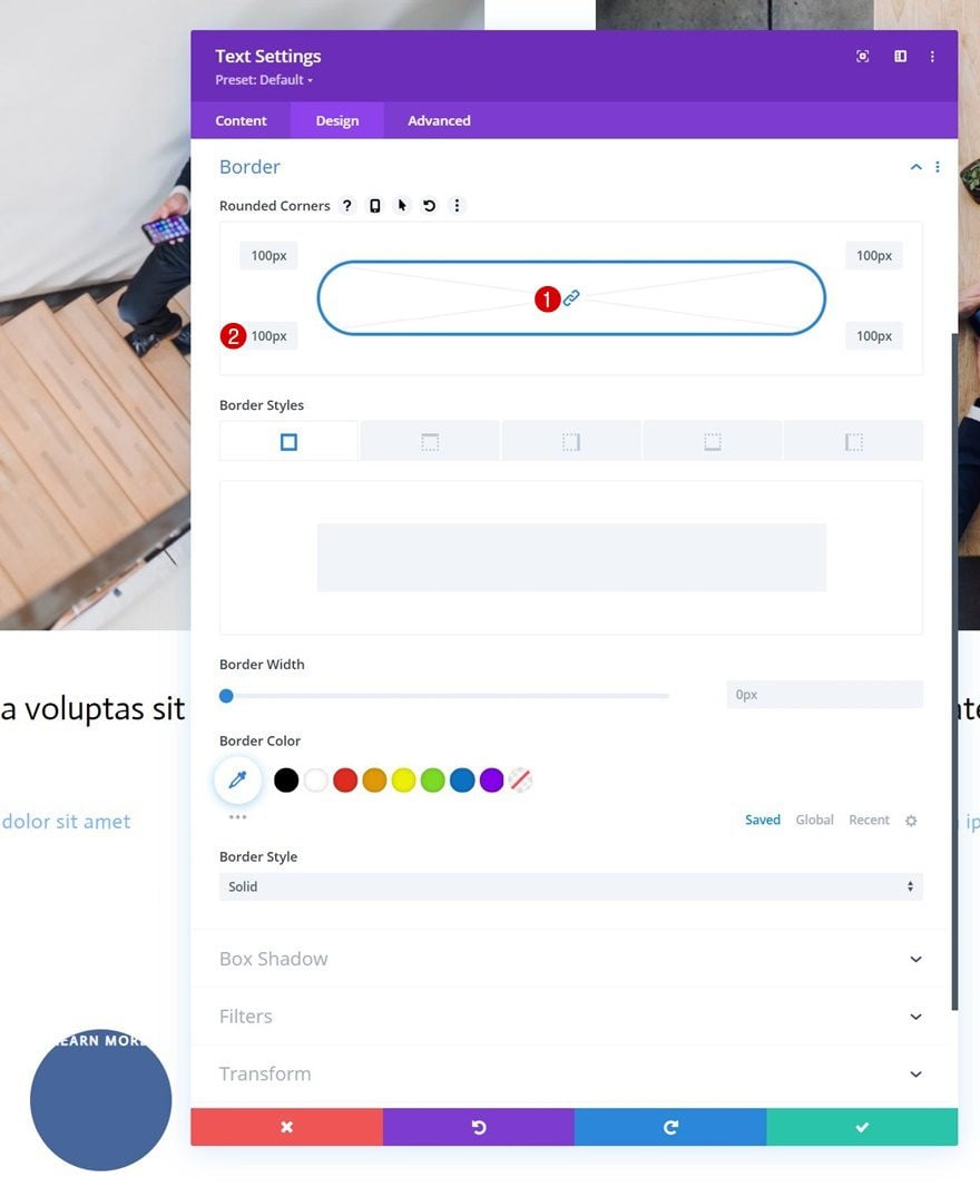
Border
We’re turning this module into a circle by changing the border settings.
- All Corners: 100px
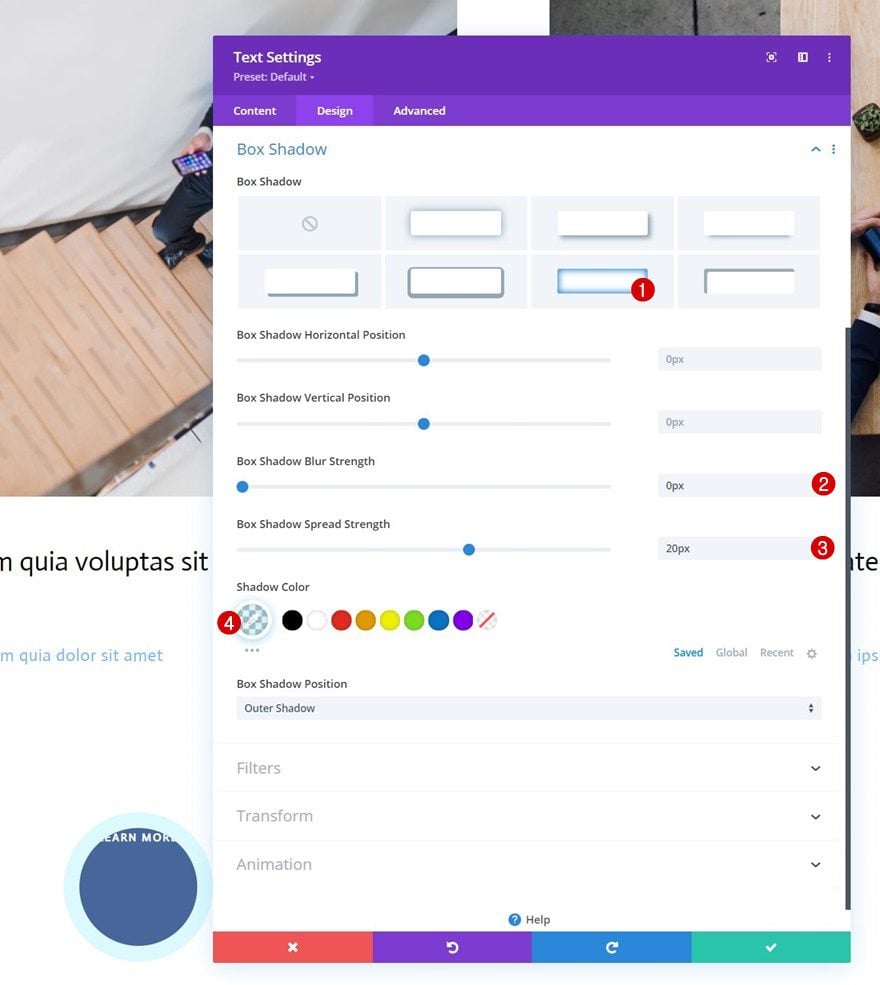
Box Shadow
We’ll add a subtle box shadow too.
- Box Shadow Blur Strength: 0px
- Box Shadow Spread Strength: 20px
- Shadow Color: rgba(7,213,255,0.14)
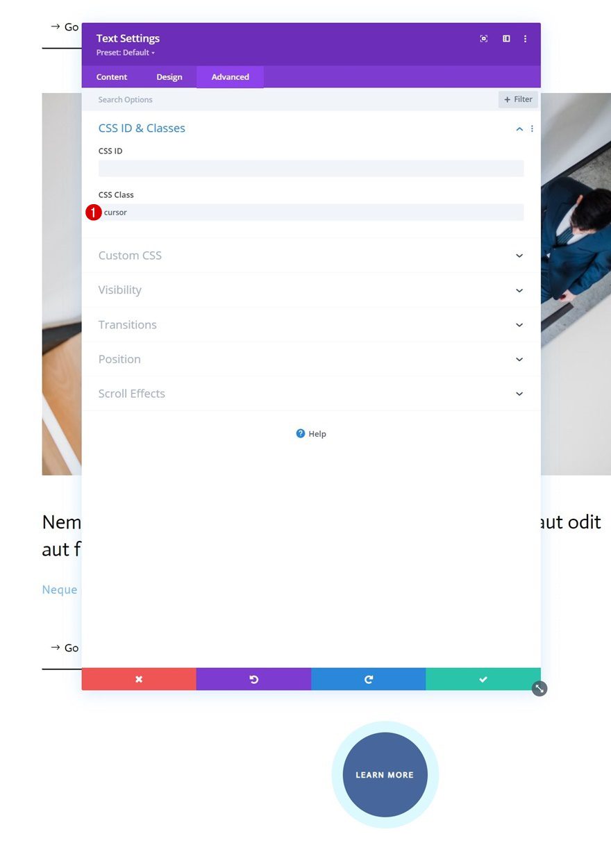
CSS Class
Then, we’ll give our module a CSS class.
- CSS Class: cursor
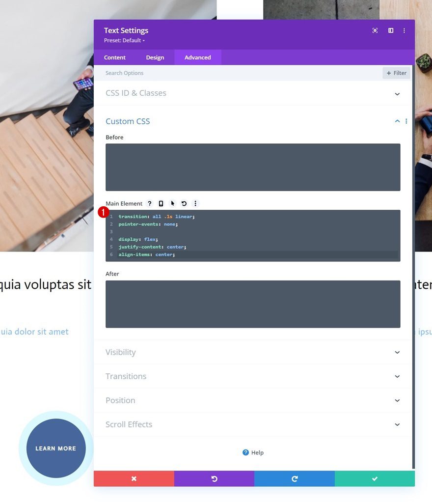
Main Element CSS
We’re adding some CSS code lines to the module’s main element as well.
transition: all .1s linear;
pointer-events: none;

display: flex;
justify-content: center;
align-items: center;
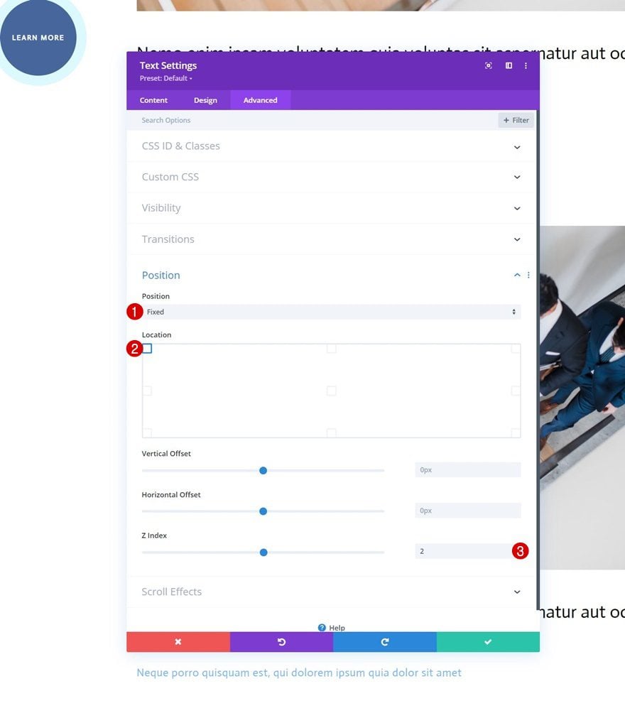
Position
And we’ll complete the module settings by modifying the position in the advanced tab:
- Position: Fixed
- Location: Top Left
- Z Index: 2
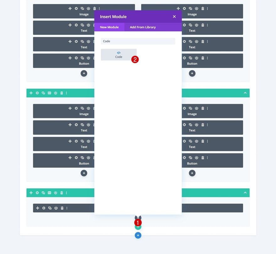
Add Code Module Below Text Module
Now that we have designed our cursor, it’s time to make the functionality work. To do that, we’ll add a new Code Module right below the cursor Text Module.
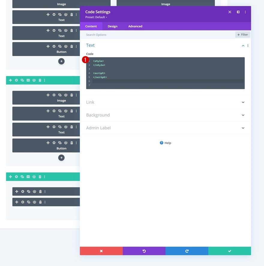
Add Style & Script Tags
Add some style and script tags to your Code Module.
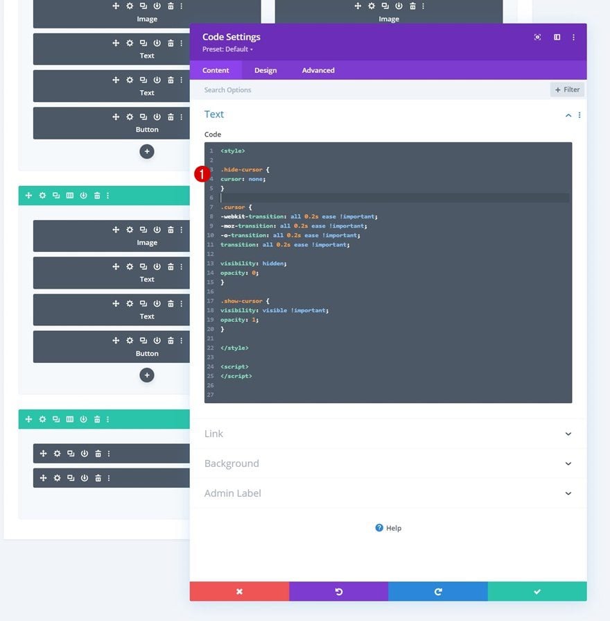
Add CSS Code
Insert the following lines of CSS code between the style tags:
.hide-cursor {
cursor: none;
}

.cursor {
-webkit-transition: all 0.2s ease !important;
-moz-transition: all 0.2s ease !important;
-o-transition: all 0.2s ease !important;
transition: all 0.2s ease !important;

visibility: hidden;
opacity: 0;
}

.show-cursor {
visibility: visible !important;
opacity: 1;
}
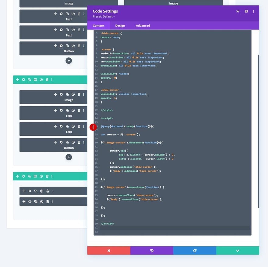
Add JQuery code
And use the following lines of JQuery code between the script tags:
jQuery(document).ready(function($){

var cursor = $('.cursor');

$('.image-cursor').mousemove(function(e){

cursor.css({
top: e.clientY - cursor.height() / 2,
left: e.clientX - cursor.width() / 2
});
cursor.addClass('show-cursor');
$('body').addClass('hide-cursor');

});

$('.image-cursor').mouseleave(function() {

cursor.removeClass('show-cursor');
$('body').removeClass('hide-cursor');

});

});
Preview
Now that we’ve gone through all the steps, let’s take a final look at the outcome across different screen sizes.
Desktop
Mobile
Final Thoughts
In this tutorial, we’ve shown you how to add more interaction to clickable elements on your page. More specifically, we’ve shown you how to trigger a cursor button when someone hovers an element of your choosing. This adds some extra interaction to your page design and might help you increase clickthrough rates! You were able to download the JSON file for free as well. If you have any questions or suggestions, feel free to leave a comment in the comment section below.
If you’re eager to learn more about Divi and get more Divi freebies, make sure you subscribe to our email newsletter and YouTube channel so you’ll always be one of the first people to know and get benefits from this free content.


Can we add the “Add to Cart” button functionality to the button on woocommerce website. Please let us know if that’s possible,.
That looks pretty cool. Will give it a go. I’m sure it will find a home somewhere on one of the projects.
Hi
Great trick. Thanks.
Is it possible to make such a button shape for all products’ images if to hover it with the cursor?
Hi, nice! Question: in the ‘box-shadow- step, your LEARN MORE text in the button suddenly align vertically to the center, where first it is place on the upper part. How is that done? I miss the step to vertical align the text ?