

As you already know by now, Divi has a ton of design settings that allow you to create unique hover effects for any Divi element (sections, rows, or modules). Usually, a hover effect is isolated to just one element. For example, if you add a transform rotate property to a module on hover, that rotation will activate when hovering over the module. However, if you add an additional hover effect to the row containing the module, this adds another layer of hover effects when hovering over the module. This opens the door for some uniquely abstract hover effects.
In this tutorial, we will explore how to transform multiple elements for abstract hover effects using Divi’s built-in settings. And since we will be using rows a little differently for this design, I’ll show you how to create a grid layout for your rows so you can showcase these hover effects in a gallery (if you want).
Let’s get started.
- 1 Sneak Peek
- 2 Download the Transform Multiple Elements on Hover Layout for FREE
- 3 Download For Free
- 4 You have successfully subscribed. Please check your email address to confirm your subscription and get access to free weekly Divi layout packs!
- 5 Getting Started
- 6 Abstract Hover Effects for an Image
- 7 Abstract Hover Effects for a Call to Action (example 1)
- 8 Abstract Hover Effects for a Call to Action (example 2)
- 9 Creating a Grid Layout for Your Rows
- 10 Final Thoughts
Sneak Peek


Download the Transform Multiple Elements on Hover Layout for FREE
To lay your hands on the designs from this tutorial, you will first need to download it using the button below. To gain access to the download you will need to subscribe to our newsletter by using the form below. As a new subscriber, you will receive even more Divi goodness and a free Divi Layout pack every Monday! If you’re already on the list, simply enter your email address below and click download. You will not be “resubscribed” or receive extra emails.

To import the layout to your page, simply extract the zip file and drag the json file into the Divi Builder.
Let’s get to the tutorial shall we?
Getting Started
Subscribe To Our Youtube Channel
For this tutorial, you will need the following:
- The Divi Theme installed and active
- A few images. I’m using images from our premade layouts accessible from within the Divi Builder
Once you are ready, go to your WordPress Dashboard. Then create a new page (Pages > Add New), give your page a title, and deploy the Divi Builder. Choose the option “Build from Scratch”.
Now your blank canvas awaits!
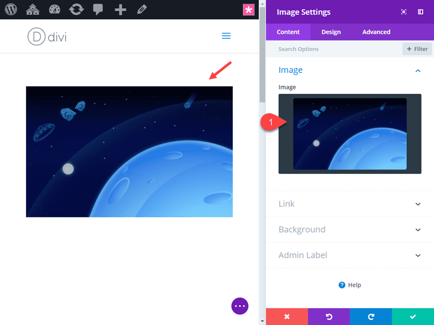
Abstract Hover Effects for an Image
This first design will combine the skew transform hover effects on the row and the image module to create a fanning effect to our image on hover. Aside from looking cool, this effect can also serve as a helpful UI interaction that lets the user know that by clicking the image, you will see more images. So you could use the image as a link to your gallery page if you wanted.
Here’s how to do it.
First create a new regular section with a one-column row.
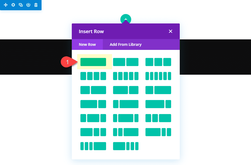
Then add an image module to the row.
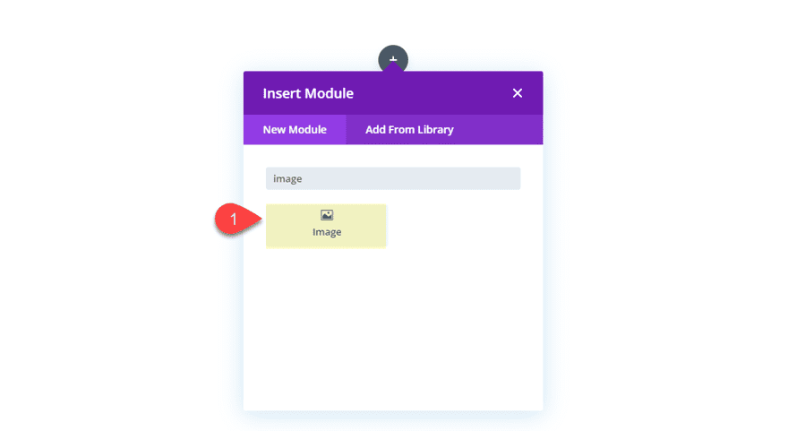
Next, add upload an image to the module.
Add Image Module Hover Effects
Now we can add a few transform hover effects to the image that will scale rotate and skew the image. To do this go to the transform options and update the following:
Transform Scale X and Y axis: 110%
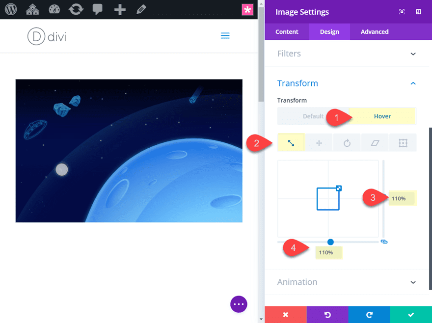
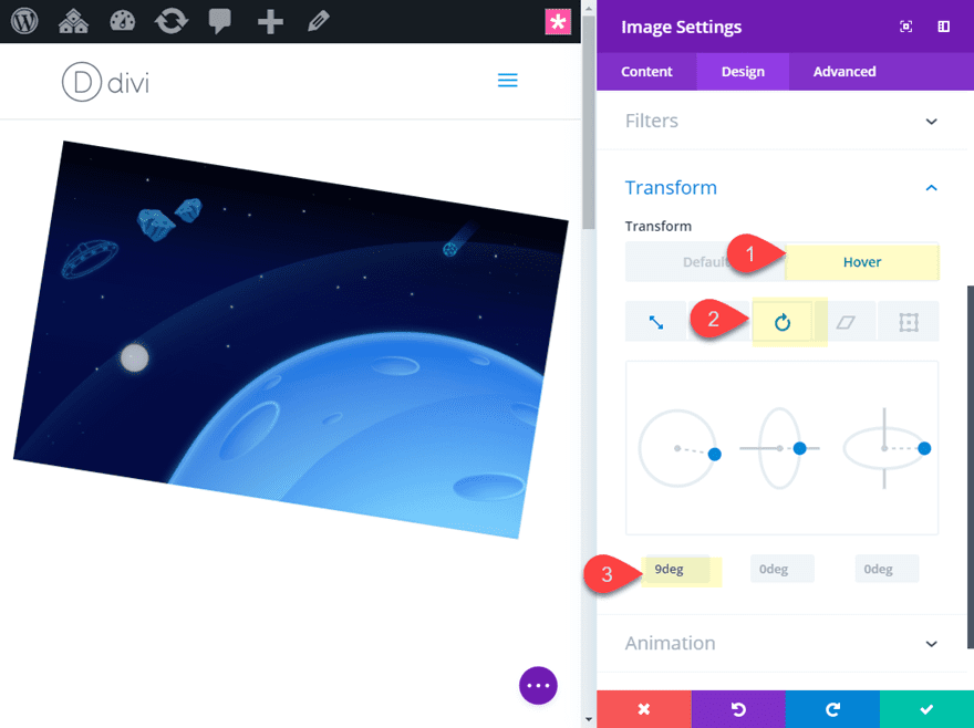
Transform Rotate Z axis: 9deg
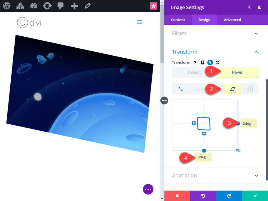
Transform Skew X and Y axis: 3deg
That’s it! Pretty simple. Now we need to customize the row to add another hover effect that will activate when hovering over the elements.
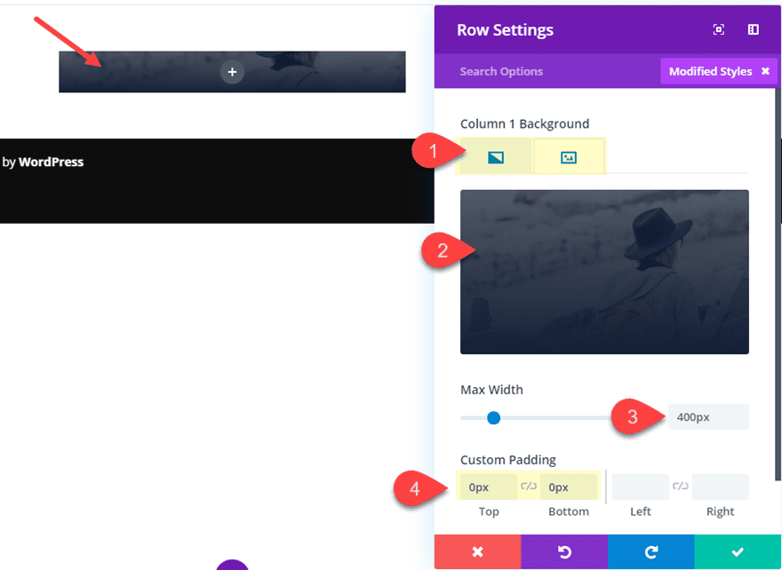
Row Settings
In order for this design to work, the row will need to be the same size as the image inside it so that the hover area will be the same for both. This will allow us to add different hover effects for both the module and the row that will activate when hovering over the module (or in this case the image). This works because hovering over a module inside of a row will activate the hover effects the same way it would if you hover over the row. And, because we have a different hover effect on the module, both hover effects will activate when hovering over the module. This allows us to use a combination of abstract hover effects using box shadow, transform skew, and transform rotate to both the row and the module.
We already have our module hover effects for our image in place, now we need to adjust the size of our row. Depending on the size of the image, the module should span the full width of the row already so technically there isn’t a need to adjust the width of the row. But for this example, I’ll shrink the row in order to make room for our hover effects.
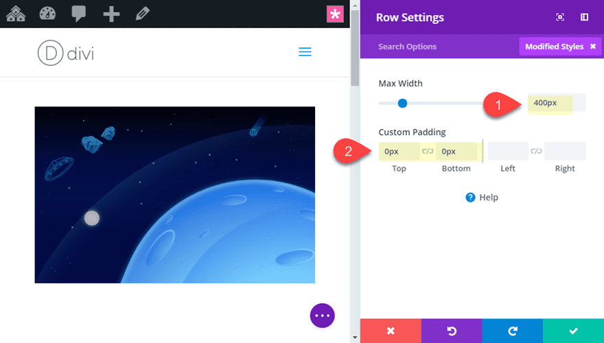
Update the row settings as follows:
Max-width: 400px
Since we want the height of our row to match the image inside it, we need to get rid of the default top and bottom padding:
Custom Padding: 0px top, 0px bottom
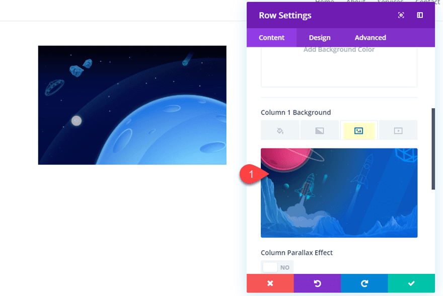
Now we need to add a background image to the row column. This background image will come into view whenever the image module transform hover effect skews and rotates.
Column 1 Background Image: [enter image]
Continue to update the row with a box shadow on hover as follows:
Box Shadow: see screenshot
Box Shadow Horizontal Position: 0px (default), -30px (hover)
Box Shadow Vertical Position: 0px (default), -15px (hover)
Shadow Color: #002f66
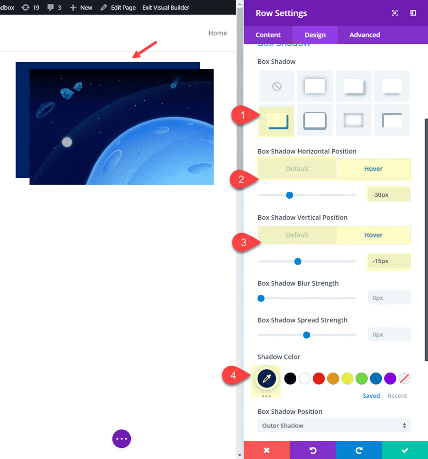
This box shadow adds the effect of another image appearing behind the row background image which will appear once we add our transform hover effects that will rotate and skew the background image into view.
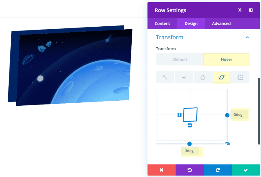
Finally, we are ready to add a skew transform property to add an additional hover effect for the row.
Transform Skew X and Y axis: -3deg
Final Result
Here is the final result.
And it will scale nicely on mobile as well.
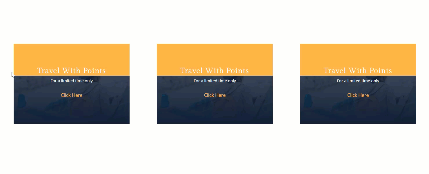
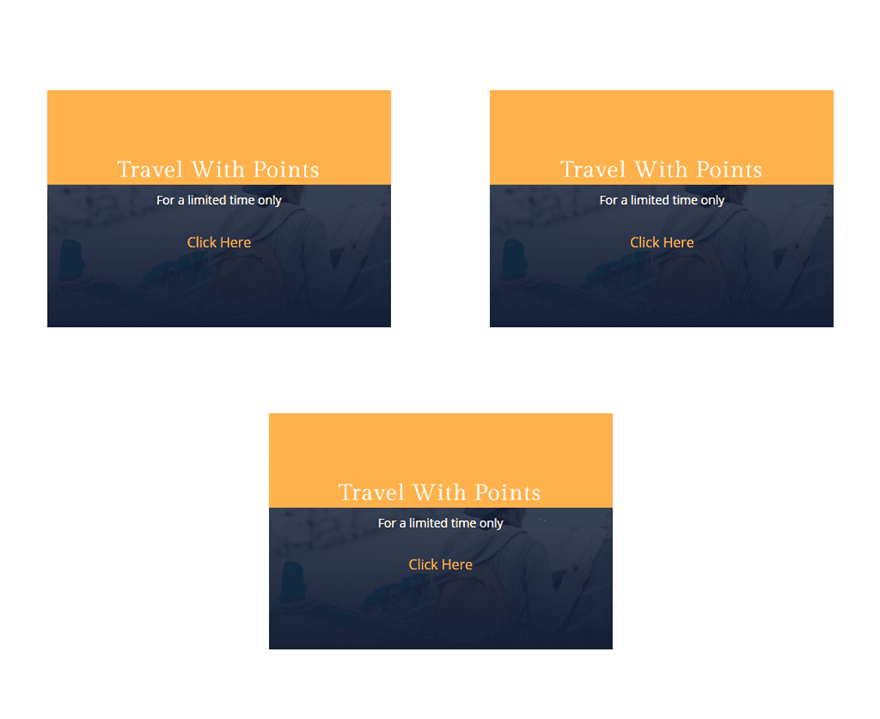
Abstract Hover Effects for a Call to Action (example 1)
Row Settings
Create a new regular section with a one column row.
Then update the row settings as follows:
Column 1 Background Gradient Left Color: rgba(34,43,58,0.71)
Column 1 Background Gradient Right Color: #222b3a
Background Image: [insert image]
Max Width: 400px
Custom Padding: 0px top, 0px bottom
We will be circling back to the row settings to complete our abstract hover effects in a bit, but for now, let’s get our call to Action Module added to the row.
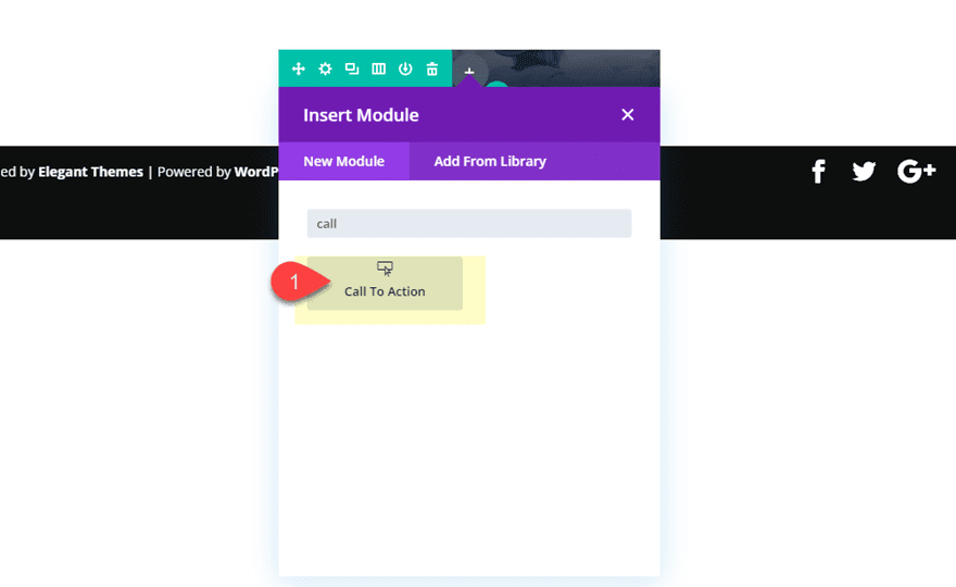
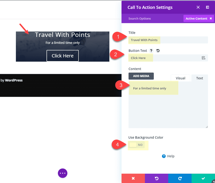
Call to Action Module Settings
Open the Call to Action Module settings and update the content as follows:
Title: Travel With Points
Button Text: Click Here
Content: For a limited time only
Button Link URL: # (just to activate the button for now)
Use Background Color: NO
Then update the design setting for the text and spacing of the module.
Title Font: Gilda Display
Button Text Size: 16px
Button Text Color: #ffb238
Button Background Color: rgba(0,0,0,0)
Button Border Width: 0px
Custom Padding: 20% top, 20% bottom
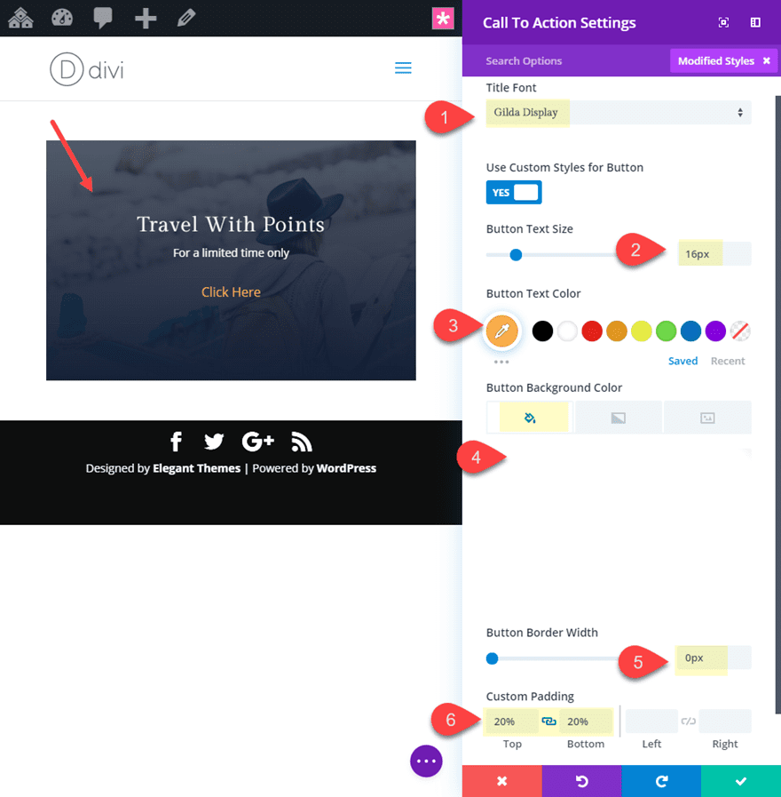
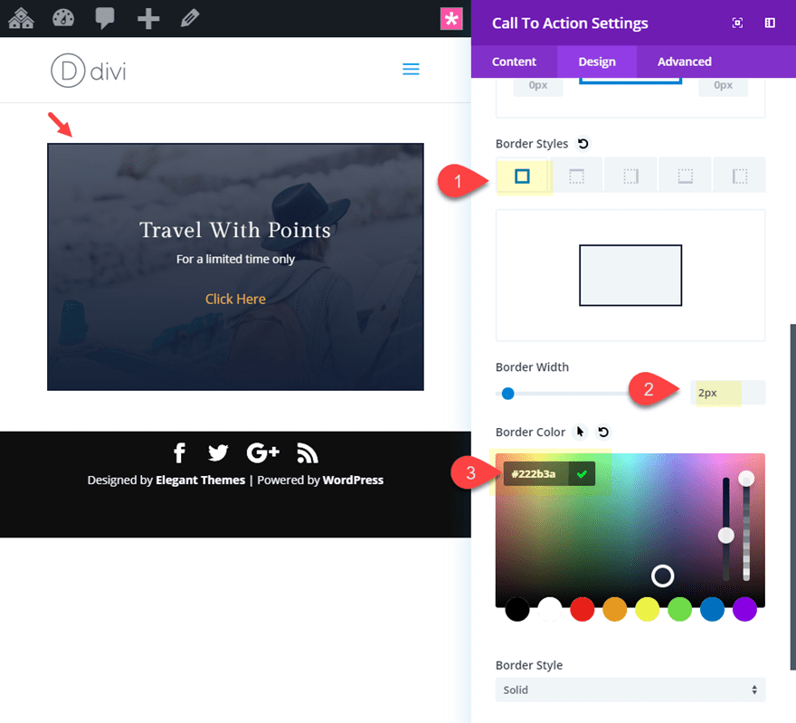
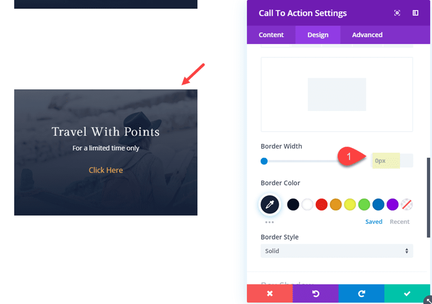
Now add a border to the module.
Border Width: 2px
Border Color: #222b3a
That takes care of our default design. Now it’s time for the fun part. Remember, because our row and module are essentially the same size (height and width), the hover area will be the same for both. In other words, the hover effects we add to the row and module will both activate when hovering over the elements. This allows us to use a combination of abstract hover effects using box shadow, transform skew, and transform rotate to both the row and the module.
Let’s start with the row hover effects.
Row Hover Effects
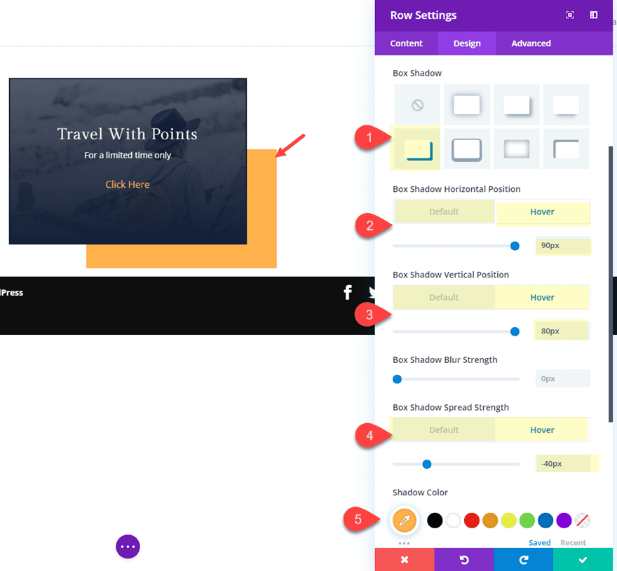
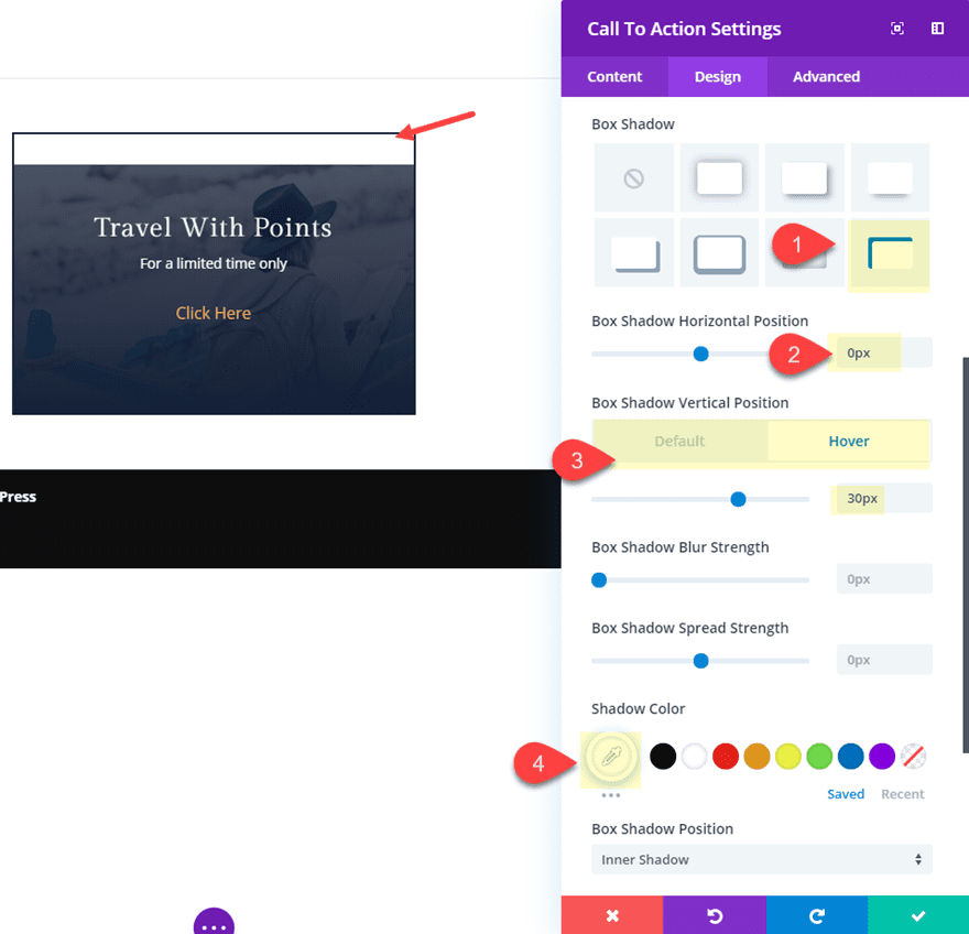
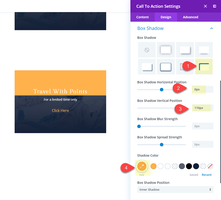
First, we can add a box shadow on hover to our row. Open the row settings and update the following:
Box Shadow: see screenshot
Box Shadow Horizontal Position: 0px (default), 90px (hover)
Box Shadow Vertical Position: 0px (default), 80px (hover)
Box Shadow Spread Strength: 0px (default), -40px (hover)
Shadow Color: #ffb238
Keep in mind that the box shadow will also inherit the transform options we will be adding next.
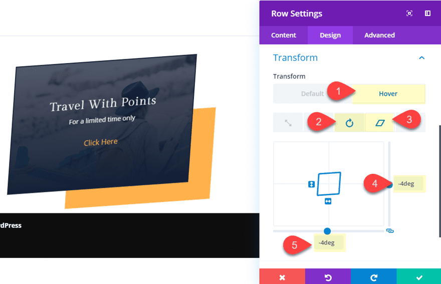
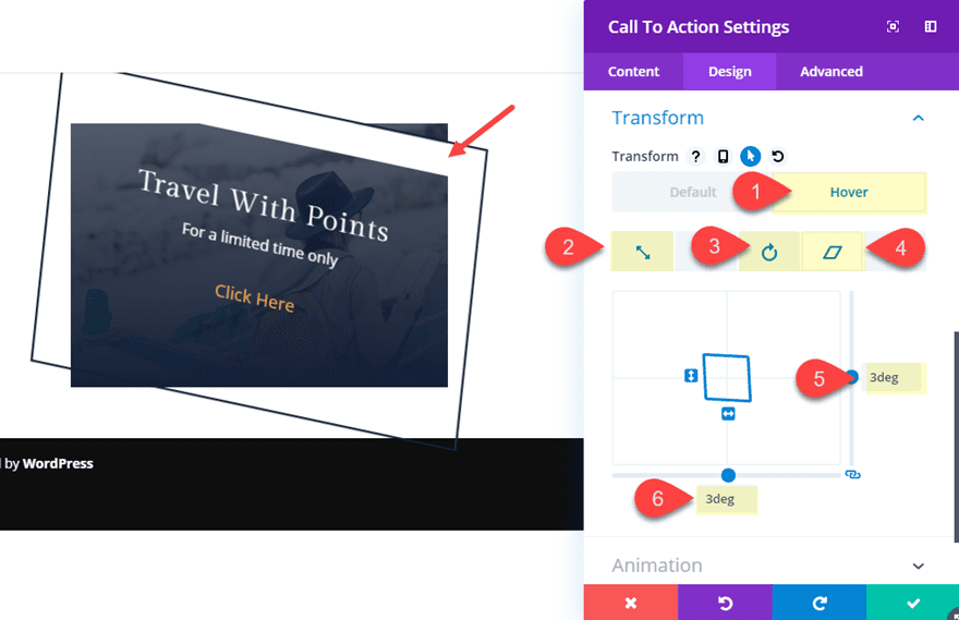
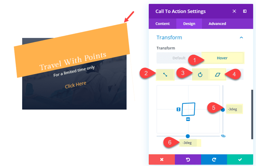
Now let’s add a rotate and skew transform property on hover.
Transform Rotate X axis (hover): 10deg
Transform Skew X axis (hover): -4deg
Transform Skew Y axis (hover): -4deg
That takes care of the row hover effects. Now we need to add the hover effect to the Call to Action Module that will complete the design.
Call to Action Module Hover Effects
Open the call to action module settings and give it a box shadow hover effect as follows:
Box Shadow: see screenshot
Box Shadow Horizontal Position: 0px
Box Shadow Vertical Position: 0px (default), 30px (hover)
Shadow Color: #ffffff
Finally, add a scale, rotate and skew transform property on hover as follows:
Transform Scale X and Y Axis (hover): 115%
Transform Rotate Z axis (hover): 9deg
Transform Skew X axis (hover): 3deg
Transform Skew Y axis (hover): 3deg
Increasing the size of the module using scale on hover will help minimize the chance of the user hovering over just the row element instead of the module.
Final Result
Here is the final result of the abstract hover effect. Notice how both the row hover effects and the module hover effects activate on hover to skew the elements in for an abstract design.
Here is what the hover effect will look like on mobile. However, since most mobile browsers require a tap to activate the hover effect, you may want to disable the hover effect on mobile to avoid the user having to double tap if you are using the module as a link.

Abstract Hover Effects for a Call to Action (example 2)
To jumpstart the design this next abstract hover effect, let’s duplicate the section containing our first example. Now all we need to do is make some minor adjustments to the design and hover effects for a unique design.
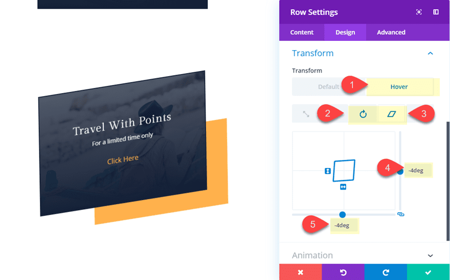
Update Row Settings
First, update the row settings as follows:
Transform Rotate Z axis: -5deg
Transform Skew X and Y axis: -4deg
Update Call to Action Module Settings
Now let’s tweak the module settings as follows:
First, take out the border…
Border width: 0px
Then update the box shadow as follows:
Box Shadow Horizontal position: 0px
Box Shadow Vertical Position: 110px
(make sure and disable the hover effect inherited from the previous design you duplicated)
Shadow Color: #ffb238
Now we can update our transform property hover effects. Here we are basically decreasing the scale a bit and adding negative values to our previous rotate and skew transform properties to move the element in the opposite direction on hover.
Update the following transform options:
Transform Scale X and Y Axis (hover): 110%
Transform Rotate Z axis (hover): -9deg
Transform Skew X axis (hover): -3deg
Transform Skew Y axis (hover): -3deg
Creating a Grid Layout for Your Rows
Because this design requires the parent row to wrap around the module and have the same height and width, you don’t really have the ability to create a column layout like you would normally, However, you can use the flex property to align your rows horizontally in a grid layout.
To do this, first duplicate the row containing your module a couple of times so that you have three rows in one section.
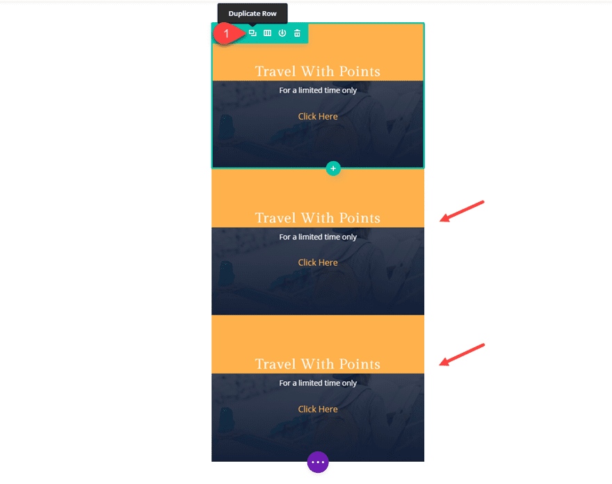
Then add a custom margin to each of the rows:
Custom Margin: 50px top, 50px bottom
Then open the section settings and simply add the following custom CSS to the Main Element.
display: flex;
flex-wrap: wrap;
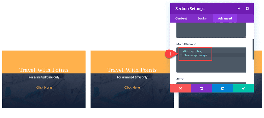
Now you have three columns of rows that will respond with your browser size.

Final Thoughts
Transforming multiple elements on hover does provide another level of creativity you can explore. The examples in this tutorial where meant to show you what is possible, but feel free to tweak the designs for your own project. As you might expect, you can get pretty wacky if you want. But you can also be a bit more conservative to create a subtle interaction design element like the image module example in this tutorial.
I look forward to hearing from you in the comments.
Cheers!


Thanks for the good tutorial.
Thanks for the good tutorial.
Thank you for making these available for download. I can deconstruct faster than I can follow each step.
Thank you.
Chris