

You can basically apply a background image to anything within the Divi Builder. Whether it’s a section, row, column or module, the possibilities are endless. And with blend modes, you can even make background images show through selectively. This allows you to make modules to connect with each other on another level. Where one module stops, the other module takes over. They don’t behave as separate elements anymore but, instead, help you get a view of the overall design.
In this tutorial, we’re going to show you, step by step, how you can connect modules with each other by making a section background show through the box shadow of your modules.
Let’s get to it!
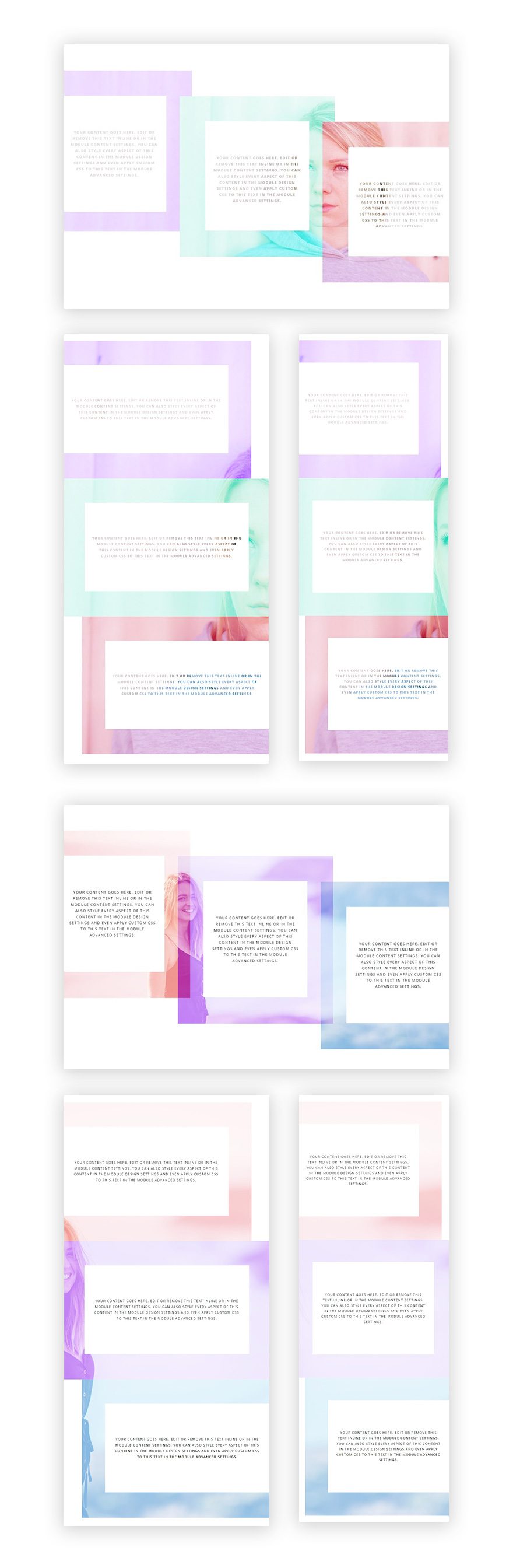
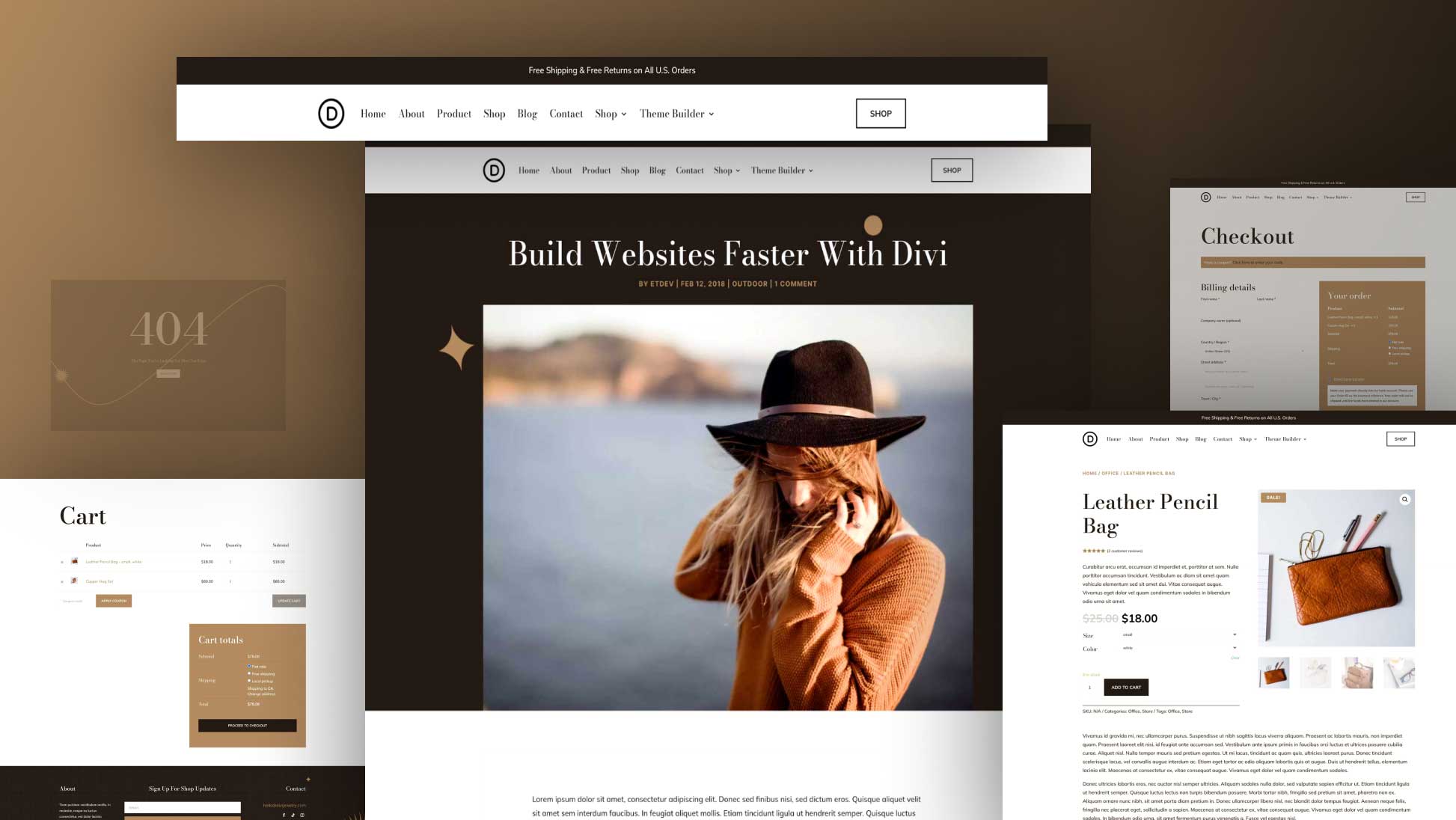
Preview
Before we dive into the tutorial, let’s take a quick look at the what we’ll recreate within this tutorial on different screen sizes.
Approach
- This approach only works only when using a white background color for your row & Text Modules
- We’re using blend modes to make parts of the section background image appear
- The two blend modes that allow this (in combination with a white row background color) are Screen & Hard Light
- To cover up the entire section background, we’re making the row take up the entire width of the screen by changing the Sizing options
- To get rid of the section background image at the top and bottom, we’ll also remove all of the top and bottom padding of our section
- Both of these blend modes give a different effect (up to you to choose which one you prefer)
- We’re using colored box shadows that’ll allow parts of the section background image to show through
- You can apply this method to any module you want (if you give it a white background + colored box shadow)
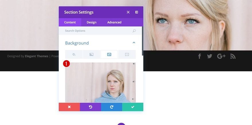
Add a New Section
Background Image
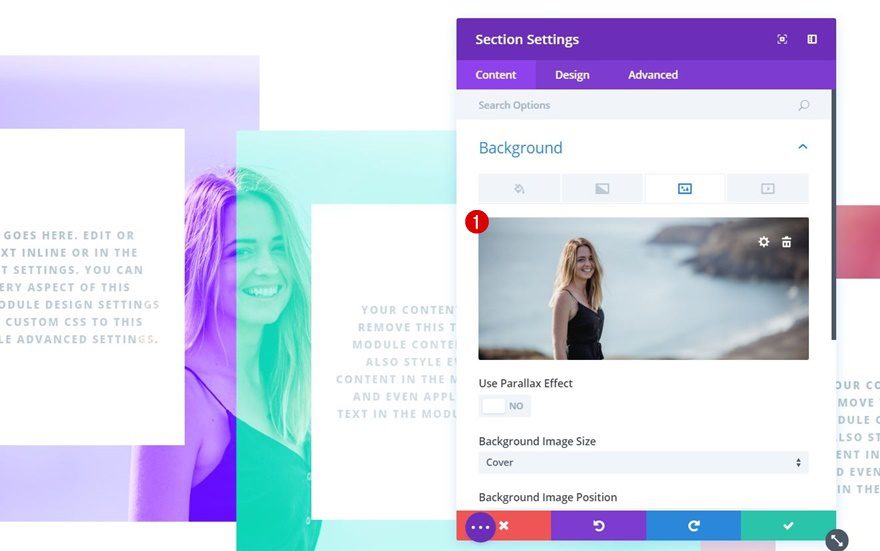
Let’s start by adding a new section to a new or existing page. The first thing you’ll need to do within your section settings is uploading a background image.
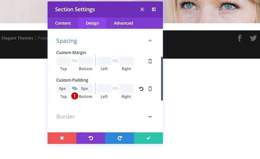
Spacing
Then, move on to the Design tab and apply ‘0px’ to both the top and bottom padding of your section within the Spacing settings. This will get rid of the space between your section and the row you’re about to add in the next part.
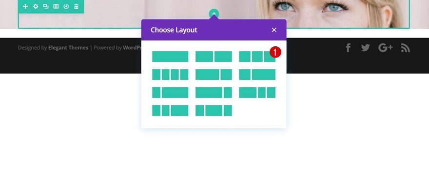
Add a New Row
Column Structure
Continue by adding a row with the following column structure to your section:
Background Color
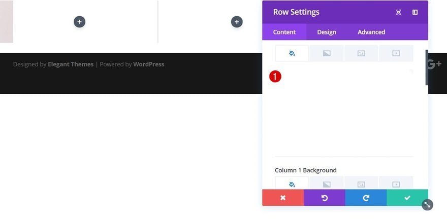
As mentioned in the approach of this blog post, you will definitely need to give your row a white background if you want it to work.
Sizing
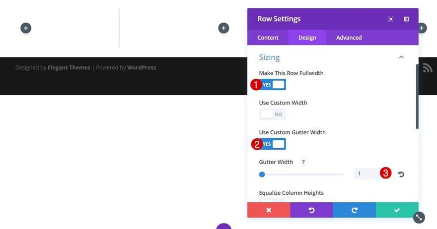
We’re also getting rid of the section background image that shows up on the left and right side of your row by using the following Sizing options:
- Make This Row Fullwidth: Yes
- Use Custom Gutter Width: Yes
- Gutter Width: 1
Spacing
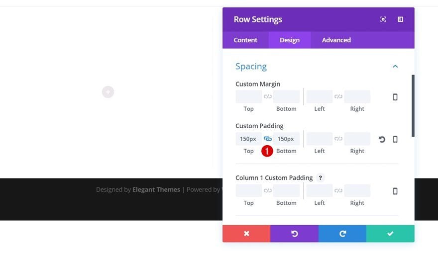
We’ve removed all of the top and bottom padding of our section. We do, however, need some space before and after our modules show up, that’s why we’ll add ‘150px’ to the top and bottom padding of the row instead.
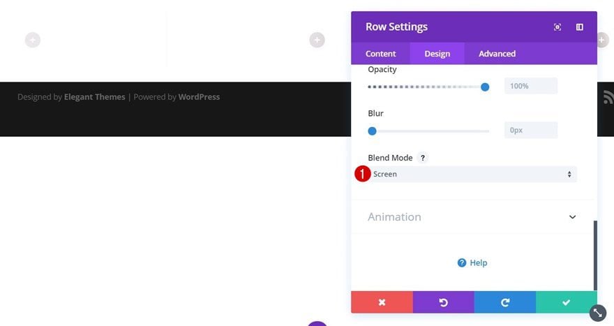
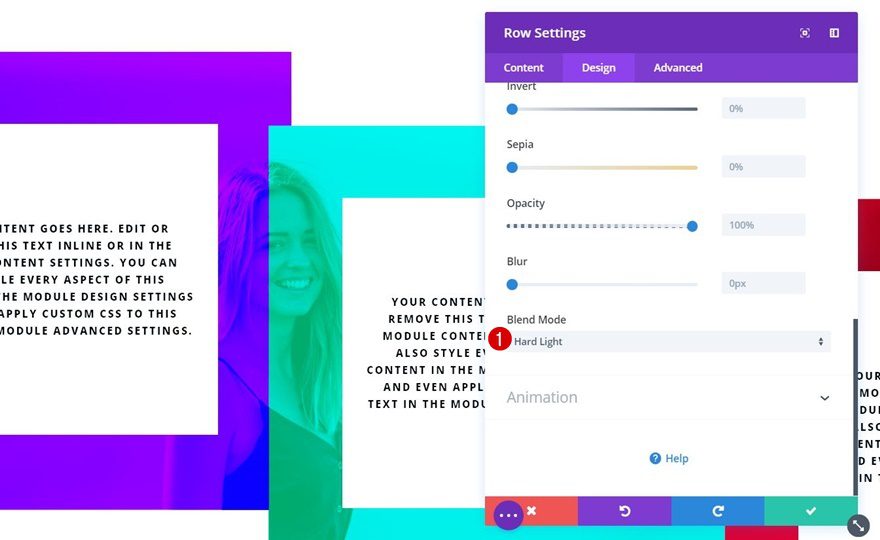
Blend Mode
Both the ‘Screen’ and ‘Hard Light’ Blend Modes will make this design work. We’ll start with the ‘Screen’ Blend Mode which you can enable in the Filter options of your row settings.
Add Text Module to Column 1
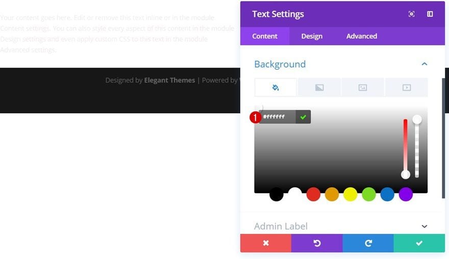
Background Color
Now that we’ve modified our section and row settings, it’s time to start adding the modules we need. We’re going to need three Text Modules in total, one for each column. We’ll start with the first Text Module in column 1 and modify it. Afterwards, we can clone it, place it in the remaining columns and make small tweaks to it. Add your Text Module and use a white background color for it. You can’t use any other color because it’ll make your section background image show.
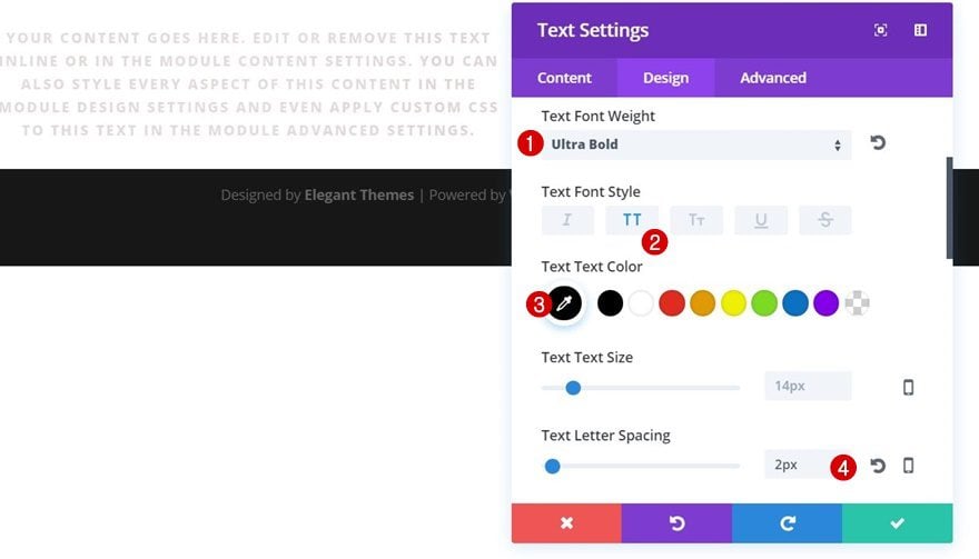
Text Setting
Then, apply the following Text settings to your Text Module:
- Text Font Weight: Ultra Bold
- Text Font Style: Uppercase
- Text Color: Black (this will make the section background image show through your text)
- Text Letter Spacing: 2px
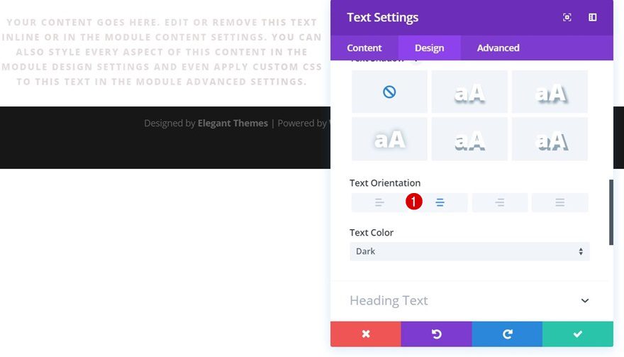
- Text Orientation: Center
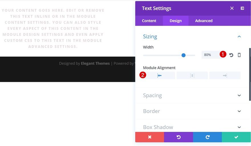
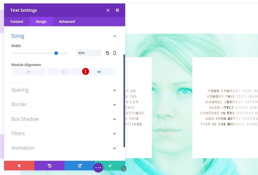
Sizing
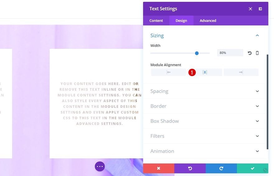
We’ve removed the default Gutter Width of our row which removes all of the space between our modules. We do want to create some space between them without messing with the row’s length. That’s why we’ll modify the Sizing settings of our Text Module instead:
- Width: 80%
- Module Alignment: Left
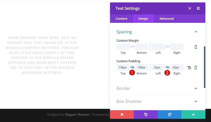
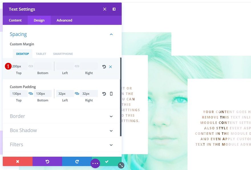
Spacing
And to make the design more appealing, we’ll also add some padding to our Text Module:
- Top & Bottom Padding: 130px
- Left & Right Padding: 32px
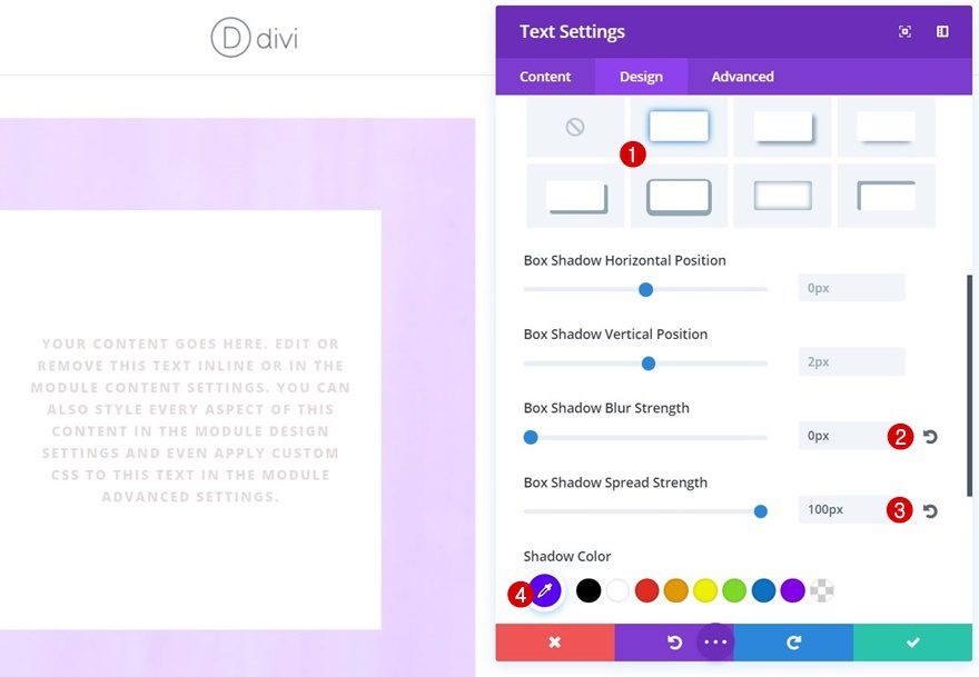
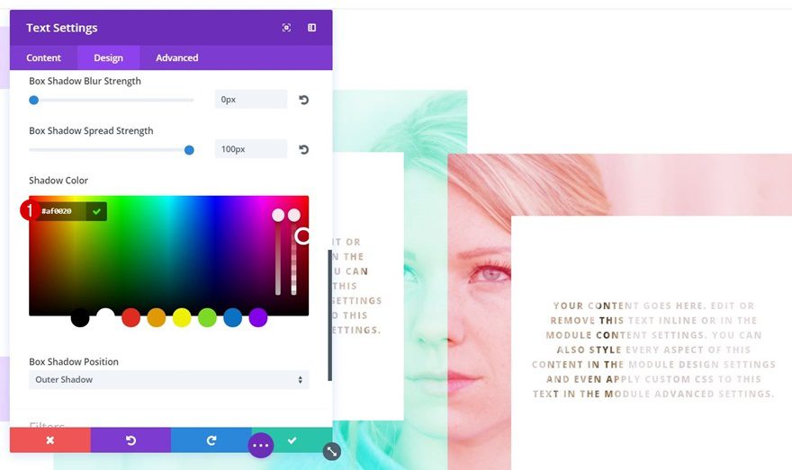
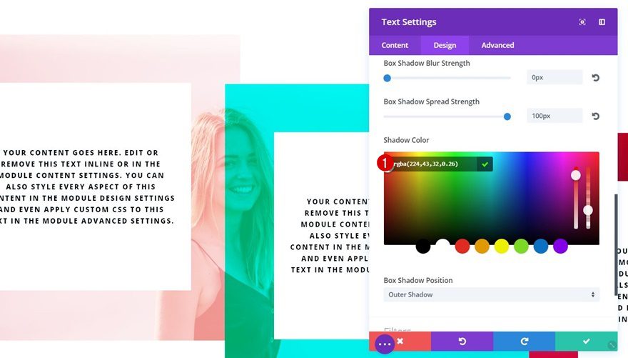
Box Shadow
The last thing we’ll need to do with this Text Module is adding a Box Shadow. This is where the magic happens. The Box Shadow will allow your section background to show through if you’re using any color but white. We’re using the following settings:
- Box Shadow Blur Strength: 0px
- Box Shadow Spread Strength: 100px
- Box Shadow Color: #5d00ff
Clone Text Module Twice
Place in Column 2
Change Module Alignment
Now go ahead and clone your Text Module twice and place it in the remaining columns. We’ll start by making some modifications to the Text Module that is located in column 2. Change the Module Alignment in the Sizing settings to center.
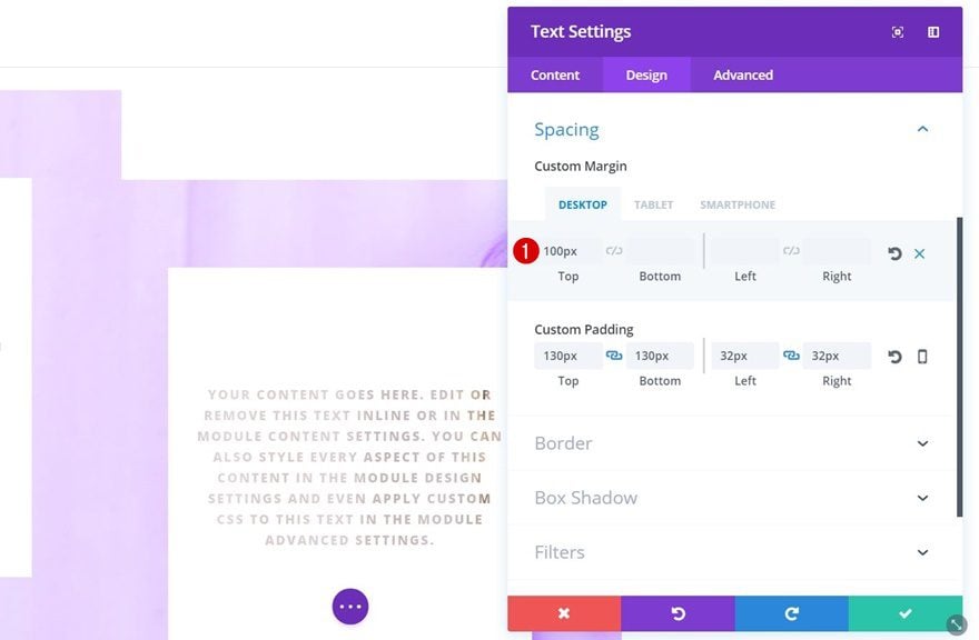
Change Spacing
We’ll also create some difference in height for our module by adding the following top margin to it:
- Top Margin: 100px (Desktop), 200px (Tablet & Phone)
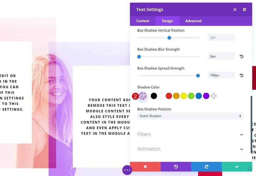
Change Box Shadow Color
Lastly, we’ll change our Box Shadow Color to ‘#00d3b3’.

Place in Column 3
Change Module Alignment
The Text Module in column 3 will need a right Module Alignment instead.
Change Spacing
We’ll also add ‘200px’ to the Top Margin (for all screen sizes.)
Change Box Shadow Color
And the Box Shadow Color for this last Text Module is ‘#af0020’.
Clone Section
Change Section Background Image
As mentioned in the approach of this blog post, you can use another Blend Mode as well called ‘Hard Light’. Clone the section you’ve created in the previous part of this post and change its background image.
Change Row Blend Mode
Then, open your row settings and change the Blend Mode to ‘Hard Light’.
Change Box Shadow Color #1
You can use whichever colors you want for the box shadows of your Text Modules as long as they’re not white. We’ve used ‘rgba(224,43,32,0.26)’ for the first Text Module.
Change Box Shadow Color #2
Open the Text Module in the second column next and change the Box Shadow Color to ‘rgba(131,0,233,0.26)’.
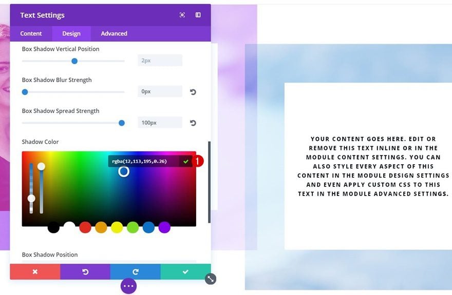
Change Box Shadow Color #3
The last Text Module uses ‘rgba(12,113,195,0.26)’.
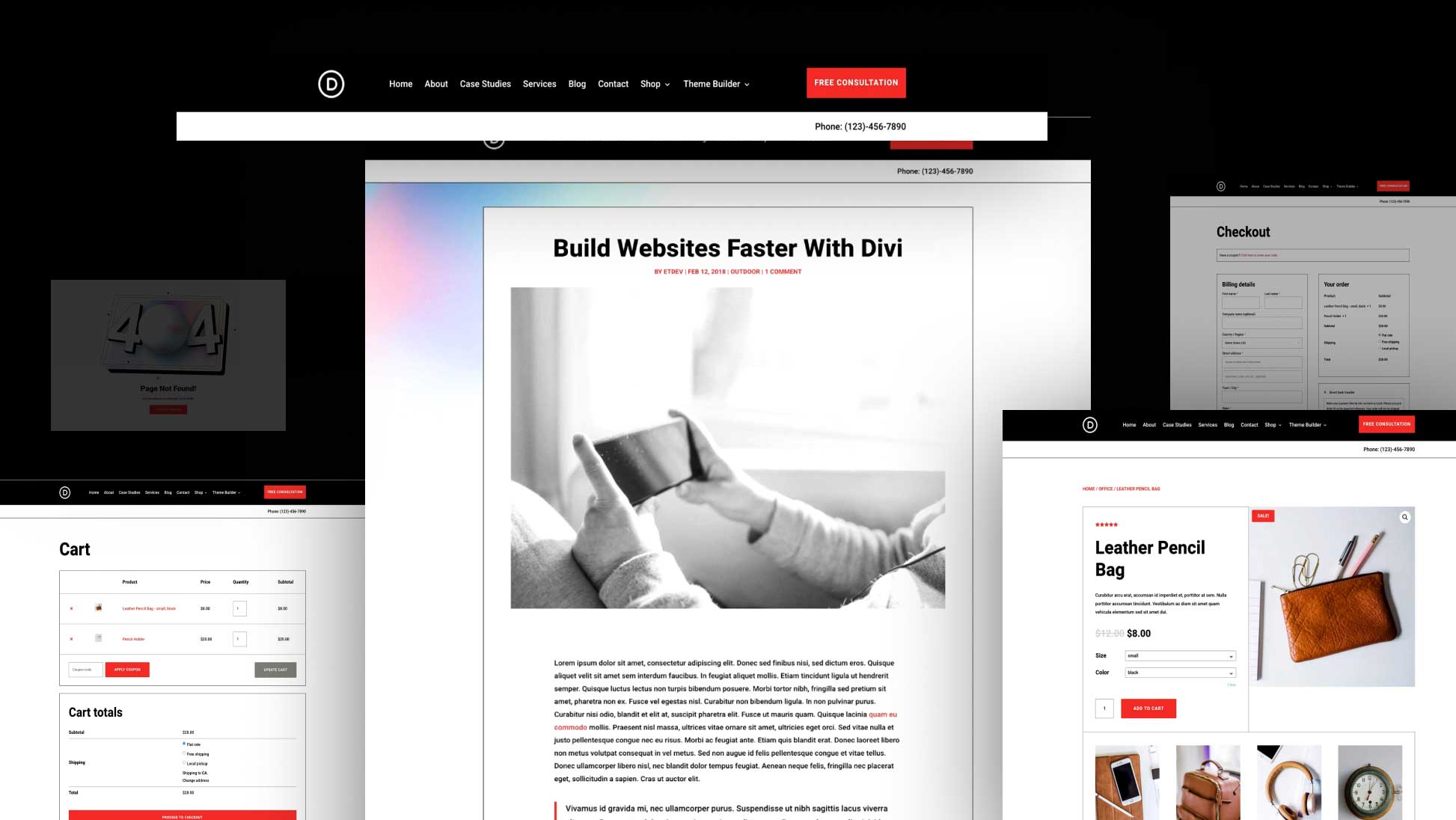
Preview
Now that we’ve gone through all the steps, let’s take a final look at the result on different screen sizes.
Final Thoughts
In this tutorial, we’ve shown you how to make section background images selectively show through, depending on your modules’ position. This approach creates more connection between modules. When one of them stops, the other takes over. If you have any questions or suggestions, make sure you leave a comment in the comment section below!


I searched for Photoshop tutorials on Google for weeks and came across this. This has been one of the best tutorials I have come across in a long time. Thanks for sharing.
great article -love the ideas. There are a lot of broken images in the post.
I always enjoy your tutes and ideas for new ways to use Divi. Nicely done!
WOW!…I’m having trouble to arrange my words, I’m very enthusiastic to see your post
Wow, this is an awesome idea to make my webpage look beautifully appealing. Background image with matching shadow will make words more appealing.
Thanks for this tutorial.
You’re welcome! 🙂
Great idea, thank you !
Very pleasant that tips are always also offered as a movie, so much quicker to follow! Thanks also to Mak for his clear way of explaining things.
Good to hear, Silvia, thanks! 🙂
Very nice.
Thanks for giving me an idea. Great Article.
You’re welcome, Dave!
Maybe I missed in the article…but could you provide the live link to a page demonstrated the final result?
Thanks!
There’s no live demo but you can check out the YouTube video to see it in action 🙂
Now that looks interesting.
Thanks, Richard!