

When showing multiple calls to action on your page, it can help to create an interactive scroll effect that unites different elements. One way to approach this is by turning modules into fixed elements while they’re moving around in their column container. In today’s tutorial, we’ll show you how to create a beautiful design that handles this technique and you’ll be able to download the JSON file for free as well!
Let’s get to it.
Preview
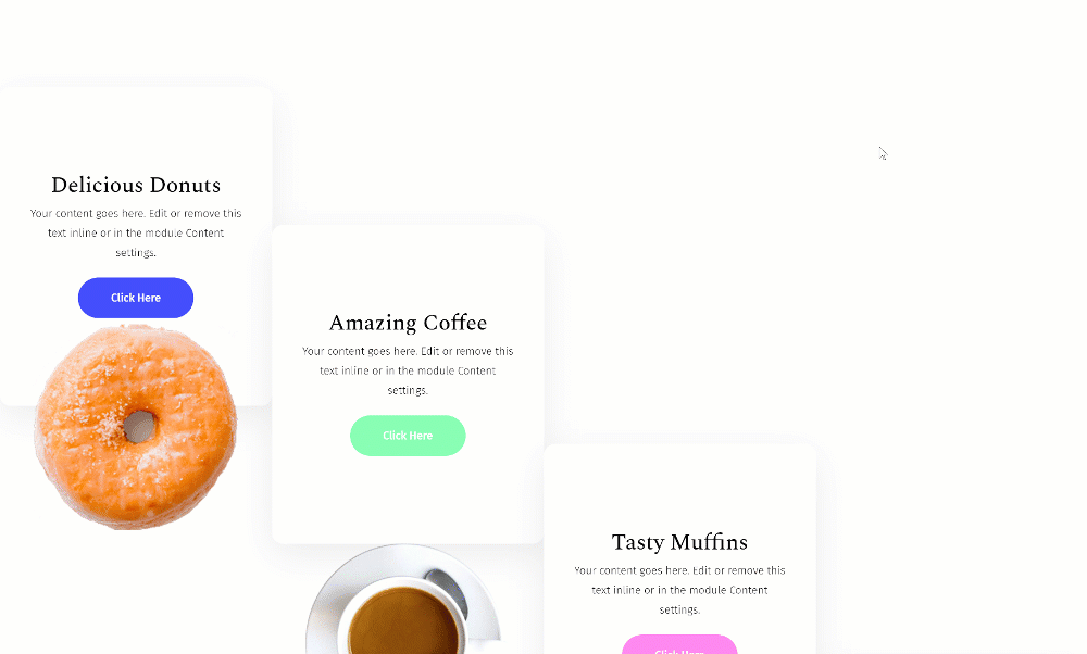
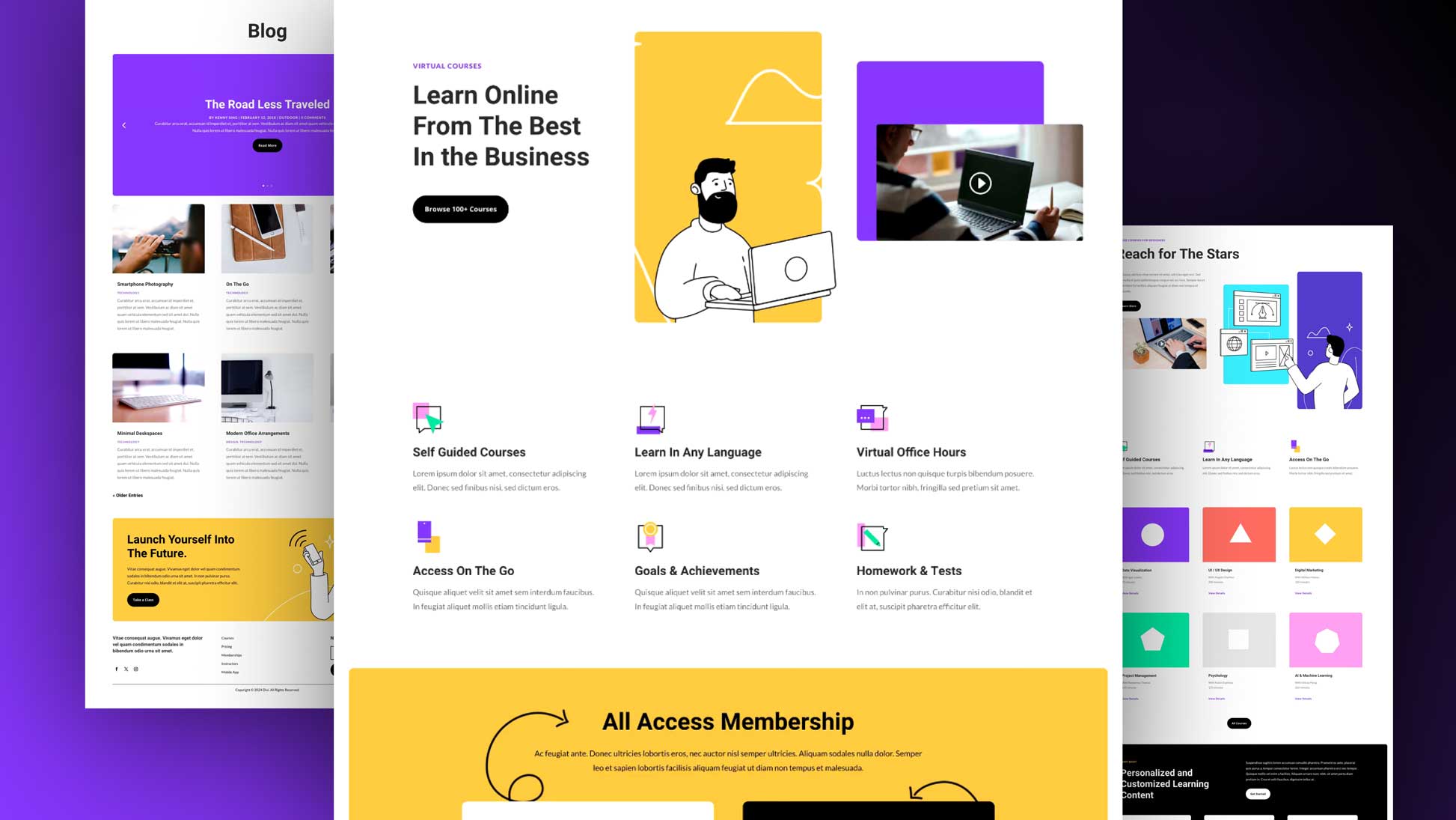
Before we dive into the tutorial, let’s take a final look at the outcome across different screen sizes.
Desktop
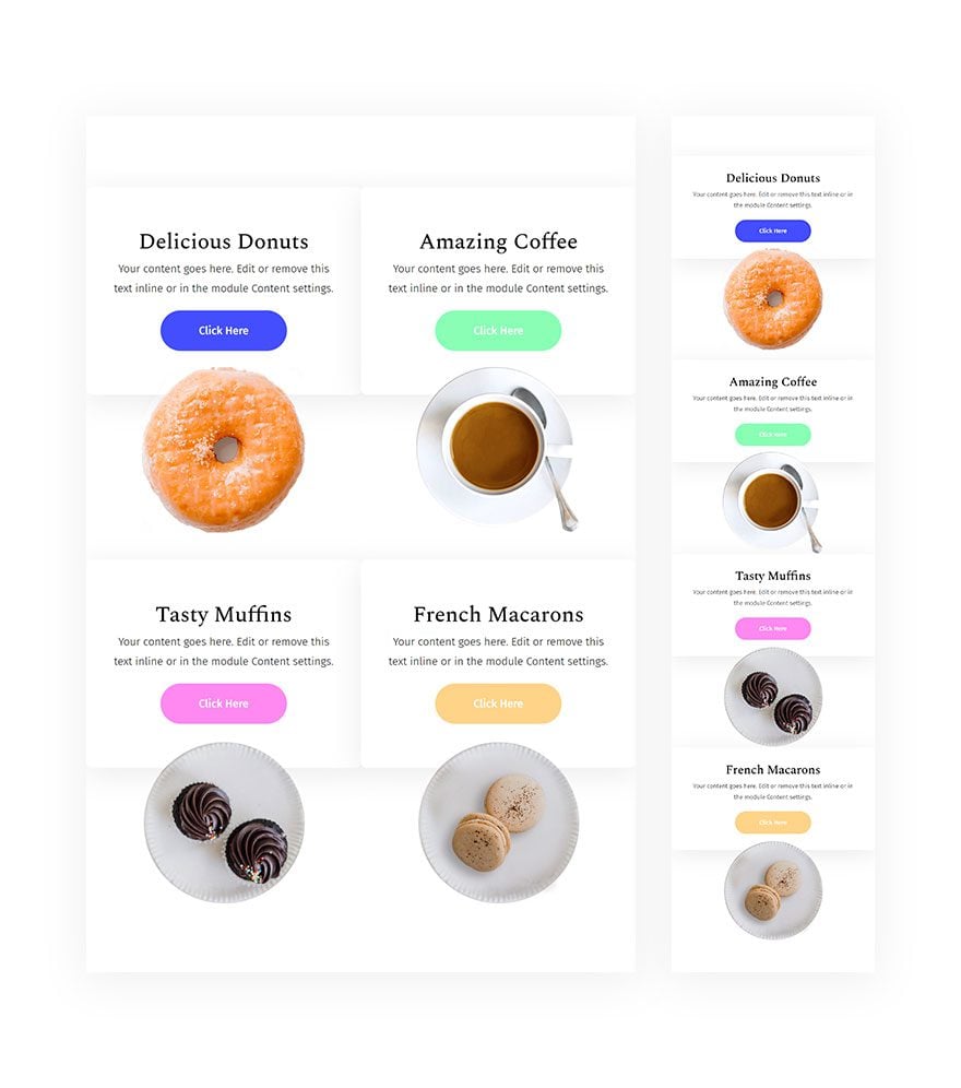
Tablet & Mobile
Download The Sticky Column Container Design for FREE
To lay your hands on the free sticky column container design, you will first need to download it using the button below. To gain access to the download you will need to subscribe to our newsletter by using the form below. As a new subscriber, you will receive even more Divi goodness and a free Divi Layout pack every Monday! If you’re already on the list, simply enter your email address below and click download. You will not be “resubscribed” or receive extra emails.

Subscribe To Our Youtube Channel
Let’s Start Recreating!
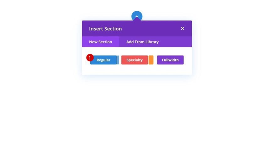
Add New Section
Start by adding a new regular section to the page you’re working on.
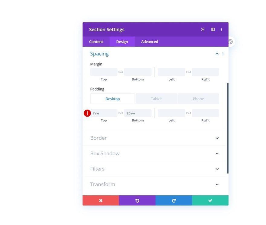
Spacing
Open the section settings and modify the top and bottom padding across different screen sizes.
- Top Padding: 7vw (Desktop), 10vw (Tablet), 15vw (Phone)
- Bottom Padding: 20vw (Desktop), 7vw (Tablet), 10vw (Phone)
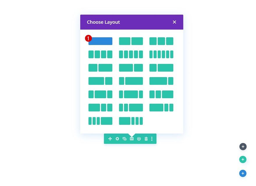
Add New Row
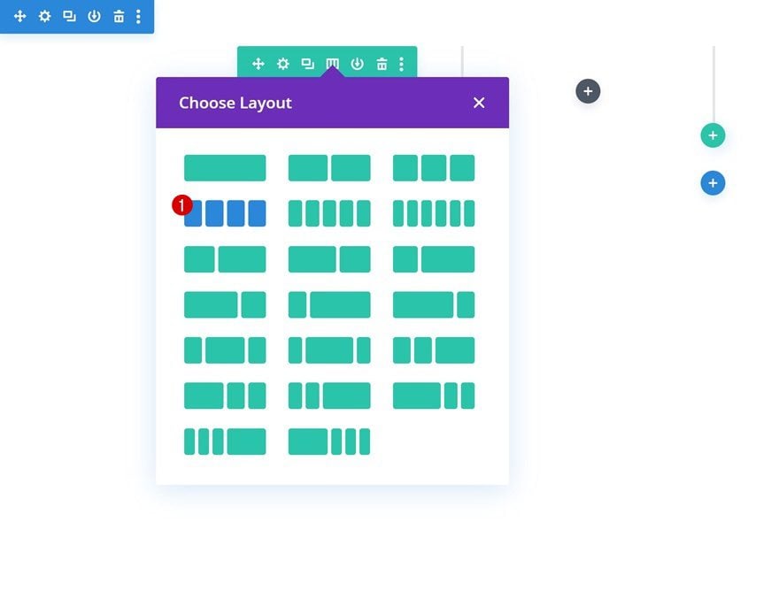
Column Structure
Continue by adding a new row using the following column structure:
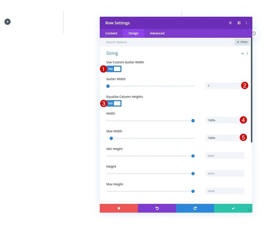
Sizing
Without adding any modules yet, open the row settings and allow the row to take up the entire width of the section. It’s also really important to enable the ‘Equalize Column Heights’ option. By doing that, you’ll create some empty space in the columns that’ll allow the fixed modules to move freely while scrolling down the page.
- Use Custom Gutter Width: Yes
- Gutter Width: 1
- Equalize Column Heights: Yes
- Width: 100%
- Max Width: 100%
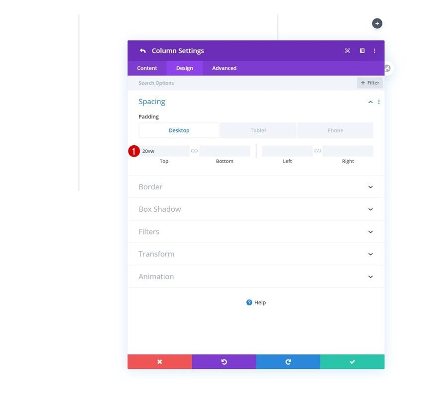
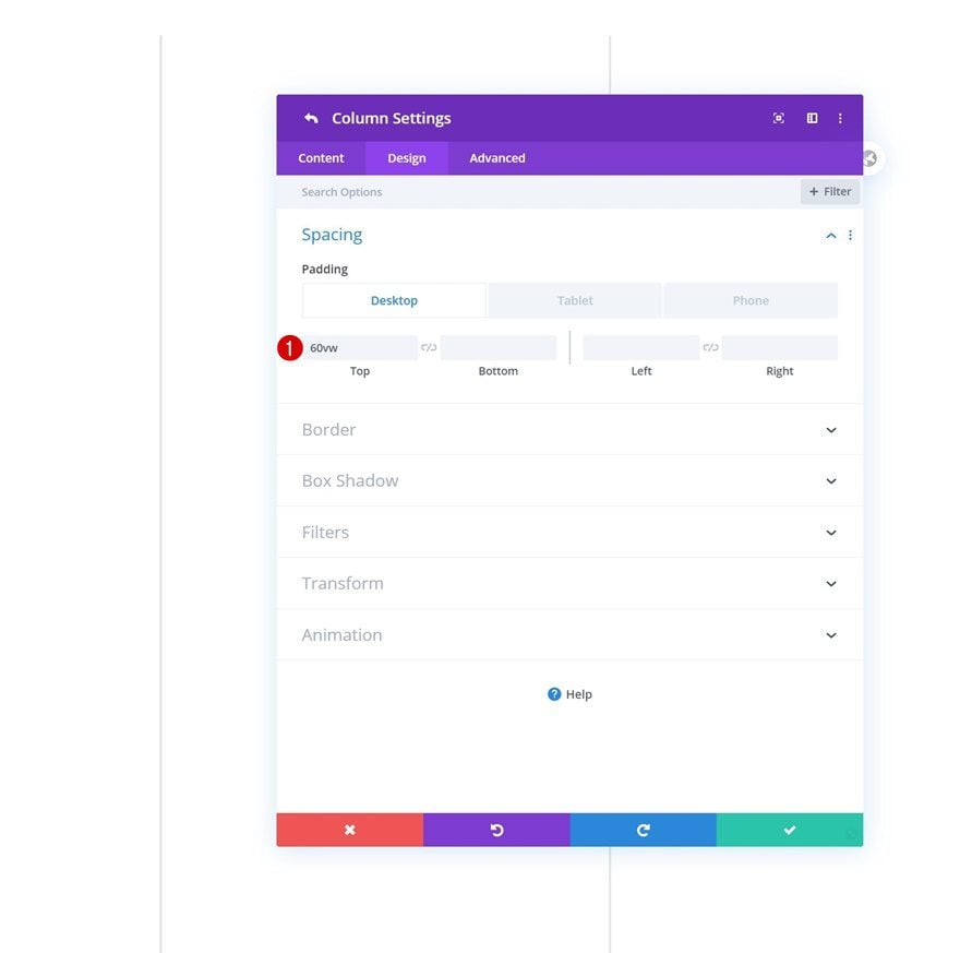
Column 2 Top Padding
Open the column 2 settings next and add some top padding on desktop.
- Top Padding: 20vw (Desktop), 0vw (Tablet & Phone)
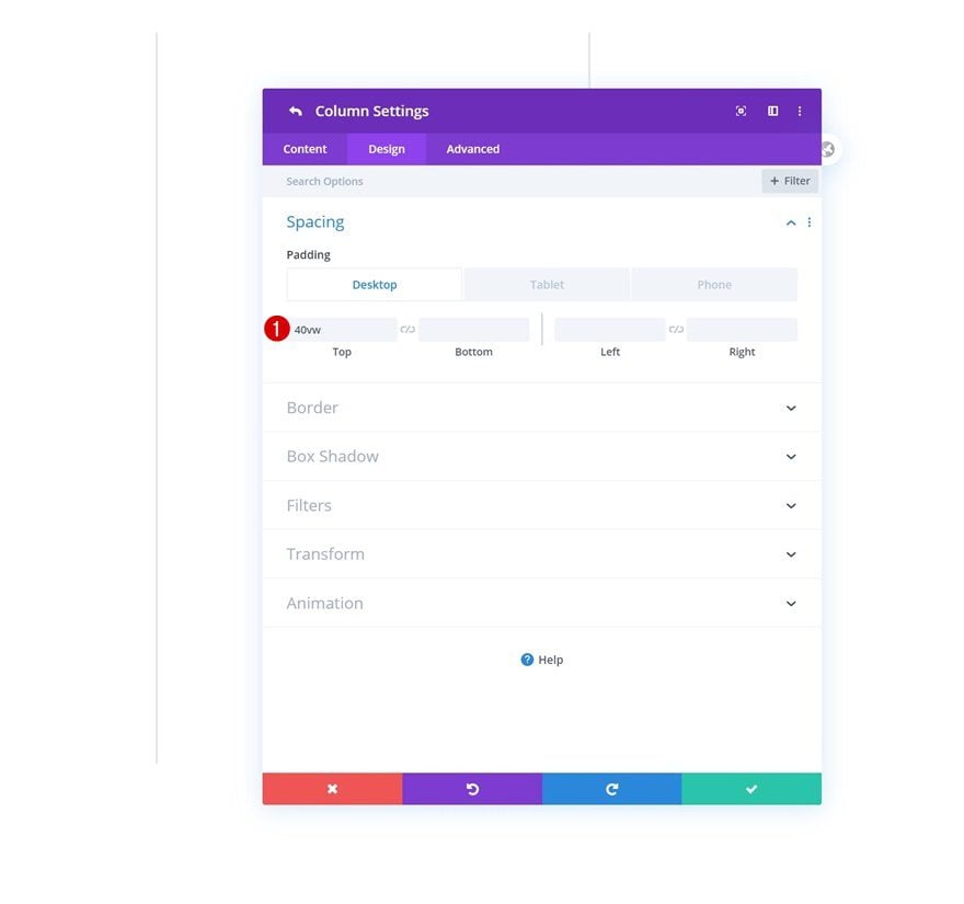
Column 3 Top Padding
Add a custom top padding value to the third column as well.
- Top Padding: 40vw (Desktop), 0vw (Tablet & Phone)
Column 4 Top Padding
And complete the row’s settings by adding a top padding value to column 4 too.
- Top Padding: 60vw (Desktop), 0vw (Tablet & Phone)
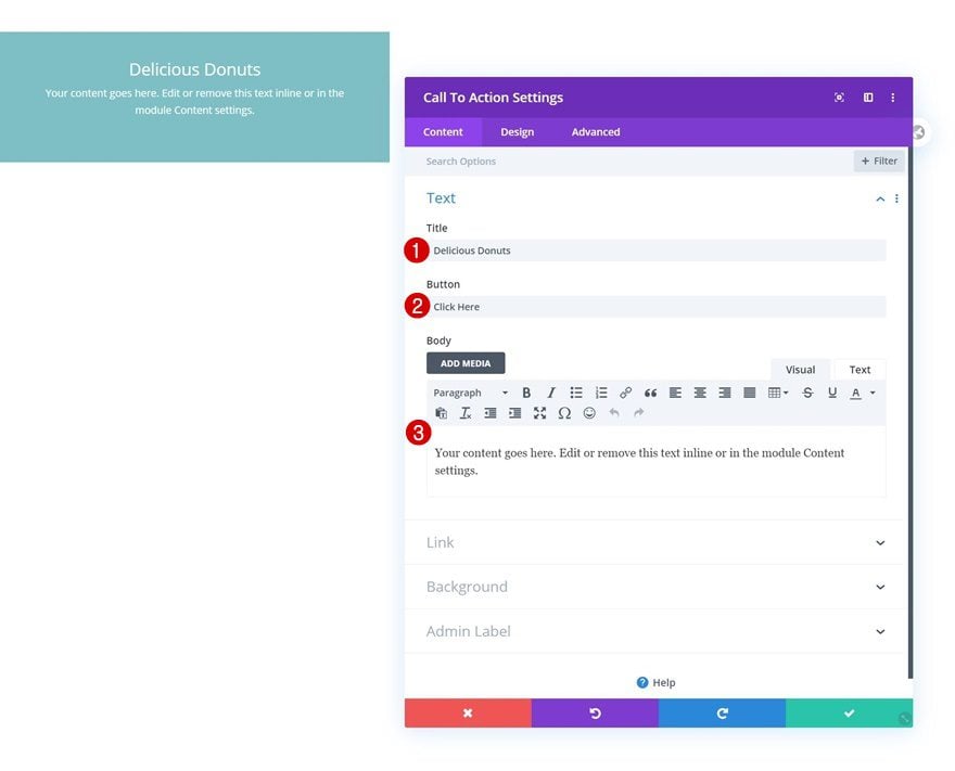
Add CTA to Column 1
Add Content
Time to start adding modules! The first module we need in column 1 is a CTA Module. Insert some content of your choice.
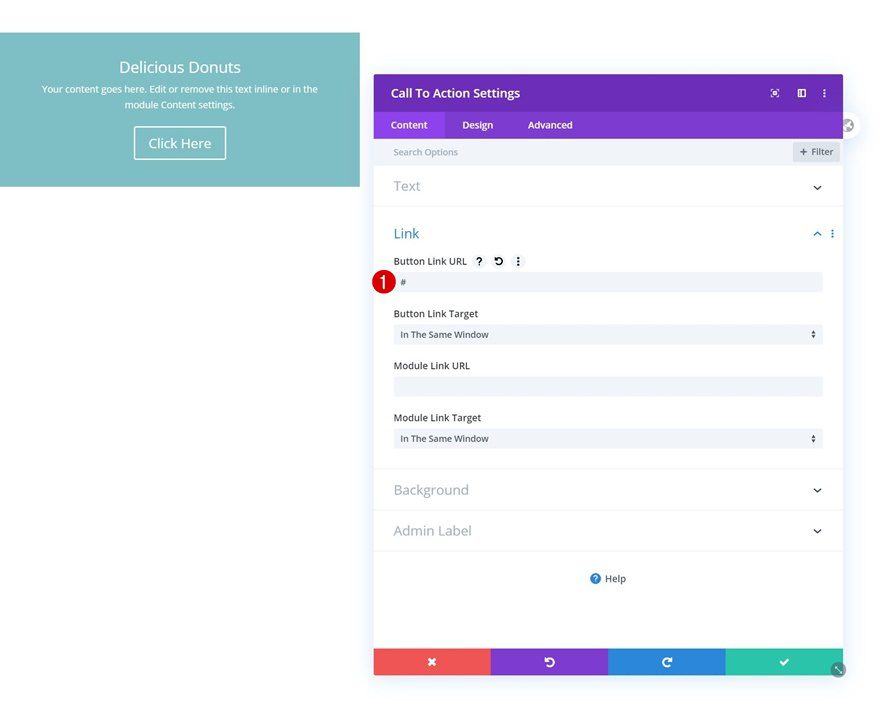
Link
Add a link to the button as well. Doing this will allow the button to show up in the design.
- Button Link URL: #
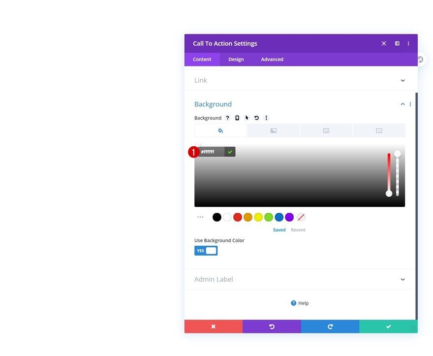
Background Color
Change the module’s background color next.
- Background Color: #ffffff
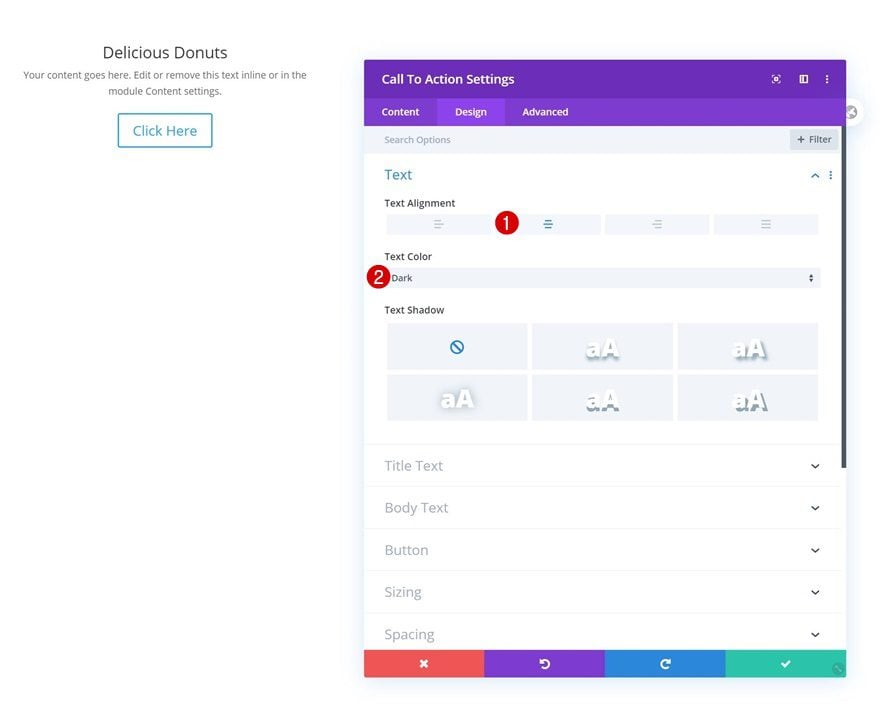
Text Settings
Move on to the design tab and change the general text settings.
- Text Alignment: Center
- Text Color: Dark
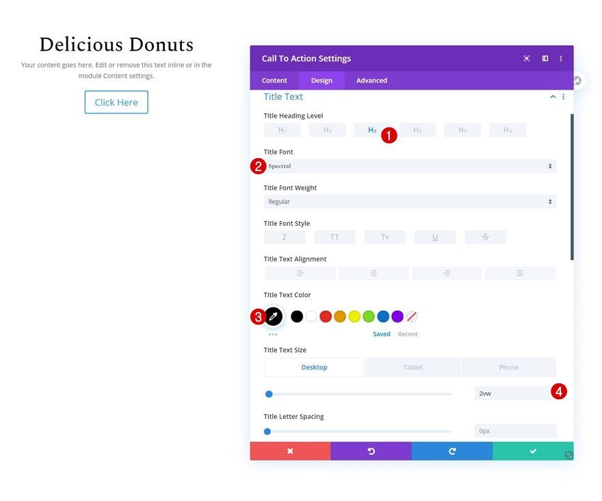
Title Text Settings
Change the title text settings too.
- Title Heading Level: H3
- Title Font: Spectral
- Title Text Color: #000000
- Title Text Size: 2vw (Desktop), 4vw (Tablet), 6vw (Phone)
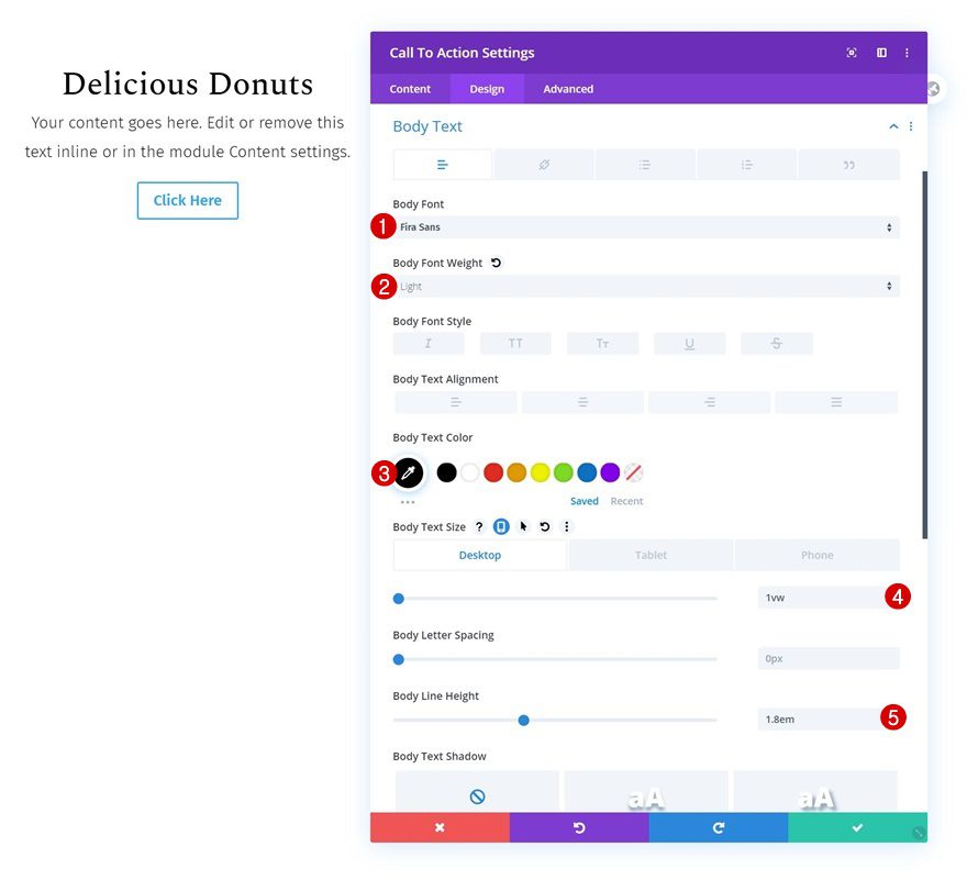
Body Text Settings
Along with the body text settings.
- Body Font: Fira Sans
- Body Font Weight: Light
- Body Text Color: #000000
- Body Text Size: 1vw (Desktop), 2vw (Tablet), 3vw (Phone)
- Body Line Height: 1.8em
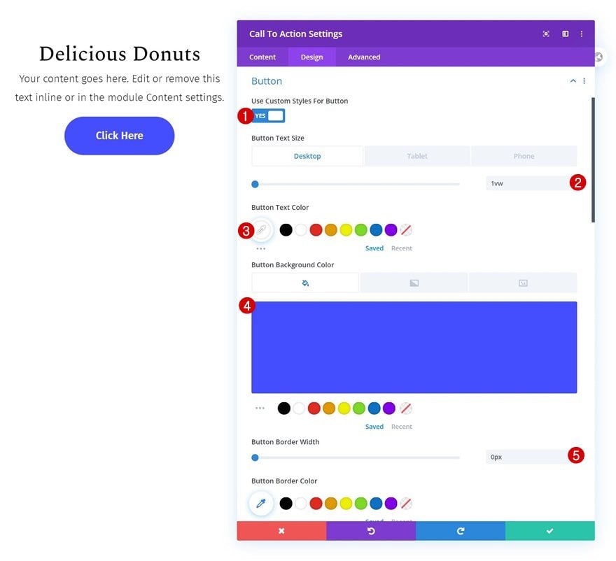
Button Settings
Don’t forget to style the button of your CTA Module as well.
- Use Custom Styles For Button: Yes
- Button Text Size: 1vw (Desktop), 2vw (Tablet), 3vw (Phone)
- Button Text Color: #ffffff
- Button Background Color: #444eff
- Button Border Width: 0px
- Button Border Radius: 50vw
- Button Font: Fira Sans
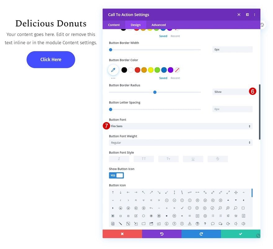
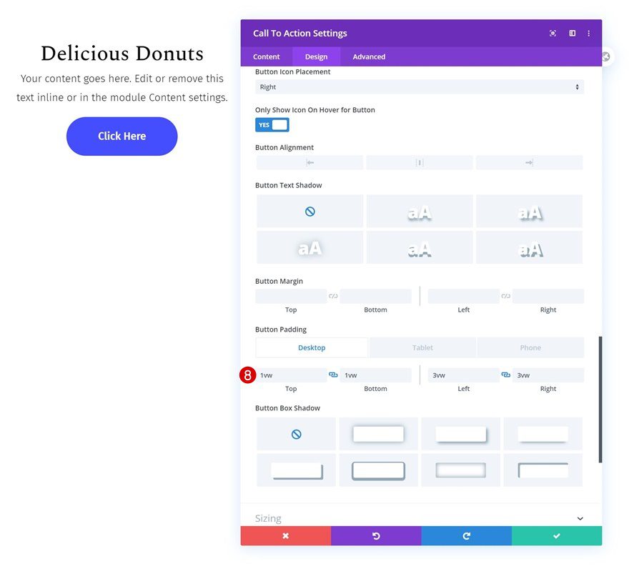
- Top Padding: 1vw (Desktop), 2vw (Tablet), 3vw (Phone)
- Bottom Padding: 1vw (Desktop), 2vw (Tablet), 3vw (Phone)
- Left Padding: 3vw (Desktop), 7vw (Tablet), 13vw (Phone)
- Right Padding: 3vw (Desktop), 7vw (Tablet), 13vw (Phone)
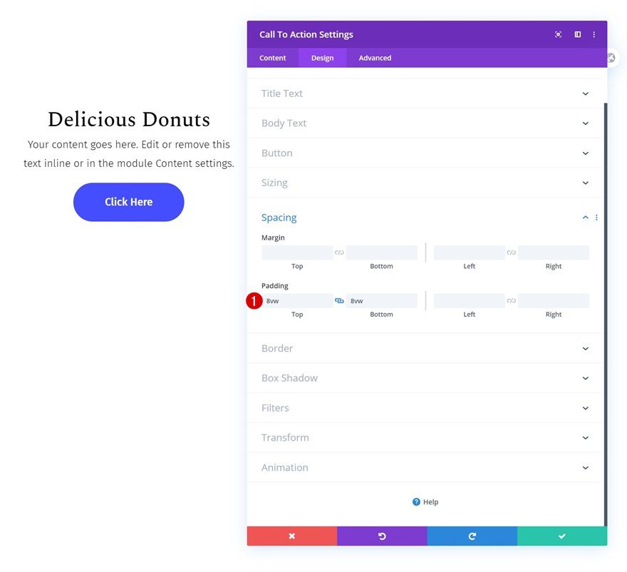
Spacing
Then, go to the spacing settings and add some custom top and bottom padding.
- Top Padding: 8vw
- Bottom Padding: 8vw
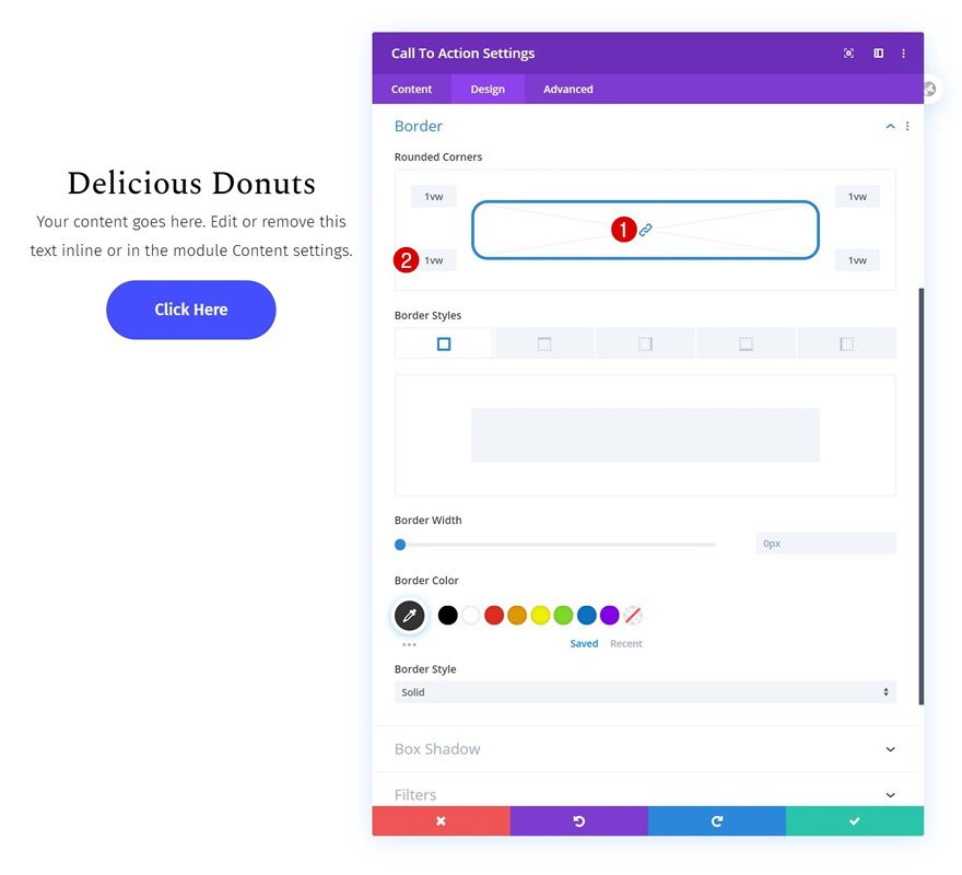
Border
Add some rounded corners to the module too.
- Rounded Corners: 1vw (All Corners)
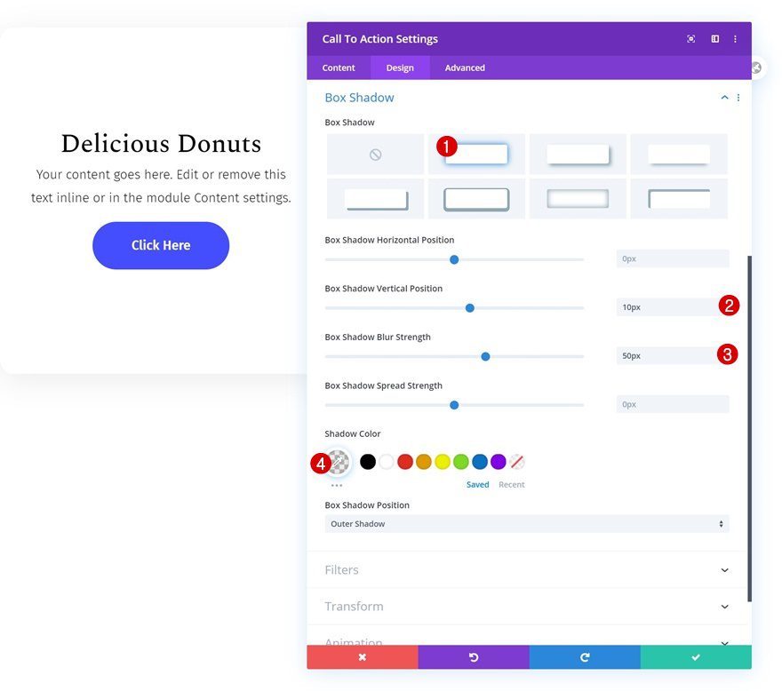
Box Shadow
Complete the module’s design by adding a subtle box shadow.
- Box Shadow Horizontal Position: 10px
- Box Shadow Blur Strength: 50px
- Shadow Color: rgba(0,0,0,0.08)
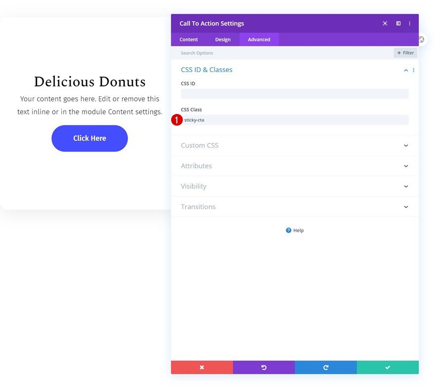
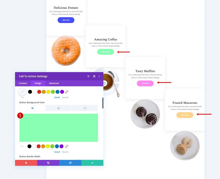
CSS Class
Now, to make the scrolling sticky effect work, we’ll need to add a few lines of CSS code at the end of this tutorial. In preparation for that, we’ll add a CSS class to the CTA Module.
- CSS Class: sticky-cta
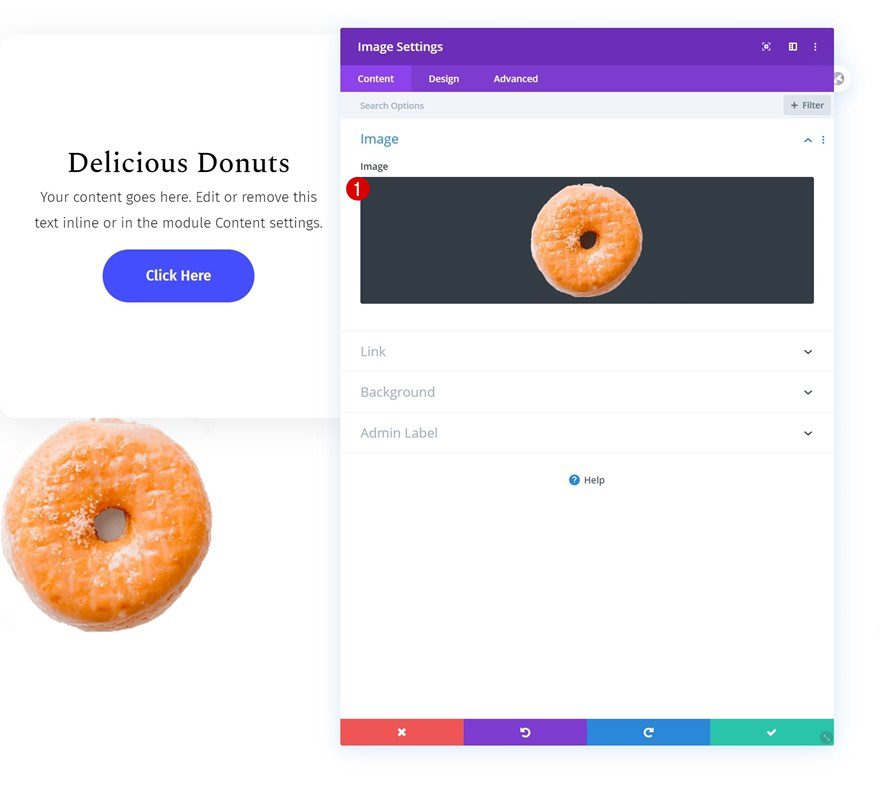
Add Image Module to Column 1
Upload Image
On to the next and last module we need in column 1, which is an Image Module. Upload a PNG image of your choice.
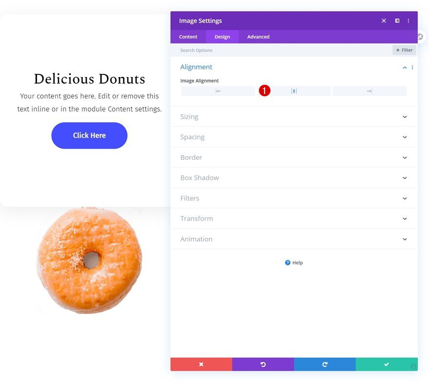
Alignment
Change the image alignment next.
- Image Alignment: Center
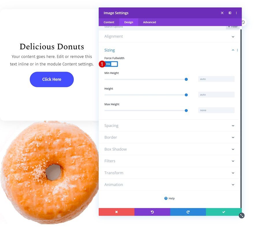
Sizing
Make sure you force fullwidth on the module too.
- Force Fullwidth: Yes
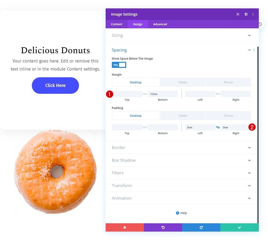
Spacing
Complete the module’s settings by going to the spacing settings and adding some custom spacing values across different screen sizes.
- Top Margin: -5vw (Tablet & Phone)
- Bottom Margin: -12vw (Desktop), 5vw (Tablet & Phone)
- Left Padding: 3vw (Desktop), 10vw (Tablet), 25vw (Phone)
- Right Padding: 3vw (Desktop), 10vw (Tablet), 25vw (Phone)
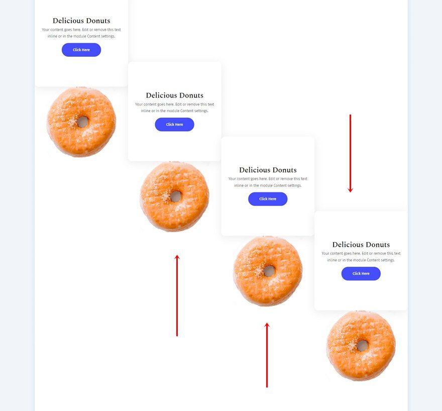
Clone Both Modules Three Times & Place In Remaining Columns
Once you’ve completed both modules in column 1, you can clone both of them three times and place the duplicates in the row’s remaining columns.
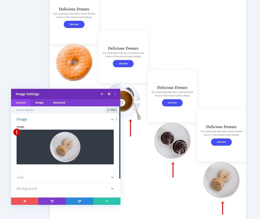
Change Images
Make sure you change the image in each duplicate Image Module.
Change CTA Content & Button Background Colors
Change the CTA content along with the button background colors too.
- CTA Module #2: #89ffb4
- CTA Module #3: #ff89f1
- CTA Module #4: #ffd389
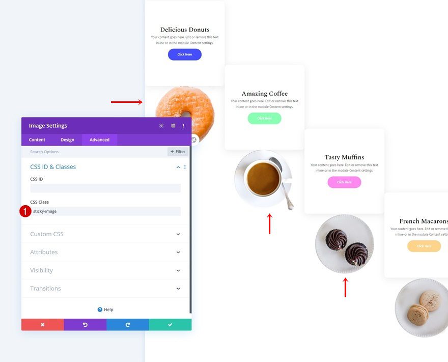
Add CSS Class to Image Modules in Column 1, 2 & 3
Now, to make sure the sticky effect works on the images too, we’ll need to add a CSS class to the Image Modules in column 1, 2 and 3.
- CSS Class: sticky-image
Add Row #2
Column Structure
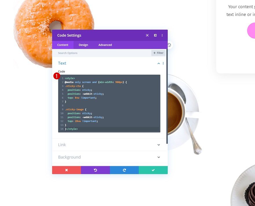
The only thing left to do is adding the CSS code. To do that, add a new row.
Add Code Module with CSS Code
Add a Code Module to the row, insert the CSS code below and you’re done!
<style>
@media only screen and (min-width: 980px) {
.sticky-cta {
position: sticky;
position: -webkit-sticky;
top: 8vw !important;
}

.sticky-image {
position: sticky;
position: -webkit-sticky;
top: 28vw !important;
}
}</style>
Preview
Now that we’ve gone through all the steps, let’s take a final look at the outcome across different screen sizes.
Desktop
Tablet & Mobile
Final Thoughts
In this post, we’ve shown you how to keep modules fixed in their column container. Using the technique can result in some stunning scroll effects that allow you to emphasize the various calls to action on your page. You were able to download the JSON file for free as well! If you have any questions or suggestions, feel free to leave a comment in the comment section below.
If you’re eager to learn more about Divi and get more Divi freebies, make sure you subscribe to our email newsletter and YouTube channel so you’ll always be one of the first people to know and get benefits from this free content.


Nothing happens when I scroll. I have gone back several times to see what I did wrong. I’m hoping someone can help.
I don’t quite understand why you created a whole row just to hold the code module and CSS. Couldn’t that be added to the row with the modules? Or couldn’t the CSS be added to the custom definitions site-wide?
I’m also having problems. I would like to add to the homepage (not a new page). I tried to download to a new page, scrolling doesn’t work, pics are not aligned as in the demo. (and yes before you repeat I downloaded the file to the library)
I then manually added it to my homepage and still won’t work….. still not aligned still not scrolling and when I update it comes up with a resource error…
extremely frustrated (been hours on it…..help!!)
Me too! Did you figure it out?
Thank You for share How to Keep Modules Fixed in Their Column Container with Divi in easy way…
Awesome! Love it!
Nice to hear, Elisandro. Thanks for stopping by in the comments! 🙂
Hello,
Here is the same Q ?”why i cant drop the json on the page builder … any ideas??
Hey there, upload the JSON to your Divi Library first, then it’ll show up in Your Saved Layouts as soon as you open/create a new page. Hope that helps!
Hi… I’m curious why i cant drop the json on the page builder … any ideas??
Hey there, upload the JSON to your Divi Library first, then it’ll show up in Your Saved Layouts as soon as you open/create a new page. Hope that helps!
why are you specifying heights with ‘vw’? I read there is also ‘vh’ for viewport height…
I’m not OP, but vw is better for proportioned sizes and positions than vh because the screen width gives you the most control rather than browser height. Consider a hero section that is supposed to of a certain aspect ratio, you can ensure the ratio in proportion of the width (3:2), but not with height. Using vw ensures that the section won’t break on browser resize either.
Another reason why it’s better to plan responsive positioning with width is because media queries are based on screen width.
Hope that helps.
Exactly what PK Son said. The level of responsive flexibility you get with vw is way higher than with vh.
I was also about to ask the same question. Would be good to know why ‘vh’ is not used. Thanks.
Woooo…… This is like the first Monday in like forever without a free layout pack. What happened here??
Thanks Donjete beatiful effect with module fixed in columns. Thanks also for the free layout
Exactly, pretty good that V4.0
Divi 4.0 Release Storm…