
")
Welcome to part two of the blog post on indirectly applying section dividers to rows and modules! In part one of this post, we’ve applied section dividers to rows and created a unique and stunning design step by step. In the second part of this post, we’ll do the same thing but for modules.
For this approach, we’ll create two versions: one for desktop and one for tablet and phone. Although the tablet and phone version isn’t really required, it will help you add a section divider to each one of the modules individually on smaller screen sizes.
Let’s get to it!
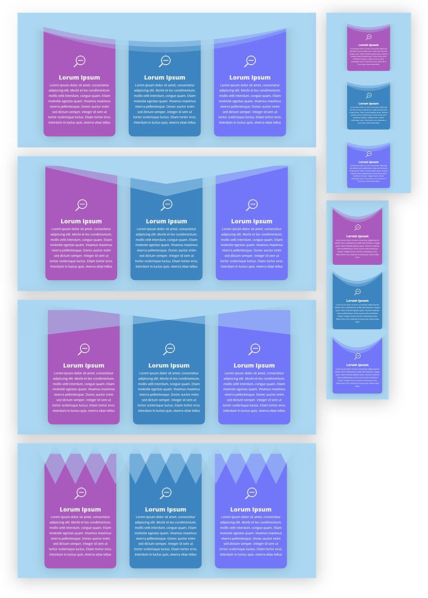
Preview
Approach
- We’re using more or less the same approach as we did in part 1 of this post
- The divider and section background have the same color
- That way, the divider and section background will blend until the divider comes in contact with another background color
- In this case, we’re applying the section dividers to Blurb Modules
- Unlike for rows, this will require placing the divider on top of section content
- To make sure it doesn’t overlap the content of our module, we’ll add extra top padding to the module (in balance with the divider height)
- You can choose to go with the desktop version only, but if you want to apply the section divider to each module as well, you’ll have to create a separate tablet and phone version
- The tablet and phone version will place each module in a new section and have a section divider dedicated to that module in question
Recreate Desktop Version
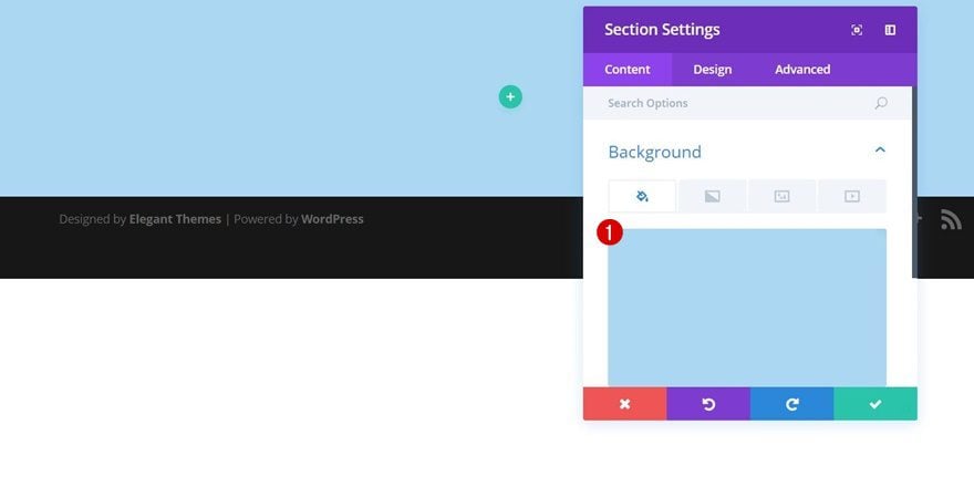
Add New Section
Background Color
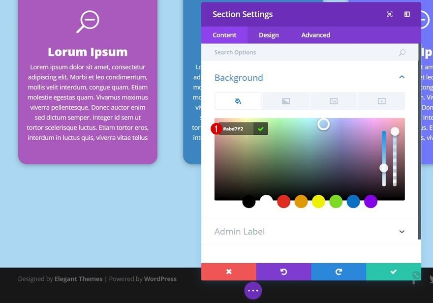
We’ll start creating the desktop version first. This version contains one section only. After adding a regular section, use ‘#abd7f2’ as its background color.
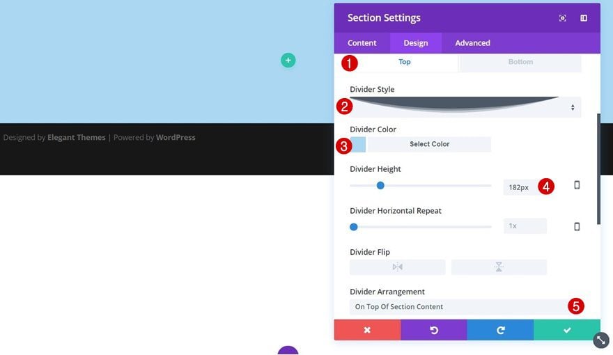
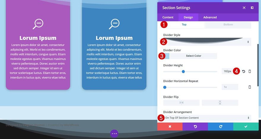
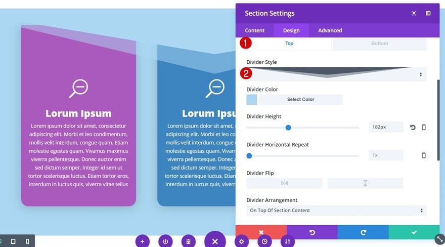
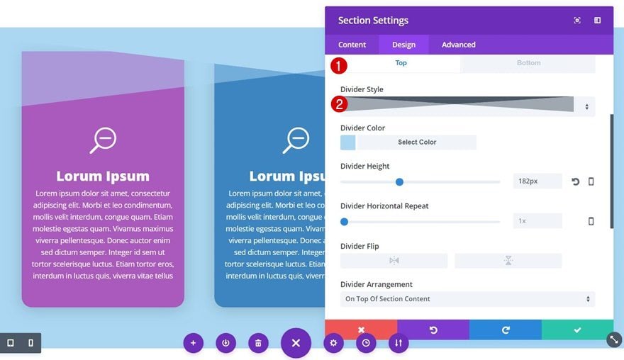
Top Divider
Go to the Design tab next and add the following Divider (containing the same color as your section):
- Divider Style: Find in List
- Divider Color: #abd7f2
- Divider Height: 182px
- Divider Arrangement: On Top of Section Content
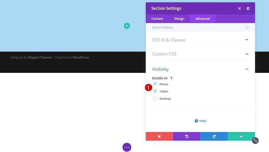
Visibility
Since we’ll create a separate version for tablet and phone, we’ll need to disable this entire section on phone and tablet in the Visibility subcategory of the section settings.
Add New Row
Column Structure
Once you’re done with your section settings, add a row with the following column structure:
Add Blurb Module to Column 1
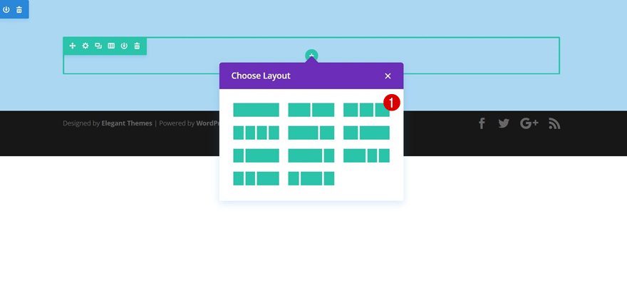
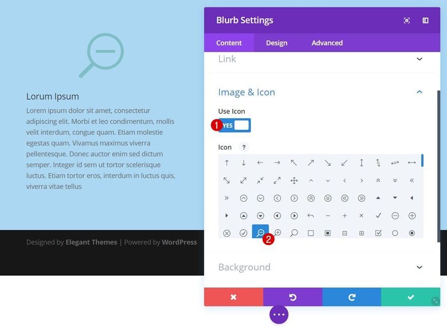
Choose Icon
We’ll add a Blurb Module to the first column of this row. After modifying the settings of this Blurb Module, we’ll reuse it for the remaining columns. Add your content, open the Image & Icon subcategory and select your icon of choice.
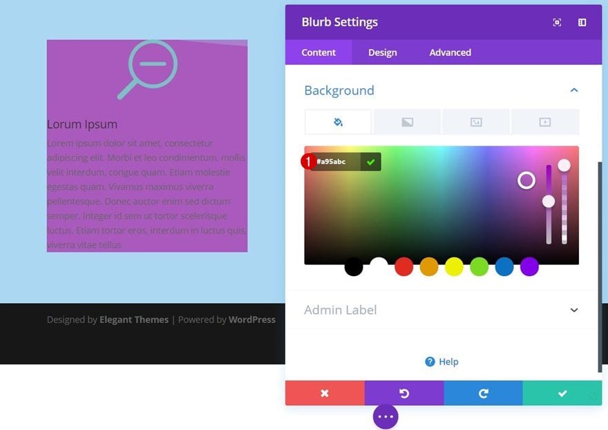
Background Color
Then, add ‘#a95abc’ as the background color of your Blurb Module.
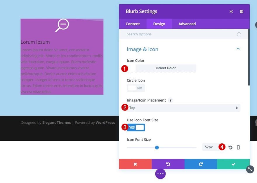
Icon Settings
Move on to the Design tab and change the appearance of your icon:
- Icon Color: #ffffff
- Icon Placement: Top
- Use Icon Font Size: Yes
- Icon Font Size: 52px
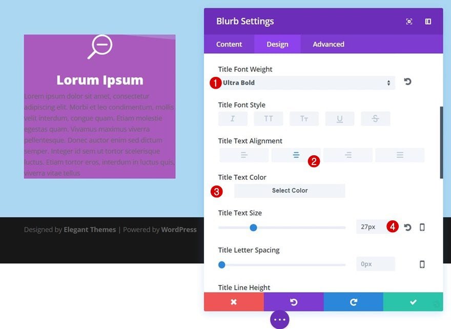
Title Text Settings
Next, change your title text settings:
- Title Font Weight: Ultra Bold
- Title Text Alignment: Center
- Title Text Color: #ffffff
- Title Text Size: 27px
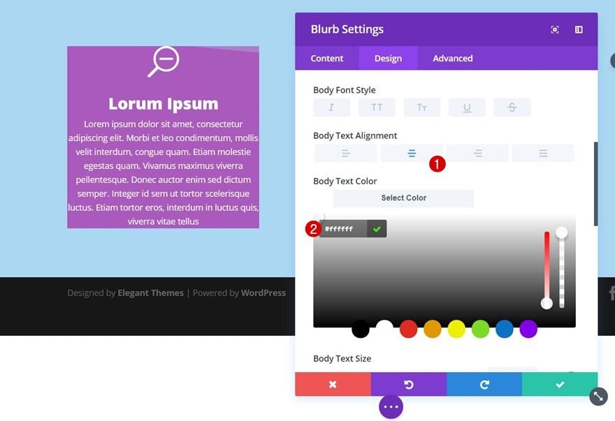
Body Text Settings
We’ll also make some modifications to the body text of our Blurb Module:
- Body Text Alignment: Center
- Body Text Color: #ffffff
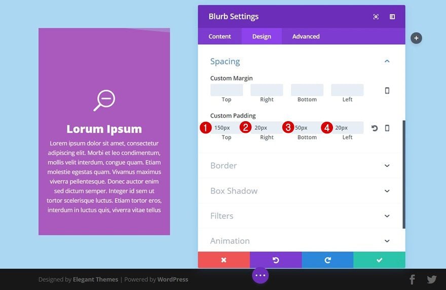
Spacing
As you can notice in the print screen below, we’ll need quite some top padding for this Blurb Module. This will prevent the divider from overlapping the content your Blurb Module contains:
- Top Padding: 150px
- Right Padding: 20px
- Bottom Padding: 50px
- Left Padding: 20px
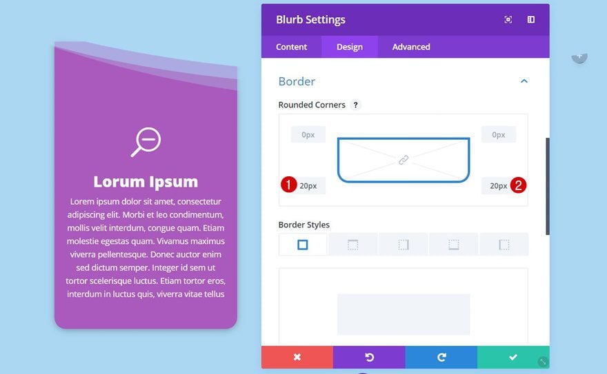
Border
We’ll apply some rounded corners of ’20px’ to the bottom left and bottom right next.
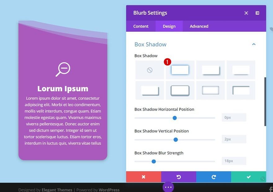
Box Shadow
To create some depth, you can also enable the first box shadow option within your settings.
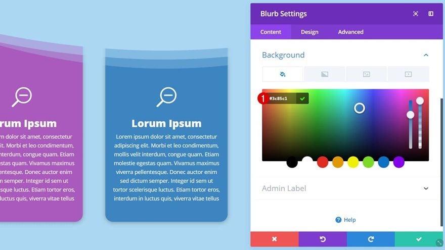
Clone Blurb Module & Place in Column 2
Change Background Color
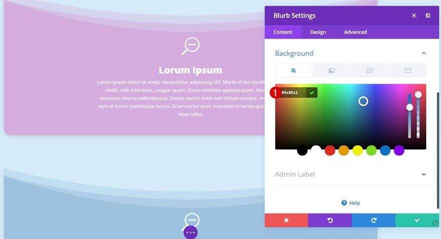
We’re done modifying the Blurb Module in column 1. We can now clone this module, place it in the second column and change its background color to ‘#3c85c1’.
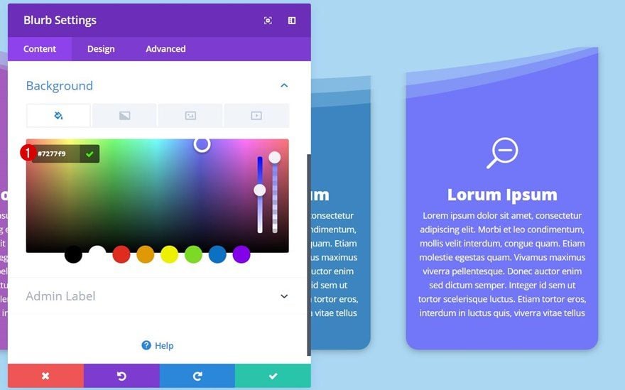
Clone Blurb Module & Place in Column 3
Change Background Color
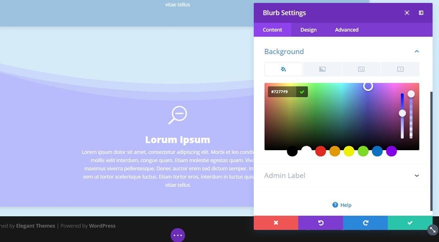
Clone the Blurb Module once again, place it in column 3 and use ‘#7277f9’ as the background color.
Recreate Tablet & Phone Version
Add New Section
Background Color
The tablet and phone version requires a more delicate approach. The section divider remains part of the section, although it doesn’t show up at the beginning of the section. On smaller screen sizes, Blurb Modules will show up vertically instead of horizontally. That’s why we’ll add a separate section for each one of the Blurb Modules. Add a new regular section and, again, use ‘#abd7f2’ as its background color.
Top Divider
We’re using the same top divider as we did for the desktop version:
- Divider Style: Find in List
- Divider Color: #abd7f2
- Divider Height: 182px
- Divider Arrangement: On Top of Section Content
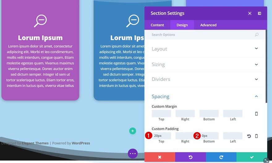
Spacing
We’ll add some custom padding to this section next:
- Top Padding: 20px
- Bottom Padding: 0px
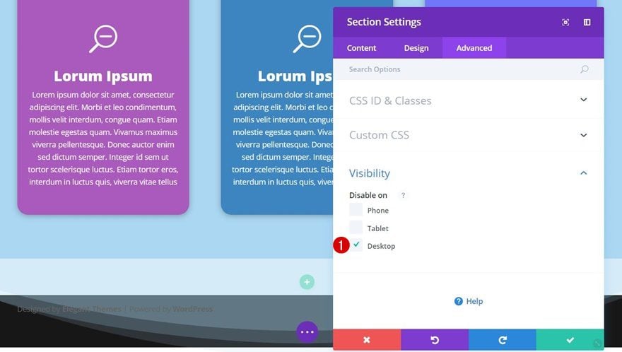
Visibility
This section is part of the tablet and mobile version so naturally, we’ll disable this section on Desktop within the Visibility subcategory.
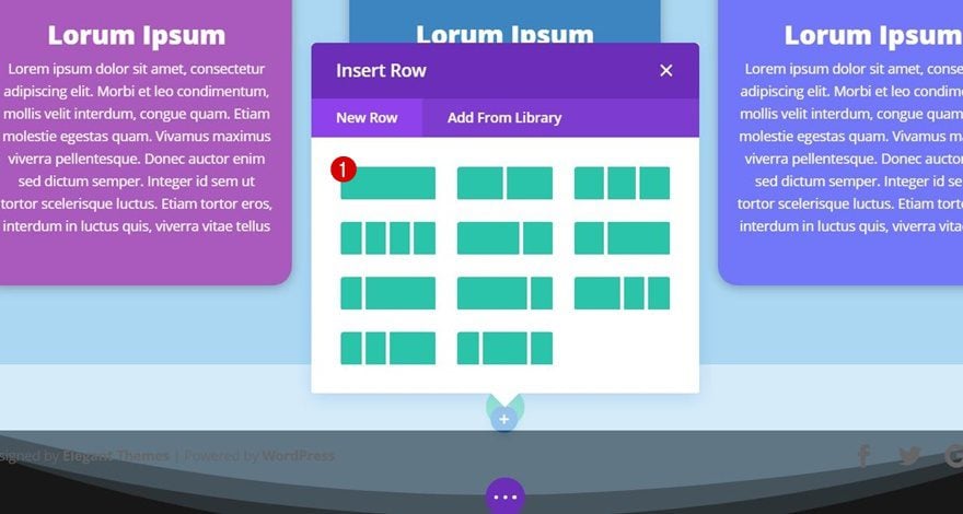
Add New Row
Column Structure
Instead of using a row with two columns, we’ll use one column.
Clone Column 1 Blurb Module of Desktop Version & Place in Column
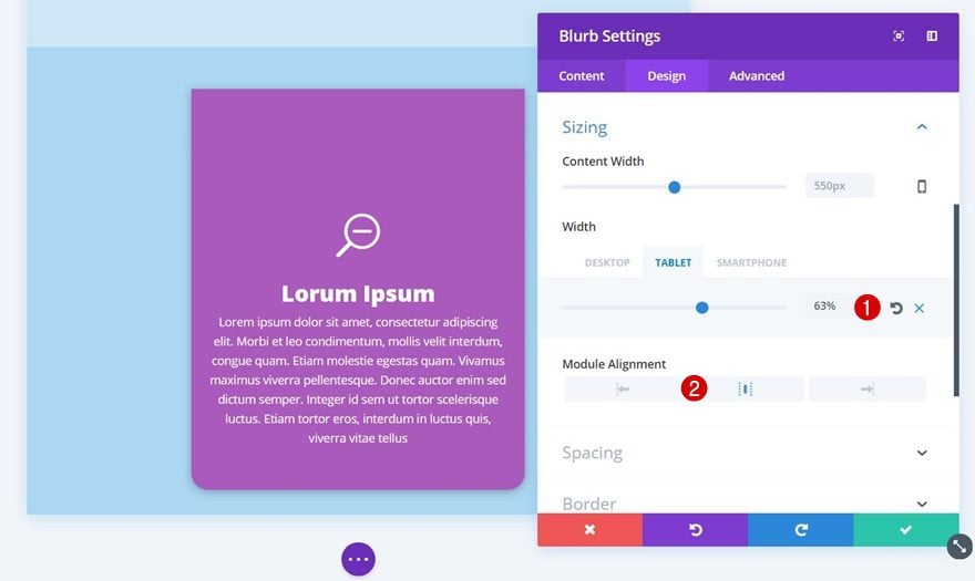
Change Sizing
We already have the desktop Blurb Module that we can clone and place in this column. The only thing we’ll need to modify is the Sizing:
- Width: 63% (Tablet), 99% (Phone)
- Module Alignment: Center
Clone Entire Section Twice
Change Background Color of Blurb Modules
Now, clone this section twice. Change the background color of your second Blurb Module to ‘#3c85c1’.
Likewise, change the background color of your third Blurb Module to ‘#7277f9’.
Divider Style #2
Top Divider Style
You can apply different divider styles to this, or any other, design. Find the following divider style on the list:
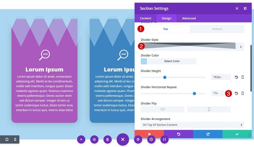
Divider Style #3
Top Divider Style
You can also go with the following divider style:
Divider Style #4
Top Divider Style
Or the last divider style which requires an increased Divider Horizontal Repeat of ’17x’.
Preview
Now that we’ve gone through all the steps, let’s take a final look at the different section dividers that we’ve applied to the Blurb Modules in this tutorial:
Final Thought
That’s it for this two-part post! In the first part, we’ve shown you how to indirectly add section dividers to rows. We accompanied that post with a stunning design that we’ve recreated step by step. In this second part, we’ve changed the scenario and applied section dividers to modules instead. To have the same effect on tablet and phone as on desktop, we’ve created two versions. If you have any questions, make sure you leave a comment in the comment section below!


Amazing design idea! love to try 🙂
Definitely do! Thanks for the comment 🙂
Wow, that´s is a very nice feature, Thank you
You’re welcome, Frank! 🙂
awesome work love it.. inspirational
Happy to hear it’s inspiring you, Jason!
Really a good information on the divider design. Always this blog gives information on new plugin and themes. Thanks for sharing.
Good to hear you enjoyed it, Zebie! 🙂
Nice tute! Have to try this one. Well done.
Thank you, Allie! Definitely do try it out! 🙂
Just completed part one and two. The examples show where Divi shines for creativity.
One thing though. Where you use the content twice, one version for desktop and another for tablet and mobile, you are straying into the territory of of DRY (Don’t Repeat Yourself). It is something I would try to avoid. The use has to remember to update twice, where changes to blurb content is required at a later date. Also probably would be flagged in terms of html validation and could get penalties under SEO and ranking. Not so bad for once off occurrences perhaps.
Donjete, can you point this out to Nick. He and the team might come with some clever solution whereby enter text once / make design change for different devices as many times as necessary.
Thanks for the comment and feedback! 🙂
It’s quite optional to create a separate tablet and mobile version, though. You can stick with the desktop version for those devices as well if you want to avoid repetitive content (but I admit that you’ll have to sacrifice the design possibilities a bit.)
thanks for the tutorial on these styles, it shows how flexible the dividers are.
They really are! Thank you for the comment, Leisa! 🙂