

Choosing to add a sidebar to your blog posts is entirely up to you. Some bloggers choose to not use a sidebar at all. This tutorial is for those of you who prefer using a sidebar but want to make it look a little different. Usually, sidebars are statically positioned, but if the post content is long, that means the reader will have to scroll back up to see the sidebar.
In this blog post template design, we’ve created a full-height fixed sidebar that stays in place while scrolling down the post content. While recreating the tutorial, keep two tabs open inside your browser: one for the theme builder and another for a blog post preview. This way you can see the changes as you go.
Let’s get started!
- 1 Preview
- 2 Download Full-Height Fixed Sidebar Template for FREE
- 3 Download For Free
- 4 You have successfully subscribed. Please check your email address to confirm your subscription and get access to free weekly Divi layout packs!
- 5 Create Sidebar Widget
- 6 2. Get Started With The Theme Builder
- 7 Recreate The Template With Full-Height Fixed Sidebar
- 8 Preview
- 9 That’s A Wrap!
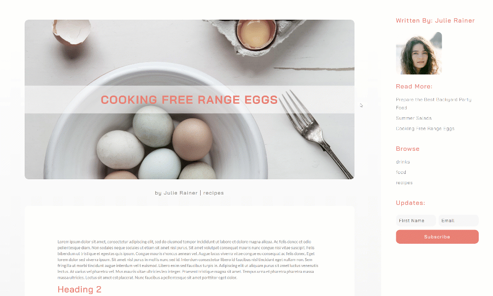
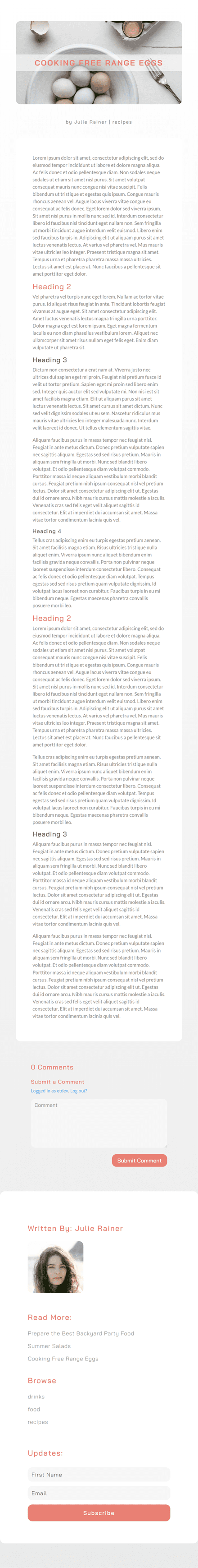
Preview
Before we start, let’s take a look at the full-height fixed sidebar.
Desktop
Mobile
To lay your hands on the free full-height fixed sidebar template, you will first need to download it using the button below. To gain access to the download you will need to subscribe to our newsletter by using the form below. As a new subscriber, you will receive even more Divi goodness and a free Divi Layout pack every Monday! If you’re already on the list, simply enter your email address below and click download. You will not be “resubscribed” or receive extra emails.

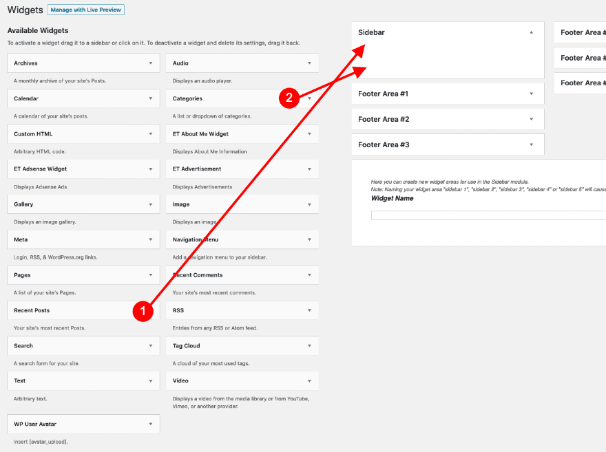
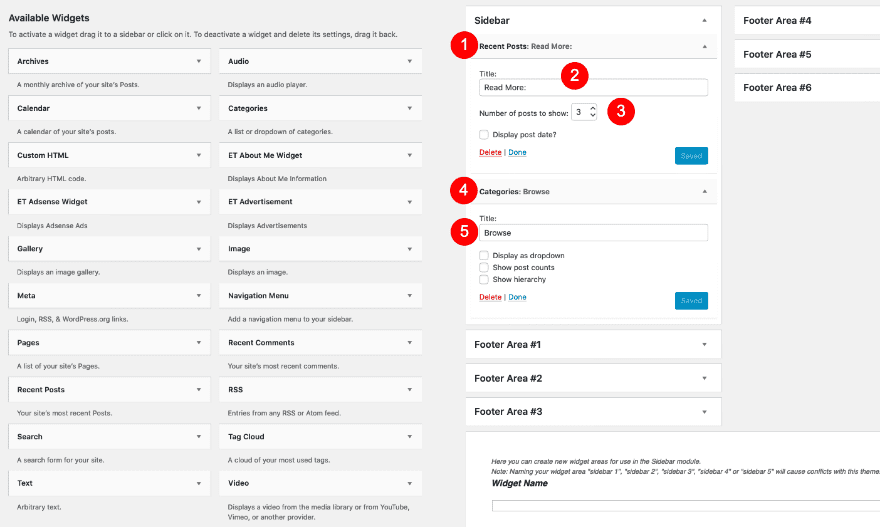
Before getting started with the full-height fixed sidebar template, create a custom sidebar widget. We’ll, later on, include this in our sidebar inside the template.
Open Widget Builder
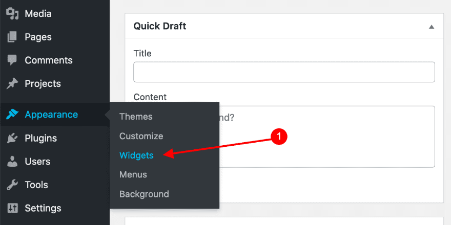
Click on ‘Appearance’ and select ‘Widgets.’
Drag the ‘Recent Posts’ and ‘Categories’ elements into the sidebar widget.
Adjust Element Settings In Widget
Choose to show only 3 recent posts and add a title. Add a title to the categories widget too and don’t forget to click ‘Save’ on both boxes when you’re done.
- Recent Posts Title: Read More:
- Categories Title: Browse
2. Get Started With The Theme Builder
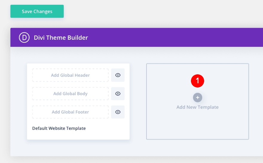
Open Theme Builder / Add New Template
It’s time to start recreating the fixed full-height sidebar template! First, open your theme builder and add a new template.
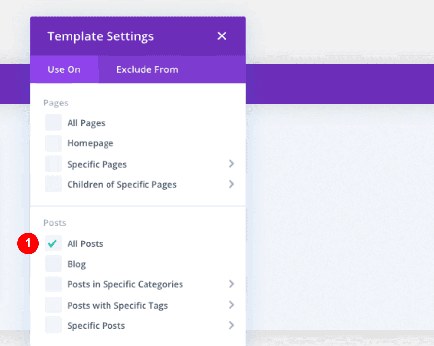
Set Template Settings
In the template settings, select ‘All Blog Posts’. If you like to use the template for a specific category or tag, modify the template settings accordingly.
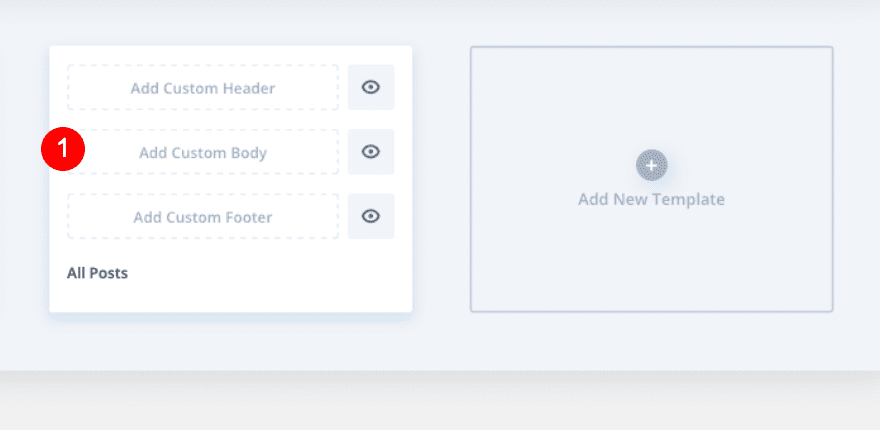
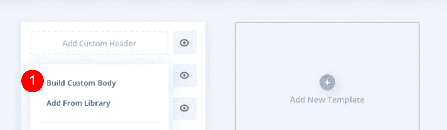
Add Custom Body
Then, click on ‘Add Custom Body’.
Select Build Custom Body
We’ll recreate this template from scratch, so go ahead and pick ‘Build Custom Body’.
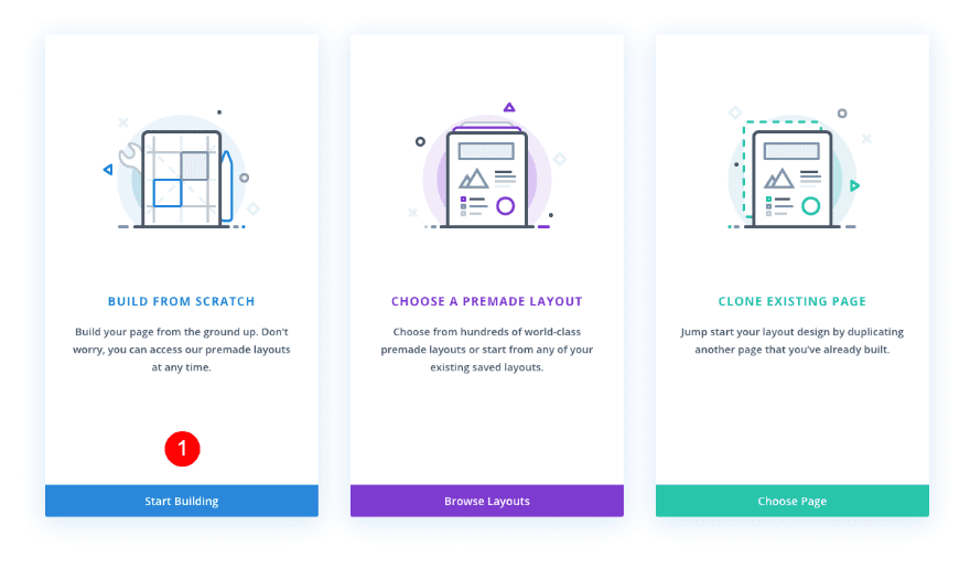
Build From Scratch
Once inside the visual builder, select the option to build from scratch once more.
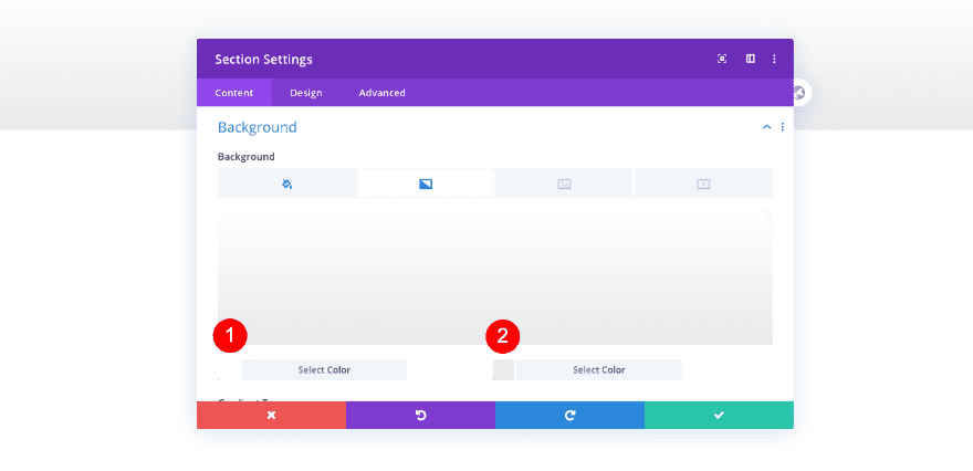
Section Settings
Background
Open the existing section inside your template editor and add a gradient background.
- Background Gradient
- Color 1: White #ffffff
- Color 2: Light Grey #eaeaea
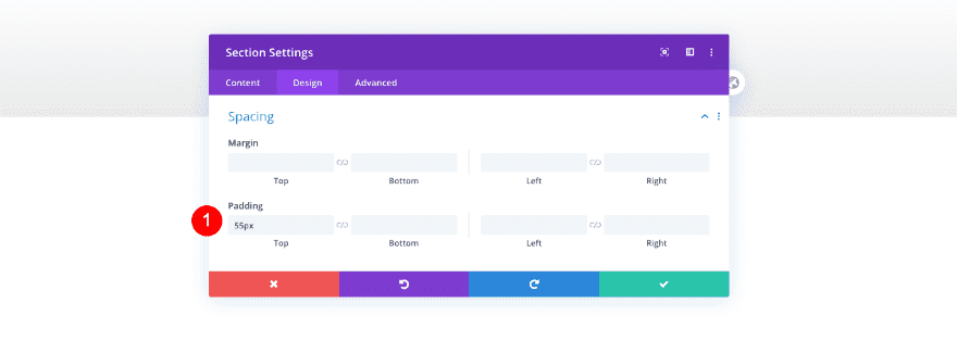
Spacing
Add some padding too.
- Top Padding: 55px
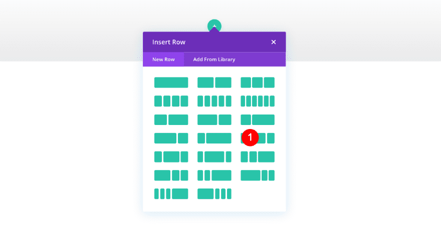
Add New Row
Column Structure
Now add a row with a 3/4 – 1/4 column structure.
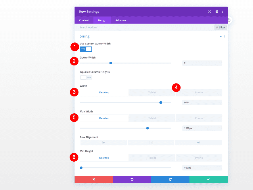
Sizing
Adjust the sizing of the row as follows.
- Custom Gutter Width: 2
- Width:
- Desktop and Tablet: 90%
- Phone: 100%
- Max Width:
- Desktop: 1920px
- Min Height: 100vh
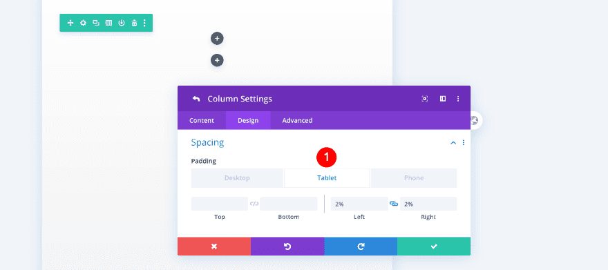
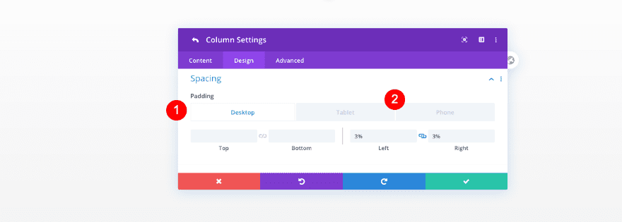
Column 1 Settings
Spacing
Before adding modules, adjust the column settings. Column 1 first.
- Left and Right Padding
- Tablet: 2%
- Phone: 8%
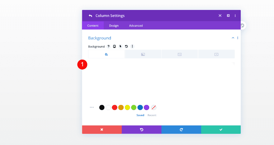
Column 2 Settings
Background
Then, add a background color to column 2.
- Background Color: White #ffffff
Spacing
Include some spacing too.
- Left and Right Padding
- Desktop: 3%
- Tablet and Phone: 14%
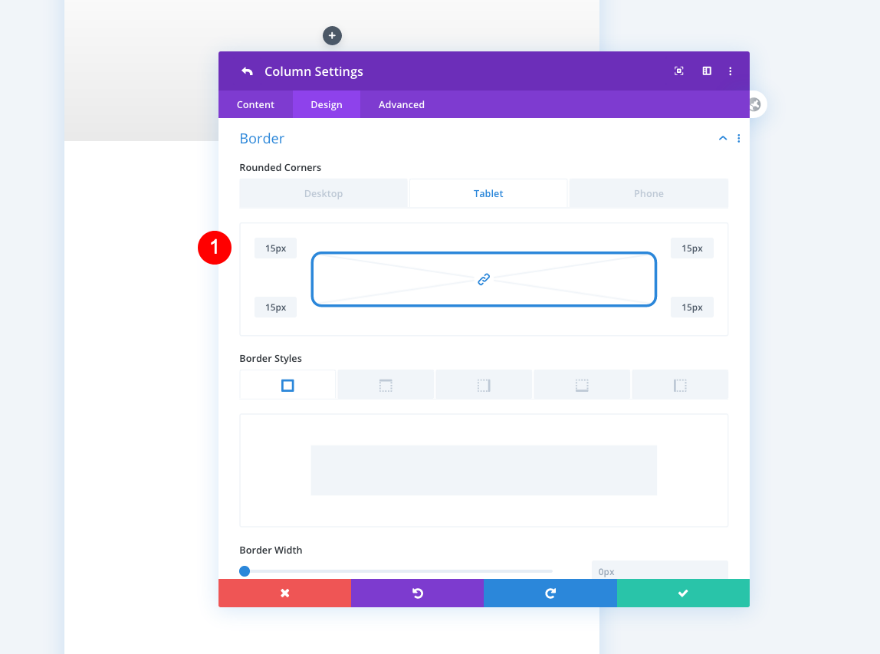
Border
Give the column rounded corners next.
- Rounded Corners
- Tablet and Desktop: 15px
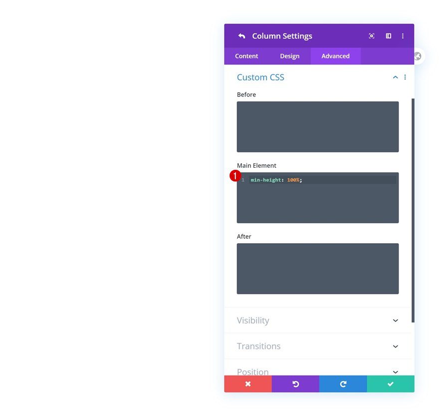
Custom CSS
Move over to the advanced tab and add some CSS code lines to the main element. This will help us create the full-height sidebar on desktop.
- Main Element
- min-height: 100%
min-height: 100%;
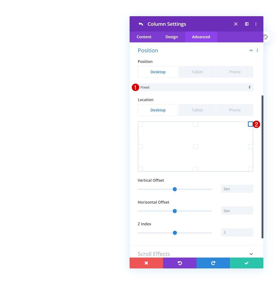
Position
Last but not least, to create the fixed sidebar effect, add a fixed position to the column.
- Position
- Desktop: Fixed
- Tablet and Phone: Default
- Location: Top Right
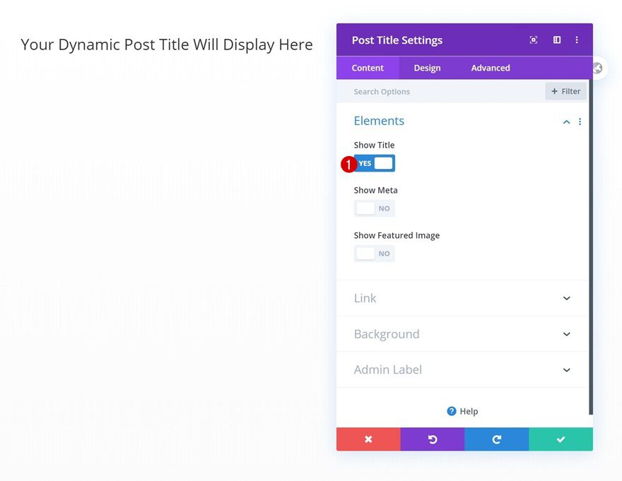
Add Post Title Module #1
Elements
Time to add modules! Start with a first post title module in column 1 and enable the title only.
- Show Title: Yes
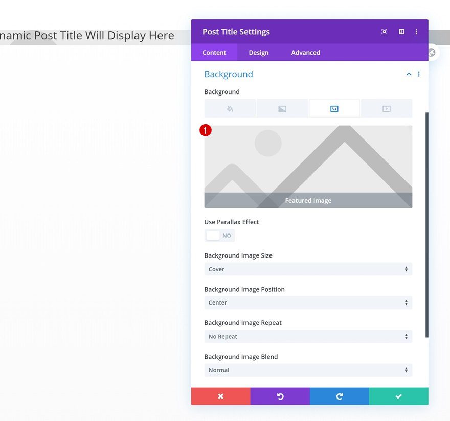
Dynamic Background Image
Then, go to the background settings and use the featured image as a dynamic background image.
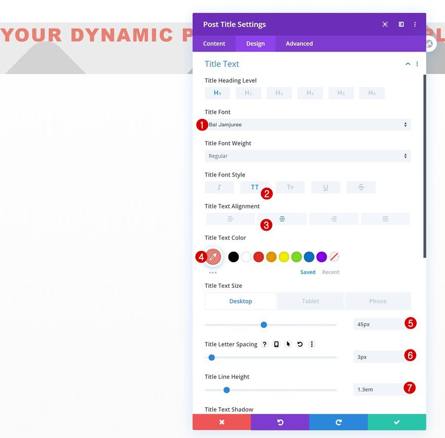
Title Text
Style the title text settings.
- Title Font: Bai Jamjuree
- Title Font Style: Uppercase
- Title Text Color: #e98074
- Title Text Size:
- Desktop: 45px
- Tablet: 35px
- Phone: 25px
- Title Letter Spacing: 3px
- Title Line Height: 1.3em
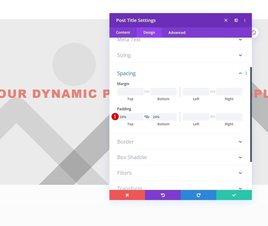
Spacing
Then, add some custom top and bottom padding.
- Top Padding: 20%
- Bottom Padding: 20%
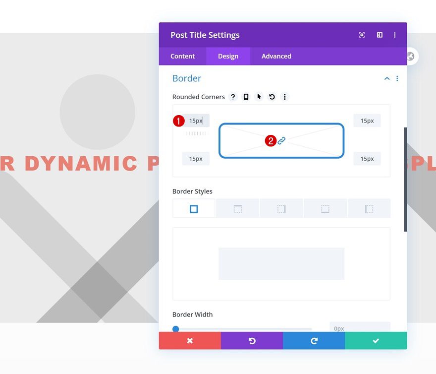
Border
Include some rounded corners too.
- All Corners: 15px
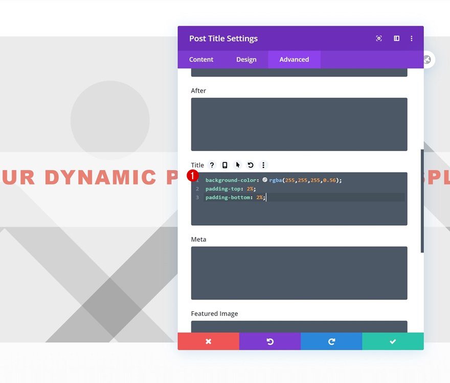
Title CSS
And complete the module settings by adding three lines of CSS code to the module’s title element in the advanced tab.
background-color: rgba(255,255,255,0.56);
padding-top: 2%;
padding-bottom: 2%;
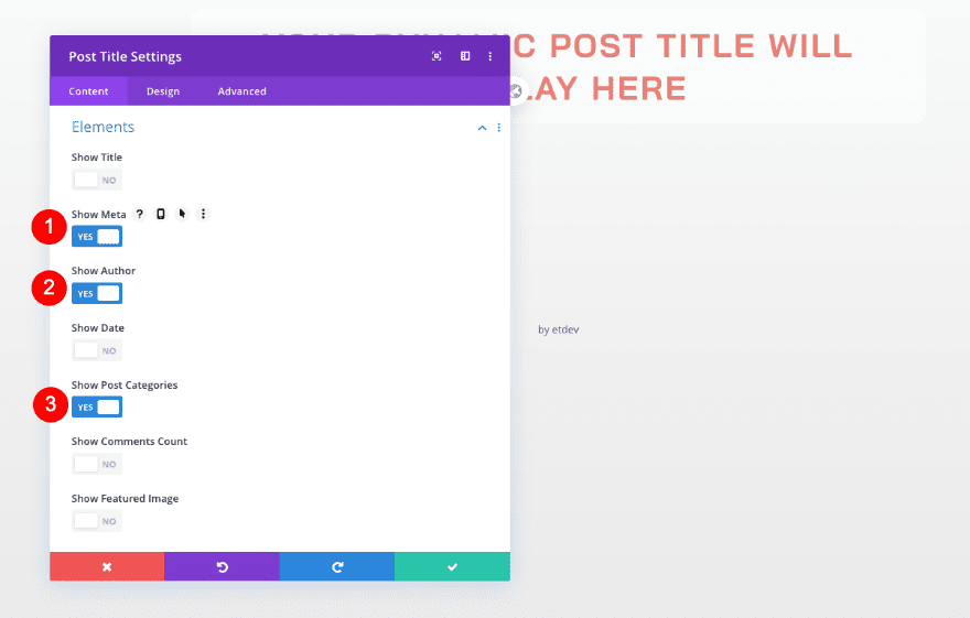
Add Post Title Module #2
Elements
Now add another post title module. Select the following elements.
- Meta
- Author
- Post Categories
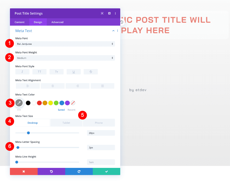
Meta Text
Open the design tab and style the meta text.
- Font: Bai Jamjuree
- Weight: Medium
- Color: Grey #8e8d8a
- Size
- Desktop: 20px
- Tablet and Phone: 15px
- Letter Spacing: 2px
Sizing
Adjust the sizing too.
- Width: 90%
- Module Alignment: Center
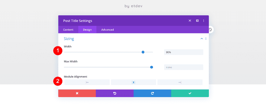
Spacing
Complete this module’s settings with some spacing.
- Top Padding: 15px
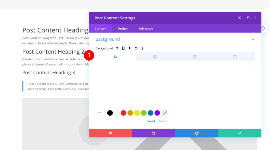
Add Post Content Module
Background
Add a post content module with a white background next.
- Background Color: White #ffffff
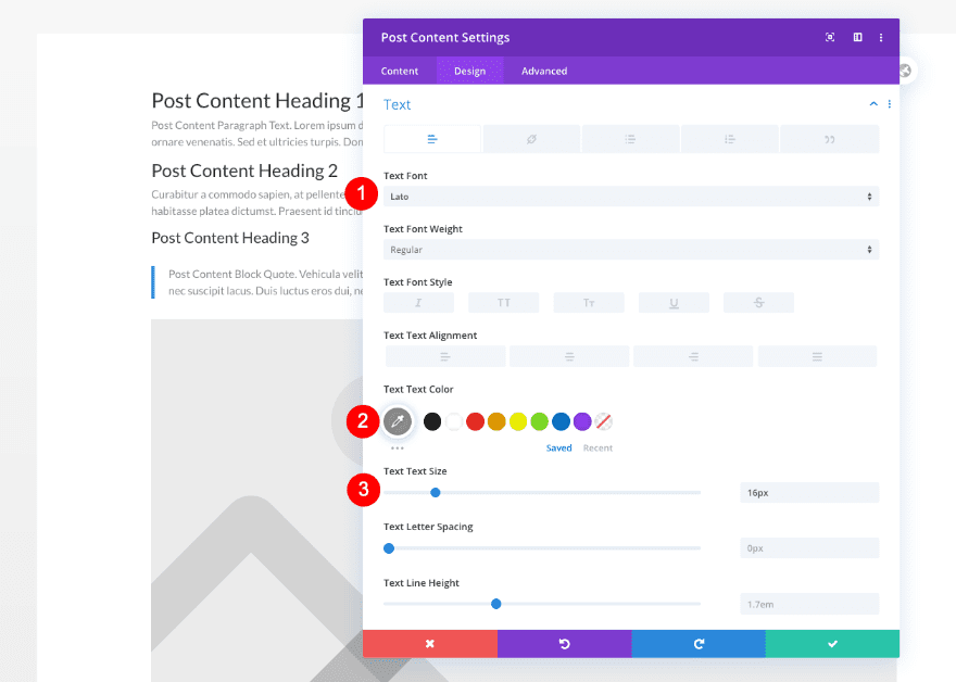
Text
Now, style the body text.
- Font: Lato
- Color: Grey #8e8d8a
- Size: 16px
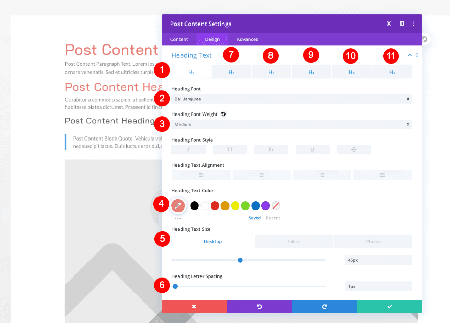
Heading Text
Continue by styling all the heading text styles.
- H1
- Font: Bai Jamjuree
- Weight: Medium
- Color: Coral #e98074
- Size
- Desktop: 45px
- Tablet: 33px
- Phone: 30px
- Letter Spacing: 1px
- H2
- Font: Bai Jamjuree
- Weight: Medium
- Color: Coral #e98074
- Size
- Desktop: 35px
- Tablet and Phone: 25px
- Letter Spacing: 1px
- H3
- Font: Bai Jamjuree
- Weight: Regular
- Color: Dark Grey #606060
- Size
- Desktop: 25px
- Tablet and Phone: 22px
- Letter Spacing: 1px
- H4
- Font: Bai Jamjuree
- Weight: Regular
- Color: Dark Grey #606060
- Size
- Desktop: 22px
- Tablet: 20px
- Phone: 18px
- Letter Spacing: 1px
- H5
- Font: Bai Jamjuree
- Weight: Medium
- Color: Dark Grey #606060
- Size: 16px
- Letter Spacing: 1px
- H6
- Font: Bai Jamjuree
- Weight: Regular
- Color: Dark Grey #606060
- Size: 16px
- Letter Spacing: 1px
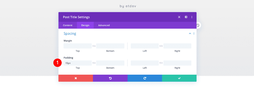
Spacing
Add some spacing settings too.
- Top Margin: 40px
- Top Padding: 10%
- Bottom Padding: 10%
- Left Padding: 10%
- Right Padding: 10%
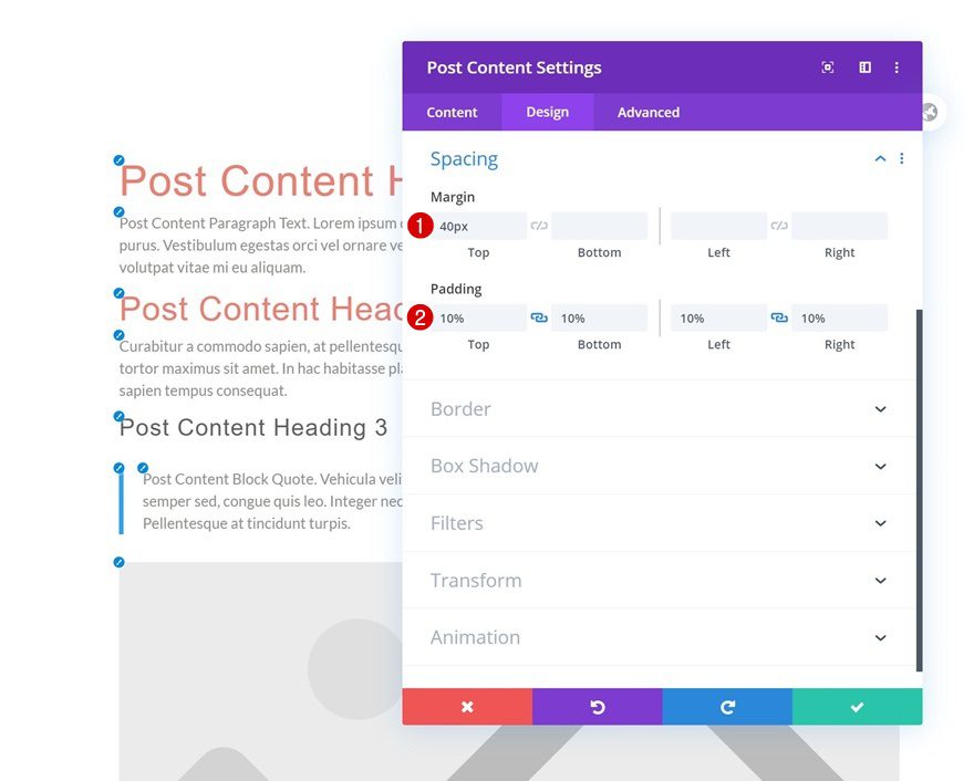
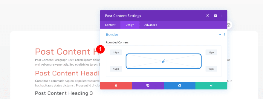
Border
Last but not least, add some rounded corners.
- Rounded Border: 15px
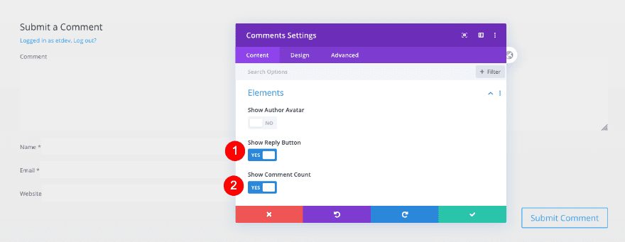
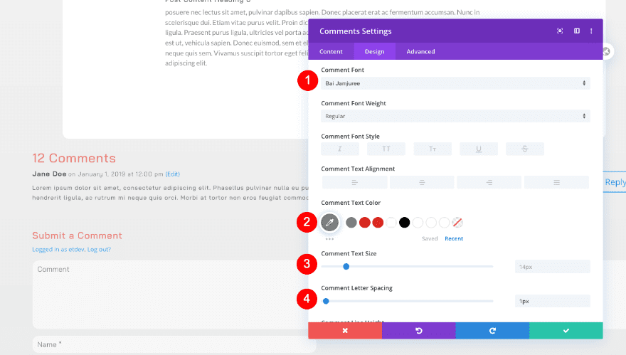
Add Comments Module
Elements
To complete the first column, add a comments module. Enable the following elements:
- Reply Button
- Comment Count
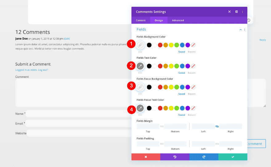
Fields
In the design tab, style the fields.
- Background Color: Light Grey #f7f7f7
- Text Color: Grey #8e8d8a
- Font: Bai Jamjuree
- Text Size: 17px
- Rounded Corners: 15px
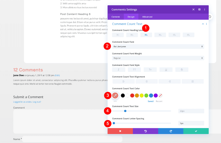
Comment Count Text
Style the comment count text too.
- Heading Level: H3
- Font: Bai Jamjuree
- Color: Coral #e98074
- Size: 22px
- Letter Spacing: 1px
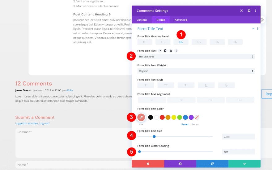
Form Title Text
Then the form title.
- Heading Level: H3
- Font: Bai Jamjuree
- Color: Coral #e98074
- Size: 18px
- Letter Spacing: 1px
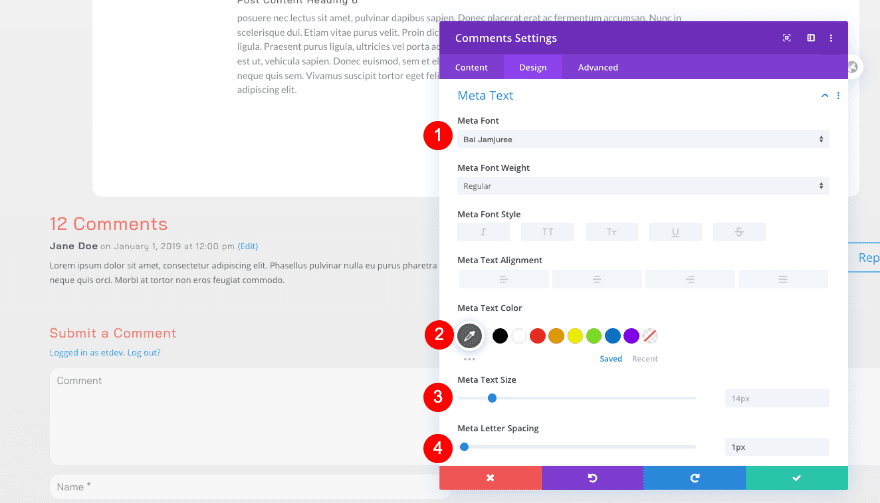
Meta Text
Style the meta text as well.
- Font: Bai Jamjuree
- Color: #606060
- Size: 14px
- Letter Spacing: 1px
Comment Text
Don’t forget the comment text.
- Font: Bai Jamjuree
- Size: 1px
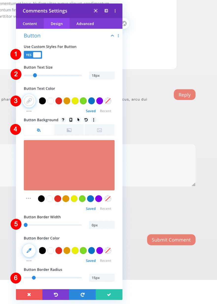
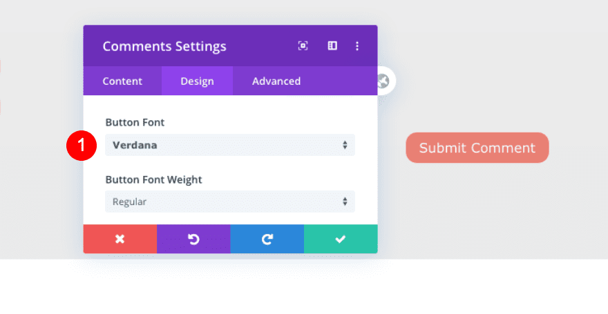
Button
Now style the buttons.
- Custom Styles
- Text Size: 18px
- Text Color: White #ffffff
- Background Color: Coral #e98074
- Button Border Radius: 15px
- Button Font: Bai Jamjuree
Sizing
Adjust the row sizing too.
- Width: 90%
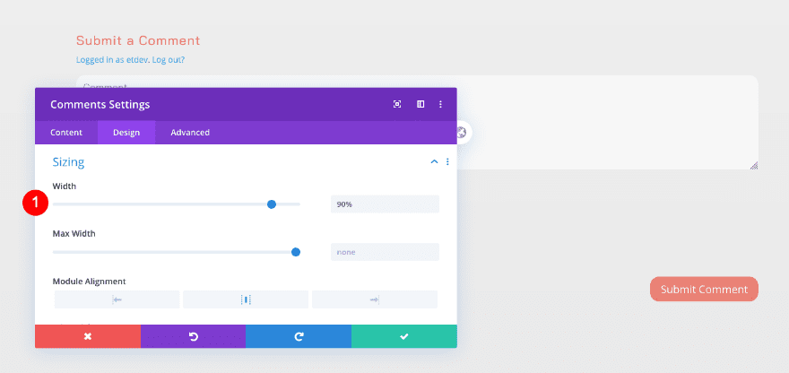
Spacing
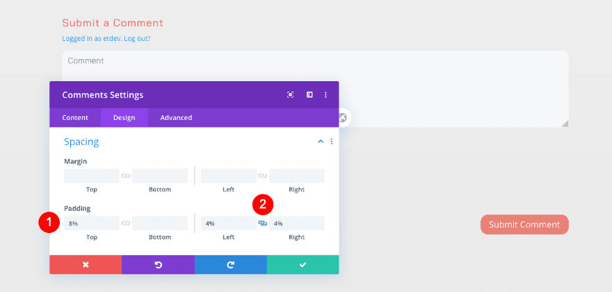
As well as the spacing settings.
- Top Padding: 8%
- Left and Right Padding: 4%
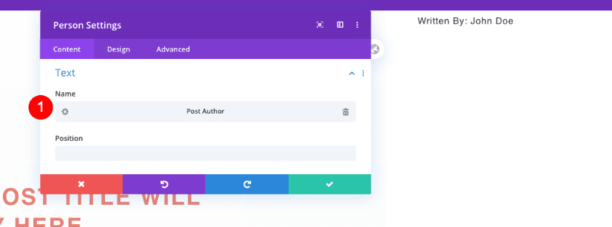
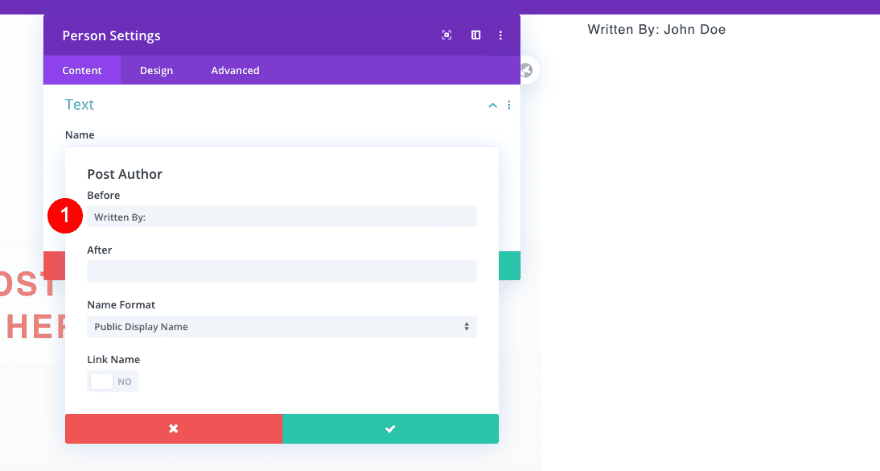
Add Person Module
Text
Move on to the fixed sidebar column and add a person module.
- Name: Dynamic Post Author
- Before: Written By:
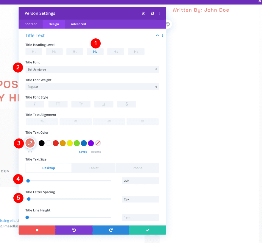
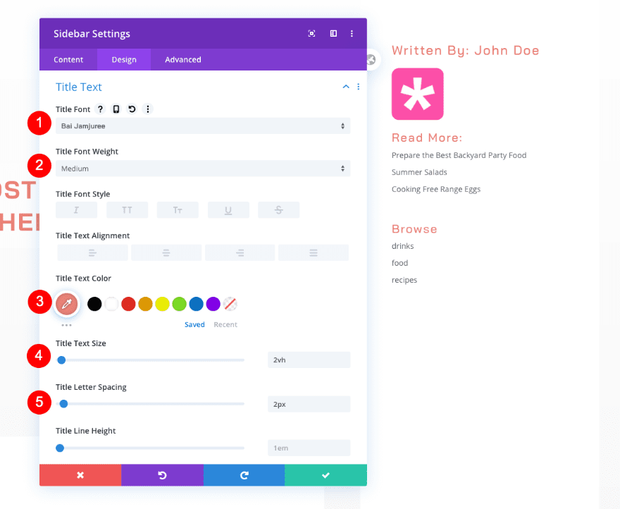
Title Text
In the design tab, style the heading text as follows:
- Heading Level: H4
- Font: Bai Jamjuree
- Color: Coral #e98074
- Size: 2vh
- Letter Spacing: 2px
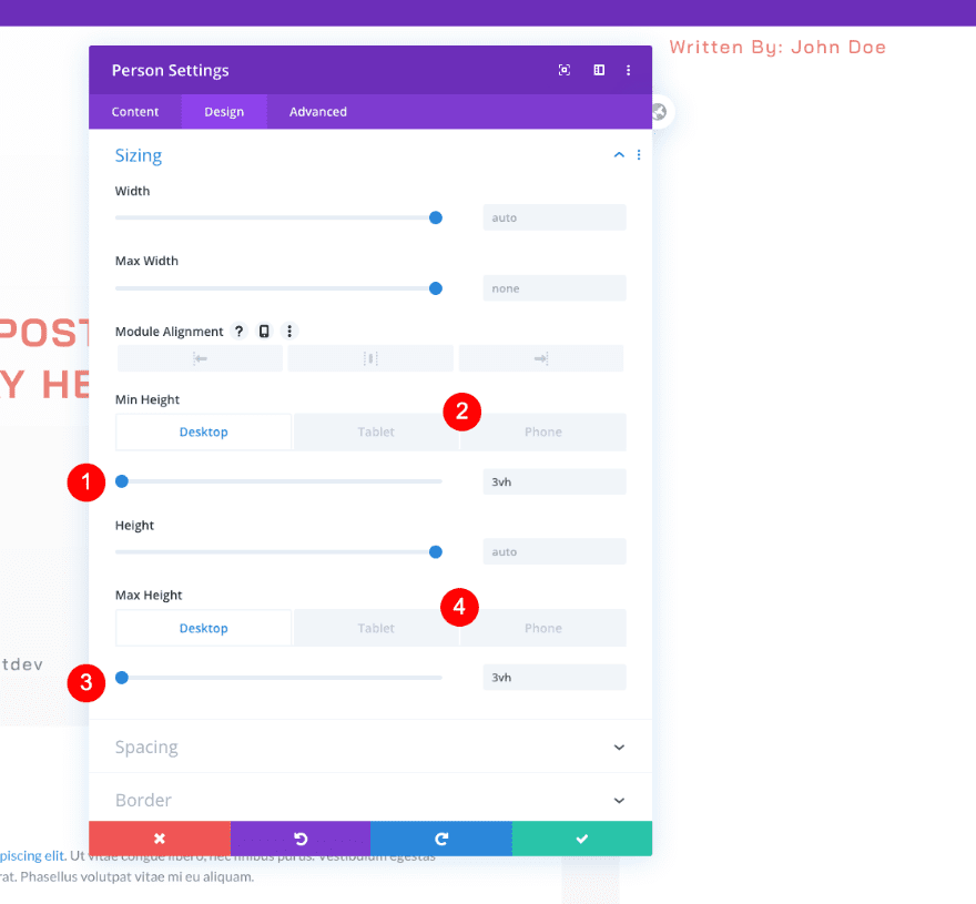
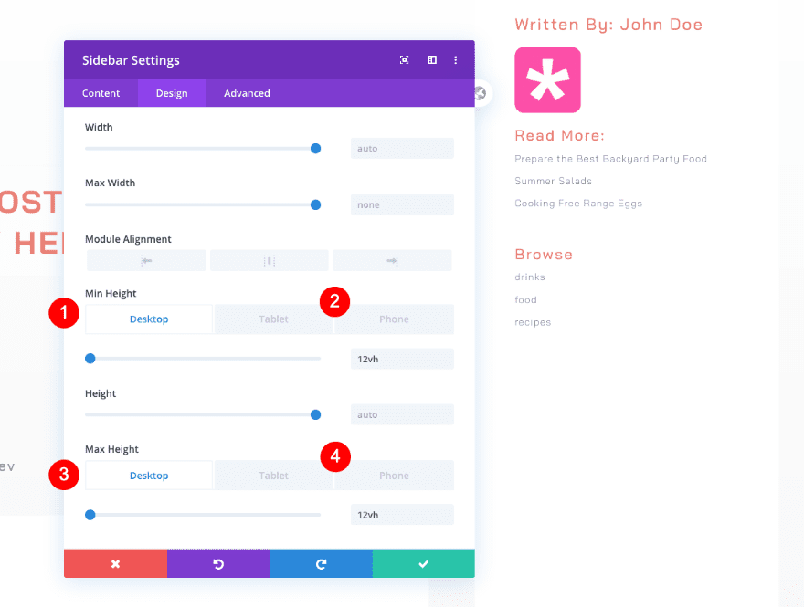
Sizing
Adjust the sizing next.
- Min Height:
- Desktop: 3vh
- Tablet and Phone: auto
- Max Height:
- Desktop: 3vh
- Tablet and Phone: auto
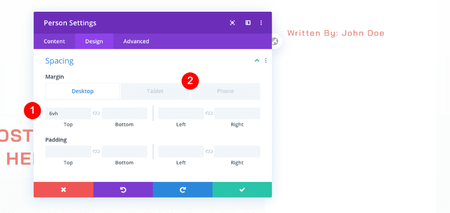
Spacing
Add some custom spacing too.
- Top Margin
- Desktop: 6vh
- Tablet and Phone: 10vh
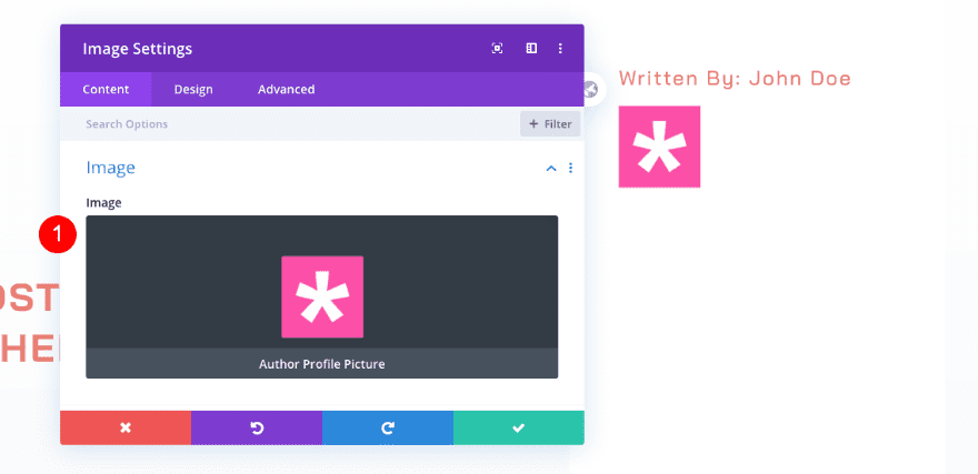
Add Image Module
Image
Now, add an image module. Select dynamic content for the author’s picture.
- Image: Dynamic Author Profile Picture
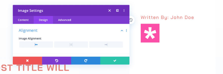
Alignment
Move over to the design tab and choose the following alignment:
- Image Alignment: Left
Sizing
Adjust the size of the module next.
- Max Width: 15vh
- Module Alignment: Left
- Max Height
- Desktop: 15vh
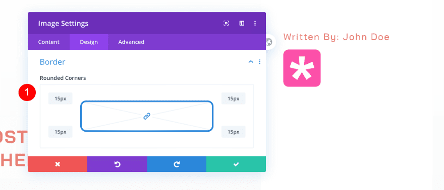
Border
Finally, add some rounded corners to the border settings.
- Rounder Corners: 15px
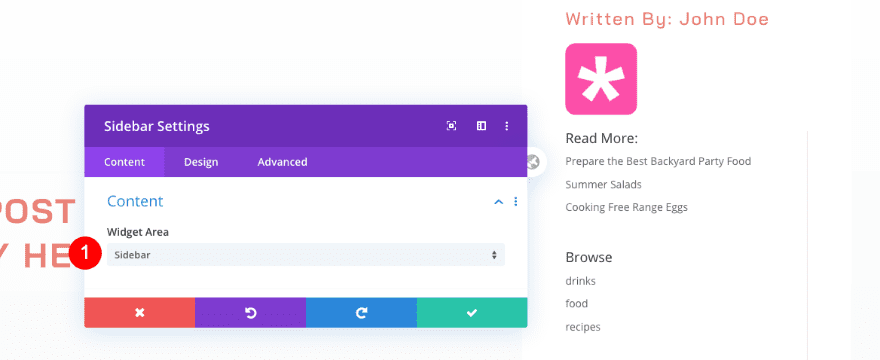
Content
Now it’s time to add the sidebar widgets using the sidebar module.
- Widget Area: Sidebar
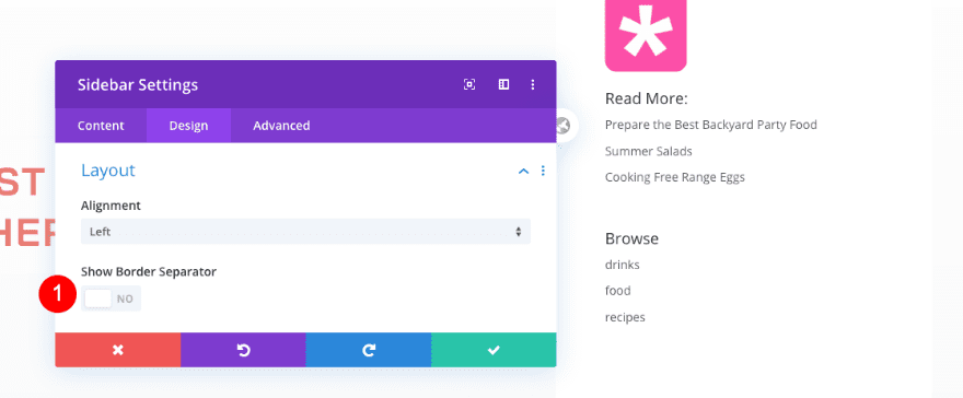
Layout
Adjust the layout first.
- Show Border Separator: No
Title Text
Modify the title text settings next.
- Font: Bai Jamjuree
- Weight: Medium
- Color: Coral #e98074
- Size: 2vh
- Letter Spacing: 2px
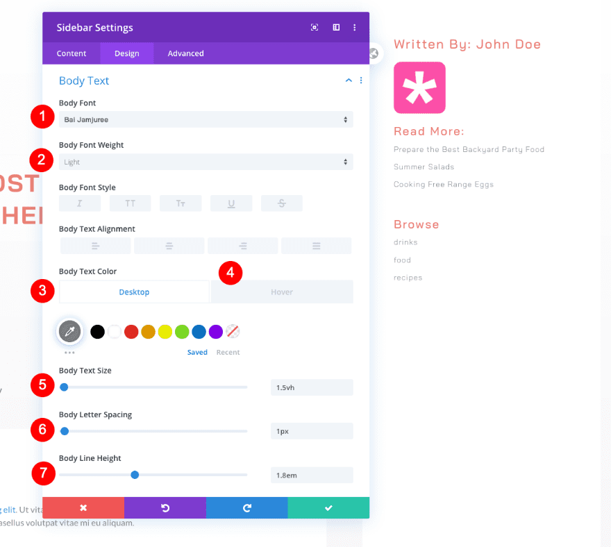
Body Text
Continue with the body text.
- Font: Bai Jamjuree
- Weight: Light
- Color: Dark Grey #7f7f7f
- Hover Color: Coral #e98074
- Size: 1.5vh
- Letter Spacing: 1px
- Line Height: 1.8em
Sizing
Adjust the sizing of the module too.
- Min Height
- Desktop: 12vh
- Tablet and Phone: auto
- Max Height
- Desktop: 12vh
- Tablet and Phone: auto
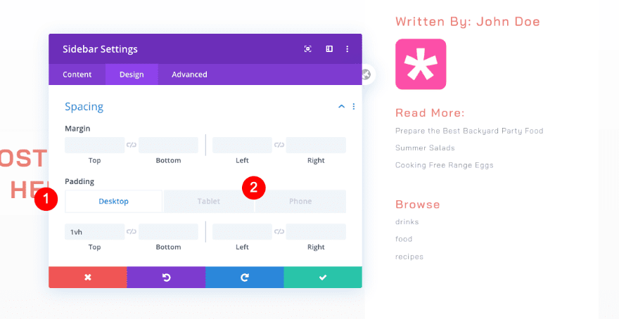
Spacing
Don’t forget to add a some spacing.
- Top Padding
- Desktop: 1vh
- Tablet and Phone: 3vh
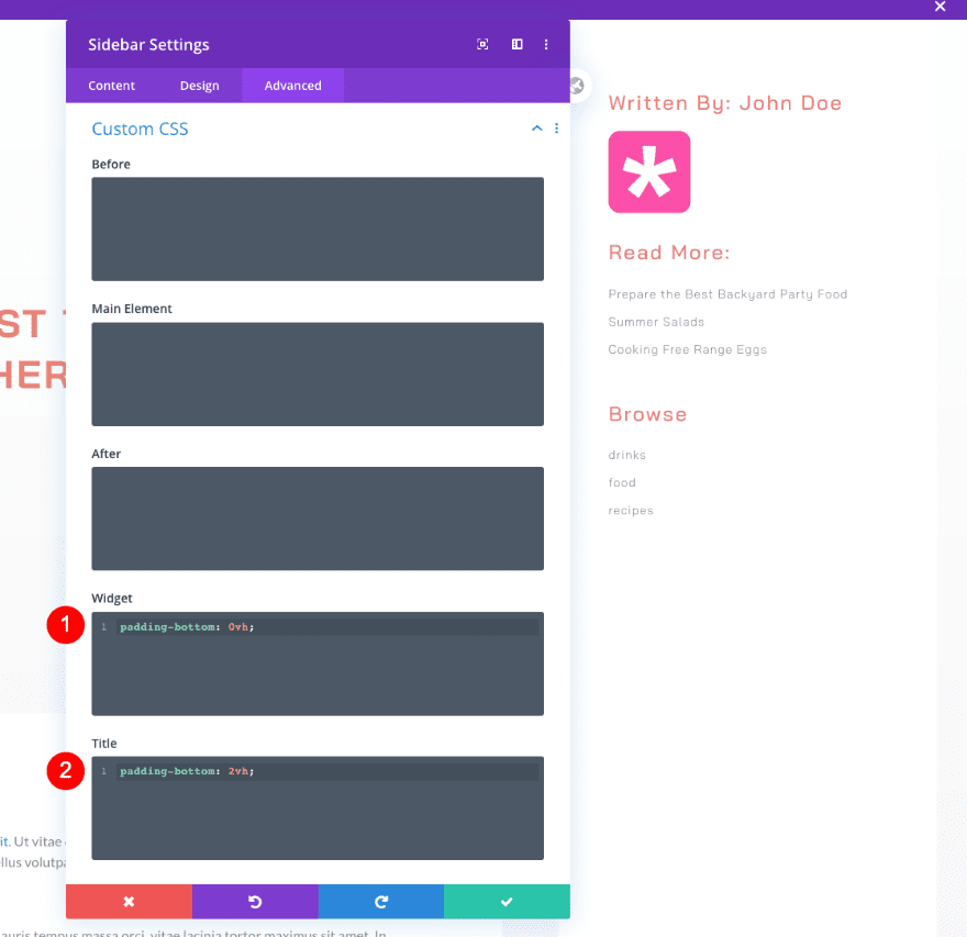
Custom CSS
Last but not least, include some CSS code lines in the advanced tab.
- Widget: padding-bottom: 0vh;
padding-bottom: 0vh;
- Title: padding-bottom: 2vh;
padding-bottom: 2vh;
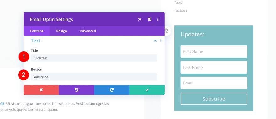
Add Email Optin
Text
The next module we need in our sidebar is an email optin module. Add some content of your choice.
- Title: Updates
- Button: Subscribe
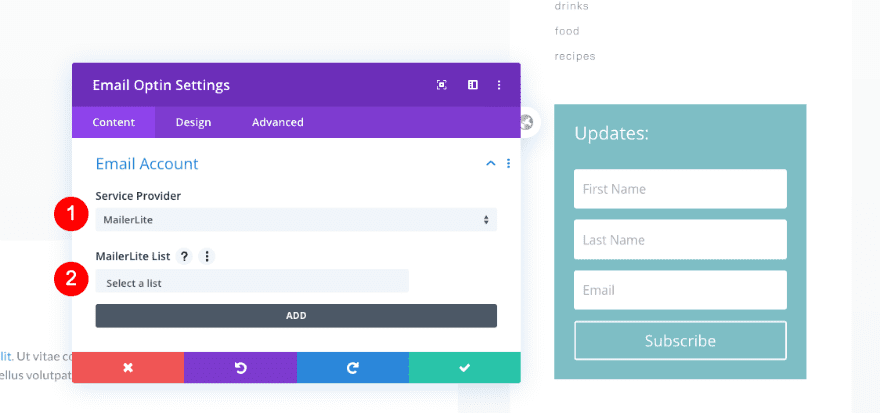
Email Account
Connect your email to the form next.
- Service Provider: Your Email Provider
- List: Your chosen list
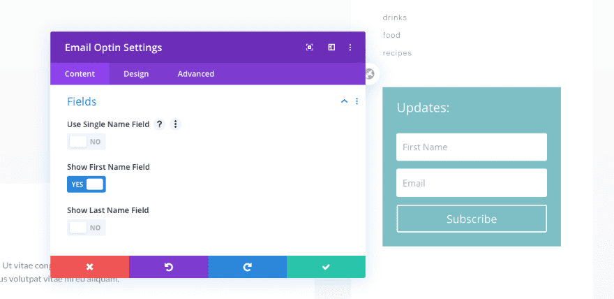
Fields
We’re only using the first name field in the fields settings.
- Show First Name Field
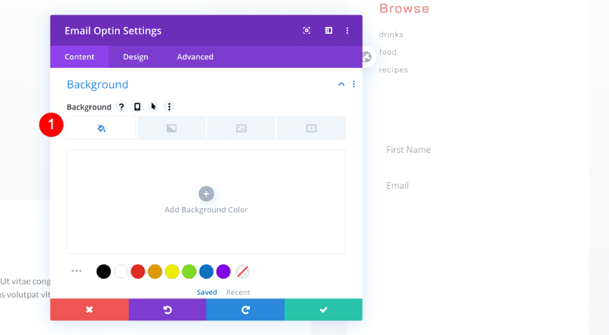
Background
Then, turn off the default background.
- Use Background Color: No
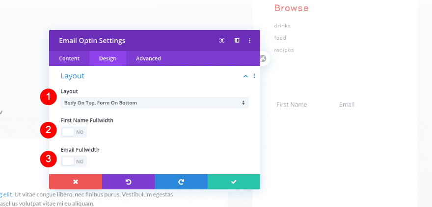
Layout
Move on to the design tab and modify the layout settings.
- Layout: Body On Top, Form on Bottom
- First Name Fullwidth: No
- Email Fullwidth: No
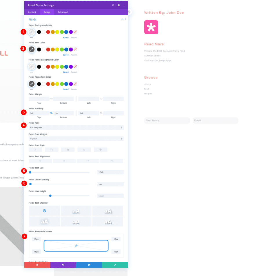
Fields
Then, style the fields as follows:
- Background Color: Light Gre #f7f7f7
- Text Color: #606060
- Top and Bottom Padding: 1vh
- Left Padding: 1vh
- Font: Bai Jamjuree
- Text Size: 1.5vh
- Letter Spacing: 1px
- Rounded Corners: 15px
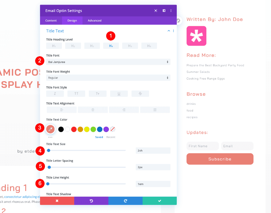
Title Text
Style the title text too.
- Heading Level: H4
- Font: Bai Jamjuree
- Color: Coral #e98074
- Size: 2vh
- Letter Spacing: 2px
- Line Height: 1em
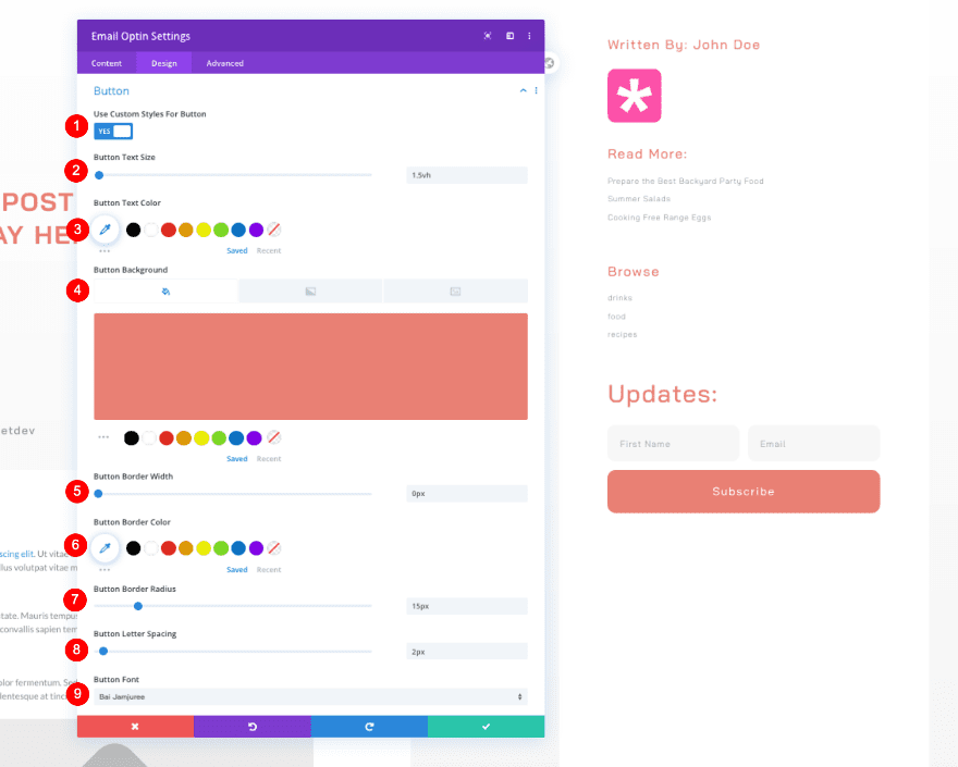
Button
Then, the button.
- Custom Styles
- Text Size: 1.5vh
- Text Color: White #ffffff
- Background Color: Coral #e98074
- Border Radius: 15px
- Letter Spacing: 2px
- Font: Bai Jamjuree
- Top and Bottom Padding: 1vh
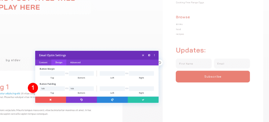
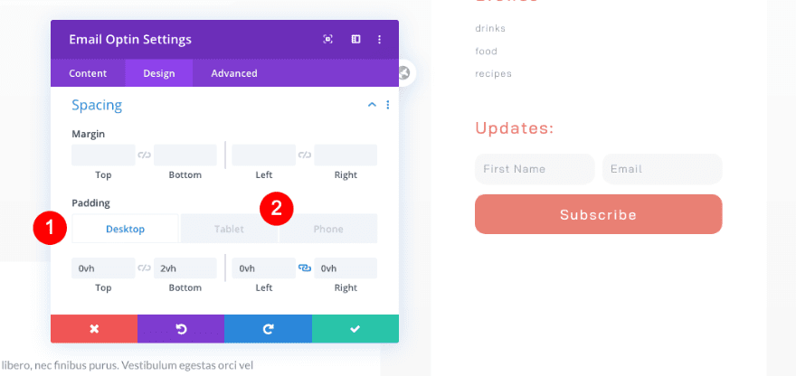
Spacing
And complete the module settings and the tutorial by adding some custom spacing values to the module. That’s it! Make sure you save all theme builder changes once you’re done creating the template body.
- Top Padding
- Desktop and Tablet: 0vh
- Bottom Padding
- Desktop: 2vh
- Tablet and Phone: 6vh
- Left and Right Padding
- Desktop and Tablet: 0vh
Preview
Now that we’ve gone through all the steps, let’s take a final look at the outcome across different screen sizes.
Desktop
Mobile
That’s A Wrap!
We’re done recreating the full-height fixed sidebar for your blog post templates. If you downloaded the template from the link above, don’t forget to set up your sidebar widgets as shown in the first part of this tutorial.
Are you a sidebar or no sidebar kind of person? Let us know in the comments if you have any thoughts or questions!


A wonderful template! It would be great if there was an accompanying all-category template with the same fonts and color palette. Does that exist?
Hi,
When I import the .json file to post, it show:
“This file should not be imported in this context.”
What’s the problem of it? what is the right way to import?
Wait for your reply, thanks in advance.
Problem solved, need to import from divi builder.
Hey,
This was exactly what I was looking for. Very recently I have started using DIVI and I feel pretty safe using it. The reason being, its really an awesome theme with all the features built in.
I would love to use the fixed sidebar option especially now after I have followed this tutorial.
Is this compatible with Google Adsense?
Can I add ads banner in this sidebar?
So only full height if no header or footer though, right? Also, do you have working demo? Curious what happens if the browser height is too short to show all the content of the sidebar. It wouldn’t be scrollable, and would thus cut off content, I think.
Hi Jon. The sidebar stays responsive down to a height of about 300px.
About the header and footer, that would depend on the design of each of those.