

The variety of Divi and its column structures allow you to create basically any design you have in mind. And although using the column structures in their original form is the most straightforward thing to do, you can also take it one step further by combining the design elements in a 6-column row with viewport units.
One of the things you could create, for example, is a collage. You won’t have to use any image editing software at all! On top of that, you can also allow each one of the images to open in a separate lightbox. In this post, we’ll show you how to do all of the above using Divi’s built-in options only.
Let’s get to it!
- 1 Preview
- 2 Approach
-
3
Let’s Start Creating
- 3.1 Backend Preview
- 3.2 Add New Section
- 3.3 Add New Row
- 3.4 Add Title Text Module to Column 6
- 3.5 Add Description Text Module to Column 6
- 3.6 Add Button Module to Column 6
- 3.7 Add Image Module #1 to Column 1
- 3.8 Add Image Module #2 to Column 1
- 3.9 Add Image Module #3 to Column 2
- 3.10 Add Image Module #4 to Column 2
- 3.11 Add Image Module #5 to Column 3
- 3.12 Add Image Module #6 to Column 3
- 3.13 Enable Lightbox for Image Module #1
- 3.14 Add Border Radius to Image Module #1
- 4 Preview
- 5 Final Thoughts
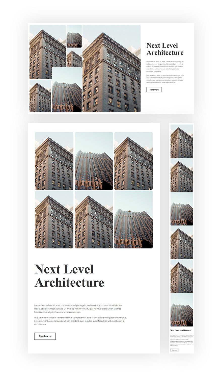
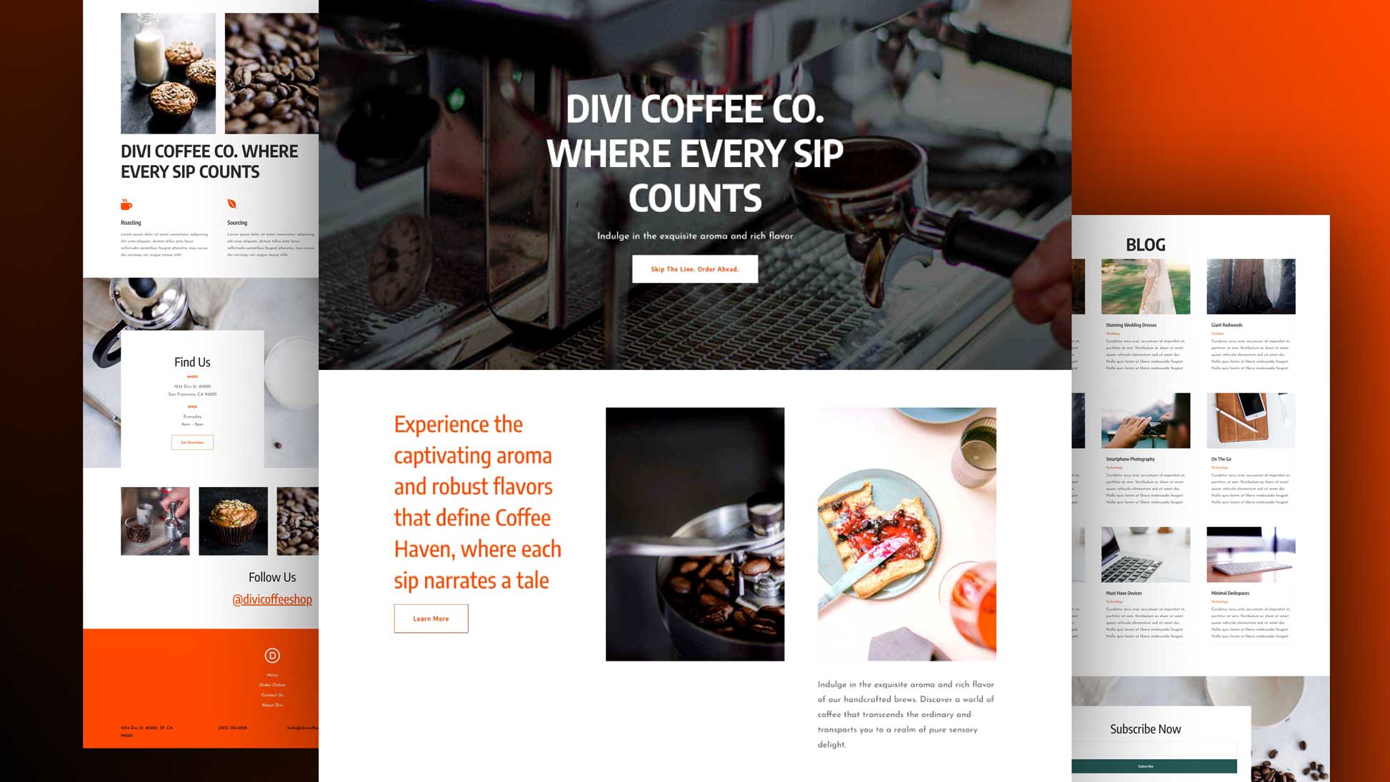
Preview
Before we dive into the tutorial, let’s take a quick look at the outcome on different screen sizes.
Approach
- We’re removing all gutter width between the section, row and columns so we can add custom margin and padding to each module manually (using viewport units)
- Viewport units make sure the positioning of design elements remains the same throughout all desktop screen sizes
- We’re going to adjust the spacing settings of each design element individually to match the overall collage design
- Thanks to the responsive options in Divi, we can make sure the above-mentioned settings don’t apply to tablet and phone
Let’s Start Creating
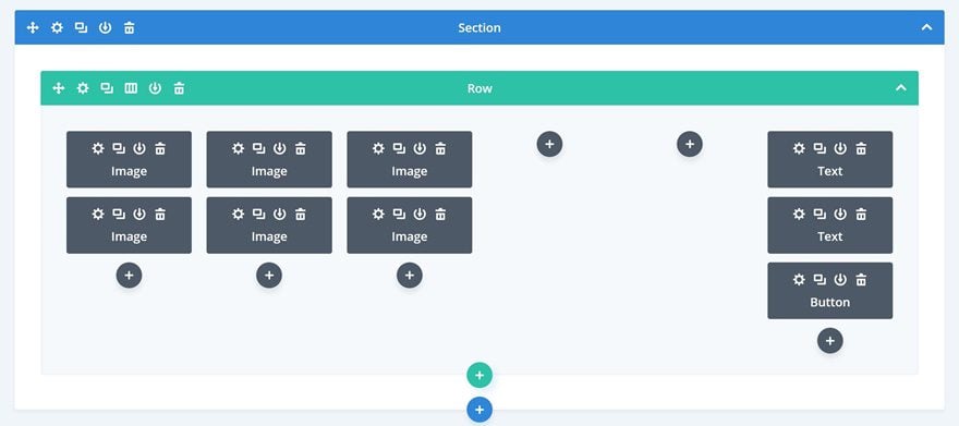
Backend Preview
This the end result from a backend perspective:
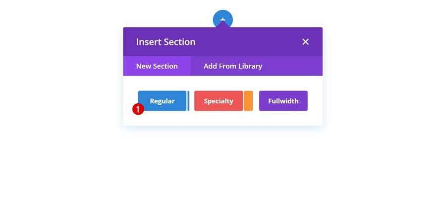
Add New Section
The first thing you will need to do is create a new page or open an existing one and add a regular section to it.
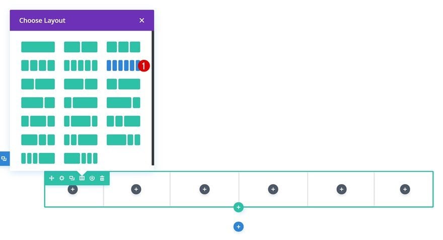
Add New Row
Column Structure
Continue by adding a new row using the following column structure:
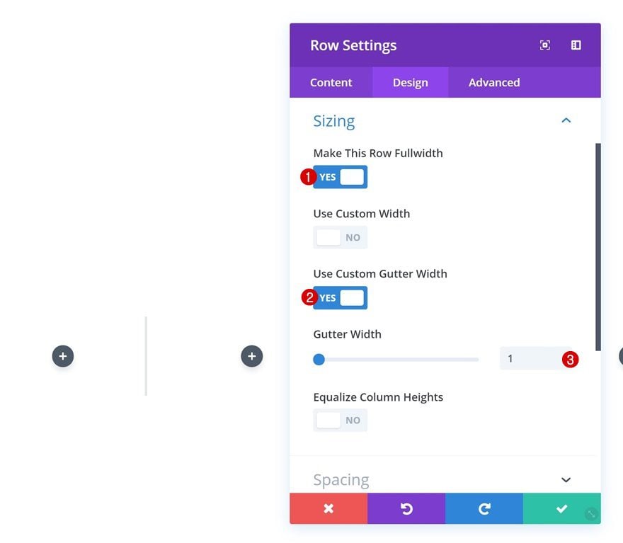
Sizing
Without adding any modules yet, open the row settings and change the sizing settings. This is an important step in this tutorial. By removing all the default margin and padding values between the section, row and modules, we’re able to manually add spacing to each and every design element using viewport units.
- Make This Row Fullwidth: Yes
- Use Custom Gutter Width: Yes
- Gutter Width: 1
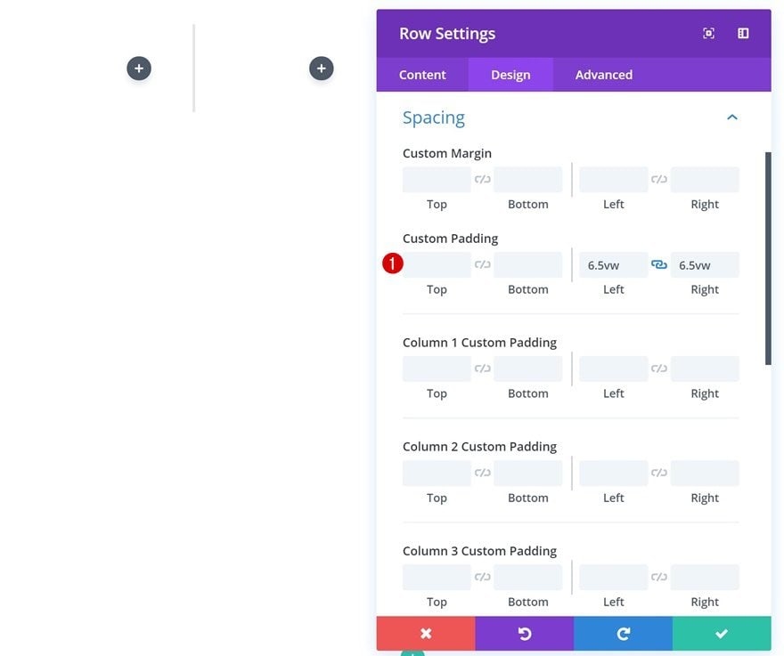
Spacing
Add some custom left and right padding to the row as well.
- Left Padding: 6.5vw
- Right Padding: 6.5vw
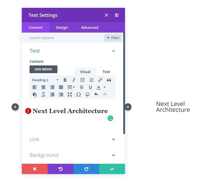
Add Title Text Module to Column 6
Add Content
Time to start adding modules! We’ll start by adding a title Text Module to column 6. Include some heading 2 copy of choice.
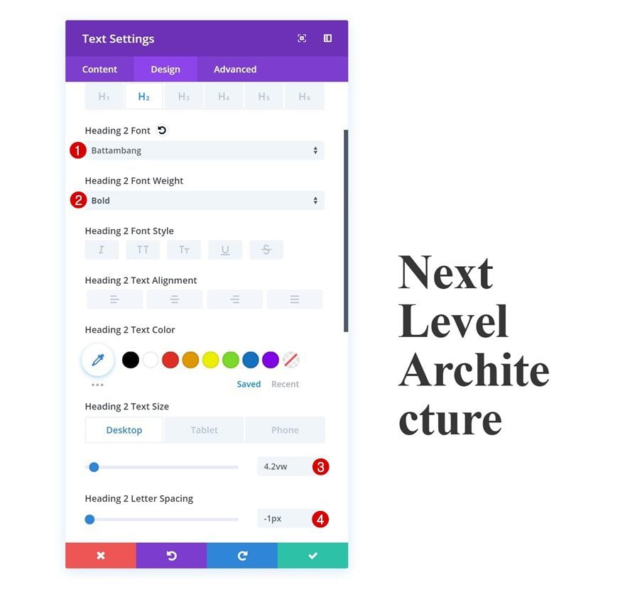
Heading Text Settings
Then, go to the design tab and change the heading text settings of the module.
- Heading 2 Font: Battambang
- Heading 2 Font Weight: Bold
- Heading 2 Text Size: 4.2vw (Desktop), 10vw (Tablet), 8vw (Phone)
- Heading 2 Letter Spacing: -1px
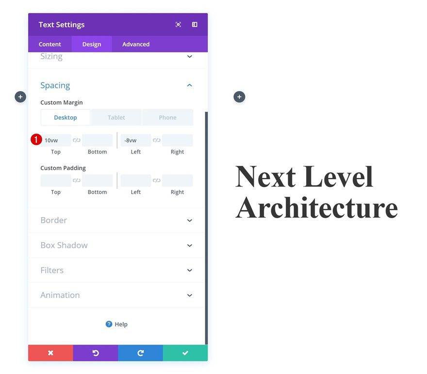
Spacing
Add some custom spacing values next to make this row overlap the 6th and 5th column of the row.
- Top Margin: 10vw
- Left Margin: -8vw (Desktop), 0vw (Tablet & Phone)
- Right Margin: -50vw (Tablet & Phone)
Add Description Text Module to Column 6
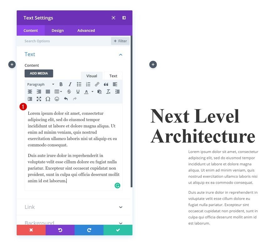
Add Content
The next module we’ll need in column 6 is a description Text Module. Add some content of choice.
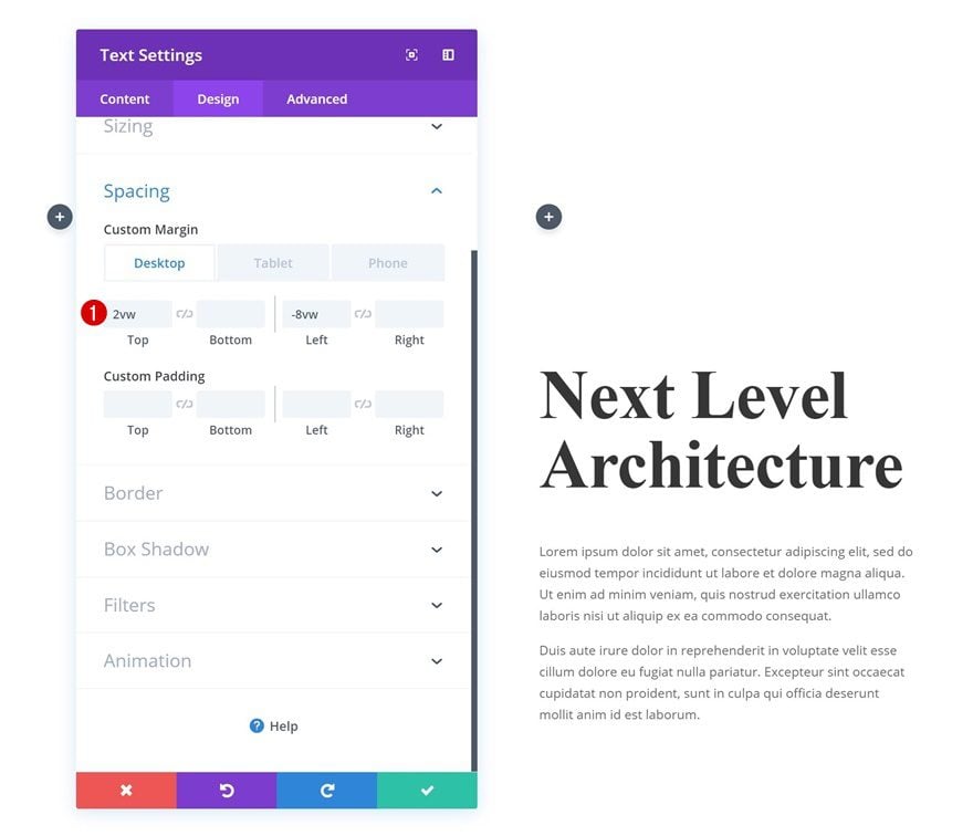
Spacing
Then, go to the spacing settings and push this module to the left as well.
- Top Margin: 2vw
- Left Margin: -8vw (Desktop), 0vw (Tablet & Phone)
- Right Margin: -50vw (Tablet), -3vw (Phone)
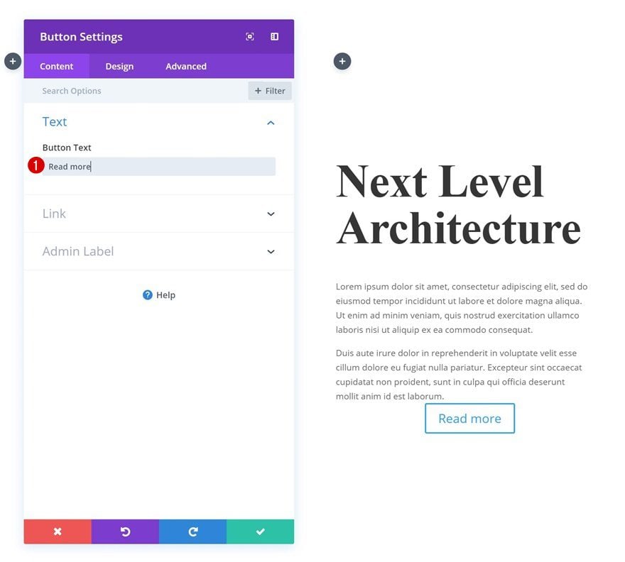
Add Copy
The next and last module needed in column 6 is a Button Module. Add some copy of choice.
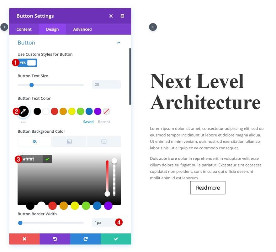
Button Settings
Then, go to the design tab and change the button settings.
- Use Custom Styles for Button: Yes
- Button Text Color: #ffffff
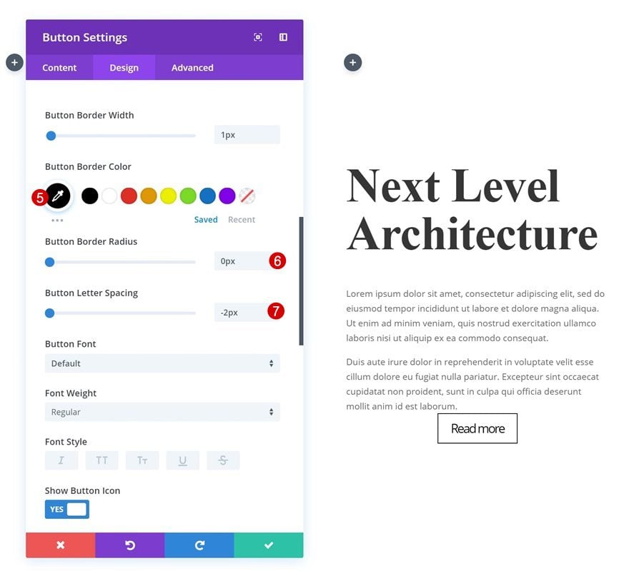
- Button Border Width: 1px
- Button Border Color: #000000
- Button Border Radius: 0px
- Button Letter Spacing: -2px
Spacing
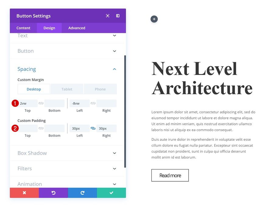
And again, we’ll need to make this module overlap column 5 and 6 by using custom margin values in the spacing settings.
- Top Margin: 2vw (Desktop), 5vw (Tablet), 10vw (Phone)
- Left Margin: -8vw (Desktop), 0vw (Tablet & Phone)
- Right Margin: -50vw (Tablet & Phone)
- Left Padding: 30px
- Right Padding: 30px
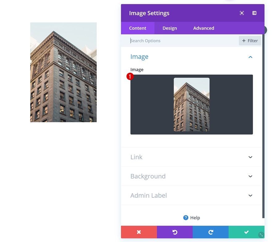
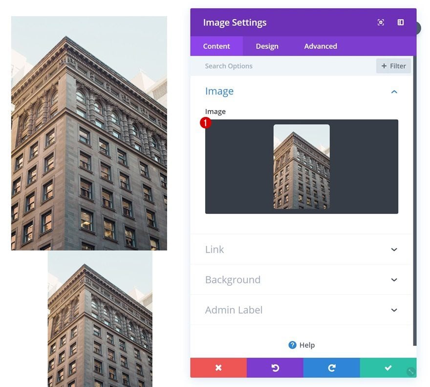
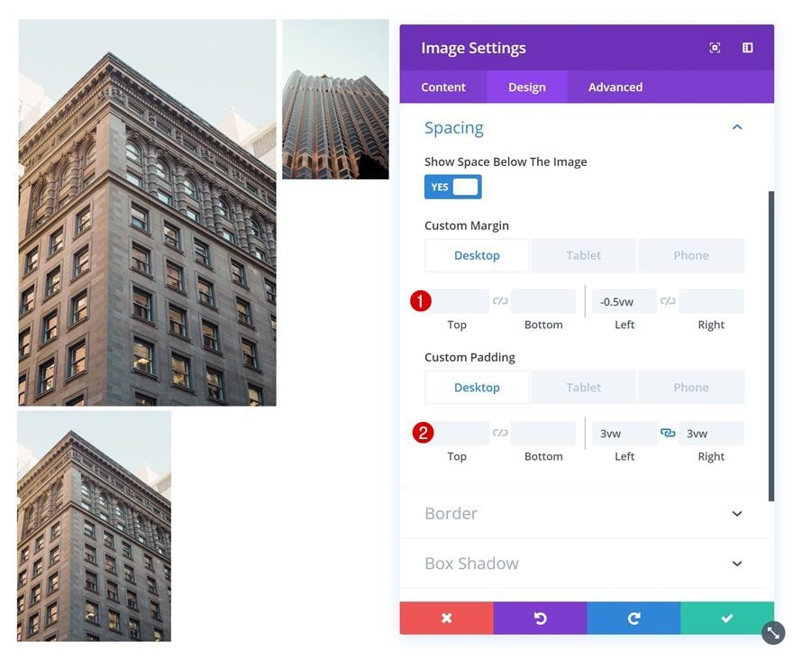
Add Image Module #1 to Column 1
Image Dimensions
Time to start adding all the different image modules! The example we’re recreating is 100% responsive if you’re only using images with 880px width and 1320 height. So, if you’re looking to create the exact same example from scratch, you should use images with that specific set of dimension. If you, however, want to make this work for any kind of set of image dimensions, you’ll have to adjust the viewport units of each Image Module manually to fit the overall design.
Upload Image
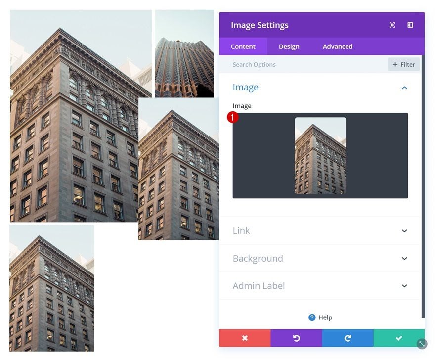
Each one of the three first columns will count two Image Modules. Add the first Image Module to column 1.
Spacing
Then, go to the spacing settings and increase the size of the image using viewport units.
- Top Margin: 0.5vw (Tablet & Phone Only)
- Bottom Margin: 0.5vw (Tablet & Phone Only)
- Left Margin: -5vw (Desktop), 0.5vw (Tablet & Phone)
- Right Margin: -2vw (Desktop), 0.5vw (Tablet & Phone)
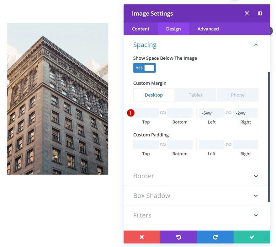
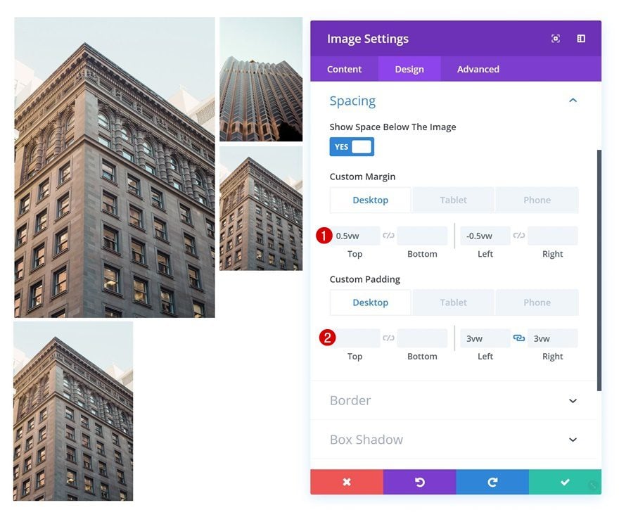
Add Image Module #2 to Column 1
Upload Image
Upload the second Image Module in column 1 as well.
Spacing
And change the spacing settings of this module as well.
- Top Margin: 0.4vw (Desktop), 0.5vw (Tablet & Phone)
- Bottom Margin: 0.5vw (Tablet & Phone Only)
- Left Margin: -8.1vw (Desktop), 0.5vw (Tablet & Phone)
- Right Margin: 3.7vw (Desktop), 0.5vw (Tablet & Phone)
- Left Padding: 3vw (Desktop), 0vw (Tablet & Phone)
- Right Padding: 3vw (Desktop), 0vw (Tablet & Phone)
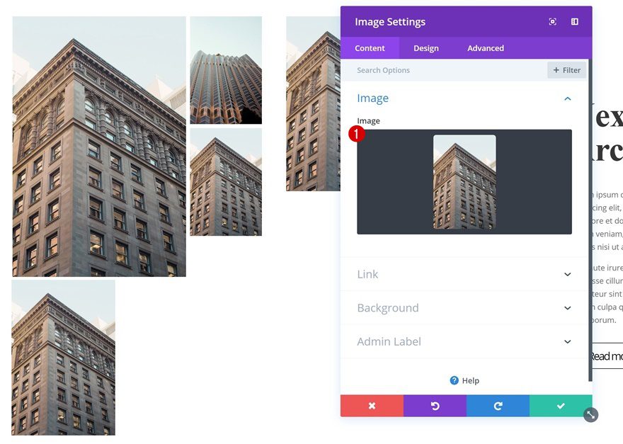
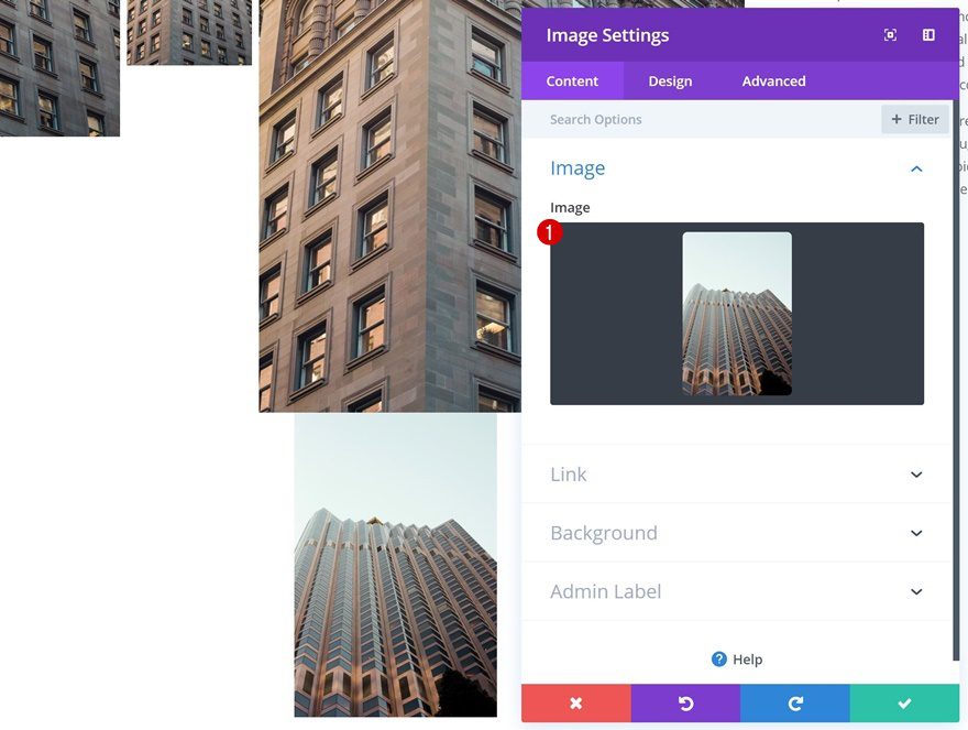
Add Image Module #3 to Column 2
Upload Image
On to the second column! Add a new Image Module and upload an image.
Spacing
Continue by using custom margin and padding values in the spacing settings to reduce the size of the image.
- Top Margin: 0.5vw (Tablet & Phone Only)
- Bottom Margin: 0.5vw (Tablet & Phone Only)
- Left Margin: -0.5vw (Desktop), 0.5vw (Tablet & Phone)
- Right Margin: 0.5vw (Tablet & Phone Only)
- Left Padding: 3vw (Desktop), 0vw (Tablet & Phone)
- Right Padding: 3vw (Desktop), 0vw (Tablet & Phone)
Add Image Module #4 to Column 2
Upload Image
Add a second Image Module to column 2 as well.
Spacing
And change the spacing settings here as well.
- Top Margin: 0.5vw
- Bottom Margin: 0.5vw (Tablet & Phone Only)
- Left Margin: -0.5vw (Desktop), 0.5vw (Tablet & Phone)
- Right Margin: 0.5vw (Tablet & Phone Only)
- Left Padding: 3vw (Desktop), 0vw (Tablet & Phone)
- Right Padding: 3vw (Desktop), 0vw (Tablet & Phone)
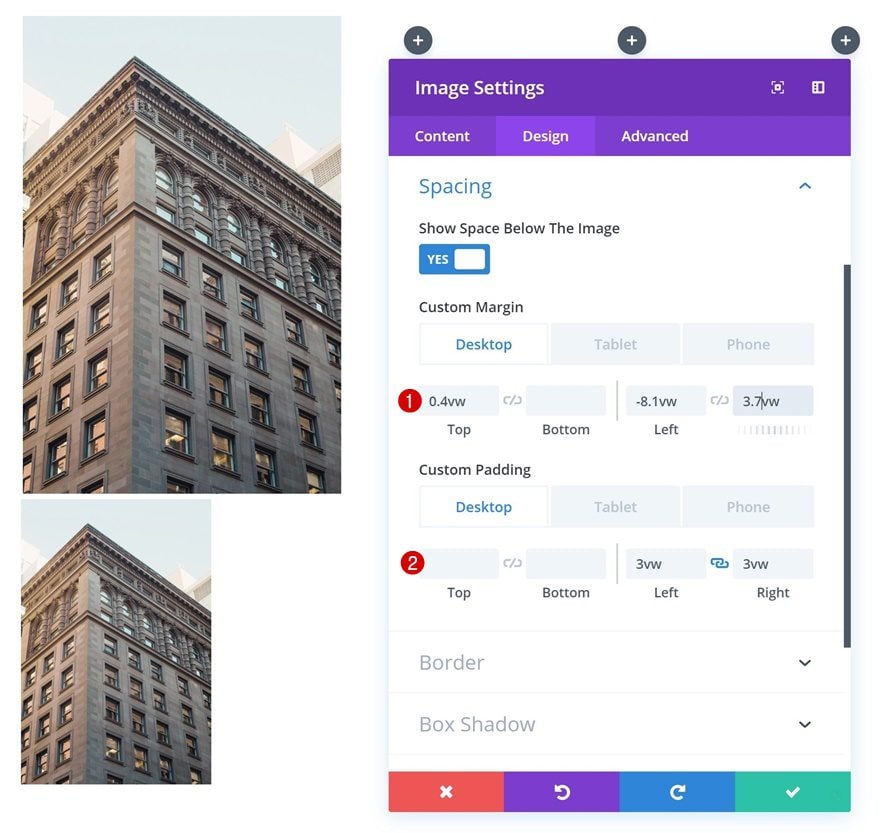
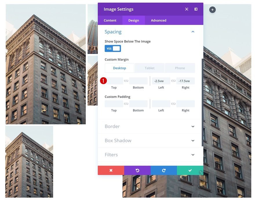
Add Image Module #5 to Column 3
Upload Image
On to the next and last column. Add the first Image Module.
Spacing
Change the spacing settings of the Image Module next. These values will help increase the size of the image as you can notice in the print screen below.
- Top Margin: 0.5vw (Tablet & Phone Only)
- Bottom Margin: 0.5vw (Tablet & Phone Only)
- Left Margin: -2.5vw (Desktop), 0.5vw (Tablet & Phone)
- Right Margin: -17.5vw (Desktop), 0.5vw (Tablet & Phone)
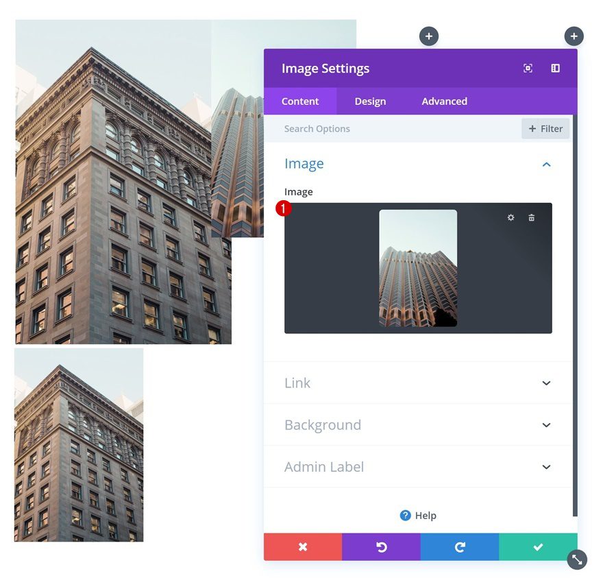
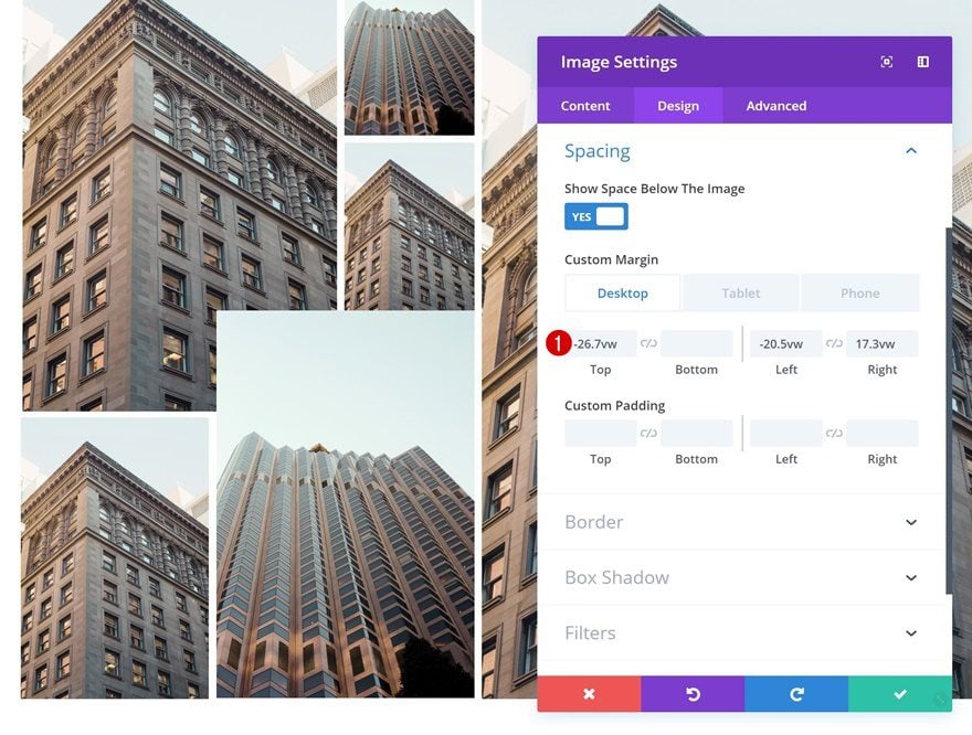
Add Image Module #6 to Column 3
Upload Image
Add the next and last Image Module in column 3.
Spacing
And change its entire position by adding custom margin values. For responsive purposes, we’re adding this module to column 3 instead of column 2.
- Top Margin: -26.7vw (Desktop), 0.5vw (Tablet & Phone)
- Bottom Margin: 0.5vw (Tablet & Phone Only)
- Left Margin: -20.5vw (Desktop), 0.5vw (Tablet & Phone)
- Right Margin: 17.3vw (Desktop), 0.5vw (Tablet & Phone)
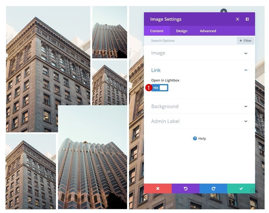
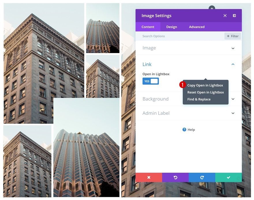
Enable Lightbox for Image Module #1
Once you have all the images in place, you can go ahead and enable the lightbox option in the first Image Module’s settings.
- Open in Lightbox: Yes
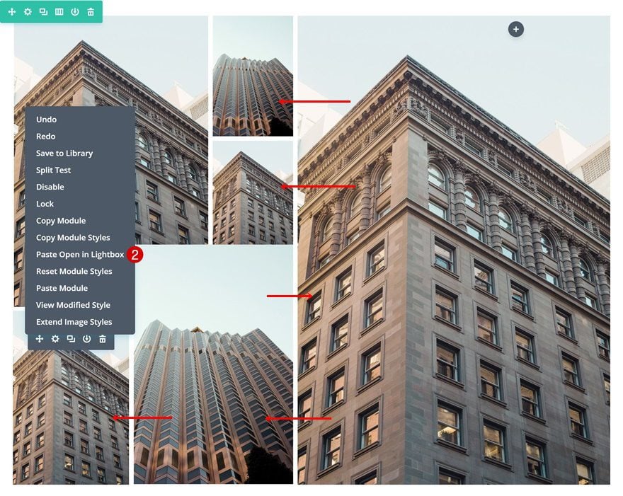
Copy Lightbox Option & Apply to All Images in Section
Once you’ve enabled the lightbox option for the first Image Module, you can copy this option and paste it to all the other Image Modules in the section.
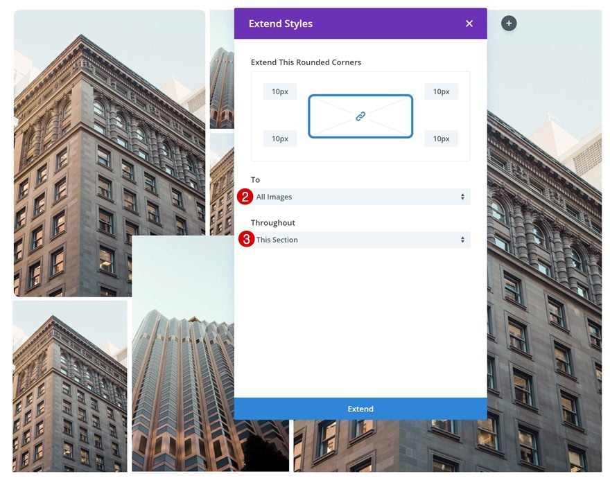
Add Border Radius to Image Module #1
Add some rounded corners to the first Image Module as well.
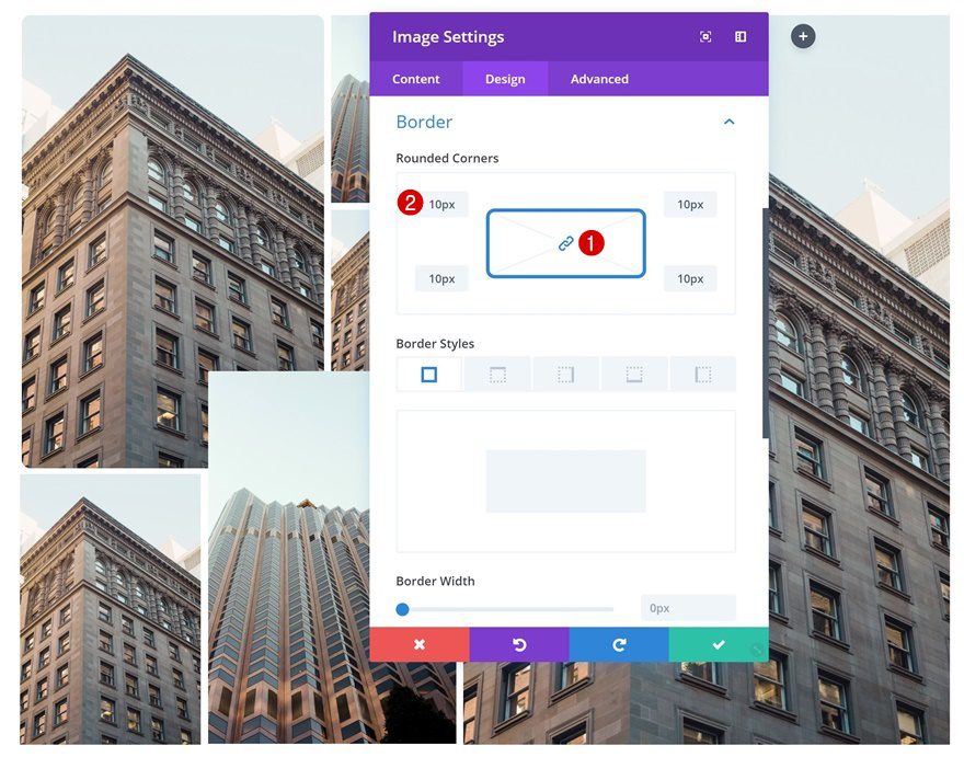
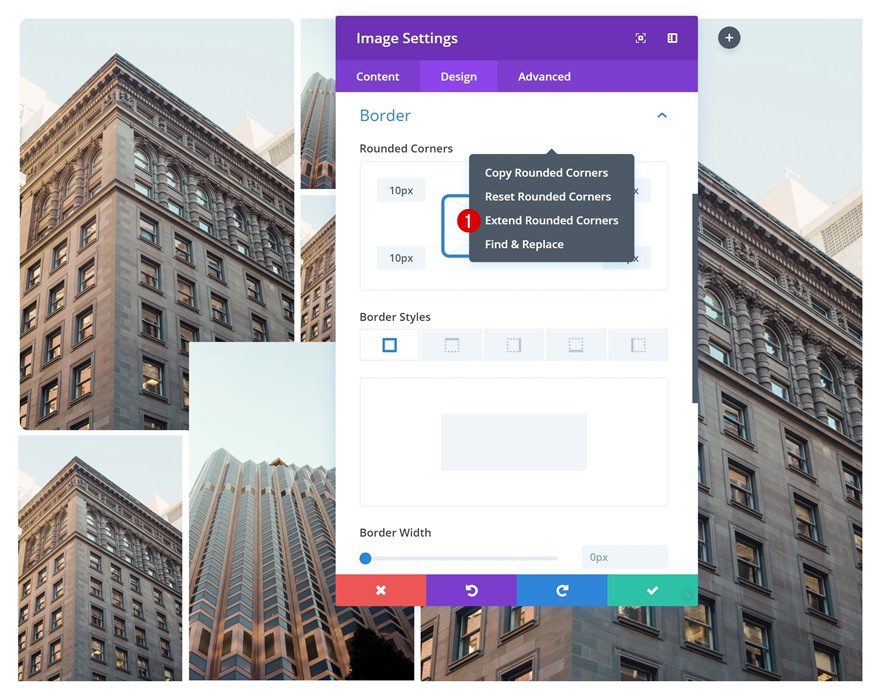
Extend Border Radius to All Images in Section
And extend these rounded corners to all the Image Modules in the section to save time.
Preview
Now that we’ve gone through all the steps, let’s take a final look at the outcome on different screen sizes.
Final Thoughts
The opportunities you have with Divi’s new 6-column row are endless. In this post, we’ve shown you how to create a stunning and unique collage using the 6-column row and viewport units. If you have any question or suggestions, make sure you leave a comment in the comment section below!


So great to find another person with some original thoughts on this issue.
Very Helpful for us to motivate us use this product for my website
Wow, These all are good study materials. I will definitely try these themes. Thank you so much for sharing valuable information.
Great post but your new support system really sucks.
Go back to the old one please. A great part of the Divi theme was the wealth of information in that forum. Now, nothing new from support gets added.
Thumbs down.
Divi is a popular page builder these days, and Thank you for sharing a valuable information on this topic. We hope to get much more informative posts from your side in future.
Great post, but I would like that the module gallery to had the option of Full Width Masonry.
Agreed! Masonry layout for images is common in design these days and should be supported in Divi.