

Your navigation menu is one of the first things visitors look for when they go to your site. Because of this, websites make sure to give it the primary real estate (at the top of the page) it deserves. But if you are looking to make your navigation menu stand out a little more, you can spice it up with custom background designs. With Divi’s Visual Builder, you can create some awesome background designs with the Divider background options available in every section of your page. And with a little creativity, you can use a divider background to serve as a unique frame for your navigation menu. You can even create a unique menu background for each page of your website.
In this tutorial, I’m going to show you how easy it is to frame your navigation menus with beautiful background designs using section divider backgrounds. I’ll be using the pharmacy layout pack as an example site to create these designs.
Let’s get started!
Sneak Peek
Here is a sneak peak of what can be accomplished with this design technique.


What You Need
For this tutorial, all you really need is the following:
- The Divi Theme (installed and active)
- The Pharmacy Layout Pack (a free premade layout pack available within the Divi Builder)
For this tutorial, I have a fresh install of Divi with my primary menu containing the six pages of the pharmacy layout pack. Here is what the menu looks like by default.

As you can see the header has a white background and sits above the first section of the page. When you scroll down, the header converts to a fixed navigation menu bar.

But for this tutorial, I want to make the header background transparent so I can add my own custom background. To do this we need to hop over to the theme customizer. From the WordPress dashboard go to Divi > Theme Customizer. Then from the customizer menu, go to Header & Navigation > Primary Menu Bar.
Change the background color to be completely transparent by dragging the transparency slider all the way down or enter the color code rgba(255,255,255,0).
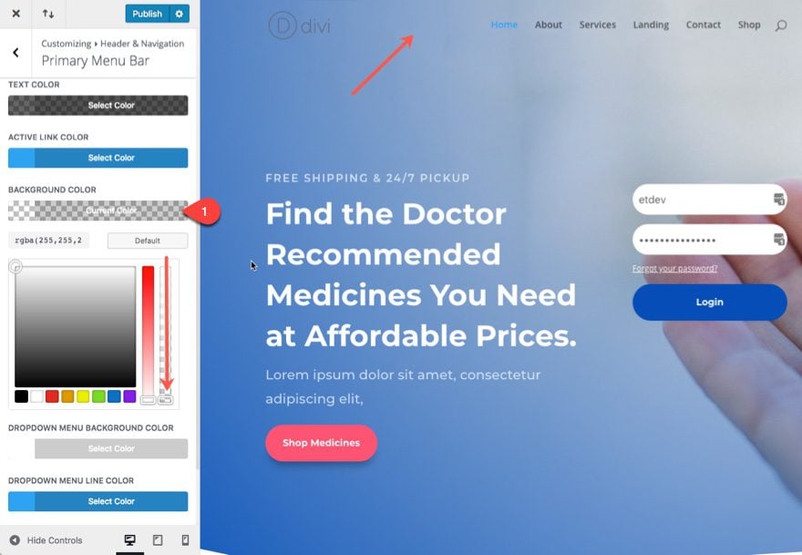
As you can see the white header background has disappeared and your first section has jumped to the top of the page to serve as the background of your header and primary menu.
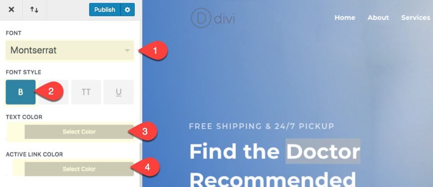
Since we are going to add a color background to frame our navigation menu, let’s update the following menu text options as well.
Font: Montserrat
Font Style: Bold (B)
Text Color: White
Active Link Color: White
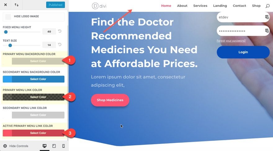
Go back one level in your customizer menu and click the Fixed Navigation tab. If you are going to be keeping the fixed navigation functional, you can give it a custom color that compliments the color of your custom background you will build in the visual builder. Or you can give it a more generic color so that you can frame your primary menus with different colors on a per page basis. For now, I’m going to use a more generic color scheme for my fixed navigation. Update the following:
Primary Menu Background Color: #ffffff
Primary Menu Link Color: rgba(0,0,0,0.61)
Active Primary Menu Link Color: #ff5473
Now we are ready! Make sure you publish your changes.
Example #1
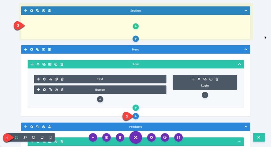
Go over to your pharmacy home page and deploy the visual builder. Then add a new regular section without any rows, columns, or modules (you don’t need them) and drag the section to the top of your page (I find it easier to rearrange sections in wireframe mode because they are larger blocks).
Now go back to desktop mode to complete the design.
Open the section settings and update the following:
Top Divider Style: see screenshot
Divider Color: #ff5473
Divider Height: 150px
Divider Horizontal Repeat: 0.8x
Custom Margin:-80px bottom
Custom Padding: 0px Top, 0px Bottom
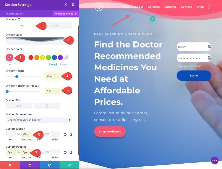
The divider color is the same pink color used in the layout. I set the divider horizontal repeat to 0.8x in order to flatten out the divider a bit. The -80px bottom margin brings the section down the page in order to hide the white background of the section. This results in the divider framing the navigation on the right. The divider extends to the left to add a nice background to your logo as well.
Here is what it looks like on the live site.

Example #2
For this next example I’m going to position the section so the divider background only frames the navigation menu instead of extending to the logo as well. To do this we need to give our section a custom width and make it right aligned so that it fits around the navigation menu.
Go to the section settings and update the following:
(Note: You may need to open the settings in wireframe mode since the custom margin of the section may make the section menu unclickable. Once you open the settings in wireframe mode you can switch back to desktop view mode.)
Width: 75%
Section Alignment: Right
Divider Style: see screenshot
Divider Horizontal Repeat: 1x

Here is what it looks like:

With Fixed Navigation activated, you can see how the fixed menu header activates just as the menu starts to leave the frame.

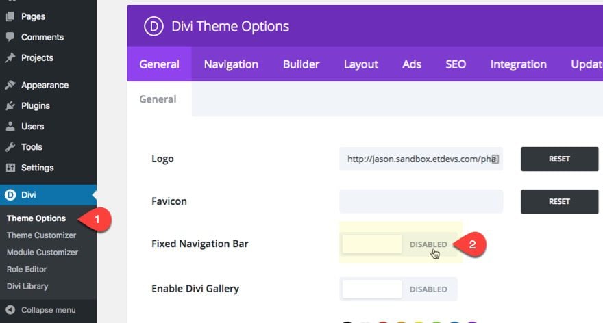
If you want to disable fixed navigation, navigate to Divi > Theme Options, and disable the Fixed Navigation Bar option under General Settings.
Without fixed navigation activated, your menu will stay locked in place within your frame design as your scroll.

Responsive
The frame will even look good on mobile as well.

But you can always choose to hide the frame by giving your section a custom divider height of zero for desktop and mobile. And then customize your mobile menu in the theme customizer.
Use Different Color Frames on Different Pages
If you want, you can add different colors and designs on a per page basis. All you need to do is save your section to your Divi Library and add it to a different page of your website. Then you can adjust the color or design as you want. The possibilities are endless.
Final Thought
Adding a custom background to your navigation menu is actually pretty easy with the Divi Builder. All you need to know is how to position your section to serve as a background for your menu. And with this setup in place, you can test out different divider styles to create all kinds of unique frames for your navigation menu. And since you are using a section, you have all the design options of a section to design your frame. You can even use a simple section background or gradient and adjust the position of your section anywhere you want.
I look forward to hearing from you in the comments.
Cheers!


It did not work for me. In the second example I put the width at 75%, but when I do this the whole section goes to the right, that is, it gets 25% of the empty area. Unfortunately I can not send a print.
It looks great in Desktop. But my Mobile menu comes up as transparent and i don’t see how i can give a background to my mobile menu only. You can see it in the link mentioned below.
Sorry Sooraj, I didn’t see a link. But you may find what you are looking for by going to Theme Customizer > Mobile Styles > Mobile Menu. There you can adjust the style of your mobile menu.
Hi Jason, I tried that, but that overrides the entire style set from above example. what i would like is the drop down from hamburger icon to have a background. Below is the link.
https://crimsoncorner.in/
Great tutorial and just what I was looking for 🙂
Thank you Jason!
Thanks Jason, simply wonderful !!!
And so helpful. Much appreciated
I. Love. This. Thank you!
Perfect for a site I am currently working on.
This is great! We’re starting to see more and more sites that are heading in this direction. Looks like the sticky bar is becoming less essential as sites are designed with more buttons and links conveninently placed within content for visitors.
Thanks, Mobolo. Great to here.
It’s also great to “HEAR”. Sorry about the typo.
Looks great on the front page. Second page in my navigation is a category link. I am unsure how to use divi to manage the display of that page or if that is possible.
Unfortunately, you would have to use custom CSS and target the “archive” class to change the design of your header on a category page. See my response to Tpuuska above. Thanks.
Beautiful effect! However I would like this effect over a Hero slider – I replaced the pharmacy top section with a full width slider – the first time I loaded the page, the wave menu appeared – as soon as the slide changed, it disappeared leaving the standard menu, and the wave shape never reappeared, only on first load.
Any ideas why this happens?
Go to your fullwidth slider settings and add the following custom css in the main element input box under the advanced tab…
Awesome, Jason, this works and looks great! Thank you.
pretty awesome looking addon, and definitely adds a new touch to the old and boring navigation headers. Makes it look sleeker and quite modern 🙂
Thanks for this simple and pretty cool feature 🙂
It’s a pitty that we can’t use this feature to EXTRA theme when the Homepage is based on a Category…
Hello Jason,
Thank you for this very interesting tutorial!
Question:
Could you tell me the name of the software you use to illustrate the steps of your tutorial by these pretty and elegant numbered bubbles, arrows and yellow markers?
I have tried the PREVIEW software notations on Mac OS which is fine, but the size of the numbers in a bubble is quite limited on the rendering on small sizes.
I searched several times on the web without finding .. 😮
Thank you for your answer ! 😉
Best regards,
Franck C
Thanks Franck. The software I use is Snagit.
Thank you very much Jason! ??
You’re welcome.
Thank you very much Jason! 😉
Just shows with a bit of creative thinking what you can do with DIVI…just about anything I reckon.
Great Job!! Will use, Thanks for the design tip.
Thank god! Finally something for Divi Menu. Thanks.
Nice trick. The only downside I see is you need to use the divibuilder for every page or post, and add this top section every single time. To make it consistent i would then make it a global section
I loved the article! I have a question, as I do so that the normal menu appears in the product window
Thanks Jenifer. I’m not quite sure what you mean. Can you explain your issue in more detail.
Nice idea but you’re left with an invisible (white on white) menu and logo on single blog post pages.
That’s true. If you aren’t using the Divi Builder for your single posts, you will need to adjust the color of your menu text on posts using custom css. Thanks for the heads up, Dave.
Could you provide an example CSS because I made a transparent menu on one site which I had to roll back to a solid color one because of this. The site has Woocommerce so on product pages the menu is white, with white text and doesn’t show. Greatly appreciate the help!
Sure! So if you want to change the header background color and/or menu item link color only on your single post template, you can add this custom CSS in the Theme Customizer:
.single #main-header {background: #333333;}
.single #top-menu li a {color: #ffffff;}
The “single” css class should target all posts including your single product pages.
If you want to target archive pages (ie. the shop page), you can use the “archive” css class:
.archive #main-header {background: #333333;}
.archive #top-menu li a {color: #ffffff;}
Hope that helps!
What is the code for the secondary menu, please?
A good idea make beautiful menu. Thanks.
Hi everybody,
Very nice post, but is possible to record a video?.
Marcelo,
There will be a live stream video for this coming this week. Thanks.
awesome, when will you guys be coming out with the header customization update ? hopefully same time ? Thanks for this tut though, divi headers are so all the same for me.
Well faiek I think they need to give us the dynamic content update first before the theme builder update.
Looks great – fantastic idea and looks pretty good… any way to keep it fixed with the menu when it stays at the top of the page – most sites have a fixed navigation – changing from this divider style to a white bar (default) could look better. Also would be great if the article covered some other tips on adding this to all pages. Library element possibly – the template was mentioned briefly.
You could just set it up as global section once you get all the settings figured out & then just add it to the top of each of your pages. And create a template with it so your new pages will have it too
Thank you Matt!
One thing that I don’t understand well with DIVI is changing the navigation – this is cool and looks great, but it scrolls with the page – you have to make it sticky – can’t just manage it like regular navigation so it’s a ‘work around’ – staying on the top of each page as you scroll through content just isn’t as easy as it should be. I’ll try it with some sticky JS and see how well we can make it work.
Great tutorial though.
One of the best design tips in a while. Thanks!
great job !
Great idea to use divider in this way, thanks for sharing !
Thanks a million Jason-so effective.
This is awesome and will try this on my own page now!
Nice idea! Not sure for mobile
If you don’t like the design on mobile, you can actually control the display of your mobile nav in the theme customizer. Then you can get rid of the divider height on mobile so that it doesn’t display.
It disappears on mobile for me. I tried playing with the margins and padding for mobile.
Sorry, Terri. Are you saying the section divider disappears on mobile?
Yes. Plus that top section is very short.
Seems obvious now that you mention the idea. Great design tip!
I know right? Why did it take me this long to see that! Thanks Courtney.
Now that does look like a fresh idea.
I dig it! Love the creative design idea.